


Trading Equity Curve: How to Read, Analyze, and Improve It

You close a clean supply-and-demand setup, watch the trade move in your favor, then give the profit back before the session ends. A few losses follow. By the time you open your journal, the trading equity curve is flat or bending lower, and you're asking the dangerous question: “Is the strategy broken, or am I?”
A single trade can't answer that. One winner may come from good execution, luck, or a favorable market regime. One loser may be a perfectly valid loss. Your equity curve gives you a longer record of what happened, including position sizing, entries, exits, slippage, commissions, missed trades, and discipline failures.
Why Your Trading Equity Curve Matters More Than Any Single Trade
A trader often gives one loss too much authority. After a stopped-out short from a supply zone, they question the zone, the timeframe, the stop placement, and sometimes the entire method. The next winning trade then produces the opposite reaction. Confidence returns, sizing increases, and the trader forgets that neither result proves much by itself.
The curve is calmer. It absorbs every closed result and shows the path created by repeated decisions. That path includes the trades you took too early, the valid setups you skipped, the revenge position after a loss, and the trade where your risk was larger than planned. It doesn't care whether the last result felt unlucky.
Journal rule: Judge the quality of a decision before judging the result. Judge the quality of the strategy through the accumulated curve.
An upward curve with controlled pullbacks suggests that the method and its execution are working together. A sideways curve can point to weak expectancy, inconsistent selection, or an edge that only works in a narrow market condition. A curve that repeatedly makes lower lows demands a serious review, even if individual trades still look technically attractive.
This is why the trading equity curve is a diagnostic instrument, not a mood meter. It helps separate normal variance from behavior that is damaging the account. A losing trade taken exactly at a fresh demand zone with a defined invalidation point belongs in the system's normal distribution. A losing trade entered after the zone was already tested, because the trader chased a move, belongs in the execution review.
The useful question isn't “Did I win today?” It's “What does the shape of my results say about my edge, risk, and decisions?” Once you ask that question consistently, the curve becomes a practical feedback loop. You can test its resilience, reduce the damage caused by poor sizing, improve supply-and-demand selection, and build journal rules that keep one emotional session from changing the whole account.
What the Trading Equity Curve Really Shows
A price-action trader can finish a week with several winning trades and still see the account moving sideways. The curve may reveal that those wins came from clean supply-and-demand setups, while losses came from late entries, oversized positions, or trades taken outside the plan. That record matters more than the emotional impression left by any single result.
An equity curve is the running timeline of cumulative trading profit and loss. Plot each closed trade in sequence, or group results by date, and you can see how the account developed. A useful drawdown statistics reference identifies maximum drawdown, average drawdown, drawdown duration, and recovery factor as important ways to examine that path.
Keep different account-value series separate. A balance curve records settled cash results, while an equity view can include open-position value and the effect of deposits or withdrawals. Mixing them can make a deposit look like trading profit, or floating loss can make a sound method appear weaker than its closed-trade record.
Read the curve through four lenses:
- Drawdown is the valley. It shows the account's decline from a previous high. A 20% drawdown removes one-fifth of the account from that peak, while a 50% drawdown requires a 100% gain to return to the prior level.
- Slope is the hill gradient. A rising line shows that positive results are accumulating. A steep rise with violent pullbacks may be less usable than slower growth that keeps risk within your tolerance.
- Streaks are weather patterns. Several losses do not prove that a setup has failed. Check whether the sequence fits the strategy's observed behavior, then confirm that your position size lets you execute the next valid trade without hesitation.
- Expectancy is the coin-flip payout. It combines win rate, loss rate, and trade size to estimate the average result per trade. A method can win frequently and still lose money when its losing trades outweigh its winners.
| Metric | Definition | What It Tells You |
|---|---|---|
| Drawdown | Decline from a previous equity peak | Recovery burden. A 20% drop needs a 25% gain to recover |
| Slope | Direction and pace of cumulative results | Whether the edge is producing growth over time |
| Streaks | Consecutive winning or losing outcomes | How variance may affect execution and psychology |
| Expectancy | Average result per trade, often expressed in R | Whether the method has a repeatable payoff |
Review the chart beside the journal. If trades from fresh demand zones hold their planned risk but chase entries create the deepest losses, the curve is showing an execution problem, not just market variance. A profitable endpoint can hide recoveries that your finances or discipline cannot tolerate, so the route to that endpoint determines whether the strategy is ready for live execution.
Reading the Curve Through Drawdowns, Slope, and Streaks
Start with the slope, but don't stop there. A rising curve means the average result is positive over the reviewed sample. The quality of that rise depends on the valleys beneath it, the time spent below each peak, and the way losses cluster around particular setups or market conditions.
Drawdown depth is the obvious feature, yet duration often exposes the more serious problem. A short, sharp decline that recovers can be easier to manage than a shallow curve that drifts sideways for a long period. The equity-curve guide from JournalPlus frames 5–10% drawdown as a normal range for active strategies and notes that a 25% drawdown requires a 33.3% gain to reach breakeven. Those figures aren't permission to accept any loss. They're reminders that your initial risk determines the recovery burden.
Four visual questions for every chart
Does the slope survive different conditions? A curve that rises only during one directional phase may be expressing market exposure rather than a durable price-action edge. Separate trend trades, range trades, and counter-trend trades in the journal so you can see which group carries the result.
How deep is the largest valley? Maximum drawdown is the single worst peak-to-trough decline. Mark its start, its lowest point, and the trade decisions inside it. Don't label the valley “bad luck” until you've checked whether entries moved away from fresh zones or risk increased after losses.
How long does recovery take? Drawdown duration runs from a peak until that peak is regained. A curve that recovers slowly may require a different size, tighter setup filter, or a reduced trading frequency even when its final profit remains positive.
What do streaks reveal? Consecutive losses may represent normal variance, but they can also expose a repeated error, such as trading weak zones during low-quality sessions. Tag each loss by setup quality and execution quality rather than treating every red result as equivalent.
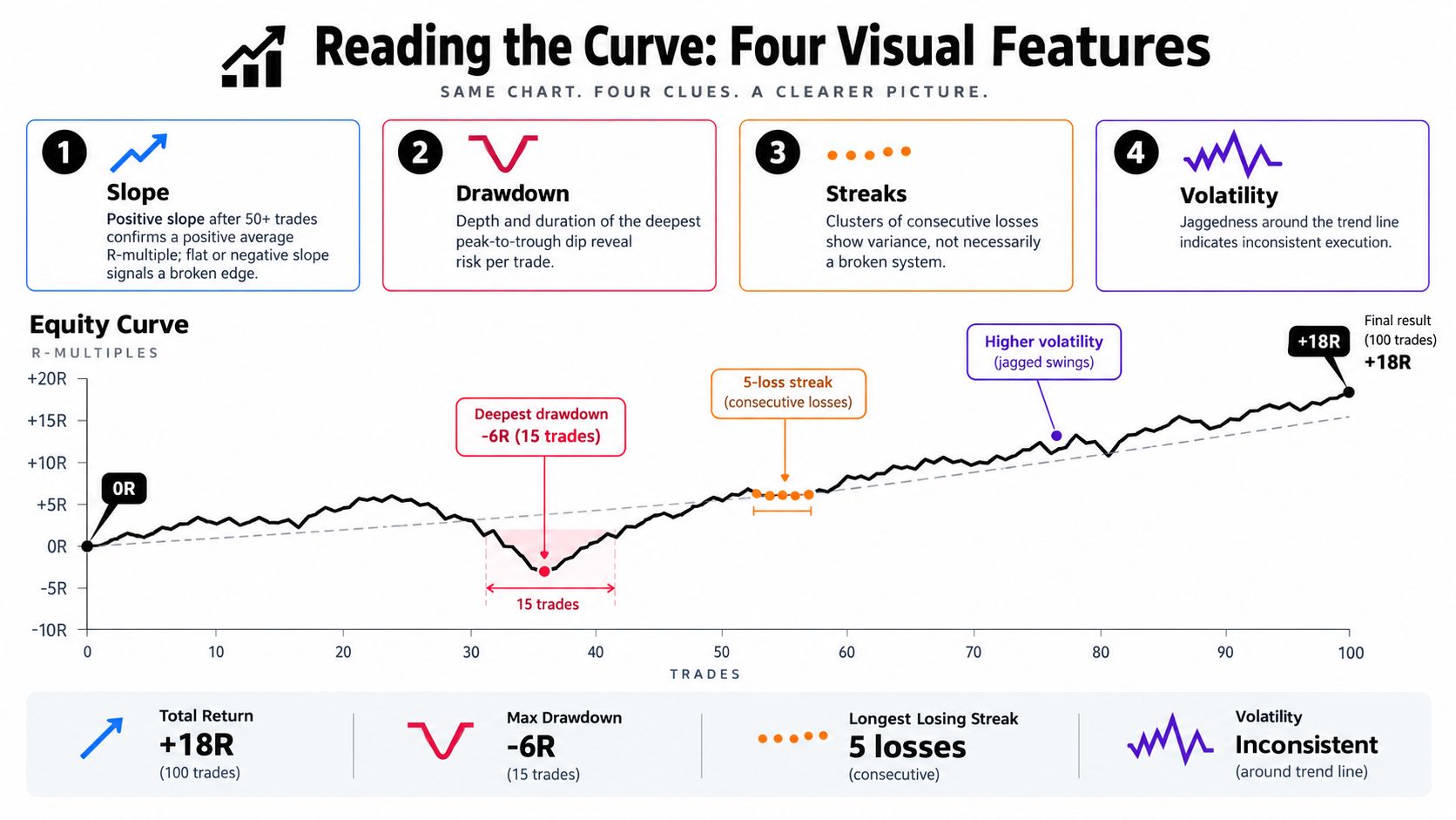
A stable curve usually looks like a rising path with ordinary pullbacks, not a ruler-straight line. You might see a climb, a retreat from a peak, a period of hesitation, and then a recovery to a new high. The drawdown explanation from Colibri Trader is useful when you need to connect that visual valley to the practical risk of continuing to trade.
A positive expectancy is the engine, while sizing and selection determine how violently that engine moves the account. If the curve is positive but the valleys keep getting deeper, inspect risk first. If the curve is flat despite disciplined risk, inspect the quality and frequency of the underlying setups.
Diagnostic Tools That Test the Strength of Your Curve
A single historical sequence can flatter a strategy. The trades may have appeared in a favorable order, or the backtest may have avoided the exact cluster of losses that would test your discipline. Resilience work asks whether the curve still behaves acceptably when the sequence, market window, or execution assumptions change.
Monte Carlo tests the order of pain
Monte Carlo analysis reorders actual trade outcomes across 1,000 to 10,000 simulations, a range described in the FXStreet trade-statistics material. The output is a group of possible equity paths rather than one reassuring line. A 95% confidence interval, often represented by the 5th and 95th percentiles, shows the range in which simulated paths fall.
Look for the difficult paths, not only the median. If the lower paths produce a drawdown you wouldn't continue trading, your position size is too aggressive even if the original backtest looks attractive. If your live curve falls below the 5th percentile, investigate execution and regime changes before changing the strategy.
Walk-forward testing challenges the setup on unseen data
Divide the historical record into an optimization period and a later validation period. Build the supply-and-demand rules using the first segment, then test them on price action the rule set hasn't seen. Repeat the process through the available history.
A useful walk-forward testing guide helps frame the difference between fitting a historical sample and testing whether the behavior persists. A weakening out-of-sample curve doesn't automatically invalidate the idea, but it does tell you to examine zone definitions, timeframes, and execution assumptions.
Stress testing makes the ugly sessions visible
Replay the worst historical weeks, gap events, and periods when related markets move together. Apply your current position sizing to those conditions. The point isn't to predict the next shock. It's to discover whether a cluster of correlated losses would force you to abandon the method.
| Diagnostic | What It Tests | Typical Runs | Warning Signal |
|---|---|---|---|
| Monte Carlo | Sensitivity to trade order and variance | 1,000–10,000 simulations | Lower paths create intolerable drawdown |
| Walk-forward | Performance on unseen market data | Repeated in-sample and out-of-sample windows | The validation curve decays materially |
| Stress test | Behavior during adverse historical conditions | Replay of selected difficult periods | Current size produces unmanageable losses |
Keep a dated log of the assumptions, sample used, sizing rule, and lower-tail result. Traders who want a broader introduction to rule-based systems can also use this Pineflows tutorial for algorithmic traders to organize their thinking before building more formal tests.
How to Improve a Trading Equity Curve with Price Action and Discipline
Improvement starts before the order is placed. A weak demand zone creates a weak trade candidate, and no sizing formula can turn a low-quality entry into a reliable edge. The curve becomes more useful when every result is connected to a specific price-action decision.
Selection removes avoidable losses
A fresh supply or demand zone should have a clear origin, visible displacement, and an understandable invalidation point. If price has already consumed the zone several times, the setup deserves more skepticism. If the stop must sit in an arbitrary location because the structure is unclear, pass.
This filter doesn't eliminate losing trades. It removes trades where the reason for entry is vague, the risk reference is unstable, or the trader is reacting to movement rather than planning around an area. Record the zone's timeframe, freshness, approach, and reaction quality. Over time, the equity curve can then be split into meaningful setup groups.
Sizing keeps a valid edge tradable
Use a fixed fraction of current equity rather than treating every position as a fixed cash commitment. When the account declines, the next position becomes smaller automatically. That doesn't improve expectancy, but it reduces the speed at which a drawdown compounds and makes recovery mathematically less demanding.
The money-management resource from Colibri Trader offers further context for connecting risk per trade with account behavior. Your sizing rule should be small enough that a normal losing cluster doesn't change your decision-making. If you widen stops or add to positions because the curve is red, the rule isn't controlling risk anymore.
Discipline protects the statistics
Execution rules turn the plan into a repeatable sample. Define where an entry is valid, where the stop belongs, when partial management is allowed, and what conditions cancel the trade. Add a journal checkpoint after each position. Ask whether you followed the plan, not whether the market rewarded you.
A daily loss limit can stop frustration from becoming a second problem. A temporary pause after consecutive losses can also be useful, provided it's a prewritten rule rather than an emotional reaction. Review the chart after the pause and decide whether the losses came from normal variance or from chasing, moving stops, and trading poor zones.
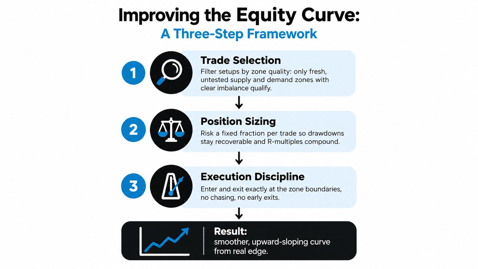
Selection raises the quality of opportunities. Fixed-fractional sizing limits the account's exposure while the edge plays out. Discipline keeps the trader from corrupting both during a difficult session. Those three controls reshape the curve together.
Two Real Equity Curve Case Studies from Price Action Traders
The following examples are composite journal patterns, not claims about named traders or independently verified performance. They represent the kind of behavior that becomes visible when a price-action journal links each result to a setup type and execution choice.
The breakout trader who abandoned the playbook
The first journal showed a productive run from breakouts leaving demand zones. The trader understood the directional context, waited for displacement, and placed the stop beyond a structural invalidation point. The curve rose with ordinary pullbacks because the trades followed one repeatable idea.
Then the market accelerated. The trader began taking counter-trend shorts into strong demand because the move looked extended. Those trades had different context, different timing, and weaker confirmation. The curve turned sharply lower, not because the original breakout idea had disappeared, but because the journal now contained a second strategy that had never been properly tested.
The repair was behavioral. The trader returned to the higher-timeframe directional setup, reduced position size while the account recovered, and added a no-trade condition after consecutive losses. The key change wasn't a clever entry. It was separating the original edge from the improvisation that had damaged it.
Review question: Did the losing trade belong to the strategy you tested, or to a new strategy you invented during the session?
The smooth curve hiding a fragile payoff
The second journal looked better at first. The trader took frequent small profits and avoided many obvious losing trades. The line climbed gently, which created confidence. Yet the journal showed that the trader was ignoring valid supply above resistance and holding some positions without a clear response plan.
Eventually, one adverse gap produced a loss large enough to erase a long sequence of small gains. The curve had looked smooth because the trader had postponed risk. Low visible volatility had concealed a poor payoff structure.
The correction required more than reducing the size of the occasional large loss. The trader had to define the zone boundary, accept smaller planned losses, and stop taking profits just to preserve a comfortable-looking line. A choppier curve built on transparent risk can be healthier than a gentle curve that depends on one position never suffering an abnormal move.
The lesson from both journals is simple. Shape must be interpreted alongside the trade logic. A steep decline after rule changes points to execution drift. A smooth rise followed by a disproportionate loss points to hidden risk. Neither curve should be judged by appearance alone.
The Smoothing Trap and Other Equity Curve Misconceptions
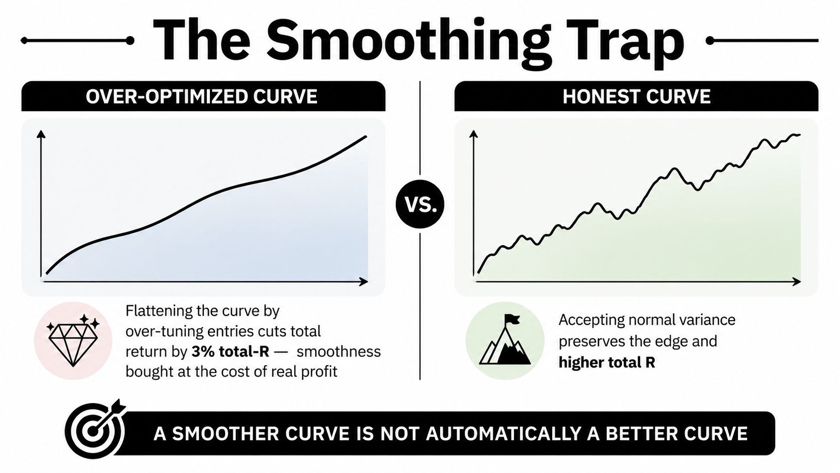
A smoother equity curve isn't automatically a better curve. Traders often remove trades that make the chart look uncomfortable, tighten filters until only ideal historical entries remain, or throttle re-entry after a loss. That can reduce visible volatility while also removing the trades that produce recovery when market conditions turn favorable.
A 2024 meta-strategy study reported about a 3% reduction in total R while maximum drawdown fell only slightly when equity-curve throttling was applied, as discussed in this analysis of equity-curve-based throttling. The practical point is not that throttling never works. It's that a smoother line has a cost, and the cost must be measured rather than assumed away.
Low drawdown doesn't prove a strong edge
A low drawdown may come from good risk control, but it may also come from taking tiny profits while leaving rare losses unmanaged. Check the distribution of winners and losers, the largest loss, and the rules used when price moves quickly. A curve that avoids every uncomfortable trade may be avoiding the market behavior that supplies its expectancy.
More size doesn't create more skill
Increasing size steepens both favorable and unfavorable movement. It doesn't repair weak zone selection, late entries, or poor exits. If you can't follow the plan at a smaller size, larger exposure usually makes the execution problem louder.
Curve fitting creates historical theatre
An over-tuned rule set can look precise on the data used to create it and fail when price changes. Walk-forward decay, unstable setup classifications, and a large difference between backtest and live execution deserve more attention than a visually perfect historical line.
Some recent discussions also describe using a moving-average benchmark to reduce exposure when the equity curve falls below it, while warning that excessive smoothness may conceal curve fitting or other risks. Treat filtering and throttling as risk-control overlays, not as proof that the underlying price-action method has improved.
A curve should breathe with the market. The goal is not to remove every pullback. The goal is to keep losses explainable, risk recoverable, and the underlying edge intact.
A Weekly Equity Curve Review Routine You Can Start Monday
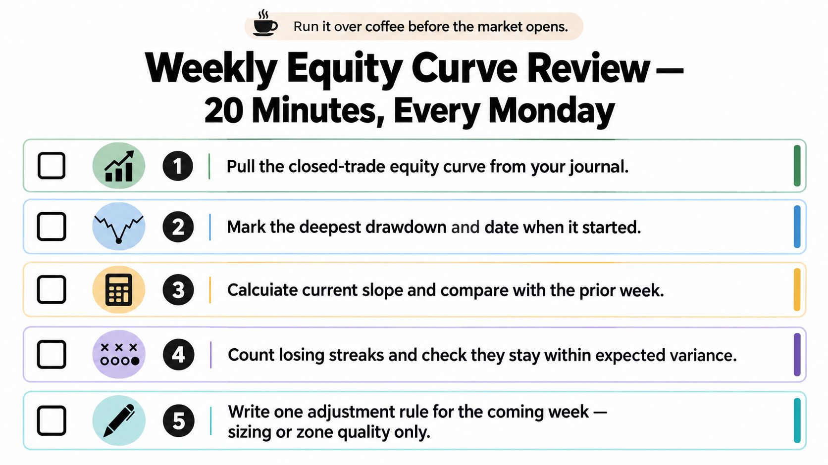
Before opening new charts on Monday, review the curve from the previous week. A trader may remember the last stop-out, but the equity chart shows whether that trade belongs to a wider pattern. Keep the routine short enough to repeat and focused enough to identify one behavior that needs correction. Do not rebuild the strategy after one losing result.
Pull the same view every week
Export closed-trade results from your journal and plot the cumulative equity line. Keep deposits, withdrawals, and open-position fluctuations separate. Use the same chart definition each week, or ordinary variation can look like a new problem.
Mark the deepest drawdown and the date it began. Then classify the trades inside that valley. Did they come from fresh supply or demand zones, late retests, counter-trend entries, or execution mistakes? Compare those decisions with the market context at the time. A drawdown caused by valid setups has a different remedy from one caused by chasing price in the middle of a range.
Calculate the slope from the previous review point to the current one. One flat week is a small observation inside a larger sample, not a verdict on the method. As noted earlier, broader market history shows that extended periods below a prior peak are normal. A trading curve is not a stock-market index, but the lesson still applies: staying below a high can be part of the process; changing risk impulsively is a control problem.
Finish with one rule, not five
Review the streak log and check whether losses formed a recognizable cluster. Overlay the supply-and-demand map from the worst losing day. Did price reach a valid zone with a clear reaction, or did you take a trade only because you wanted activity?
Write one adjustment for the coming week. Reduce size after a defined drawdown, require fresher zones, or remove counter-trend trades against a strong higher-timeframe move. Change one variable at a time. Altering entries, stops, targets, and timeframes together prevents you from knowing which decision improved or damaged the curve.
Judge progress over a meaningful sample rather than demanding a new high every week. A flat period inside a sustained upward curve can reflect consolidation. Repeated lower highs, weak zone selection, and slow recovery call for action. Decide whether to keep trading, reduce exposure, or investigate the rules before committing more capital.
If your journal shows inconsistent entries, unclear supply-and-demand zones, or drawdowns that change your behavior, Colibri Trader offers price-action education covering trade selection, discipline, and money management. Use that material to convert review findings into specific rules, then check each Monday whether execution is becoming more consistent.