


Supply and Demand Levels and Price Action Trading
Supply and Demand Levels and Price Action Trading
Supply and demand levels are commonly associated with support and resistance levels.
I must say that they share a lot of common characteristics, but are still slightly different structurally.
In this article I will explore some of the characteristics that supply and demand levels exhibit and how they relate to price action trading.
If you are new to that area in trading, you can start with this article first: Supply and Demand zones and how to trade with them
As you a lot of you might be familiar, I recently launched a Supply and Demand trading course that shows how I trade with supply and demand zones.
In this article, I will share why supply and demand and price action are intertwined.
Let me first start with the definition of supply and demand levels.
5 SWING TRADING STRATEGIES PDF
DOWNLOAD PDF NOW
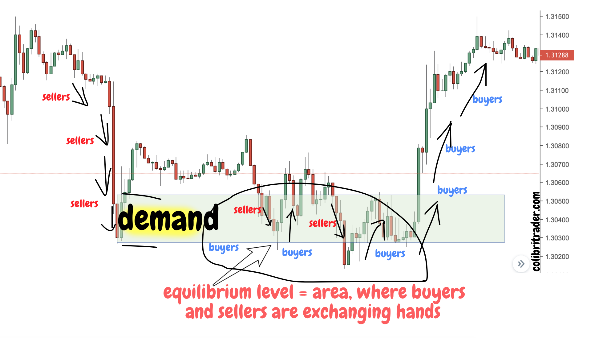
Supply and Demand Levels
Supply and demand levels are very close to support and resistance levels.
The majority of you are possibly familiar with support and resistance and this means that you are ready to take your trading to the next level.
Supply level
What is a supply level?
It is a place on the chart that is marked by either:
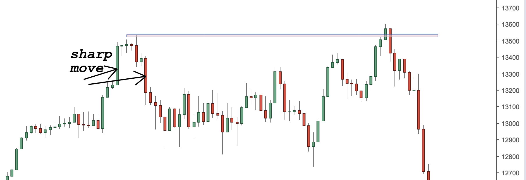
- Strong bullish candle that precedes it or strong bearish candle follows this level
- Cluster of a few small-bodied candles
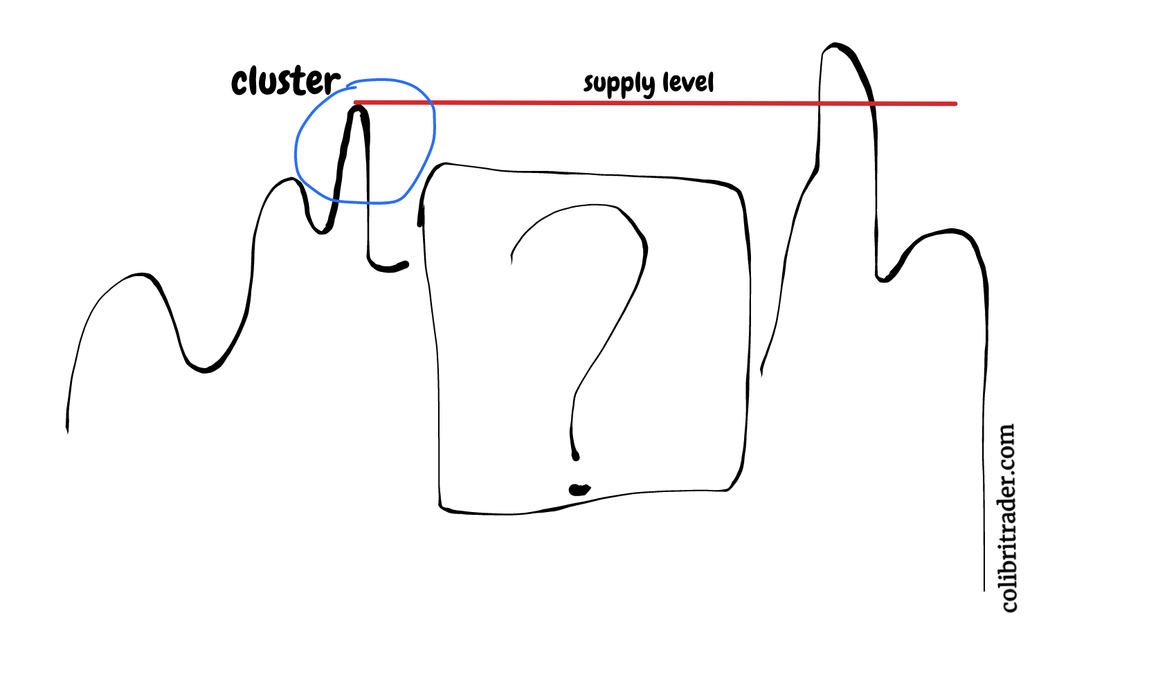
Here is a chart that illustrates that principle in real-time:
I usually take the highest point in the region as shown above. Supply levels are nothing else, but a very powerful resistance level for which supply and demand traders are aiming to short.
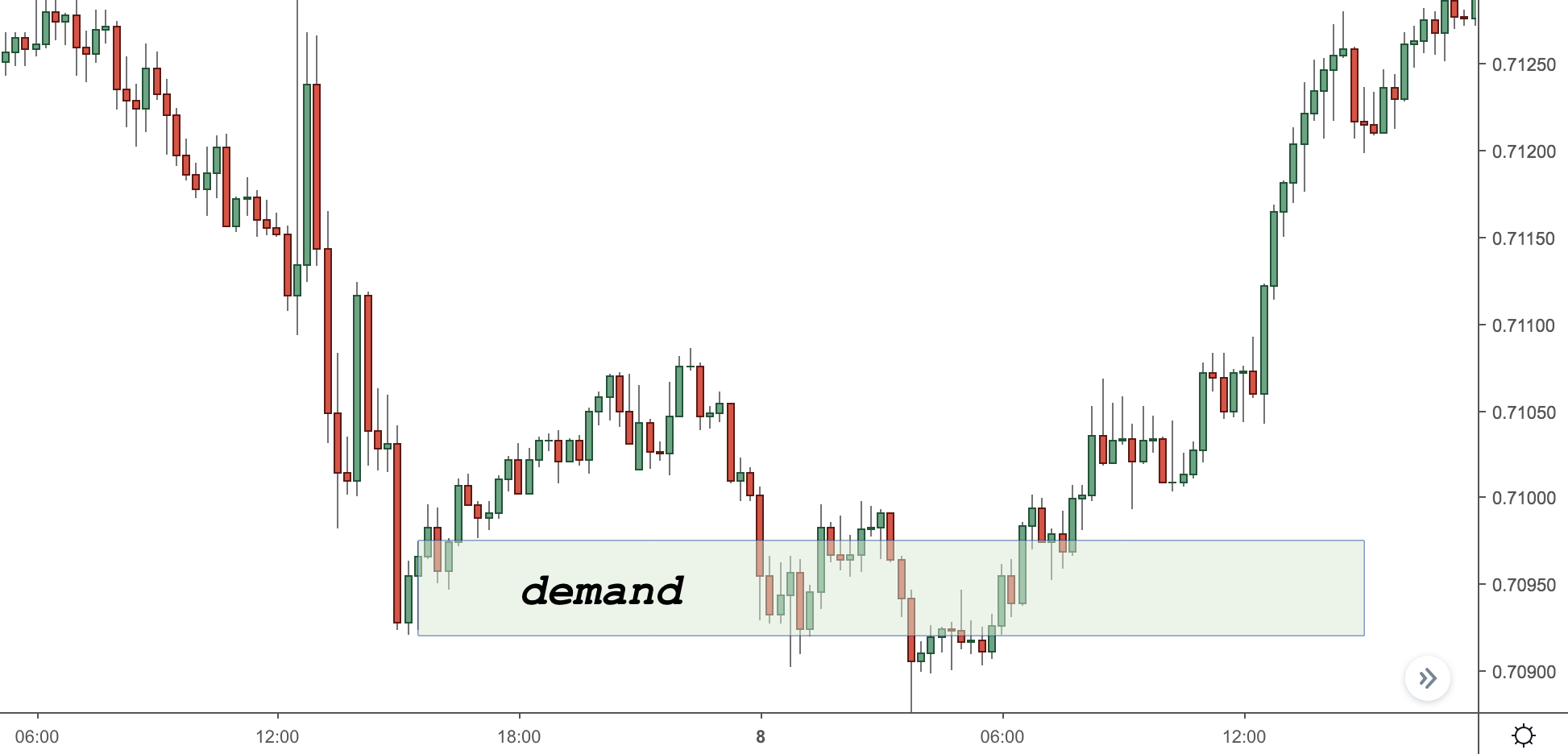
Demand Level
Demand levels are just the opposite of what a supply level is.
In order to qualify for a demand level, you will need to tick either one of those two boxes:
- Sharp bearish candle that precedes that level or a strong bullish candle that follows it
- A cluster of small-bodied candles that forms around it
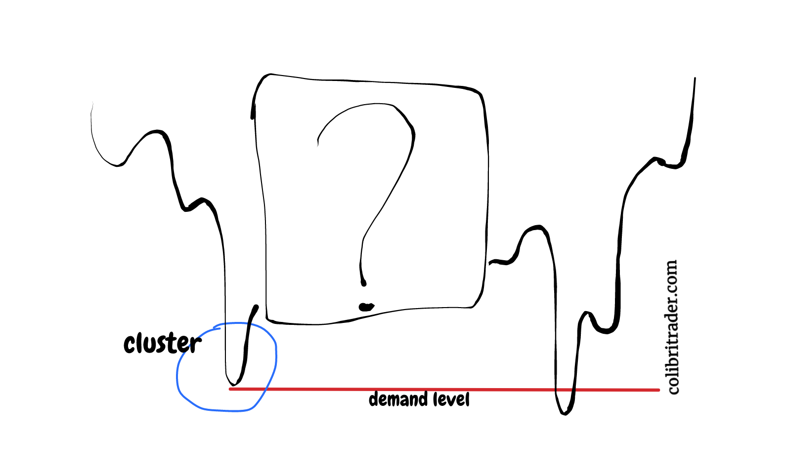
Here is a real-life example of a demand level:
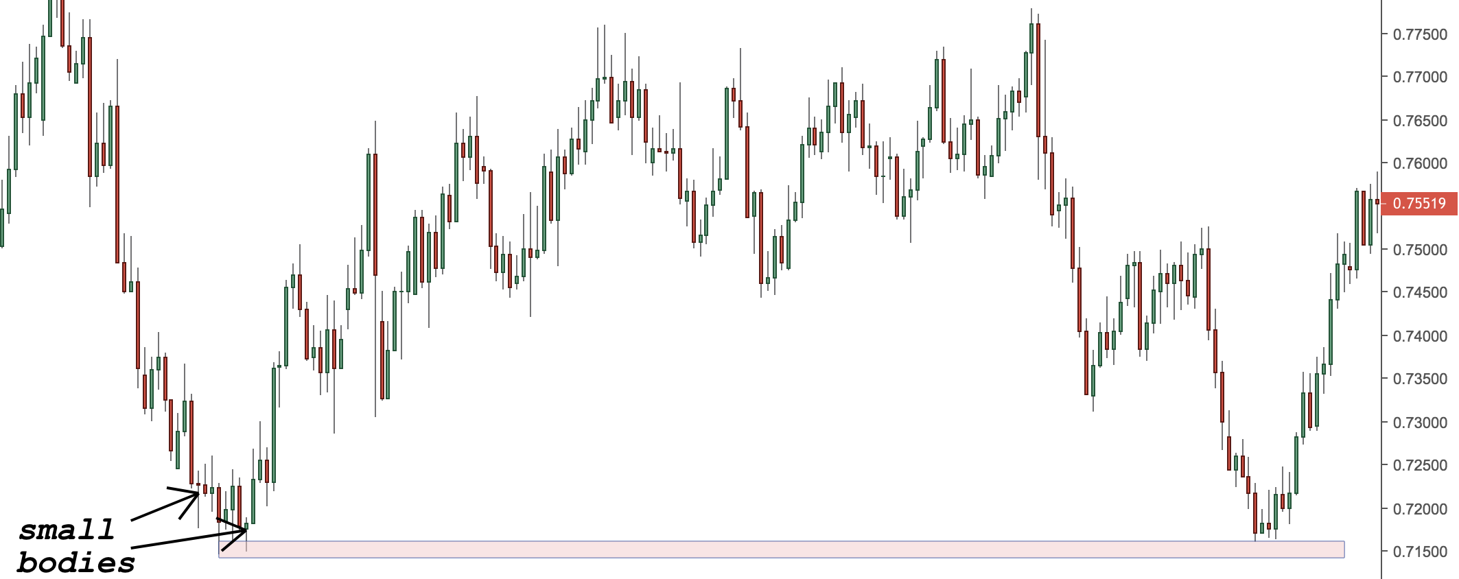
I am normally taking the lowest point in the area as shown above in order to mark the area.
Those levels are quite rare and when they occur, they are really powerful sign for supply and demand traders.
Support and Resistance Levels
What are support and resistance levels and are they much different than supply and demand levels?
Not really!
To be honest, they are pretty much the same level. The only difference between resistance and supply and demand and support is the price action around those levels as explained above.
Other than that they have the exact same characteristics and are indeed both quite powerful tools for the price action trader.
Support
Just to reiterate, a support level is the level at which demand is strong enough so that price does not go lower.
The logic behind that is that as the price goes lower, it becomes cheaper and more alluring for market participants to buy.
By the time that price is at the support, supply will overcome demand and the price will bounce up and go higher.
Resistance
Resistance is the opposite of support. It is the level at which sellers are hesitant to continue buying, because it is too expensive already.
The logic behind says that as buyers become more hesitant to buy, sellers come into play and push the price lower.
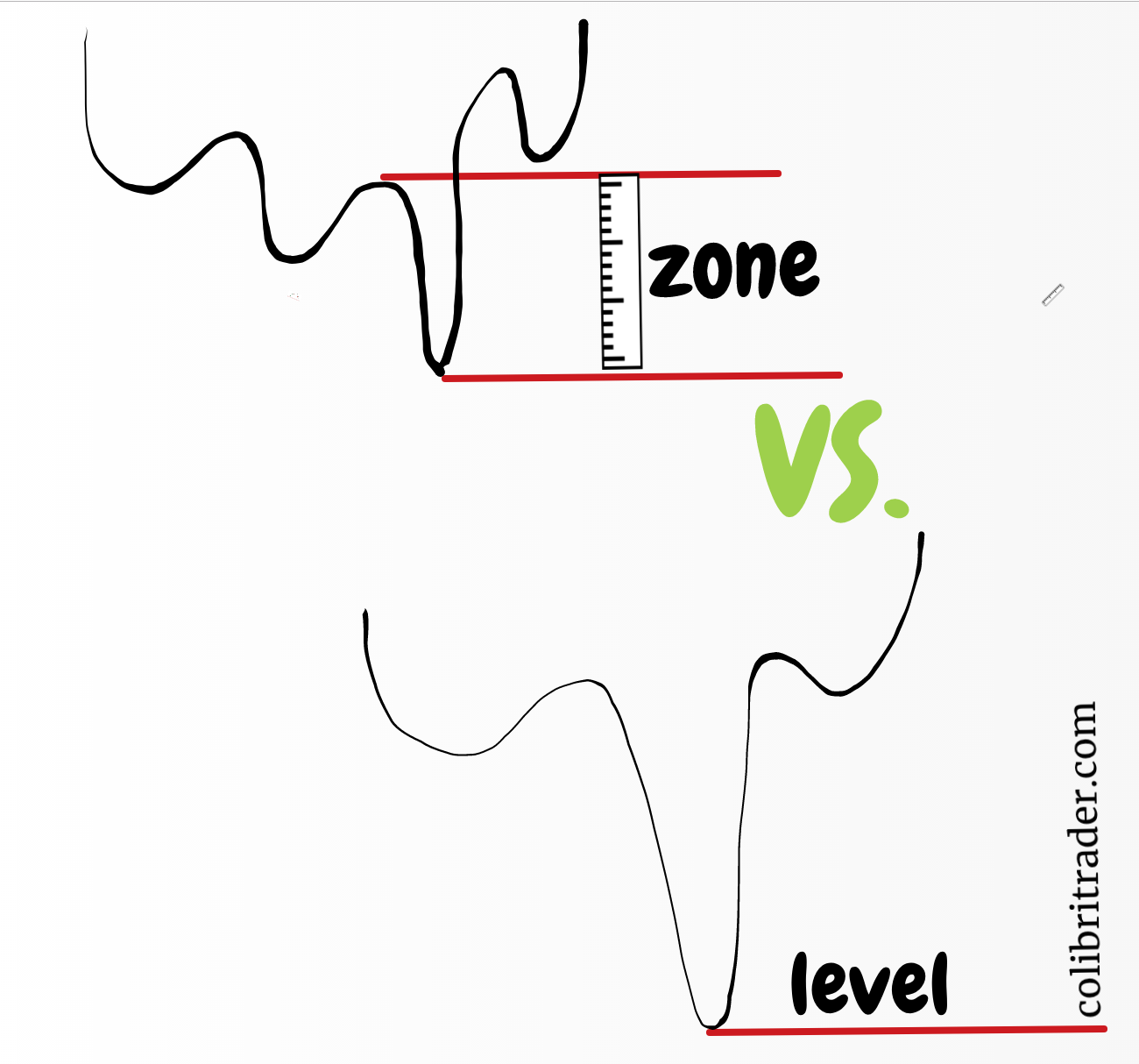
Zones vs. Levels
So how much difference are supply and demand zones from supply and demand levels.
They are quite different.
The major difference is in the area they encompass. The way traders use them is similar.
Supply and demand levels require smaller amount to be risked, since a supply or demand level takes less space.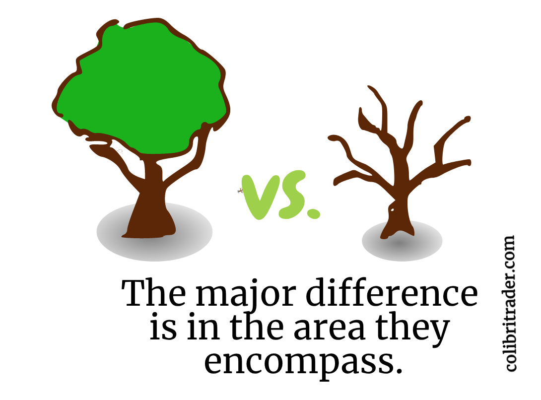
On the other side a supply or demand zone takes more space and therefore requires slightly different money management practices.
I have explained thoroughly in my trading course about supply and demand trading how to minimise the risk when trading with supply and demand zones.
Let’s have a look at a couple of examples of zones vs. levels.
Supply Zone vs. Supply Level
Before I proceed, please have a look at the image below:
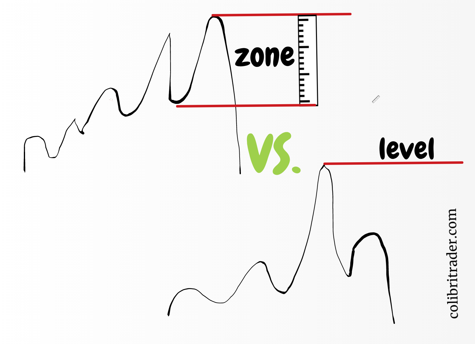
Supply zone is by definition an area of strong resistance. It encompasses a larger area than a supply level.
Supply level on the other side is a thin line that marks the highest point in a region. It shares almost the same characteristics with resistance.
For supply and demand traders it is harder to place a trade in a supply zone. Psychologically they find it difficult to find a good place to place their stop loss.
Whereas, for a supply level, it is usually easier to find a place where to place a stop loss order.
From my perspective, a supply zone is more effective than a supply level. Since trading is not precise science, I have found supply zones to show traders better where the majority of the big market participants are located.
A supply level could be a very strong level of resistance, especially on weekly or monthly charts.
On anything below a daily chart, usually supply zones can help traders better if used correctly.
Demand Zone vs. Demand Level
Let’s repeat the exercise from above and look at the image below:
Same as levels/zones of supply, a demand zone encompasses a larger area than a demand level.
Very similar to supply zones, demand zones are better used on timeframes below daily. Demand levels are most easily discernible on weekly and monthly charts.
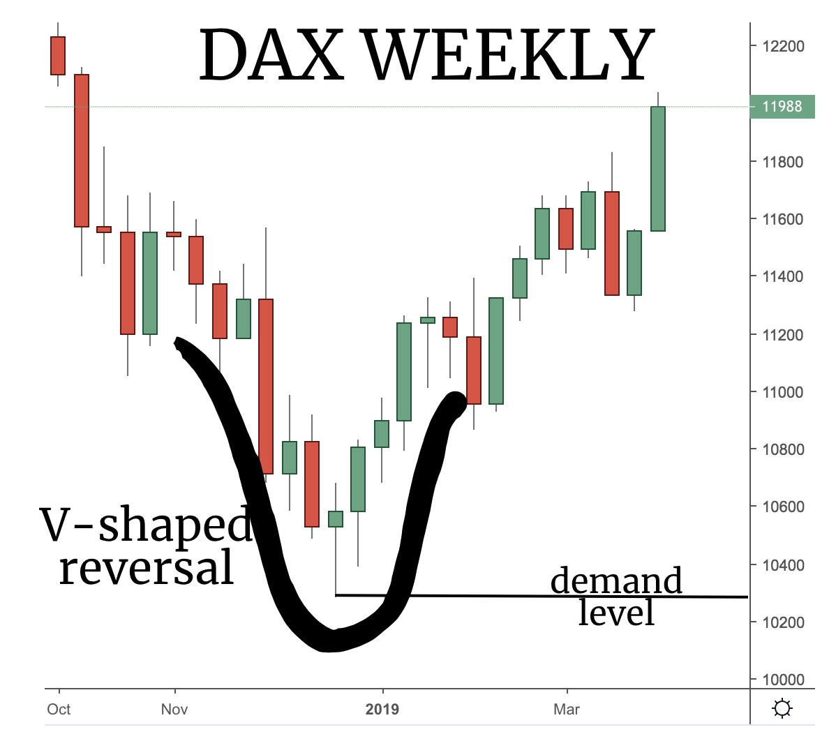
A demand level is a thin line that extends from the highest point in a certain region. As it was shown in the image above, usually a demand level stands on the bottom of a sharp V-shaped reversal pattern.
A real life scenario from the weekly chart of DAX is shown below:
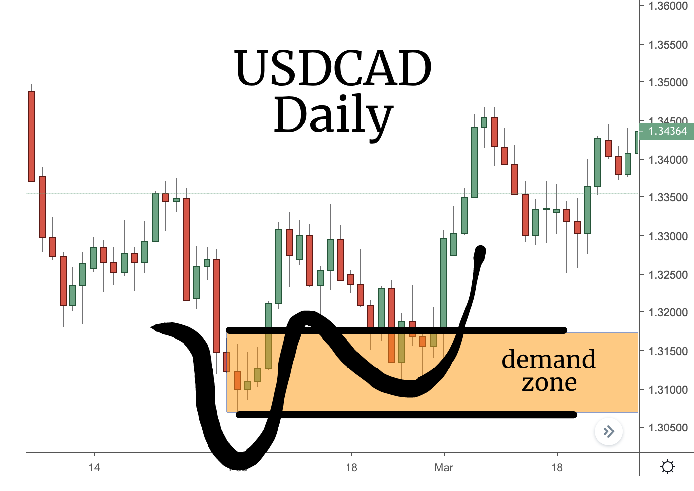
On the other side, here is a real-life demand zone example from the daily chart of USDCAD:
Zones or Levels??
As you can see from both images above, both demand levels and zones share the same meaning- they are both used as a place of powerful support.
The only difference is that one (zone) takes much larger space on the chart than the other (line).
Supply and demand traders use different approaches to this trading model, but in the end they share the same market structure.
With practice you will come to realise that finding them on the chart is easier than it initially looks. With the right trading strategy and methodology you will be half-way there.
Round Levels and Supply and Demand
As with any other indicator or trading tool, supply and demand levels work great around round numbers.
This is mostly due to the mass psychology of market participants.
People simply think in round numbers.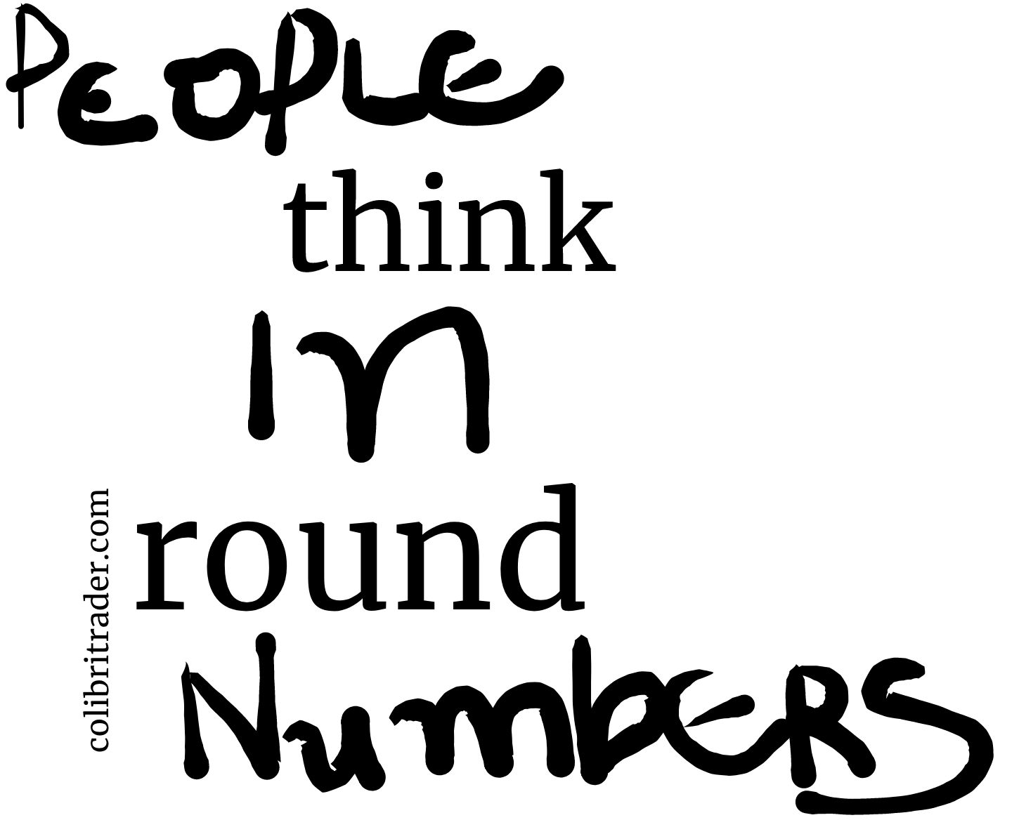
Just think about it for a moment. When you go to the store to buy something that costs you 24.95 USD, you are thinking subconsciously thinking about 25 USD (although marketers will try to convince me otherwise).
Our brains tend to simplify long numbers and shorten them to an easier chunk of information.
Same with market prices.
We don’t naturally think in decimals. Therefore, when you are buying or selling you are more prone to think of a round number (all other things being equal).
That is also the major reason why supply and demand lines work better around round numbers. They are not some sort of magical numbers, but just levels at which more people are willing to place a buy/sell order.
Price Action and Supply Levels
Price action takes central role when trading with supply and demand levels.
In fact, price action complements supply and demand levels/zones and vice versa. The best way to confirm a supply or demand level is by double-checking with price action.
Let’s take an example with a well-established supply level where you are looking to enter into a short trade.
What will be the first thing that comes to mind?
Indicator?
Trendline?
Moving average?
I would actually go with price action. Candlesticks are invaluable tools for confirming important supply and demand levels.
Let’s take another example.
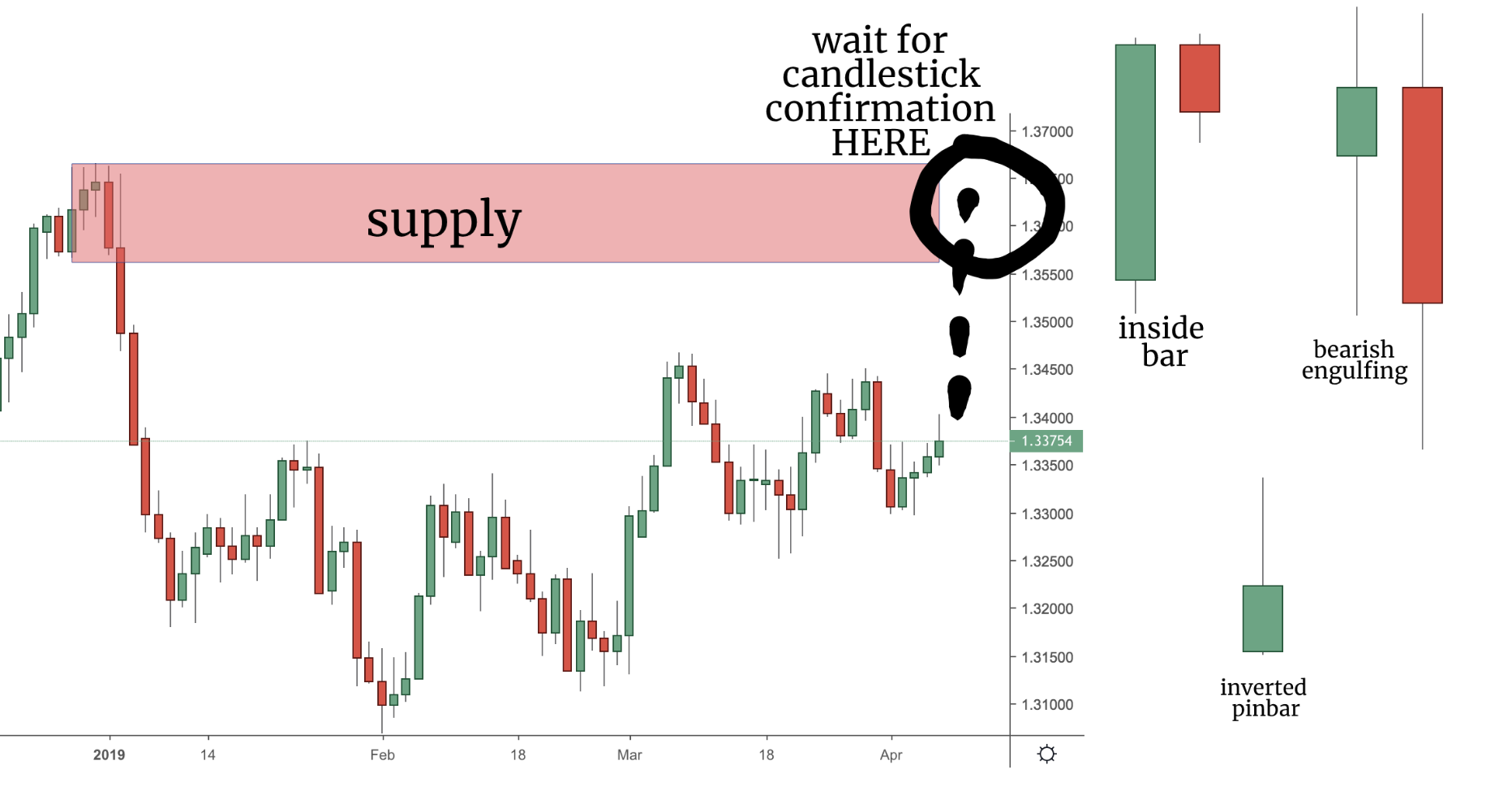
That’s the daily chart of the USDCAD. What supply and demand traders will be looking for is how price reacts to these levels.
Also, traders will be looking for a price action confirmation. The three candlesticks given above are some of the most popular candlesticks that traders would like to see forming around a supply zone.
It will be interesting to see how price will react to these levels when it reaches that zone. Currently (as I am writing this article is 05 April, 2019) price is around 300 pips below this zone.
Price Action and Demand Levels
Very similar to supply levels, demand levels are levels at which supply and demand traders are looking for a price action confirmation.
In order to get to the price action, you will need to have an established level first.
Let’s have a look at another example. 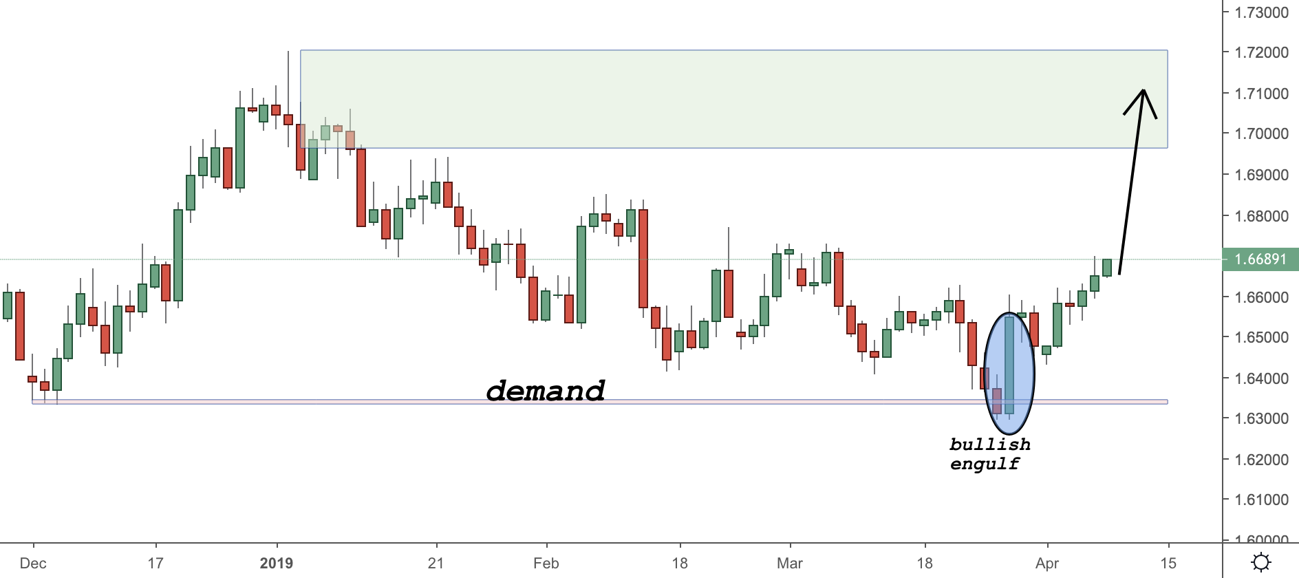
In this screenshot above you can see the daily chart of EURNZD. Indeed, I wrote about it HERE.
There was a demand level and a few months later when price reached this level it formed a bullish engulfing pattern.
This is a very powerful demand level. Price did literally jump up from this level.
As you can see if you did take a trade before the price action confirmation, you could have been stopped.
That is why it is always a great idea to get a confirmation from price action (as the screenshot above shows) before jumping into a trade.
Indicators with Supply and Demand Levels
A lot of traders are asking me on a daily basis if I am using any indicators with supply and demand levels and zones.
The short answer is:
NO.
I know traders who combine indicators with supply and demand levels but that is not me.
I find more value of combining price action and supply and demand levels than anything else.
I am not saying it won’t work, but I personally have tried it and failed.
What on the other side works for me is a combination of price action and supply and demand levels.
Timeframes and Supply and Demand Levels
Another very important concept when using supply and demand levels are timeframes.
Supply and demand traders are using different timeframes.
In fact, I have met traders using anything from 5 minutes to monthly charts.
Although it depends on the approach, I would say that the best timeframes that fit my trading style are 4H, Daily, Weekly and Monthly.
Attention: I do favour Daily and 4H charts in particular. I am using daily for the initial trigger and then 4H for fine-tuning.
Different traders might use different timeframes. Some traders might prefer using just one timeframe.
It is totally up to your personal preferences, but my experience has taught me that the Daily and 4H charts are the best combination of charts when trading with supply and demand levels. 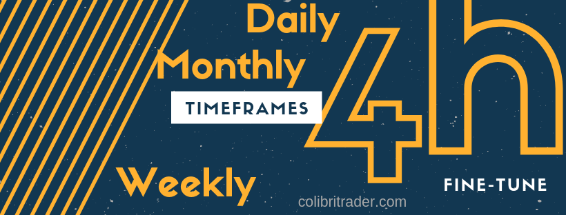
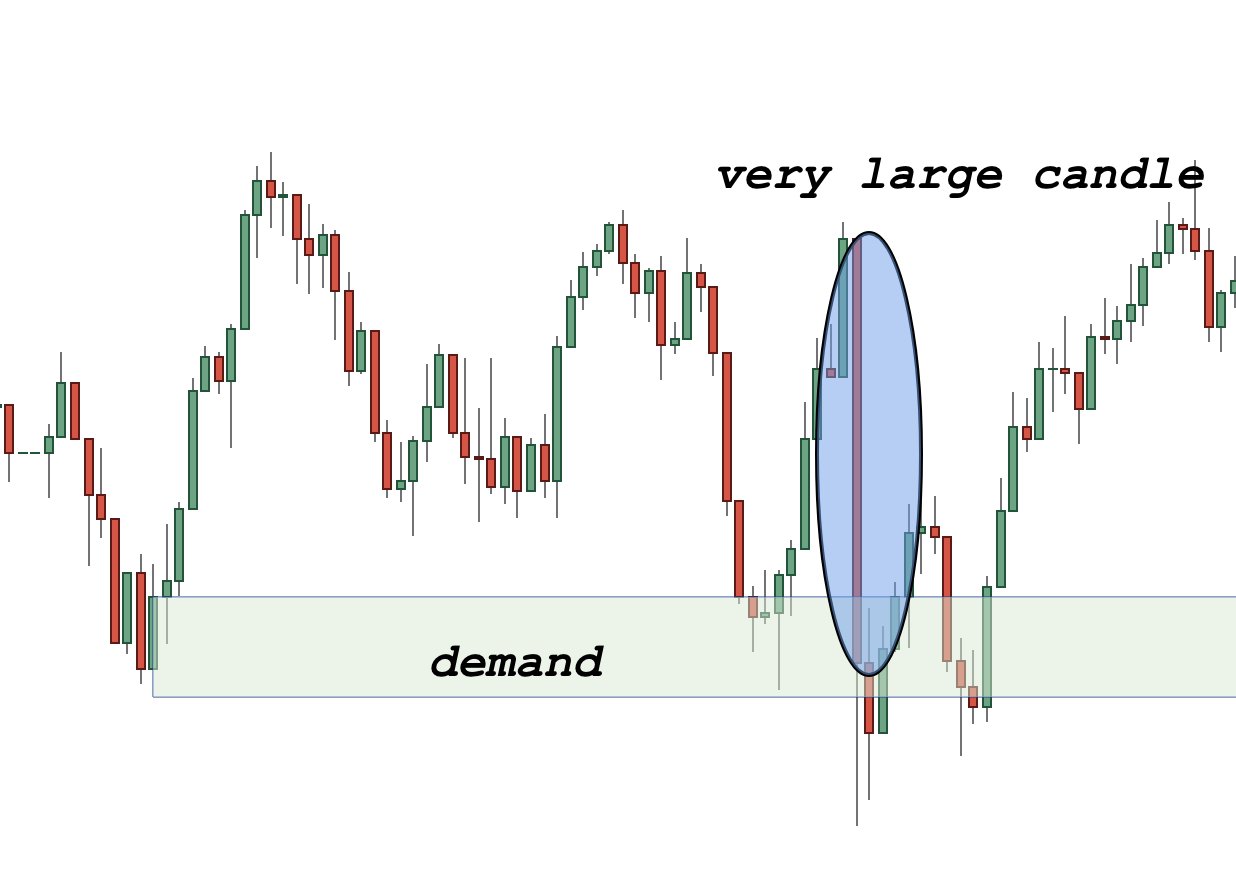
Size of Candles Around Supply and Demand Levels
Another important element in trading with supply and demand is the size of the candles around the supply or demand level.
If the level is very strong, you will see a large-bodied candle. That is a good indication that a lot of market participants are interested in this level and is a good confirmation by itself.
Here is one example of a very large red candle in close proximity to a supply zone:
In the image above you can see how quickly price went down and then formed an inside bar. After which price hesitated a bit above the demand zone and went back up.
That is a very good example of a demand zone in combination with a price action signal.
In the example below, there is a strong supply level, which is shows larger than usual candles before and after the level was re-tested. 
The candles are not as big as the first image, but that shows you once again that trading around supply or demand levels is usually surrounded by bigger candles.
Recent Examples of Supply and Demand Levels
I will use this paragraph to share with you some of my recent trading ideas and trades, so you can get the full picture. I won’t be able to reveal my whole trading strategy, since it will take me forever, but will share with you a few screenshots.
The traders who took my supply and demand trading course will certainly know what I am talking about.
I will give a few different examples from different timeframes.
Examples from the daily timeframe
Here is the first example:

Above is the daily chart of the EURNZD pair. As you can see, there is a demand zone that acts as a magnet pushing the price higher. I shared my thoughts on this pair with my followers here.
That was a great setup because it not only showed a demand zone, but also confirmed it with price action setup.
Let’s have a look at another example:
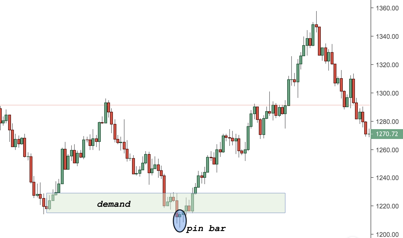
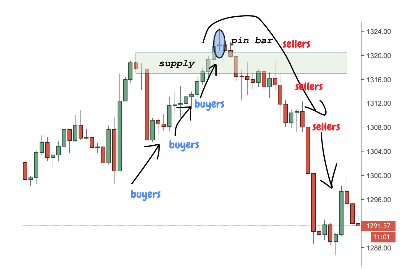
The example above is given from the daily chart of XAUUSD.
As you can see, there was a strong demand area that was later confirmed with a pin bar.
Once again, trading with supply and demand levels and zones and using price action to execute your trades can be very profitable.
There will be some fake setups as you can expect, but overall a correctly constructed supply and demand trading system should be beneficial to the trader using it.
Here is another example:
This is the daily chart of gold again, but this time is showing a supply level/ zone.
You can see how strong the price is pushed to the downside once the supply area has been re-tested.
Let’s change the timeframe and look into a couple of 4H examples:
Examples from the 4-hour timeframe
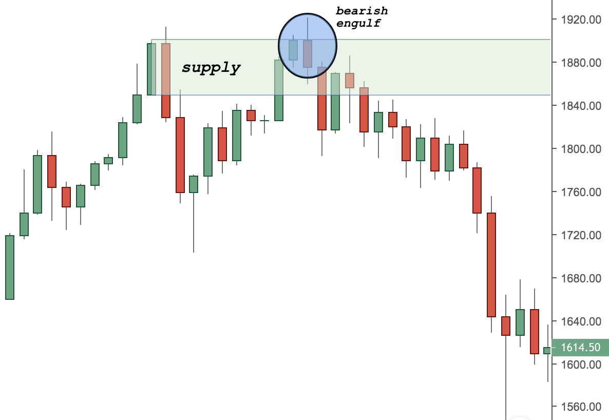
The first example that is given is taken from the 4H of gold:
On the way up, there are plenty of buyers who are pushing the price higher until they reach the peak.
A supply level is formed there and the next time price reaches this level, it quickly reverses back.
There is a pin bar at the top, which confirms the supply zone.
Let’s have a look at another example now:
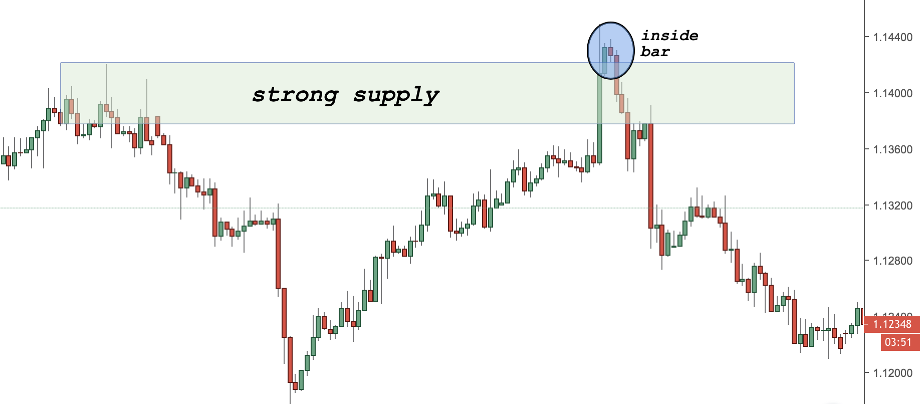
This is the 4H EURUSD chart. Once the supply zone is formed and price reaches back to it, an inside bar is formed as shown on the screenshot above.
This is a great indication for a continuation of the previously formed downtrend. This was a fantastic example indeed!
Lower timeframes
Although I am not really using the lower timeframes, I know supply and demand traders who are using them successfully.
For the sake of this article, I will give a couple of examples. It is always better if a supply and demand level from the lower timeframes coincides with a supply and demand level or zone from a higher timeframe.
Let’s have a look into an example from the 1H chart.
Examples from 1 hour timeframe
Here is one:
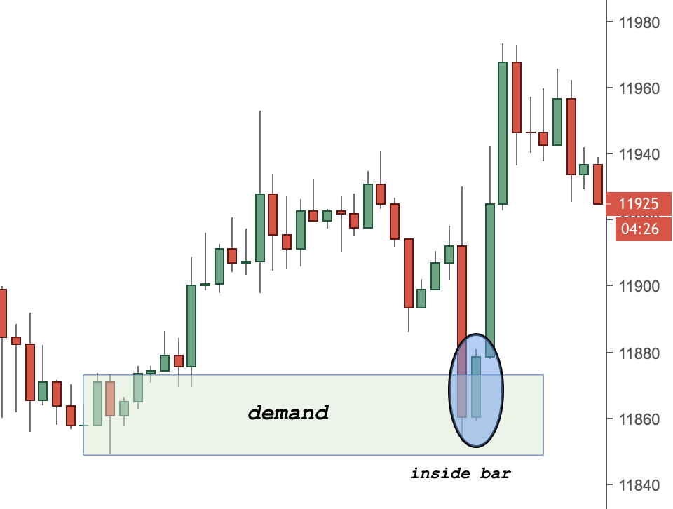
That is the 1-hour chart of the German stock index DAX. As you can see, the demand zone acted again as a strong repellant for the sellers and pushed the price higher after forming an inside bar.
This chart is just one place where demand acted as a support level on a lower timeframe.
Let’s have a look at another example:
Above is the 1-hour chart of crude oil.
As you can see there is a supply level/zone, which again acts as a:
- strong magnet for buyers
- nest for short-sellers
Price went down very sharply after it touched the supply level.
Let’s have a look at another example:
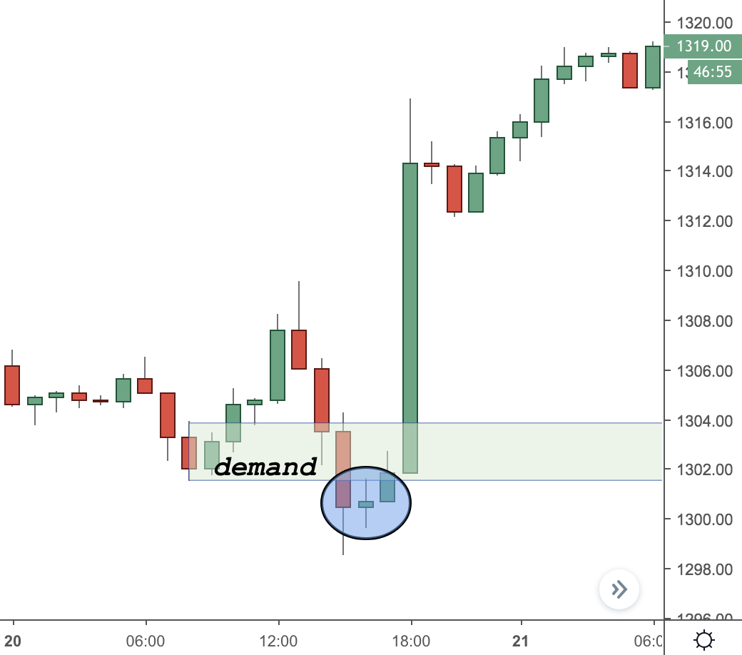
This is the 1-hour chart of gold. You can see a strong demand level or more like a small demand zone that has formed between 1302 and 1304.
Once price touched this area of demand, there was an inside bar that formed and shortly after the price just rocketed to the upside.
Again, supply and demand levels and zones can be used profitably on the lower timeframes, but in my opinion they are harder to pinpoint.
In other words, you might have more false signals, since the majority of big players will be watching the higher timeframes.
So I would only consider as a valid trading signal if a smaller-scale’s supply or demand level coincides with a higher timeframe’s supply or demand level or a zone.
If you are just looking for a smaller timeframe’s supply and demand levels, they might or might not work. In other words, you might get more false trading signals.
Let’s now look at another even smaller timeframe just for reference.
Examples from the 15 minute chart
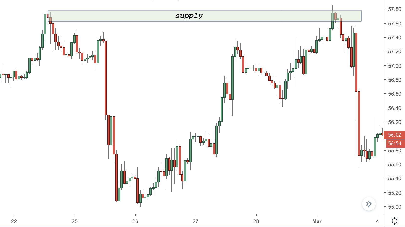
The example above is given from the 15 minute GBPUSD chart.
As you can see, there is a supply level (or more likely a zone) in which sellers and buyers are exchanging hands and are turning the direction of the price.
Supply and demand trading is a very powerful technique that if used correctly can lead to very profitable results in the long-term.
Let’s have a look at another example.
Below is given the 15-minute chart of the AUDUSD. Look how precisely price bounces back from the demand level, which it has previously established:
You can see the price quickly pierces through the demand level, forms an inside bar and then reverses back to the upside.
Although this is a lower timeframe demand level, it coincides with a higher timeframe’s demand zone.
That is another reason why it is harder to trade with demand and supply levels on the lower timeframes- you should still start by exploring a higher timeframe.
In order to visualise this concept better, imagine a giant seashell, where each lower timeframe goes around a larger timeframe and so on ad infinitum… 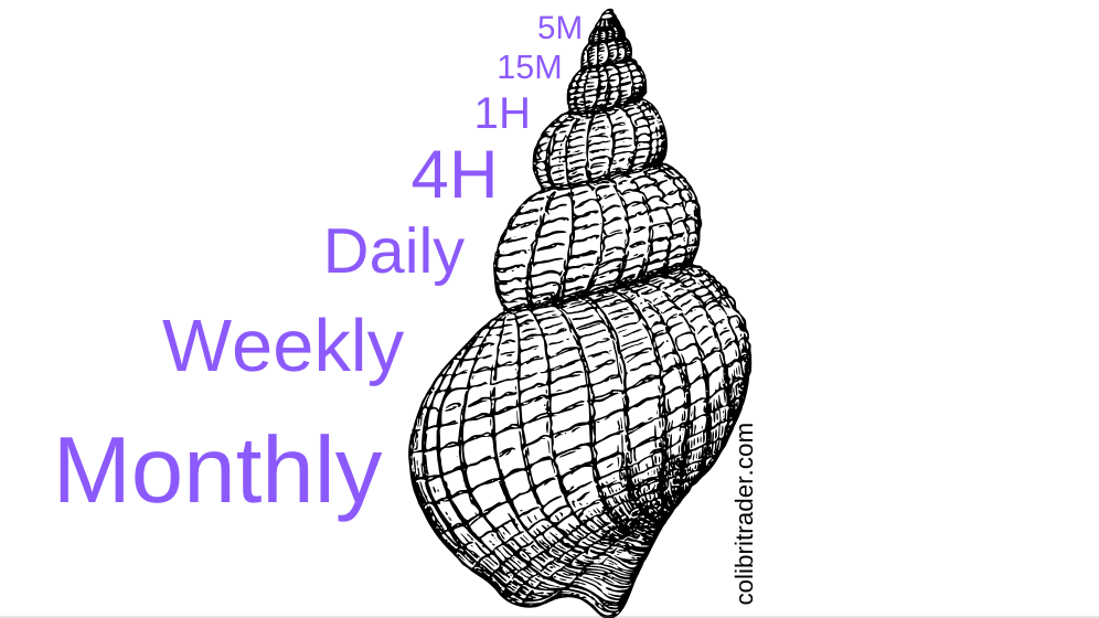
Conclusion- Supply and Demand Levels and Zones
Instead of a conclusion, I would like to recap the article in a video format.
It might be hard to pinpoint a supply or demand level or zone and it certainly takes time and experience to master this trading method.
But as everything else in life, the more time you spend on mastering a subject, the better you become and the more you see how many are quitting quickly.
This gives you better chances at succeeding- the more you stick to what works for you, the better your results will be in the future.
Happy Trading,
Colibri Trader
P.S.
Have you checked my other articles on Supply and Demand Trading or Advanced Supply and Demand Zones
hey Colibri i have question S and D level or zone
Big player are wait for confirmation like candelstick
Hi Sadan, it is not that straightforward to explain. I do walk traders through all the steps I am looking for before entering into a trade in my Supply and Demand Trading course. Candlesticks do definitely play a role but not only