


Top Down Analysis in Trading: A Practical Guide
You open a 5-minute chart, see a clean-looking breakout, take the trade, and then watch price reverse hard. A few minutes later you zoom out and realize the daily chart was pressing straight into resistance the whole time. That's not bad luck. That's missing context.
Most struggling traders don't have an entry problem first. They have a framing problem. They're trying to make execution decisions from the noisiest chart on the screen.
Top down analysis fixes that. It gives you a way to read price in the right order, from broad structure to specific trigger. If you trade price action, that matters even more. Price action is powerful, but only when you understand where the market is, what it's doing, and which side has the advantage.
What Is Top Down Analysis and Why It Matters
Top down analysis is a decision process that starts with the bigger picture and narrows down to the trade. In investing, it became a formalized framework in modern finance by the late 20th century and is widely taught as an economy → sector → stock funnel, beginning with macro variables such as GDP growth, inflation, and interest rates before moving into sectors and individual securities, as explained in CFI's overview of top-down analysis in finance.
In trading, the same logic applies to charts. You don't begin with the entry. You begin with context.
If you're a price action trader, top down analysis means one simple thing. Read the market from the highest relevant timeframe down to the one you use to execute. The higher chart tells you the environment. The middle chart tells you where business might get done. The lower chart tells you whether price is confirming your idea.
That order matters because lower timeframes lie all the time. They print reversals that aren't reversals, breakouts that go nowhere, and momentum bursts that die into higher-timeframe levels. If you've ever taken a trade that looked perfect on a fast chart and failed immediately, you've already seen this problem.
Why context changes the quality of your trades
A trader who starts low usually reacts. A trader who starts high usually filters.
Here's what top down analysis helps you do:
- Cut noise early: You stop treating every candle pattern as tradable.
- Trade with bias: You know whether you're looking for longs, shorts, or no trade at all.
- Choose better locations: You focus on areas that matter on more than one chart.
- Stay consistent: Your process becomes repeatable instead of emotional.
Practical rule: If the higher timeframe doesn't support the trade idea, the lower timeframe signal usually isn't worth much.
This is also why top down analysis fits naturally with a clean-chart approach. If you already study raw price, structure, and levels, adding a clear hierarchy makes your reads sharper. If you want a solid grounding in the underlying method, Colibri Trader's explanation of what price action trading is is a useful starting point.
What this looks like in practice
Think in three questions:
- What is the broader market doing
- Where is price likely to react
- Is there a clean trigger at that area
Most traders reverse that order. They see a trigger first, then try to justify it. That habit costs money.
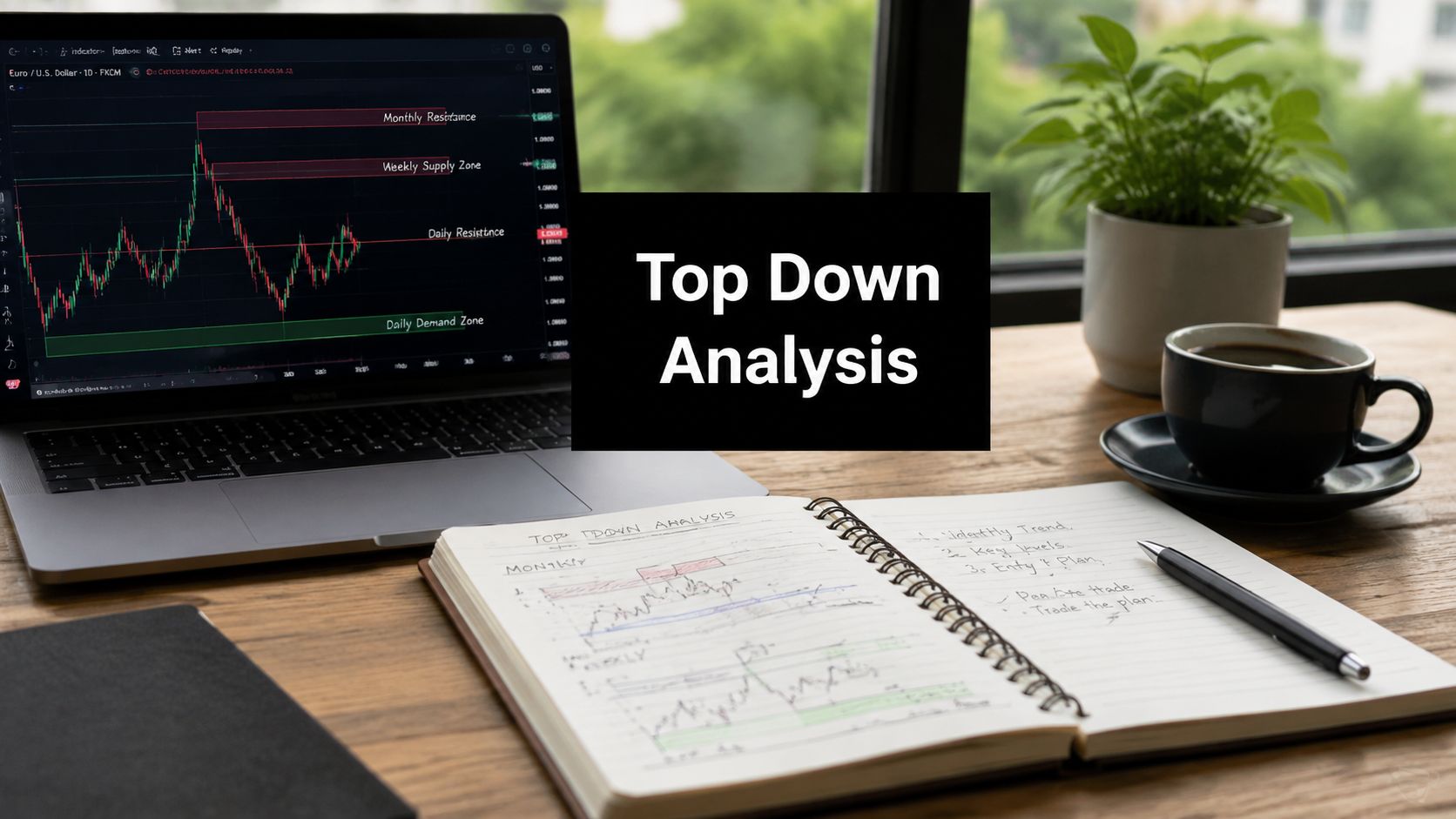
The Timeframe Pyramid Explained
The easiest way to understand top down analysis is to picture a pyramid. The top gives you the widest view. Each level below gets more precise.

In market practice, this multi-timeframe approach is commonly taught as a three-layer workflow. Traders often start with weekly or daily charts, then move to 4-hour or 1-hour charts, and finally use 15-minute or 5-minute charts for execution, as described in NinjaTrader's guide to top-down analysis for trading.
The top of the pyramid is direction
This is your weekly or daily chart, depending on how long you hold trades.
You're not hunting for an entry here. You're answering basic structural questions:
- Is price making higher highs and higher lows
- Is price making lower highs and lower lows
- Is price trapped in a range
- Is price approaching a major swing point
That gives you directional bias. If the daily chart is trending up cleanly, your job on lower charts isn't to become clever and short every small intraday fade. Your job is to look for places where buyers may step back in.
The middle of the pyramid is setup
This is often the 4-hour chart. Sometimes it's the 1-hour if your holding period is shorter.
Here you mark the areas that matter:
| Layer | Main job | What you look for |
|---|---|---|
| Higher timeframe | Direction | Trend, structure, major levels |
| Middle timeframe | Setup | Pullbacks, supply and demand, support and resistance |
| Lower timeframe | Execution | Entry trigger, invalidation, trade management |
The middle chart is where the trade idea becomes real. You're no longer asking, “What is the market doing overall?” You're asking, “Where would I want to participate?”
That could be a pullback into support in an uptrend, a retest of broken structure, or a rally into supply during a downtrend.
The bottom of the pyramid is execution
Most traders start here. That's the mistake.
Your lower chart, often the 1-hour, 15-minute, or even 5-minute, is only for timing. It's where you wait for price to confirm the story built by the higher charts. A rejection candle, engulfing pattern, failed break, or shift in short-term structure can all work here if they appear in the right place.
Lower timeframes should sharpen a good idea, not rescue a bad one.
If you want to deepen the technical side of this process, Colibri Trader has a practical guide on using multiple timeframes in technical analysis.
A clean way to build your own pyramid
Don't overcomplicate the stack. Use timeframes that make sense for your style:
- Swing trader: Weekly, Daily, 4-Hour
- Short-term swing trader: Daily, 4-Hour, 1-Hour
- Intraday trader: 4-Hour, 1-Hour, 15-Minute
What matters isn't the exact combination. What matters is that each chart has one job. When traders use every timeframe for every decision, analysis gets muddy fast.
A Practical Workflow for Price Action Traders
You don't need a complicated routine. You need one you can repeat the same way every day.

Step one, mark structure on the higher timeframe
Start on the daily chart.
Your first task is to classify the market. Is it trending, ranging, or transitioning? Keep this simple. You're reading swing structure, not trying to predict the next month of price.
Mark the obvious areas:
- Major support and resistance
- Recent swing highs and lows
- Breaks of structure
- Areas where price strongly left a zone
If the chart is messy and you can't state the bias in one sentence, leave it alone. A vague read on the daily chart usually turns into a forced trade later.
Step two, drop to the setup chart
Move to the 4-hour chart.
Now you want to see how price is behaving inside the broader context. I then look for the path into a level. Is price pulling back cleanly or chopping its way there? Is momentum fading as it reaches a zone? Is the move impulsive or corrective?
Those details matter because they change the quality of the setup. A clean pullback into a clear level is easier to trade than a violent, erratic move that smashes through multiple reaction points.
Here's a practical checklist:
- Confirm the bias: The setup should match the higher timeframe.
- Define the location: Mark the exact zone that interests you.
- Assess the path: Notice whether price is arriving in a controlled or messy way.
- Decide in advance: If price reaches the zone, what lower-timeframe signal would make you act?
For traders building their chart-reading skill, Colibri Trader's guide on how to read price action helps with this exact part of the process.
Step three, wait on the execution chart
Execution is where patience gets tested.
Drop to the 1-hour or 15-minute chart only when price reaches your area. Then wait for proof that the side you want to trade is stepping in. That proof can be a rejection wick, an engulfing candle, a failed push through the level, or a lower-timeframe break in the opposite direction of the pullback.
What doesn't work is entering because price is “close enough.”
Entry rule: No lower-timeframe confirmation, no trade. A good level without a trigger is still only an idea.
A visual walkthrough can help if you learn better by seeing the sequence on charts:
Step four, write the trade in one sentence
Before you enter, summarize the trade clearly.
For example: “Daily trend is up, 4-hour price is pulling into support, 1-hour printed bullish rejection, so I'm looking long from this zone.”
If you can't explain the trade cleanly, don't take it. Good top down analysis simplifies decisions. It shouldn't produce a long paragraph of reasons, exceptions, and maybes.
Top Down Analysis Examples in Action
Examples are where the method stops being theory. Let's walk through two common chart situations using pure price action logic.
Example one, bullish continuation after a pullback
Start with the daily chart. Price has been making higher highs and higher lows. The structure is intact, and the market is pulling back rather than breaking down. That gives you a bullish bias.
Now move to the 4-hour chart. Price is retracing into a prior demand area that also lines up with a visible support zone. This is the kind of location you want. It's not random. It's an area where buyers previously took control.
On the 1-hour chart, you wait. Price dips into the zone, probes below it briefly, then snaps back and closes strong. That failed push lower is important. It tells you sellers managed to reach the area but couldn't hold the break.
A clean trade plan from there looks like this:
- Bias: Long only, because the higher structure remains bullish
- Location: 4-hour support or demand inside the daily uptrend
- Trigger: 1-hour bullish rejection or engulfing pattern
- Invalidation: Below the reaction low that proved buyers were present
Notice what made the trade good. Not the candle by itself. The candle mattered because of where it formed and what the higher charts already suggested.
Example two, bearish reversal from supply
Now flip the process.
The daily chart is printing lower highs and lower lows. Price rallies, but the rally looks corrective rather than impulsive. That keeps the bearish bias intact.
On the 4-hour chart, the rally pushes into a supply area created by a sharp prior selloff. You don't short blindly into the zone. You wait to see whether sellers defend it.
Then the 1-hour chart gives you the clue. Price wicks above the area, fails to hold, and closes back below resistance. That's often enough for a price action trader to start planning a short.
Here's the thought process in plain language:
| Timeframe | Reading | Decision |
|---|---|---|
| Daily | Downtrend | Only consider shorts |
| 4-Hour | Rally into supply | Watch for failure |
| 1-Hour | Rejection from the zone | Execute if risk is clean |
This is also where macro awareness can help market selection. In fundamental top-down work, analysts often move from macro conditions to sector behavior before choosing individual assets, and sector leadership tends to rotate with the broader cycle, as outlined in Daloopa's guide to fundamental top-down analysis. If you want a practical complement to that idea, this guide to investment sector rotation gives useful background on how leadership shifts can influence where you focus.
What both examples have in common
Both setups depend on the same discipline:
- The higher timeframe sets the side.
- The middle timeframe defines the area.
- The lower timeframe confirms the moment.
Most traders lose that sequence when they get impatient. They see the lower-timeframe pattern first and try to build a case around it after the fact. That's not analysis. That's justification.
Common Pitfalls and How to Avoid Them
The biggest failure point in top down analysis isn't identifying trend. It's handling conflict.

A common problem in trading education is that many guides show the clean version only. Everything aligns, the trend is obvious, and the entry appears on cue. Real charts don't behave that neatly. The hard part is deciding what to do when the daily chart says buy and the 15-minute chart says sell. In a 2025 CFA Institute study cited in the prompt, 68% of retail traders abandoned their plans when timeframe signals conflicted, while traders using timeframe priority rules achieved 2.3x higher win rates in the same context, referenced in the provided CFA Institute claim link.
Use timeframe priority rules
My rule is simple. The higher timeframe wins.
That doesn't mean lower charts don't matter. It means they have a narrower job. They refine entry. They do not overrule bias.
If the daily chart is bullish and the 15-minute chart looks weak, there are only a few valid responses:
- Wait for the lower timeframe to turn back up.
- Drop the setup if weakness damages the higher-timeframe premise.
- Stand aside if the picture becomes unclear.
What you should not do is flip short just because a fast chart printed a bearish pattern into higher-timeframe support.
When timeframes disagree, don't ask which one is “right.” Ask which one has authority.
Don't use too many charts
Another common mistake is stacking chart after chart until the process collapses under its own weight.
You don't need monthly, weekly, daily, 8-hour, 4-hour, 90-minute, 30-minute, 15-minute, and 5-minute charts open for one trade. Too many layers create hesitation and let you find evidence for anything.
A cleaner approach looks like this:
| Problem | Better rule |
|---|---|
| Too many timeframes | Use three, each with one job |
| Trading every signal | Require alignment with higher-timeframe bias |
| Entering at levels blindly | Wait for lower-timeframe confirmation |
| Refusing to adapt | Reassess if higher-timeframe structure changes |
Stay flexible without becoming random
Top down analysis isn't rigid. It's ordered.
If new price action changes the higher-timeframe picture, your bias should change too. What you don't do is let every lower-timeframe wobble force a complete rewrite of the trade idea. Flexibility belongs at the top of the pyramid first.
That distinction matters. Many traders think discipline means stubbornness. It doesn't. Discipline means following a hierarchy.
Integrating Top Down Analysis with the Colibri Trader Method
Top down analysis gives you the map. Price action gives you the trigger.

If you trade a pure price action method, this integration is straightforward. The higher timeframe tells you where you want to do business. The lower timeframe tells you whether price is behaving the way you need before you commit risk.
Where the framework and the method meet
This is the cleanest way to combine them:
- Top down analysis chooses direction: You decide whether you should be hunting longs, shorts, or nothing.
- Price action chooses location: You mark support, resistance, supply, demand, swing points, and failed breaks.
- Execution comes from confirmation: You enter only when price prints a pattern that fits the context.
That keeps you from treating every pattern as equal. A bullish signal in the middle of nowhere doesn't have the same value as a bullish signal at higher-timeframe support in an established uptrend.
Keep the method simple
You don't need indicators to make this work. You also don't need a macro-heavy workflow if your style is built around raw charts. For many traders, the practical blend is enough: higher-timeframe structure, middle-timeframe zone, lower-timeframe confirmation.
That's also where one structured training resource can help. Colibri Trader teaches a price-action based approach built around chart reading, discipline, and repeatable setups, which fits naturally with a top down workflow.
Bottom line: Top down analysis tells you where to look. Price action tells you when to act.
Use them together and the market gets quieter. Not easy, but quieter. And for most traders, that's the shift that finally turns random screen time into a real process.
If you want a clearer, price-action based trading process, Colibri Trader offers educational resources focused on reading raw charts, building discipline, and applying repeatable setups within a structured top down framework.