


Technical Analysis Using Multiple Timeframes: A 2026 Guide
You're probably doing this right now. You spot a clean setup on a fast chart, the candle closes exactly how you want, you enter, and within minutes price snaps the other way and tags your stop.
That usually isn't because price action “stopped working.” It's because the setup made sense on one chart and failed in the larger context. A sharp rejection on a 5-minute chart can still be nothing more than noise inside a higher-timeframe pullback, squeeze, or expansion leg.
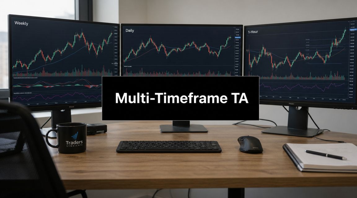
Technical analysis using multiple timeframes fixes that problem by forcing you to read context before execution. Instead of letting the smallest chart tell the whole story, you start with the market's broad structure and only then drill down to the level where timing matters. That top-down habit has been part of serious trading education for years. One well-known milestone was Brian Shannon's role in popularizing the workflow through his teaching and interviews, including a record showing how he monitored weekly, daily, 65-minute, 30-minute, 15-minute, 10-minute, and 2-minute charts rather than relying on a single screen, as described in this multiple-timeframe trading report.
For traders who still use indicators as supporting tools, it also helps to understand where those tools fit and where they don't. A useful comparison is this breakdown of UBAMM.AI crypto indicator insights, especially if you trade crypto and want to see why many developing traders confuse indicator signals with actual market context.
The professional difference isn't that experienced traders always find better-looking candles. It's that they don't let a lower timeframe overrule the higher-timeframe story.
Why Your Perfect Setups Keep Failing
The most common losing trade I see looks clean at entry.
A trader finds a pin bar into support on a low timeframe. The level reacted before. The wick is obvious. Risk looks tight. Then the trade fails almost immediately because the higher chart was still pressing lower, or because that “support” sat in the middle of a larger corrective leg with no real structural reason to hold.
The low timeframe lies by omission
A lower chart gives detail, but it also hides context. It shows the last few pushes, the last rejection, the last micro break. What it doesn't show clearly is whether buyers are stepping into a meaningful higher-timeframe level or trying to catch a falling knife in the middle of nowhere.
That's why traders keep saying, “My entry was good, but the market reversed.” Often the entry candle was fine. The location was bad.
A precise entry doesn't rescue a trade built on the wrong directional bias.
Multi-timeframe work changes everything. You stop asking, “Is this candle tradable?” and start asking, “Is this candle appearing where it should appear, in the direction it should appear?”
What professionals do differently
Professionals don't start with the execution chart and hunt for reasons to click. They work top down. Broad trend first. Structure next. Trigger last.
That sounds simple, but it changes your decision quality in a big way:
- Higher timeframe first. You define whether the market is broadly trending, correcting, or ranging.
- Middle timeframe second. You inspect whether price is approaching a level that matters.
- Lower timeframe last. You wait for price to prove the idea before risking capital.
If you skip the first two steps, every lower-timeframe pattern starts to look tradable. That's how traders overtrade without realizing it.
The real issue isn't your pattern
Engulfing bars, pin bars, inside bars, break-retest entries. None of those are magic, and none of them are useless. Their value depends on context.
A bearish engulfing candle that forms into weekly resistance carries very different weight from the same candle printed in the middle of a choppy intraday range. The candle shape is identical. The trade quality isn't.
That's the first shift to make. Stop grading setups by appearance alone. Grade them by location, context, and alignment.
How to Choose Your Timeframe Trio
Most traders use too many charts, not too few. They open every timeframe from monthly down to 1-minute, collect conflicting opinions, and end up frozen.
A cleaner benchmark is to use two to three timeframes and space them so each chart gives distinct information. A common guideline is to choose the higher timeframe at roughly 4 to 6 times the trading timeframe. Examples often given are validating a 4-hour setup with the daily chart, or confirming a 30-minute chart with a 2-hour or 4-hour context, as noted in this guide to multi-timeframe chart analysis. The same guidance warns that piling on too many timeframes creates conflicting signals and decision paralysis.
Use one chart for each job
Each timeframe in your trio needs a specific role:
- Context chart: Define directional bias and major levels.
- Setup chart: Study structure and look for the trade location.
- Entry chart: Time the trigger and place risk.
If two charts are doing the same job, your stack is poorly built.
Recommended timeframe combinations by trading style
| Trading Style | Higher Timeframe (Context) | Medium Timeframe (Setup) | Lower Timeframe (Entry) |
|---|---|---|---|
| Swing trading | Weekly | Daily | 4-hour |
| Day trading | Daily | 1-hour | 15-minute |
| Scalping | 1-hour | 15-minute | 5-minute |
These aren't the only workable combinations, but they respect separation. Each chart adds something new instead of repeating the same information with slightly different candle sizes.
For a broader discussion of chart selection for longer holds, this guide on best time frames for swing trading is a useful companion.
What works and what doesn't
Some combinations create clean handoffs between context and execution. Others create confusion.
What usually works:
- Weekly, daily, 4-hour for swing trades.
- Daily, 1-hour, 15-minute for day trades built on clear intraday structure.
- 1-hour, 15-minute, 5-minute when you need faster entries but still want a directional anchor.
What usually doesn't:
- Monthly, 5-minute, 1-minute. The gap is too wide.
- 4-hour, 1-hour, 45-minute. The charts are too similar.
- Seven open charts. You'll find contradiction somewhere and talk yourself into or out of anything.
Practical rule: If your higher timeframe and setup timeframe don't tell clearly different parts of the same story, tighten the stack.
Pick the trio that matches your hold time
This part matters more than people think. Don't choose timeframes because another trader uses them. Choose them based on how long you expect to hold and how often you can monitor the market.
If you're checking charts a few times a day, weekly-daily-4-hour makes sense. If you're active during one session and flat by the close, daily-1-hour-15-minute is more realistic. The wrong trio doesn't just give bad signals. It pushes you into a rhythm you can't execute consistently.
Reading the High-Timeframe Narrative
The highest chart in your stack decides the boundaries of the trade. It tells you whether you should be thinking about continuation, reversal, or no trade at all.
A foundational rule in technical analysis using multiple timeframes is the top-down sequence. Traders start by identifying the dominant trend on higher charts such as weekly or monthly, then refine structure on daily charts, and finally use intraday charts like 1-hour or 15-minute for execution. That three-timeframe approach is repeatedly described as balanced because it reduces noise while preserving timing precision in this explanation of multi-timeframe analysis basics and benefits.

Start with structure, not signals
On the high timeframe, don't look for entry patterns. That isn't the job of this chart.
Look for these instead:
- Trend condition. Is price making higher highs and higher lows, lower highs and lower lows, or neither?
- Major swing points. Where did price make a decisive turn previously?
- Clean horizontal zones. Where did price leave sharply or repeatedly react?
- Current phase. Is price impulsing, correcting, compressing, or ranging?
Many developing traders sabotage themselves. They treat every chart like an entry chart. The high timeframe isn't for finding a pin bar. It's for answering one question: What kind of market am I in?
Build the story the chart is telling
I like to reduce the high-timeframe read to a short narrative.
Examples:
- Buyers are still in control, but price is pulling back into prior breakout structure.
- Sellers broke structure, and the current bounce looks corrective.
- Price is trapped between major highs and lows, so directional conviction is weak.
That narrative does two things. It creates bias, and it limits bad ideas. If the weekly chart shows a broad bullish trend pulling into support, I'm not interested in forcing aggressive shorts on the lower chart. If the daily chart is ranging in the middle of a wider box, I know to cut expectations and be selective.
A strong primer on identifying those swing relationships is this resource on understanding market structure.
Mark levels that can actually move price
Not every line on the chart matters. Most don't.
The levels worth carrying down are usually:
- Previous swing highs and lows
- Areas where price left with expansion
- Well-tested support or resistance
- Breakout points that may flip role on retest
The point isn't to cover the chart in zones. The point is to mark the levels where a lower-timeframe setup would mean something.
If your high-timeframe chart is cluttered, your bias will be weak and your execution will be random.
Decide your bias before you zoom in
Your bias doesn't have to be bullish or bearish every day. Neutral is a valid read.
That's important. Some of the best decisions in trading are the trades you refuse to take because the higher timeframe isn't clean. If the chart is compressing into overhead resistance, or ranging without a clear edge, forcing a bias just creates low-quality trades with a neat story attached.
The high timeframe should leave you with one of three decisions: look for longs, look for shorts, or stand aside. Anything fuzzier than that needs more waiting, not more analysis.
Pinpointing Entries on Your Trading Timeframe
Once the high-timeframe narrative is clear, the trading timeframe becomes useful. Before that, it's just noise with candlesticks.

This chart has one job. It must show that price is responding properly at the area you marked above. You aren't inventing a fresh trade idea here. You're looking for confirmation that the higher-timeframe idea is active.
The setup has to appear in the right place
Many traders often get sloppy. They say they trade price action, but what they really trade is candle shape. They buy any bullish engulfing bar. They sell any pin bar with a long wick. That isn't price action trading. That's pattern collecting.
A valid trigger needs location behind it.
For longs, I want to see a bullish pattern form where buyers should logically defend. That might be a pullback into higher-timeframe support, a retest of a breakout level, or a reaction from a prior demand zone. For shorts, the same logic applies in reverse.
What I want to see on the setup chart
I don't need a perfect textbook signal. I need evidence that the market is respecting the story.
That usually looks like one or more of these:
- Rejection from a marked zone with a clear failure to continue through it
- Engulfing behavior that shows one side taking control after a pullback
- Inside bar break after compression near a meaningful level
- Break and retest where old resistance holds as support, or the opposite
- Micro structure shift in the direction of the higher-timeframe bias
The key phrase is in the direction of the bias. A bullish trigger against a bearish higher-timeframe structure may produce a bounce, but that doesn't make it a quality trade for this workflow.
Good entries aren't just early. They're aligned.
What patience actually looks like
Patience in trading isn't passive. It's selective.
You already know the zone you care about. You already know the direction you prefer. Now you wait for price to do something useful there. If it doesn't, there's no trade. If price slices straight through the level with conviction, that also tells you something. It tells you the idea is wrong or early.
A lot of losses come from entering because price is “close enough” to the level. Close enough is where random trades live.
Here's a useful visual walkthrough before you practice it on your own charts:
Keep the entry chart on a short leash
The lower the timeframe, the easier it is to get distracted. Every candle looks urgent. Every push feels meaningful.
That's why I keep strict rules here:
- No new bias from the entry chart
- No trade in the middle of the range
- No pattern without a level
- No forcing a trigger before candle close
The trading timeframe should sharpen your execution, not talk you into trades the higher charts never approved.
The Unbreakable Rules of Timeframe Alignment
Most trade errors happen before the order is placed. The trader has already accepted conflicting information, bent the bias, or allowed a lower-timeframe move to overrule the broader structure.
A practical multi-timeframe workflow used by professional traders is to begin with the highest timeframe to define the dominant trend, then move one or two levels down to judge structure and momentum, and finally use the lowest timeframe only for precise execution. This sequencing reduces the risk of countertrend entries because the smallest chart is treated as a timing tool, not a signal generator, as described in this overview of using multiple time frames in trading.
The four rules I won't bend

If you want consistency, your process needs hard edges. These are mine.
Higher-timeframe direction must be clear
If the context chart is messy, I don't proceed. A weak bias creates weak decisions.The setup timeframe must show structure at a meaningful level
I need price interacting with a place that matters, not printing random candles in open space.The entry trigger must confirm, not predict
I want the market to reveal its hand first. Early entries feel clever right up until they fail.Risk has to sit behind structure
If the stop can't be placed logically beyond the setup structure, the trade doesn't fit.
A simple pre-trade checklist
Before entering, I run through this short list:
- Bias check. Am I trading with the higher-timeframe narrative?
- Location check. Is price at a level I marked before drilling down?
- Confirmation check. Has the setup timeframe shown actual response?
- Execution check. Is the lower timeframe giving a clean trigger?
- Invalidation check. Do I know exactly what price action proves me wrong?
That is confluence in the only sense that matters. Not ten indicators agreeing, but multiple layers of price agreeing. If you want a deeper look at how traders think about stacked evidence, this article on confluence in trading is worth reading.
Alignment doesn't guarantee a winning trade. It gives you a valid trade.
What alignment is not
Alignment doesn't mean every chart looks identical. A bullish high timeframe can still contain a bearish lower-timeframe pullback. That's often where the opportunity comes from.
Alignment means the lower-timeframe movement fits inside the larger story. The pullback should look corrective, not dominant. The trigger should signal resumption, not contradiction.
That distinction matters. If the lower chart is making aggressive structure breaks against your bias, don't call that “just noise.” That may be the market telling you the higher-timeframe idea is weakening.
Trade Management and Common Analysis Pitfalls
A clean entry solves only one part of the trade. Poor management can still turn a strong read into a bad result.

The easiest way to stay logical is to keep management tied to the same chart hierarchy that got you into the trade. If the setup came from structure on the middle timeframe, the stop should usually relate to that same structure, not some arbitrary tight distance you chose because the trade looked attractive.
Place stops where the trade idea fails
A stop belongs at the point where your read is wrong.
That often means:
- Below the reaction low in a bullish setup
- Above the reaction high in a bearish setup
- Beyond the structural level that justified the trade in the first place
The mistake many traders make is placing the stop based on discomfort rather than invalidation. They don't want to risk a wider structural stop, so they tuck it into noise and call it discipline. Then price clips the stop, rotates, and moves exactly as expected.
Use the higher chart for targets
Targets should come from the next meaningful area on the context chart, not from a random desire to “get at least two to one.”
That might be the next major swing high, a clear resistance zone, or the opposite edge of the current range. The point is that the market should have a reason to react there.
This also helps you avoid one of the most common beginner habits. Taking profit just because the trade is green. If your target is planned from a higher-timeframe level, you're managing the trade from structure, not from emotion.
A good trade can lose and a bad trade can win
It's the point where traders either mature or stay stuck.
A well-aligned trade can fail. That doesn't make it a mistake. A reckless countertrend click can make money. That doesn't make it skill.
Judge your process first.
- Good losing trade. Higher-timeframe bias was clear, setup formed at a valid level, entry confirmed, stop sat behind structure, then price failed.
- Bad winning trade. No clean bias, no level, no confirmation, entry was emotional, then price happened to move in your favor.
The first trade builds a repeatable edge. The second trade teaches bad habits.
The market pays and punishes randomly in the short run. Your job is to stay loyal to a sound process.
The traps that break most traders
The big mistakes are rarely technical. They're procedural.
- Too many timeframes. More charts don't create more clarity. They create more arguments.
- Letting the lower chart overrule the higher chart. This is one of the fastest ways to sabotage your workflow.
- Changing timeframe after entry. Traders often hunt for a chart that supports a trade they already took.
- Impatience during dead periods. If the setup isn't there, there's nothing to do.
- Revenge trading after a clean loss. A valid setup that fails doesn't justify forcing the next one.
One practical note here. If you want a structured, price-action-based training path that includes top-down chart reading without leaning on indicator-heavy systems, Colibri Trader offers educational material centered on that style of workflow.
The point of technical analysis using multiple timeframes isn't to predict every move. It's to filter weak trades, improve location, and make your decisions harder to corrupt. That's what separates disciplined price action trading from random pattern chasing.
If you want to build a more disciplined top-down routine, Colibri Trader is a practical place to continue. The platform focuses on straightforward price action, market structure, risk management, and trader discipline, which fits naturally with the workflow in this guide.