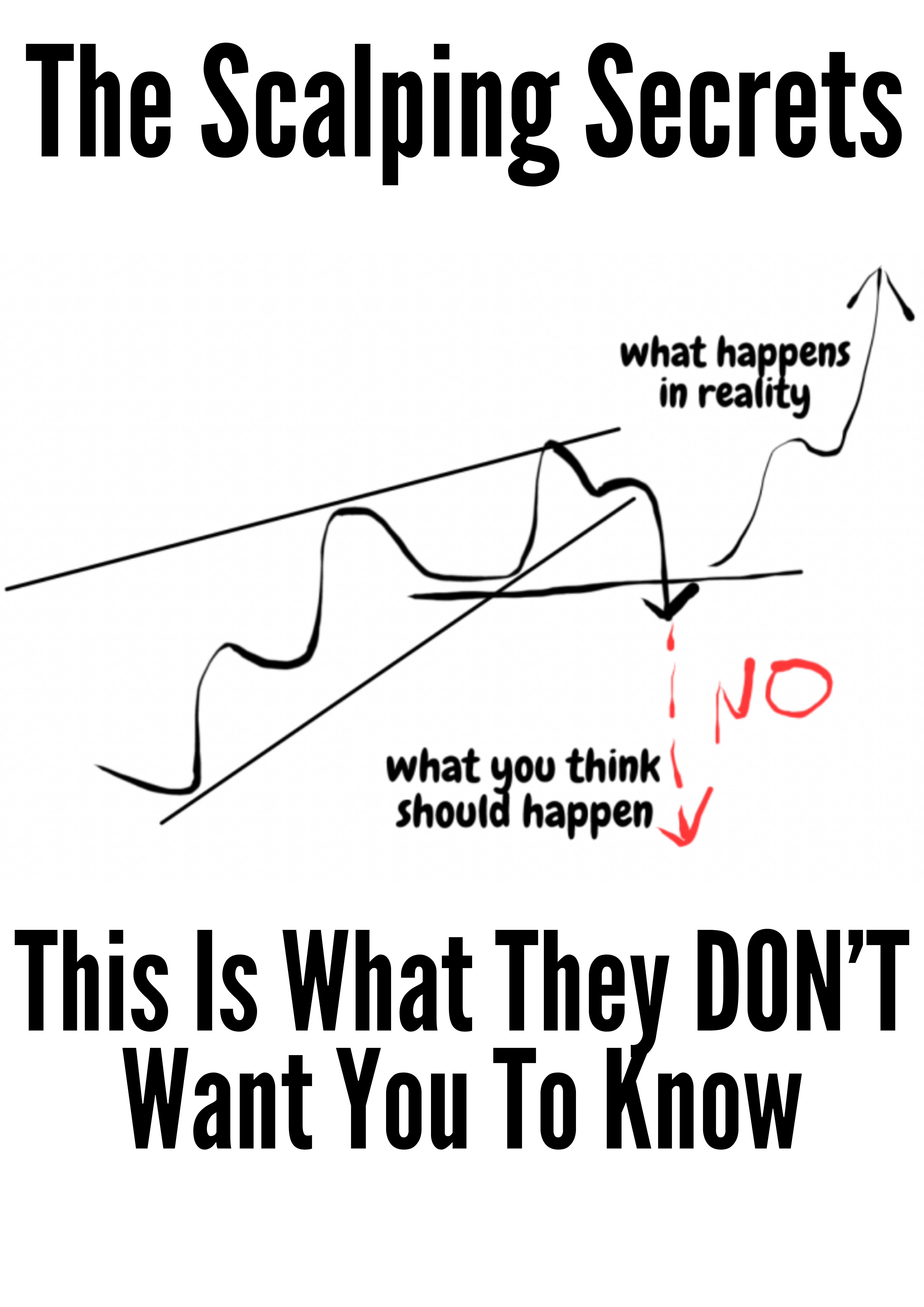
Technical Analysis for Dummies: Learn Trading Basics
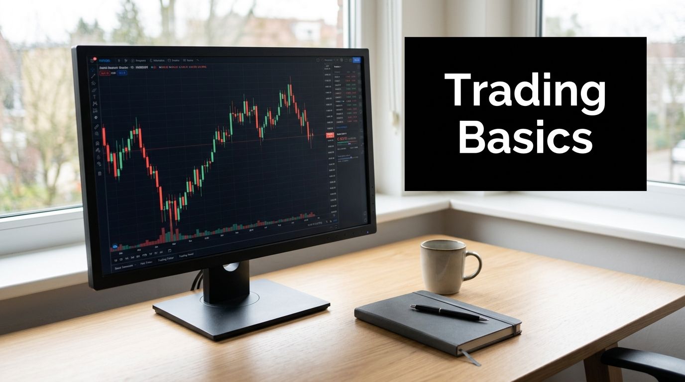
You open a chart for the first time and it looks like noise. Candles flicker up and down, indicators crowd the screen, and every tutorial seems to throw ten new terms at you before you even know what you're looking at.
That's where most beginners get stuck.
A good technical analysis for dummies guide shouldn't bury you in jargon. It should help you read the chart the way a skilled trader reads it. Not as random lines, but as a record of buyers and sellers making decisions in real time. Once you see that, the market starts to feel less mysterious and much more structured.
What Is Technical Analysis Anyway
Technical analysis is a way to make buy and sell decisions by studying historical price and volume data instead of focusing on fundamentals like earnings or management quality, as explained in this Shortform summary of Barbara Rockefeller's approach. In plain English, it means you're looking at what price has done, not what you think it should do.
That distinction matters.
A fundamental analyst asks, “Is this company worth owning?” A technical trader asks, “What are buyers and sellers doing right now, and where is price likely to react next?” Both approaches can be useful. They just answer different questions. If you want a broader side by side view, Finzer insights on market strategy gives a helpful comparison.
Reading the story in the chart
A chart is a story of pressure. Buyers push up. Sellers push down. Fear speeds moves. Confidence sustains them. Technical analysis tries to read that story from the footprints price leaves behind.
That's why old price levels matter. That's why trends matter. That's why the same types of moves show up again and again. People change, but crowd behavior often rhymes.
Price is the final vote. News, opinions, and forecasts all matter less than what traders actually do with money on the line.
Beginners often think technical analysis means memorizing dozens of indicators. It doesn't. Indicators like SMA, RSI, and MACD are just tools layered on top of price. They can help, but they aren't the market itself.
Why beginners get overwhelmed
Most confusion starts when traders jump straight to tools before learning the language of the chart. That's like trying to write essays before learning the alphabet.
Start with three questions:
- What is price doing now: Is it moving up, down, or sideways?
- Where has price reacted before: What levels keep attracting buyers or sellers?
- How is price behaving at those levels: Is it rejecting, breaking, or hesitating?
If you want a clean primer before adding anything advanced, this guide on how to read market charts is a useful next step.
Learning the Language of the Market
Before you can trade well, you need chart literacy. That means recognizing what type of chart you're looking at, what each candle is saying, and how the same market can look completely different depending on the timeframe.

Line charts, bar charts, and candlesticks
A line chart is the simplest version. It usually connects closing prices over time. That makes it useful for spotting the broad direction of a market, but it leaves out a lot of detail.
A bar chart adds more information. Each bar shows the open, high, low, and close for a given period. Traders often shorten that to OHLC.
Most beginners end up preferring Japanese candlesticks because they tell the story more clearly. A candlestick still shows the open, high, low, and close, but the visual shape makes the battle between buyers and sellers easier to read at a glance.
How to read a candlestick
Each candle has two main parts:
- The body: The distance between the open and close
- The wicks: The highest and lowest prices reached during that period
A long bullish body tells you buyers stayed in control for most of that candle. A long upper wick can tell you buyers pushed higher but sellers hit back before the close. A small body with long wicks often shows hesitation.
Think of each candle as one chapter in a longer story. One candle alone doesn't mean much. A sequence of candles near an important level can mean a lot.
Practical rule: Don't ask what one candle means in isolation. Ask what it means at that location on the chart.
Timeframes change the story
A one minute chart and a daily chart can show the same market in completely different ways. That doesn't mean one is wrong. It means they answer different questions.
Here's a simple explanation:
| Timeframe | What it tends to show |
|---|---|
| Lower timeframes | More detail, more noise, faster decision making |
| Higher timeframes | Cleaner structure, stronger levels, slower decisions |
Beginners often get trapped by staring too close. They see every little move and mistake noise for opportunity. Higher timeframes usually make structure easier to recognize.
The three basic chart conditions
Every chart is doing one of three things most of the time:
- Uptrend: Price makes higher highs and higher lows
- Downtrend: Price makes lower highs and lower lows
- Range: Price moves sideways between a floor and a ceiling
That's the first filter for almost every trade idea. If you can't tell whether the chart is trending or ranging, don't rush into patterns or indicators. The market's basic plot comes first.
Identifying Key Price Levels on Your Chart
If trend tells you the market's direction, support and resistance tell you where the important battles happen. These are the zones where price has a history of reacting. They matter because traders remember them, even if they don't realize they do.

Support is the floor, resistance is the ceiling
Support is an area where falling price tends to find buyers. Picture it as a floor. Price drops into that area, buyers step in, and the decline slows or reverses.
Resistance is the opposite. It acts like a ceiling. Price rises into that area, sellers appear, and the move struggles to continue.
These aren't magical lines. They're areas where traders have previously decided, “This is cheap enough to buy,” or “This is expensive enough to sell.”
How to spot them without overcomplicating it
Look left on the chart. That simple habit solves a lot of beginner mistakes.
Mark the places where price has clearly turned more than once. If the market rejected a zone several times, that zone probably matters. You don't need perfect precision. In real trading, support and resistance work better as zones than razor thin lines.
A practical checklist helps:
- Repeated reactions: Has price bounced or rejected here before?
- Clean turns: Did the market reverse sharply or hesitate around this area?
- Visible on higher timeframes: Does the level still matter when you zoom out?
For crypto traders, Coiner Blog's crypto trading guide gives solid examples of how these levels appear in fast-moving markets.
The next visual makes the floor and ceiling idea easier to see in context.
The role reversal idea
One of the most useful chart behaviors is role reversal. When price breaks above resistance, that old ceiling can become the new floor. When price falls below support, that old floor can become the new ceiling.
That happens because traders react to memory. A trader who missed the breakout may buy the pullback into the old resistance. A trader trapped on the wrong side may use that same area to exit.
A broken level isn't interesting because the line moved. It's interesting because trader behavior changed around that area.
Here, many beginner charts become cleaner. Instead of drawing ten indicators, you start marking a few meaningful zones and watching how price behaves there.
Recognizing Common Chart Patterns
Most beginner material on technical analysis for dummies throws a giant list of patterns at you. That usually creates more confusion than skill. You don't need twenty patterns. You need a few reliable ones, plus the judgment to know when they matter.

Two candlestick patterns worth learning
A pin bar shows rejection. It has a small body and a long wick. If price pushes into resistance and leaves a long upper wick, sellers have rejected higher prices. If the same thing happens at support with a long lower wick, buyers may be stepping in.
An engulfing bar shows a sudden shift in control. A bullish engulfing candle swallowing the prior candle near support can signal that buyers took over decisively. A bearish engulfing bar near resistance can tell the opposite story.
The key isn't the shape alone. The location matters more than the pattern name.
Two larger chart patterns beginners can actually use
A double top forms when price tests a high twice and fails both times. That often signals buyers are losing strength at resistance. A double bottom says the opposite at support.
A head and shoulders pattern is a more developed reversal structure. It often appears after an uptrend. Price makes a peak, then a higher peak, then a lower peak. That sequence can reveal weakening demand before a larger drop.
If you want a stronger visual library, this guide to the top 10 chart patterns every trader should know can help you recognize them faster.
Why pattern memorization fails beginners
Patterns don't work because they have catchy names. They work when they reflect real order flow at meaningful levels.
Many beginner guides become dangerous on points like this. For example, “gaps always get filled” sounds simple, but it's not reliable in every market condition. Data summarized by tastylive notes that breakaway gaps often don't fill quickly, and a 2024 Investopedia analysis found that in trending markets, gap-fill strategies had a 60 to 70% failure rate for mean-reversion attempts, which traps beginners who ignore context (tastylive on gap trading).
So treat patterns as clues, not commands.
- Good context: A bearish pattern at major resistance in a weak market
- Bad context: The same bearish pattern in the middle of a strong trend with no key level nearby
- Best habit: Ask what traders are trapped, defending, or giving up at that point
A pattern without context is just a shape.
The Power of Trading with Price Action
At some point, many traders realize their charts have become crowded. RSI at the bottom. MACD below that. Moving averages crossing everywhere. Signals keep appearing, but confidence doesn't improve.
That's where price action becomes powerful.

Why indicator-heavy trading often creates confusion
Indicators aren't useless. RSI uses 70 and 30 as key barriers, where readings above 70 suggest overbought conditions and readings below 30 can signal potential bullish opportunities, based on the earlier summary of technical analysis concepts. MACD also helps show momentum by combining moving averages.
The problem is timing. Indicators are built from price, so they often react after price has already moved. That lag becomes more obvious in fast markets.
The criticism of beginner indicator dependence is strong in the available data. O'Reilly 2023 highlighted that 68% of retail traders lose money due to overreliance on lagging indicators during high-volatility events, and emerging 2024 to 2025 analysis found that traders using raw price action outperform indicator-based traders by 15% in trending regimes (Dummies cheat sheet discussion).
Reading the book instead of the summary
Price action means focusing on the chart itself. Trend. Structure. Support and resistance. Candlestick behavior. Breakouts. Retests. It's cleaner because it removes layers between you and the actual market.
A simple comparison makes it clearer:
| Approach | What you're mostly reading |
|---|---|
| Indicator-heavy trading | A processed version of price |
| Price action trading | Price behavior directly |
That's the difference between reading the book and reading a delayed summary of the book. The summary can help. But if it conflicts with what the book plainly says, trust the original text.
What a cleaner chart gives you
A cleaner chart often improves three things:
- Decision quality: You focus on key levels instead of chasing every signal
- Speed of understanding: You can see structure faster
- Discipline: Fewer tools means fewer excuses for random trades
For a beginner, price action is often the better foundation because it teaches market behavior first. Indicators can always be added later if they support what price is already saying.
Avoiding Beginner Mistakes and Managing Risk
New traders usually think their biggest problem is finding the right setup. It usually isn't. The bigger problem is surviving mistakes long enough to improve.
Technical analysis is a probabilistic framework, not a guaranteed system. Past price and volume can reveal recurring patterns, but they can't promise future outcomes because market conditions can shift quickly. That's why risk management matters, as explained in this discussion of technical analysis and uncertainty.
The mistakes that do the most damage
A few beginner habits show up again and again:
- Revenge trading: Taking a rushed trade after a loss because you want the money back
- Oversizing positions: Trading too large, so a normal loss feels emotionally unbearable
- No exit plan: Entering because the setup looks good, but having no clear stop or target
- Moving the stop: Refusing to accept a small loss and turning it into a much bigger one
None of these come from lack of intelligence. They come from emotion overruling process.
A simple risk framework
Good traders don't need to be right all the time. They need to keep losses controlled and let good trades pay for bad ones.
Use this routine before any trade:
- Find the invalidation point: Where is the chart proving your idea wrong?
- Place the stop logically: Put it beyond that price area, not at a random distance.
- Define the target: Where is price likely to meet the next obstacle or reaction zone?
- Check if the trade is worth taking: If the likely reward doesn't justify the risk, skip it.
If you want a deeper practical walkthrough, this guide on risk management for traders breaks down the habits that keep traders in the game.
One hard truth: A good setup with bad risk management is still a bad trade.
Why accepting losses is part of the job
Beginners often treat a losing trade as evidence they're failing. That's the wrong lens. A loss can be completely normal if you followed your plan and kept risk controlled.
Trading works more like poker than prophecy. You can make a smart decision and still lose on one hand. What matters is whether your process holds up across many decisions.
That mindset shift changes everything. You stop trying to predict perfectly. You start trying to manage uncertainty well.
Where to Go from Here A Practical Learning Path
Learners don't need more chart jargon. They need repetition, observation, and a process they can follow.
Barbara Rockefeller's Technical Analysis for Dummies, now in its fifth edition, has long helped readers learn how technical data and indicators can guide trading decisions, according to the Dummies book page. That kind of foundation is useful. But reading alone won't build skill. You only start improving when you apply ideas on real charts.
A practical next step
Start with a demo account. Mark trends. Draw support and resistance zones. Watch how candles behave at those areas. Keep notes. Don't rush into real money just because a pattern looks familiar.
A learning path that works usually looks like this:
- Study a small core: Candlesticks, trend, levels, and a few recurring patterns
- Practice in replay or demo mode: Build chart recognition without financial pressure
- Review your decisions: Why did you enter, where was the stop, what did price do
- Simplify your method: If your chart is crowded, remove tools until the structure becomes obvious again
What beginners should aim for
Don't aim to predict every move. Aim to become consistent at reading structure and managing risk. That's a realistic goal, and it's the one that compounds.
The traders who last usually aren't the ones with the fanciest setups. They're the ones who learn to stay simple, stay selective, and stay disciplined.
If you want a structured way to learn price action without drowning in indicators, Colibri Trader is a strong next step. You can start with the free Trading Potential Quiz, get access to the first two chapters of its Amazon bestselling book on price action, and explore practical training built around clean chart reading, discipline, and money management.