


Best Time Frame for Day Trading: Build Your System
Why are you looking for a single chart interval as if the market owes everyone the same answer?
That's the first mistake most day traders make. They ask for the best time frame for day trading, then expect to hear one number. 5-minute. 15-minute. 1-hour. But a timeframe only works inside a system. If the system doesn't match your pace, your risk tolerance, and your decision-making style, the chart won't save you.
I've seen traders force themselves onto fast charts because they want more action, then freeze when price starts printing candles too quickly. I've also seen traders move too high and miss entries because they need more detail than they're admitting. The right answer isn't a magic chart. It's a structure you can execute repeatedly without fighting your own temperament.
Why Searching for a Single Best Timeframe Is a Trap
A scalper and an intraday trend trader can both be profitable on the same instrument and the same day while using completely different charts. One may work off the 1-minute and 5-minute. The other may barely look below the 15-minute. Neither is wrong.
The trap starts when traders confuse popular with universal. A chart can be useful for many people and still be wrong for you. That's why the search for the best time frame for day trading usually leads to frustration. You copy someone else's setup, but you also copy their speed, their patience level, and their tolerance for uncertainty. Few can borrow those.
The chart is only part of the decision
A timeframe determines more than candle size. It shapes:
- How often you trade. Lower charts print more setups, but they also tempt weak trades.
- How long you sit in uncertainty. Higher charts often require more patience between entry and outcome.
- How tight your stops can be. Entry precision changes with chart speed.
- How much noise you must filter. Lower charts demand sharper execution and stronger discipline.
Practical rule: If a timeframe forces you to become a different person to trade it well, it's probably the wrong timeframe for you.
The better question is simple. What chart combination lets you read price clearly, wait for your setup, and manage risk without panic?
That's a professional question. It shifts the focus from hunting for a secret to building a repeatable process.
Personal best beats universal best
Some traders need a slower read to see structure. Others do their best work when they can drill down and execute with precision. Neither approach wins by default.
What matters is whether your timeframe selection supports your edge. If you trade pullbacks in trend, you need enough context to define the move and enough detail to enter cleanly. If you scalp breakouts, you need quick information without getting chopped to death by every flicker.
The market doesn't grade you on chart loyalty. It grades you on execution.
What Chart Timeframes Actually Show You
A chart timeframe is a zoom level. That's the cleanest way to understand it.
The higher you go, the more price gets compressed into each candle. The lower you go, the more detail you see inside each move. Neither view is superior on its own. They answer different questions.

High timeframes show structure
Think of a 1-hour or 4-hour chart as the satellite view. You won't see every wiggle, but you will see the path price has been respecting.
That's where you spot the big things that matter to day traders:
- Trend direction
- Major support and resistance
- Range boundaries
- Whether price is compressing or expanding
If you skip this view, you end up trading tiny patterns directly into bigger barriers. Many bad day trades look good on a low chart right until they run straight into a higher-timeframe level.
Lower timeframes show execution
Now drop down to the 5-minute or 1-minute chart. This is your street view. You can see the pullback, the failed break, the rejection, the retest. Here, entries become practical.
Lower charts help with:
- Tighter entry timing
- More precise stop placement
- Reading short-term momentum
- Avoiding late entries after the move is already extended
But detail comes at a cost. The lower you go, the more random movement you have to ignore. What looks like a reversal on a very small chart may be nothing more than a pause inside a larger directional move.
A lower timeframe is useful when it sharpens a decision you already understand. It's dangerous when you use it to invent a trade that the higher chart never supported.
Medium timeframes connect the two
This is the piece beginners often miss. The middle chart is where structure and execution meet.
A 15-minute or 30-minute chart often gives the clearest read on intraday swings. It's detailed enough to show the setup, but not so fast that every candle feels urgent. This middle layer is what keeps multi-timeframe analysis from becoming a mess.
A simple way to think about the map:
| View | Common Role | What You See |
|---|---|---|
| Higher timeframe | Bias and key levels | Trend, structure, major turning points |
| Middle timeframe | Setup location | Pullbacks, consolidations, breaks, retests |
| Lower timeframe | Entry trigger | Fine detail for execution and risk control |
Price action traders don't need ten indicators to do this. They need the discipline to zoom out before zooming in. Most mistakes happen in the opposite order.
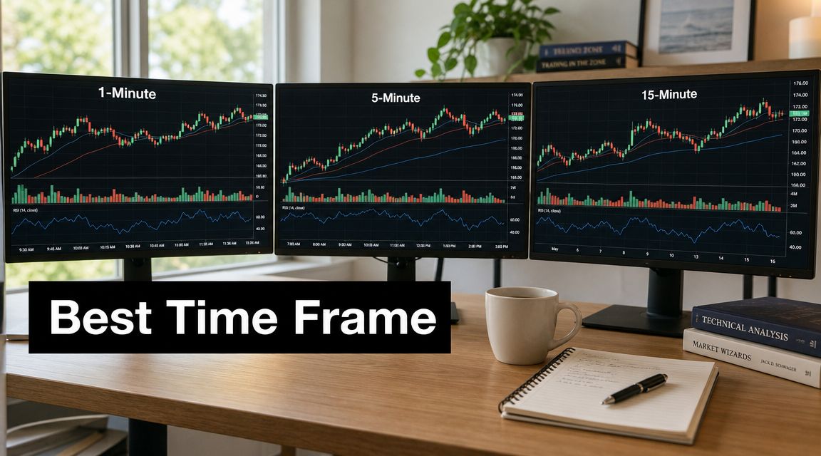
A Guide to Common Day Trading Timeframes
Each intraday timeframe has a personality. If you treat them as interchangeable, they'll punish you.
Across trading education sources, the 5-minute chart is repeatedly described as a practical middle ground, and one source based on 10+ years of trading experience calls it the “sweet spot” because it balances the signal frequency of the 1-minute with the reduced noise of the 15-minute in that specific approach, as discussed in this video on the five-minute timeframe.
The fast end of the spectrum
The 1-minute chart is for traders who can make decisions quickly and stay disciplined under pressure. It gives maximum detail and frequent signals. It also prints a lot of junk.
On this chart, traders tend to overreact. They chase breakouts, cut winners too early, and take mediocre setups because another candle is always arriving. If you don't already have a clear higher-timeframe bias, the 1-minute chart will keep feeding you reasons to do something.
The 5-minute chart slows that pace just enough. You still get enough trade opportunities during the session, but the structure is easier to read. For many day traders, that balance matters more than raw speed.
The cleaner end of the spectrum
The 15-minute chart gives you better-shaped swings and cleaner zones. It suits traders who don't need constant action and prefer to let the setup develop. The trade-off is simple. Fewer signals, wider stops, and more waiting.
The 30-minute chart is often a strong structure chart for intraday work. It's less useful for fine entry timing, but very useful for identifying whether a move has room to continue.
The 1-hour chart isn't where most day traders execute. It's where many of them decide whether they should even be looking long or short. That's a very different job, and it's an important one.
Comparison table
| Timeframe | Best For (Trading Style) | Signal Frequency | Noise Level | Typical Use Case |
|---|---|---|---|---|
| 1-minute | Scalping, ultra-fast execution | High | High | Precise entries, micro pullbacks, breakout scalps |
| 5-minute | Active day trading, balanced execution | Medium to high | Moderate | Main execution chart for many intraday setups |
| 15-minute | Slower intraday trading, cleaner swings | Medium | Lower | Structure, pullbacks, holding moves for longer |
| 30-minute | Selective intraday traders | Lower | Lower | Intraday zones, major session structure |
| 1-hour | Bias and broad context | Low | Lower | Trend direction, support and resistance, trade filtering |
What about tick and Renko charts
These aren't time-based charts, but they deserve a quick mention because some traders use them to clean up execution.
- Tick charts print bars based on activity, not elapsed time. They can help active traders see bursts of participation more clearly.
- Renko charts print bricks based on price movement. They can make trends look cleaner, though they also remove some information that time-based traders rely on.
- Neither is a shortcut. If your read of structure is weak, changing the chart type won't fix it.
Most traders are better off mastering standard time-based charts first. Fancy charting often becomes a distraction when the underlying problem is poor process.
How to Match Your Timeframe to Your Trading Style
Timeframe choice is part technical, part psychological. A trader who needs constant stimulation usually won't trade a slow chart well. A trader who likes time to think usually won't survive on the 1-minute chart without forcing trades.

If you're still defining your style, this breakdown of different types of traders helps put names to the behavior patterns many people struggle to identify in themselves.
If you think like a scalper
Scalpers want movement now. They're comfortable making repeated decisions and taking small bites out of the session. They usually gravitate toward the 1-minute and 5-minute charts.
That style only works if you can do three things consistently:
- Act fast without chasing
- Accept small losses without emotion
- Stay selective even when setups appear constantly
A trader who hesitates, second-guesses, or revenge trades will usually get chewed up here.
If you trade intraday swings
Many developing day traders adopt this approach once they stop confusing activity with quality. They don't need every little move. They want the stronger move inside the session.
These traders often work best with combinations like:
- 1-hour for bias
- 15-minute for structure
- 5-minute for execution
That mix gives enough context to avoid random trades and enough detail to enter with purpose. It's also a good fit for traders who can watch the market actively but don't want to micromanage every tick.
The best timeframe is the one that lets you wait without getting bored and act without getting rushed.
If you keep forcing reversals
Reversal traders need timing, but they also need location. That means the lower chart alone won't cut it. A sharp rejection candle on a small timeframe means very little if it's floating in the middle of nowhere.
These traders usually need a higher chart for the key level and a lower chart for the trigger. If you're wired to fade moves, your chart stack must protect you from fading strong momentum blindly. That's where many reversal traders fail. Their entry chart is fine. Their context chart is missing.
If your lifestyle is the real limiter
A trader with one focused trading block each day needs a different chart plan than someone who sits at a desk all session. That's not a weakness. It's part of system design.
Your timeframe has to fit your actual life, not the fantasy version of your trading life.
How to Build Your Multiple Timeframe Analysis Framework
Professional day traders rarely make decisions from one chart alone. The cleanest approach is top-down analysis. Start broad, narrow down, then execute.
A practical version is to use a higher timeframe such as H1 or H4 for intraday bias and major support or resistance, then a lower timeframe such as M5 or M15 to time entries, as outlined in this guide to multi-timeframe day trading.

If you want another practical overview of the process, this article on technical analysis using multiple timeframes shows how traders layer context and execution without cluttering the decision.
Start with the highest chart you need
The top chart answers one question. What side of the market has the advantage right now?
For a day trader, that's often the 1-hour or 4-hour. You're not looking for entries there. You're looking for facts:
- Is price trending or ranging?
- Where are the major support and resistance levels?
- Is price approaching a location where continuation is likely, or where reaction is likely?
- Are you trying to buy into resistance or short into support?
This chart keeps you from taking technically clean but strategically bad trades.
Use the middle chart to find the setup
The middle chart is where the trade starts becoming real. This is often the 15-minute or 1-hour, depending on your style.
Here you're watching for things like:
- Pullbacks into a directional move
- Consolidation before expansion
- Failed breaks at a key level
- Rejections that form at a meaningful location
This is also where the Rule of 4 or 6 becomes useful. A commonly cited benchmark is a 4:1 to 6:1 timeframe ratio, often expressed as 4H trend, 1H setup, 15M entry, as explained in this discussion of the Rule of 4 or 6 for timeframe selection.
That ratio matters because it creates separation between context, setup, and execution. If your charts are too close together, they all show nearly the same thing. If they're too far apart, the connection becomes loose.
Drop to the execution chart only after the trade makes sense
Your entry chart should answer one question. When do I commit risk?
For many day traders, that's the 5-minute. For faster traders, it might be the 1-minute. The lower chart is where you refine the stop, wait for a trigger, and avoid entering too early.
Common triggers include:
- A lower-timeframe break and retest
- A rejection from a pre-marked zone
- A small consolidation that resolves in the direction of the higher-timeframe bias
- A failed push against your intended trade direction
Execution insight: The lower chart should improve the trade you already want. It shouldn't talk you into a trade the higher charts never justified.
A short visual explanation can help if you learn better by watching the process in action.
Keep the framework simple enough to repeat
A lot of traders overbuild this part. They monitor too many windows, mark too many levels, and create conflicts between charts. Then they call that sophistication.
It usually isn't. It's hesitation disguised as analysis.
Use three charts at most until you can read them smoothly:
- Bias chart for direction and major levels
- Setup chart for trade location
- Entry chart for timing and risk control
That's enough. The edge comes from consistency, not from stacking endless confirmation.
When You Trade Is as Important as What You See
A great chart read taken at the wrong time of day can still be a poor trade.
Intraday traders often focus so heavily on candle intervals that they ignore session behavior. That's a mistake. The same 5-minute setup can behave very differently at the open, in the middle of the session, and near the close.
The session changes the quality of the setup
For intraday trading in India, a widely cited tradable window is 10:15 a.m. to 2:30 p.m., because opening volatility often settles after 10:00 to 10:15 a.m., and traders are advised to square off before the close to avoid late-session risk, according to this article on the best time of day and timeframe for intraday trading.
That idea matters beyond one market. The principle is what counts. Early-session candles often carry more noise, wider swings, and emotional order flow. Mid-session price action is often cleaner. Late-session movement can become erratic again as traders flatten positions.
If you want a deeper look at session timing, this guide on the best time of day to trade is useful for matching your setup to the part of the session that supports it.
Timeframe and risk are tied together
Shorter charts usually mean tighter stops, faster decisions, and more chances to make mistakes quickly. Higher intraday charts usually mean wider stops, fewer entries, and more patience.
That affects your process in practical ways:
- On lower charts, you need sharper execution and stricter selectivity.
- On middle charts, you often get a cleaner stop placement because the swing structure is easier to read.
- On higher intraday charts, your stop may need more room, so position size has to reflect that.
A trader who chooses a timeframe without adjusting risk is only doing half the job. Your chart interval determines how price breathes. Your stop has to respect that.
A setup isn't good because it looks clean on the chart. It's good when the chart, the session, and the risk model all line up.
Your Checklist for Finding Your Ideal Timeframe
The best time frame for day trading isn't something you discover by scrolling forums. You find it by testing what fits your behavior under live market conditions.

Ask the questions that actually matter
Use this checklist before you settle on any chart combination:
- How much screen time do you really have. Not idealized time. Real time.
- Do you trade better when things move fast or when you have time to think.
- Are you taking weak trades from boredom on lower charts.
- Are you missing valid entries because your chart is too slow for your decision style.
- Can you define bias, setup, and entry clearly across your chosen charts.
- Does your stop placement make sense for the timeframe you trade.
Test the system, not the chart in isolation
Many sources recommend combinations like 1-hour bias, 15-minute setup, 5-minute entry, but those are still rules of thumb. A serious trader should question whether adding more timeframes improves profitability after costs or whether it merely adds complexity and overtrading risk, as argued in this piece on day trading timeframes and strategy complexity.
That's an important point. More charts don't automatically mean better decisions.
So keep your test simple:
- Pick one market.
- Choose one higher chart, one setup chart, and one entry chart.
- Trade the same session window repeatedly.
- Journal what you saw, where you entered, and whether the lower chart helped or only increased noise.
- Remove anything that doesn't improve clarity.
The right timeframe system should feel demanding, but not chaotic. It should help you act with intent, not keep you trapped in analysis.
If you want to sharpen a price-action approach to timeframe selection, Colibri Trader offers educational resources focused on reading structure, aligning multiple timeframes, and building a trading process around clean execution rather than indicator overload.