

Pure Price Action Trading: A Practical Guide to Naked Charts

Most traders don't lose on a naked chart because they lack indicators, they lose because they treat price action like a shortcut. A clean chart removes clutter, but it doesn't remove the need to read structure, wait for confirmation, and manage risk with discipline. Pure price action trading works when it's treated as a decision framework, not a magic entry signal.
What Pure Price Action Trading Really Means
A naked chart can feel liberating the first time you strip off the moving averages, oscillators, and colored overlays. That feeling is deceptive. The chart looks simpler, but the job gets harder because every decision now depends on how well you read raw price movement, market structure, and key levels without leaning on lagging tools.
That's the true meaning of pure price action trading. It's a method of making decisions from price itself, from support and resistance, trend structure, and candlestick behavior, as described by major educational sources on the subject, including this overview of price action meaning. The point isn't to trade faster. The point is to trade with fewer excuses and a clearer view of what buyers and sellers are doing right now.
Practical rule: if you can't explain where the level is, what trend you're in, and why the candle matters, you don't have a setup yet.
This approach has survived because price is the one input that never disappears. Every freely traded market prints it, and in liquid, volatile conditions the information is visible in real time. That's why traders often start with higher-timeframe levels, then refine entries on the daily, 4-hour, 1-hour, or 15-minute chart.
Pure price action is also not the same as trading with no process. Good traders still define rules, plan entries, place stops, and take profits at logical areas. The difference is that the rules come from the chart itself, not from an indicator overlay trying to translate the chart for you.
The Core Building Blocks Every Trader Must Master
Before any setup makes sense, the chart has to be read in layers. Reading a story, the higher timeframe gives you the plot, and the lower timeframe gives you the sentence-level details. If you skip the plot, every candle can look important when it isn't.
Market structure comes first
The first skill is recognizing higher highs, higher lows, lower highs, and lower lows. In an uptrend, price should keep pushing to fresh highs while pullbacks stay above prior swing lows. In a downtrend, the sequence flips, and each rally fails below the prior swing high.
That structure tells you who has control. If the swing sequence is messy, ranging, or overlapping, the market is not giving you a clean directional story. Traders who ignore structure usually end up treating every candle like an event, which is how overtrading starts.
Supply and demand are the map
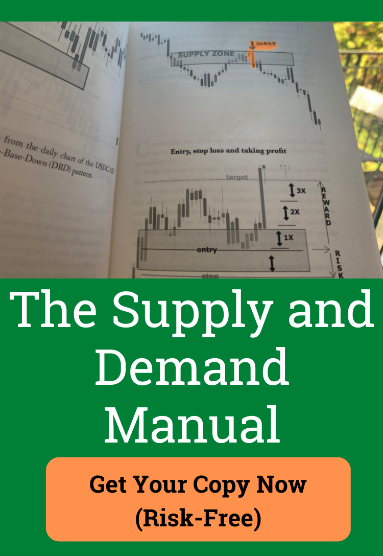
Once structure is visible, mark the zones where price previously reacted hard. Those areas matter because they show where orders were absorbed, rejected, or defended. A supply zone is not just an arbitrary line, and a demand zone is not just the lowest wick on the chart. They're areas where reaction happened before, so they deserve attention again.
The practical work is simple. Mark the most obvious swing highs and swing lows, then watch how price behaves when it returns. If the market slices straight through the level without hesitation, the zone wasn't strong enough for that session or timeframe.
Candlesticks are the proof
Candles matter because they show the response at the level. A rejection candle, engulfing candle, or inside bar only has meaning when it appears where price already had a reason to react. A bullish candle in the middle of a dull range is just a candle.
A pattern without location is decoration. Location without confirmation is guesswork.
A clean workflow is to label swings, draw zones, then ask whether the candle at the zone shows rejection, absorption, or continuation. That sequence keeps the chart readable and stops you from chasing every familiar shape that prints.
High-Probability Setups That Actually Repeat
The best pure price action setups are boring in a good way. They repeat because market participants keep responding to the same kinds of areas, especially in liquid markets where stops and limit orders cluster around obvious levels. The edge comes from context, not from naming a pattern.
A useful companion read on the behavior behind these moves is Parkview Partners Capital Management's market volatility guide, because volatility changes how much patience a setup needs and how far price can stretch before it reacts.
The bullish engulfing at support
A bullish engulfing candle matters when it forms after a selloff into a marked demand area or a prior swing low. The candle should close strong enough to show that sellers were absorbed and buyers took control. Entry can be taken on the close of the engulfing candle or on a small retest if the market offers one.
The stop belongs just beyond the low of the engulfing candle or slightly under the structural support that triggered the reaction. Profit belongs at the next logical resistance zone, not in the middle of open space. If price is bouncing in the middle of nowhere, skip it.
The pin bar at a supply zone
A pin bar is useful when the wick shows rejection at a level that already mattered. A bearish pin bar at resistance tells you buyers tried to push higher and failed, which can open room for a downside continuation. A long wick alone doesn't mean anything unless it forms at a real zone.
The inside bar breakout at a level
Inside bars work when consolidation happens at a decision point. If price coils under resistance in an uptrend, a breakout in the trend direction can offer a tight stop and a clear trigger. If the same inside bar forms in a choppy middle range, it's often just noise.
The pullback to value in a trend
Trend-continuation pullbacks are often the cleanest trades. Price makes the trend sequence, pulls back into support or resistance, then prints a rejection candle that tells you the dominant side is still in control. That's where many traders get patient enough to act, and it's where they usually stop trying to predict bottoms and tops.
A quick filter helps separate tradeable setups from chart art:
- At a level: the candle forms where prior buyers or sellers already proved themselves.
- With trend: the setup aligns with the dominant higher-timeframe direction.
- With room: the next target isn't immediately blocked by the next obvious barrier.
- With confirmation: the closing candle proves the market accepted the reversal or continuation.
That checklist keeps you focused on trades with a story, not just a shape.
Reading Multiple Timeframes Without Drowning in Charts
Pure price action becomes more reliable when the chart is read top-down. The daily or 4-hour chart defines the major direction and the important zones, then the 1-hour, 15-minute, or 30-minute chart handles timing. That hierarchy matters because a lower-timeframe candle only means something inside a larger structure.
A good way to think about it is simple. The higher timeframe shows the road, and the lower timeframe shows the turn signal. If the road is pointing up and the lower chart prints a bullish rejection at support, the trade has context. If the road is pointing down and the lower chart prints the same candle into resistance, the signal is harder to ignore.
The practical filter here is continuation quality. One of the recurring ideas in price action literature is a retracement below 38.2% as a useful continuation threshold, because shallow pullbacks often show stronger trend behavior than deep, uncertain retraces. Used properly, that filter keeps you aligned with the dominant move instead of fighting it.
This is also where traders get trapped by low-timeframe noise. A pin bar on the 5-minute chart can look exciting, then disappear inside a broader range. A breakout candle can feel urgent, then fail because the higher timeframe was still leaning the other way. The candle wasn't wrong, it was just out of context.
For a structured walkthrough of this workflow, the multiple-timeframe method described in technical analysis using multiple timeframes is worth studying alongside your own charts.
Practical rule: start with the daily or 4-hour chart, mark the levels, then only drop lower once the bigger picture tells you where to look.
Keep the routine tight. Two higher-timeframe decisions, one lower-timeframe trigger, and no extra chart clutter. That's enough to cover the day without drowning in possibilities.
Risk and Money Management Carry the Edge
Pure price action doesn't win because it predicts more accurately, it wins when the risk is defined better than the crowd's. The cleanest setup in the world can still fail, which is why stop placement and sizing matter more than ego. A trader who survives bad trades stays in the game long enough for good trades to matter.
The standard framework is straightforward. Risk a fixed amount on each trade, aim for 1:2 reward-to-risk or better, and place the stop beyond the structural level or beyond the candle extreme that invalidates the setup. That keeps the trade tied to the chart logic instead of to hope.
Some educational material on price action notes that experienced traders may work with win rates of 55% to 65% and average reward-to-risk ratios around 2.5:1, which shows why the method appeals to traders who value structure over prediction. The number itself matters less than the principle. You don't need to win every trade when your losers are contained and your winners are allowed to pay.
For smaller accounts, a practical sizing guide like position sizing rules for small budgets can help you think through exposure without drifting into oversized bets. Pair that with a simple money-management framework such as the one outlined in money management in trading, then keep the process consistent.
A simple formula works:
- Identify the invalidation point. Put the stop where the setup is wrong.
- Measure the distance to entry. That defines the risk.
- Size the position to fit the risk. Don't size the position first.
- Take profit at the next logical zone. Let the chart decide, not the urge to grab something quickly.
Many traders protect themselves from emotional damage. A losing streak doesn't have to become a blown account if each trade risks the same controlled amount. The edge is not just in reading price, it's in refusing to let one trade decide the month.
Transitioning Out of Indicator Reliance
A trader used to MACD crosses and RSI thresholds usually doesn't become a naked-chart trader in one clean move. The blank chart feels exposed at first, and the instinct is to add something back the moment a trade goes wrong. That reaction is normal, but it keeps dependency alive.
The transition works better as a staged removal. Start by keeping one familiar indicator as a confirmation filter only, then remove the rest. Journal each trade by structure, level, entry trigger, stop, and result. If the journal can't explain why the trade existed without the indicator, the chart work isn't mature enough yet.
The rough part is the silence. When the screen isn't covered in overlays, the trader has to trust the level, the candle, and the market context. That discomfort is useful, because it forces real pattern recognition instead of borrowed confidence.
A practical week-by-week rhythm
- Week 1: keep the old indicator, but write the trade idea from price first.
- Week 2: remove the weakest tool and keep only the chart structure.
- Week 3: trade smaller size and focus on levels, not prediction.
- Week 4: strip the last indicator and review only price, entry quality, and risk.
A structured learning environment can help here. Programs built around price action, journaling, and money management, including Colibri Trader, give traders a framework while the old habits fade. The point isn't to replace discipline with a product, it's to keep the process accountable while the chart becomes familiar again.
Pure Price Action Versus Indicator Strategies

The choice isn't which style looks smarter on social media. It's which one fits how you think under pressure. Pure price action and indicator-heavy trading both have strengths, and both break down when the trader uses them badly.
Where pure price action is strong
Pure price action gives you clarity. You're reading the actual market, not a smoothed version of it. It also gives you speed of decision because there's no lagging line to wait on, and it works across markets because price is the common language of all freely traded assets.
The downside is the learning curve. Naked charts force you to think in structure, not signals, which feels uncomfortable for many beginners. They also demand a trader who can stay patient when the chart is empty and confident when the candle is noisy.
Where indicator strategies help
Indicator-heavy systems can be easier to learn because they turn discretion into rules. That helps newer traders who want a checklist and don't yet trust their own eyes. The trouble is that indicators are derivatives of price, so they tend to lag, clutter the chart, and produce weak signals in messy ranges.
The biggest practical difference is psychological. Pure price action asks for judgment. Indicators often promise certainty, then disappoint when market conditions change.
A fair way to decide is to ask what you need more right now, structure or simplicity. If you freeze on a blank chart, an indicator may be a temporary training wheel. If you keep getting trapped by lag and over-filtered setups, the chart probably needs to be cleaned up.
A 30-Day Practice Plan and Common Pitfalls to Avoid

If the goal is to trade naked charts with discipline, the first month should be about repetition, not profit chasing. The habits that stick are the ones you practice on purpose. A clean plan beats random screen time every time.
A simple 30-day cadence
- Weeks 1 to 2: trade only the higher timeframes, mark structure, zones, and trend direction.
- Week 3: add lower-timeframe entries after the higher-timeframe bias is set.
- Week 4: journal every trade, then review what matched the plan.
The common mistakes are usually the same. Traders overtrade mid-range chop, chase the perfect entry, move stops after entry, and add indicators back after a losing streak. Another costly error is confusing a pattern with a setup. A pattern is just the candle shape, the setup includes location, trend, confirmation, stop, and target.
A good self-audit question before every trade is simple. If the candle disappears, does the trade still make sense from structure alone? If the answer is no, the trade is probably too thin.
Use the month to build a routine, not a fantasy. Mark the levels, wait for the reaction, write down why you acted, and review what the chart was telling you.
Colibri Trader offers a price-action based learning path with structured programs, practical trade rules, and a free Trading Potential Quiz for traders who want a cleaner process. If you're trying to read naked charts without leaning on lagging tools, visit Colibri Trader and work through the material with the same level of discipline you want on the chart.