


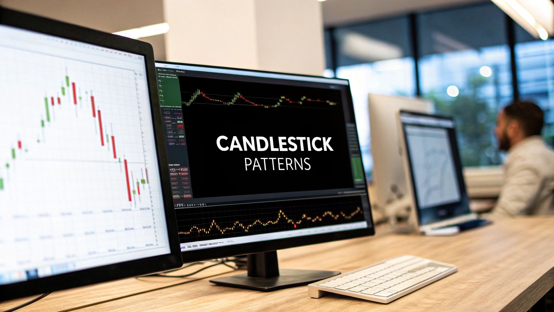
Japanese Candlestick Patterns Ultimate Guide
Japanese candlestick patterns aren't just squiggles on a chart. Think of them as a visual story of the battle raging between buyers (bulls) and sellers (bears). Each candle, formed by the open, high, low, and close prices, gives you a snapshot of market psychology, making them a true cornerstone of modern technical analysis.
The Trader's Story Behind Candlestick Charts
Before we get into the nitty-gritty of dojis and hammers, it's crucial to understand where this stuff even comes from. The story of Japanese candlestick patterns doesn't start on a flashy trading floor or with a supercomputer. Nope. It begins way back in 18th-century Japan with a legendary rice merchant named Munehisa Homma.
Homma was more than just a rice trader; he was a student of the market itself. He figured out that while supply and demand were obviously important, the price of rice was also massively swayed by the emotions of other traders. The collective fear, greed, and hesitation of the crowd created visible, repeatable patterns.
Homma’s great discovery was that there was a link between price and the emotion of traders. He understood that when emotions played a part in the market, a disparity between the true value and the price of rice occurred.
This was a game-changing realization. He started tracking the open, high, low, and close prices for each day, essentially creating the first-ever candlestick charts. This gave him a massive edge, letting him read the emotional temperature of the market and anticipate what was coming next.
From Feudal Japan to Wall Street
For centuries, this powerful way of looking at markets was a closely-guarded secret in Japan. It wasn’t until the late 20th century that the Western world got a peek behind the curtain, thanks to an analyst named Steve Nison. He stumbled upon this method, studied it obsessively, and finally brought candlestick charting to a global audience.
Nison's work was the bridge between East and West. He showed how this centuries-old technique could be applied to modern financial markets with incredible results. Suddenly, traders had a tool that did more than just spit out prices—it visualized the human story driving them.
- Stocks: Traders could now literally see the tug-of-war between bulls and bears.
- Forex: The psychology driving currency pairs became much clearer and easier to read.
- Commodities: The same principles Homma used for rice worked just as well for gold and oil.
- Crypto: Even in the wild west of crypto, the human emotions of fear and greed are still the main event.
The Enduring Power of Market Psychology
Japanese candlestick charting was pioneered in 18th century Japan by Homma Munehisa, who saw how market psychology moved prices. It exploded in the West after Steve Nison's groundbreaking book in 1991 showed traders just how powerful a predictive tool it could be. Today, candlesticks are a standard-issue tool for traders across stocks, forex, commodities, and indexes worldwide. You can dive deeper into the complete history of candlestick patterns and their journey to modern trading floors.
The reason these patterns have stuck around for hundreds of years is simple: they're based on human nature, which never really changes. Technology evolves, markets shift, but the core drivers of fear and greed are timeless. When you learn to read these patterns, you're learning to read the collective mind of the market—a skill that's every bit as valuable today as it was in the rice fields of ancient Japan.
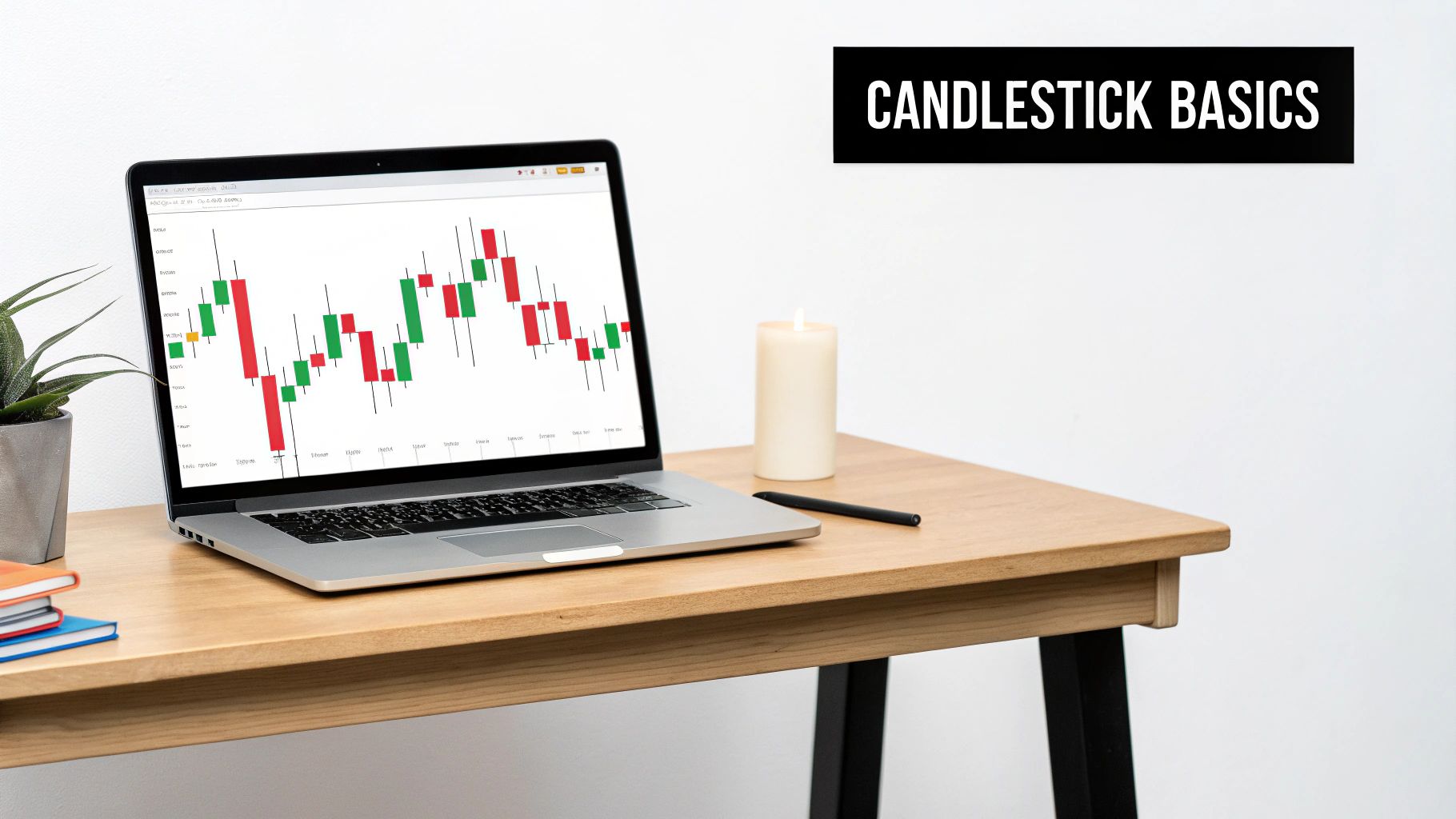
How to Read the Story in a Single Candlestick
Before you can spot complex Japanese candlestick patterns, you first need to learn the basic alphabet. Think of each individual candle as a self-contained story—a visual snapshot of the battle between buyers and sellers over a specific timeframe.
It’s like a single frame in the entire movie of the market.
At its core, every single candlestick is built from just four key prices: the open, high, low, and close (OHLC) for a given period. It doesn't matter if you're looking at a five-minute chart or a weekly chart; the principle is exactly the same.
The "story" of each candle comes from its two main parts: the body and the wicks. Getting a feel for these is your first step toward reading price action like a seasoned pro.
Decoding the Candlestick Body
The thick, solid part of the candlestick is called the real body. This shows you the distance between where the price opened and where it closed. Its color and size tell you the most critical piece of information: who won the battle for that session.
- Green (or White) Body: This is a bullish candle. It forms when the closing price is higher than the opening price. In this period, the buyers (bulls) were in charge and successfully drove the price up.
- Red (or Black) Body: This is a bearish candle. It forms when the closing price is lower than the opening price. Here, the sellers (bears) took control and pushed the price down.
The length of the body is also a massive clue. It tells you about the conviction behind the price move. A long green body screams aggressive buying power, while a long red body signals that sellers were completely dominant. A tiny body? That shows a much tighter fight, with neither side gaining much ground.
A candlestick chart is a language. If you understand the language, the market will speak to you. The body of the candle is the headline—it tells you who was in charge.
The Tale of the Wicks
The thin lines that stick out from the top and bottom of the body are known as wicks or shadows. These are absolutely crucial because they show the full drama of the trading session—the highest and lowest points the price hit before the candle finally closed.
They tell the story of the skirmishes that were fought but ultimately not won by either side.
To help you get comfortable with these parts, here's a quick breakdown of a candle's anatomy.
Anatomy of a Candlestick
| Component | What It Represents |
|---|---|
| Real Body | The price range between the open and close. Shows who won the session (buyers or sellers). |
| Upper Wick | The highest price reached during the period. Represents the peak buying enthusiasm. |
| Lower Wick | The lowest price reached during the period. Represents the peak selling pressure. |
| Color | Indicates the direction of the net price move (Green/Bullish = Up, Red/Bearish = Down). |
Once you start looking for them, these components tell a rich story.
Imagine seeing a candle with a small body but a very long upper wick. This is a fascinating signal. It tells you that buyers tried their best to rally the price much higher, but sellers stormed in and smacked it all the way back down near where it opened. The bulls attempted a major advance, but they were decisively rejected.
Likewise, a long lower wick tells you that sellers tried to sink the price, but buyers jumped in with enough force to prop it up, pushing the price back toward the top of its range.
Each wick is a footprint left behind by the struggle between market forces. They give you priceless clues about shifting momentum and potential turning points. When you combine the story of the body with the narrative from the wicks, you start to understand the raw market psychology behind every single bar on your chart.
Decoding Bullish Reversal Patterns
Alright, you've learned how to read the story inside a single candle. Now it’s time to start stringing them together to find powerful, actionable patterns in the market. We'll kick things off with the patterns that give hope to traders who've been patiently watching a market fall: bullish reversal patterns.
These specific Japanese candlestick patterns show up during a clear downtrend. They’re a huge clue that the sellers are getting tired and the buyers are finally stepping up to the plate, potentially ready to drive the price back up. Think of yourself as a price action detective; you're looking for signs that the balance of power is about to shift.
This infographic gives you a quick visual on the relative strength of the bullish patterns we’re about to cover.
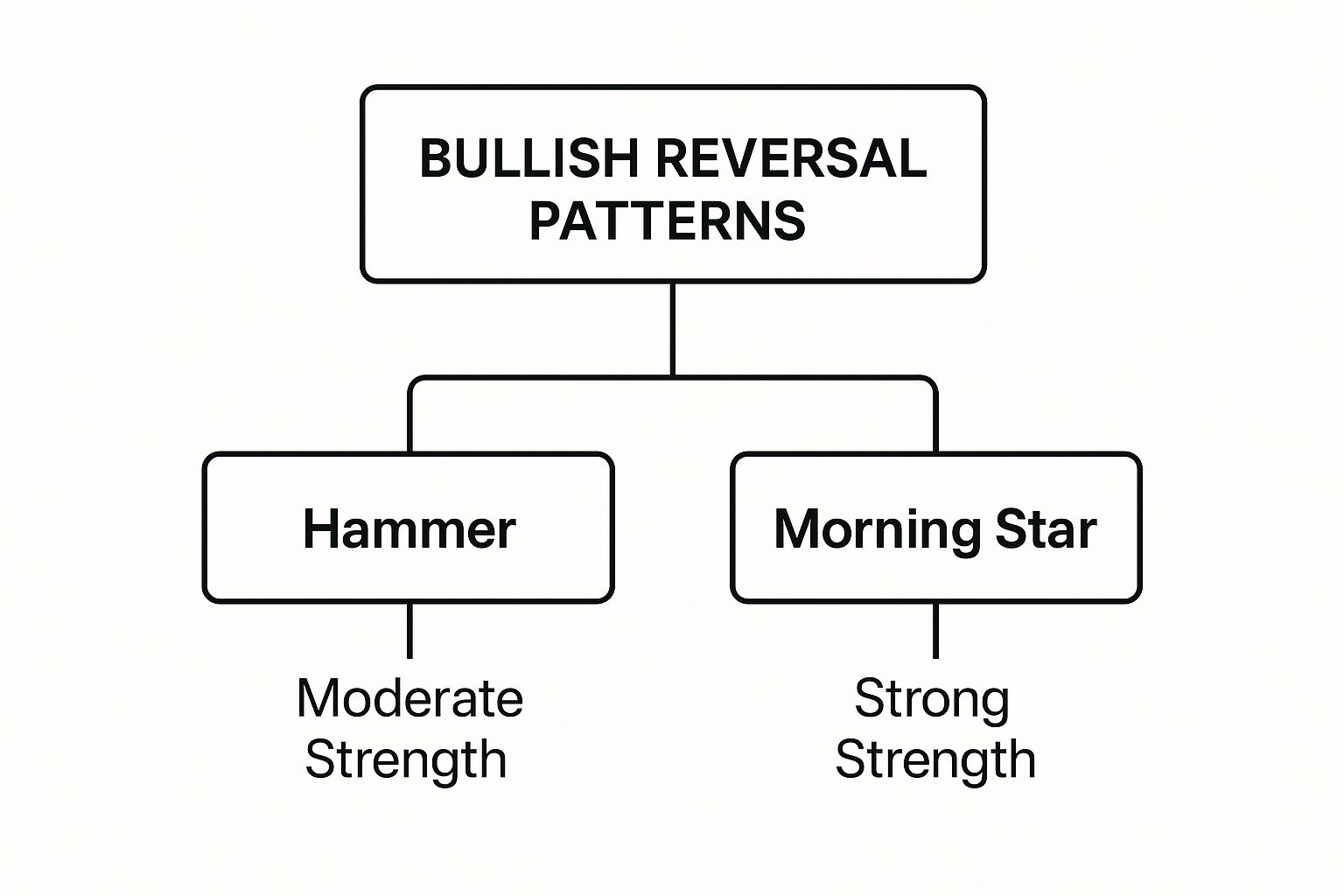
As you can see, some patterns pack more of a punch than others. A multi-candle formation like the Morning Star often carries more weight than a single candle like a Hammer. It all comes down to the story they tell.
The Hammer: A Sign of Buyer Resilience
The Hammer is easily one of the most famous single-candle bullish reversal patterns out there. It paints a vivid picture of sellers trying to slam the price down to new lows, only to get completely rejected by a surprise wave of buyers.
For a candle to truly be a Hammer, it needs to check these boxes:
- It has to show up during a clear downtrend.
- The real body is small and sits at the top of the candle's range.
- There's little to no upper wick—a shaven head is best.
- The lower wick must be at least twice the length of the real body.
Picture this: A stock has been bleeding for days, with sellers firmly in command. They try to push it down again, but this time, something's different. Buyers watching from the sidelines see the lower price as a steal and jump in with force. This buying frenzy soaks up all the selling pressure, rocketing the price all the way back up to close near its opening price.
The long lower wick of the Hammer is everything. It’s the battleground where sellers made their final push but were ultimately overpowered by buyers before the trading session ended.
The color of the Hammer’s body can be red or green. However, a green body is considered a bit more bullish because it shows that buyers not only fought back against the lows but also managed to push the close above the open.
The Bullish Engulfing Pattern: A Decisive Takeover
If the Hammer shows a rejection of lower prices, the Bullish Engulfing pattern shows a complete and total takeover by the buyers. This is a two-candle pattern that tells an even more powerful story of a potential turnaround.
Here’s how it plays out:
- The market is in an established downtrend.
- The first candle is a bearish (red) one, continuing that downward move.
- The second candle is a big, bold bullish (green) candle that completely "engulfs" the entire body of the previous red candle.
The psychology here is incredibly strong. The first candle confirms that sellers are still in the driver's seat. But on the very next session, the buyers step in with such overwhelming force that they don't just erase the previous day's losses—they blow past them. It’s a sudden and dramatic shift in sentiment. If you want a deeper dive, you should definitely learn how to trade the Bullish Engulfing pattern effectively, as many traders consider it one of the most reliable price action signals.
The sheer size of that engulfing candle screams buying pressure. It suggests the bears were caught completely off guard and a new uptrend could be just around the corner.
The Morning Star: A Beacon of Hope
So, the Hammer is resilience and the Bullish Engulfing is a takeover. What about the Morning Star? I like to think of it as a clear beacon of hope after a long, dark night. This is a three-candle pattern that delivers one of the strongest bullish reversal signals you'll find.
The pattern unfolds in three acts:
- The Bearish Candle: The first candle is a long red one, confirming that the downtrend is still in full swing and sellers are dominant.
- The Star: The second candle is a small-bodied candle (it can be red, green, or even a Doji) that ideally gaps down from the first one. This "star" represents a moment of pure indecision where the selling pressure has stalled.
- The Bullish Candle: The third candle is a strong green candle that closes well into the body of the first red candle—at least past the halfway mark.
This sequence tells a full story. The first candle is despair for the bulls. The second is uncertainty, a pause in the attack. And the third is the triumphant return, confirming that buyers have seized control with conviction. It’s the "morning" arriving after the "night" of the downtrend.
Because it takes three full trading sessions to form, its signal is often considered more reliable than patterns that form in just one or two candles.
Identifying Key Bearish Reversal Patterns
Just like bullish patterns can signal a market bottom, their bearish cousins are the warning signs that a top might be just around the corner.
After a long, powerful uptrend, you have to be on high alert. You're watching for any sign that the buying frenzy is finally losing its legs. These key Japanese candlestick patterns are the market's way of whispering that sellers are starting to wrestle back control.
These setups are most powerful when they show up after a significant run-up in price. Spotting them in a choppy, sideways market doesn't carry nearly the same weight. Context is everything. You're looking for the story of bullish exhaustion and the first real evidence of a bearish takeover.
The Shooting Star: A Failed Rally Attempt
The Shooting Star is the classic sign of a failed rally. It’s a single-candle pattern that paints a dramatic picture of buyers making one last, desperate push higher, only to be smacked down by a wall of sellers.
Think of it as the final gasp of optimism before reality kicks in.
To be a true Shooting Star, a candle needs these features:
- A small real body hanging out at the bottom of the trading range.
- A long upper wick that's at least twice the length of the body.
- Little to no lower wick. This creates what traders call a "shaven bottom."
The story this candle tells is what makes it so powerful. The session opens, and bulls, still riding the high of the uptrend, shove the price way up. But at these new, lofty prices, sellers come out in force, seeing an overvalued market. They slam the price all the way back down, forcing it to close near where it opened. This rejection is a huge red flag that momentum has shifted.
The Bearish Engulfing Pattern: A Hostile Takeover
While a Shooting Star shows rejection, the Bearish Engulfing pattern shows a full-blown hostile takeover by the sellers. It’s a dominant two-candle pattern that often signals a very sharp and immediate reversal in market mood.
The story plays out over two days:
- The market is in a clear uptrend. The first candle is a solid green (bullish) one, continuing the positive momentum.
- The second candle is a massive red (bearish) one. It opens higher than the previous close but then craters, completely "engulfing" the entire body of the first candle.
The psychology here is impossible to ignore. Bulls start the day feeling good enough to gap the price up, but that confidence vanishes in a flash. Sellers jump in with so much force that they don't just erase the prior day's gains—they drive the price much lower. This pattern screams that the bears are now in charge.
Statistical analysis backs up the power of these patterns. One study found that bearish engulfing patterns led to a negative return the next day about 58% of the time, giving a real edge over a coin flip. For a deeper dive, you can check out the full research paper on candlestick effectiveness.
The Evening Star: The Onset of Darkness
If the Shooting Star is a warning shot, the Evening Star is the confirmation that night is falling on the uptrend. This is a highly reliable three-candle bearish reversal pattern that tells a more complete story of a market topping out. It’s the bearish brother of the Morning Star.
The pattern unfolds in three acts:
- The Bullish Candle: The first candle is a long green one, confirming the uptrend is still chugging along and buyers are feeling great.
- The Star: The second candle is a small-bodied candle (it can be red, green, or even a Doji) that gaps up from the first. This "star" marks a critical moment of indecision where the buying pressure has completely stalled.
- The Bearish Candle: The third candle is a strong red one that closes deep into the body of the first green candle, ideally past its halfway mark. This confirms that sellers have taken over.
The Evening Star's power comes from this clear narrative. You see the peak of bullish excitement (candle one), the following uncertainty and total loss of steam (candle two), and the final, decisive takeover by the bears (candle three). Because this story unfolds over three sessions, the signal is considered much more robust than a single-candle pattern. It’s a clear sign the party is over.
Many of these reversal patterns, like the Shooting Star, are variations of what we call a pin bar. A pin bar’s long wick simply shows a sharp rejection of a certain price level. If you want to master this specific setup, take a look at our detailed guide to trading the pin bar candlestick for more advanced strategies.
Recognizing Trend Continuation and Indecision
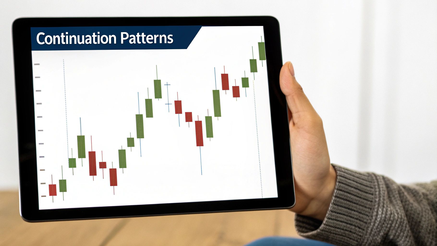
While the big, dramatic reversal patterns tend to grab all the attention, they aren't the only story the candles are telling. Some of the most practical Japanese candlestick patterns are the ones that whisper, not shout. They signal that the market is just taking a breather before continuing its journey, or that it's hit a wall of pure indecision.
Ignoring these more subtle signals is a classic rookie mistake. They give you critical context, helping you tell the difference between a real trend change and just a temporary pit stop. Learning to read these nuances is what separates the chart-watchers from the actual price action traders.
Patterns That Signal a Pause, Not a Stop
Continuation patterns are your best friend in a strong trend. They suggest the dominant momentum is still very much alive, even if it doesn't look like it at first glance. These patterns usually pop up mid-trend and look like a small consolidation before the primary direction comes roaring back to life.
Think of it like a marathon runner slowing to a walk through a water station. They haven't quit the race; they're just rehydrating for the next big push.
A great example of this is the Rising Three Methods. This is a bullish continuation pattern that plays out in three acts:
- Act I: A long, powerful green candle appears, confirming the uptrend is in full swing.
- Act II: This is followed by a series of 2-4 small red candles. The key here is that they all trade within the range of that first big green candle. This is the pause.
- Act III: A final, strong green candle bursts through, closing above the high of the very first candle. This is the signal that the bulls have refueled and are back in charge.
The bearish version, the Falling Three Methods, tells the same story but in reverse during a downtrend. A big red candle is followed by a few weak green candles that can't break its range, right before another powerful red candle sends the price tumbling to new lows.
The Art of Reading Indecision
Now we move from a brief pause to a full-on stalemate. Indecision patterns are signs that the market has reached an equilibrium point. Neither the bulls nor the bears can gain an edge, and the next move is truly up in the air. These are the moments when smart traders know to wait for more clues.
The most famous indecision candle of all is the Doji. A Doji is a candle with an extremely thin body—or sometimes no body at all. This means the open and close prices were almost exactly the same. It often looks like a cross or a plus sign.
A Doji represents a perfect tie in the tug-of-war between buyers and sellers. The price might have swung wildly up and down during the session, creating long wicks, but it ultimately closed right back where it started. It’s the very picture of market uncertainty.
The meaning of a Doji, however, is all about context. If one appears after a long, charging uptrend, it’s a major red flag that the bulls have run out of steam. But if a Doji shows up in the middle of a messy, sideways market, it’s mostly just noise and doesn't tell you much.
Spinning Tops and Market Confusion
A close cousin to the Doji is the Spinning Top. This candle has a small real body with long upper and lower wicks that are roughly the same size. Just like the Doji, it shows a fierce battle where neither side could land a knockout blow by the closing bell.
The main difference is that a Spinning Top's body is a bit fatter than a Doji's, but the psychological message is identical: the market is confused. Spotting a string of Spinning Tops or Dojis points to a period of consolidation. This can be a goldmine of information, as these quiet periods often come right before a massive breakout. Mastering these subtleties is a huge part of learning how to trade with candlestick charts like a pro.
In the end, continuation and indecision patterns are all about cultivating patience. They tell you when a trend is likely to keep running, and just as importantly, when you should sit on your hands and wait for the market to make up its mind.
Common Questions About Trading Candlestick Patterns
Even after you get a decent handle on the individual patterns, a lot of practical questions pop up the moment you try to use Japanese candlestick patterns on a live chart. Moving from a textbook example to the real world is a whole different ball game.
Let's tackle some of the most common questions I hear from traders. My goal here is to give you clear, direct answers to help you navigate the common hurdles and use these powerful signals the right way—as part of a complete trading system, not just a standalone trick.
How Reliable Are Candlestick Patterns on Their Own?
This is the big one. While many patterns absolutely give you a proven statistical edge, no single candlestick formation is a magic bullet. Their real power is only unlocked through context.
Think about it: a Hammer or a Bullish Engulfing pattern is interesting on its own. But when it forms right at a major support level you've already marked, or when it's confirmed by a huge spike in trading volume? Now that's a high-probability signal.
Think of a candlestick pattern as a key signal, not a complete strategy. It's the market telling you to pay close attention, but you must look for other clues to confirm the story before you act. Always seek confirmation.
For instance, if you spot a bullish reversal pattern that lines up perfectly with an oversold reading on an oscillator like the RSI, you've got a much stronger case for a potential trade.
What Is the Best Timeframe for Candlestick Analysis?
One of the beautiful things about candlestick analysis is that the patterns are fractal. That just means they show up on every single timeframe, from a one-minute chart all the way to a monthly chart.
So, the "best" timeframe isn't a fixed rule; it's dictated entirely by your personal trading style.
- Day Traders: You'll be living on the 5-minute and 15-minute charts, looking for immediate signals to get in and out quickly.
- Swing Traders: Your home base will be the daily and 4-hour charts. You're hunting for patterns that can support trades lasting several days or even weeks.
- Long-Term Investors: You'll be scanning the weekly and monthly charts to spot major shifts in market sentiment over a much wider horizon.
The patterns mean the same thing no matter where you see them. What changes dramatically is the duration and size of the move that follows. A Pin Bar on a 5-minute chart might lead to a 20-pip move, while the same pattern on a weekly chart could signal a trend change lasting for months.
Do Candlestick Patterns Work for All Markets?
Yes, absolutely. The reason they're so universal is that they aren't just squiggles on a screen. They are a direct visualization of raw human psychology—the timeless battle between greed and fear.
That emotional tug-of-war is the engine that drives all liquid, freely-traded markets.
It doesn't matter if you're trading Bitcoin, the EUR/USD forex pair, or Apple stock. As long as a market is driven by buyers and sellers making emotional decisions, candlestick patterns will remain an incredibly effective tool for reading sentiment and anticipating where the price might go next.
At Colibri Trader, we teach you how to master these price action signals without relying on a mess of confusing indicators. Transform your trading performance with our proven, action-based programs. Start your journey with Colibri Trader today.