


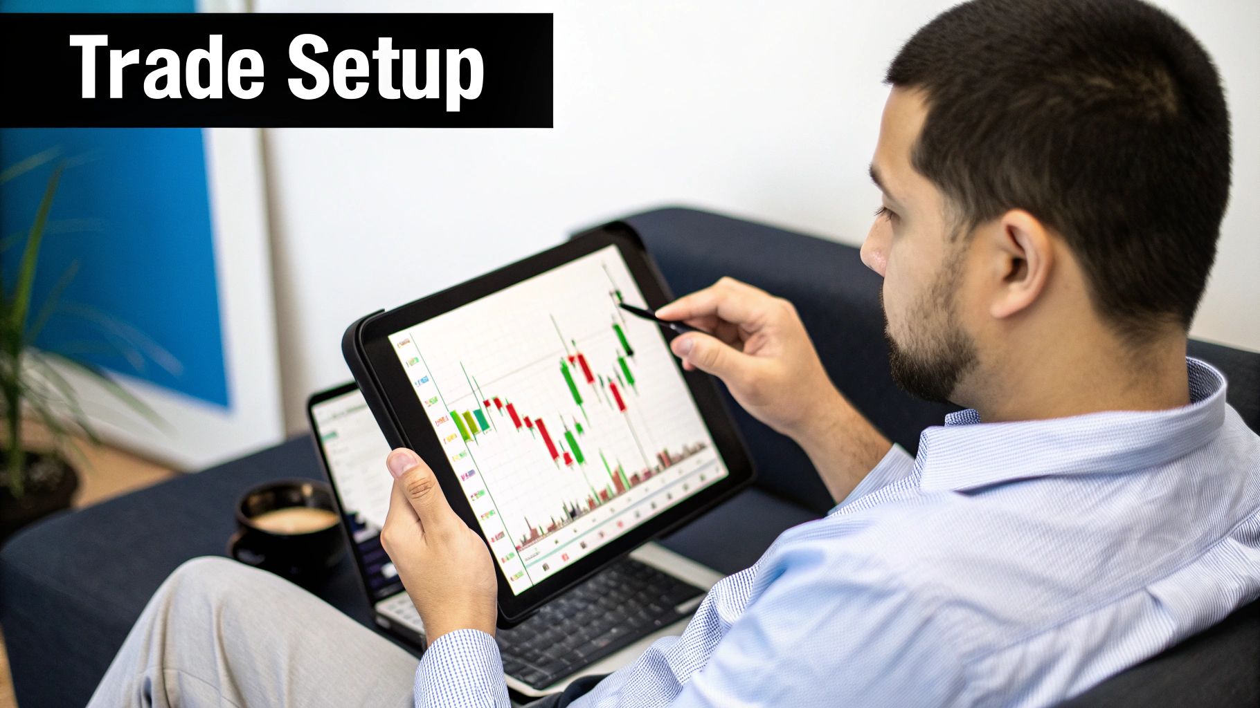
Understanding Candlesticks Charts: A Trader’s Essential Guide
Think of candlestick charts as the market’s own visual language. Every single candle is telling you a story—a blow-by-blow account of the fight between buyers (bulls) and sellers (bears) over a specific time period. The candle’s color, its body, and its wicks all give you clues about who’s winning and where the price might be headed next.
How To Read A Candlestick Chart
Before you can spot complex patterns that signal major market moves, you have to learn the alphabet first. In trading, the individual candlestick is the most basic building block of your entire analysis. I want you to see each one not as a boring data point, but as a miniature story about market sentiment.
A single candle packs a ton of information into one simple shape. It captures four crucial data points: the open, the close, the high, and the low for that session. This information is what gives traders such a quick, intuitive feel for what’s happening. It’s no surprise they became the go-to tool for technical traders almost as soon as they were introduced to the West.
To help you get a handle on the parts of a candle, here's a quick breakdown of what each component means.
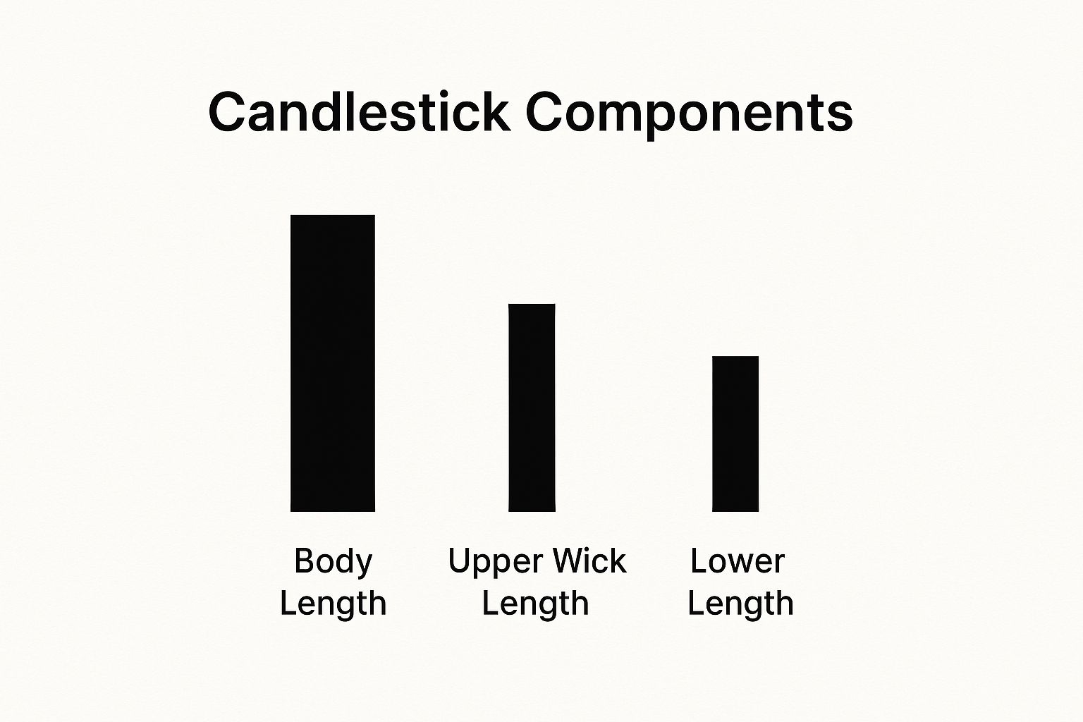
Anatomy of a Candlestick
| Component | What It Represents | Market Implication |
|---|---|---|
| Real Body | The range between the opening and closing price. | A long body shows strong, decisive momentum. A short body signals weakness or indecision. |
| Upper Wick | The highest price point reached during the period. | A long upper wick suggests buyers tried to push price up but sellers forced it back down. |
| Lower Wick | The lowest price point reached during the period. | A long lower wick indicates sellers tried to drive price down but buyers stepped in and pushed it up. |
| Color | The direction of the price movement from open to close. | Green (bullish) means the close was higher than the open. Red (bearish) means the close was lower. |
Memorizing these parts is your first step. Now, let’s see how they tell a story.
The Story Told By Color
The first and fastest clue you get from a candle is its color.
- A green (or white) candle is bullish. This tells you the closing price was higher than the opening price. Buyers took control and pushed the price up. Simple as that.
- A red (or black) candle is bearish. This means the closing price was lower than the opening price. In this session, sellers were the dominant force.
Just by glancing at the colors across a chart, you can immediately feel the market’s pulse—is the mood optimistic (bullish) or pessimistic (bearish)?
Decoding The Body And Wicks
This is where the real art of reading price action comes in. The body and wicks add the crucial details to the story the color started. The body shows you the core battle, while the wicks reveal the emotional extremes of the fight.
The real power of a candlestick lies in the relationship between its components. A long body suggests strong momentum, while long wicks indicate volatility and indecision.
For example, a long green body with tiny wicks tells you that buyers were in complete command from the opening bell to the close. On the other hand, a candle with a small body but very long upper and lower wicks—what we call a Spinning Top—screams indecision. Neither buyers nor sellers could gain any real ground, hinting that the market might be about to turn or just pause for a bit.
Getting this foundational skill right is absolutely essential. For a deeper dive, I recommend you check out this guide on how to read candlestick charts for beginners. Mastering this is the only way to build a solid price-action strategy that works.
The Trader Who Read Market Emotions
To really get a handle on candlestick charts, we have to jump in a time machine. Forget the blinking screens and algorithmic trading for a minute. We're going way back to 18th-century Japan, where this whole method was dreamed up by a legendary rice trader.
This isn't some modern, complex invention. It’s a story about a man named Munehisa Homma, who became a trading legend not just for his incredible wealth, but for his deep understanding of how markets really work.
In a time when information moved at a snail's pace, Homma figured something out that gave him a massive edge. He realized price wasn't just a number. It was a story. A story driven by the raw, collective emotions of every trader in the market—their greed, their fear, and their hesitation.
The Psychology of Price
Homma’s genius was in seeing that he could track these emotional tides visually. He knew that human reactions, especially under pressure, tend to repeat themselves. A market gripped by panic selling looks a whole lot different than one surging with confident buying.
So, he created a system to capture that emotional narrative.
Homma's big idea was simple but powerful: market psychology and price are two sides of the same coin. By visualizing what price was doing, he could literally read the emotional temperature of the market.
This was a game-changer. Instead of just noting the closing price of rice each day, he started tracking four key data points: the open, the high, the low, and the close. These four elements became the building blocks for the very same candlestick charts we use on our screens today.
His methods, born at the Osaka Stock Exchange during the Edo period, let him anticipate major market shifts with uncanny accuracy. He even wrote about his system in his 1755 book, The Fountain of Gold – The Three Monkey Record of Money, one of the earliest known books on market psychology. You can learn more about the brief history of candlesticks on TradingView.
This backstory is so important because it proves candlestick patterns aren't just random shapes. They are a visual record of human behavior that has held true for centuries. The same emotional forces that drove rice prices back then are what move stocks, forex, and crypto markets today. It’s a timeless tool because human nature doesn’t really change.
Identifying Bullish Reversal Patterns
Alright, now that you can read the story of a single candle, it's time to start seeing entire chapters in the market's narrative. Bullish reversal patterns are specific formations that can signal a downtrend is running out of steam and a new uptrend might be starting. Think of them as the first glimmers of dawn after a long, dark night.
These patterns aren't just random shapes on a chart. They're visual proof of a critical power shift. After a period where sellers (the bears) have been pushing prices down, these patterns show that buyers (the bulls) are stepping up, absorbing all the selling pressure, and finally starting to take control.
Spotting these signals is a core skill in reading candlestick charts. The trick is to find them in the right context—specifically, after a clear price drop. When one of these patterns forms near a major support level, its reliability can increase dramatically.
The Hammer: A Sign of Buyer Rejection
One of the most classic and easy-to-spot bullish signals is the Hammer. It's a single-candle pattern that often shows up at the bottom of a downtrend, and it looks exactly like its namesake.
A Hammer has a small real body at the top of the candle and a long lower wick that's at least twice the size of the body. You want to see little to no upper wick. The body can be red or green, but a green body is considered a bit more bullish.
The psychology behind this is powerful. During the trading session, sellers were initially in full control, shoving the price down significantly, which creates that long lower wick. But before the session closed, a strong wave of buying pressure came in, rejecting those lower prices and driving the asset to close right back near where it opened.
The Hammer tells a story of failed selling pressure. It shows that despite the sellers' best efforts to continue the downtrend, buyers stepped in with enough force to reverse all the intraday losses. It’s a huge clue that market sentiment might be turning around.
This visual helps break down how the different parts of a candle tell you who's winning the fight.
As you can see, that long lower wick on a Hammer is a clear signal of buyer rejection—and that's the whole secret to this pattern's power.
The Bullish Engulfing: A Power Play by Buyers
If the Hammer is a sign of rejection, the Bullish Engulfing pattern is a show of outright dominance. This is a two-candle pattern, and it’s a much more aggressive signal that buyers have completely wrestled control away from the sellers.
You'll spot this pattern when a large green (bullish) candle completely "engulfs" the real body of the smaller red (bearish) candle that came before it.
Here’s the story it tells:
- The first candle is bearish, making it look like the downtrend is business as usual.
- The second candle opens lower than the previous close but then explodes upward, closing much higher than the open of the previous candle. This move completely wipes out the prior day's selling.
This fast and brutal reversal shows a massive shift in momentum. The sellers thought they were in charge, but the buyers stepped in with so much conviction that they didn't just stop the bleeding—they established a powerful new move to the upside.
The Morning Star: A Hopeful New Beginning
The Morning Star is a three-candle pattern that signals a more gradual, and often more confirmed, bullish reversal. It represents a slow and steady transition from bearish despair to bullish hope.
This pattern plays out in three acts:
- Candle 1: A Large Bearish Candle. The downtrend still looks strong and healthy.
- Candle 2: A Small-Bodied Candle (or a Doji). This is the moment of pure indecision. The powerful downtrend has stalled, and neither the bulls nor the bears are in control. This little candle often gaps down from the first one.
- Candle 3: A Large Bullish Candle. Buyers finally take decisive control, pushing the price up and closing well into the body of the first bearish candle. This confirms the reversal.
The Morning Star is so potent because it shows you the entire journey of a market bottom: the final exhaustive push down, the moment of uncertainty, and then the decisive takeover by the bulls. Seeing this pattern is a strong sign that the market's mood has fundamentally shifted from negative to positive.
To help you quickly identify these key bullish signals, here’s a handy cheat sheet summarizing what to look for and what they mean.
Bullish Reversal Pattern Cheat Sheet
| Pattern Name | Appearance | Psychology Behind It |
|---|---|---|
| Hammer | Small body at the top, long lower wick (at least 2x the body), little to no upper wick. | Sellers tried to push the price down, but buyers rejected the lower prices and drove it back up, showing strength. |
| Bullish Engulfing | A large green candle whose body completely covers or "engulfs" the body of the previous smaller red candle. | A sudden and powerful shift in control. Buyers overwhelmed sellers, completely reversing the previous session's losses. |
| Morning Star | A three-candle pattern: a big red candle, followed by a small-bodied candle, followed by a big green candle. | A story in three parts: Sellers are in control, then indecision hits, then buyers take over with conviction, confirming the reversal. |
Keep this table in your back pocket. As you get more experienced, you'll start spotting these formations almost instinctively, giving you a real edge in anticipating when a downtrend might be ready to turn.
Recognizing Bearish Reversal Signals
Just like a skilled sailor reads the clouds for signs of a storm, a smart trader learns to read the charts for hints of market weakness. Once you know how to spot bullish moves, the next logical step is to master their bearish counterparts. These patterns are your early warnings that an uptrend is running out of steam, crucial clues that the momentum is about to shift from buyers to sellers.
What goes up, must come down. Bearish reversal patterns are simply the market's way of showing you this shift is happening. They usually show up at the peak of an uptrend and carry the most weight when they form near a known resistance level. Spotting these isn't just about finding chances to short the market; it’s also a vital risk management skill. It helps you protect your profits and get out of long trades before a downturn wipes out your gains.
The Shooting Star: A Warning Shot From Sellers
Picture an uptrend as a powerful rocket launch. The Shooting Star is that exact moment the rocket hits its peak, hangs in the air for a second, and then starts to fall back to Earth. This single-candle pattern is the bearish twin of the Hammer and acts as a potent warning that the upward push is failing.
A Shooting Star has a small real body at the bottom of the candle, with a long upper wick at least twice the size of the body. You’ll see little to no lower wick. This shape tells a very specific story.
Buyers came into the session feeling strong, pushing the price way up and creating that long upper wick. But their rally didn't last. A huge wave of selling pressure hit the market, overpowering the buyers completely and driving the price all the way back down to close near where it opened. That failure to hold the high ground is a classic sign of weakness.
The Bearish Engulfing: An Aggressive Takeover
If the Shooting Star is a warning shot, the Bearish Engulfing pattern is an all-out declaration of war by the sellers. It’s a decisive, two-candle formation that signals a dramatic and often violent shift in market sentiment from bullish to bearish. There’s no ambiguity here—the sellers have seized control.
Here’s how it plays out:
- The first candle is a regular green (bullish) candle, making it look like the uptrend is continuing just fine.
- The second candle is a massive red (bearish) one that opens higher than the first candle's close but then plummets, completely "engulfing" the entire real body of the green candle before it.
The Bearish Engulfing pattern represents a major psychological blow. The initial optimism from the gap up gets totally wiped out by overwhelming selling, showing that the bears haven't just stopped the uptrend—they've forcefully reversed it.
This pattern is one of the most trusted reversal signals in trading because it leaves no doubt about who is in charge. The buyers' momentum has been completely swallowed by the sellers' aggression.
The Evening Star: The Twilight of an Uptrend
Just as the Morning Star signals a new dawn for the bulls, the Evening Star signals the arrival of night for an uptrend. It's a three-candle pattern that shows a more gradual—and often more reliable—transition from buying to selling pressure. Think of it as a story told in three acts.
- Act I: A Large Bullish Candle: The uptrend looks strong. Buyers are clearly in the driver's seat.
- Act II: A Small-Bodied Candle (or Doji): The market hits the brakes. Upward momentum stops cold, creating a small candle that screams indecision. Neither buyers nor sellers can gain an edge.
- Act III: A Large Bearish Candle: The sellers take over. This candle closes deep into the body of the first bullish candle, confirming the reversal is on and the bears are now in command.
The Evening Star is so highly regarded because it shows you the complete anatomy of a market top: the final burst of bullish confidence, the moment of peak uncertainty, and the decisive confirmation of a bearish takeover. When you see this pattern form after a long run-up, it’s a very strong signal that the trend is about to turn.
A Practical Framework for Chart Analysis
Spotting individual candlestick patterns is a great first step, but it’s just one piece of the puzzle. Real chart analysis is about putting all those pieces together to read the market’s story. Think of yourself as a detective. You need to combine multiple clues—the overall trend, key price levels, and the candlestick signals themselves—to build a solid case for a trade.
This section gives you a practical, step-by-step framework to go from just seeing patterns to actually analyzing live charts.
The core idea is to shift from a micro view to a macro one, and then back again. A big, powerful bearish engulfing pattern doesn’t mean much if it just pops up in the middle of nowhere. But what if that same pattern forms right at a major resistance level after a long, sustained uptrend? Now that’s a different story entirely. Its significance just multiplied tenfold. Context is everything.
This framework isn't a rigid set of rules. It’s a flexible process you can use to build a trading thesis in any market, whether it's stocks, crypto, or forex, because it’s built on the universal language of price action.
Step 1: Start With The Bigger Picture
Before you even think about hunting for individual patterns, you have to zoom out. The very first question you need to answer is: what is the overall market trend? Are prices generally climbing, falling, or just chopping sideways? Identifying the dominant trend gives you the essential context for everything that follows.
An easy way to do this is to look for a series of "higher highs and higher lows" in an uptrend, or "lower highs and lower lows" in a downtrend. This top-down approach helps ensure you’re trading with the market’s main momentum, not fighting against it.
Next, you need to identify the key battlegrounds on the chart. These are your support and resistance levels.
- Support: Think of this as a price floor. It’s an area where a downtrend is likely to stall because of a concentration of buyers. Price has a tough time breaking through it.
- Resistance: This is the opposite—a price ceiling. It’s an area where an uptrend often pauses because sellers are piling in, making it hard for the price to push higher.
Marking these horizontal levels on your chart is absolutely crucial. These are the hotspots, the locations where high-probability reversal patterns are most likely to show up and actually work.
A candlestick pattern is like a single word. The trend is the sentence, and the support or resistance level is the punctuation. You need all three to understand the message.
By mapping out the trend and these key levels first, you've created a map of the market. Now you know exactly where to start looking for the most important clues.
Step 2: Zoom In On High-Probability Zones
With your map drawn, it's time to zoom in and become a pattern hunter. But you’re not looking for patterns just anywhere. You’re looking for them specifically at the support and resistance zones you’ve already marked. This filtering process is what separates professional analysis from amateur guesswork.
If the price is climbing toward a major resistance level in an uptrend, you should be on the lookout for bearish reversal signals. This could be a Shooting Star, a Bearish Engulfing pattern, or an Evening Star. The appearance of one of these patterns at a key resistance zone is a powerful confirmation that sellers are stepping in.
On the other hand, if the price is dropping toward a strong support level, you need to be on high alert for bullish reversal patterns. A Hammer, a Bullish Engulfing, or a Morning Star tells you that buyers are defending that level and a bounce could be imminent.
Step 3: Wait For Confirmation And Execute
The final step is all about patience and discipline. A single pattern is a signal, not a command to trade. A lot of traders get into trouble by jumping the gun the moment a pattern forms. A much better approach is to wait for the very next candle to confirm the signal.
- For a bullish reversal: Let's say a Hammer forms at support. Don't trade yet. Wait for the next candle to be bullish (green) and to close above the Hammer's high. This proves that buyers have actually followed through.
- For a bearish reversal: After a Shooting Star appears at resistance, wait for the next candle to be bearish (red) and to close below the Shooting Star's low. This confirms that the selling pressure is real.
This simple confirmation step will help you filter out a ton of "false signals" and seriously increase the odds of a successful trade.
Combining this three-step framework with other techniques is a cornerstone of effective trading. You can learn more about building a complete strategy in this detailed guide on trading price action. At the end of the day, mastering candlestick charts is about learning how to weave these individual signals into a compelling story about where the market might be headed next.
Frequently Asked Questions About Candlesticks
As you start digging into candlestick charts, a few practical questions always pop up. It's totally natural. This section is here to give you straight answers to the most common things traders ask, helping you clear up any confusion and feel more confident when you're looking at a live chart.
Think of it as your quick-fire guide for those lingering doubts.
How Reliable Are Candlestick Patterns?
This is the big one, and the real answer isn't a simple yes or no. No single candlestick pattern is 100% reliable on its own. Their real power comes from context.
Think about it: a Hammer pattern showing up at a random price level doesn't tell you much. But what if that same Hammer forms right at a major support level you've already marked on your chart, especially after a long, grinding downtrend? Now that's a high-probability signal.
The reliability of a candlestick pattern isn’t baked into the pattern itself. It’s dramatically increased by where it appears on the chart and whether other factors, like volume and the overall trend, back it up.
You should always be looking for a confluence of signals. Combining a bullish reversal pattern with a key support level and then waiting for the next candle to confirm the move is how you seriously stack the odds in your favour.
What Is the Best Timeframe to Use for Candlesticks?
There's no single "best" timeframe. It comes down to your personal trading style and how long you plan to be in a trade.
- Day Traders: You'll likely live on the shorter timeframes like the 5-minute, 15-minute, or 1-hour charts. You need to see the intraday swings as they happen.
- Swing Traders: If you're holding trades for a few days or weeks, your focus will be on the 4-hour and daily charts to spot the more significant trends and reversal points.
- Position Traders: For those with a long-term view, the weekly and monthly charts are where you'll be looking to understand the big-picture story.
A great habit to get into is using multiple timeframes together. For example, you could identify the main trend on a daily chart, then zoom into a 1-hour chart to pinpoint a much more precise entry.
How Do Candlesticks Compare to Bar Charts?
Both charts give you the same four pieces of information: the open, high, low, and close. The key difference is that candlesticks give you a much more visual, intuitive feel for the price action.
That colored "real body" instantly tells you if the session was bullish or bearish. With a standard bar chart, you have to look a bit closer and do more mental work to figure that out.
This visual clarity is why so many traders I know prefer them. It's much easier to understand the emotional story behind candlestick patterns for beginners because the color and shape immediately communicate the sentiment in the market. When it comes to quickly sizing up the battle between buyers and sellers, candlesticks are simply more effective.
Do Professionals Really Use Candlestick Patterns?
Yes, absolutely. A lot of professional traders use candlestick analysis as a fundamental part of their technical toolkit. The key is that they don't use these patterns in a vacuum.
They integrate them with everything else they're looking at—support and resistance, moving averages, volume, you name it.
Pros value them because they provide quick, visual clues about market psychology and potential shifts in momentum. They're an indispensable tool in any serious trader's arsenal.
Ready to stop relying on confusing indicators and start reading the market like a pro? At Colibri Trader, we teach a straightforward, price-action based approach that works in any market condition. Take the first step towards transforming your trading performance today.