


How To Understand Candlestick Charts In Days Not Months
The Ancient Wisdom That Changed Modern Trading Forever
Imagine deciphering market sentiment using only basic line charts, missing the subtle cues of trader psychology. This was the reality before candlestick charts. This visualization technique wasn't developed on Wall Street, but rather in the 18th-century rice markets of Japan. This section explores how the need to understand market emotions birthed a charting method that remains relevant centuries later.
The origins of candlestick charts trace back to a rice trader named Munehisa Homma. Homma realized that price alone wasn't enough. The emotions behind buying and selling decisions held the key to predicting future price movements. His innovation? Visually represent the opening, high, low, and closing prices within a specific period. This created a "candlestick" that captured both the price range and the direction of movement. These charts were used to track and predict price movements on the Osaka Rice Exchange, considered by some to be the world's first organized futures market. Explore this topic further.
Why Candlesticks? A Visual Advantage
Homma's method proved incredibly effective, surpassing other charting methods of the time. Its success stems from the visual nature of candlesticks. They provide a quick, at-a-glance understanding of price action. A long green candlestick body, for instance, indicates strong buying pressure. Conversely, a long red body signals strong selling. This visual clarity lets traders quickly assess market sentiment and identify potential trading opportunities.
The "wicks" or "shadows" of the candlesticks offer further clues. Long upper wicks suggest rejection at higher prices, hinting at potential selling pressure. Long lower wicks indicate buying pressure at lower prices. This added information gives traders a deeper understanding of market dynamics within each period, refining their analysis. This detailed visualization of price action became a cornerstone of technical analysis, influencing how traders interpret market activity.
From Rice Paddies to Global Markets: The Enduring Legacy
The power of candlestick charts lies in their visual representation of market emotions. This offers a level of understanding still valuable in modern trading. While sophisticated algorithms and analysis tools now exist, the core principles of candlestick analysis remain largely unchanged. This enduring legacy testifies to the effectiveness of Homma's approach, allowing traders to interpret market sentiment in a unique way. By understanding the origins and visual language of candlestick charts, traders gain valuable insights into the psychological factors that drive market movements. This "ancient wisdom" remains a powerful tool in the modern trader's arsenal, contributing to informed decision-making and effective market analysis.
Decoding The DNA Of Every Candlestick Formation
Stop just looking at those colored bars and start truly reading them. Each candlestick offers a glimpse into the ongoing battle between buyers (bulls) and sellers (bears). This section will show you how to interpret these signals and unlock the valuable information hidden within each candlestick on a chart.
The Four Pillars Of Price: Open, High, Low, Close
Every candlestick represents four key data points: the opening price, the highest price reached, the lowest price reached, and the closing price. All of this occurs within a specific timeframe.
This timeframe could be anything from one minute to one month, depending on your chart settings. Understanding these four components is essential for understanding candlestick charts.
For example, a daily chart displays one candlestick for each day, summarizing the entire day's price action.
The Body: A Tale Of Strength and Direction
The "body" of the candlestick, the thick colored portion, visually represents the difference between the opening and closing prices. A green (or sometimes white) body indicates a bullish candle. This means the closing price is higher than the opening price.
A red (or black) body signifies a bearish candle, where the closing price is lower than the opening price. This visual cue allows traders to quickly assess whether buyers or sellers were dominant during that period.
The length of the body also provides important information. A longer body suggests stronger buying or selling pressure. A shorter body indicates indecision or consolidation.
The Wicks: Whispers Of Rejection and Support
Extending from the body are the wicks (also known as shadows or tails). These wicks represent the price extremes reached during the specified period.
The upper wick shows the highest price traded, while the lower wick shows the lowest price traded. Their length and position provide valuable insights into market dynamics.
For instance, a long upper wick on a red candlestick suggests buyers initially pushed the price higher, but sellers then took control, pushing it back down. This often signals potential resistance at that higher price level.
Conversely, a long lower wick on a green candlestick might mean sellers initially pushed the price lower, but buyers stepped in, pushing it back up. This can indicate potential support at that lower level.
To help illustrate the meaning of the different components of a candlestick, let's look at the following table:
Candlestick Components And Their Meanings
A comprehensive breakdown of each part of a candlestick and what market information it conveys
| Component | Description | Market Signal | What It Tells You |
|---|---|---|---|
| Body (Green) | Difference between opening and closing price; close > open | Bullish | Buyers were more dominant during this period |
| Body (Red) | Difference between opening and closing price; close < open | Bearish | Sellers were more dominant during this period |
| Long Body | Large difference between open and close | Strong Trend | Strong buying or selling pressure |
| Short Body | Small difference between open and close | Indecision | Potential consolidation or reversal |
| Upper Wick | Shows the highest price traded during the period | Potential Resistance | Buyers pushed price higher, but were rejected by sellers |
| Lower Wick | Shows the lowest price traded during the period | Potential Support | Sellers pushed price lower, but were rejected by buyers |
| Long Upper Wick on Red Candle | Significant difference between high and close | Strong Selling Pressure | Buyers were rejected at the high |
| Long Lower Wick on Green Candle | Significant difference between low and open | Strong Buying Pressure | Sellers were rejected at the low |
This table provides a quick reference for understanding the different parts of a candlestick and their potential interpretations. Remember, these are just potential interpretations and should be considered in conjunction with other technical analysis tools and indicators.
Putting It All Together: Building a Narrative From Candles
By understanding the relationship between the body and wicks, we can start to understand price action. A long green body with short wicks typically signifies strong bullish momentum. A long red body with short wicks usually indicates strong bearish momentum.
Candlesticks with long wicks, regardless of color, often signal indecision or potential reversals. For a more in-depth look at specific formations, check out this guide on candlestick patterns for beginners. You might also find this helpful: How to master candlestick patterns.
This knowledge helps traders interpret market sentiment, identify potential trading opportunities, and ultimately, make more informed decisions. This ability to "read" the story behind each candlestick is a key skill that distinguishes experienced traders.
When East Met West: The Trading Revolution Of The 1990s
Imagine Western markets before the 1990s. Traders relied heavily on basic bar charts, missing crucial information readily available in candlestick charts. This section explores the significant shift that occurred when these powerful tools, developed over centuries in the East, finally reached the West. Their introduction dramatically changed how traders analyze markets and understand price action.
The Introduction of Candlestick Charts to the West
Steve Nison, a technical analyst, is credited with introducing candlestick charts to Western audiences. His book, Japanese Candlestick Charting Techniques, published in the early 1990s, unveiled their potential. Before this, Western traders primarily used bar charts and other less visually informative methods. Nison’s work bridged a gap, bringing Eastern wisdom to Western trading practices, and highlighting the potential of candlestick charts to reveal market psychology.
Prior to the 1990s, few Western traders had even heard of candlestick charting. Surveys conducted in 1995 showed fewer than 10% of traders in the U.S. and Europe used them. However, by 2005, adoption had skyrocketed to over 70% among professional traders and analysts. This swift uptake underscores the profound impact of this new charting technique. Find more detailed statistics here.
The Irresistible Allure of Visual Information
The rapid adoption of candlestick charts wasn't by chance. Their visual nature made them immediately attractive. The colored bodies and wicks, also known as shadows, offer a concise picture of price action. They provide insights into market sentiment that bar charts simply could not match.
For instance, a long green candlestick body immediately indicates strong buying pressure. Conversely, a long red body signifies strong selling pressure. This visual clarity empowered traders to spot potential opportunities and make quicker, more informed decisions.
Advantages Over Traditional Charting Methods
Several key advantages propelled the shift to candlestick charts. They provide a more comprehensive view of price action, clearly displaying the open, high, low, and close prices within a specific timeframe. This visual representation of these four data points makes it easier to spot patterns and developing trends.
The color-coded bodies provide an immediate signal of price movement direction. The wicks, or shadows, extending from the bodies, offer important clues about potential support and resistance levels. This assists traders in anticipating price reversals and refining their strategies.
Shaping Modern Trading
The widespread adoption of candlestick charts has undeniably transformed modern trading. They are now a staple in technical analysis, integrated into virtually every trading platform. They are used by traders of all experience levels. The insights these charts provide have undeniably enhanced the sophistication of modern trading strategies. Despite the rise of advanced algorithms and technologies, candlestick charts remain incredibly valuable tools for interpreting market behavior.
High-Probability Patterns That Actually Work In Real Markets
Forget memorizing countless obscure candlestick patterns. Focus on proven formations that consistently signal market turning points and offer dependable trading opportunities. This section explores battle-tested patterns like the doji, hammer, shooting star, and engulfing formations. These formations have proven effective over decades of market analysis. However, simply identifying them isn't enough. We'll explore how to interpret these patterns within specific market conditions and manage risk effectively, avoiding common pitfalls.
The Doji: A Moment of Indecision
The doji pattern, where open and close prices are virtually identical, represents market indecision. It signals a potential momentum shift, as neither buyers nor sellers control the price. The doji's wicks provide additional context. A long-legged doji, with long upper and lower wicks, suggests significant uncertainty. A gravestone doji, with a long upper wick and no lower wick, hints at selling pressure. Conversely, a dragonfly doji, with a long lower wick and no upper wick, indicates potential buying pressure.
The Hammer and Shooting Star: Reversal Signals
The hammer and shooting star patterns look similar, with small bodies and long wicks. However, their position and context reveal different signals. The hammer, appearing at the bottom of a downtrend, has a long lower wick. This shows sellers initially pushed the price down, but buyers then stepped in, driving it back up, suggesting a potential bullish reversal. The shooting star, found at the top of an uptrend, is the opposite. Its long upper wick indicates buyers initially pushed the price up, only to be met with strong selling pressure, pushing it back down. This signals a potential bearish reversal.
Engulfing Patterns: A Shift in Power
Engulfing patterns involve two candlesticks where the second candle completely "engulfs" the first candle's body. A bullish engulfing pattern occurs when a small red candle is followed by a larger green candle that engulfs the red candle’s body. This demonstrates buyers overpowering sellers, suggesting a potential uptrend. A bearish engulfing pattern is the opposite: a small green candle followed by a larger red candle. This indicates sellers taking control, suggesting a potential downtrend.
The following infographic visualizes the occurrence rates of three common candlestick patterns: Doji (30%), Hammer (25%), and Engulfing (20%).
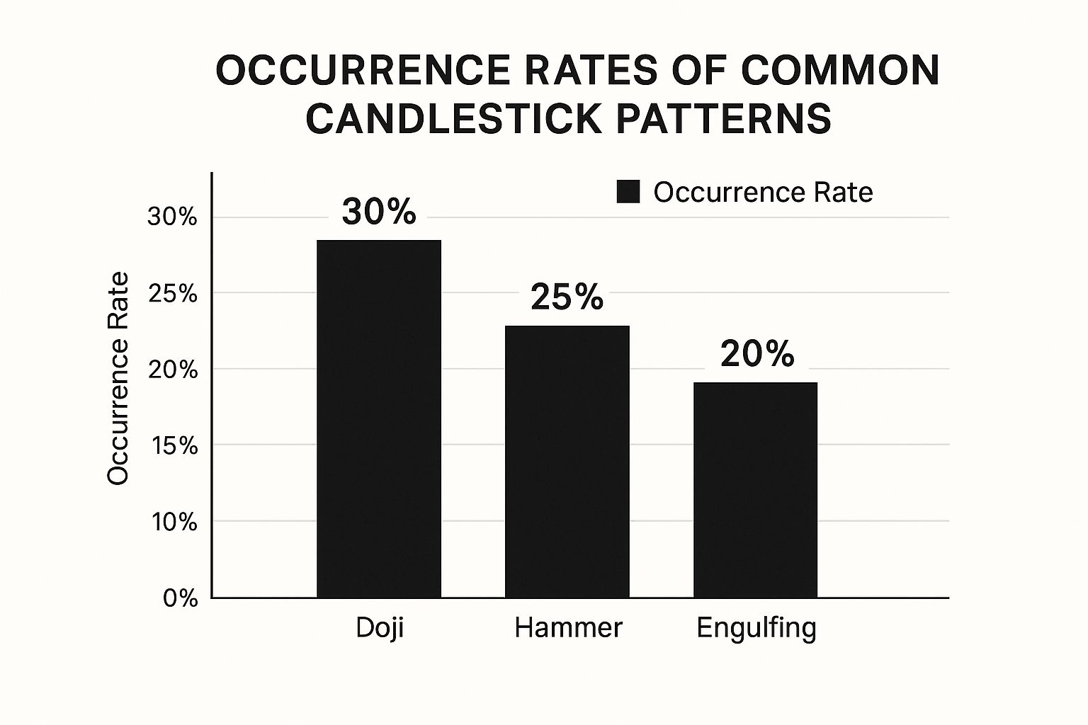
As the infographic shows, the doji pattern appears slightly more often than hammer and engulfing patterns. This can be useful for traders looking for potential trend shifts and market indecision. Remember, frequency doesn't guarantee predictive power. Interpret all patterns within the market context.
Context is Key: Combining Patterns With Other Indicators
While these patterns offer valuable signals, consider them alongside other factors, including volume, support and resistance levels, and overall market trends. For example, a high-volume hammer pattern is a stronger bullish signal than a low-volume one. Similarly, an engulfing pattern near a key support or resistance level is more significant.
The following table summarizes key characteristics of the discussed patterns:
High-Probability Candlestick Patterns Comparison: A detailed comparison of the most effective candlestick patterns, their success rates, and optimal trading conditions.
| Pattern | Market Signal | Success Rate | Best Time Frame | Key Confirmation |
|---|---|---|---|---|
| Doji | Indecision, Potential Reversal | Varies | Any | Volume, other indicators |
| Hammer | Bullish Reversal | Varies | Any | High volume, support level |
| Shooting Star | Bearish Reversal | Varies | Any | High volume, resistance level |
| Bullish Engulfing | Bullish Reversal | Varies | Any | High volume, break of resistance |
| Bearish Engulfing | Bearish Reversal | Varies | Any | High volume, break of support |
This table provides a quick reference for identifying and interpreting these patterns. Remember, success rates vary based on market conditions and other factors.
Combining candlestick analysis with tools like Fibonacci retracements, moving averages, or the Relative Strength Index (RSI) offers additional confirmation and refines trading decisions. This comprehensive approach to pattern recognition is crucial for effectively using candlestick charts to understand market movements. For more on the RSI, refer to the official RSI page on TradingView. Using these tools in conjunction with candlestick patterns significantly enhances trading effectiveness.
Reading The Market's Emotional Fingerprints
Understanding candlestick charts isn't just about identifying individual candles. It's about deciphering the psychological narrative they weave. Each candlestick acts like a snapshot of the emotional push and pull between buyers and sellers. Many traders, however, miss these critical cues. This section explores how various formations reflect shifting trader sentiment and market psychology. We'll examine advanced concepts that provide a more profound understanding of market mechanics.
Price Rejection Zones: Where Battles Are Won and Lost
Candlestick wicks, also called shadows, offer valuable clues about price rejection. For example, a long upper wick on a red candlestick suggests buyers initially pushed the price up, but sellers ultimately took control. This creates a potential resistance zone where future price increases may be rejected. Conversely, a long lower wick on a green candlestick indicates a potential support zone. To grasp how market sentiment shapes price action, consider how consumer preferences influence trends in areas like music streaming, as discussed in this Spotify Playlist SEO article. Just as listener choices drive playlist rankings, trader sentiment can sway market direction.
Exhaustion Signals: Recognizing When The Tide Turns
Certain candlestick formations act as exhaustion signals, hinting at a possible market reversal. A doji, a candlestick with nearly identical open and close prices, often appears at the end of a trend, signaling indecision. This pattern suggests the current trend might be weakening, and a reversal could be near. Similarly, a hammer pattern, a small body with a long lower wick, can signal a potential bullish reversal after a downtrend. It implies sellers initially pushed the price down, but buyers rallied, closing near the opening price.
Momentum Shifts: Catching the Wave Before It Breaks
Effective candlestick reading also involves recognizing momentum shifts. An engulfing pattern, where one candlestick completely envelops the previous one, indicates a potential shift in control. A bullish engulfing pattern, a large green candle following a smaller red candle, suggests buyers are taking charge and a potential uptrend might be emerging. For those interested in learning more about identifying momentum, How to master Pin Bar candlestick patterns offers valuable information on this specific pattern.
Volume and Context: The Missing Pieces of the Puzzle
Remember, candlestick analysis shouldn’t stand alone. Volume, the number of traded shares or contracts, provides important context. A candlestick pattern with high volume holds more significance than one with low volume, confirming the sentiment represented by the pattern. Also, consider the overall market context, including support and resistance levels and broader market trends.
Combining candlestick analysis with other technical indicators like moving averages or the relative strength index (RSI) can enhance your grasp of market psychology. These tools can confirm potential reversals, identify overbought or oversold conditions, and filter false signals. By mastering this interpretive art, you gain valuable market insights that basic technical analysis can't provide, leading to smarter trading decisions and potentially greater profits.
Your Complete Toolkit For Professional Candlestick Analysis
Ready to elevate your candlestick chart analysis? Understanding the available platforms and software is key to analyzing markets effectively. This section will help you choose the right tools, whether you're a beginner or seasoned trader. We'll explore popular and professional-grade options, highlighting their features and important considerations.
Charting Platforms: Your Analytical Command Center
Choosing a robust charting platform is essential for serious candlestick analysis. Several leading platforms offer comprehensive charting tools, real-time data, and powerful analytical features.
-
TradingView: Known for its extensive charting tools, indicators, and active community. TradingView offers a freemium model with basic charting functionalities available for free. Paid subscriptions unlock advanced features like custom indicators and real-time alerts.
-
MetaTrader (MT4/MT5): Widely used by forex traders, MetaTrader provides charting, technical indicators, automated trading (Expert Advisors), and a large user community. MT4 is the established version, while MT5 offers additional features and instruments.
-
Professional-Grade Platforms: For institutional or high-volume traders, platforms like Bloomberg Terminal and Refinitiv Eikon offer advanced analytics, in-depth market data, and sophisticated trading tools. These come with a higher cost, reflecting their extensive capabilities.
The right platform depends on your individual trading style, budget, and analytical needs.
Essential Features For Enhanced Analysis
Regardless of your chosen platform, certain key features are crucial for effective candlestick analysis:
-
Multiple Timeframes: Analyzing charts across various timeframes, from minutes to months, provides a comprehensive market overview.
-
Drawing Tools: Trendlines, support and resistance lines, and Fibonacci retracements are essential for identifying patterns and trading opportunities. Interested in learning more about Fibonacci? Check out this article on How to master Fibonacci retracements.
-
Technical Indicators: Indicators like moving averages, RSI, and MACD offer additional confirmation and enhance analytical accuracy.
-
Customizable Alerts: Setting alerts for price levels or patterns enables prompt reactions to market changes.
-
Backtesting Capabilities: Testing strategies on historical data refines your approach and improves long-term results.
These features unlock the full potential of candlestick charts, enabling informed trading decisions.
Free Alternatives and Educational Resources
Beginners and budget-conscious traders can utilize several free resources for charting and educational materials:
-
Free Brokerage Platform Demos: Many online brokers offer demo accounts with full charting features for practicing candlestick analysis without risking real capital.
-
Free Charting Websites: Some websites offer free candlestick charting, though with limited features compared to premium platforms. They can still be valuable for basic analysis.
-
Educational Resources: Reputable educational websites and YouTube channels focusing on candlestick patterns and trading strategies offer excellent learning opportunities.
These free tools provide valuable learning and practice experiences, preparing you for live trading.
Mobile Solutions: Trading On The Go
Many platforms offer mobile apps for monitoring markets and executing trades from your mobile device. This provides flexibility and keeps you connected to opportunities even when you're away from your computer.
Maximizing Your Analytical Effectiveness: Proven Strategies
Effective candlestick analysis requires more than just pattern recognition. Here are essential tips to enhance your approach:
-
Combine Patterns With Other Indicators: Use indicators like volume, moving averages, and RSI to confirm candlestick signals and filter out false breakouts.
-
Understand Market Context: Consider the broader market trend, news, and economic data when interpreting candlestick formations for valuable context and improved analysis.
-
Practice Risk Management: Always use appropriate position sizing and stop-loss orders. Candlestick analysis, like any trading method, carries risk. Proper risk management is crucial for long-term success.
Following these strategies will significantly improve your ability to understand and use candlestick charts effectively.
Key Takeaways
This section provides a practical roadmap for mastering candlestick charts, combining historical market wisdom with modern trading insights. We'll explore actionable steps, practice schedules, and benchmarks to track your progress. Each takeaway emphasizes building confidence through systematic learning, providing techniques to avoid common pitfalls and maximize your analytical reliability. We'll also offer checklists for pattern recognition and risk management guidelines for practical application. For a quick overview of fire blankets, see this guide: Key Takeaways.
Understanding Individual Candlesticks
-
The Four Data Points: Each candlestick encapsulates four crucial data points: the opening price, closing price, the high, and the low for a specific time period. This concise visual representation is a significant benefit of using candlestick charts.
-
Bullish vs. Bearish Candles: Green (or white) candlesticks signify periods where the closing price exceeds the opening price – a bullish signal. Red (or black) candles indicate the opposite – a bearish signal where the closing price is lower than the opening price.
-
The Importance of the Body: The candlestick body's length reveals the price movement's strength. A long body signifies strong buying or selling pressure, whereas a short body suggests indecision or market consolidation.
-
Wicks and Shadows: Wicks (or shadows) extending from the body depict the price extremes within the period. These wicks provide insights into potential support and resistance levels. A long upper wick, for example, may indicate selling pressure.
Mastering Key Candlestick Patterns
-
Focus on High-Probability Patterns: Instead of memorizing numerous patterns, focus on reliable ones like the doji, hammer, shooting star, and engulfing formations. These patterns have a history of signaling trend reversals and continuations.
-
Doji – The Symbol of Indecision: The doji, where the open and close are almost identical, represents market indecision. Variations like the long-legged doji, gravestone doji, and dragonfly doji provide further insights.
-
Hammer and Shooting Star: These patterns have small bodies and long wicks, hinting at potential reversals. The hammer suggests a bullish reversal, while the shooting star implies a bearish one. Their position within a trend confirms their importance.
-
Engulfing Patterns: Engulfing patterns emerge when one candlestick completely engulfs the previous one. A bullish engulfing pattern signals buying pressure overcoming selling pressure, and a bearish engulfing pattern suggests the reverse.
Integrating Candlesticks With Other Indicators
-
Volume is Key: Volume validates the strength of price movements. A candlestick pattern accompanied by high volume is more significant than one with low volume.
-
Context Matters: Analyze candlestick patterns within the broader market context, considering support and resistance levels, trendlines, and overall market trends.
-
Combine With Other Technical Indicators: Integrate candlestick analysis with other technical indicators like moving averages, the Relative Strength Index (RSI), and Fibonacci retracements to validate signals and enhance analytical accuracy. You can find resources and tools for these on websites like TradingView.
Practice and Risk Management
-
Consistent Practice: Regular practice is vital for mastering candlestick patterns. Utilize historical charts and charting platforms like TradingView to refine your skills.
-
Risk Management: Implement appropriate risk management techniques. Set stop-loss orders to limit potential losses and manage position sizes to safeguard your capital. Protecting yourself from downside risk is crucial.
Candlestick charts offer valuable insights into market dynamics and trader psychology. By mastering these key takeaways, you'll gain a significant advantage in understanding price action and making informed trading decisions. Want to further develop your trading skills? Consider exploring Colibri Trader, a platform offering price-action strategies, including training on candlestick patterns.