


Trading the Triple Top Chart Pattern

Picture an army trying to storm a heavily fortified wall. They charge once, only to be thrown back. They regroup and try again, but the wall holds firm at the exact same spot. A third, final attempt also fails, leaving the attackers completely exhausted.
This is the story of the triple top chart pattern playing out in the financial markets. It's a powerful visual of a dying uptrend.
What a Triple Top Reveals About Market Psychology
The triple top is a classic bearish reversal signal that shows up after a nice, long uptrend. In simple terms, it tells us that the buying pressure that was pushing the price higher is running out of gas, and sellers are starting to wrestle for control.
Think of it as the market hitting a hard ceiling three separate times. After failing to break through on the third attempt, the buyers finally give up.
But this pattern is more than just a shape on a chart; it tells a compelling story about shifting market sentiment. Each of the three peaks is a failed attempt by buyers to forge new highs. When the price gets rejected for a third time from that same resistance level, it signals deep-seated weakness and pure buyer exhaustion. The final confirmation comes when the price breaks below the support level, or "neckline," proving the bears have won the battle.
Core Components of the Pattern
To really get a feel for this signal, you have to know its key parts. The pattern isn't truly confirmed until every piece falls into place, which is what makes it a fairly reliable sign of a potential trend change.
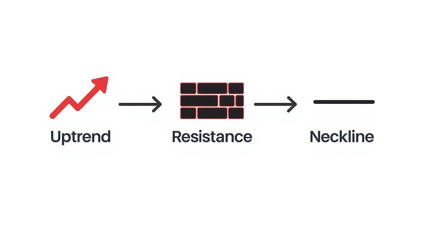
- A Preceding Uptrend: A triple top has to reverse something, so it can only form after an established uptrend. It's the signal that a bullish run might be over.
- Three Distinct Peaks: The defining feature is three consecutive peaks that hit roughly the same price level. This creates a very clear horizontal resistance zone.
- The Neckline (Support Level): The lows, or pullbacks, between the three peaks form a line of support. A clean, decisive break below this neckline is the critical confirmation traders wait for.
The triple top is so powerful because it shows repeated failure at a key price level. It’s not just one rejection; it's a series of failed pushes that exposes the buyers' fading confidence and the sellers' growing strength. This visible battle for control is what makes it such a significant formation in price action trading.
Understanding these components gives you the foundation you need to spot this pattern in the wild. It belongs to a family of powerful technical signals known as price action patterns, which traders use to read market behaviour directly from the charts without needing a lot of confusing indicators. By learning to read the story of the triple top, you can get much better at anticipating major shifts from a bull market to a bear market and position your trades accordingly.
Anatomy of a Powerful Triple Top
To really get a handle on the triple top chart pattern, you need to break it down and see what’s happening behind the scenes. Think of it like a story unfolding on your chart; each part gives you a clue about a dying uptrend. It's not just a random shape—it’s the chart telling you that buyers have thrown everything they've got at a price level and are finally running out of steam.
The whole setup boils down to three key ingredients: a solid uptrend leading into the pattern, three failed attempts to break a resistance level, and a floor of support called the neckline.
The Foundation: A Clear Preceding Uptrend
First things first: a triple top can’t just appear out of nowhere. Its whole job is to signal a reversal, which means there has to be a trend to reverse in the first place. This preceding uptrend is the opening act, where bullish traders have been confidently pushing prices higher for some time.
The length and strength of this prior move really matter. A long, sustained rally gives the pattern more weight because it means a lot of buyers are invested. When they start to get exhausted, the potential for a sharp reversal grows.
The Three Peaks: The Battle for Control
The defining feature, of course, is the three distinct peaks. These represent three separate, failed attempts by buyers to smash through a price ceiling. It’s like a boxer trying to break through a solid defence but getting knocked back every single time.
This trio of failures lines up at roughly the same horizontal level, carving out a serious area of resistance. The first peak shows the initial exhaustion. The second peak is a renewed—but equally failed—attempt. The third is often the final gasp before sellers step in and take over for good. Learning to spot these critical levels is a cornerstone of trading, and you can sharpen your skills by digging deeper into resistance and support in stocks.
This chart shows you exactly how that initial uptrend hits a wall, eventually forming the all-important neckline.
You can clearly see the psychological fight playing out—the bullish push meeting a strong bearish defence.
The Neckline: The Line in the Sand
Between each of those three peaks, the price pulls back and finds support. If you draw a line connecting the lows of these pullbacks, you get the neckline. This is arguably the most important part of the whole formation. It’s the bulls’ last line of defence.
The neckline is the floor holding the uptrend together. As long as the price stays above it, the bullish structure is technically still intact. A clean, confirmed break below this level is the final signal that sellers have won and the trend is rolling over.
This structural break is what gives the pattern its predictive edge. These patterns often take weeks or even months to play out on daily charts. For instance, a classic example saw Chevron (CVX) climb from about $135 to $170 before forming three clear peaks right around that $170 mark. This established a very well-defined resistance zone. The bigger the timeframe, the more significant the pattern, because it reflects the decisions of a much larger pool of traders.
Confirmation Signals You Cannot Ignore
Seeing what looks like a triple top is one thing. Trading it with real money is another game entirely. One of the biggest mistakes traders make is jumping the gun, trying to short the pattern before it’s fully baked. This is a classic recipe for getting caught in a nasty fakeout.
Think of confirmation as the market giving you the final nod. It's the green light telling you the sellers have officially wrestled control from the bulls. Without it, you’re not trading; you’re gambling. Just like a detective needs solid evidence, we need proof that a real reversal is underway.
The three peaks are just the start of the story. The real proof—the stuff that matters—comes from two critical signals. Let’s break them down.

The Neckline Break: The Point of No Return
First up, and most importantly, we need a decisive price break and close below the neckline. This support level is the floor holding the whole pattern together. As long as the price stays above it, the bulls are still in the fight, even if they're on the ropes.
When that neckline breaks, it's like the final defensive wall has been breached.
But here’s the key: a quick dip below isn't good enough. Long wicks piercing that support are often just "bear traps" designed to lure in impatient sellers before snapping back up. For real confirmation, you must wait for a candlestick to close firmly below that line. This is the sellers showing their hand, confirming that support has officially failed. Our guide on understanding candlesticks charts can give you a deeper feel for reading these price action clues.
A candle closing below the neckline is the ultimate sign that the market structure has shifted. It tells you that sellers have absorbed all remaining buying pressure at that support level and are now strong enough to push the price into a new downtrend.
Volume: The Story of Fading Enthusiasm
Our second piece of evidence is volume. Volume tells you the story behind the price action. It reveals the conviction—or lack thereof—in every move. A high-probability triple top has a very specific volume signature that shows dying bullish momentum and rising bearish power.
Here's what you want to see:
- Decreasing Volume on Peaks: Ideally, the volume during the second and third peaks should be lower than on the first. This is a huge clue. It tells you fewer and fewer buyers are interested at that price. Their enthusiasm is drying up with each failed attempt to push higher.
- Surging Volume on the Break: Then, when the price finally breaks and closes below the neckline, you want to see a significant increase in trading volume. This spike is your confirmation that sellers are storming in with force, providing the fuel needed for a new downtrend.
Statistical research backs this up, placing the success rate of a properly confirmed triple top between 65% and 75%, especially on daily and weekly charts.
To help you put this all together, here’s a quick checklist to run through before you even think about placing a trade.
Triple Top Confirmation Checklist
| Confirmation Signal | What to Look For | Why It Matters |
|---|---|---|
| Price Action | A candlestick body closes clearly below the neckline support level. | A close, not just a wick, proves sellers have overpowered buyers at that key level. |
| Volume on Peaks | Volume on Peak 2 and Peak 3 is noticeably lower than on Peak 1. | Shows that buying pressure and enthusiasm are weakening with each failed rally. |
| Volume on Break | A significant spike in selling volume as the neckline is broken. | Confirms strong seller participation, adding fuel and conviction to the new downtrend. |
This checklist isn't about ticking boxes for the sake of it. It's about building a robust case for your trade.
By waiting patiently for these two signals—a confirmed neckline break and the right volume story—you dramatically stack the odds in your favour and sidestep the traps that catch so many other traders.
How to Build a Triple Top Trading Plan
Spotting a confirmed triple top chart pattern is one thing. Turning it into a profitable trade? That requires a solid, repeatable plan. Think of a trading plan as your roadmap; it guides every single decision, from entry to exit, with cold, hard logic. It's how you take emotion out of the driver's seat.
This section is your playbook for building that plan. We'll get into specific entry triggers, how to place a smart stop-loss to keep risk in check, and realistic ways to set your profit targets. This is how you trade the pattern like a professional.
Defining Your Entry Trigger
Okay, so the neckline is broken and a spike in volume is telling you the sellers mean business. Now it's time to think about getting in. There’s no single "best" way to enter—it really boils down to your own risk appetite and trading style. Most traders fall into one of two camps.
- The Aggressive Entry (The Breakout): This is for traders who want to get in on the action early. You'd enter a short position as soon as a candle closes decisively below the neckline. The upside? You could catch the entire move down. The risk, however, is getting snagged in a "bear trap" if the price whipsaws right back up.
- The Conservative Entry (The Retest): This is the patient trader's approach. You wait for the price to break the neckline, and then you watch for it to pull back and retest that same level from below. That old floor (support) has now become a new ceiling (resistance). You pull the trigger on your short trade when the price hits this level and gets rejected, proving the sellers are still firmly in control. This often gives you a much better risk-to-reward ratio, but you do risk the price never pulling back and leaving you behind.
No matter which you choose, patience is everything. Never jump the gun while a candle is still painting; wait for that official close below the support level to validate the signal.
Setting a Protective Stop-Loss
A trading plan without a stop-loss is like a car without brakes. It's not optional—it's your number one tool for protecting your capital. Having effective stop-loss strategies in place is a non-negotiable part of managing risk with any setup, including the triple top.
Here are the two most logical places to set your stop when trading this pattern:
- Above the Neckline: For a tighter stop, you can place it just a bit above the broken neckline. This works really well for the conservative retest entry because it keeps your potential loss nice and small. The downside is that you can get shaken out by normal market noise before the real move gets going.
- Above the Third Peak: This is the safest, most structurally sound spot for a stop-loss. Placing it slightly above the high of the third peak gives the trade a lot more room to breathe. You'll only get taken out if the entire bearish idea behind the pattern is completely proven wrong.
Your stop-loss placement defines your risk. A wider stop (like one above the third peak) might mean you need to use a smaller position size to keep your dollar risk in line. A tighter stop (just above the neckline) could allow for a larger position.
Calculating Your Profit Target
Finally, you need a logical place to cash out. "Let your winners run" is great advice, but without a target, you risk watching a winning trade turn back into a loser. The most common and objective way to set a target for the triple top is using the measured move technique.
It’s a simple, three-step process:
- Measure the Height: Calculate the distance (in pips or points) from the highest of the three peaks down to the neckline. This is the pattern's "height."
- Project Downward: Take that measured height and subtract it from the point where the price broke through the neckline.
- Set Your Target: The price level you get is your minimum profit target for the trade.
Here’s a quick example:
- The peaks form around $120.
- The neckline is at $112.
- The pattern's height is $8 (that's $120 – $112).
- Your minimum profit target would be $104 (that's $112 – $8).
This technique gives you a data-driven target based on the pattern's own volatility. Just be sure to look for any other major support levels that might get in the way of your target; those can also be smart places to take some or all of your profits off the table.
By combining a clear entry trigger, a protective stop, and a calculated target, you've just transformed a simple chart pattern into a complete, professional trading plan.
Real World Examples Of The Triple Top
Theory only goes so far. Watching the triple top chart pattern unfold on live markets is where true insight emerges.
Historical price charts are packed with moments when this setup signaled major trend reversals. By studying those past peaks, necklines, and volume shifts, you’ll learn how psychology and price action collide.

The Dot-Com Bubble: A Massive Warning Sign
Few patterns have shouted as loudly as the one atop the dot-com boom. Here, a triple top formed on the S&P 500, setting the stage for one of history’s most brutal bear markets.
Between March and December 2000, the index carved three peaks around 1550, each met with heavier selling. The lows between them held support at roughly 1350, defining the crucial neckline. In early 2001, the break beneath that line unleashed a selling cascade that erased vast amounts of market value.
This historical example illustrates the pattern’s strength as a long-term forecasting tool. When a triple top forms on a major index over many months, it reflects a deep, fundamental shift in investor sentiment from widespread optimism to fear.
Breaking Down A Modern Example
Most traders will spot this formation on single stocks or commodities rather than large indices. Here’s a simplified walkthrough using a tech stock rally from $200 to $300:
- Peak 1: Price hits $300 on high volume, then retreats to $280.
- Peak 2: A second push tops at $301 but on lighter volume, and it falls back to $280.
- Peak 3: Final attempt stalls at $299 with even weaker volume—warning bells ring.
- Confirmation: A close below the $280 neckline on surging sell volume seals the pattern.
A trader could short the break of $280, place a stop above $302, and target a drop equal to the pattern’s height ($20)—around $260.
To get hands-on practice, load up a TradingView demo web application and scroll through past charts.
By examining both grand, market-defining instances and everyday examples, your eye will sharpen on the key signals of a high-probability triple top setup.
Still Have Questions About the Triple Top?
Even when you have a solid trading plan, seeing a pattern form on a live chart can bring up new questions. It's totally normal. The triple top chart pattern, in particular, has its own quirks that can trip up even seasoned traders.
Let's clear the air and tackle four of the most common questions I get asked. Think of this as your go-to reference for sharpening your analysis and acting with confidence when you spot this setup.
What's the Real Difference Between a Triple Top and a Head and Shoulders?
This is a great question, and the answer is all in the peaks. The key difference is the story they tell about resistance.
- In a triple top, all three peaks hit a wall at roughly the same price. It's a clear picture of buyers trying and failing, over and over, at a single horizontal ceiling.
- With a Head and Shoulders pattern, the middle peak (the "head") pokes noticeably higher than the two "shoulders" on either side. It still signals a bearish reversal, but it shows one final, failed push for a new high before the bears take control.
How Often Does the Triple Top Pattern Actually Fail?
Like any chart pattern, it's not foolproof. A triple top can and does fail. One of the most common ways it goes wrong is a "bear trap." This is when the price breaks below the neckline, sucking in short-sellers, only to snap back and rally aggressively above it. This is precisely why waiting for a candle to close below that support level is so crucial.
The other type of failure is simpler: the price just never breaks the neckline. Instead, it pushes right through the three-peak resistance, signaling that the original uptrend is back with a vengeance. In either case, your stop-loss is your best friend. It's there to manage your risk if the trade turns against you.
A failed triple top is a powerful signal in its own right. When the price breaks above the three peaks instead of below the neckline, it often signals an incredibly strong continuation of the uptrend. Why? Because it shows buyers have just bulldozed through a major area of supply.
Does This Pattern Work on All Timeframes?
Yes, you'll see the triple top appear on everything from a one-minute chart to a weekly, and in every market. However, its reliability gets a lot better on the higher timeframes, like the daily or weekly charts.
It makes sense when you think about it. A pattern formed over days or weeks involves far more market participants and represents a much more significant shift in sentiment. On the tiny timeframes, the pattern is much more susceptible to random market noise and false signals, meaning you need to be much stricter with your confirmation rules.
How Do I Set a Profit Target for a Triple Top?
The classic technique here is the "measured move." It's a straightforward way to get a baseline target.
First, you measure the pattern's height—that's simply the distance from the highest peak down to the neckline.
Once the price breaks and closes below the neckline, you project that same distance downward from the breakout point. For example, if the peaks are at $150 and the neckline is at $140, the height is $10. Your minimum price target after a confirmed breakdown from $140 would be $130.
At Colibri Trader, we teach you to master these price action signals without getting bogged down by confusing indicators. Our entire approach is about learning to read the story the market is telling you, turning complex patterns into clear, actionable trading plans. Discover your trading potential by taking our free quiz today at https://www.colibritrader.com.