


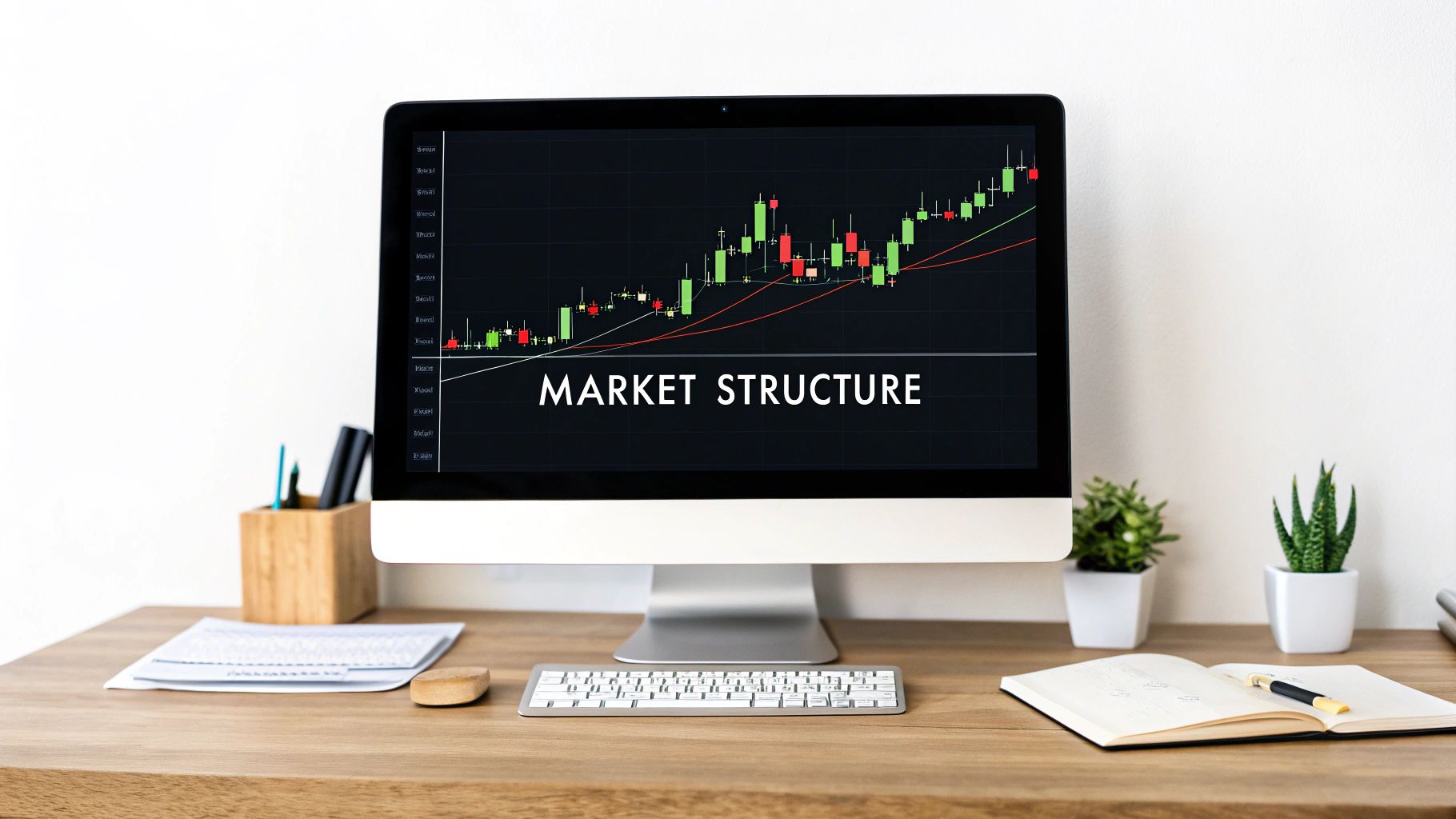
Mastering Trading Market Structure
Trading market structure is simply the art of reading the “story” a price chart is telling you. It’s all about identifying the patterns of highs and lows to figure out who’s winning the constant battle between buyers and sellers.
What Is Market Structure and Why It Matters

Ever tried to play a game without knowing the rules? You might get lucky once or twice, but you'll never have a consistent strategy. The financial markets are exactly the same. To a new trader, a price chart looks like a bunch of random, chaotic squiggles. But beneath that noise is a logical framework: the market structure.
This structure is the very skeleton of price movement. It shows you the dominant trend, flags where momentum might be about to shift, and pinpoints the key battlegrounds where control flips from buyers to sellers. Mastering market structure is the foundation of confident trading because it gives you the context for every single decision.
By learning to read this framework, you stop gambling and start making calculated trades based on the market's real story. It’s the difference between guessing and truly analyzing.
This skill is absolutely fundamental. Why? Because every other tool or strategy—whether it’s based on fancy indicators, supply and demand zones, or chart patterns—works ten times better when you apply it in the right structural context.
The Building Blocks of Price Action
At its heart, trading market structure comes down to spotting a few key elements. These are the basic words you need to know to become fluent in the language of the market. Think of them as the vocabulary of price action; they combine to form trends, ranges, and reversals.
If you want to dig deeper into these ideas, you can find a lot more information on understanding market structure and using it to build a rock-solid trading plan.
To get you started, here is a quick table that breaks down the most critical components of market structure. Think of this as your cheat sheet for understanding what the chart is telling you at a glance.
Key Components of Market Structure
| Component | What It Represents | What It Signals to a Trader |
|---|---|---|
| Swing High | A peak in price before a pullback. | A potential resistance area where sellers are overpowering buyers. |
| Swing Low | A valley in price before a rally. | A potential support area where buyers are stepping in. |
| Uptrend | A series of higher highs and higher lows. | Buyers are in control. The game plan is to look for buying opportunities on dips. |
| Downtrend | A series of lower lows and lower highs. | Sellers are in charge. The strategy is to look for selling opportunities on rallies. |
| Range | Price is stuck moving sideways. | A temporary truce between buyers and sellers. No one has clear control. |
This table covers the essentials, but the real skill comes from seeing these components interact on a live chart and understanding the story they create together.
Why Structure Is Your Most Reliable Guide
So many new traders fall into the trap of loading up their charts with complex indicators and chasing every breaking news alert. They’re hunting for a "holy grail" that will magically predict the next move. But here's the thing: those tools often lag or give conflicting signals.
Market structure, on the other hand, is a direct print of collective human psychology—all the fear, greed, and indecision etched right onto your chart. It’s raw, unfiltered price action.
Just look at the U.S. equity markets. They are incredibly deep and competitive, and their efficiency is built on this very framework of buying and selling. By focusing on trading market structure, you’re aligning your strategy with the most fundamental force driving any market: price itself. This approach strips away the noise and helps you build a simple, repeatable process for spotting high-quality trading setups.
The Three States of Market Structure
The market is never really moving at random. If you look closely, you'll see it's always in one of three distinct states. Your first job as a trader is figuring out which state the market is in right now.
It’s a bit like being a swimmer in the ocean. The first thing you need to know is whether the tide is coming in, going out, or just sitting still. Trying to swim against a powerful current is a quick way to get exhausted and go nowhere.
It's the same in trading. Your core task is to identify the market's current and align your strategy with it. This one skill can stop you from buying when powerful sellers are dumping, or selling right as strong buyers are jumping in. The three states are an uptrend, a downtrend, and a consolidation (or range). Each one has its own personality and demands a different game plan.
The Bullish Uptrend
An uptrend, which you'll often hear called a bull market, is the most optimistic of the three states. It's defined by a clear pattern of higher highs (HH) and higher lows (HL). Think of it like walking up a staircase; each step you take up is a new high, and each flat landing part is a higher low than the one before it. This structure is a dead giveaway that buyers are firmly in control.
In an uptrend, every little dip or pullback is seen by buyers as a sale. They eagerly jump in, seeing a discount, and their buying pushes the price up to break the previous high. The takeaway for us is simple: in a strong uptrend, you should primarily be looking for reasons to buy. Selling into this kind of strength is like trying to stop a freight train. It’s possible, but man, is it risky.
The dominant psychology in an uptrend is pure optimism. Traders and investors expect prices to keep climbing, which becomes a self-fulfilling prophecy as more and more buyers pile in.
This visual below breaks down how these market states are built, showing that it all comes down to how price reacts to key support and resistance levels.
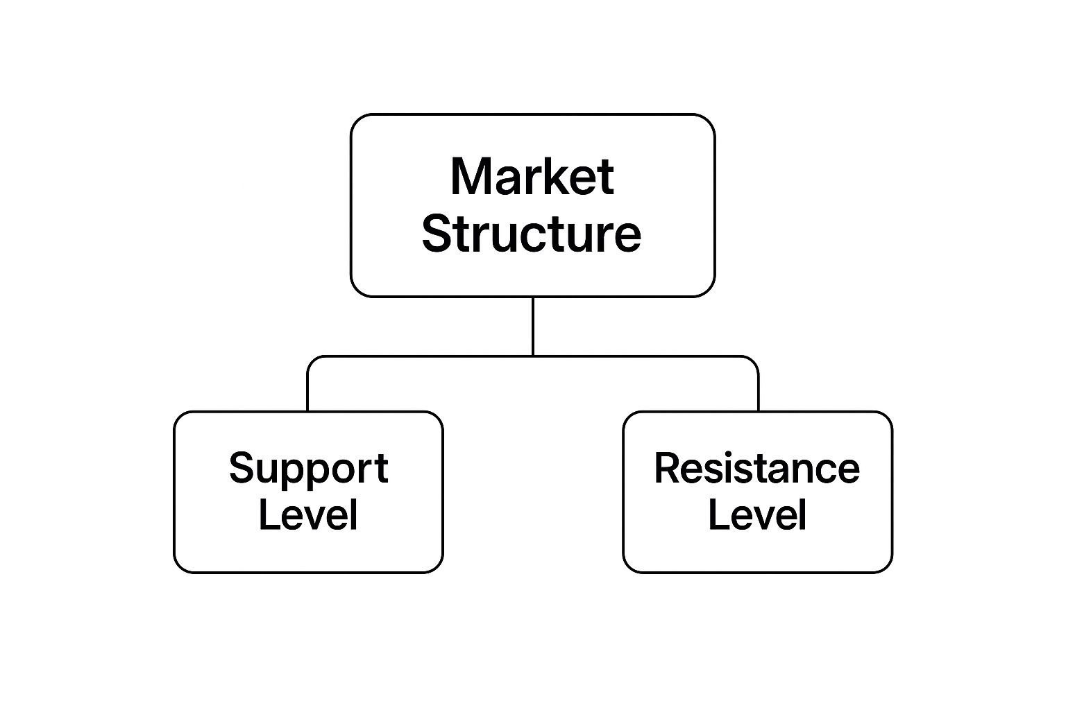
As the infographic shows, the entire framework of market structure is really just a story of the battle between support (price floors) and resistance (price ceilings).
The Bearish Downtrend
A downtrend, or bear market, is the complete opposite. You can spot it by its sequence of lower lows (LL) and lower highs (LH). This structure tells you that sellers have wrestled control away from the buyers and are now aggressively shoving prices down.
Every time the price tries to rally, it gets smacked down by overwhelming selling pressure. This creates a new lower high before the price eventually tumbles to a new lower low. The dominant emotion here is pessimism, and sometimes outright fear. In a downtrend, traders are hunting for any excuse to sell, seeing every bounce as a golden opportunity to get a better price for their short position. Your strategy here is to look for selling opportunities, because fighting a downtrend is a low-probability bet.
The Sideways Consolidation
The third state is consolidation, also known as a ranging market. This is what happens when price gets trapped between a well-defined support level below and a resistance level above. It just chops back and forth, going nowhere fast. You won't see any higher highs and higher lows, nor will you see lower highs and lower lows.
Consolidation is basically a state of equilibrium—a temporary ceasefire in the war between buyers and sellers. Neither side has enough firepower to push the price into a new trend. This period of indecision can be frustrating to sit through, but it gives us incredibly valuable information.
A consolidation phase is often like a spring coiling up, storing energy before a massive release. As a trader, you have two main ways to play a ranging market:
- Range Trading: This involves buying near the support level (the floor) and selling near the resistance level (the ceiling), profiting from the predictable bounce between the two.
- Breakout Trading: Here, you wait patiently for the price to finally, and decisively, break out of the range. Once it does, you trade in the direction of that breakout, hoping to ride the next trend.
Getting a handle on these three states is the absolute bedrock of trading market structure. It allows you to correctly classify what the market is doing and pick the right tool for the job, which will drastically improve your decision-making.
Identifying Swings Highs and Lows

If market trends are the chapters of a story, then swing highs and swing lows are the crucial plot points that push the narrative forward. Think of them as the peaks and valleys on your chart—the exact moments where the balance of power tipped between buyers and sellers. Honestly, without being able to spot these, trying to read the overall trading market structure is a losing game.
A swing high is simply a price peak right before a pullback. It’s a visual clue that sellers showed up with enough force to stop a rally in its tracks and push prices back down. On the flip side, a swing low marks a valley, a point where buyers got aggressive, stopped a decline, and started pushing the price higher.
Getting good at identifying these swings is what separates a clear, readable chart from a confusing mess of lines. They are the dots you connect to see the bigger picture of an uptrend or a downtrend.
The Anatomy of a Swing Point
At its most basic, a swing point is just a simple fractal pattern made of candlesticks. A classic swing high is a candle with a lower high on both its left and right sides. A swing low is a candle with a higher low on each side. Simple.
But the technical definition is only half the battle. The real skill is in understanding the context. You have to learn to tell the difference between the major swings that define the market's overarching structure and the minor little wiggles that are just noise. If you focus on every tiny move, you’ll just get stuck in analysis paralysis.
The most significant swing points are the ones that lead to a break of the previous structure. These are the pivots that truly matter because they either confirm the trend is continuing or signal a potential reversal is on the cards.
The goal is to train your eye to filter out all that noise and lock onto the turning points that actually mean something. This gives you a clean, actionable map of what the market is doing.
A Practical Method for Marking Swings
So, how do you turn this from a concept into a practical skill? You need a simple, repeatable process. No need for fancy, complicated indicators; all you need is your eyes and the price action itself. Here’s a straightforward method to start marking the important swings on your chart.
-
Zoom Out for Context: First things first, zoom out. Look at the last 100-200 candles to get the bigger picture. This immediately helps you spot the major, obvious turning points that are shaping the primary trend.
-
Identify the Extremes: Start by marking the highest high and the lowest low you can see. These are your initial anchor points, setting the boundaries for the current market action.
-
Work Your Way Inward: From that major high, trace the price back down. Mark the most significant low that formed before the price rallied to that high. Do the same from the major low—trace price back up and mark the most significant high before the sell-off.
-
Connect the Dots: Once you've marked a few of these major pivots, you can start connecting them. Are they creating a pattern of higher highs and higher lows (an uptrend)? Or is it lower lows and lower highs (a downtrend)? This simple process makes the underlying trading market structure crystal clear.
The Psychology Behind the Swings
Swing points are much more than just patterns on a chart; they are the footprints of market psychology. A swing high shows us a point of maximum optimism that ultimately failed. Buyers pushed and pushed, but eventually, their conviction cracked, and sellers took over.
A swing low, in contrast, represents a point of peak pessimism that was finally overcome. Sellers drove the price down into a valley, but at that exact point, fear gave way to opportunity, and confident buyers stepped in. Each swing tells a story of a battle won or lost.
When you start to see it this way, you're no longer just looking at lines on a screen. You're reading a roadmap of where market sentiment shifted before, giving you powerful clues about where it might just shift again.
How to Read Market Shifts Like a Pro

Markets are living, breathing things. They don’t just move in one direction forever. A strong, clear trend can lose momentum and start to fade, while a quiet, ranging market can suddenly erupt with incredible force.
The best traders I know are masters of observation. They're constantly watching the charts, looking for those tiny clues that a change is on the horizon. This is how they adapt their strategy on the fly—they see the market’s story shifting before everyone else.
This is where understanding trading market structure really pays off. It's what separates reactive traders from predictive ones. Two of the most critical signals you need to spot are the Break of Structure and the Change of Character. They might sound alike, but they tell you two completely different things about what the market plans to do next.
The Break of Structure (BOS) Confirms the Trend
Think of a Break of Structure, or BOS, as the market giving you a solid thumbs-up. It’s a signal of continuation. It confirms that the current trend is still healthy and firmly in control.
In an uptrend, a BOS happens when the price decisively pushes through and closes above the last swing high. For a downtrend, it’s the opposite—price breaks and closes below the previous swing low.
A Break of Structure isn't just a hint; it's a clear statement. It tells you the dominant players (buyers in an uptrend, sellers in a downtrend) still have the muscle to push past the last key level.
When you see a BOS, it confirms your bias. If you're looking to buy in an uptrend, a BOS is your green light to hunt for entries on the next pullback. It's the market's way of saying, "Yep, we're still headed this way."
The Change of Character (CHoCH) Warns of Reversal
Now, for the more dramatic signal: a Change of Character, or CHoCH. This is your first legitimate warning that a trend might be gassing out and getting ready to reverse. It’s the plot twist in the market’s story.
Imagine a strong uptrend that’s been printing consistent higher highs and higher lows. Then, all of a sudden, after making a new high, the price tumbles and breaks below the most recent swing low. That's a CHoCH. The staircase pattern is officially broken.
- Bullish CHoCH: In a downtrend, this happens when price breaks above the most recent swing high.
- Bearish CHoCH: In an uptrend, this occurs when price breaks below the most recent swing low.
A CHoCH is a massive piece of information. It signals a potential power shift from buyers to sellers, or vice versa. While it doesn't guarantee a full-blown reversal, it's your cue to sit up and pay very close attention. You should get more cautious with your trend-following trades and maybe even start scouting for counter-trend opportunities.
To truly get a feel for these signals, you have to learn how to read price action in its rawest form.
Comparing BOS vs CHoCH
Knowing the difference between these two signals is absolutely crucial for adapting your strategy in real-time. Mixing them up is a classic mistake that gets traders caught fighting the market's real intentions.
| Signal | What It Means | Trader's Action |
|---|---|---|
| Break of Structure (BOS) | The trend is healthy and likely continuing. | Keep looking for trades in the direction of the trend. |
| Change of Character (CHoCH) | The trend may be weakening or reversing. | Be cautious, protect profits, and watch for potential reversal setups. |
This distinction is the core of dynamic market analysis. A BOS keeps you in a winning trade, while a CHoCH tells you when it might be time to take profits or even flip your bias.
Real-World Events Triggering Market Shifts
These technical patterns don't just happen in a bubble. More often than not, they are kicked off by major real-world events that cause a sudden, violent shift in market sentiment. Big economic news, central bank bombshells, or geopolitical shocks can all pour fuel on the fire.
For example, think about how sudden changes in trade policy can rock the global markets. We saw this play out when new trade policies and tariffs significantly impacted global market structure and risk behavior in the first half of 2025.
The U.S. administration rolled out sweeping tariffs on key partners like the EU, China, Mexico, and Canada starting April 2, 2025. This move instantly triggered massive market stress, sending the VIX volatility index spiking above 50. That’s a clear sign of a huge spike in investor fear. An event like this can easily cause a CHoCH on major indices as the big players rapidly reprice risk.
By connecting these real-world catalysts to the patterns on your chart, you start to see the why behind the price action, which is a much deeper level of understanding.
Applying Market Structure to Your Trading
Knowing the theory behind trends and market shifts is one thing. Actually making money from it is a completely different ballgame. This is where we bridge the gap between reading the chart and clicking the mouse.
Applying market structure isn’t some magic formula. It’s about building a simple, repeatable, rules-based process for every trade you take.
This framework gives you a rock-solid reason for every action. You'll know exactly why you're entering at a specific price, where your safety net (the stop-loss) needs to be, and when it’s time to take your profits off the table. Let's turn what you've learned into a practical plan for entries, exits, and risk management.
Finding High-Probability Entries
One of the biggest mistakes I see traders make is chasing price. They spot a massive move up and jump in right at the top, just as the smart money who got in early are starting to sell. That’s a recipe for disaster and a lot of frustration.
A much smarter, and frankly more professional, way to trade is to use pullbacks within a clear trend.
Once you’ve identified a strong trend using trading market structure—let's say an uptrend with a clean Break of Structure—the waiting game begins. Instead of buying the breakout, you patiently wait for the price to pull back to a logical area of support. A perfect example is the previous swing high that was just smashed through.
This approach gives you two massive advantages:
- Improved Risk-to-Reward: Getting in on a pullback means you're buying at a "discount" compared to the recent high. This move alone can seriously boost your potential profit on the trade.
- Clear Invalidation: If the price plows straight through that old resistance-turned-support level, your trade idea is clearly wrong. This allows you to get out fast for a small, manageable loss.
A professional trader buys weakness in an uptrend and sells strength in a downtrend. An amateur does the exact opposite. Patience is your greatest ally when you're hunting for these quality entry points.
Setting Smarter Stop-Losses
Your stop-loss is not just a random price; it’s your number one risk management tool. I'd argue that placing it correctly is even more important than finding the perfect entry. The market structure itself shows you the most logical place to hide your stop.
Forget about using an arbitrary percentage or a fixed number of pips. Instead, place your stop-loss in a structurally sound location. For a long trade in a clear uptrend, the most logical spot is just below the most recent significant swing low.
Why there? Simple. If the price breaks that low, the entire uptrend structure is violated (what we call a Change of Character), and your original reason for being in the trade is gone. This method bases your risk on the market's real behavior, not your hopes. By placing it in a structurally protected area, you give your trade the room it needs to work without getting knocked out by random market noise.
Defining Realistic Profit Targets
Just like the structure helps you find a great entry, it also tells you when to get out with a profit. So many traders sabotage winning positions by either panicking and getting out too early or by getting greedy and watching all their profits vanish.
Use the structure to the left of your chart to set logical targets. In an uptrend, the most obvious target is the previous swing high. This is a known area where sellers showed up before, making it a natural place for price to stall or reverse.
You can also pinpoint other key structural areas, like major supply and demand zones, to set your targets. These zones often look like areas of consolidation right before a huge price move. If you want to get better at spotting these crucial levels, you can learn how to master supply and demand trading for more precise targets.
A Complete Trade Walkthrough
Alright, let's put all three pieces together into a complete, rules-based trading plan.
Scenario: We spot a currency pair in a strong, clear uptrend.
-
Identify the Trend: We confirm the market is printing a series of higher highs (HH) and higher lows (HL). We see a clean Break of Structure (BOS) as the price moves decisively above the last swing high. Our bias is now firmly bullish.
-
Plan the Entry: We don't chase the breakout like an amateur. Instead, we mark the previous swing high (which should now act as support) and patiently wait for the price to pull back to this level.
-
Place the Stop-Loss: Before we even think about clicking "buy," we identify the last significant swing low. Our stop-loss order will be placed just below this level. This defines our maximum risk before we're in the trade.
-
Set the Profit Target: We look left on the chart and identify the next major swing high or an untouched supply zone. This becomes our primary profit target, giving us a clear goal for the trade.
By following these simple, structure-based rules, you create a system. This process removes emotion and guesswork from the equation, turning your trading into a disciplined, professional operation.
Common Questions About Market Structure
Once you start getting the hang of reading price action, some questions will naturally start to bubble up. This is a great sign! It means you're past the beginner stage and are really thinking about how this stuff works in the real world of trading.
Getting these common points cleared up is what will build your confidence and help you create a solid foundation for trading market structure. This section is all about tackling those frequent questions with practical, no-fluff answers to help you trade with a lot more clarity.
Which Timeframe Is Best for Analyzing Market Structure?
There's no magic "best" timeframe. The right one for you comes down to your personal trading style and what you're trying to achieve. An investor's chart would be painfully slow for a day trader, and vice versa. The real secret isn't finding one perfect timeframe, but learning how to blend multiple timeframes together.
- Investors (Weeks to Months): You'll probably live on the weekly and daily charts, looking for those huge, long-term trends and major structural shifts.
- Swing Traders (Days to Weeks): The daily and 4-hour charts are your sweet spot. This is where you'll find those medium-term swings that play out over several days.
- Day Traders (Intraday): You're in the trenches. The 1-hour, 15-minute, and even 5-minute charts are your home for executing trades within a single day.
The key is to always start your analysis on a higher timeframe to get the "big picture." Is the market fundamentally bullish, bearish, or just chopping sideways? Once you know the main story, you can zoom in to a lower timeframe to find those sharp, precise entries that align with the larger trend. This top-down approach will drastically improve the quality of your trades.
How Does Market Structure Relate to Indicators Like RSI?
Think of it like this: market structure is the main character in the movie. Indicators like RSI or MACD? They're the supporting cast. Your analysis must always, always start with what price itself is doing—the structure. This tells you what the market is actually doing, not what some lagging algorithm thinks it might do.
After you spot a great setup based purely on structure—say, a pullback to a key swing low in a clear uptrend—then you can glance at an indicator for a bit of extra confirmation. For example, you might see that bullish structure and then look for some hidden bullish divergence on the RSI to add a little more conviction to your trade idea.
Using an indicator to confirm what market structure is already screaming at you is a powerful combo. But using indicators on their own, hoping they'll predict the future? That's a rookie mistake that costs traders a lot of money. Structure leads; indicators follow.
This way of thinking keeps your charts clean and your mind focused on what really moves the market: price. It helps you avoid "analysis paralysis," that horrible feeling when you have a dozen conflicting indicators on your screen and are too frozen to pull the trigger.
What Is the Biggest Mistake Traders Make with Market Structure?
By far, the most common and damaging mistake I see is focusing on the wrong swing points. New traders get completely lost in the "noise"—all those tiny, meaningless wiggles on the chart that have zero impact on the real trend.
They’ll see a little dip on a 5-minute chart and panic, thinking the entire daily uptrend is over. This leads to nothing but confusion, constant second-guessing, and a string of bad trades based on bad information. You end up fighting the dominant market direction simply because you're reacting to meaningless blips.
To fix this, you have to train your eye to see the difference between minor noise and the significant pivots that cause a real Break of Structure (BOS) or a Change of Character (CHoCH). Those are the only swing points that truly matter.
Here's a simple habit that will bring incredible clarity to your trading: regularly zoom your chart out to see the last 100-200 candles. This forces your brain to see the big picture and ignore the noise. Only mark the major swing highs and lows that define the primary structure. This one discipline alone will clean up your charts and your P/L.
Ready to stop relying on confusing indicators and start trading with the confidence that comes from a deep understanding of price action? At Colibri Trader, we specialize in teaching a straightforward, structure-based approach that works in any market. Discover your trading potential with our free quiz and get started today!