


A Trader’s Guide to the Supply Demand Zone
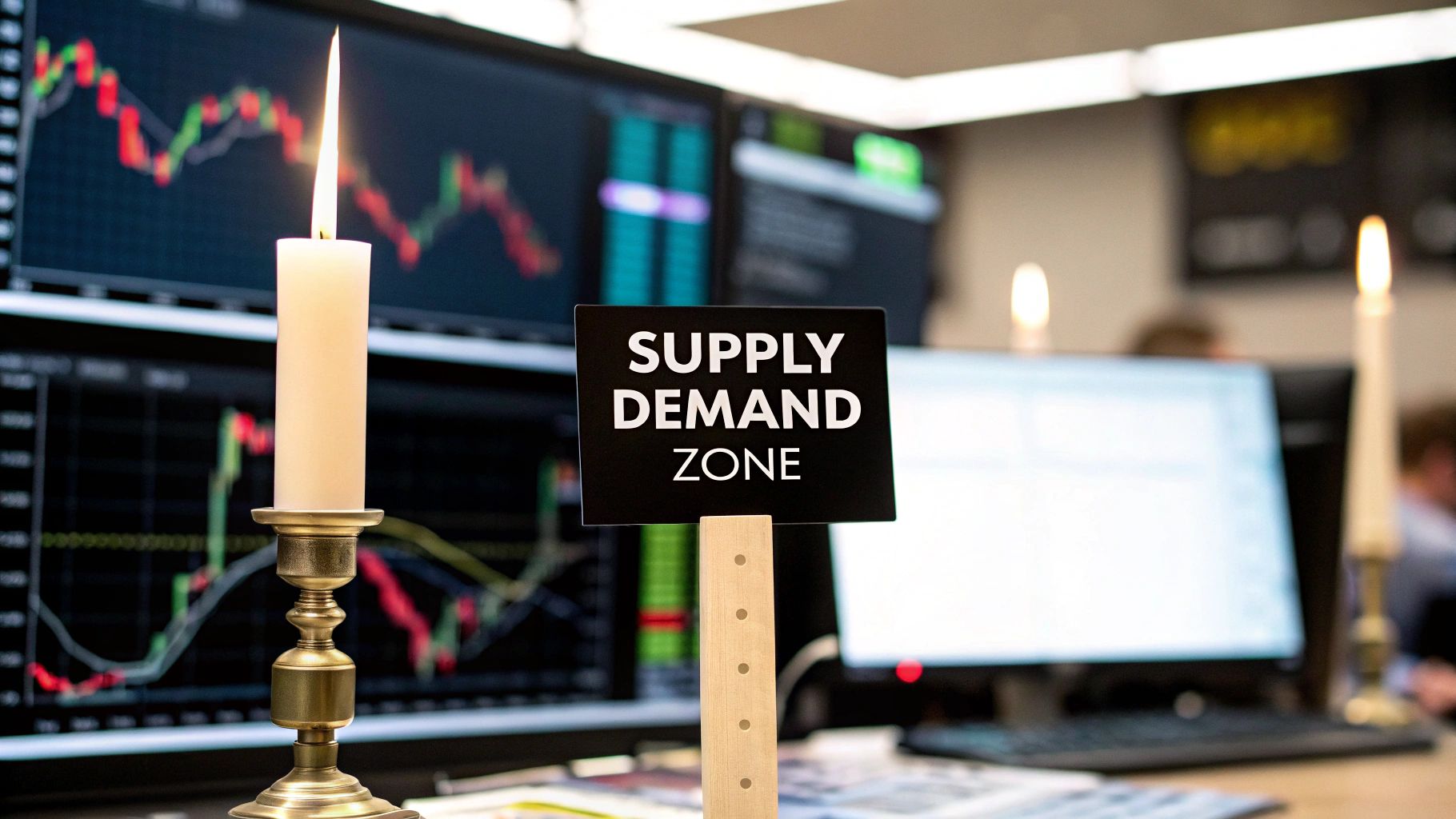
Think of a supply and demand zone as the footprints left behind by large financial institutions. It’s not just a line on a chart; it's a whole price area where a massive imbalance between buyers and sellers previously slammed the market, causing a sharp, explosive move.
What a Supply Demand Zone Tells You About the Market
Let's use a simple analogy. Picture a local farmers' market. If one stall is suddenly overflowing with apples (that's high supply), the farmer has to slash prices to get rid of them before they spoil. On the other hand, if a huge crowd descends, all wanting the last few baskets of prize-winning apples (that's high demand), the price is going to shoot up.
A supply and demand zone on your trading chart works exactly the same way. It’s an area where the "smart money"—the big banks, hedge funds, and major institutions—made their moves, leaving a trail of unfilled orders in their wake.
Spotting these zones is incredibly powerful because they highlight high-probability areas where the price is likely to reverse. When the price dips back into a demand zone, it's like returning to a scene where buyers were previously fighting over those last apple baskets. The leftover buy orders can ignite another rally. The opposite is true for a supply zone, where a surplus of sell orders can stop a price climb dead in its tracks and shove it back down.
The Anatomy of a Trading Zone
Here’s a critical distinction: these are zones, not simple support and resistance lines. A line is just a single price point. A zone is a broader area that captures the entire price range where the battle between buyers and sellers took place. This makes it a much more practical and robust tool for planning your entries and, just as importantly, placing your stop-loss.
Here are the key characteristics you'll be looking for:
- Supply Zones (Distribution): You'll find these at price peaks. They are areas where aggressive selling completely overwhelmed all buying interest, causing the price to drop hard. A strong, sharp move down from this area is its tell-tale signature.
- Demand Zones (Accumulation): These form at the bottom of price troughs. In these areas, intense buying pressure soaked up every available sell order, triggering a powerful rally. Its defining feature is a strong move up and away from the zone.
The most reliable reversals tend to happen at "fresh" zones—levels that price hasn't revisited since they were created. An untouched zone is believed to have a higher concentration of those original, unfilled orders, which boosts the odds of a strong reaction when price returns.
This principle isn't just for stocks or currencies. It’s fundamental. Take the commodity markets, where global production and consumption physically shape these zones. The liquefied natural gas (LNG) market is a perfect real-world example. Countries like Qatar, which produce a staggering 77.4 million tons per annum, establish clear supply levels. As global demand ebbs and flows, prices react sharply when they hit these well-defined zones.
Really getting the difference between a simple line and a full-on zone is a game-changer. If you want to dig deeper into these foundational concepts, you can check out our guide on supply and demand zones.
The Mechanics of Supply and Demand Imbalances
Those explosive price moves you see on a chart aren't just random spikes. They happen for a very specific reason: a massive imbalance between buyers and sellers. Imagine a game of tug-of-war where one team suddenly drops the rope. The other team doesn't just win—they fly backward with serious force.
That's precisely what's happening in the market. A supply zone forms when a huge wave of sell orders floods in, swallowing up every single buy order in sight and then some. This leaves a trail of unfilled sell orders sitting at that price level, acting like a future barrier if the price tries to climb back up.
The opposite is true for a demand zone. It’s born from an aggressive surge of buy orders that vacuums up all the sell orders. This leaves a footprint of unfilled buy orders, which becomes a powerful magnet, pulling the price back up if it drops to that level again. These zones are the fingerprints of "smart money"—the big institutions moving serious capital.
The Anatomy of a Powerful Zone
Every good supply or demand zone has a distinct structure you can learn to spot. Getting this down is the first real step to trading them well. Think of a zone as having two main parts that, together, tell the story of that market imbalance.
These two parts are:
- The Base: This is the cluster of candles, the sideways price action that happens right before the big move. It’s where the big players were quietly building their positions, accumulating a massive number of orders in a tight price range.
- The Leg-Out: This is the strong, sharp, decisive move away from the base. A powerful leg-out is your best confirmation that a real imbalance occurred. It’s the market screaming that one side got completely steamrolled.
The strength of the leg-out is a huge clue to the zone's potential. A slow, grinding move away from a base suggests a weaker imbalance. But a fast, explosive departure? That’s a sign of a high concentration of unfilled orders—and a much stronger zone.
This basic structure helps us classify zones into two main types. For anyone serious about building a solid trading foundation, you can learn how to master supply and demand trading with our in-depth resources.
Reversal vs. Continuation Patterns
Zones can either signal a major market turning point or just a quick pause before the trend kicks off again. Knowing the difference is crucial for aligning your trades with what the market is actually doing.
Reversal Patterns
These are the classic patterns you see at major tops and bottoms. They show up when a strong trend gets stopped in its tracks and violently sent in the other direction.
- Drop-Base-Rally (DBR): This is your classic demand zone. The price is trending down (drop), pauses to consolidate (base), and then a flood of buyers reverses it into a new uptrend (rally).
- Rally-Base-Drop (RBD): This creates a supply zone. Price is climbing (rally), consolidates at a peak (base), and then sellers take over, reversing it into a downtrend (drop).
Continuation Patterns
These patterns happen inside an established trend. They're more like a quick pit stop where the market reloads on orders before continuing on its way. Trading these often feels a bit safer because you’re moving with the market's momentum.
- Rally-Base-Rally (RBR): A continuation demand zone. The price is already in an uptrend, pauses briefly to build more buy orders, and then continues its climb.
- Drop-Base-Drop (DBD): A continuation supply zone. The price is already falling, takes a breather to accumulate more sell orders, and then continues its move down.
Of course. Here is the rewritten section, crafted to sound like it was written by an experienced human trader, following all the provided guidelines and examples.
How to Draw Supply and Demand Zones Like a Pro
Alright, moving from theory to actually drawing these zones on a live chart is where the rubber meets the road. This is what separates aspiring traders from consistently profitable ones. Drawing a high-probability supply and demand zone isn’t guesswork; it’s a practical skill you build through a clear, repeatable process.
The whole idea is to pinpoint the exact origin of a strong, explosive price move. This is the footprint left by institutional orders, the very imbalance you’re looking to trade. It’s not random—it follows a series of steps you can learn and master.
Step 1: Identify the Strong Price Move
First things first, you need to scan your charts for big, powerful price movements. Some traders call these "impulsive" or "explosive" candles because they cover a lot of ground in a very short amount of time. This violent move is the most important clue you have.
Think about it: a weak, choppy, or slow drift away from a price level suggests a balanced market. There's no real institutional muscle behind it. But a powerful launch away from a level? That screams a major supply or demand imbalance—and that’s exactly what we’re hunting for. This explosive move is your starting point.
This visual breaks down a simple, three-step workflow for getting these zones drawn accurately on your charts.
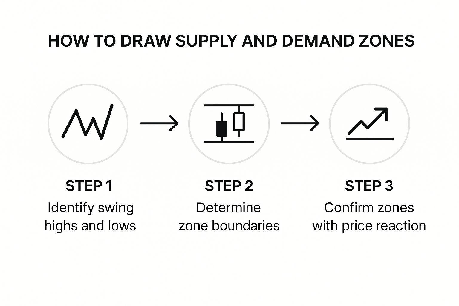
As the graphic shows, the process boils down to identifying the turning point, drawing the zone's boundaries, and then patiently waiting for price to return and confirm the level.
Step 2: Find the Base and Draw the Zone
Once you've spotted that strong exit, your next job is to find where it came from—the "basing" candles. The base is that small area of consolidation that happens right before the explosive leg-out. This is where the big players were busy accumulating their orders before they unleashed them.
To draw the zone, you'll grab the rectangle tool on your charting platform. You'll need to define two key boundaries: the proximal line (the one closest to the current price) and the distal line (the one farthest away).
There are two main ways to do this, and each has its pros and cons:
- Using Candle Bodies: A lot of traders prefer drawing their zones using only the bodies of the basing candles. The proximal line goes on the edge of the candle body closest to the big move, and the distal line goes on the farthest edge of the body. This gives you a tighter zone, which can mean a better risk-to-reward ratio, but you might miss an entry if price only wicks into the zone.
- Using Candle Wicks: The other way is to include the entire price range of the basing candles, wicks and all. Here, the proximal line is on the closest body, but the distal line is drawn at the absolute tip of the farthest wick. This creates a wider zone. It gives you a better chance of getting your order filled, but it also means you need a bigger stop-loss.
Choosing between bodies and wicks really comes down to personal preference and what your backtesting tells you. A pretty common approach is to use the wicks on higher timeframes to capture the whole area and then switch to bodies on lower timeframes to really fine-tune your entry.
Step 3: Judge the Strength and Freshness of the Zone
Listen, not all zones are created equal. After you've drawn a supply and demand zone, you must qualify its strength before you even think about putting on a trade. A high-quality zone has a much higher probability of holding up.
The "freshness" of a zone is one of its most critical traits. A fresh zone is one that price has not returned to since it was formed. These are the A+ setups because the original unfilled institutional orders are likely still sitting right there, waiting to get triggered.
Every time price comes back and touches a zone, it's like a little withdrawal from a bank account—it consumes some of those orders. This weakens the level for the next visit. A zone that’s been hit multiple times is "stale," and it's far more likely to break.
To help you tell the difference between a great setup and a weak one, you need a quick way to grade them. Assessing a zone's quality is a crucial step before risking any capital.
Characteristics of Strong vs Weak Supply and Demand Zones
This table gives you a quick reference for spotting the tell-tale signs of a high-probability zone versus one you should probably ignore.
| Characteristic | Strong Zone Indicator | Weak Zone Indicator |
|---|---|---|
| Price Exit | A fast, explosive move away from the zone. | A slow, grinding, or choppy move away. |
| Zone Freshness | The zone is untouched since its creation. | Price has tested the zone one or more times. |
| Risk-Reward | The move away from the zone was at least 3 times the size of the zone itself. | The move away was small relative to the zone's size. |
| Time at Base | Price spent very little time (1-3 candles) at the base. | Price consolidated for many candles at the base. |
By sticking to this structured approach—spotting the move, drawing the base, and then grading the zone's strength—you stop guessing and start making calculated, high-probability trading decisions. This disciplined process is how you learn to consistently follow the footprints of institutional money.
Actionable Supply and Demand Trading Strategies
Once you can draw a high-probability supply demand zone on your chart, you’ve basically got a map of where the institutional power is hiding. The next step, of course, is turning that map into a concrete trading plan with clear rules for entry, exit, and risk management. This is where theory gets real and becomes a tangible, repeatable strategy.
There are really two main ways traders approach these zones. The one you pick will come down to your trading personality, how much risk you're comfortable with, and how much time you can actually spend staring at charts. Neither is better than the other; they're just different tools for different jobs.
The Set-and-Forget Entry Method
This first strategy is a favorite among traders who prefer a more hands-off style. The "set-and-forget" method is exactly what it sounds like: you place a limit order to get into a trade the moment price touches the edge of a zone you've already marked. It’s built on the confidence that a fresh, strong zone has enough leftover orders to force a reaction on the very first touch.
Here’s the breakdown:
- Identify a High-Quality Zone: You spot a fresh, strong supply or demand zone on your chart, just like we’ve covered.
- Place a Limit Order: For a demand zone, you place a buy limit order at the proximal line (the top edge). For a supply zone, you place a sell limit order at its proximal line (the bottom edge).
- Set Your Stop-Loss: Your safety net—the stop-loss—goes just outside the distal line (the far edge) of the zone. This gives the trade a little room to breathe without killing the setup.
- Define Your Profit Target: Your take-profit order is usually set at the next opposing zone. If you’re buying from demand, you’re aiming for the closest supply zone.
The big win here is simplicity and taking emotion out of the equation. You do your homework, set the trade, and then you can walk away. The trade-off? The zone could fail without giving you any warning signs, leading to a quick stop-out.
The Confirmation Entry Method
For traders who need a bit more proof before putting money on the line, the confirmation entry is the way to go. Instead of blindly entering at the zone’s edge, you wait for the price to actually enter the zone and then show you a specific price action signal that confirms buyers (or sellers) are really stepping in.
This approach demands more screen time but can seriously improve your win rate by helping you sidestep failing zones.
Popular confirmation signals to look for include:
- Engulfing Candles: A big, powerful bullish engulfing candle forming inside a demand zone is a classic sign that buyers have wrestled back control.
- Pin Bars or Hammers: A candle with a long tail rejecting the zone shows that price tried to push through but was smacked back down.
- A Lower Timeframe Break of Structure: You can zoom into a lower timeframe (say, from a 4-hour zone down to a 15-minute chart) and wait for the immediate trend to flip in your favor.
With this method, the confirmation signal is your trigger, not just the zone itself. Your stop-loss still sits outside the zone, and your profit target remains the next opposing level.
Building a Complete Trading Plan
No matter which entry you use, every single trade needs three core parts: an entry point, a stop-loss, and a profit target. These aren't just suggestions; they are the absolute bedrock of disciplined trading and smart risk management.
A critical piece of this puzzle is the risk-to-reward ratio. A solid rule of thumb is to only take trades that offer at least a 1:2 risk-to-reward. This means for every dollar you risk, you stand to make at least two. This simple discipline allows you to be wrong more often than you're right and still come out profitable in the long run.
Key Takeaway: A winning strategy isn't about being right 100% of the time. It's about making sure your winning trades are significantly larger than your losing trades. Consistently applying a positive risk-to-reward ratio is a non-negotiable part of a sustainable trading career.
These principles of spotting zones based on historical imbalances work across all markets—even on a global, macroeconomic scale. Take the oil market, for instance. For decades, agencies have been tracking global supply and demand. The International Energy Agency’s data, which goes all the way back to 1984, shows how analysts use historical production and consumption numbers to forecast future price moves, essentially mapping massive-scale supply and demand zones. You can dive into the detailed stats in the IEA’s Monthly Oil Data Service.
By pairing a proven entry method with strict risk management, you turn the supply demand zone from a simple chart pattern into a complete and powerful trading system.
Common Mistakes When Trading Supply and Demand

Just knowing how to spot a supply demand zone isn't a golden ticket. It’s a powerful concept, no doubt, but plenty of traders learn the basics only to fall into the same old traps that bleed their accounts dry.
Honestly, knowing what not to do is just as important as knowing how to draw the boxes on your chart. Let’s walk through the most common blunders I see so you can steer clear of them.
The biggest mistake, and the one I see most often, is trading “stale” zones. Think of a supply or demand zone like a bank account filled with institutional orders. Every time price revisits that zone, it makes a withdrawal, and the account balance shrinks. A fresh, untouched zone has the most firepower, giving you the best shot at a sharp reversal.
Ignoring the Dominant Market Trend
This one’s a classic. A trader finds a picture-perfect demand zone, but the market is in a screaming downtrend. They take the trade and get run over. The same goes for trying to short a supply zone when the market is rocketing higher. It's like trying to swim against a riptide; you’ll just exhaust yourself and get nowhere.
Always, and I mean always, start your analysis on a higher timeframe. Check the daily or 4-hour chart to get a feel for the primary trend. Only then should you hunt for zones that align with that broader market momentum.
- In an Uptrend: You should be focusing almost exclusively on buying at demand zones.
- In a Downtrend: Your priority should be selling at supply zones.
It’s a simple filter, but it will dramatically improve your odds. You’re putting the big money’s momentum at your back instead of standing in front of a freight train.
"The trend is your friend" is a trading cliché for a reason. When you trade a supply demand zone in the direction of the main trend, you're letting the market do the heavy lifting for you.
The Dangers of Curve Fitting
Curve fitting is a sneaky psychological trap that gets a lot of traders. It’s when you’re so desperate to find a trade that you start seeing things that aren't really there. You begin forcing zones onto your chart, drawing a box around some messy price chop and convincing yourself it's a major institutional level.
This usually stems from impatience and poor discipline. The market doesn't owe you a five-star setup every single day. A huge part of being a professional trader is the patience to sit on your hands and wait for the A-grade opportunities. This is all about mastering your own mind, which is a critical piece of any strategy. For more on this, check out these practical tips to master your mind and beat the market.
You have to resist that urge to make a pattern fit. If a zone isn't crystal clear and obvious, just move on. Your capital is far too valuable to risk on a flimsy setup born from wishful thinking. Sidestep these common pitfalls, and you’ll protect your account and shorten your learning curve immensely.
Frequently Asked Questions About Trading Zones
As you start moving from theory to looking at live charts, questions are bound to pop up. That's a great sign. It means you're really digging in and thinking about how to make the supply demand zone concept actually work for your trading. Let's walk through some of the most common questions I hear to clear up any confusion and get you trading with more confidence.
How Are These Zones Different From Support and Resistance?
This is probably one of the most critical things to get right. Think of classic support and resistance as a thin line drawn in the sand—a single, exact price. When the market touches it, the line either holds or it breaks. There’s not a lot of wiggle room.
A supply demand zone, however, is more like a thick sponge. It’s an entire area, a zone that soaks up all the orders that were left behind by the big institutions. This makes it way more robust than a simple line. It’s a truer reflection of how markets work because the real fight between buyers and sellers happened across a range of prices, not at one specific number.
This shift in thinking gives you a few real-world advantages:
- Breathing Room: Price can poke into a zone without breaking it. This gives your trade setup a bit more forgiveness and stops you from getting shaken out of a good trade too early.
- A Clearer Story: Zones show you exactly where a powerful move started. This tells a much clearer story about a market imbalance than just connecting old highs and lows with a line.
- Following the "Smart Money": A zone is a footprint. It's where the big financial institutions left a trail of unfilled orders, and that's a much more powerful reason to take a trade than a simple historical pivot point.
Shifting your mindset from lines to zones is a huge leap forward for any trader. You stop thinking like a retail trader and start seeing the market through the lens of institutional order flow.
What Is the Best Timeframe for Finding Zones?
You can spot these zones on just about any chart, but they're not all created equal. The rule of thumb is simple: the higher the timeframe, the more significant the zone. A supply or demand area you find on a Daily or Weekly chart is going to carry a lot more weight than one you spot on a 5-minute chart.
Why is that? A zone on a higher timeframe was created over days, maybe even weeks. It took an incredible amount of money and conviction from institutions to create that imbalance, which means any leftover orders sitting there are likely to be massive.
The best way to approach this is to use multiple timeframes in your analysis. Here's a workflow that a lot of pros use:
- Start High (Daily/4-Hour): First, scan these higher timeframes to find the major, game-changing supply and demand zones. This becomes your roadmap, showing you the most important battlegrounds in the market.
- Drill Down (1-Hour/15-Minute): When you see price getting close to one of your big zones, that's your cue to zoom in. On a lower timeframe, you can look for a more precise entry point and watch for price action to confirm your idea.
Using this top-down approach gives you the best of both worlds—the rock-solid reliability of the major zones and the sharp, precise entries from the lower timeframes.
How Can I Tell if a Zone Is Likely to Hold?
No zone comes with a 100% guarantee, but you can absolutely stack the odds in your favor by hunting for confluence. Confluence is just a fancy word for when several different technical signals all show up in the same price area, all telling you the same story. A zone that has multiple reasons to hold is far more powerful than one that's standing all by itself.
First, always go back to the basics we've covered. A zone's strength comes from its freshness (has it been tested before?) and the strength of the move that left it. An untouched zone that price exploded away from is your gold standard.
Once you have that, start looking for other confirming factors:
- Trend Lines: Does your demand zone line up perfectly with a rising trend line that's been respected for weeks?
- Moving Averages: Is a major moving average, like the 50 or 200 EMA, slicing right through your zone, acting as an extra layer of support or resistance?
- Fibonacci Levels: Does a key Fibonacci retracement, like the popular 61.8% level, fall right inside your zone?
When you find a fresh, strong supply or demand zone that also happens to line up with one or two of these other signals, you’ve found a high-probability setup. This patient, disciplined approach of waiting for confluence is what separates professional, calculated trading from just pure guesswork.