


How to Read Trading Charts for Beginners
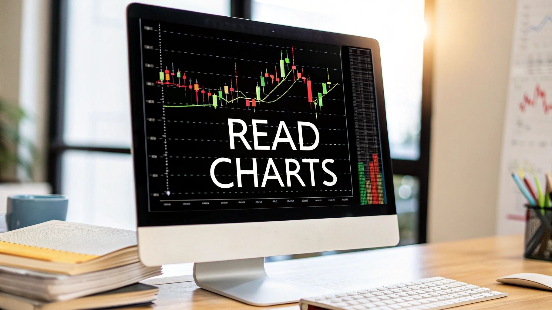
Reading a trading chart is like learning a new language. At its core, it’s all about deciphering the visual story of market psychology. You're analyzing price action—the open, high, low, and close—within a specific timeframe to understand the constant tug-of-war between buyers and sellers and hopefully get a feel for where things are headed next.
Learning the Language of the Market
Staring at your first trading chart can feel a lot like trying to read a foreign language without a dictionary. It’s intimidating. But all you're really seeing is a visual footprint of price movement over time. Each line, bar, or candle is a clue left by the market, telling a story about supply and demand.
Think of it as a weather map for the financial markets. A meteorologist reads maps to forecast the weather, and a trader reads charts to spot potential opportunities or incoming storms. The goal isn't to predict the future with 100% certainty—that's impossible. Instead, you're making educated decisions based on historical patterns and what the market is doing right now.
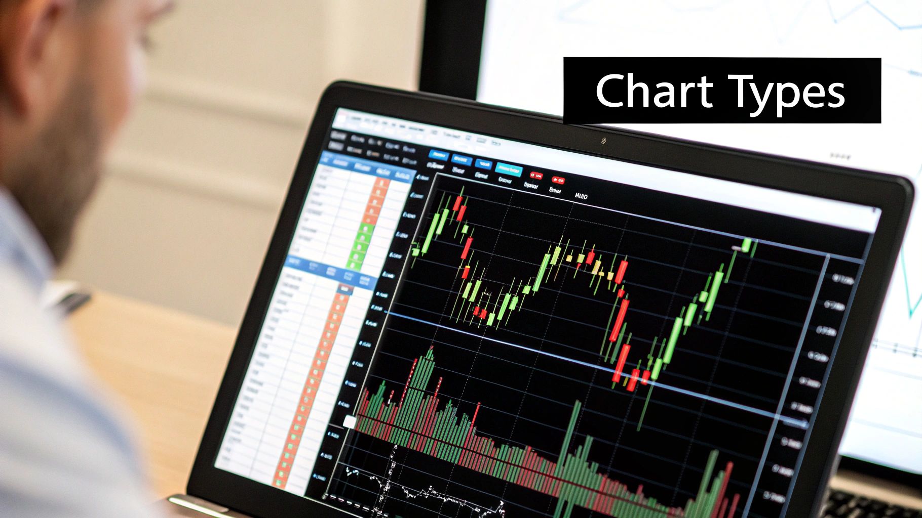
Getting to Know the Chart Types
While there are a few ways to visualize price, most traders you'll meet stick to one of three main chart types. Each gives you a different level of detail, and knowing the difference is your first step toward fluency.
Before we dive in, here’s a quick overview of the big three. Each has its place, but as you'll see, one has become the go-to for most active traders.
A Quick Guide to Chart Types
| Chart Type | What It Shows | Best For |
|---|---|---|
| Line Chart | A single line connecting the closing prices over a period. | Seeing the "big picture" trend at a glance without any extra noise. Great for beginners just starting out. |
| Bar Chart (OHLC) | The open, high, low, and close (OHLC) for each period. | A more detailed view of price volatility and ranges within a session. |
| Candlestick Chart | The OHLC, but visualized with a "body" and "wicks." | Quickly interpreting market psychology and momentum. This is the industry standard for price action traders. |
As you can see, each chart builds on the last. While line charts are simple, they leave out a ton of information that you'll need to make informed decisions. This is why most experienced traders quickly move on to something more detailed.
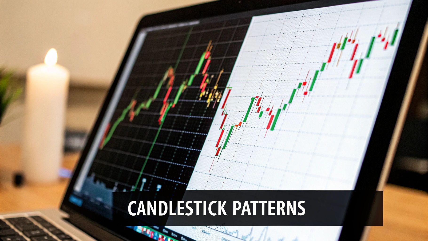
Why Candlesticks Are King
There's a reason candlestick charts are the favorite for the vast majority of modern traders. I’d estimate that well over 70% of professional traders I’ve encountered use them almost exclusively. Why? Because they make interpreting market psychology incredibly intuitive.
This isn't some new fad. The method actually came from Japanese rice traders more than 300 years ago who needed a way to visually track price movements. You can find more of the backstory on these powerful tools on sites like TradingEconomics.com.
My Take: While all charts show price, candlestick charts tell a much richer story. The color and size of each candle give you instant feedback on whether the buyers (bulls) or sellers (bears) were in control for that period. It’s the closest you can get to feeling the market's pulse.
By focusing on candlesticks from the start, you're learning the most widely spoken language in the trading world. This is the foundation you need. It will allow you to understand the patterns and strategies we'll be discussing and give you the skills to read the market’s story right from the source.
What Each Candlestick Is Telling You
Let's zoom in on the building blocks of almost every chart you'll see: Japanese candlesticks. To really learn how to read trading charts, you have to move beyond just seeing simple red and green boxes. Each candle is a miniature story about market sentiment, revealing the outcome of a battle between buyers and sellers within a specific period.
A candle has two main parts: the body and the wicks (which some people call shadows). The body shows you the difference between the opening and closing price. The wicks stretch out to show the highest and lowest prices reached during that session. The real magic, though, is in reading what their sizes tell you about market psychology.
A long, solid-colored body suggests strong conviction. If it's a green (or white) candle, it means buyers were in firm control from open to close. On the flip side, a long red (or black) candle shows that sellers absolutely dominated the session.
Shorter bodies, on the other hand, signal a lack of momentum or a period of consolidation. When you see wicks, they tell a story of indecision and price rejection. A long wick at the top of a candle means buyers tried to push the price higher, but sellers stepped in and forced it back down, rejecting those higher prices.
Key Single-Candle Clues
Some individual candles are so powerful they can signal a potential shift in market direction all on their own. They are the punctuation marks in the language of the market, and learning to spot them is a critical skill.
Here are a few essential single-candle patterns you'll see time and again:
- The Doji: This candle has a tiny (or even non-existent) body, making it look like a cross or plus sign. It screams pure indecision—neither buyers nor sellers could gain control. When a Doji shows up after a strong trend, it can be an early warning that momentum is starting to fizzle out.
- The Hammer: Found at the bottom of a downtrend, this candle has a short body and a long lower wick. It shows that sellers pushed the price down, but a strong wave of buying pressure emerged to close the price back up near its open. It’s a classic bullish reversal signal.
- The Shooting Star: This is the evil twin of the Hammer and appears at the top of an uptrend. It has a short body and a long upper wick, showing that buyers tried to push higher but were completely overwhelmed by sellers. This is a clear bearish reversal signal.
Understanding the narrative behind each candle is far more important than just memorizing its name. The Hammer shows a rejection of lower prices, while the Shooting Star shows a rejection of higher prices. Simple as that.
Simple But Powerful Two-Candle Patterns
Once you can read a single candle, you can start combining them to see more complex stories unfold. In my experience, two-candle patterns are often more reliable than single candles because they show a clearer power shift between buyers and sellers over two consecutive periods.
Let’s look at two of the most common and effective patterns:
-
Engulfing Patterns: A Bearish Engulfing pattern happens when a large red candle completely "engulfs" the body of the previous smaller green candle. This shows a dramatic shift where sellers have completely overpowered the buyers from the prior session. A Bullish Engulfing pattern is the inverse and signals a potential bottom.
-
Harami Patterns: A Harami is the opposite of an engulfing pattern. It happens when a small candle's body is completely contained within the body of the previous, larger candle. It represents a sudden loss of momentum and is often interpreted as a sign of consolidation or a potential trend reversal.
Trader's Insight: These patterns gain immense power from their location. A Hammer is a much stronger signal if it forms at a known support level. A Bearish Engulfing pattern at a key resistance level is a high-probability signal that the uptrend may be over. Context is everything.
These patterns are just the beginning. To truly master reading charts, you must study the nuances of how these candles interact with each other and with the broader market structure. For a deeper dive, you can find a comprehensive guide to Japanese candlestick patterns that covers many more variations. Studying them will build a strong foundation for your price action analysis.
Choosing Your Timeframe and Seeing the Trend
Looking at a chart without a timeframe is like using a map with no scale. You see the road, but have no clue how long the trip is. This is a fundamental mistake I see a lot of new traders make. Your first, most crucial decision is picking the right timeframe, and it all boils down to your trading style.
Each candle on your chart tells a story over a set period. On a 5-minute chart, a new candle pops up every five minutes. On a weekly chart, each candle holds an entire week of market drama.
The story can change dramatically depending on your view. A stock might look like it’s in a freefall on a 15-minute chart, but zoom out to the daily chart, and you might realize it’s just a small dip in a massive, powerful uptrend.
Matching Your Timeframe to Your Style
Your personality and, just as importantly, your daily schedule will dictate your timeframe. If you’ve got a 9-to-5 job and can only glance at the market in the evenings, trying to day trade on a 1-minute chart is a recipe for disaster. You’re much better off swing or position trading on daily or weekly charts.
- Day Traders: These folks live in the fast lane, using tiny timeframes like the 1-minute, 5-minute, or 15-minute charts. Their goal is to get in and out of multiple trades within a single session.
- Swing Traders: Holding trades for a few days to a few weeks, swing traders lean heavily on the 4-hour and daily charts to make their core decisions. This is a sweet spot for many who can't watch the screen all day.
- Position Traders & Investors: These are the long-haul players, holding assets for months or even years. They couldn’t care less about the 5-minute noise; they live on the weekly and monthly charts, focusing on the big picture.
The power of long-term charts is undeniable, especially with major indexes. Take a look at the historical performance of the DJIA. Data from 1914 to 2025 shows staggering growth from about 100 points to over 35,000, weathering countless recessions along the way. This bird's-eye view helps investors spot the major sea changes in trend.
The Power of Multi-Timeframe Analysis
Here’s a secret: the pros never stick to a single timeframe. They use a technique called multi-timeframe analysis to build a complete picture of what the market is doing. The concept is simple but powerful: use a higher timeframe to find the dominant, overwhelming trend, then drop down to a lower timeframe to pinpoint your entry and exit.
Think of yourself as a military general. You start with the satellite view (the weekly or daily chart) to see the main direction of the army's advance. Once you have your strategy, you zoom in with binoculars (the 1-hour or 15-minute chart) to find the perfect spot for an ambush.
Trader's Tip: A good rule of thumb I've always used is a ratio of 1:4 or 1:6 between your charts. If you're building your case on the daily chart, hunt for precise entries on the 4-hour chart. If you're a day trader on the 15-minute chart, you absolutely must be checking the 1-hour or 4-hour chart to make sure you're trading with the bigger flow, not against it.
Identifying the Market Structure
The final piece of this puzzle is learning to see the trend itself. We call this market structure, and frankly, it's the bedrock of all price action trading. If you don't get this, nothing else matters.
An uptrend is simply a series of higher highs (HH) and higher lows (HL). The price pushes up, pulls back to a higher level than its last dip, and then powers past its previous peak.
A downtrend is the mirror image: a series of lower lows (LL) and lower highs (LH). The price falls, bounces back to a lower peak than before, and then continues its slide.
When the market is just chopping around, not making any real progress up or down, it’s stuck in a sideways range. Learning to spot these three market states is non-negotiable. It's the first skill every serious trader must master.
Drawing Support Resistance and Trendlines
https://www.youtube.com/embed/RC4eXN3dSwQ
Now that you have a feel for candlesticks and timeframes, it’s time to bring in the most fundamental tools in any price action trader's toolkit: lines. But these aren’t just any old lines scrawled on a chart. They are visual maps of supply and demand—the psychological battlegrounds where bulls and bears fight for control.
These lines—support, resistance, and trendlines—are the absolute backbone of price action analysis. Honestly, if you want to understand how to read a trading chart, learning to draw these correctly is non-negotiable. They create the entire context for the price story you're trying to read.
Pinpointing Key Price Levels
Think of support as a price floor. It’s a level or a zone where buying interest is so strong that it absorbs all the selling pressure, causing a downtrend to halt and reverse. Imagine a stock drops to $50, finds buyers, and bounces. If it drops back to $50 a week later and bounces again, you've just identified a support level. That $50 mark is a floor where buyers have proven they are willing to step in.
Resistance is the exact opposite—it's a price ceiling. This is an area where sellers overwhelm buyers, stopping a rally in its tracks and pushing the price back down. If a stock repeatedly pushes up to $60 only to be smacked down each time, that $60 level has established itself as a significant barrier.
Finding these levels is simpler than you might think. Just look to the left on your chart.
- For Support: Scan for previous major lows or "valleys" where the price bounced up. You need to connect at least two of these swing lows with a horizontal line.
- For Resistance: Do the same for previous major highs or "peaks" where rallies failed. Connect at least two of these swing highs.
The more times a level is tested and holds, the more significant it becomes. A support level that has defended against five different sell-offs is a much more reliable area than one that's only been tested once.
Trader's Insight: I've learned from experience that it's far better to think of these as zones rather than razor-thin lines. Price rarely respects a single tick. A support zone might span from $49.50 to $50.00. Drawing a small box or rectangle can keep you from getting shaken out by a minor wick that briefly pierces a single line.
Mapping the Trend's Path
While support and resistance mark horizontal battle lines, trendlines define the diagonal path of the market. They don't just show you the direction of a trend; they help you gauge its momentum and steepness. Drawing them well is a skill that separates the pros from the amateurs, and it definitely takes practice.
An uptrend line connects two or more "higher lows" in a rising market. This line acts as a dynamic support, showing you the angle at which buyers are consistently stepping in to buy the dips.
A downtrend line connects two or more "lower highs" in a falling market. This line acts as dynamic resistance, highlighting the points where sellers are regaining control during relief rallies.
Before you start drawing lines all over the place, it helps to have a methodical approach. The infographic below shows a simple process for how I approach my chart analysis.
This flow keeps your analysis structured, starting with your main objective and drilling down to the specific trend you're looking at.
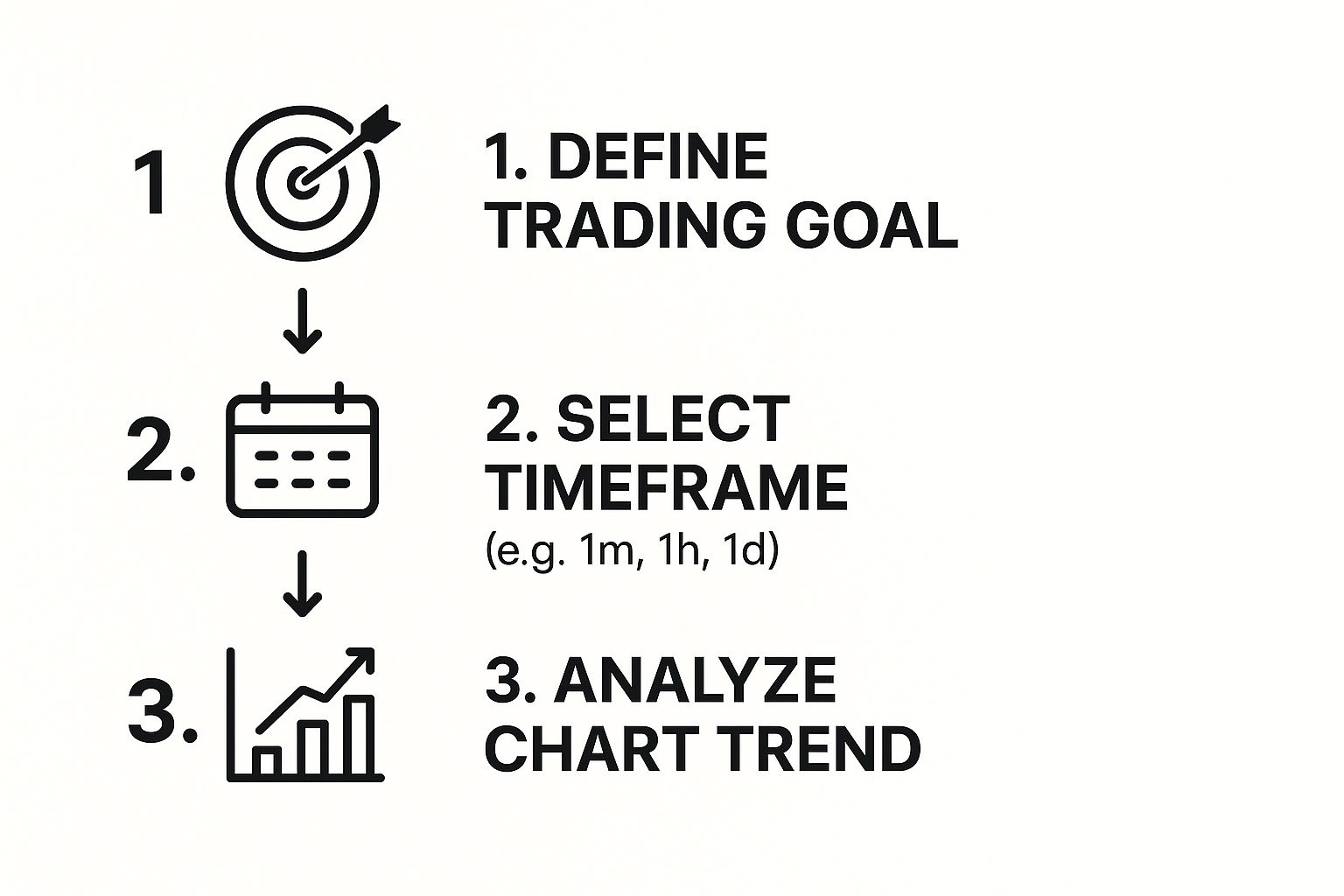
Following a logical sequence like this ensures every line you draw serves a purpose, preventing a cluttered and confusing chart.
The Role Reversal Principle
Here's where things get really interesting and where some of the best trade setups are born. When a major support or resistance level is decisively broken, it often flips its role. This is one of the most reliable principles in all of technical analysis.
- Broken Resistance Becomes New Support: Once the price smashes through a stubborn resistance ceiling, that old ceiling frequently becomes the new floor. Traders who were shorting at resistance are forced to buy back their positions, and new buyers jump in, seeing the breakout as a sign of strength.
- Broken Support Becomes New Resistance: In the same way, when a critical support floor gives way, it often turns into a new ceiling. This gives you a high-probability area to look for short entries when the price rallies back to retest the old support level from below.
This role-reversal dynamic creates incredibly clear and actionable trade signals. For a more detailed look with plenty of examples, check out this guide on how to draw a trendline correctly. Mastering this simple concept will make a massive difference in your ability to read what the market is telling you.
Using Volume and Indicators for Confirmation
So, you’ve got a handle on price action, support, and resistance. That’s the core of reading any trading chart. But to really trade with conviction, you need to learn how to find confirmation.
This is where you bring in a couple of extra tools to double-check what the price is telling you. It's how you can better spot false signals and sidestep those weak, frustrating setups.
Think of it like being a detective. The price action is your star witness, but you still want to dust for fingerprints. Volume and a couple of key indicators are that crucial backup evidence, adding weight to your trading decisions without cluttering your chart or your mind.
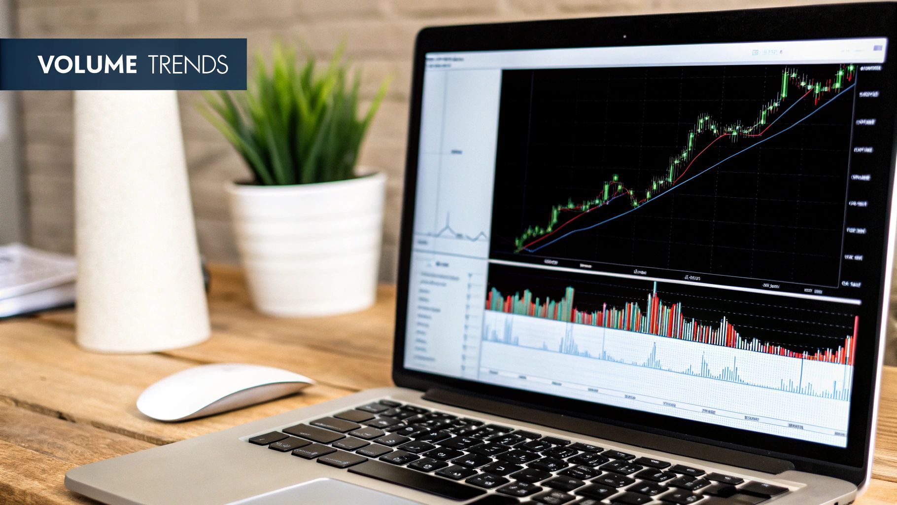
Why Volume Is the Fuel Behind the Price
If price is the car, then volume is the gas in the tank. Simple as that.
Volume is the total number of shares or contracts traded during a set period. You'll see it as those vertical bars at the bottom of your chart. It shows you the real conviction and participation behind a price move.
When a price move happens on high volume, it's significant. It’s a loud-and-clear signal that a ton of market participants are putting real money behind that move, giving it strength and legitimacy. On the flip side, a move on low, fading volume is suspicious and has a much higher chance of failing.
Here's how I think about it in real-time:
- Confirming a Breakout: Imagine a stock has been grinding under a $50 resistance level for weeks. If it finally punches through $50 on a massive spike in volume, that's an incredibly powerful signal. It tells you a wave of enthusiastic buyers just stormed the market.
- Spotting a Weak Trend: Now, what if that same stock just sort of drifts above $50 on barely-there volume? You have to be extremely wary. That suggests a lack of real interest, and the price could easily slip right back below resistance.
Trader's Takeaway: A price trend without volume is like a rumor without a source—it just can’t be trusted. I always, always glance down at the volume bars to confirm the strength of any price action that catches my eye. It’s one of the purest forms of confirmation you'll find.
Demystifying Key Technical Indicators
Alright, let's talk indicators. It is incredibly easy to get lost in the thousands of options out there. The truth is, you only need to master one or two to dramatically improve your chart reading.
I'm going to focus on two of the most trusted workhorses in my own trading: Moving Averages and the Relative Strength Index (RSI).
Moving Averages: The Trend Followers
A Moving Average (MA) is one of the simplest yet most effective indicators around. It smooths out the raw price data by calculating an average price over a certain number of periods. This helps you tune out the short-term "noise" and see the real, underlying trend more clearly.
For instance, a 50-period MA simply shows you the average price over the last 50 candles. If the current price is trading above the 50 MA, the medium-term sentiment is generally bullish. If it's below, it's bearish.
One of the most classic signals is the moving average crossover. A "Golden Cross" happens when a shorter-term MA (like the 50) crosses above a longer-term MA (like the 200), often signaling the start of a major new uptrend. The "Death Cross" is the exact opposite and can be a warning sign of a potential bear market.
The Relative Strength Index: Gauging Momentum
The Relative Strength Index (RSI) is what’s known as an oscillator. It measures the speed and change of price movements, moving on a scale from 0 to 100. Its main job is to help us spot overbought and oversold conditions.
- An RSI reading above 70 suggests an asset might be overbought and could be due for a pullback.
- An RSI reading below 30 suggests it may be oversold and could be ready for a bounce.
The key is to use this to confirm what you’re already seeing in the price action at key levels. For example, finding a bearish engulfing pattern right at a major resistance level is a good signal. But finding that same pattern while the RSI is also screaming overbought above 70? That becomes a much higher-probability setup in my book.
These signals get even more powerful when they line up with well-established supply and demand zones on your chart.
Of course. Here is the rewritten section, adopting the voice and style of an experienced human expert.
What Is the Best Chart Type for a Beginner to Learn First?
For anyone just getting started, the Japanese candlestick chart is, hands down, the best place to begin. A line chart might look cleaner, but it only shows you closing prices. You're missing out on the most important part of the story: the battle between buyers and sellers within each period.
Bar charts (or OHLC charts) give you the same info—the open, high, low, and close—but they aren't nearly as visual. Most traders find them clunky and hard to read at a glance.
Candlestick charts, on the other hand, pack all four price points into a format that’s incredibly intuitive. The colored bodies and wicks give you an instant feel for market sentiment. You can spot bullish or bearish pressure in a heartbeat, which is exactly the skill you need to build a solid foundation in price action. It's the method most of us use every single day.
How Reliable Are Classic Chart Patterns?
Chart patterns like the "Head and Shoulders," "Double Tops," or "Triangles" are a core part of a trader's toolkit, but they are not crystal balls. I can't stress this enough: their reliability is never 100%.
Think of patterns as probabilistic signals, not certainties. They give you an edge—a higher probability of one outcome over another—but never a guarantee.
The real magic happens when a pattern is confirmed by other factors. This is a concept called confluence, and it's what separates consistently profitable traders from those just getting lucky.
Here's how this plays out in the real world:
Imagine you spot a Head and Shoulders pattern at the top of an uptrend. It becomes a much higher-probability trade if you see a few other things lining up:
- The breakdown below the "neckline" happens on a big spike in volume.
- The Relative Strength Index (RSI) is showing bearish divergence (price makes a higher high, but the RSI makes a lower high).
- The entire pattern forms right at a major, pre-existing resistance level you've marked on a higher timeframe.
Never, ever trade a pattern in isolation. Always hunt for confluence. When you have multiple, non-correlated signals all pointing in the same direction, your odds of success go up dramatically.
Should I Use a Lot of Indicators on My Chart?
A classic rookie mistake is plastering a chart with too many indicators. I've seen it a thousand times. Layering on multiple Moving Averages, RSI, MACD, Bollinger Bands, and Stochastics all at once is a recipe for disaster. It leads to what we call "analysis paralysis."
You'll inevitably get conflicting signals that leave you confused and frozen, unable to make a decision.
Remember, every indicator is just a mathematical formula based on price and/or volume. Using too many is like asking ten different people for directions and trying to follow all of them simultaneously. It's a mess.
The smarter approach? Keep your charts clean. Master reading price action first.
- Foundation: Start with the raw chart: candlesticks, volume, support/resistance, and trendlines. This is your core.
- Confirmation: Then, and only then, add one or two complementary indicators to confirm what you're already seeing in the price.
For example, I might use a Moving Average to help define the overall trend and an oscillator like the RSI to gauge momentum. The key is to use indicators as a secondary tool, not the primary reason for a trade. Let price action lead.
What Is the Single Most Important Thing on a Trading Chart?
If you forced me to pick just one thing, the single most critical element to master is price action in the context of market structure.
Price action—the movement of the candlesticks themselves—is the purest information you can get. It's the real-time reflection of every belief, fear, and greedy impulse of every market participant. Every indicator is just a derivative of this raw data.
Before you even think about an indicator, you have to be able to answer one simple question by looking at your chart:
- Is the market in an uptrend, making higher highs and higher lows?
- Is it in a downtrend, carving out lower highs and lower lows?
- Or is it just ranging, chopping sideways with no clear direction?
Answering that question gives you the context for everything else. A bullish pin bar is incredibly powerful in a strong uptrend, but it means very little in the middle of a downtrend. Learning to read price directly is the most fundamental and valuable skill you can develop in your entire trading career.
Ready to stop relying on confusing indicators and learn a proven, price-action based approach? Colibri Trader offers a clear path to building real trading skill and confidence. Take the first step by discovering your unique trading strengths.