


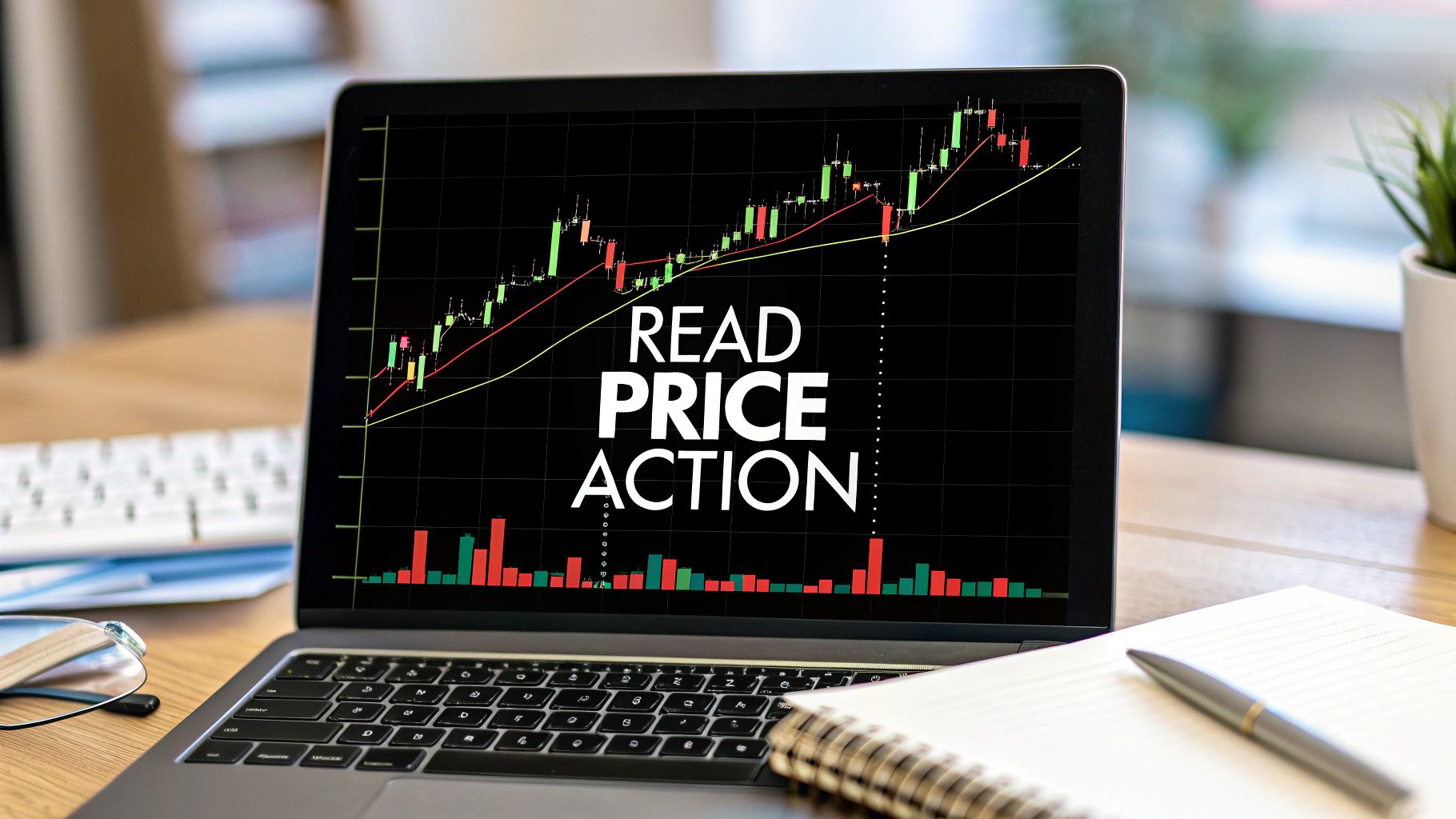
How to Read Price Action A Trader’s Guide
If you're just getting started, you might hear the term "price action" thrown around a lot. So, what is it?
Simply put, reading price action is about interpreting the raw movement of a security's price right on the chart. You're not relying on a bunch of lagging indicators to tell you what to do. Instead, you're learning to read the story the market is telling through candlestick patterns, market structure, and crucial support and resistance levels.
This approach helps you make much clearer decisions based on what's happening right now, not what happened 15 minutes ago.
What Is Price Action and Why Does It Matter?
At its heart, price action is the footprint of money. Every single economic report, every earnings surprise, and every wave of trader emotion is ultimately baked into one thing: the price chart. When you learn to read price action, you're really learning to interpret the collective psychology of every buyer and seller in the market.
It's easy to get drawn to fancy technical indicators like the RSI or MACD, especially when you're new. And while they have their place, they are, by definition, lagging. They need to process past price data to spit out a signal, which means they'll always be a step behind the live market.
Price action is happening in real-time.
The biggest advantage of trading with pure price action is clarity. When you strip all the indicators off your charts, you're left with a clean canvas that shows you the raw, unfiltered story of the market. This forces you to focus on the single most important piece of data available: the price itself.
Before we dive into the "how," it's helpful to understand the core components you'll be looking at. These are the fundamental building blocks of reading any chart.
Core Components of Price Action Analysis
| Component | What It Reveals |
|---|---|
| Candlestick Patterns | The micro-story of the battle between buyers and sellers in a single period. |
| Market Structure | The sequence of swing highs and lows that define the overall trend (or lack thereof). |
| Support & Resistance | Key horizontal levels where buying or selling pressure is historically strong. |
| Trend Lines | The diagonal direction of the market, connecting key price points. |
Each of these elements provides a different piece of the puzzle. When you learn to put them together, the market's narrative becomes much clearer.
The Power of a Clean Chart
Imagine trying to read a book while someone has scribbled all over the pages with colorful, distracting drawings. That’s what trading with a chart cluttered with indicators can feel like. A price action trader prefers a "naked" or clean chart, focusing almost exclusively on the price bars or candlesticks.
This approach brings some serious advantages to the table:
- It reflects real-time market psychology: Every candle tells you who won the fight between the bulls and bears over a specific timeframe.
- It cuts down on "analysis paralysis": With fewer conflicting signals to worry about, your decision-making becomes much more direct and less stressful.
- It often provides leading signals: Price patterns tend to form before a big move happens, giving you a potential jump on indicator-based signals that only confirm the move after it's already underway.
The Statistical Edge of Price Patterns
This isn't just about "feel" or subjective chart reading; there's a real statistical basis to this. Backtesting studies on price action strategies have shown they can offer a genuine edge.
For instance, certain strategies built around breakouts, trends, and reversals have demonstrated a statistically significant advantage. Breakout trades at key resistance levels have historically outperformed random entries by 5–10%. On top of that, some reversal candlestick patterns have shown win rates topping 55% in both stock and futures markets. You can dig into some of this data in research from Quantified Strategies on day trading with price action.
At the end of the day, learning to read price action isn't about finding a crystal ball to predict the future. It's about interpreting the present reality of the market so you can spot high-probability setups where the risk is defined and the potential reward makes sense.
It’s your foundation for seeing the market as a clear story of supply and demand, not just a bunch of random wiggles on a screen.
Decoding The Language Of Candlesticks
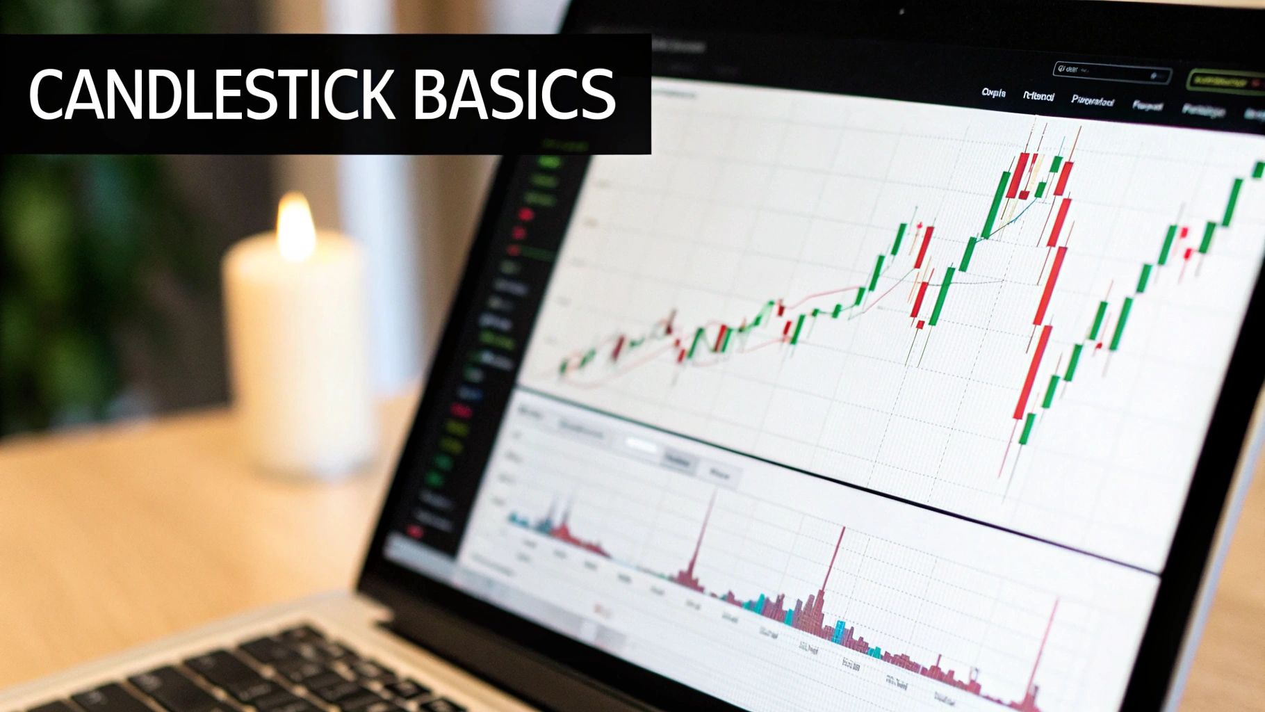
If price action is the story of the market, candlesticks are the words. Each and every candle tells a self-contained story about the fight between buyers and sellers over a specific slice of time. Learning to read these individual stories is a non-negotiable skill if you want to understand price action on a deeper level.
Instead of trying to memorize dozens of abstract patterns, your goal should be to understand what each part of a candle actually represents. This simple shift in thinking turns abstract shapes into concrete, actionable market information.
The Anatomy Of A Single Candle
Every single candlestick, no matter its shape or size, is built from the same core components. Understanding these is the first step in decoding the market's message.
- The Body: This is the thick, rectangular part of the candle. It simply shows you the distance between the opening and closing price for that period. A long body signals strong conviction, while a short, stubby body suggests indecision or weak momentum.
- The Wicks (or Shadows): These are the thin lines sticking out from the top and bottom of the body. They mark the highest and lowest prices the market reached during that period. Long wicks are a huge tell—they often signal significant price rejection and volatility.
- The Color: This is the most basic signal. Traditionally, green (or white) candles mean the price closed higher than it opened (a bullish candle). Red (or black) candles mean the price closed lower than it opened (a bearish candle).
Just one candle can tell you a surprising amount about market sentiment. Think about it: a long green candle with almost no wicks tells you buyers were in complete control from start to finish. On the flip side, a candle with a tiny body but long wicks poking out in both directions screams market indecision. Neither buyers nor sellers could gain any real ground.
Key Candlestick Patterns And Their Psychology
While there are hundreds of named patterns out there, a small handful appear again and again. These patterns carry significant weight, especially when they show up at critical market levels. They work because they represent clear, repeatable shifts in market psychology.
A fantastic way to build your skills here is to explore how to master your price action trading strategy with a complete guide, as this can give you a more structured path for your learning journey.
https://www.colibritrader.com/master-your-price-action-trading-strategy-a-complete-guide/
Let's break down three of the most important patterns you'll see.
The Pin Bar (Or Hammer/Shooting Star)
A Pin Bar is easy to spot: it has a very long wick sticking out one end and a small body bunched up at the other.
- Bullish Pin Bar (Hammer): This one has a long lower wick. It shows that sellers tried to push the price way down, but buyers stormed back in, rejecting those lower prices and closing near the high. This is a powerful signal of buying rejection.
- Bearish Pin Bar (Shooting Star): This version features a long upper wick. It tells you buyers attempted to rally but were completely overpowered by sellers who pushed the price back down. This is a clear sign of selling rejection.
Think of that long wick as the footprint of a failed attack. It shows you the market tried to go in one direction but was forcefully beaten back.
The Engulfing Bar
This is a potent two-candle pattern where the body of the second candle completely "engulfs," or swallows, the body of the candle that came before it.
- Bullish Engulfing: A large green candle’s body completely covers the previous red candle's body. It’s a visual signal that buyers have decisively wrestled control away from sellers.
- Bearish Engulfing: A large red candle’s body completely wraps around the prior green candle’s body, showing that sellers have overwhelmed the buyers and are now in charge.
An Engulfing Bar is a sign of a strong, often sudden reversal in momentum. As a rule of thumb, the larger the engulfing candle, the more significant the signal.
Trader's Insight: The most powerful candlestick signals never happen in a vacuum. A Pin Bar that forms in the middle of a choppy, sideways range means very little. However, a perfect Bearish Pin Bar that prints right at a major resistance level after a long rally? That is a high-probability signal that should command your full attention. Context is everything.
Reading the Market's Overall Direction
Candlesticks give you the micro-story, but it's the market structure that truly reveals the plot. Before you can even think about placing a trade, you have to zoom out. You need to get a feel for the market's overall direction. Are the buyers in charge, are the sellers calling the shots, or is it a stalemate?
This broader context is the most important filter for every single trade you take. Really learning to read price action begins with identifying the prevailing trend. This tells you whether you should be hunting for buying opportunities or looking to get short.
Identifying The Three Market Phases
At any moment, the market can only be in one of three states. Your job is to figure out which one is active by simply watching the sequence of peaks and valleys—the swing highs and swing lows—that price carves out as it moves.
-
Uptrend (Bullish Phase): Price is consistently printing a series of higher highs (HH) and higher lows (HL). This is a classic sign that buyers are in control. They're strong enough to push prices to new peaks, and sellers can't even drag the price back to the previous low.
-
Downtrend (Bearish Phase): The chart is showing a sequence of lower lows (LL) and lower highs (LH). This is a dead giveaway that sellers have the upper hand, driving prices down and snuffing out any rally attempts before they can reclaim previous highs.
-
Range (Consolidation Phase): Price is just bouncing around between a clear high and low, not making any real progress. This signifies indecision or equilibrium—a state where neither buyers nor sellers have a clear advantage.
These aren't just textbook definitions; they are the strategic bedrock of price action trading. Your primary job is to trade in harmony with the current market phase. This means you should be biased toward looking for buys in a confirmed uptrend and sells in a confirmed downtrend.
How To Read The Health Of A Trend
Once you've spotted a trend, the next step is to keep a close eye on its health. A strong, energetic trend looks completely different from one that's running out of gas and getting ready to turn over. The key is to watch the swing points for clues.
Let's take an uptrend, for example. The market pushes to a higher high, pulls back to form a higher low, and then powers on to another higher high. That’s the healthy, rhythmic pulse of a bullish market. But what happens when that rhythm changes?
The very first warning sign of a trend losing steam is a "failure to swing." In an uptrend, this happens when price fails to make a new higher high. In a downtrend, it’s the failure to make a new lower low. This is a critical piece of information.
This failure to print a new peak tells you that the buying pressure is starting to dry up. It doesn't mean the trend is over—not yet. But it's a yellow flag. It’s the market whispering that you should probably tighten up your risk management and think twice before jumping into new long positions.
The Anatomy Of A Trend Reversal
A full-blown trend reversal doesn't just happen out of the blue. It’s a process, a sequence of events you can actually see on the chart. Understanding this sequence is vital if you want to know how to read price action when the market hits a turning point.
Let's stick with our uptrend example. Here’s the typical playbook for how a reversal to a downtrend unfolds:
- Failure to Make a Higher High: Like we just discussed, this is the first red flag. Bullish momentum is fading.
- Break of Market Structure: The critical moment arrives when price breaks below the most recent higher low (HL). This move directly violates the definition of an uptrend and is often called a "break of market structure" or BOS.
- A New Lower High Forms: After the structure breaks, price will often try to rally a bit. But it will fail to take back the previous high, instead creating a lower high (LH). This confirms that sellers are now willing to step in at lower prices.
- Confirmation with a Lower Low: The final nail in the coffin for the uptrend is when price breaks below the low created in step #2, officially printing a lower low (LL) on the chart.
Once this sequence is complete, the market has officially put in a lower high and a lower low. The structure has flipped from bullish to bearish. At this point, your entire trading bias needs to shift from looking for buys to actively seeking selling opportunities on pullbacks.
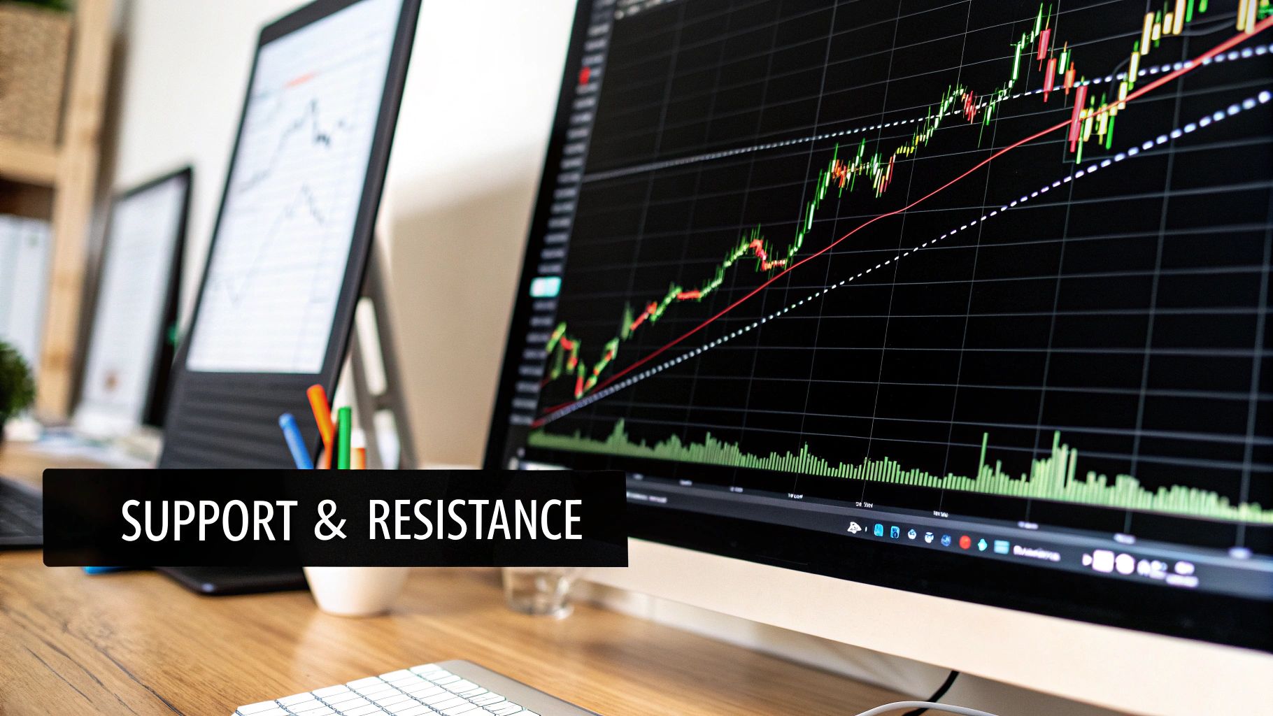
Finding Key Support and Resistance Zones
If market structure gives you the plot, then support and resistance zones are the key scenes where all the action unfolds. These aren't just arbitrary lines drawn on a chart. They are critical price areas where the battles between buyers and sellers have historically been fought and decided.
To really read price action effectively, you have to be able to pinpoint these zones with confidence.
Think of support and resistance as the floor and ceiling of a room. Support is the price floor where a wave of buying interest tends to step in, preventing the price from dropping further. On the flip side, resistance is the price ceiling where selling pressure usually shows up, capping any more upward movement.
These levels exist because of market memory. If a price level was a major turning point in the past, traders will be watching it like a hawk when the price gets close again. This attention can create a self-fulfilling prophecy of supply and demand.
Moving From Lines to Meaningful Zones
A classic mistake I see new traders make is drawing support and resistance as razor-thin, single-price lines. But the market is rarely that precise. It’s far more effective to think of these as zones or broad areas of interest.
A support zone might span a few pips or points, representing a general area where buyers have shown up before.
Instead of a thin line, try drawing a thick box or rectangle on your chart. This simple visual cue reminds you that you're looking for a reaction within an area, not at one specific price. This small shift in perspective can save you from getting shaken out by minor price wiggles that pierce a single line but still respect the overall zone.
Pro Tip: The more times a level has been tested and has held, the stronger and more significant it becomes. A support zone that has been respected three or four times carries far more weight than a level with only one prior touch.
How to Identify Horizontal Support and Resistance
The most straightforward way to find these levels is by looking for obvious swing points in the market's past. Here’s a simple process I use:
- Zoom out your chart. Start with the daily or 4-hour chart to get a bird's-eye view of the major turning points.
- Look for the peaks. Find the clear highs where the price turned back down. These form your potential resistance zones.
- Look for the valleys. Find the obvious lows where the price bounced back up. These are your potential support zones.
Now, just draw horizontal lines or boxes connecting these peaks and valleys. You'll often see that the market respects the same general area multiple times. These are your high-probability S/R zones.
Support and resistance levels come in a few different flavors. Understanding the distinctions can really sharpen your analysis.
Here's a quick breakdown of the main types you'll encounter on your charts.
| Level Type | Description | How to Identify It |
|---|---|---|
| Horizontal S/R | Static price levels that act as a floor (support) or ceiling (resistance). | Look for historical price peaks (resistance) and troughs (support). Connect them with a horizontal line or zone. |
| Dynamic S/R | Moving levels that change as the price evolves, often used in trending markets. | Use moving averages (e.g., 20 EMA, 50 SMA). In an uptrend, price often bounces off the MA as support. In a downtrend, it hits it as resistance. |
| Trend Lines | Diagonal lines that connect a series of higher lows in an uptrend or lower highs in a downtrend. | In an uptrend, draw a line connecting at least two significant swing lows. In a downtrend, connect at least two swing highs. |
| Role Reversal Levels | A former support level that, once broken, becomes a new resistance level (and vice versa). | Identify a strong, broken support or resistance level. Watch for price to retest this level from the opposite side. |
Seeing these different types on your chart gives you a more complete picture of the market's structure.
The Critical Principle of Role Reversal
This is one of the most powerful concepts in price action trading. When a strong support level is decisively broken, it often flips and becomes new resistance. The opposite is also true: when a key resistance level is broken, it frequently turns into new support.
Why does this happen? The psychology behind it is straightforward.
Imagine buyers who bought at a support level, expecting a bounce. When that support breaks, they are now holding a losing position. If the price ever returns to that level, their first instinct is often to sell and get out at their breakeven point. This wave of selling creates new resistance where there was once support.
For a deeper dive into this dynamic, our guide on understanding supply and demand levels in price action trading provides excellent context. This "role reversal" principle is a fantastic way to anticipate future turning points.
Dynamic Support and Resistance
Not all S/R levels are static and horizontal. Some are dynamic, meaning they move right along with the price. The most common example is moving averages, like the 20 or 50 EMA.
- In a strong uptrend, the price will often pull back to a moving average, find support, and then resume its journey higher.
- In a downtrend, the price might rally up to a moving average, hit it as resistance, and then continue its move lower.
These dynamic levels are especially useful for finding high-probability entries within an established trend.
Finding Confluence for High-Probability Setups
The absolute best trading opportunities often show up at a point of confluence. This is where multiple support or resistance factors all converge in the same price area.
For example, imagine a scenario where a horizontal resistance zone lines up perfectly with a falling trend line and the 50-period moving average. A price rejection at this specific point is far more significant than a rejection at any single one of those levels alone.
When you spot confluence, it's a signal to pay very close attention. The odds of a meaningful market reaction are much, much higher.
Using Volume to Confirm Your Analysis
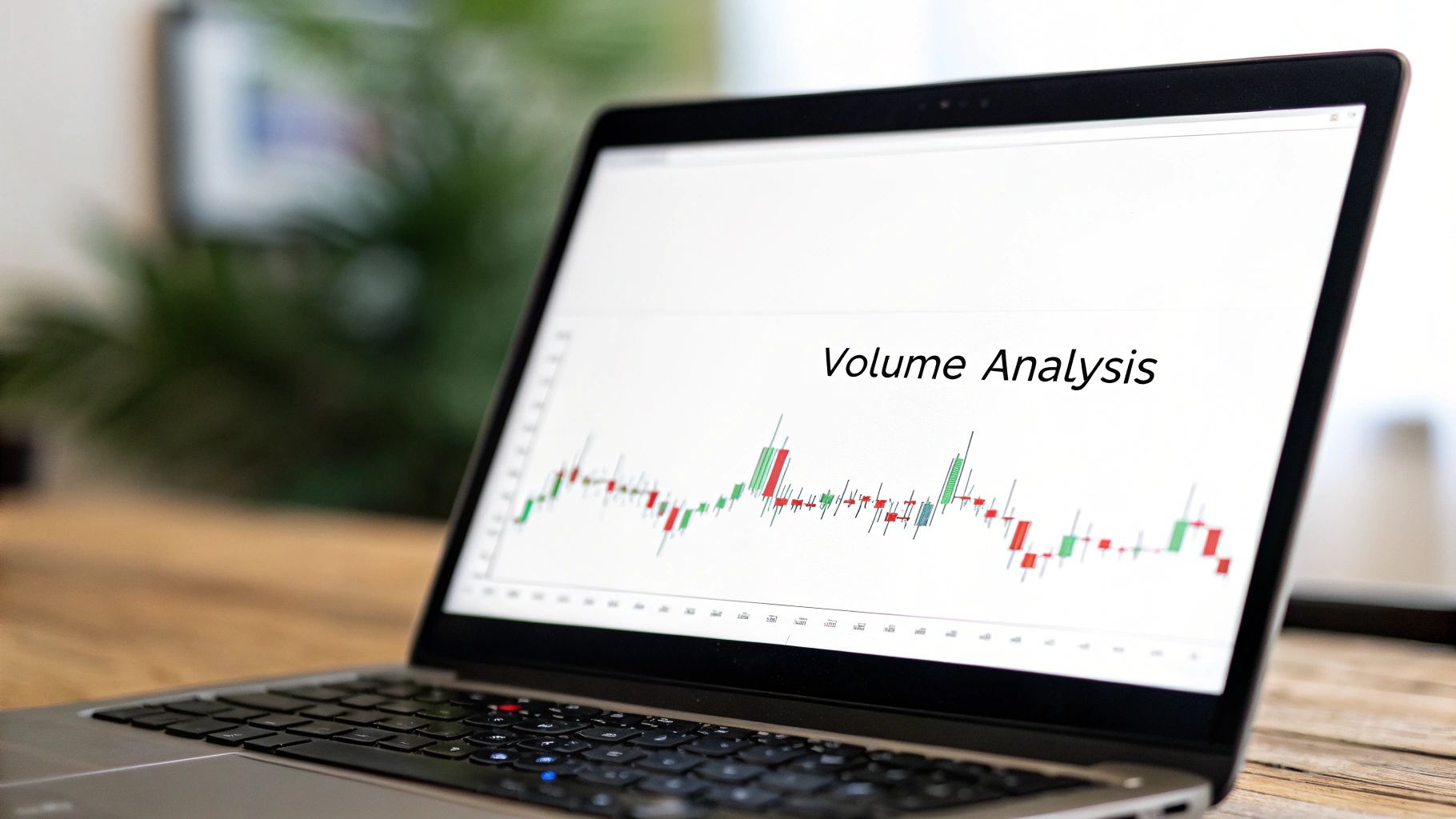
So far, we've only looked at what price itself is telling you—the candlesticks, the market structure, and those all-important zones. Now, it's time to add a critical layer of confirmation to your analysis.
Think of it like this: price tells you what happened, but volume reveals how much conviction was behind that move.
Volume is simply the total number of shares or contracts traded in a given period. It's a direct measure of market participation. By learning to read volume, you can start to see the difference between a genuine market shift backed by big money and a flimsy, false move designed to trap retail traders. It’s a skill that will give you so much more confidence in the setups you take.
Volume and Breakouts
One of the best ways I use volume is to confirm breakouts from key support or resistance zones. A breakout is only as believable as the participation behind it.
Imagine price has been churning below a major resistance level for days. Finally, a big bullish candle smashes through it. Looks good, right? But a quick glance at the volume bar gives you the real story.
-
High-Volume Breakout: If that breakout candle is paired with a massive spike in volume, it shows that a wave of institutional buying likely drove the price up. This is a strong sign of genuine intent. The big players have put their money where their mouth is, making it far more likely the breakout will hold and continue higher.
-
Low-Volume Breakout: Now, if that same breakout happens on weak, anemic volume, that’s a huge red flag. This tells me there's a lack of real interest. It's very likely a false breakout, or "fakeout." The price will often get sucked right back below the resistance level, trapping anyone who chased the initial pop.
Confirming Reversal Patterns with Volume
Volume is just as crucial for validating candlestick reversal patterns. A powerful pattern like a Pin Bar or an Engulfing Bar becomes exponentially more reliable when it forms on a big volume surge.
Let's say a market has been dumping hard and finally hits a major daily support zone. All of a sudden, a perfect Bullish Pin Bar forms, rejecting the lower prices. If this rejection happens on the highest volume you've seen in the last 20 bars, that's an incredibly powerful signal. It tells you that a large number of buyers aggressively stepped in at that support level and simply overpowered the sellers.
Without that volume spike, the Pin Bar is still a signal, but with it, the story becomes far more compelling. The volume confirms that the battle at that level was fierce and that the buyers won decisively.
Key Takeaway: I always think of it this way: Volume is the effort, and price is the result. If you see huge effort (high volume) but a tiny result (small candle or long rejection wick), it signals exhaustion. If you see a big result (strong breakout) on little effort (low volume), it's a warning sign of a weak, untrustworthy move.
Volume and Trend Health
You can also use volume to get a read on the health of an existing trend. A healthy, sustainable trend has a certain rhythm to its volume signature.
- Impulse Moves: In a strong uptrend, the legs that push to new higher highs (the impulse waves) should ideally happen on increasing or high volume. This shows that buyers are enthusiastic and keep participating as the price climbs.
- Corrective Moves: The pullbacks that form higher lows (the corrective waves) should happen on diminishing or low volume. This indicates that selling pressure is light and there isn't much interest in pushing the price down.
If you spot this pattern reversing—say, an impulse move on weak volume followed by a pullback on surging volume—it’s a warning sign. The trend might be losing steam and could be setting up for a reversal. This isn't just theory; historical data shows that trading on high-volume days, where market participation is strong, tends to produce clearer price action. You can learn more from this statistical analysis of trading patterns that digs into the correlation between volume and price behavior.
Building Your Price Action Trading Plan
So, you've got the individual pieces of the puzzle down. You can spot a trend, draw your key zones, read the stories candlesticks are telling, and use volume to see if the big players agree. Now comes the real work: putting it all together. This isn't just about knowing things; it's about building a disciplined, repeatable process that guides every single trade you take.
A solid plan is what separates professional traders from gamblers. It yanks emotion and guesswork out of the equation. It forces you to be patient, to sit on your hands until the market gives you your specific setup. Without a plan, you’re just a ship without a rudder, getting tossed around by market noise. With one, you're a hunter, patiently waiting for the perfect shot.
Defining Your Core Strategy
At its heart, your trading plan is a simple "if-then" statement. It’s your core reason for entering the market.
For example, a bread-and-butter strategy might sound something like this: "If the daily chart is in a clear uptrend and price pulls back to a major support zone, then I will look for a bullish Pin Bar on high volume to go long."
Think about what that simple sentence accomplishes. It checks all the boxes:
- Market Structure: "in a clear uptrend"
- Support and Resistance: "pulls back to a major support zone"
- Candlestick Signal: "look for a bullish Pin Bar"
- Volume Confirmation: "on high volume"
This single, clear rule keeps you out of choppy, unpredictable markets. You know exactly what you’re looking for, which means you can confidently ignore everything else.
A trading plan is your business plan. It outlines your goals, your entry and exit strategies, and your risk management rules. Trading without one is one of the fastest ways to fail. It's the foundation of consistent profitability.
Once your entry signal fires, the game is far from over. The real management of the trade begins, as you can see below.
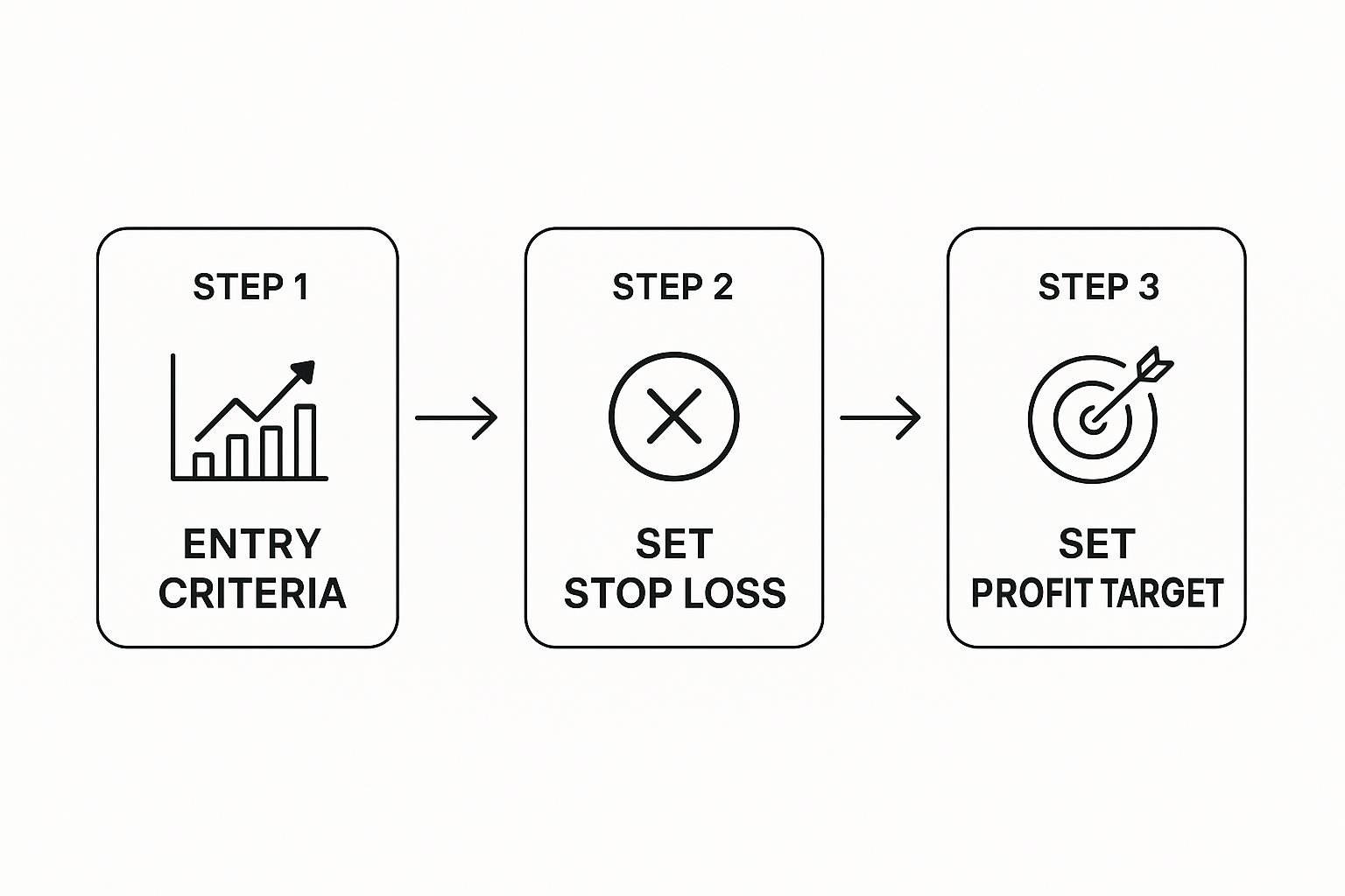
This just shows that finding a good entry is only the first step. Knowing where you’re wrong (your stop loss) and where you’ll take profit is just as critical.
Your Pre-Trade Checklist
Before you ever dream of clicking that buy or sell button, you need a quick, non-negotiable checklist. Run through it every single time. It's your final quality control.
- What's the bigger picture? Look at the Daily or 4-Hour chart. Are we trending up, down, or just stuck in a range? Your trade needs to be on the right side of the dominant flow.
- Where are the major roadblocks? Have I drawn the most obvious, significant support and resistance levels on my chart? The ones that jump right out at you.
- Is price at my level? The best trades happen when the market comes to you at a pre-marked zone of interest. Don't chase it.
- Do I have a clear signal? Has a clean, textbook-perfect reversal candle like a Pin Bar or Engulfing Bar printed right at my level?
- Is there any power behind the move? Did that signal candle form on a spike in volume? This tells you the big money is likely involved.
If you can't give a confident "yes" to every question, then there is no trade. It’s that simple. This disciplined patience—waiting for all your stars to align—is the soul of professional price action trading.
To really cement this process, you can find more examples in guides that show you how to trade price action with a systematic approach. This helps build the muscle memory needed for a robust trading framework.
Common Questions About Reading Price Action
Even after you get a solid grip on the basics, there are always a few questions that pop up again and again for new traders. Getting clear answers to these can help you sidestep common hurdles and build real confidence a lot faster.
Let's clear up a couple of the most frequent sticking points I see.
Can You Mix Price Action With Indicators?
One of the first things traders ask is whether they can pair price action with indicators. Absolutely. While many purists trade on "naked" charts (charts with no indicators at all), plenty of successful traders use a hybrid approach.
The key is to let price action always lead your analysis. An indicator, like a moving average or the RSI, should only ever be used for secondary confirmation of what the price is already telling you.
Never, ever let an indicator's signal override a clear message from the price action itself. Price is king.
What Is the Best Timeframe to Use?
Another big question is about the best timeframe. The beautiful thing about price action is that its principles are universal—they work just as well on a 1-minute chart as they do on a weekly one.
That said, if you're just starting out, I strongly recommend you begin on the higher timeframes. Stick to the 4-hour or Daily charts.
Why? These charts move more slowly and have far less market "noise." This makes the key support and resistance zones much more reliable and the candlestick patterns easier to spot and interpret. It gives you the breathing room you need to practice without feeling completely overwhelmed.
Think of it like learning a new language. You can memorize vocabulary and grammar rules in a few weeks, but genuine fluency only comes after months of immersive practice.
Your goal isn't just to know the rules, but to build an instinctive feel for the market's rhythm. That only comes from screen time—analyzing charts, placing trades, and reviewing everything, whether it was a win or a loss.
At Colibri Trader, we provide the structured guidance and mentorship to help you build that fluency. Our action-based programs cut through the noise, focusing on the proven price action techniques that create consistent traders. Start your journey and discover your trading potential with us today.