


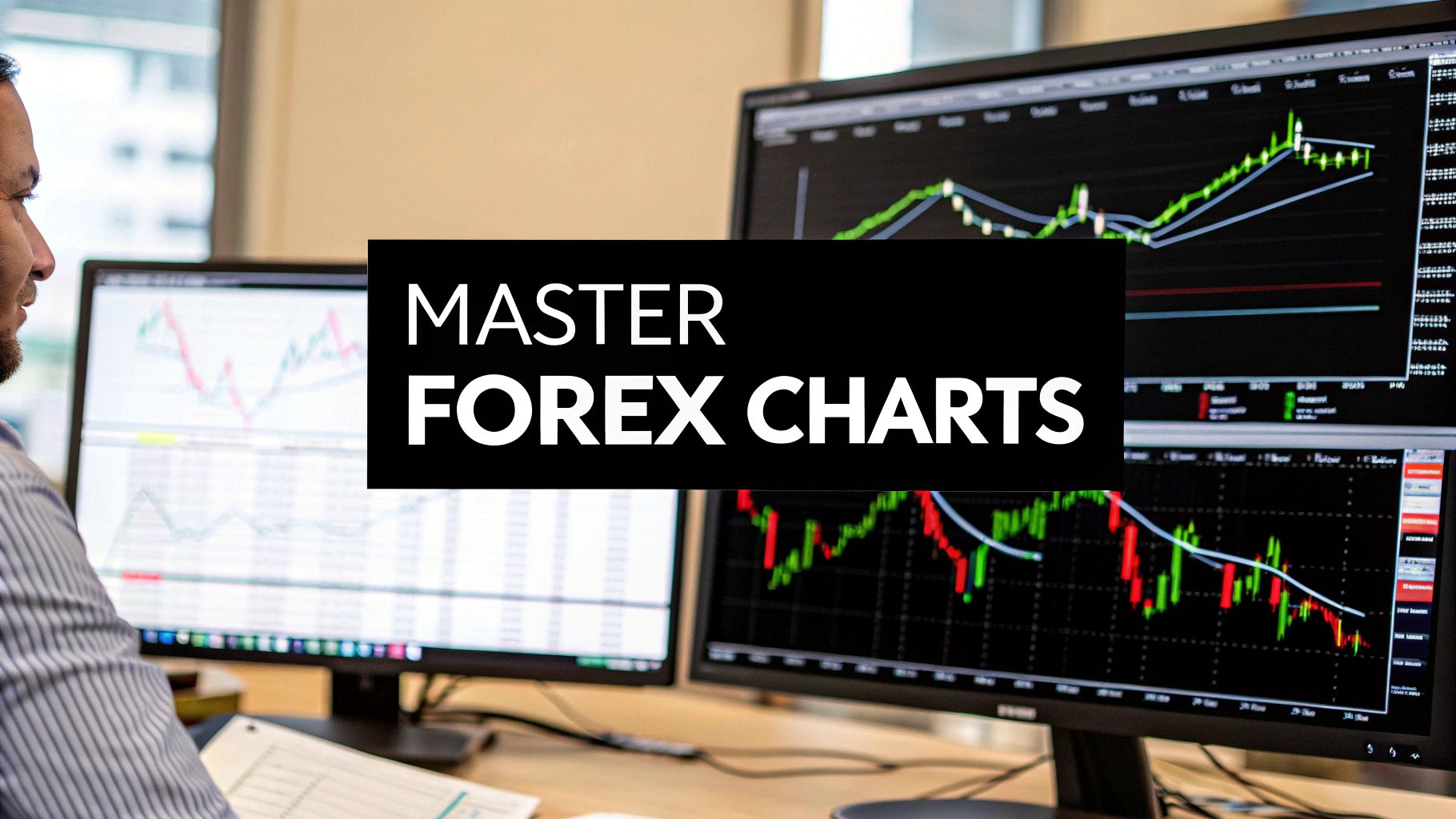
How to Read Forex Charts A Practical Guide
Learning how to read forex charts is all about a few core skills: picking the right chart type, understanding what each price tick means, and seeing the bigger picture the market is painting. The two most critical pieces are getting a feel for candlestick patterns—they show you the tug-of-war between buyers and sellers—and plotting trend lines to track the market's overall direction. Nail these down, and you’re on your way to making much smarter trading decisions.
Your Starting Point for Reading Forex Charts
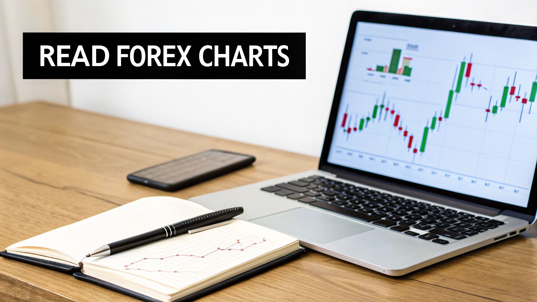
Think of a forex chart as the story of a battle between buyers and sellers over a currency pair. It might look like a jumble of lines and colors at first, but it’s just plotting price against time. Your job is to learn how to read that story so you can analyze price action and spot potential opportunities.
And it's a massive story. The global forex market sees an average daily turnover of $7.51 trillion as of April 2022. Charts are the single most important tool traders have to make sense of all that activity. You can get more details on the daily forex trading volume from this comprehensive report.
The Three Main Types of Charts
Before you can analyze anything, you need to choose the right lens to view the market through. You'll run into three main chart types, each offering a different level of detail.
Most traders gravitate toward one type, but it's good to know what all three do. Let's break them down.
The Three Main Types of Forex Charts
| Chart Type | Information Displayed | Best For |
|---|---|---|
| Line Chart | Just the closing prices over a set period. | Seeing the big-picture, long-term trend at a glance. |
| Bar Chart | Open, High, Low, and Close (OHLC) prices for each period. | A more detailed view than a line chart, showing the period's full range. |
| Candlestick Chart | The same OHLC data as bar charts, but in a much more visual format. | Quickly gauging market sentiment and spotting common trading patterns. |
As you can see, each has its place, but there’s a clear favorite for a reason.
For most active traders, candlestick charts are the undisputed winner. The visual design—the colored "body" and the "wicks"—makes it incredibly easy to see the relationship between the open and close, gauge the intensity of buying or selling pressure, and spot repeatable patterns that can give you a heads-up on where the price might go next.
Key Takeaway: While line and bar charts have their uses, mastering candlestick charts is non-negotiable if you want to read forex charts effectively. They pack the richest visual data into a format that's perfect for day-to-day analysis.
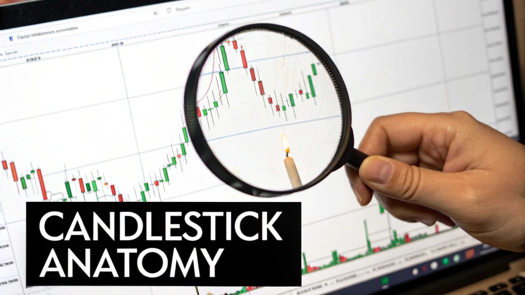
The image below is a classic example of a candlestick chart. The green candles show the price moved up (bullish), and the red ones show it moved down (bearish).
This single image tells a powerful story. You can see how the size of each candle's body and the length of its wicks give you clues about the session's volatility and which side—buyers or sellers—had more conviction. We'll break down exactly what all of that means in a bit.
Decoding the Language of Candlesticks
While a simple line chart gives you the basic plot, candlestick charts tell the full story. If you're serious about trading forex, learning to read these is probably the single most important skill you can develop.
Think of each candlestick as a snapshot of the battle between buyers (bulls) and sellers (bears) over a specific chunk of time. It's a visual language that, once you get the hang of it, shows you exactly who's winning.
Every single candle hands you four critical pieces of data on a silver platter: the open, high, low, and close prices for that period. The way these four points come together forms the candle's shape and gives you a powerful read on market sentiment.
This language is universal. It works the same on a 5-minute chart for EUR/USD as it does on a weekly chart for gold, making it an indispensable tool in your arsenal.
The Anatomy of a Single Candle
Let's break it down. Every candlestick has two main parts: the body and the wicks (some traders call them shadows or tails). Getting what each part represents is the foundation of reading price action.
- The Body: This is the thick, rectangular bit. It shows you the distance between where the price opened and where it closed for that session. Its color tells you which way the price moved.
- The Wicks: These are the thin lines poking out from the top and bottom of the body. They show the absolute highest and lowest prices the asset hit during that period before settling at the close.
It’s the interplay between the body and the wicks that reveals the real drama—the intensity of the fight between buyers and sellers.
Bullish vs. Bearish Candles
The first thing a candle tells you is direction, and it does that with color. Most charting platforms let you customize these, but the standard convention is straightforward.
A bullish candle (usually green or white) shows up when the closing price is higher than the opening price. Simple enough. This means buyers were in charge, pushing the price up. A long, solid green body is a sign of strong buying pressure and conviction.
On the flip side, a bearish candle (usually red or black) forms when the closing price is lower than the opening price. This tells you sellers dominated that period, driving the price down. A big, fat red body screams heavy selling pressure.
Trader's Insight: The size of the candle's body is a direct reflection of momentum. A string of long bullish bodies points to a strong, confident uptrend. A series of long bearish bodies? That's a powerful downtrend in the making.
What the Wicks Are Telling You
The wicks add crucial context that the body alone can't provide. They map out the price extremes and tell you a ton about volatility and, more importantly, indecision. Think of long wicks as the story of a battle that was fought hard but ended without a clear winner.
Let's look at a couple of scenarios:
- Long Upper Wick: See a candle with a small body but a long wick sticking out the top? That means buyers tried to rally hard, pushing the price way up. But before the session closed, sellers jumped in and slammed it back down. This can be a major red flag that buying momentum is sputtering out, hinting at a potential reversal.
- Long Lower Wick: This is the exact opposite story. Sellers managed to drag the price way down, but buyers saw a bargain and stepped in with force, pushing the price all the way back up to close near the high. This shows powerful underlying support and can signal a reversal from a downtrend.
When you start seeing candles with long wicks and small bodies pop up, it’s often a sign of market indecision. Neither the bulls nor the bears could land a knockout punch.
These individual candles are just the alphabet. To really become fluent, you need to see how they form words and sentences through patterns. For a deeper dive, exploring more on understanding candlesticks charts will give you the building blocks for anticipating moves with more confidence.
Identifying Market Trends and Momentum
Individual candlesticks are the words, but the market trend is the full conversation. Learning how to read the market's overarching narrative is where the real analysis begins.
Price rarely moves in a straight line. It ebbs and flows, creating recognizable trends that give you critical context for every single trade you’re thinking about taking.
Understanding these larger movements helps you stop fighting the market's current. A strong trend is like a powerful river; it's a hell of a lot easier to trade downstream than to paddle against the flow. Your job is to figure out which way the river is flowing and for how long it might continue.
The Three Phases of Market Movement
Every market, no matter the asset, exists in one of three distinct phases. Figuring out which phase you're in is the first step to aligning your strategy with what's actually happening.
- Uptrend (Bullish): This is just a series of higher highs and higher lows. Think of it like climbing a staircase—each step up is a new high, and each landing is a higher low than the one before it. This shows consistent buying pressure is in control.
- Downtrend (Bearish): The polar opposite. Here you'll see a series of lower highs and lower lows. It's like walking down a flight of stairs, proving that sellers are steering the ship and pushing the price down.
- Consolidation (Sideways): This is when the price gets stuck moving within a relatively tight range, not making any significant new highs or lows. It signals a period of indecision—a standoff between buyers and sellers—that often comes right before a major breakout into a new trend.
Trader's Tip: So many new traders get chopped up trying to force trades during consolidation. If you see the price just bouncing between a clear floor and ceiling with no real direction, sometimes the smartest move is to sit on your hands and wait for the market to pick a side.
How to Draw and Use Trend Lines
One of the most practical tools for visualizing a trend is the simple trend line. It’s just a line you draw on your chart connecting key price points, acting as a visual guide to the market's direction and a dynamic level of support or resistance.
Drawing them is surprisingly straightforward.
To map out an uptrend, you need to find at least two major "higher lows" (the swing points or troughs) and connect them with a line extending up and to the right. This line becomes your rising floor of support.
For a downtrend, you do the opposite. Find at least two major "lower highs" (the swing points or peaks) and connect them with a line extending down and to the right. This creates a falling ceiling of resistance.
A trend line is only confirmed after it has at least two touches, but it becomes much more reliable on the third touch. When the price pulls back to an established trend line and bounces off it, that's a powerful confirmation of the trend's strength and can set up a high-probability trade.
On the flip side, if the price breaks decisively through the trend line, take that as a strong signal that the trend's momentum is fading and a potential reversal could be on the horizon.
Confirming Trends with Moving Averages
While trend lines are great, they can be a bit subjective. For a more objective view, a lot of experienced traders turn to moving averages (MAs). A moving average smooths out all the noisy price data to create a single, flowing line, making it much easier to see the underlying trend.
A simple way to use them is to just add a 50-period or 100-period moving average to your chart.
- If the price is consistently trading above the moving average, it helps confirm you’re in an uptrend.
- If the price is consistently trading below the moving average, it helps confirm a downtrend.
When the price crosses over the moving average, it can act as an early warning that the trend's momentum is shifting. If you combine this signal with a trend line break, you get a powerful, two-pronged confirmation that market sentiment is changing.
Mastering these techniques is absolutely fundamental. To build a truly solid foundation for your analysis, you can dive deeper into how to identify market trends. By learning to read the trend, you’re no longer just reacting to single candles; you’re finally understanding the entire story the chart is telling you.
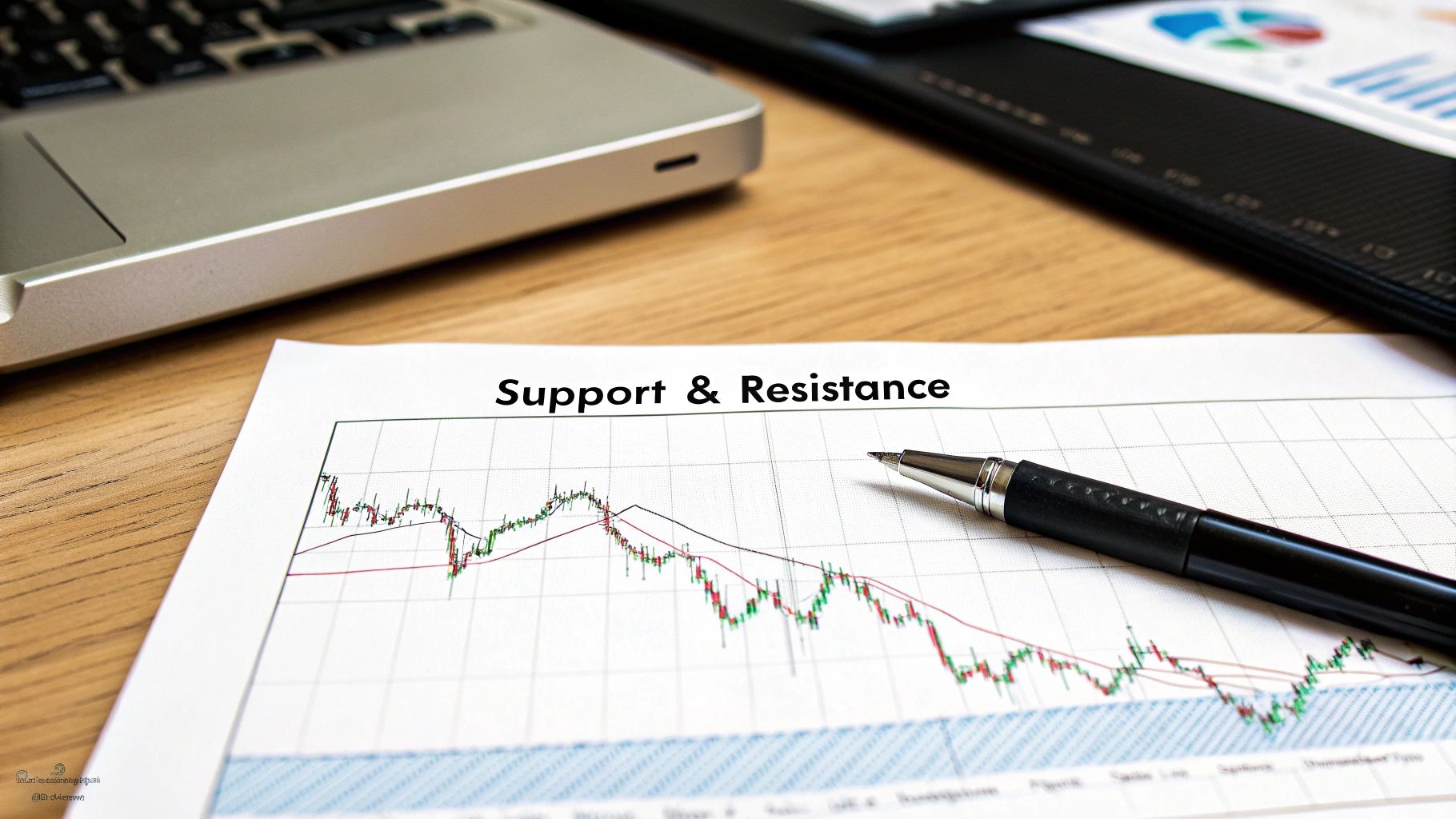
Pinpointing Key Support and Resistance Levels
If trend lines show us the market's direction, then support and resistance levels are the critical plot points where the story takes a turn. Think of them as invisible floors and ceilings on your chart where price action tends to pause, bounce, or reverse entirely.
Learning to spot these zones is non-negotiable. It’s where the big decisions are made, not just by you, but by thousands of other traders watching the exact same levels. This shared psychology is precisely what gives these areas their power.
Here's how it works: when a price drops to a certain point and then bounces, traders notice. They remember. The next time price approaches that same spot, buyers are ready to jump in, anticipating another rebound. This collective action creates a psychological floor, or support.
The opposite is true for resistance. When price climbs to a level and gets smacked down, sellers take note. The next time it gets back to that area, they're waiting to sell again. This creates a psychological ceiling, or resistance. At their core, these levels are simply memory points on the chart where the balance of supply and demand has historically shifted.
Drawing Your Horizontal Lines
Identifying these levels is one of the most practical skills you can develop. It’s a straightforward process: just look for previous peaks and troughs where the price has clearly reversed, then draw a horizontal line to connect them.
- To find Support: Look for at least two distinct lows (troughs) where the price turned around. Connect them with a line. The more times price has touched and bounced off this line, the stronger that support level is considered to be.
- To find Resistance: Do the exact same thing for the highs (peaks). Connect at least two major peaks where the price was rejected. A resistance level that has held back the price multiple times is a significant barrier to overcome.
Trader's Insight: A huge mistake beginners make is treating support and resistance like razor-thin, exact lines. It's much more effective to view them as zones. Price will often pierce a level slightly before reversing, so drawing a thicker "zone" around your line can prevent you from getting shaken out of a good trade prematurely.
The Power of Role Reversals
Now, this is where reading charts gets really interesting. When a strong support or resistance level is finally broken, it often flips its role. We call this powerful concept a role reversal.
Imagine a resistance level that has been a ceiling for weeks. Buyers keep trying to push through it, but they keep failing. Then, finally, a huge surge of buying pressure smashes right through it.
What happens next is key. That old ceiling now becomes the new floor. Traders who were previously selling at that level now see it as a potential buying opportunity on a pullback. This phenomenon is a classic sign of a confirmed trend continuation.
- Broken Resistance Becomes New Support: Once the price breaks decisively above a resistance level, it will often pull back to "test" that same level from above. If it holds, it confirms the level is now acting as support.
- Broken Support Becomes New Resistance: In the same way, when price crashes through a key support level, that floor often turns into a new ceiling. Sellers will watch for the price to rally back up to it, ready to sell at the newly formed resistance.
Understanding this principle adds another layer of confidence to your trading analysis. To really dig into the nuances, you can learn much more about how to identify support and resistance in our detailed guide. Mastering this will fundamentally change how you view price action and plan your trades.
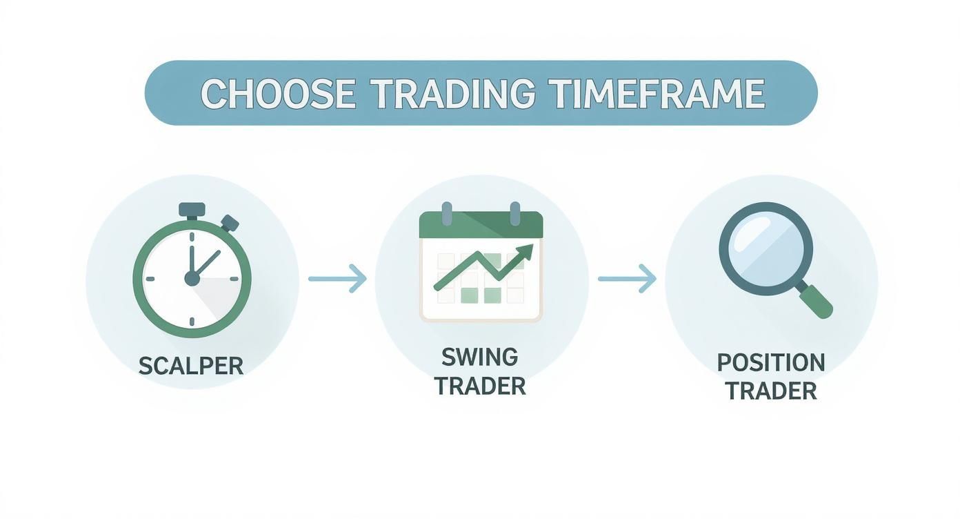
Picking a Timeframe That Fits Your Style
A forex chart doesn't tell just one story; it tells several at once. The narrative you see completely changes depending on the timeframe you pull up.
What looks like a powerful, clean uptrend on a daily chart can easily look like a chaotic, choppy mess on a 5-minute chart. This is a critical lesson: learning to read charts means first picking a timeframe that actually aligns with your trading personality and strategy.
Your choice of timeframe dictates everything—the kinds of trades you'll spot, how long you'll hold them, and even how often you need to be watching the screen. There’s no single "best" timeframe, only the one that’s best for you.
Short-Term Timeframes for Quick Trades
Short-term timeframes, usually anything from the 1-minute to the 15-minute charts, are the natural habitat of scalpers and hyper-active day traders. These charts are zoomed way in, showing you every tiny price fluctuation in high definition.
Trading here requires intense focus and the ability to make decisions in a heartbeat. The upside? You'll see a ton of potential trading opportunities pop up in a single session.
The downside is that these charts are absolutely full of "market noise"—random price ticks that have very little to do with the real, underlying trend. This noise can trigger a lot of false signals and lead to an emotionally draining experience if you’re not built for that kind of pace.
Trader's Insight: The shorter the timeframe, the less weight each candle carries. A huge bearish candle on a 1-minute chart is just a blip. That same candle on a 4-hour chart signals a serious shift in market sentiment.
Medium and Long-Term Timeframes for the Bigger Picture
Once you move up to medium-term charts like the 1-hour and 4-hour, the picture starts to get a lot clearer. Most of that market noise is filtered out, making the underlying trends, support, and resistance levels much more reliable. This is the sweet spot for most swing traders.
Swing traders are looking to capture larger price moves—or "swings"—over a period of a few days or even weeks. They might use the 4-hour chart to spot a promising setup and then glance at the daily chart just to make sure they're trading with the primary trend. The signals are stronger, and you have more time to think and plan your trades without feeling rushed.
Finally, you have the daily, weekly, and monthly charts. This is the domain of position traders and long-term investors. Here, the focus is on major economic trends and fundamental shifts that can drive a market for months or even years at a time.
Using Multiple Timeframe Analysis
So, which one should you choose? The best traders don't just stick to one. They use a powerful technique called multiple timeframe analysis to get a complete, 3D view of what the market is doing.
The whole idea is to use a higher timeframe to figure out the dominant trend and then drill down to a lower timeframe to nail your entry and exit points with precision.
Here’s how that looks in the real world:
- Higher Timeframe (e.g., Daily Chart): You look at the EUR/USD daily chart and see a strong, established uptrend. That becomes your strategic bias—you're now only interested in looking for buy signals.
- Medium Timeframe (e.g., 4-Hour Chart): Next, you zoom into the 4-hour chart. You're not looking for the trend anymore; you're pinpointing key support levels within that uptrend where price might pull back to.
- Lower Timeframe (e.g., 1-Hour Chart): Finally, you watch the 1-hour chart like a hawk. You wait for a specific bullish candlestick pattern to form right at your support level, giving you the perfect trigger to enter the trade.
This top-down approach helps ensure you are always trading in sync with the bigger market flow, which can dramatically improve your odds. As you get better at reading charts, learning how to layer your timeframes is a game-changer. For a deeper dive, check out this guide on finding your perfect trading time frame to really sync your analysis with your personal style.
Putting It All Together: A Real Chart Example
Theory is great, but it only gets you so far. The real test comes when you pull up a fresh, unlabeled chart and have to make sense of it all. Let's walk through a practical example, pulling together everything we've covered to build a cohesive market view and a potential trade idea from scratch.
Imagine we're looking at the GBP/USD on a 4-hour chart. The first thing I do isn't hunt for a trade setup—it's to get my bearings. What's the bigger story the price is telling me?
A quick glance shows a series of lower highs and lower lows. That immediately tells me we're in a downtrend. This establishes my bias right away; I should be looking for opportunities to sell and trade with the dominant market flow, not against it.
Mapping the Key Levels
With my bearish bias established, the next job is to plot the critical price levels. I'll start by drawing horizontal lines to mark obvious areas where price has previously found support or hit a ceiling of resistance.
I notice a clear zone around the 1.2500 handle where price bounced multiple times before finally breaking below it. That old support level is now a prime candidate for future resistance—a classic role reversal that I see play out time and time again.
Next, I'll draw a descending trend line connecting the recent lower highs. This line acts as a dynamic ceiling, giving me a visual on the angle and momentum of the current downtrend. Where the horizontal resistance at 1.2500 intersects with this descending trend line, we have a high-probability zone where sellers might show up in force.
Trader’s Tip: The most powerful trade setups I've ever taken have been at a "confluence" of signals. When a key horizontal level, a trend line, and maybe a moving average all point to the same area, it dramatically strengthens the probability of that zone holding firm.
Waiting for Price Action Confirmation
Now comes the hard part: waiting. I'm not just going to blindly sell because the price is getting close to my zone. I need confirmation from the candlesticks themselves that sellers are actually stepping in.
As the price rallies back up toward our 1.2500 resistance area, I'll drop down to a 1-hour chart to watch for specific bearish signals.
Sure enough, I see a couple of small, indecisive candles appear, followed by a huge bearish engulfing candle. That's the trigger I was waiting for. That long red candle tells me that sellers have aggressively taken control right at my pre-defined resistance zone, confirming my entire analysis. This combination of trend, level, and candlestick pattern gives me a complete, logical reason to consider a short trade.
Your preferred trading timeframe will dictate how you approach this kind of analysis, from a big-picture view to a more granular one.
As you can see, a long-term position trader might be looking at the weekly chart for their zones, while a scalper is focused on the 5-minute chart. But ultimately, the core principles of reading the chart remain exactly the same.
Common Questions About Reading Forex Charts
As you start putting all this into practice, you're going to have questions. It happens to everyone. It's just part of the process of figuring out how to read these charts properly.
Let's walk through some of the most common questions I hear from new traders. The goal here is to cut through the confusion and give you some solid answers you can run with.
What Is the Most Important Element on a Forex Chart?
No question, it's price action.
Everything else you can possibly add to a chart—your RSI, MACD, Bollinger Bands, you name it—is just a derivative of price. They are all lagging indicators, which means they only show you what happened after the price has already made its move.
Learning to read the raw movement of price gives you the purest, most unfiltered look at what the market is thinking. When you focus on the core elements we've already covered, you're reading the real-time story of market psychology.
- Trends: Is the herd buying, selling, or just sitting on the sidelines?
- Support & Resistance: Where are the historical battlegrounds that caused price to react?
- Candlestick Patterns: What’s the current tug-of-war between buyers and sellers telling you right now?
Before you ever think about cluttering your screen with a dozen different indicators, master the story that price itself is telling you. That foundation is the only thing that will make any other tool make sense later on.
Trader's Insight: Think of it this way: price action is the book itself. Indicators are the book review. The review might give you some context, but the real story, the one that matters, is in the original text. Always start there.
How Long Does It Take to Get Good at Reading Charts?
I get this one a lot, and the honest-to-God answer is: it depends.
You can learn the basic definitions—what a candle is, what a trend looks like, what support is—in a few weeks. But getting to that next level, where you can glance at a chart and instantly get the story? That takes real proficiency, and it usually takes several months to a year of dedicated, daily practice.
The single biggest factor in speeding this up is consistency. Showing up for a focused 30 minutes of chart time every single day will do more for you than a five-hour cram session once a week. It's a skill you build through repetition, not by binging content.
Want to shorten that learning curve?
- Get your hands dirty with live charts every day, even if you’re not trading. Just watch.
- Scroll back in time on historical charts. Pick a pattern or a key level and see how it actually played out.
- Keep a trading journal. Screenshot your analysis, jot down why you think a move is coming, and then come back later to see if you were right or wrong. This is non-negotiable.
Are Classic Chart Patterns Reliable?
Patterns like the 'head and shoulders,' 'double tops,' or 'triangles' can absolutely be reliable, but they are not foolproof. Not even close. It's a massive rookie mistake to see one of these patterns forming and assume the outcome is guaranteed.
Their real power comes from context and confirmation.
Think of a chart pattern as a clue, not a command. For instance, a bearish 'head and shoulders' pattern is interesting. But what about a bearish 'head and shoulders' that forms right at a major weekly resistance level, after a monster uptrend, and is then confirmed by a nasty-looking bearish engulfing candle? Now that is a high-probability signal.
These patterns just represent mass market psychology in a visual form. They tend to work because thousands of other traders see the exact same picture and react to it. Always, always use them as just one piece of the puzzle, never as a standalone reason to hit the buy or sell button.
Do I Need Expensive Charting Software?
Absolutely not, especially when you're just starting. So many new traders fall for the myth that expensive, complex software holds some secret edge. The reality is, the most effective and widely used tools are often free.
Most good forex brokers provide powerful, free platforms like MetaTrader 4 (MT4) or its newer sibling, MetaTrader 5 (MT5). These are the industry workhorses, used by millions of successful retail traders across the globe.
On top of that, incredible web-based tools like TradingView have fantastic free versions that give you all the charting power and drawing tools you could ever need to analyze price action. Sure, paid software might have some niche features, but everything you need to learn how to read charts and execute a solid strategy is available for free.
Invest your money in your education and your time in practice, not in fancy software.
At Colibri Trader, we teach a no-nonsense, price-action-based approach that helps you read charts with clarity and confidence, without the crutch of complicated indicators. If you're ready to master the skills that lead to consistent trading results, you can check out our action-based programs at https://www.colibritrader.com.