


The Ultimate Guide to Forex Candlestick Patterns
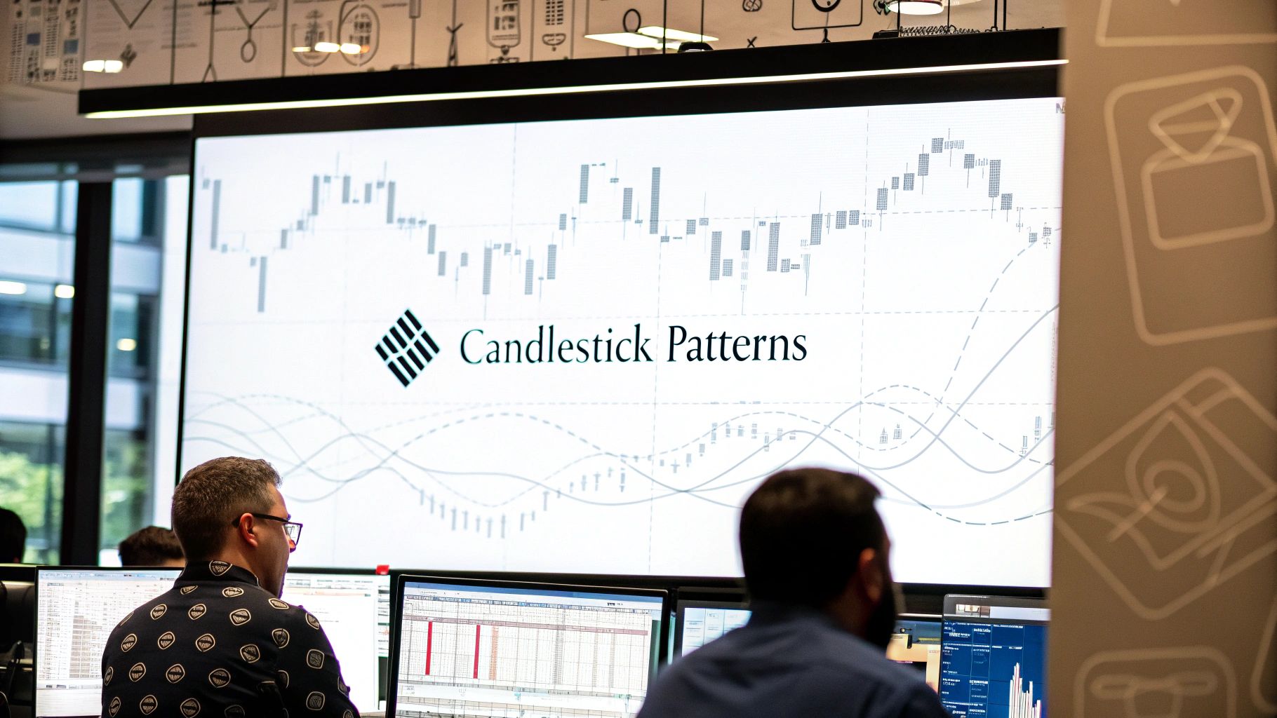
Forex candlestick patterns are a visual diary of the constant battle raging between buyers and sellers in the market. Each pattern tells a story, hinting at potential reversals or signaling that a trend is likely to continue, which is why they're a cornerstone of price action trading.
Reading the Secret Language of the Market
Let's forget the dry, academic definitions for a moment. Think of forex candlestick patterns as the market's secret language. Each candle is a word, and stringing them together creates sentences that reveal the mood, momentum, and the tug-of-war between the bulls (buyers) and bears (sellers). Mastering this language is your first real step toward trading without a chart full of lagging indicators.
This guide isn’t about memorizing dozens of weirdly-named shapes. It's about getting the story behind the price action. When you see a long wick, you're not just looking at a line; you're seeing a story of rejection. One side tried to push the price somewhere, but the other side slammed the door shut. That's the real foundation of a practical, no-nonsense trading approach.
The Anatomy of a Market Story
Every single candlestick gives you four critical pieces of information to build this story. Once you get these components, you can start interpreting what the market is trying to tell you. For a deeper dive into the mechanics, you can learn more about understanding candlestick charts in our detailed article.
Here are the core components:
- The Body: This is the thick part, showing the distance between where the price opened and where it closed for that period. A long body screams strong momentum. A tiny body whispers indecision.
- The Wicks (or Shadows): These are the thin lines poking out from the top and bottom of the body. They show the highest and lowest prices hit during the session. Long wicks are huge clues, often signaling price rejection at important levels.
- The Color: Traditionally, green (or white) candles mean the price closed higher than it opened—that's bullish. Red (or black) candles mean the price closed lower—that's bearish. Color gives you an instant read on who won the battle for that session.
By learning to interpret these simple elements, you shift from being a pattern-spotter to a market storyteller. You begin to see the "why" behind the price movements, not just the "what."
This shift in perspective is everything. Instead of just robotically identifying a "Hammer" pattern, you'll see it for what it is: a moment where sellers tried to smash the price down but were completely overwhelmed by a late surge of buying pressure. It’s a clue that a potential bottom might be forming. This narrative-driven approach is what separates consistently profitable traders from those who just chase patterns without understanding the context.
The Three Foundational Candlestick Formations
To really get a handle on forex candlestick patterns, you don't need to memorize a hundred different formations with bizarre names. That's a rookie mistake.
Instead, let's simplify things by breaking them down into three core groups. This approach forces you to see past the shapes and understand the story behind them—the constant battle between buyers and sellers.
These three categories are:
- Single-Candle Patterns: Formations that tell a complete story with just one candle.
- Dual-Candle Patterns: Where two consecutive candles team up to create a powerful signal.
- Multi-Candle Patterns: Formations needing three or more candles to reveal a potential shift in market momentum.
By thinking in these groups, you can quickly classify what you're seeing on a chart and get a much better read on the market's narrative. Each category builds on the last, moving from quick, punchy signals to more complex stories.
Before we dive in, this simple flowchart breaks down the anatomy of any candlestick. These are the building blocks for every pattern we'll discuss.
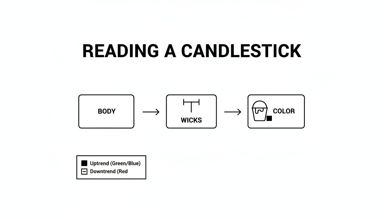
Think of the body, wicks, and color as direct clues to the struggle between buying and selling pressure happening right now.
Single-Candle Reversal Patterns
Single-candle patterns are the quickest, most direct signals you can get from a price chart. They pack an entire story of market sentiment into a single session. Their power comes from showing a sudden, dramatic shift in control.
One of the most reliable single-candle patterns is the Hammer (or its bearish cousin, the Hanging Man). Picture a downtrend where sellers are confidently pushing the price lower. Out of nowhere, buyers rush in, absorb all that selling pressure, and drive the price right back up to close near its open.
This creates a candle with a small body at the top and a long lower wick. That wick isn't just a line; it's the visual proof of a failed bearish attack and a powerful bullish counter-assault. It's a story of rejection.
Another key single-candle pattern is the Doji. A Doji has a tiny, almost non-existent body, meaning the open and close prices were nearly the same. This pattern screams pure indecision—neither the bulls nor the bears could gain control. When a Doji shows up after a strong trend, it’s a massive clue that momentum is drying up and a reversal could be around the corner.
Dual-Candle Power Plays
Dual-candle patterns add another layer to the story, showing how the sentiment from one candle is immediately challenged or confirmed by the next. These patterns are often more potent than single-candle formations because they show a more sustained power shift.
The most famous of these is the Engulfing pattern. A Bullish Engulfing pattern appears in a downtrend when a small bearish candle is completely "engulfed" by a large bullish candle right after it.
This isn't just two candles side-by-side. It's a visual of a complete power reversal. The sellers were in charge on the first candle, but the buyers stepped in with so much force on the second that they completely wiped out the previous period's losses and then some.
The Bearish Engulfing is the exact opposite, signaling a potential top. It shows a small bullish candle being swallowed by a massive bearish one. You can learn more about trading this specific setup in our guide on the Bullish Engulfing pattern.
Another important duo is the Piercing Pattern (bullish) and its counterpart, the Dark Cloud Cover (bearish). These patterns hint at a reversal without the overwhelming force of an Engulfing pattern, making them more subtle but still very effective clues.
Multi-Candle Narrative Arcs
Multi-candle patterns unfold over three or more sessions, creating a more detailed and confirmed narrative. While they take longer to form, their signals are often seen as highly reliable because they show a more gradual, deliberate transfer of power.
The classic example is the Morning Star formation. This three-candle bullish reversal pattern tells a crystal-clear story:
- First Candle: A long bearish candle shows sellers are firmly in control.
- Second Candle: A small-bodied candle (like a Doji or a Spinning Top) signals seller exhaustion and market indecision.
- Third Candle: A strong bullish candle closes well into the body of the first candle, confirming that buyers have seized control.
Its bearish twin, the Evening Star, signals a potential market top with the same three-act story in reverse. Other well-known multi-candle patterns include the Three White Soldiers (a strong bullish continuation signal) and the Three Black Crows (a powerful bearish reversal signal). These patterns illustrate sustained, directional pressure over multiple periods.
Why Most Traders Fail With Candlestick Patterns
If you've been trading for any length of time, you know the feeling. A perfect, textbook candlestick pattern pops up on your chart—a beautiful Bullish Engulfing or a crisp Pin Bar. You take the trade, feeling confident, only to watch the market reverse and smash your stop loss.
It’s a story I hear all the time, and it leaves traders wondering if these patterns are just a myth.
The hard truth is, most traders fail with candlestick patterns not because the patterns are flawed, but because they’re using them completely wrong. They treat them like magic bullets, expecting a pattern to work anywhere and everywhere on the chart. This is the single most expensive mistake you can make.
A candlestick pattern appearing in the middle of a random, choppy price range is just noise. It's meaningless.
The Power of Location
Here’s an analogy I like to use: think of a candlestick pattern as a traffic light. A green light means "go," right? But you wouldn't just slam on the gas if you saw a green light sitting in the middle of an open field. You act on it because of its location: an intersection.
The intersection gives the signal context. It makes it relevant.
In trading, supply and demand zones (or major support and resistance levels) are your intersections. These are the critical price levels where the big players—the banks and institutions—have stepped in before, and are likely to do so again.
A candlestick pattern's predictive power comes almost entirely from its location. A textbook pattern at a key level is a high-probability signal; the same pattern floating in "no man's land" is a gamble.
When you shift your focus from just spotting patterns to trading patterns at key locations, your whole approach changes. You move from random guesswork to a strategic, probability-based system.
A Tale of Two Patterns
Let's walk through a common scenario with a Bearish Engulfing pattern to see what I mean.
Scenario A (The Trap): Price is drifting sideways in the middle of a range, miles away from any real resistance. A Bearish Engulfing forms. A new trader, excited by the "perfect" shape, jumps in short. The market chops around for a bit before continuing its upward drift, stopping them out for a loss.
Scenario B (The High-Probability Play): Now, imagine price rallies hard into a major resistance zone you’ve already marked on your chart—an area where sellers have repeatedly shut down rallies in the past. Right at this level, a clean Bearish Engulfing pattern forms. This isn't just a random pattern; it's confirmation that sellers are defending their turf, just as you expected.
See the difference? The pattern in Scenario B is powerful because it confirms your analysis at a critical location. The pattern in Scenario A was just market noise.
This isn't just my opinion; it's backed by data. Traders love chasing the holy grail of patterns, but academic research reveals a sobering truth about how unreliable they are on their own. A 2015 Lund University thesis looked at eight classic reversal patterns and found their predictive power was dismal—barely better than a coin flip when used in isolation.
However, when you fuse these patterns with critical price action zones—the way we teach in the Colibri Trader Supply & Demand courses—their effectiveness changes dramatically. You can read the full research about these candlestick findings to see the statistical limitations for yourself.
At the end of the day, successful trading isn't about finding more patterns. It’s about having the discipline to ignore the junk and only act on the A-grade setups that form exactly where they matter most.
You’ve spotted a perfect candlestick pattern forming right at a key level. It's tempting to jump in, right? Hold your horses.
This is where professional traders separate themselves from the crowd. They add one final, crucial layer to their plan: confirmation.
This isn't about being scared to pull the trigger; it’s about discipline. Confirmation is the filter that sorts the A+ setups from the merely "good" ones, dramatically stacking the odds in your favour.
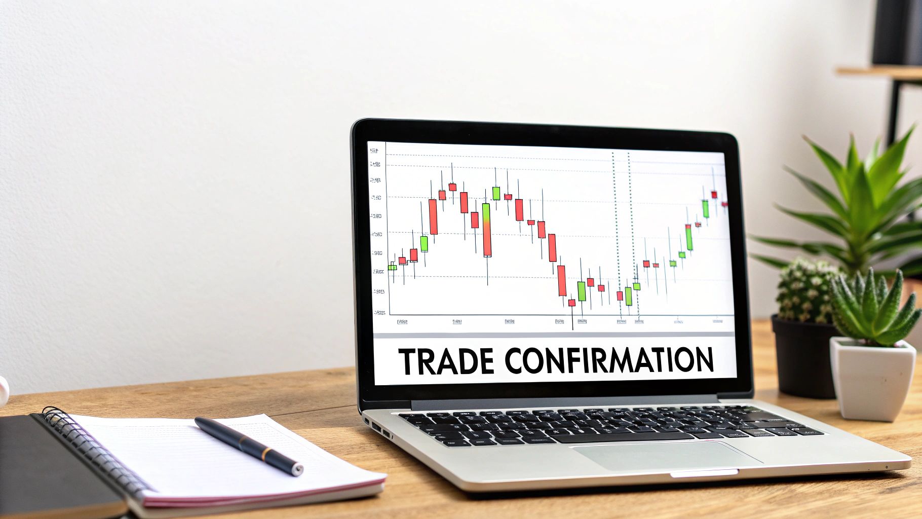
Think of confirmation as the market giving you a final nod, saying, "Yep, that signal you saw is legit, and we're starting to move." Without it, even the most textbook-perfect pattern can morph into a painful fake-out. By waiting for this small piece of extra evidence, you sidestep countless traps and build the confidence needed to execute consistently.
The Three-Step Execution Framework
To turn a potential setup into a high-probability trade, I use a simple, repeatable, three-step process. This isn’t some complex algorithm; it’s a logical checklist that makes sure every piece of the puzzle—context, signal, and confirmation—is locked in before you risk a single cent.
It’s a bit like a detective solving a case. The location (your key level) is the crime scene. The candlestick pattern is the main clue. And the confirmation candle? That’s the eyewitness testimony that proves your theory right.
Here’s the framework broken down:
- Identify a Key Level: First things first. Your chart needs to be marked up with significant supply and demand zones or major support and resistance levels. This is your hunting ground.
- Wait for a Reliable Pattern: Now, you patiently watch for one of the high-probability forex candlestick patterns we've discussed—like an Engulfing Bar or a Pin Bar—to form directly at your pre-defined level.
- Get Confirmation from the Next Candle: This is your trigger. For a bullish setup, you need the next candle to break and close above the high of your signal pattern. For a bearish setup, you need a break and close below the low.
This methodical approach takes emotion and guesswork right out of your entries. You're no longer chasing random patterns all over the chart. Instead, you're strategically ambushing the market at points of maximum opportunity, armed with a clear plan for entry and risk.
Short Trade Example: A Bearish Engulfing
Let's put this framework into action.
Imagine the EUR/USD has rallied up to a major daily resistance level you marked out days ago. Right at this zone, a powerful Bearish Engulfing pattern prints, screaming that sellers are aggressively defending this price.
- Entry: You don't sell immediately. Instead, you place a sell-stop order a few pips below the low of that big bearish engulfing candle. The trade only gets triggered if the next candle shows bearish follow-through.
- Stop-Loss: Your protective stop-loss goes just a few pips above the high of the engulfing candle. This defines your exact risk before you're even in the trade.
- Take-Profit: Your target is the next significant support level below, ensuring you have a solid risk-to-reward ratio of at least 1:2.
By waiting for that break of the low, you've just confirmed that bearish momentum is actually taking hold, and you've neatly avoided getting trapped in a fake-out where the price whipsaws back up.
Long Trade Example: A Bullish Hammer
Now for the opposite scenario. Let's say the GBP/JPY has been trending down but is now approaching a critical weekly support zone. Right on the level, a Bullish Hammer forms with a long lower wick, showing a powerful rejection of lower prices.
- Entry: You place a buy-stop order just above the high of the Hammer candle. Your entry is triggered only when the subsequent candle confirms that buyers are finally wrestling back control.
- Stop-Loss: The stop-loss is tucked a few pips below the low of the Hammer's long wick. If the price breaks that level, your bullish idea is clearly invalidated, and you're out with a small, manageable loss.
- Take-Profit: Your profit target is aimed at the nearest major resistance level, again, making sure you have a favourable risk-to-reward setup from the start.
This systematic confirmation process is more than just a technicality; it's a foundational pillar of disciplined trading. It forces you to wait for the market to prove your analysis right before you commit capital.
Even the simplest confirmation rules can produce incredible results when applied with discipline. A fascinating backtest shared by CodeTrading analysed a basic candle strategy over seven years of data on major forex pairs.
The results? A staggering 90% win rate on EUR/USD. The strategy generated 12% in total returns compared to a buy-and-hold benchmark of -5% over the same period. This just goes to show that a simple, rule-based approach with clear confirmation can give you a significant edge.
Choosing Winning Patterns With a Data-Backed Approach
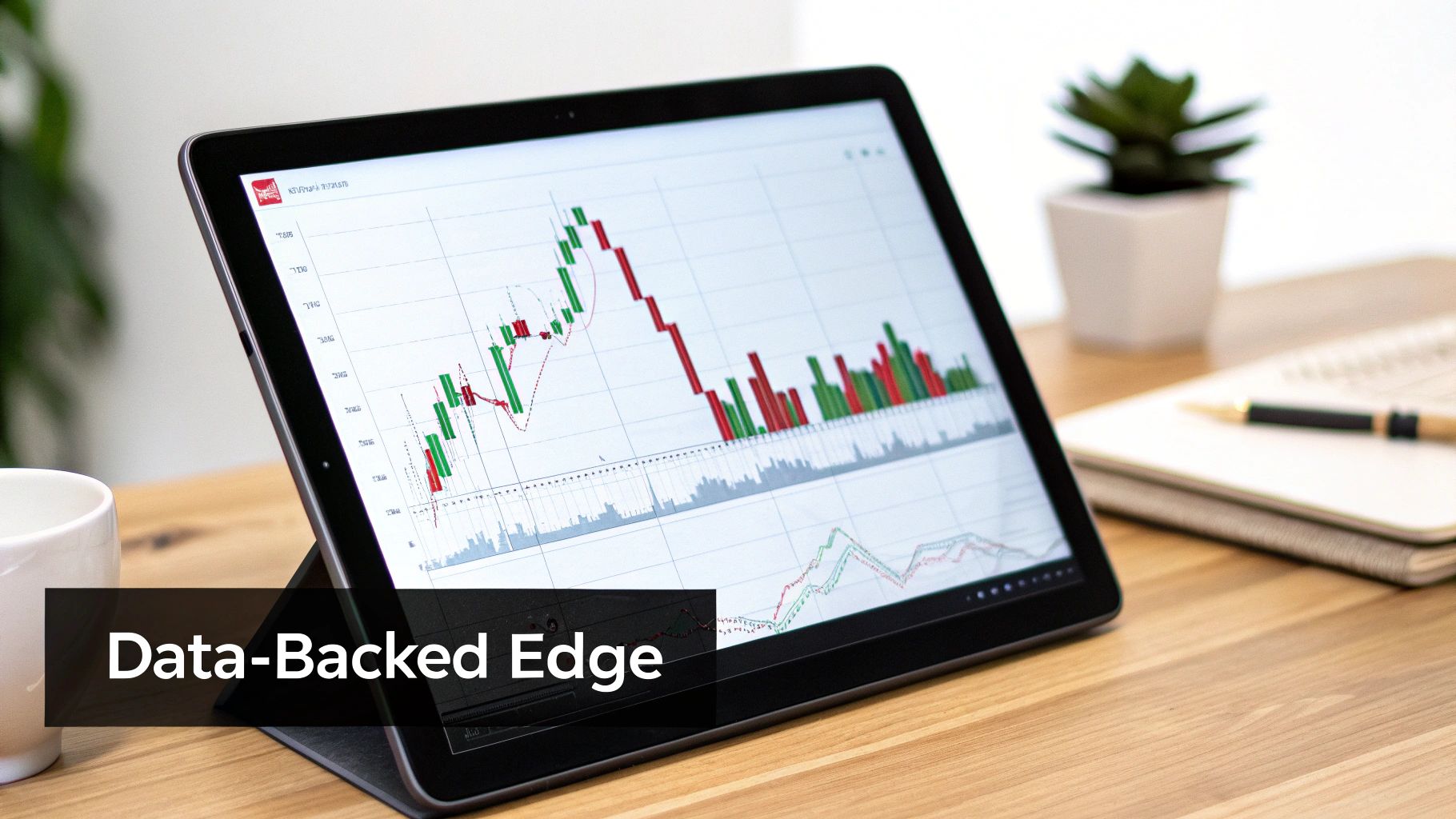
So, you can now spot patterns at key levels and know how to look for confirmation. Great. Now it’s time to add a professional edge to your trading that separates the consistently profitable from everyone else.
Here’s a hard truth: not all forex candlestick patterns are created equal. Some carry a much higher statistical probability of working out than others. Knowing the difference is a game-changer.
Think like a pro sports scout building a team. They don't just pick players who look the part; they dive deep into performance stats—batting averages, completion percentages, you name it. As a trader, you must do the same with your patterns. It’s time to move from just spotting shapes to understanding the data behind them.
This is where you shift your mindset to trading as a game of probabilities, not certainties. Your job isn't to find a pattern that works 100% of the time—that's a fantasy. Your job is to find patterns with a proven statistical edge and execute on them consistently.
Separating High-Performers From Statistical Noise
To build a real edge, you have to focus on patterns that have shown a positive expectancy over thousands of historical examples. Extensive back-testing and data analysis have shown that patterns like the Hammer, Engulfing variations, and Three Black Crows simply carry more statistical weight than more obscure formations.
But be careful—a high win rate alone can be deceiving. A pattern might win 70% of the time, but if your average losing trade is three times bigger than your average winning trade, you're going to bleed money. It's a classic rookie mistake.
To get the full picture, you have to look at net profitability. For instance, a deep 2016 analysis of thousands of setups on major pairs like GBP/USD revealed some fascinating insights. The top-tier patterns were the ones boasting positive net gains, like +0.5% to +2% per trade on daily charts. While a bullish hammer might win over 60% of the time, its actual profitability hinged on keeping the average losses small.
The data showed that the truly elite patterns could still be net profitable even with a 40% loss rate. That’s the power of a statistical edge in action.
The ultimate goal is to identify patterns with a positive expectancy—a formula where the probability of winning multiplied by the average win is greater than the probability of losing multiplied by the average loss.
This data-driven mindset is what keeps you grounded. It stops you from getting emotionally attached to any single trade and forces you to think like a casino. You know that individual hands will lose, but the house edge ensures you come out ahead over time. For more on this, check out our guide on how to calculate your trading win rate and apply it to your strategy.
Prioritizing Your Go-To Setups
Armed with this knowledge, you can start building a playbook of high-probability setups. Instead of trying to memorize dozens of forex candlestick patterns, zero in on a select few with a documented history of strong performance.
To help you focus, I’ve put together a table summarizing the statistical edge of some of the most reliable patterns I use.
Statistical Edge of Key Candlestick Patterns
This table offers a snapshot of popular patterns, their historical performance, and where they tend to work best. Think of it as a cheat sheet to help you focus on high-expectancy setups.
| Pattern Name | Typical Win Rate | Relative Profitability | Best Context |
|---|---|---|---|
| Engulfing Pattern | Moderate to High | High | Reversal signal at major supply/demand zones. |
| Hammer / Pin Bar | High | Moderate to High | Strong rejection signal at key support/resistance. |
| Three Black Crows | Very High | High | Powerful bearish reversal after a sustained uptrend. |
| Doji | Low | Low to Moderate | Signals indecision; best used as a confirmation tool. |
By prioritizing patterns with proven reliability and profitability, you're building a trading plan based on evidence, not hope. This methodical approach strips out the guesswork and helps you trade with the disciplined confidence of a seasoned professional.
Frequently Asked Questions About Candlestick Patterns
Even when you feel like you've got a good handle on candlestick patterns, questions will always come up. That's a good thing. It means you’re thinking like a trader and digging deeper into how these patterns actually work in a live market.
Let's tackle some of the most common questions I hear. Clearing these up will help you execute your trading plan with more confidence and discipline. Think of it as a final check before you step onto the trading floor.
Which Time Frame Is Best For Trading Candlestick Patterns?
This is probably the question I get asked the most, and the honest answer is: there's no single "best" time frame. It really comes down to your trading style and what your daily schedule allows.
That said, patterns on higher time frames—like the 4-hour, daily, or weekly charts—carry a lot more weight. They are far more significant.
Why? It's simple. They represent a much larger chunk of market activity and sentiment. A single Pin Bar on the daily chart tells the story of an entire 24 hours of buying and selling. Compare that to a 5-minute Pin Bar, which is often just random market noise.
If you're just starting out, I highly recommend sticking to the daily chart. It filters out all the distracting noise from the lower time frames and forces you to focus on what truly matters: the major market structure. The core principle is to use higher time frames to find your key levels, then wait for the candlestick patterns to show up there.
Can I Use Candlestick Patterns Without Other Indicators?
Absolutely. In fact, that's the whole point of pure price action trading. Many of the best traders I know use "naked" charts, meaning they rely solely on candlestick patterns forming at key supply and demand levels. This approach gets rid of the clutter and confusion that lagging indicators like RSI or MACD can cause.
Candlesticks give you a real-time look at the battle between buyers and sellers. Indicators are usually just telling you what already happened; price action tells you what's happening right now.
When you combine the immediate story of a candlestick with the powerful context of a major support or resistance zone, you have everything you need. It’s a clean, direct way to read the market’s language without secondary tools muddying the waters.
How Do I Know If A Candlestick Pattern Has Failed?
A pattern has "failed" when the price moves decisively against the direction it was signaling. This is exactly why disciplined risk management is non-negotiable. You absolutely must know your invalidation point before you even think about entering a trade.
Let's take a bullish Hammer, for example. The pattern tells you that buyers stepped in and rejected lower prices. Its failure point is crystal clear: a break below the low of its long wick.
- You must define this failure point before you place the trade.
- Your stop-loss order should be placed just below that level, period.
A failed pattern isn't a personal failure on your part. It's just a normal part of a probability-based business. The pros accept these small, pre-defined losses as the cost of doing business and immediately move on to find the next high-probability setup.
What Is The Single Biggest Mistake Traders Make With Patterns?
The most common—and most expensive—mistake is trading candlestick patterns in a vacuum, completely ignoring their location. A new trader will spot a "perfect" Engulfing pattern, get excited, and jump into a trade, only to get stopped out almost immediately.
An experienced price action trader asks a completely different question: "Where is this pattern forming?"
If that "perfect" pattern isn't at a significant, pre-identified level of support or resistance, they simply ignore it. They know the pattern is just the trigger; the location is what gives it power. For those who want to level up their learning with others, you could even start a trading group to share charts and analysis.
Focusing only on high-quality setups at key levels is the fundamental difference between traders who struggle and those who build a sustainable, profitable career. It's about being a sniper, not a machine gunner.
At Colibri Trader, we are dedicated to helping you master this sniper-like approach. Our programs are built on proven price action strategies that teach you to trade with clarity and confidence, free from the clutter of indicators. If you're ready to transform your trading with a straightforward, effective methodology, discover your path to consistent profitability today.