


Engulfing Pattern Bullish: A Trader’s Guide (engulfing pattern bullish)
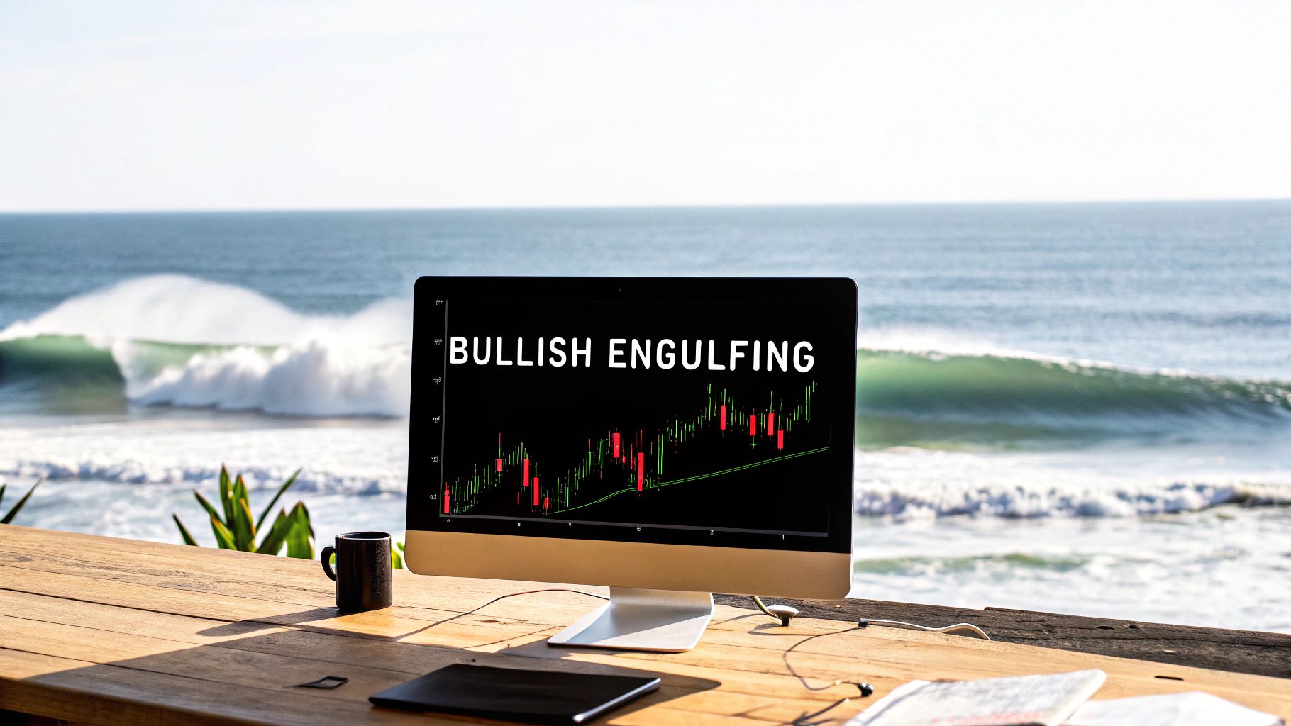
When you're scanning the charts, some patterns just jump out at you. The bullish engulfing pattern is one of them. It’s a powerful two-candle formation that signals a potential reversal at the end of a downtrend, and it's a cornerstone of my price action trading approach.
What Is a Bullish Engulfing Pattern?
Picture a market that's been sliding downwards. Sellers are clearly in the driver's seat, and you see a string of red, bearish candles painting the chart. Then, out of nowhere, the dynamic shifts dramatically.
The bullish engulfing pattern tells the story of this power struggle in just two candles. It’s the moment when buyers wrestle control back from the sellers, and they do it decisively.
I like to think of it as a tide turning at the beach. The first candle is a small, bearish wave pulling back from the shore—the sellers are still around, but maybe they're running out of steam. Then, the second candle forms. This one is a massive bullish wave that crashes onto the sand, completely overwhelming the spot where the previous, smaller wave was. This is the buyers taking over, plain and simple.

This pattern isn't just a random blip; it shows a genuine change in market sentiment. This kind of signal is recognized across all markets, and a good grasp of understanding candlestick patterns for crypto trading can give you a solid foundation for spotting them.
The Anatomy of the Pattern
At its heart, the pattern is incredibly simple, made up of just two candles. But for it to be a valid signal in my book, it has to meet a few specific criteria. It's not just about the shape, but also where it shows up. If you're new to reading charts, getting a handle on understanding candlesticks charts is the perfect first step.
Here’s what I look for:
- A Preceding Downtrend: The pattern has to show up after a clear move down. It’s a reversal signal, so there has to be something to reverse. No downtrend, no signal.
- The First Candle: This is a bearish (red or black) candle. It's just a continuation of the downtrend that's already in place. Its size isn't as important as the candle that comes next.
- The Second Candle: This is the big one—a bullish (green or white) candle. The key is that its real body has to completely "engulf" the entire real body of the first candle. This means it opens lower than the previous close and closes higher than the previous open.
The most critical part is that complete engulfing action. It’s a visual sign that the buyers not only absorbed all of the previous day's selling pressure but had enough strength to push the price much higher. It's an aggressive takeover.
To make it even clearer, I've put together a quick checklist. Use this to quickly validate a pattern when you think you've spotted one on your charts.
Bullish Engulfing Pattern Identification Checklist
This simple table breaks down the essential criteria. If you can tick all three boxes, you've likely found a high-quality bullish engulfing signal.
| Checklist Item | Description | Why It Matters |
|---|---|---|
| Context: Downtrend | The pattern must appear after a series of lower lows and lower highs. | This establishes that there is a bearish trend to potentially reverse. It’s a reversal pattern, not a continuation one. |
| First Candle: Bearish | The first candle in the two-bar pattern must be red/black, closing lower than its open. | This candle represents the final push from the sellers before the buyers step in. It’s the last gasp of the downtrend. |
| Second Candle: Engulfing Bullish | The second candle is green/white and its body completely covers the body of the first candle. | This is the confirmation. It shows that buying pressure has overwhelmed selling pressure in a single session. |
Think of this checklist as your first filter. By ensuring every pattern you consider meets these basic rules, you'll immediately improve the quality of the signals you trade.
The Psychology Behind the Market Reversal
A bullish engulfing pattern is so much more than just two coloured bars on your screen. It’s a powerful story of market emotion, a footprint of a rapid and decisive shift in power from sellers to buyers. To really get a feel for this pattern, you have to look past the candlesticks and understand the mindset driving the price.
The first candle, the small bearish one, tells a story of a market lulled into complacency. Sellers have been in the driver's seat, pushing prices down. They're feeling confident, maybe even adding to their short positions. At the same time, some of the smarter sellers might be getting a bit twitchy, looking to cash in as the downward momentum starts to fade.
This initial red candle is really the last gasp of seller dominance. For the bears, it’s a moment of calm before the storm, a false belief that the trend will just keep rolling downhill. Little do they know, a massive force is building just under the surface, waiting for the perfect moment to strike.
The Aggressive Takeover by Buyers
Then, the second candle forms, and the entire game changes in an instant. The engulfing pattern bullish candle opens below the previous close, which at first looks like a victory for the sellers. But this dip is a trap. Buyers, who have been waiting patiently at a key price level, suddenly charge in with overwhelming force.
They don’t just absorb all the selling pressure; they start buying aggressively, creating a powerful wave that completely steamrolls the previous session's losses. The price rockets up, closing well above where the prior candle even opened.
This huge green candle is fueled by a few key psychological drivers:
- Institutional Buying: The "big money" often steps in at strategic support levels. Their massive orders can soak up all available supply and kickstart a reversal.
- Short Squeezing: As the price shoots up, panicked sellers who were short are forced to buy back their positions to cut their losses. This just adds more fuel to the fire.
- FOMO (Fear Of Missing Out): Traders watching this explosive move from the sidelines pile in, desperate not to miss the start of a new potential uptrend.
The bullish engulfing pattern is a visual confirmation that demand has violently overwhelmed supply. It's not a gentle transition; it's an ambush by the bulls that catches the bears completely off guard.
From Seller Control to Buyer Dominance
This sudden, dramatic shift is the heart of the pattern's predictive power. It doesn’t just happen anywhere; it often appears at critical psychological price points like major support levels, previous lows, or big round numbers where buyers have historically shown up.
This isn't just trading folklore, either. Market analysis backs it up. Academic research, including one study spanning six decades of the S&P 500, confirms the predictive strength of the bullish engulfing pattern, especially when it appears after a clear downtrend. Studies from around the world have found the same thing, showing this classic signal has real predictive power. You can even explore more about these findings and how they apply to automated strategies.
How to Identify High-Probability Trading Setups
Spotting a bullish engulfing pattern is the easy part. The real skill is knowing which ones are genuine, A-grade trading opportunities and which are just market noise.
Not all patterns are created equal. Some signal powerful reversals, while others are traps that lead to frustrating losses. To tell the difference, you need a solid filtering process.
Think of yourself as a detective. The engulfing pattern is your first clue, but it doesn't tell the whole story. You need more evidence to build a strong case. In trading, this evidence comes from three key areas: context, confirmation, and the characteristics of the candle itself. By looking at these three elements together, you can dramatically improve your odds.
Context Is King: Where Does the Pattern Appear?
The single most important factor is the pattern's location. A bullish engulfing pattern that pops up randomly in the middle of a choppy, sideways market means very little. It’s a clue with no connection to the crime.
But when that same pattern appears at a significant technical level? That’s a completely different story.
These are the locations where the big players—banks, hedge funds, institutions—are likely placing their orders. When a bullish engulfing forms in one of these key areas, it’s a strong sign that demand is stepping in exactly where you’d expect it to.
Look for the pattern at these high-probability locations:
- Major Support Levels: These are historical price floors where buyers have shown up before. A bullish engulfing here confirms they're defending the level again.
- Established Trendlines: During a larger uptrend, a pullback to a rising trendline is a classic spot for buyers to re-enter. The pattern acts as your trigger to rejoin the trend.
- Key Fibonacci Retracement Levels: Levels like the 61.8% retracement are widely watched zones. A reversal signal here suggests the pullback is likely over.
- Previous Demand Zones: In supply and demand trading, these are areas where a sharp rally started. Price returning to this zone and printing an engulfing candle is a textbook setup.
Combining candlestick patterns with other technical elements creates what we call confluence. You can learn more about confluence in trading to see just how powerful layering this evidence can be.
Confirmation: The Role of Trading Volume
Once you have a strong context, the next piece of evidence is confirmation. The most reliable confirmation for a bullish engulfing pattern is trading volume. Volume tells you how much conviction is behind a move.
Think of it like this: a single person shouting in a quiet room is noticeable. A roar from an entire stadium is impossible to ignore. Volume is the market’s roar.
Key Insight: For a bullish engulfing signal to be truly powerful, the volume on the big green candle should be significantly higher than the average volume of the candles before it. This spike confirms a large number of participants were involved, signaling strong institutional interest and validating the reversal.
A pattern on low volume suggests a lack of commitment and is far more likely to fail. Always check your volume indicator. If you see a surge that accompanies the engulfing candle, you have a much stronger piece of evidence in your hands. This is especially true after a long downtrend. Seeing that rush of buyers, confirmed by volume, is a powerful signal.
Analyzing the Candle Itself
Finally, let's zoom in on the pattern itself. The size and shape of the two candles offer subtle but important clues about the strength of the reversal.
- Body-to-Wick Ratio: Ideally, the big green engulfing candle should have a long real body and very small wicks. This shows that buyers were in control from nearly the open to the close, finishing the session near its high. Long wicks, on the other hand, signal indecision.
- Relative Size: The more decisively the second candle swallows the first, the better. A massive green candle that dwarfs the prior red one shows an extreme, sudden shift in momentum. There's no doubt who is in control now.
Imagine spotting a bullish engulfing at the end of a brutal downtrend. It's the market’s way of shouting, "Hey, the bears are exhausted, and the bulls are charging back!" Some analysis pegs its success rate at 60-70% when it's found at a key level with high volume after at least four prior bearish candles. It’s a powerful way to catch bottoms without needing a single indicator.
Executing the Bullish Engulfing Trade Step by Step
Spotting a high-probability bullish engulfing pattern is one thing, but turning that signal into a profitable trade requires a rock-solid, disciplined plan. This is where theory meets action. A real trading strategy isn't just about finding the right entry; it's a complete system built on three core pillars: a precise entry trigger, a logical stop loss, and well-defined profit targets.
Without a structured plan, even the most perfect-looking signals can fall apart because of emotional decisions. By defining your rules before you even think about placing the trade, you take the guesswork out of the equation and can operate with the confidence of a professional. This framework ensures you know exactly what to do from the moment the pattern forms until the trade is closed, protecting your capital and giving you the best shot at maximizing returns.
Defining Your Entry Trigger
So, a valid bullish engulfing pattern has formed at a key location. The next question is simple: when do you actually click the "buy" button? While it's tempting to jump in the second the candle closes, a more patient approach can often snag you a better entry price and give you more confirmation that the reversal has legs.
Here are the two most common ways to get into the trade:
-
Market Entry on the Close: This is the most direct approach. As soon as that bullish engulfing candle closes, you're in. The benefit is you won't miss the move if the price takes off like a rocket. The main downside? You're buying right after a strong push up, which can sometimes be the very peak before a small pullback.
-
Limit Order on a Retracement: This is a more conservative method. Instead of jumping in right away, you wait for the price to pull back a bit after the pattern completes. A classic technique is to place a limit order to buy at the 50% level of the engulfing candle's body. This gives you a much better entry price and a more favorable risk-to-reward ratio, but you do run the risk of the price never retracing and leaving without you.
Trader's Insight: Your entry choice really boils down to your personal risk tolerance. An aggressive trader might hit the market entry to ride the momentum, while a more conservative trader will patiently wait for a retracement to get a better price.
Setting a Protective Stop Loss
Let's be clear: no pattern is foolproof, and the bullish engulfing is no exception. A stop loss is your non-negotiable safety net. It’s the point where you admit the trade idea was wrong, cut your losses, and live to trade another day. Placing it correctly is one of the most critical skills in trading.
The most logical place to set your stop loss is just below the low of the bullish engulfing candle itself.
This placement makes perfect sense. The whole idea behind the trade is that buyers have wrestled control from sellers and established a new short-term floor. If the price breaks below this level, the bullish thesis is dead in the water, and sellers are back in charge. There's simply no reason to stay in the trade. For an extra layer of protection, some traders place it a few pips or cents below the low to avoid getting shaken out by random market "noise."
Learning how to properly set your exit points is fundamental. You can discover more essential strategies in our detailed guide on how to use a stop loss and take profit.
Identifying Your Profit Targets
Alright, you're in the trade, and your stop loss is protecting your downside. The final piece of the puzzle is knowing where to get out and take your profits. A professional trade plan has clear exit targets based on the market structure you see on the chart, not on a gut feeling or an arbitrary dollar amount.
Look to the left of your chart. You're searching for potential areas of resistance where the price might run out of steam or even reverse.
These are your logical profit targets:
- Previous Resistance Levels: The most obvious target is the first major area of overhead resistance, a place where sellers have shown up in force before.
- Major Moving Averages: A key moving average on a higher timeframe (like the 50 or 200 SMA) can act as a powerful price magnet and resistance zone.
- Measured Moves: For more advanced traders, you can project the height of the previous downtrend upwards from the pattern's low to calculate a potential target.
Here is a simple framework to help you build a complete trading plan.
| Trade Component | Method | Rationale |
|---|---|---|
| Entry | Wait for a pullback to the 50% level of the engulfing candle's body and enter with a limit order. | Provides a better entry price and improves the risk-to-reward ratio, although it risks missing the trade if no pullback occurs. |
| Stop Loss | Place the stop loss a few pips below the absolute low of the bullish engulfing candle. | The trade idea is invalidated if this level breaks, as it signals that sellers have regained control of the market. |
| Profit Target | Identify the nearest significant resistance level on the chart (look left!) and set your take-profit order there. | This is a logical area where sellers are likely to re-emerge, offering a high-probability exit point based on past price behavior. |
This table gives you a repeatable structure, but always remember to adapt it to the specific market context you're trading.
The visual guide below breaks down the essential steps for filtering and confirming a high-probability setup before you ever risk a single penny.
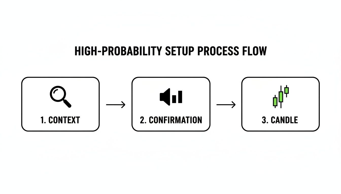
This process flow drives home a crucial point: a valid trade is built on layers of evidence, not just on a single candlestick.
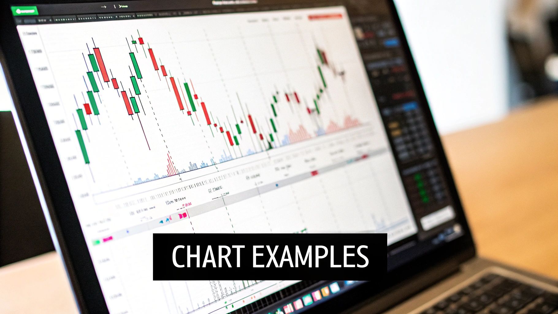
Real-World Chart Examples of Bullish Engulfing Patterns
Theory is great, but seeing the bullish engulfing pattern come to life on a real chart is where the rubber meets the road. It's time to move past the diagrams and see how these setups actually perform in the wild across different markets.
These charts will walk you through the entire process—from spotting the initial pattern to managing the trade from start to finish. Just remember, trading is a game of probabilities, not certainties. We'll look at trades that worked beautifully and others that failed, because a solid trading plan is built to handle both.
S&P 500 Index: A Textbook Reversal at Support
Our first example is a classic from the S&P 500 daily chart, a perfect scenario where context was everything. The index was stuck in a clear downtrend for weeks, carving out a steady series of lower highs and lower lows.
Eventually, the price dropped into a major historical support zone—an area where we know from the past that buyers have shown up in force. As the market probed this level, a picture-perfect bullish engulfing pattern formed. The big green candle completely swallowed the previous day's red candle, screaming that a powerful shift in momentum was underway.
Here’s how the trade was managed:
- Entry: A limit order was set at the 50% retracement of the bullish engulfing candle’s body. This is a great technique for getting a better price and boosting the potential risk-to-reward ratio.
- Stop Loss: The stop was placed just underneath the low of the engulfing candle. This is our line in the sand; if price breaks below this, the bullish idea is wrong.
- Profit Target: The target was set at the next significant resistance level, which happened to be a previous swing high from the downtrend.
This trade played out perfectly. The entry order was hit, and the price rallied straight to the profit target without ever looking back or threatening the stop loss.
EUR/USD Forex: An Example of a Failed Signal
Not every textbook pattern results in a winning trade. This example from the EUR/USD 4-hour chart drives home why risk management is absolutely non-negotiable.
In this case, the price was trending down and formed what appeared to be a valid bullish engulfing pattern. The problem? It showed up in the middle of nowhere, far from any meaningful support level. There was simply no confluence of factors to give the signal extra weight.
A pattern without context is just noise. The location of the signal is often more important than the signal itself. This is why we stress trading from key supply and demand zones.
Following our rules, a trade was still taken. The entry was on the close of the engulfing candle with a stop loss placed below its low. But the sellers were still in the driver's seat. After a short pause, the price rolled over, broke the pattern's low, and hit our stop for a small, controlled loss.
This is a crucial lesson. The loss was contained because a plan was in place from the start. A failed signal doesn't mean your strategy is broken; it’s just a normal, expected part of playing the odds in trading.
Stock Example: A Continuation Trade
The bullish engulfing pattern isn't just for catching bottoms. It can also be a fantastic signal for hopping aboard an existing uptrend. For this example, we’ll look at a popular tech stock that was in a strong, established uptrend.
The stock pulled back in a healthy correction, retracing to a key support level that lined up nicely with the 50-period moving average. Right at this area of confluence, a bullish engulfing candle printed, signalling that buyers were stepping back in to defend the trend.
The trade was executed like this:
- Entry: A market order right on the close of the bullish candle to catch the immediate momentum.
- Stop Loss: Tucked just below the low of the pattern and the support level.
- Profit Target: Placed just under the prior high of the uptrend.
This setup shows how the engulfing pattern bullish can be a high-probability trigger to rejoin a dominant trend. This is often a much safer approach than trying to catch a falling knife by picking a bottom.
Got Questions? Let's Talk Strategy
Even with a solid game plan, stepping into the live market with a new pattern can feel a bit daunting. The bullish engulfing pattern looks simple enough on paper, but in the heat of the moment, questions always pop up. Let's tackle some of the most common ones I hear from traders.
Think of this as our own little Q&A session. I'll give you straight, practical answers to clear up any lingering doubts, so you can trade this pattern with confidence.
What Is the Best Timeframe for This Pattern?
This is probably the number one question traders ask. The short answer is, the engulfing pattern bullish signal shows up on every timeframe, from the tiny 1-minute chart right up to the monthly. But here's the catch: its reliability isn't the same across the board.
As a rule of thumb, the pattern becomes much more powerful on higher timeframes like the daily or 4-hour charts. Why? Because each candle on these charts represents a huge amount of trading activity. A bullish engulfing on a daily chart tells you that for an entire day, buyers wrestled control from sellers and won decisively. That's a much bigger deal than a quick flicker on a 5-minute chart.
For swing traders, the daily and 4-hour charts are the sweet spot. You're less likely to get shaken out by market noise, and you have more time to think through your setup. If you're a day trader, the pattern is still your friend on the 15-minute or 1-hour charts, but you absolutely need extra confirmation. A big spike in volume on that engulfing candle is non-negotiable.
Beginner's Tip: If you're just getting started with this pattern, do yourself a favor and stick to the daily chart. It’s a slower, less stressful environment to really learn what a high-quality setup looks like before you speed things up.
Is a Bullish Engulfing Pattern a Guaranteed Reversal Signal?
Let me be crystal clear: absolutely not. This is one of the most important lessons in trading. There's no such thing as a candlestick pattern that offers a 100% guarantee. Period. Believing in certainties is the fastest way to blow up your trading account.
It’s much healthier to see a bullish engulfing as a high-probability clue. It's a strong piece of evidence telling you the scales might be tipping in the bulls' favor. The real magic isn't in the pattern itself, but in its context.
Picture this:
- Scenario A: A bullish engulfing pops up in the middle of a messy, sideways market with hardly any volume. That signal is weak, and I wouldn't touch it.
- Scenario B: A bullish engulfing forms right at a major historical support level after a long, grinding downtrend, and it's backed by a massive surge in volume. Now that is an A-grade setup.
Successful trading is all about stacking the odds in your favor. The pattern is just one piece of the puzzle. When you combine it with other analysis—and, crucially, a hard stop-loss—it becomes an incredibly effective tool for managing risk.
How Does This Pattern Relate to Supply and Demand?
The bullish engulfing pattern is the purest visual you can get of demand steamrolling supply. In the Colibri Trader framework, we're obsessed with finding "demand zones." These are specific price areas where a previous sharp rally kicked off, showing us exactly where big institutions stepped in and bought everything in sight.
So, when the price drops back down into one of these demand zones, we’re watching like a hawk for proof that those big buyers are still there. The bullish engulfing pattern is the perfect trigger.
When it forms right inside that zone, it's a flashing sign that the buyers have woken up again. They've soaked up all the selling pressure and are now aggressively pushing the price up. For a supply and demand trader, this is the textbook confirmation we need to go long, combining the pattern's immediate momentum with the proven strength of the zone.
Should I Trade This Pattern Against a Strong Trend?
Trying to catch a reversal against a freight-train downtrend is a high-risk game. Sure, nailing the absolute bottom of a market feels amazing and can be wildly profitable, but the odds are usually stacked against you. It’s like trying to stop that train with your bare hands.
For traders who are still building their skills, there's a much smarter, higher-probability way to play this: use the bullish engulfing as a continuation signal within an established uptrend.
Here's how that works:
- First, find a market that's already in a clear uptrend (making a series of higher highs and higher lows).
- Next, be patient and wait for a natural pullback to a key support area. This could be a rising trendline, a key moving average, or a previous demand zone.
- Finally, look for a bullish engulfing to form right on that support level.
In this context, the pattern isn’t fighting the market; it's signaling the end of a brief pause and the likely restart of the main bullish trend. Trading this way means you have the market's primary momentum at your back, which is a much more forgiving—and often more profitable—place to be.
At Colibri Trader, we teach you how to master these kinds of high-probability price action signals without relying on confusing indicators. Our methods are designed to give you a clear, repeatable process for finding and managing trades in any market. Discover your trading potential and see how our approach can transform your results. Learn more at https://www.colibritrader.com.