


Master Analyzing Market Trends for Smarter Decisions
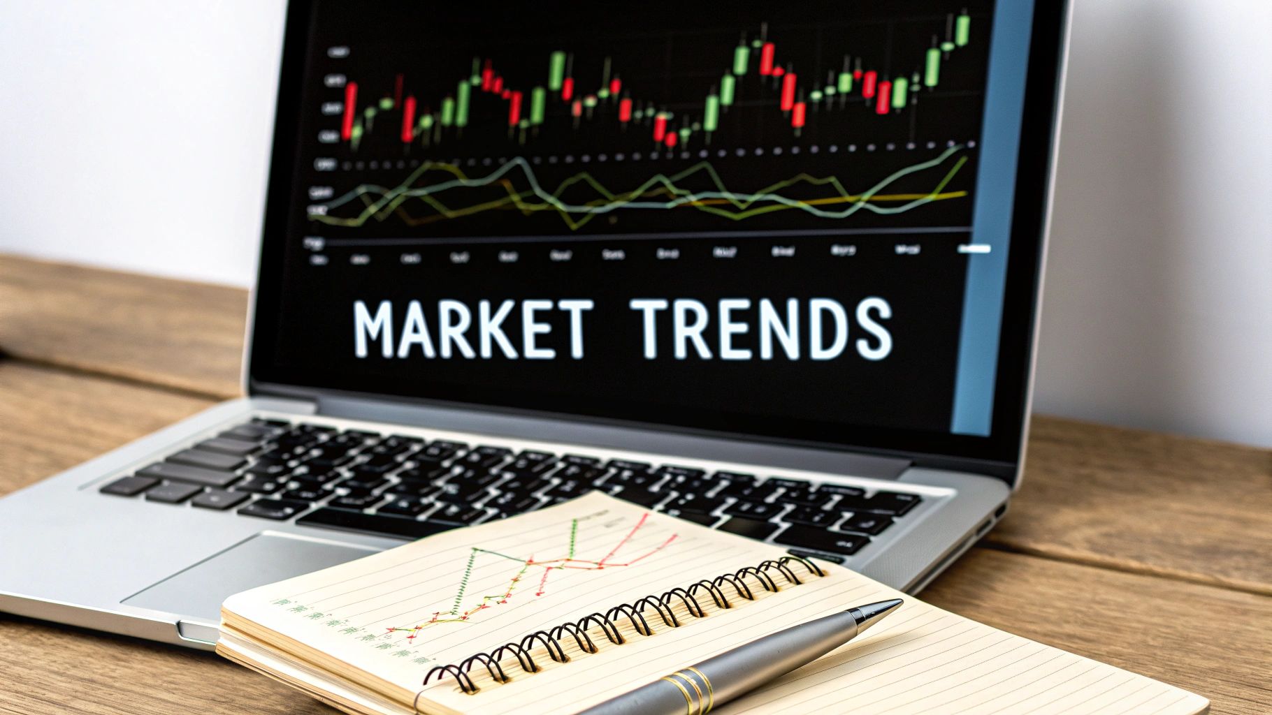
Learning to read market trends is really about learning to see the story the market is telling through its price movements. It’s a skill you develop over time, where you start to identify the patterns left behind by the constant push and pull of supply, demand, and investor psychology. This is how you start making truly informed decisions, by understanding why the markets are moving.
Understanding What Really Moves the Market
Before you dive into a single chart, you need a gut-level feel for the forces that create trends in the first place. This isn't about memorizing complex economic theories; it's about seeing the real-world tug-of-war that dictates every tick up or down.
At its core, a market trend is just a visual record of the battle between buyers (demand) and sellers (supply). When demand overwhelms supply, prices have no choice but to go up, creating an uptrend. When the sellers take control and supply floods the market, prices fall, and you get a downtrend. It’s that simple. This dynamic is the engine behind every market move you'll ever see.
Core Market Trend Indicators
To get a clearer picture of the forces shaping supply and demand, we look at a few key indicators. These are the big-picture numbers that tell us about the overall health and sentiment of the market before we even look at a price chart. Think of them as the fundamental building blocks of any trend.
Here’s a quick summary of the main ones I keep an eye on:
| Indicator Type | What It Measures | Why It Matters for Trend Analysis |
|---|---|---|
| Economic Data | Reports on inflation, employment, and GDP growth. | This is the "weather report" for the economy. Strong data often boosts investor confidence and fuels uptrends, while weak data can signal a downturn. |
| Interest Rates | The cost of borrowing money, set by central banks. | Higher rates can cool down an economy and the market, while lower rates often stimulate spending and push markets up. |
| Market Sentiment | The collective mood or attitude of investors. | This is all about psychology. Fear and greed are powerful forces that can drive trends far beyond what the economic data might suggest. |
These indicators don't exist in a vacuum. They all influence each other and contribute to the overall market environment. By understanding them, you start to build an intuitive framework for why a trend might be starting, or why an existing one might be running out of steam.
The Role of Economic Data
Those big-picture economic reports are what set the stage. They are the external events that shift the collective mood of traders and investors, directly fueling that supply and demand battle we talked about.
A few of the heavy hitters include:
- Interest Rates: When a central bank like the Fed makes a decision on rates, it has a ripple effect. It changes borrowing costs for everyone, which can either kickstart economic activity or pump the brakes.
- Inflation Reports: Rising inflation is a big one. It eats away at purchasing power and often forces central banks to tighten their policies, which usually leads to market jitters and bearish pressure.
- Employment Data: Strong job numbers are almost always a good sign for the economy. They signal health, boost confidence, and can be a major tailwind for the markets.
For instance, you might see global growth forecasts from a major institution like Morgan Stanley Research. They might project a global growth rate of around 2.9%, expected to slow to 2.8% the next year. That slight slowdown might seem small, but for a trader, it's a clue that the overall market environment could be shifting to a more cautious tone.
By learning to see how macroeconomic data influences market sentiment, you build an intuitive framework for spotting why a trend begins, gains momentum, or eventually fizzles out. This provides a solid foundation for more detailed analysis.
Finally, you have to understand the market's structure. It's the framework that helps you organize all this price action into a coherent story of highs and lows. It's the context that gives individual candles and patterns their real meaning. For a deeper dive on this, I recommend checking out our guide on understanding market structure.
Reading the Story Told by Price Action
While economic data sets the stage for the market, price action is the live performance. I find it's the most direct way to analyze market trends because it shows you exactly what buyers and sellers are actually doing in real-time. It completely filters out the noise, the news, and the opinions.
Learning to read price action is like learning a new language. At first, a chart might just look like a bunch of random, jagged lines. But with experience, you start to see a clear story playing out—a story of conflict, indecision, and resolution between the bulls and the bears. This is where theory gets real.
Decoding Individual Candlesticks
Every single candlestick on a chart tells a small but important part of the story for a specific time period. A long green (or bullish) candle shows that buyers were in complete control, pushing prices up significantly from the open to the close. On the flip side, a long red (or bearish) candle signals intense selling pressure.
The real magic, though, happens when you see the patterns formed by multiple candles together. Take a "Doji," for instance, where the open and close prices are almost identical. This screams indecision. It’s a pause in the action, a moment where neither buyers nor sellers can gain the upper hand. Spotting a Doji after a long, strong uptrend can be a critical early warning that the bullish momentum is starting to fizzle out.
For a much deeper dive into these formations, our guide on Japanese candlestick patterns is a fantastic resource I highly recommend.
Identifying Key Battlegrounds: Support and Resistance
As prices move up and down, they often seem to hit invisible walls they struggle to break through. These psychological barriers are what we traders call support and resistance.
- Support: Think of this as a floor. It's a price level where a downtrend is likely to pause or reverse because of a heavy concentration of buyers. When the price drops to a support level, it's a test of the sellers' conviction.
- Resistance: This is the opposite—the ceiling. It's a price level where an uptrend often stalls due to a cluster of selling interest. This is the line in the sand that sellers are defending.
Imagine a stock has bounced off the $50 mark three times in a row. That $50 level has now become a significant support zone. If the price finally slices through it and closes below, that's a powerful bearish signal. The old floor has just become the new ceiling. This is a classic example of analyzing market trends by watching how the price behaves at these key levels.
A core principle I live by in my own trading is that old support, once broken, often becomes new resistance. The same is true in reverse. Recognizing these "flipped" levels gives you high-probability areas to watch for future price reactions.
Recognizing Major Chart Patterns
Over time, these individual skirmishes at support and resistance levels build up into larger, recognizable patterns on the chart. These formations offer massive clues about where the trend might be heading next. One of the most famous—and for good reason—is the Head and Shoulders pattern.
This pattern usually forms at the peak of an uptrend and is a classic signal of a potential reversal. It unfolds in three parts:
- Left Shoulder: A strong price rally followed by a minor pullback.
- Head: An even higher rally that surpasses the first peak, followed by another pullback to roughly the same low as the first one.
- Right Shoulder: A final, weaker rally that fails to reach the height of the head before falling again.
The "neckline" is simply a line drawn to connect the lows of the two pullbacks. A decisive break below this neckline is the strong confirmation traders look for. It signals that the uptrend is likely over and the sellers have seized control.
This isn't just an abstract shape on a screen; it's the visual story of buyers losing steam and sellers growing stronger with each failed attempt to push the price higher. Recognizing these formations is a cornerstone skill for analyzing market trends effectively.
Connecting Global Events to Your Charts
Technical price patterns are powerful, but they don't happen in a vacuum. I’ve seen it a thousand times: a perfect head and shoulders pattern gets completely shattered by a single news headline. To build a resilient trading approach, you have to learn how to connect these real-world events to the price action on your screen.
Markets are simply a reflection of human psychology reacting to new information. A central bank's interest rate decision, a geopolitical flare-up, or even a new piece of legislation can flip market sentiment on its head. This is why layering fundamental context over your technical analysis isn't just an option—it’s essential for survival.
How Global News Moves the Needle
Think of your chart as a car's speedometer and global news as the foot on the gas or the brake. One directly and immediately influences the other. A surprise interest rate hike, for example, is like slamming on the market's brakes, often causing sharp, sudden drops in stocks.
Let’s walk through a concrete scenario. Imagine a tech stock has been in a clean, steady uptrend for weeks, respecting a key moving average like clockwork. Then, out of the blue, a major government announces new regulations that will directly hit the company's business model.
- Before the News: The trend is your friend. The technicals look fantastic, and buyers are clearly in control.
- After the News: Fear and uncertainty flood the market. The uptrend line snaps, price slices through that trusted moving average, and panic selling kicks in.
The technical pattern didn't "fail." The underlying conditions that supported it changed in an instant. By understanding the why behind the move, you're in a much better position to react intelligently instead of getting run over.
Anticipating Volatility Around Key Events
You can't predict the news, but you absolutely can anticipate the volatility that scheduled events create. Things like central bank meetings, inflation reports (CPI), and major employment data are known market-movers.
A critical part of trend analysis is knowing when not to trade. If a major economic announcement is minutes away, the market is basically a coin flip. Experienced traders often stand aside and wait for the dust to settle.
The impact of international relations on markets is a perfect example. Trade tensions and policy shifts have become massive drivers of global market trends. The International Monetary Fund's World Economic Outlook has repeatedly pointed out how escalating trade conflicts slow global growth, with tariff rates hitting levels we haven't seen in nearly a century. You can dig into the full report covering these economic shifts on IMF.org.
When you see headlines about new tariffs, that's your cue to think about which sectors will be hit. Companies that rely heavily on international supply chains could see their stock prices come under immediate pressure, no matter how bullish their charts looked yesterday.
This extra layer of awareness turns your analysis from a flat, two-dimensional exercise into a three-dimensional strategic overview. It helps you anticipate shocks, manage your risk, and truly understand the story driving the price action in front of you.
Using Technology to Sharpen Your Analysis
Relying on manual chart analysis is an essential skill, I won't argue with that. But trying to trade today's markets without using modern technology is like insisting on navigating with a paper map instead of GPS. It's just not practical.
Technology is a massive force multiplier. It lets you process way more information, spot opportunities faster, and, crucially, helps keep emotional mistakes out of your trend analysis. The right tools don't replace your judgment; they sharpen it. They do the heavy data crunching so you can focus on the important part: making high-quality decisions.
Supercharge Your Process with Charting Platforms and Screeners
Today’s charting platforms are so much more than digital graph paper. Think of them as analytical hubs where you can layer indicators, draw trendlines with pixel-perfect precision, and instantly test theories across different timeframes. This immediate visual feedback is vital for building your pattern recognition skills.
But the real game-changer? Market screeners. Instead of manually flipping through hundreds of charts looking for that one perfect setup—a process that can take hours—a screener does the legwork for you in seconds.
For instance, you can set up a screener to instantly find:
- Stocks that have just popped above their 50-day moving average.
- Assets currently printing a Doji candle after a steep downtrend.
- Markets showing a huge spike in volume right alongside a bullish engulfing pattern.
This automates the discovery part of your process. It hands you a pre-vetted list of candidates that already fit your specific criteria. This frees up your mental bandwidth for what truly matters—the actual analysis.
The goal of technology isn't to find perfect trades for you, but to filter out all the noise. It helps you focus your limited time and attention on the highest-probability opportunities that match your personal strategy.
The Rise of AI in Market Analysis
The spread of artificial intelligence in business is a massive market trend in itself. A shocking 77% of companies around the world are either using or exploring AI, and 35% have already put it to work. This directly impacts market dynamics by improving data analytics and changing how investors behave. You can dive deeper into these 2025 business trends on Quantive.com.
For us as individual analysts, AI-powered tools can spot subtle patterns that are almost impossible for the human eye to catch. They can find complex correlations between assets that seem completely unrelated or flag the earliest whispers of shifting market sentiment.
Here’s a quick look at how AI can give you an edge:
| AI Application | How It Helps Your Analysis |
|---|---|
| Sentiment Analysis | Scans millions of news articles, social media posts, and financial reports to gauge the overall mood around an asset, giving you a real-time sentiment score. |
| Predictive Analytics | Uses historical data to map out statistical probabilities of future price moves, giving you another data point to weigh against your own technical analysis. |
| Anomaly Detection | Automatically flags weird trading activity, like a sudden volume spike or price action that breaks from historical norms, alerting you to potential news or events. |
Let's be clear: you're not outsourcing your brain to a robot. You're augmenting it. Technology allows you to double-check your own price action analysis with a much broader set of data, leading to more robust and confident trading decisions.
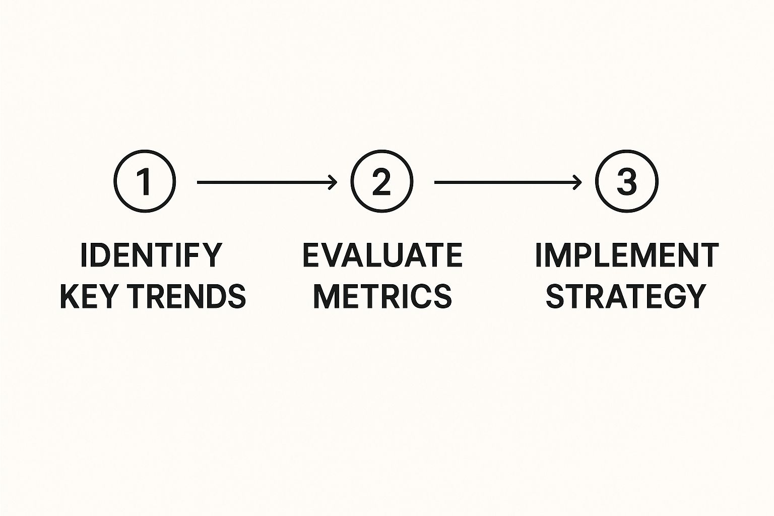
Turning Your Market Analysis into a Plan
Insight without action is just an interesting observation. It’s a harsh truth, but one every trader needs to accept. The final, and arguably most critical, part of analyzing market trends is actually turning your findings into a concrete, repeatable plan. This is where you put your money where your mouth is, moving from theory to execution.
This is what separates the consistently profitable traders from the gamblers. It's about building a disciplined framework for every single decision you make, taking improvisation and gut feelings completely out of the equation. A solid plan doesn't just suggest what to do; it defines precisely what you will do and when you will do it.
This approach turns a mountain of complex market data into a simple, actionable workflow. It ensures every move you make is a direct result of the hard work you put into your analysis.
Defining Your Entry and Exit Triggers
Your plan must answer two fundamental questions with absolute clarity: what specific conditions trigger an entry, and what signals tell you it’s time to exit? These triggers can't be wishy-washy; they have to be based directly on your price-action analysis.
An entry trigger isn't a vague feeling or a "good setup." It's a specific, observable event on the chart. For example, a rule might be: enter a long position only after a stock closes above a major resistance level with higher-than-average volume. This becomes a non-negotiable condition for putting your capital at risk.
Your exit plan is just as important, covering both your wins and your losses.
- Profit Targets: A logical profit target could be the next major resistance level staring you down on the chart. If you enter at a breakout, the next ceiling is a sensible place to consider taking some money off the table.
- Stop-Losses: Your stop-loss needs to be placed at a logical level where your original trade idea is proven wrong. A common practice is setting it just below the support level you bought at. If the price breaks that floor, the entire reason for your trade is gone.
This almost mechanical approach to entries and exits builds the discipline needed for long-term success. Creating this kind of structure is one of the most important steps you can take, and you can explore more ways to become a more disciplined trader in our guide.
Building Your Risk Management Framework
Let's be clear: effective risk management is what keeps you in the game long enough to be successful. Before you even think about hitting the "buy" button, you must know exactly how much you are willing to lose. This is a non-negotiable part of your plan.
A common rule of thumb, and one I stick to, is to never risk more than 1-2% of your total account capital on a single trade. For a $10,000 account, that means your maximum acceptable loss on any one position should be between $100 and $200. Period.
Knowing your max risk is what allows you to calculate your position size. For instance, if your stop-loss is $1 away from your entry price and your max risk per trade is $100, you can buy 100 shares. This mathematical precision is what strips emotion from your decision-making.
By combining specific entry and exit rules with a strict risk management framework, you create a robust trading plan. You're no longer just reacting to every market wiggle; you're operating with a clear, strategic edge based on your analysis. And that, really, is the ultimate goal of analyzing market trends.
Common Questions About Analyzing Market Trends
When you're just starting to read price action, a lot of questions pop up. It’s totally normal. Let's dig into a few of the most common ones I hear from new traders, so you can get some clear, practical answers.
One of the first things everyone wants to know is how long it takes to actually get good at this. There's no single answer, but in my experience, most traders start to feel a real sense of confidence with basic price action after about 3-6 months of daily, focused practice. Reaching true mastery, though? That's a lifelong journey of learning and adapting to whatever the market throws at you.
A huge tip here is to focus. Don't try to trade everything. Pick one or two markets and learn them inside and out. That focus dramatically speeds up your learning curve. And you absolutely must review your trades—both the winners and the losers—to see what you did right and where you went wrong.
Technical Versus Fundamental Analysis
Another big point of confusion is the whole technical vs. fundamental analysis debate. Traders often think they have to pick a side, but that’s a mistake. The real power comes from using them together.
Here’s how I think about it:
- Fundamental analysis gives you the "why." It's the big-picture stuff like economic news or company earnings that explains why a market might make a major move.
- Technical analysis gives you the "when." It’s the pure price action on the chart, showing you the real-time battle between supply and demand.
A very effective approach is to use fundamentals to form your overall bias—do you think this market is heading up or down long-term? Then, you switch to the charts and use technicals to find the perfect spot to get in and get out.
It's a classic case of the 'why' versus the 'when.' Fundamentals give you the big-picture story, while technicals provide the tactical map for navigating the immediate price movements. Combining them gives you a more complete view.
Can You Analyze Trends with a Small Account?
Finally, a question that holds a lot of people back: "Can I do this with a small trading account?" The answer is a huge, emphatic yes. The principles of reading market trends are the same whether you have $500 in your account or $500,000.
In fact, starting with a small account—or even better, a paper trading account—is the smartest way to begin. It lets you get your hands dirty, make the inevitable rookie mistakes, and test your strategies without risking serious cash.
The skills you're building—reading charts, spotting patterns, managing risk—are completely transferable. Once you've got them down, they work just as well when your account grows. The size of your stake doesn't change what the price is doing on the chart.
Ready to stop relying on complicated indicators and start reading the market with clarity? At Colibri Trader, we teach a straightforward, price-action based approach that works. Get instant access to a free Trading Potential Quiz and start your journey today.