


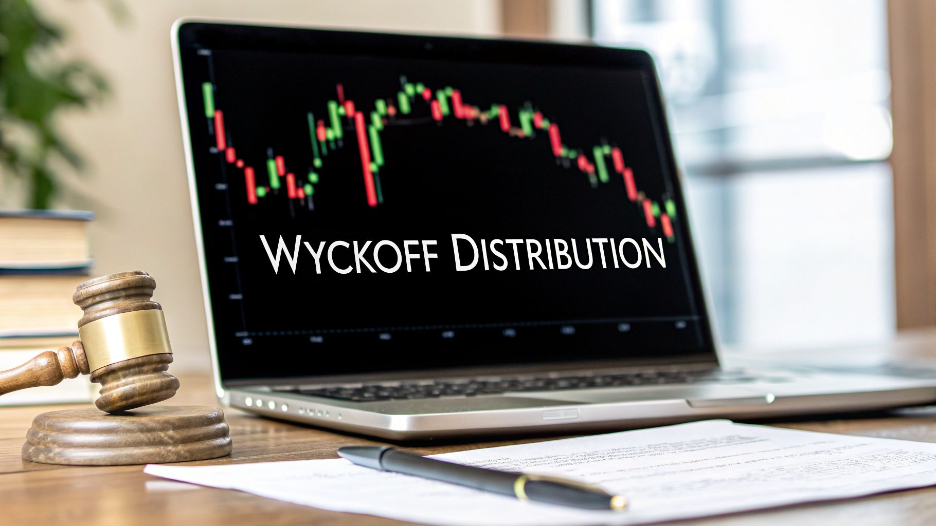
A Trader’s Guide to the Wyckoff Distribution Pattern
The Wyckoff distribution pattern is a classic chart formation that shows you exactly how institutional traders—the "smart money"—systematically unload their positions right before a big market downturn.
What it really does is map out the market's transition from a strong, buyer-led uptrend to a weak, seller-dominated downtrend. If you can read this pattern, you can learn to spot market tops before they completely fall apart.
How to Spot a Market Top Before It Happens
Imagine having a roadmap that reveals when a powerful rally is secretly losing its strength, just before prices take a nosedive. That’s the real power of mastering the Wyckoff distribution pattern. This isn't just about drawing lines on a chart; it’s about understanding the story of how big players methodically sell their assets to an over-enthusiastic public right at the peak of excitement.
Think of it this way: a high-end store decides to have a quiet, massive sale on its best items. The store owner (the "smart money") doesn't announce a 50% off sale all at once, because that would create a panic and cheapen the brand. Instead, they sell off their premium inventory piece by piece to excited shoppers who are convinced prices will only go up. The owner makes the most sales when the store is busiest and excitement is at an all-time high.
In the same way, professional traders distribute—or sell—their holdings when the news is great and retail buying is frantic. This careful selling creates a distinct sideways trading range where control of the asset is passed from the strong hands of institutions to the weaker hands of the general public.
Understanding the Logic of Distribution
Richard Wyckoff, a legendary market technician from the early 20th century, came up with this model by observing the timeless laws of supply and demand. His work gives us a clean, indicator-free way to navigate the markets today. The trick is to stop obsessing over news headlines and lagging indicators and start reading the market’s real story through price action and volume.
The distribution pattern is a logical sequence with a few key phases:
- Halting the Uptrend: This is the first sign of trouble. The powerful uptrend starts to sputter as heavy selling pressure shows up for the first time.
- Building the Cause: A trading range or consolidation forms. Here, institutions are strategically offloading their positions without crashing the price.
- The Final Shakeout: A sneaky move higher traps all the late buyers, confirming that real demand is pretty much gone.
- Confirming the Downtrend: Supply finally takes over completely. The price breaks below key support levels and the real descent begins.
Learning to see these stages helps you move from just reacting to market moves to actually anticipating them. To really get a handle on the wyckoff distribution pattern and use it effectively, it's crucial to first understand how market psychology drives investment decisions. This gives you the foundation to see the pattern not as random wiggles on a chart, but as a logical story unfolding right before your eyes.
The Five Phases of a Wyckoff Distribution
To really get a handle on the Wyckoff distribution pattern, you have to look at its anatomy. This isn't just a single event; it's more like a structured, five-act play where the big institutional players methodically get the market ready for a downturn. Each phase has its own purpose and leaves behind specific clues about the shifting balance between supply and demand.
Let's break down this process, going from the first hint of weakness all the way to the final price collapse. This timeline gives you a good visual of the general sequence as a market starts to top out, moving from a rally into distribution before the slide begins.

As you can see, distribution isn't an overnight affair. It's a transitional phase, bridging that gap between peak bullish excitement and the start of a bearish collapse.
Phase A: The Uptrend Hits a Wall
Phase A is that first moment when a seemingly unstoppable uptrend starts showing signs of exhaustion. Up to this point, demand has been in the driver's seat. But now, for the first time, we start to see significant selling pressure from large institutions, who begin offloading shares to all the frantic public buyers.
Two key events really define this initial stage:
- Preliminary Supply (PSY): This is the first noticeable wave of selling into strength. It often shows up as a sharp rally on unusually high volume, but the price just can't seem to make any more headway. It’s our first warning that the big players are starting to cash out.
- Buying Climax (BC): After the PSY, the market makes one last, powerful push higher. This move is fueled by public euphoria and media hype, creating a massive surge in volume. This is where institutions dump a huge chunk of their holdings into all that peak demand.
Right after the Buying Climax, we almost always see an Automatic Reaction (AR). This is just a sharp price drop caused by the sudden lack of institutional buying and the weight of all their initial selling. The high of the BC and the low of the AR set the upper and lower boundaries of the trading range to come, setting the stage for the rest of the distribution process.
Phase B: Building the Cause
Phase B is often the longest and most deceptive part of the whole pattern. The market settles into a sideways trading range, which a lot of retail traders mistake for a simple consolidation before the next leg up. In reality, this is where the "smart money" is doing its most important work.
Think of it as a logistical operation. The institutions are methodically selling off their huge inventory of shares, but they're doing it carefully so they don't crash the price. They sell into any small rally within the range and might even buy back small amounts during dips to keep things looking stable and bullish.
During this phase, you'll see a series of rallies and reactions between the support and resistance levels set up in Phase A. A key clue here is watching the volume. Rallies toward the top of the range often happen on diminishing volume—a crystal-clear signal that genuine buying demand is drying up.
Phase C: The Final Test
Phase C is the pivotal moment. It's where the market’s true weakness is revealed through one final, decisive test. This phase contains one of the most powerful signals in the entire schematic.
The Upthrust After Distribution (UTAD) is a bull trap, plain and simple. It's designed to mislead breakout traders and suck in the last bit of public buying, allowing institutions to sell their remaining positions at the best possible prices before the markdown begins.
The Upthrust After Distribution (UTAD) is a move where the price breaks above the resistance of the trading range, making it look for all the world like the uptrend is back on. But this breakout is often on weak volume and quickly fails, with the price reversing right back into the range.
This failure is a critical sign. It tells us the big operators are no longer interested in higher prices—they’ve finished distributing their shares and are now ready to let the market fall. A failed UTAD is a high-probability signal that supply has taken control for good.
Phase D: Confirming the New Downtrend
After the trap has been sprung in Phase C, Phase D is all about confirming the market's switch into a downtrend. The price action now clearly shows that supply is in command.
In this phase, the price moves into the lower half of the trading range. Any attempts to rally are weak and get slapped down by heavy selling pressure, often forming what are called Last Points of Supply (LPSY). These LPSYs represent the final, feeble attempts by buyers before support finally cracks.
The defining moment of Phase D is the Sign of Weakness (SOW), where the price breaks decisively below the support line of the trading range. This breakdown is usually accompanied by an increase in volume, confirming the sellers' dominance. If you want to dive deeper into the broader market cycles at play, our detailed guide on the accumulation manipulation distribution model offers some excellent context.
Phase E: The Markdown
Phase E is the final, and often most dramatic, outcome of the whole distribution pattern. Having soaked up all available demand and confirmed that supply is in charge, the market enters a full-blown downtrend.
The path of least resistance is now clearly to the downside. Support levels break with ease, and any rallies are short-lived and weak. This is the "effect" that was built up by the "cause" during the trading range of Phase B. The markdown continues until another market process, like accumulation, starts to take shape at a much lower price level, beginning the entire cycle anew.
To tie it all together, here’s a quick summary of each phase and what to look for.
Wyckoff Distribution Phases and Key Events
| Phase | Primary Purpose | Key Events and Signals |
|---|---|---|
| Phase A | Halting the prior uptrend. | Preliminary Supply (PSY), Buying Climax (BC), Automatic Reaction (AR). |
| Phase B | Building a cause; absorbing demand. | Sideways trading range, rallies on diminishing volume. |
| Phase C | A final test of remaining demand. | Upthrust After Distribution (UTAD) as a definitive bull trap. |
| Phase D | Confirming supply dominance. | Last Point of Supply (LPSY), Sign of Weakness (SOW) below support. |
| Phase E | The markdown; the effect of the cause. | A clear and sustained downtrend as support levels fail. |
Understanding these stages gives you a real-time map of what the big institutions are doing. Instead of just seeing random price wiggles, you start to see a deliberate and logical process unfold.
Case Study: Bitcoin's 2021 Distribution Peak
Schematics and theory are one thing, but there’s nothing like seeing a Wyckoff distribution pattern play out in a real, high-stakes market. It just clicks. The massive run-up and subsequent collapse of Bitcoin in late 2021 is a perfect, modern-day example of institutional distribution in action.
This wasn't just a random price swing; it was a textbook case of smart money methodically selling their positions to a public caught up in pure euphoria. Let's walk through the chart and connect the dots between the theory and what actually happened.

Phase A: The Euphoria Peaks
The scene was set in the fall of 2021. Bitcoin was everywhere, and the news was overwhelmingly positive. The approval of the first U.S. Bitcoin futures ETF and big endorsements from major financial players created a buying frenzy. With analysts calling for $100,000, the public's appetite for BTC felt insatiable.
This created the perfect storm for a Buying Climax (BC). In early November, Bitcoin rocketed to its all-time high of around $69,000 on massive volume. This was the absolute peak of retail excitement—and the ideal moment for large holders to start unloading.
Right after this peak, the price fell back hard, establishing an Automatic Reaction (AR). This sharp drop defined the lower boundary of the trading range that would form, signaling the end of the clean uptrend and the start of Phase A.
Phase B: Building the Cause
For the next few months, Bitcoin went into a choppy, sideways grind—the classic Phase B trading range. To the untrained eye, it looked like a healthy pause before the next big move up. In reality, institutions were carefully offloading their inventory without spooking the market and crashing the price.
They sold into the rallies and absorbed just enough selling on the dips to keep up the bullish appearance. The real clue during this time was in the volume:
- Rallies on Weak Volume: Attempts to push back toward the highs were often on less and less volume. This was a clear sign that genuine, powerful demand was drying up.
- Declines on Rising Volume: Drops toward the range's support saw volume pick up, telling us that supply was quietly becoming the dominant force.
This subtle dance between price and volume is the core of price action trading. It’s the market whispering its true intentions long before the trend officially turns.
Phases C, D, and E: The Unraveling
Phase C kicked off with a final, deceptive push higher that failed to make a new all-time high. This Upthrust (UT) was a classic bull trap, designed to pull in the last of the hopeful buyers. When it was sold off aggressively, it was the final confirmation that sellers were in complete control.
The failure of the Upthrust was the market’s last warning. It showed the big players had finished selling and were ready to pull the rug.
Phase D followed quickly as the price broke below the trading range's support. This Sign of Weakness (SOW) was the point of no return. From here, any small bounces were weak and served as Last Points of Supply (LPSY)—the final chances for traders to get on the short side of the market.
Finally, Phase E—the markdown—began. With all the demand soaked up, the price collapsed. It eventually shed over 70% of its value, plunging below $20,000 by June 2022. The long distribution "cause" led to a devastating "effect," exactly as Wyckoff's principles predicted.
If you want to master identifying these critical market turning points, understanding the dynamics of supply and demand zones is an essential next step. This Bitcoin case study proves that price and volume alone gave you all the clues needed to sidestep a disaster—no lagging indicators necessary.
A Practical Framework for Trading This Pattern
Spotting a textbook Wyckoff distribution pattern is one thing, but actually making money from it? That requires a plan. Without a clear framework, even the most beautiful chart setup can end in frustration. Let's break down how to turn this pattern into a repeatable, actionable trading strategy.
This isn't about fortune-telling. It's about having a concrete plan for your entry, your risk, and your exit. The goal is simple: act decisively when the odds are in your favor, protect your capital, and know exactly where you're taking profits.

Defining Your Entry Points
Patience is everything when trading a distribution. So many traders get burned by jumping the gun before weakness is truly confirmed. Your job is to wait for the market to show its hand. There are three classic entry points, each with its own risk profile.
The Aggressive Entry (Phase C): This is for traders comfortable with higher risk. The trigger is shorting right after an Upthrust (UT) or Upthrust After Distribution (UTAD) fails. You see the price poke its head above resistance, only to get slammed back down into the range on heavy volume. It's a classic bull trap, and it's your earliest signal to get short.
The Standard Entry (Phase D): A more balanced approach. Here, you wait for the first real Sign of Weakness (SOW)—a clean, decisive break below the support of the trading range. Ideally, you want to see volume expand on this move. It’s the market’s way of screaming that the sellers have finally taken control.
The Conservative Entry (Phase D Retest): This is often the highest-probability entry of the three. After the initial breakdown (SOW), price will often drift back up to test the old support level, which has now flipped to become new resistance. Shorting this retest, known as a Last Point of Supply (LPSY), can offer a fantastic risk-to-reward ratio.
A trader's job is not to predict the future but to react to what the market is showing them. Waiting for confirmation signals like a failed UTAD or a breakdown below support separates professional execution from amateur gambling.
Disciplined Risk Management
No strategy works without iron-clad risk management. The great thing about the Wyckoff distribution is that the pattern itself gives you logical places to hide your stop-loss, protecting you if your analysis is off.
- For Aggressive Entries (UTAD): Your stop-loss goes just above the high of that failed Upthrust. If the price reclaims that level, your bearish idea is invalidated, and it's time to get out.
- For Standard and Conservative Entries (Breakdown/Retest): Place the stop-loss above the most recent swing high inside the range, which is usually just above the LPSY. This gives the trade some room to work while still defining your "uncle" point.
Position sizing is just as important. A cardinal rule is to never risk more than 1-2% of your trading account on any single trade. This discipline is what keeps you in the game long enough to find the winning patterns.
Setting Logical Profit Targets
One of the most elegant parts of Wyckoff's work is his law of "cause and effect." The sideways trading range (Phase B) is the "cause," and the big move that follows is the "effect." The size of the effect is often proportional to the size of the cause.
Here’s a simple way to estimate a target:
- Measure the Range: Calculate the height of the trading range, from the support line to the resistance line.
- Project Downward: Take that same distance and project it down from the support line that was broken. This gives you a logical minimum price target for the downtrend.
For instance, if a stock was stuck in a $10-wide range (from $90 support to $100 resistance), your first target after it breaks below $90 would be $80 ($90 minus the $10 range). You can also look for other major support levels or Fibonacci extensions to set secondary targets. A smart approach is often to take some profit at that first target and let a smaller part of your position run, just in case the markdown turns into a major waterfall decline.
How to Avoid Common Wyckoff Traps
So, you've spotted what looks like a classic sideways consolidation near a market high. Is it a guaranteed Wyckoff distribution pattern? Not so fast.
This is probably the biggest trap for anyone learning to trade with Wyckoff's methods. Sometimes, what you think is distribution is actually re-accumulation—a brief pause where smart money is quietly absorbing shares before launching the next leg up.
Getting this wrong can be a painful, expensive lesson. You might go short, thinking you’ve timed the top perfectly, only to watch the market explode higher. Or, you stay long, expecting a breakout, and get caught in a brutal sell-off. The key to avoiding these traps is simple: careful observation and, above all, patience.
Your job is to wait for confirmation. A true distribution pattern will consistently give you clues in the relationship between price action and volume. Think of yourself as a detective, piecing together evidence instead of jumping to a conclusion.
Distribution vs. Re-Accumulation Key Differences
The most reliable way to tell these two patterns apart is to watch how the market behaves on rallies versus declines inside the trading range. This is where the real story of supply and demand comes into focus.
In a Distribution Pattern: You’ll notice that rallies toward the top of the range happen on diminishing volume. This is a huge red flag showing that buying interest is drying up. On the flip side, declines toward the support line often happen on expanding volume, signaling that sellers are getting aggressive and taking control.
In a Re-Accumulation Pattern: The picture is completely reversed. Rallies occur on increasing volume as buyers confidently push prices higher. Any dips or declines, however, happen on light, drying-up volume. This tells you there's very little selling pressure left in the market.
Waiting for price to break a key structural level—either the support in a distribution or the resistance in a re-accumulation—is the ultimate confirmation. Acting before this happens is simply speculation.
To really get a feel for this, it helps to understand how market psychology drives investment decisions. This bigger picture context is what helps you see why these volume clues are so powerful in the first place.
Learning from a Counter-Example: The 2011 Market Bottom
To really sharpen your eye, it's incredibly useful to study Wyckoff's principles in reverse. The S&P 500's market bottom in October 2011 is a perfect example. What initially looked like extreme weakness was actually a massive, high-volume absorption of panic selling—an accumulation phase that kicked off a major bull run.
On October 3, 2011, the index crashed below critical support, and volume went through the roof. It looked like a catastrophe. But this was actually a Selling Climax (SC), the mirror image of a Buying Climax. Smart money stepped in and absorbed all that panic, causing the price to spring back and rally 15% into the end of the year.
This case perfectly illustrates how massive volume at a market low can signal exhaustion, not continuation. The principles that define a market top are the exact same ones that define a bottom, just flipped on their head. This symmetry is what makes the Wyckoff method so robust.
The Power of Patience and Confirmation
Now, let's compare that to a real distribution, like the Dow's 2007 top. That pattern unfolded over seven long months before the market finally collapsed by 54%. The signs were all there for patient traders: failed rallies on weakening volume, definitive upthrusts, and clear signs of weakness at resistance.
The core lesson here is this: never risk your capital until the market proves your theory right. Let the price break support and show its hand. This discipline is what separates traders who are consistently profitable from those who are constantly getting caught on the wrong side of big moves.
By learning to distinguish distribution from re-accumulation, you stop guessing and start skillfully reading the market's true intentions.
Frequently Asked Questions
When you start digging into the Wyckoff distribution pattern, a few common questions always pop up. Let's tackle them head-on to give you more confidence when you see these setups playing out on your charts.
What Is the Single Most Important Signal in a Wyckoff Distribution?
If I had to pick just one, it's the Upthrust (UT) or the Upthrust After Distribution (UTAD) that shows up in Phase C. This is the market's final "tell"—the moment the mask comes off.
Think of it as the last-ditch effort by bulls to push prices higher. But when that push happens on weak volume and gets slammed back down, it’s a massive red flag. This failure confirms that the sellers have absorbed all the demand and are now firmly in control. It's often the cleanest, lowest-risk entry for a short trade, with a very obvious place to hide your stop-loss just above the peak of that failed rally.
How Long Does a Distribution Pattern Usually Take to Form?
There’s no set schedule here. A distribution can play out over a few intense weeks or drag on for months. It really depends on the asset, the overall market environment, and how much inventory the institutional players need to unload without crashing the price.
For example, the 2021 Bitcoin top took about four months to build out. In contrast, some major stock market tops have been known to form over six months or even longer.
It all comes back to Wyckoff's law of "cause and effect." The longer and wider the distribution (the "cause"), the more powerful the subsequent downtrend (the "effect") is likely to be. This is why patience isn't just a virtue for traders; it's a core part of the strategy.
Should I Use Indicators Like RSI or MACD for Confirmation?
The beauty of the Wyckoff method is its purity. It forces you to focus on what truly matters: price and volume. These are the raw footprints of supply and demand, and learning to read them gives you a huge edge.
While some traders might look for extra confirmation, like a bearish divergence on the RSI that lines up with a UTAD, it’s not essential. Remember, indicators are always a step behind because they're calculated from price. They are lagging. Your primary analysis should always come from the wyckoff distribution pattern itself—the indicators should only ever play a supporting role, if any at all.
Does the Wyckoff Distribution Pattern Work in All Markets?
Yes, absolutely. The pattern is built on the universal laws of supply and demand, which are driven by human psychology. The emotions of greed at the top and fear at the bottom are the same everywhere.
Whether you're trading stocks, crypto, forex, or commodities, these principles hold true. The key is learning to interpret the unique character of price and volume in your chosen market. The underlying logic, however, never changes.
At Colibri Trader, we teach traders how to build consistency by reading pure price action, cutting through the noise of lagging indicators. The principles of the Wyckoff method are a perfect example of this philosophy. If you're ready to start understanding the market's real intentions, it's time to see how we do things. Learn more about how we transform traders at Colibri Trader.