


What Is Market Structure? A Complete Guide to Market Patterns
Market structure is the absolute foundation of price action. It's the blueprint that shows you how and why price is moving the way it is. When you understand it, you can see if the market is trending up, trending down, or just chopping sideways. This context is everything; it's the backdrop for every single trading decision you'll ever make.
Decoding the Market's Blueprint

Ever look at a price chart and it just feels like random, chaotic noise? I've been there. A lot of traders have.
The secret to cutting through that noise is learning to read market structure. Think of it like learning the architecture of the markets. A building has a foundation, walls, and a roof holding it together. In the same way, a market has a distinct structure that supports its every move.
Reading this blueprint is the first, and honestly, the most critical step in price action trading. It strips away all the complexity and starts to show you the story the market is telling. Is the price climbing a staircase of higher highs? Or is it tumbling down a slide of lower lows? Maybe it's just stuck in a hallway, bouncing between the floor and the ceiling.
The Three Foundational States
Every single financial market, whether it's stocks, forex, or crypto, is always in one of three states. Always. Your job is to figure out which one, because that's what gives you the context for any potential trade.
These states are:
- Uptrend (Bullish): This is just a series of higher highs (HH) and higher lows (HL). It tells you buyers are in control and feeling good, pushing prices up.
- Downtrend (Bearish): The opposite. You'll see a sequence of lower highs (LH) and lower lows (LL). This is your signal that sellers are dominating the field.
- Consolidation (Range): This happens when price gets stuck moving sideways between a clear floor (support) and ceiling (resistance). It's a period of indecision, a battle between buyers and sellers with no clear winner yet.
By identifying the prevailing market structure, you move from a reactive gambler to a proactive strategist. You're no longer guessing; you're interpreting the market's language and aligning your actions with its current narrative.
This isn't just theory—it's intensely practical. Once you can spot an uptrend, you know you should be looking for chances to buy. In a downtrend, your focus flips to selling. And during consolidation? You can either trade the bounces between the floor and ceiling, or better yet, just sit on your hands and wait for a real trend to show itself.
Getting this skill down is what sets the stage for every other strategy you'll ever learn.
Identifying the Three Core Market States
Every chart you'll ever look at is telling a story. It's not just random squiggles; it's communicating one of three things at any given time. Is it bullish, bearish, or just plain undecided?
Figuring out which chapter the market is currently in—trending up, trending down, or chopping sideways—is the absolute foundation of price action trading. Once you get this, every single candle starts to have context.
The Upward Climb and the Downward Slide
Think of a trend as a staircase.
An uptrend is like walking up that staircase. Price takes a step up, creating a higher high, then pauses on a new, higher step, forming a higher low. This rhythm is classic buyer control. Each time the price dips, buyers step in at a higher level than before, showing they're optimistic and willing to pay more. The path of least resistance is clearly up.
A downtrend is just the opposite—you're walking down the stairs. Price steps down to a lower low, pulls back to rest on a lower step (lower high), and then continues its descent. This is the sellers' game. They are firmly in command, and any attempt to rally is quickly shut down at a lower price point. The mood is pessimistic.
The Sideways Shuffle: When Nobody's in Charge
So what happens when the market isn't climbing or falling? It gets stuck in a range, also known as consolidation.
Picture a tennis ball bouncing between a very solid floor and ceiling. Price is trapped, moving back and forth without making any real progress up or down.
This sideways grind shows a perfect balance of power. Buyers and sellers are in a stalemate, and nobody has the strength to take control. Spotting a ranging market is critical because your favorite trend-following strategy will just get you chopped to pieces here. You either have to switch gears or, more often than not, just sit on your hands and wait for a winner to emerge.
A market in consolidation is a market taking a breath. It’s pausing to gather energy before its next significant move, and your job is to wait patiently to see which direction it chooses.
Getting a feel for these three states is how you start reading the psychology behind the chart. An uptrend is greed in action. A downtrend is driven by fear. And a range? That’s pure, unadulterated uncertainty.
To help you quickly reference these states, here's a simple breakdown of their core characteristics.
Characteristics of Core Market Structures
| Characteristic | Uptrend (Bullish) | Downtrend (Bearish) | Range (Neutral) |
|---|---|---|---|
| Price Direction | Ascending | Descending | Sideways |
| Highs | Consistently Higher Highs (HH) | Consistently Lower Highs (LH) | Roughly Equal Highs |
| Lows | Consistently Higher Lows (HL) | Consistently Lower Lows (LL) | Roughly Equal Lows |
| Market Psychology | Optimism, Greed | Pessimism, Fear | Indecision, Uncertainty |
| Dominant Force | Buyers | Sellers | Equilibrium |
This table is your cheat sheet. When you're looking at a new chart, run through these characteristics to quickly diagnose what the market is doing.
This infographic also does a great job of breaking down the elements of a perfectly competitive market, which is where these price structures show up in their purest form.
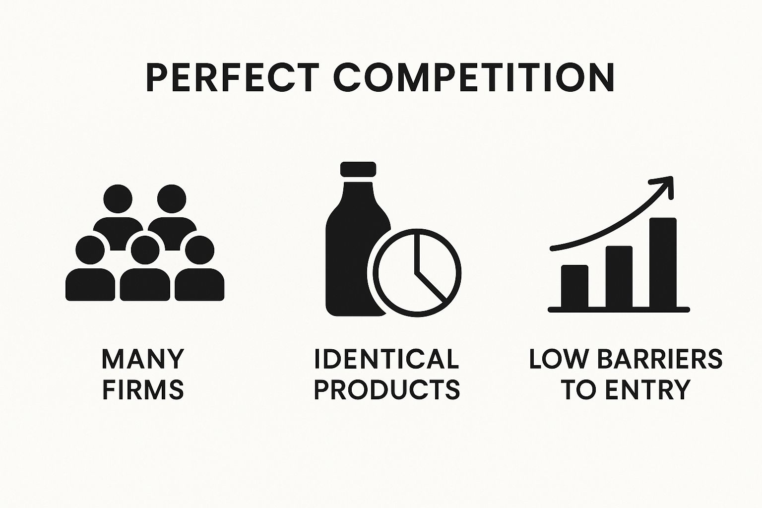
When you see a large number of buyers and sellers and no single player can control the price, you get a clean read on the market's collective sentiment. The first real step to making smarter trades is simply to align yourself with whatever the market is telling you it wants to do. Don't fight it.
How Competitive Markets Shape Price Action

Those patterns you see on your charts—the uptrends, downtrends, and sideways grinds—aren't just random squiggles. They're the direct result of real-world economic forces, specifically how competitive a market is.
When you can connect the dots between the chart and the underlying economics, you're no longer just a pattern-spotter. You're a trader who understands why prices are moving.
Take a market with perfect competition. This is where millions of participants are buying and selling an identical product, like the massive global market for wheat. No single farmer or buyer has enough power to move the price. They're all "price-takers."
This environment creates the purest possible picture of supply and demand on a chart. When you see a clean, sustained trend, you're watching a genuine shift in collective thinking. There isn't a single dominant player pushing things around behind the scenes.
This is the very essence of market structure trading. You have to know the underlying environment to truly trust the patterns you're seeing.
The Power of Countless Participants
The wheat market is the perfect real-world example. With global production hitting roughly 780 million metric tons in 2023 from millions of individual farms, no single entity can corner the market. It's a pure reflection of global supply and demand.
This has a massive impact on what you see on the chart.
- Clean Trends: Price action is often smoother and easier to read. It reflects real, widespread sentiment shifts, not the moves of a few big whales.
- Reliable Levels: Key highs and lows are formed by the collective agreement of millions, giving them much more weight as support and resistance.
- Pure Psychology: An uptrend in a market like this is a crystal-clear sign that optimism is winning out over pessimism across the board. The reverse is true for a downtrend.
Understanding the competitive landscape behind an asset gives you a much deeper appreciation for the price action. Those patterns aren't random; they are the visual footprint of a vast economic ecosystem at work.
This is exactly why so many classic chart patterns and trend-following strategies were born from studying commodities charts. The price action is simply less susceptible to weird, manipulative spikes because the sheer number of participants smooths everything out.
So, the next time you spot a clean break of structure or a new trend taking hold in a highly competitive market, you can trade it with more confidence. It’s a signal that a true, market-wide shift is happening.
Why Dominant Players Create Predictable Trends
What happens when a whole industry is basically run by a couple of giants? You don't get the same kind of wild, fluid price action you see in other markets. Instead, you get something a lot more deliberate. This is the world of oligopolies, where the chess moves of a few huge companies create market structures that are often slower, clearer, and a whole lot more predictable.
Think about it. In a normal market with millions of buyers and sellers, price is a reflection of mass psychology. But in an oligopoly, price is driven by the big decisions of the leaders. A major product launch from one company, a big strategy shift, or a supply chain headache can send powerful, easy-to-read ripples through the entire sector. The chart isn't just showing supply and demand; it's showing you a high-stakes game between a handful of titans.
This concentration of power often creates trends that are less choppy and more methodical. Instead of chaotic swings, you might see a stock grind higher for months or get stuck in a long, drawn-out range as these giants battle for market share.
The Boeing and Airbus Duopoly
The commercial aircraft industry is the perfect real-world example. It's basically a duopoly dominated by Boeing and Airbus. In fact, these two companies controlled about 85% of the market share by value in 2024. This gives them massive control over pricing and new technology, and their stock charts tell a story of long-term, strategic warfare. You can get more background on these kinds of market dynamics from UNCTAD's 2025 global trade update.
So, if you're analyzing a stock like Boeing, you can't just look at the S&P 500. You have to be asking, "What's Airbus up to?"
- Major Contract Wins: When one company lands a multi-billion dollar order, its stock can start a steady, sustained rally while its competitor feels the heat.
- Production Delays: Any news of a delay can kick off a clear downtrend as big money moves to the player who can actually deliver.
- Technological Advances: The announcement of a new, game-changing aircraft can ignite a bullish trend that plays out over years, not days.
In an oligopoly, news and corporate actions have a much heavier weight. The decisions of a few CEOs can define the market structure for months or even years, making fundamental awareness just as important as technical analysis.
For a trader, spotting this kind of market structure changes everything. You have to adjust your expectations. Trends will likely unfold more slowly. Key support and resistance levels might hold for much longer. And major news events are the big catalysts that finally break prices out of those long-standing ranges. Once you understand the competitive landscape, you're in a much better position to anticipate the deliberate, powerful moves that define these unique markets.
Using Product Differences to Analyze Market Behavior

So far, we've talked about markets with either a ton of identical players or just a handful of giants. But what about that massive space in the middle, where countless companies sell products that are similar, but not the same?
This is the world of monopolistic competition, and it’s where market structure analysis gets really interesting.
Take the global fast-food industry. You have hundreds of brands, all selling quick meals. But a burger from McDonald's isn't the same as a burger from Burger King, and neither is trying to be a taco from Taco Bell. Each one has its own menu, brand identity, and customer experience.
That difference is everything. It gives each company a tiny bit of pricing power—a "mini-monopoly" over its own brand. For us as traders, this changes the game. You can no longer just look at the health of the overall consumer sector and call it a day. A single company’s stock can completely break away from the market trend based on its own unique story.
Analyzing Individual Strength in a Crowded Field
In a market like this, company-specific news and performance become massive drivers of price action. It's a constant battle for attention and market share.
- A hit product can send a stock on a tear, even if the rest of the industry is flat.
- A brilliant marketing campaign can steal customers, causing one stock to crush its rivals.
- Bad press about a single brand can tank its stock while its competitors pick up the pieces.
When you're looking at a market driven by monopolistic competition, you have to stop looking at the forest and start paying attention to the individual trees. The broad market structure gives you the context, but the real trading opportunities are often in the relative strength or weakness of one company against its direct competitors.
The fast-food sector is a perfect global example. With sales expected to hit around $950 billion in 2024, the market is enormous, but it's fractured across thousands of companies all fighting for a piece of the action. Each one is using unique products and clever marketing to stand out. If you want to dive deeper into how global economic shifts affect these sectors, the latest reports from the OECD are a great place to start.
This forces you to add a new tool to your kit: relative strength. Don't just ask if the market is bullish. Instead, ask, "Which company is the strongest bull in this field?"
When you spot a brand that is consistently printing higher highs while its competitors are lagging or falling behind, that's a powerful signal. It tells you that smart money is flowing specifically to that winner, creating a high-probability setup that most traders, who are only looking at the broad index, will completely miss.
A Practical Framework for Trading Market Structure
Knowing the theory is one thing, but actually applying it to a live, breathing chart is a completely different ballgame. This is where the real skill is built.
To bridge that gap from theory to practice, you need a simple, repeatable process. Let's walk through a framework that cuts through the noise and helps you analyze any chart with clarity and confidence. The goal here is to stop guessing and start making educated decisions based on what the chart is telling you.
Ultimately, this is about forming a clear trading bias—are you bullish, bearish, or should you just sit on your hands? Once you know that, you know exactly what kind of setups to hunt for.
Start With The Bigger Picture
First things first: always zoom out. Before you even think about an entry, you have to establish the primary trend on a higher timeframe, like the daily or 4-hour chart.
This gives you the crucial context for everything happening on the lower timeframes.
Trading without this high-level view is like trying to navigate a city with your nose pressed to the map. Sure, you can see the street you’re on, but you have no idea if you're actually heading toward your destination or just walking in circles.
Mark Your Key Structural Points
Once you have your bearings from the higher timeframe, it's time to mark the key swing highs and swing lows that define the current structure. These are the most recent, obvious peaks and troughs that tell the market's story.
- In an uptrend: Find the most recent higher high (HH) and higher low (HL).
- In a downtrend: Mark the most recent lower high (LH) and lower low (LL).
Think of these points as your roadmap. They tell you who's in control—buyers or sellers—and where the lines in the sand have been drawn. A solid grasp of how to read price action is absolutely fundamental here, as it allows you to correctly interpret what these swing points really mean.
Spot The Break of Structure
A break of structure (BOS) is a massive clue that a trend is likely to continue. In a strong uptrend, when price smashes through the previous higher high, that's a bullish BOS. In a downtrend, a break below the prior lower low confirms the bears are still in charge.
On the flip side, a "change of character" occurs when that expected structure is violated. For instance, if an uptrend fails to make a new high and instead breaks below its last higher low, that's an early warning sign that sellers are muscling their way in.
By combining the high-timeframe trend with the current structural points and any recent breaks, you can form a powerful trading bias. This bias dictates your actions: look for buys, sells, or simply wait.
Common Questions About Market Structure
Alright, let's tackle some of the questions I get all the time. Thinking through these will help you move from theory to actually applying this stuff on your live charts with confidence.
Which Timeframe Is Best for Analysis?
This is the classic question, but there's no magic answer. The "best" timeframe is the one that fits your trading style. A long-term investor holding for months or years? They'll be living on the weekly charts. A day trader like me? The 1-hour and 15-minute charts are my bread and butter.
The real key here isn't finding one perfect timeframe, but using them together. It's called multi-timeframe analysis. Always, and I mean always, start on a higher timeframe to see the big picture. That's what gives you the context for the dominant trend, so you can make much smarter entry decisions on the lower timeframes.
What Is a Break of Structure?
A Break of Structure (BOS) is one of the most important signals in price action trading. It's the market's way of telling you that the current trend is still in play and likely to continue.
In a healthy uptrend, a BOS happens when the price pushes past and closes above the most recent higher high. For a downtrend, it’s the opposite—price breaks below the last lower low. Spotting these breaks is fundamental to trading with the trend. If you want to dive deeper, you can find more information on understanding market structure right here: https://www.colibritrader.com/understanding-market-structure/
It's crucial not to confuse a BOS with a "change of character" (CHOCH). A CHOCH is an early warning sign that the trend might be losing steam or reversing. For example, an uptrend that fails to create a new higher high and instead breaks down below the previous higher low is a major red flag.