


What Is a Renko Chart? A Clear Guide to Trading Insights
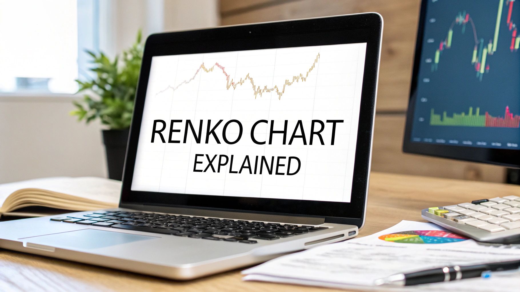
If you've ever felt overwhelmed by the constant, erratic movements on a standard price chart, you're not alone. A Renko chart offers a refreshingly clear alternative. Instead of tracking every single price tick against time, Renko charts focus exclusively on significant price movement. The result? A much cleaner view that reveals the underlying trend with exceptional clarity.
Decoding Your First Renko Chart
Imagine you're building a wall with bricks. You don't add a new brick for every tiny, insignificant change in height. Instead, you wait until you have a full brick's worth of progress before adding the next one. This is exactly how Renko charts work.
Each "brick" on the chart represents a fixed, predetermined price movement. Time is completely taken out of the equation.

A new brick only gets drawn after the price moves a specific amount, which we call the brick size. This simple method filters out all the market "noise"—those small, meaningless price wiggles that create confusion and often lead to bad trading decisions on time-based charts.
The Power of Price Over Time
This unique way of building a chart gives Renko its distinctively clean and uncluttered look. On a typical candlestick chart, a new candle forms every minute or hour, no matter what the price does. With Renko, a single brick might take a few seconds or even several days to form.
The only thing that matters is price.
This focus on price alone is what makes Renko charts so incredibly powerful for trend traders. By stripping away the element of time, we can more easily identify the true direction of the market without getting whipsawed by volatility that has no real impact on the trend.
This isn't some newfangled idea; it has deep roots in trading history. Renko charts originated in Japan way back in the Edo period (1603-1868) to track the price of rice futures. The name itself, "Renko," comes from the Japanese word for brick, "renga." This centuries-old method has stuck around for one simple reason: it works. It simplifies trend detection and makes support and resistance levels stand out. You can learn more about its fascinating history by exploring its origins in Japanese markets.
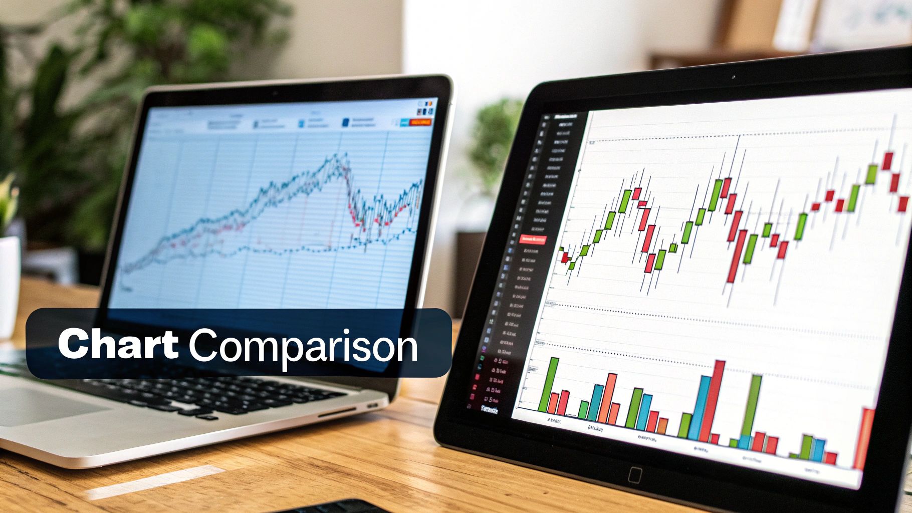
Renko Charts vs Candlestick Charts at a Glance
To really get a feel for the difference, it helps to see a side-by-side comparison. Both charts are valuable tools for a price action trader, but they tell very different stories about the market.
Here’s a quick rundown of how they stack up.
| Feature | Renko Chart | Candlestick Chart |
|---|---|---|
| Primary Axis | Price Movement | Time Interval |
| Noise Level | Low (filters out minor moves) | High (shows all price action) |
| Main Purpose | Trend and level identification | Detailed price action analysis |
| Visuals | Uniform bricks, clean appearance | Varied candle sizes and wicks |
| Data Shown | Only significant closing prices | Open, High, Low, and Close |
As you can see, Renko charts excel at giving you a high-level, noise-free view of the trend, while candlesticks provide a granular look at the price action within a specific time period. For a price action trader like myself, using them together can provide a really powerful perspective on what the market is doing.
How Renko Bricks Are Built
To really get a feel for a Renko chart, you have to look under the hood and see how each brick is actually put together. It all boils down to one critical setting that you control: the brick size. This number sets the exact price move needed before a new brick even has a chance to form.
Think of it like setting a hurdle. Price has to clear that hurdle, up or down, for anything new to be plotted on your chart. It's this very mechanism that gives Renko its power to cut through all the market noise.
The Two Core Rules of Formation
Building a Renko chart comes down to two simple, non-negotiable rules. These rules dictate when a new brick shows up and what colour it’ll be, which is what keeps the chart looking so clean and focused on the trend.
Here’s the breakdown:
- To Continue a Trend: For another brick of the same colour to appear (like another green brick in an uptrend), the price has to move the full, pre-set brick size in that same direction.
- To Reverse a Trend: Now, for a brick of the opposite colour to print (say, a red brick after a string of green ones), the price must move twice the brick size in the opposite direction.
This "two-brick reversal" rule is absolutely fundamental. It’s what stops bricks from forming side-by-side and acts as a powerful filter, making sure only significant reversals get printed. Those minor pullbacks that don't meet the threshold? They're just ignored.
The infographic below really helps visualize this process, showing how price movement triggers new bricks.
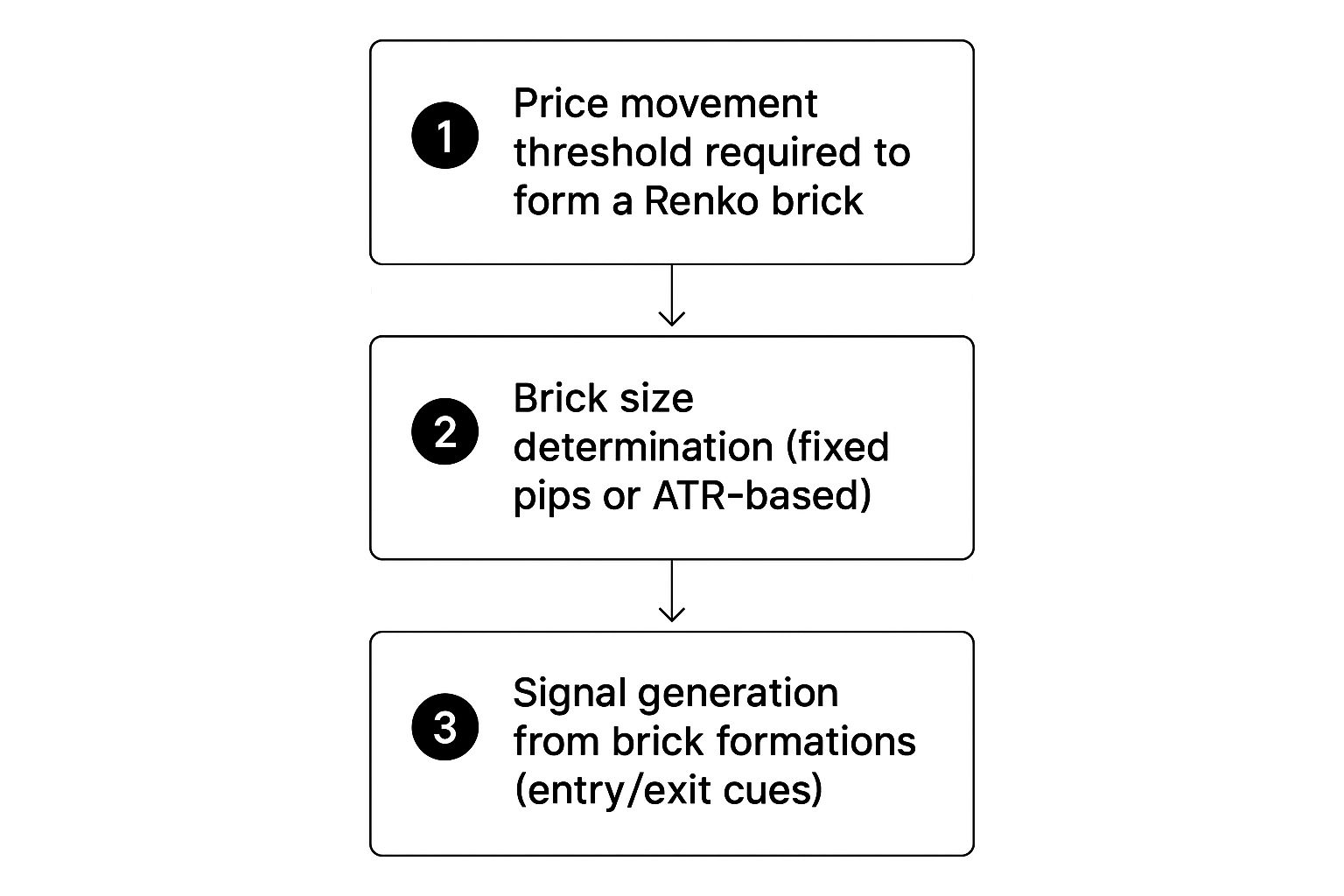
This shows you the core logic, all the way from setting your brick size to how the chart actually generates trend and reversal bricks.
A Practical Example of Brick Construction
Let's make this real. Imagine you're trading the S&P 500 e-mini, and you've set your Renko chart to a 20-point brick size. This means a new brick only gets drawn when the price moves a full 20 points from the last brick's close.
But here’s the key part: if the price reverses, it has to move twice that amount—a full 40 points in our example—to print a brick in the opposite direction. This unique rule is what prevents bricks from forming next to each other and really highlights the price shifts that matter.
This is why Renko charts often look so much smoother than candlestick or OHLC charts; they make spotting trends and reversals much more straightforward. The bricks are always plotted one after the other to the right, creating a clean, linear picture of price action. You can find more on this unique charting method on Wikipedia.
Once you get a handle on these mechanics, you'll have the practical know-how to start customising and reading your own Renko charts with a lot more confidence.
Reading the Story the Bricks Are Telling
Once you get a feel for how Renko bricks are built, you can start to read the surprisingly clear stories they tell about price action. A candlestick chart can often feel chaotic, like trying to listen to a dozen conversations at once. Renko charts, on the other hand, speak in simple, direct signals.
Learning to interpret these signals is your key to unlocking just how powerful this tool can be.
The most fundamental signal is the trend itself. It doesn't get much clearer than this. A string of green bricks marching upwards paints a vivid picture of a strong, sustained uptrend. Flip that, and a chain of red bricks signals an undeniable downtrend. That visual clarity alone can be a game-changer for staying on the right side of the market.
By their very nature, these charts make it easier to follow one of the oldest adages in trading: trade with the trend. There's less temptation to second-guess yourself when the chart is this consistent.
Spotting Key Price Action Signals
Beyond just seeing the trend, Renko charts are exceptional at shining a spotlight on specific price action events. Because they filter out all the insignificant market "noise," the signals that actually get printed on the chart carry more weight. This is a core concept we teach, and if you're new to chart analysis, it's worth taking the time to learn to read stock charts properly. Building that foundation is crucial.
Here are the most common signals you'll want to watch for:
- Trend Reversals: This is the big one. The appearance of a single red brick after a long line of green ones is a massive warning sign that the uptrend might be losing steam or reversing entirely. This is your cue to protect long positions or even start looking for a short.
- Support and Resistance Zones: When you see the price bounce between bullish and bearish bricks in a horizontal channel, the chart is screaming "support and resistance!" These zones become incredibly obvious because the bricks literally stack up at the same price levels, showing you exactly where the battles between buyers and sellers are being fought.
- Breakouts and Breakdowns: A breakout happens when a new green brick finally closes above a well-defined resistance zone. Conversely, a breakdown occurs when a red brick closes below a key support level. These signals are often more reliable on Renko charts because, to even appear, the price had to move enough to overcome your brick size setting, filtering out false moves.
The beauty of a Renko chart is its simplicity. A change in brick color isn't just a minor fluctuation; it's a confirmed price move that has met a specific threshold, signaling a potential shift in market control from buyers to sellers or vice versa.
Interpreting the Narrative
I like to think of each brick as a chapter in the market’s story. A series of green bricks tells a story of optimism and growth. That first red brick to appear? That's the plot twist, a sign of conflict and a potential change in the story's direction.
When you see a strong trend followed by a period of bricks oscillating back and forth, the market is telling you it's pausing to catch its breath. It’s consolidating, building up energy for its next major move. Reading these patterns effectively turns you from just a spectator into an active interpreter of price action, giving you a very real edge in your analysis.
The Real Advantages of Trading with Renko
So why do so many seasoned traders keep Renko charts in their back pocket? It really comes down to the practical, real-world benefits they bring to the table. The biggest advantage, without a doubt, is their incredible noise cancellation.
By design, Renko charts just ignore all the insignificant price wiggles and minor volatility that clog up a normal chart. This filtering is a game-changer because it helps you keep your focus locked on the real market trend. You’re less likely to make those emotional, knee-jerk trades that almost always end badly.
Instead of getting shaken out of a perfectly good trade by a meaningless price spike, you can ride the underlying trend with much more confidence. This naturally leads to the next huge benefit: spotting trends becomes almost effortless. On a standard chart, choppy price action can make you second-guess the market's direction. With Renko, it's visually obvious whether you should be hunting for long or short setups.
A Clearer Roadmap for Trading Decisions
One of the first things you'll notice is how Renko charts make finding critical support and resistance levels so much simpler. The bricks literally stack up at consistent price points where the big buying or selling pressure is, making these key zones pop right off the chart.
This gives you a much cleaner roadmap for your trading. You're not just guessing where a key level might be; the chart is showing you exactly where the market has previously put up a fight or found its footing.
The real power of Renko is that it fosters discipline. By removing the distracting noise and providing clear visual cues for trends and key levels, it encourages a more patient and systematic approach to trading.
Ultimately, this clear structure leads to more methodical trading. You know exactly what a valid breakout looks like—a new brick closing cleanly above a resistance zone. A breakdown is just as clear: a new bearish brick forming below a well-defined support area. There's much less ambiguity.
Key Benefits Summarized
When you add up all these advantages, you get a less stressful and more streamlined trading experience. It’s not about just one feature; it’s about how they all work together to improve your analysis and execution.
I've put together a quick table to show how these benefits translate into tangible outcomes for a trader.
Summary of Renko Chart Benefits
| Advantage | Description | Benefit for the Trader |
|---|---|---|
| Noise Reduction | Ignores minor price fluctuations that do not meet the brick size threshold. | Eliminates emotional trading and prevents being stopped out by insignificant volatility. |
| Trend Clarity | A continuous series of same-colored bricks makes the primary trend unmistakable. | Allows for easier decision-making and helps traders stay on the right side of the market. |
| Level Identification | Support and resistance zones appear as clear horizontal brick formations. | Provides a reliable and objective map for setting price targets and stop-loss orders. |
As you can see, each advantage directly addresses a common pain point for traders, from psychological pressure to technical uncertainty. By filtering the market's "chatter," Renko charts allow you to focus on what truly matters: the underlying price structure.
Understanding Renko Chart Limitations
No trading tool is perfect, and Renko charts are no exception. I love their clarity, but you absolutely have to respect their limitations to avoid some major pitfalls. Ignoring the drawbacks is a quick way to get into trouble, so let's take an honest look at what they are.

The biggest trade-off, by far, is the complete absence of a time element. Think about it: on a normal chart, you can see if a price move happened in a single, aggressive five-minute candle or if it took all day. You get a feel for the market's urgency.
With Renko, you lose that completely. A single brick might print in five seconds during a news spike or take five days to form in a sleepy market. You can't tell the difference just by looking at the chart, and that loss of context can be a real handicap for short-term decision-making.
The Inherent Signal Lag
Another major point to understand is that Renko signals have a built-in lag. Since a new brick only forms after the price has moved a specific, predetermined distance, the chart is by its very nature a lagging indicator. The signal to jump into a trade only appears after a good chunk of the move has already happened.
For a reversal from bullish to bearish to even appear, the price has to move twice the brick size in the opposite direction. While this is great for filtering out noise, it's a weakness for getting in early. You'll often find yourself entering a trade much later than you would with other chart types.
This delay can mean you miss the most profitable, explosive part of a new trend. It's one of the most common trading mistakes to see a new Renko brick and treat it like a real-time event, forgetting the entire price journey it took to get there.
Whipsaws in Choppy Markets
While Renko charts shine in strong, clear trends, they can become a nightmare in choppy, sideways markets. When price is stuck in a range, it can bounce around just enough to print one bullish brick, then a bearish one, then another bullish one—creating a series of frustrating false signals known as "whipsaws."
This can easily lead to overtrading and a string of stop-outs as you get faked out in both directions. The beautiful clarity that helps so much in a trend becomes a source of complete confusion when the market has no direction.
Interestingly, Renko charts have been used in Japan for centuries, but they are a relatively new tool for Western traders. It was Steve Nison’s 1994 book, "Beyond Candlesticks," that really brought them into the spotlight. Now, platforms like NinjaTrader 8 make them accessible to everyone, but they still haven't reached the same popularity as standard candlestick charts.
Combining Renko with Other Technical Indicators
While Renko charts are exceptionally good at cutting through market noise, they really come alive when you pair them with other technical indicators. I like to think of it this way: a Renko chart gives you a clean, simplified map of the market's trend. But to actually navigate that map effectively, you need a compass and a barometer. That's what other tools provide.
Combining them creates a much more complete and robust trading system.
A simple, yet powerful, technique is to just overlay a moving average on your Renko chart. A 20-period Simple Moving Average (SMA), for instance, can act as a fantastic dynamic trend filter. When you see bricks forming above the SMA, it gives you that extra bit of confirmation for your bullish bias.
On the flip side, if bricks are forming below the SMA, it reinforces a bearish outlook and can save you from jumping into risky counter-trend trades.
Adding Confirmation with Volume and Oscillators
Another critical layer of confirmation comes from volume. A breakout on a Renko chart is a strong signal on its own, but a breakout happening with a big surge in volume? That's far more convincing. It tells you the market has real conviction behind the move, which seriously reduces the chances of it being a false signal.
Similarly, oscillators like the Relative Strength Index (RSI) can give you invaluable context. Since Renko charts have a natural lag, an oscillator can be your early warning system that a trend is running out of gas.
For example, if your Renko chart is still printing bullish green bricks but the RSI is showing a bearish divergence (higher highs in price but lower highs on the RSI), that's a major red flag. This signals that the upward momentum is fading and a reversal could be right around the corner.
This multi-indicator approach helps patch up some of the inherent limitations of using Renko charts by themselves. It provides the necessary checks and balances to help you make much more informed decisions. If you're looking for a deeper dive, our guide on how to trade with Renko charts explores these advanced strategies in greater detail.
Here’s a quick summary of how you can combine these tools:
- Trend Confirmation: Use a moving average to confirm the direction that the Renko bricks are showing you.
- Breakout Validation: Use a volume indicator to confirm the strength behind a breakout or breakdown. Is there real money behind the move?
- Exhaustion Signals: Use an oscillator like the RSI to spot divergences and catch potential trend reversals early, before they become obvious.
Common Questions About Renko Charts
Once traders start digging into what a Renko chart is, a few practical questions always pop up. Getting these answers right is crucial for using them properly in a live market and dodging some common mistakes. Let's tackle some of the most frequent ones I hear.
How Do I Choose the Right Brick Size?
This is probably the most critical decision you'll make when setting up a Renko chart, and honestly, there's no single "best" size. It all comes down to the instrument you're trading, its volatility, and your personal trading style.
A popular method many traders lean on is using the Average True Range (ATR). For example, if you set your brick size to the current value of a 14-period ATR, your chart will naturally adapt to the market's rhythm. It becomes more sensitive during quiet times and less jumpy when volatility explodes.
- Day Traders tend to gravitate towards a smaller, fixed point or pip size. They need that extra sensitivity to spot and act on quicker intraday moves.
- Swing Traders, on the other hand, usually opt for a much larger brick size. Their goal is to filter out the market "noise" and concentrate only on the more significant, longer-term trends.
The best way forward? Fire up your charts and backtest. Try out different sizes on the specific asset you trade. This is the only way to see for yourself which setting best highlights the kind of trends you're trying to catch.
Are Renko Charts Better Than Candlesticks?
This is a classic question, but neither chart is inherently "better" than the other. It's like asking if a hammer is better than a screwdriver. They're different tools designed for different jobs, and they each tell a different part of the price action story.
Renko charts are fantastic at cutting through the noise and showing you the underlying trend with incredible clarity. This makes them a favorite for trend-followers. But, they achieve this by deliberately ignoring time, which means they can lag quite a bit.
Candlestick charts, by contrast, paint a very detailed picture of the fight between buyers and sellers within a specific time period (showing the open, high, low, and close). That detail is gold if you're analysing short-term momentum or trading specific candlestick patterns.
In my experience, many of the best traders I know use both. They'll use Renko to get a clean read on the big-picture trend and then switch to candlesticks to pinpoint their exact entries and exits.
At Colibri Trader, we teach a price-action methodology that helps you interpret market structure without relying on cluttered indicators. Discover your trading potential by taking our free quiz and get on the path to consistent results. Learn more about our approach at https://www.colibritrader.com.