


Master Understanding Price Action Trading for Better Market Insights
To really get good at trading, you have to learn how to read a market’s story right from a clean, unfiltered price chart. This skill is what we call price action trading. It’s all about analyzing how an asset's price moves over time, instead of plastering your screen with mathematical indicators that are just derivatives of that same price.
Think of it as learning the language of the market itself.
What Is Price Action And Why Should You Care
Imagine trying to understand a conversation by only reading a summary someone else wrote for you. You'd get the gist, but you’d miss all the nuance—the tone, the pauses, and the emotion that give the words their real meaning. Relying only on technical indicators is a lot like that. They just summarize what already happened and almost always lag behind what the market is doing right now.
Price action trading, on the other hand, is like listening directly to the conversation between buyers and sellers. It’s the art of looking at the raw data on a chart to understand the market's psychology and get a feel for where it might go next.
Every price bar, or candlestick, is like a word. When you string them together, they form sentences and paragraphs that tell a vivid story about supply, demand, greed, and fear.
The Language of the Market
Learning price action really is like learning a new language. At first, you just see random squiggles (price ticks). Before long, you start recognizing individual words (candlesticks). Eventually, you can read entire sentences (chart patterns) that tell you exactly who's in control of the market.
This approach strips away all the noise from lagging indicators like the RSI or MACD, which can often flash conflicting signals and just create confusion. Instead, you're focused purely on the price itself—the most current and vital piece of information you have. You can dive deeper into this core concept in our detailed guide on what is price action.
Going straight to the source like this gives you a serious edge. You aren't waiting around for an indicator to confirm what the price has already told you; you're watching the battle between bulls and bears unfold in real-time. This skill isn't just another strategy; it's a fundamental competency that every serious trader needs to develop.
Price action trading is less about predicting the future with 100% certainty and more about understanding the probabilities based on the raw, unfiltered behavior of market participants. It’s a shift from just plugging in formulas to interpreting market psychology.
The great thing is, this isn't just some abstract theory. With modern backtesting platforms, traders can now rigorously test their price action strategies against decades of historical data. For instance, my own simulations of price action strategies across more than 20 years of market conditions have shown that simply reading candlesticks and market structure can produce methods with a real, verifiable statistical edge.
To really get why this is so different, it helps to put it side-by-side with the more common, indicator-heavy methods.
Price Action vs. Indicator-Based Trading
When you compare the two approaches, the differences become crystal clear. One is about reading the present, and the other is about analyzing the past.
Here’s a quick breakdown:
| Aspect | Price Action Trading | Indicator-Based Trading |
|---|---|---|
| Data Source | Raw price charts (candlesticks, bars) | Mathematical formulas based on price |
| Timing | Real-time, leading | Lagging, confirms past moves |
| Analysis Focus | Market psychology, patterns, structure | Statistical levels (e.g., overbought) |
| Complexity | Simple, clean charts | Often cluttered with multiple overlays |
| Decision-Making | Discretionary, based on context | Rule-based, based on signals |
Ultimately, price action trading empowers you to see the market for what it is—a dynamic environment driven by human emotion. Indicators just give you a mathematical echo of that reality.
How to Read the Story in Each Candlestick
Every single candlestick on your chart is a miniature story of conflict. It’s a complete narrative of a single trading session, whether that session is one minute, one day, or one week. To really get good at price action trading, you have to learn how to read these individual stories so you can piece together the market's bigger plot.
Forget seeing simple red and green blocks. You need to start seeing the raw psychological battle between the buyers (bulls) and sellers (bears). Each part of the candle gives you critical clues about who won the fight, who lost, and just how intense it was.
The Anatomy of a Market Battle
Think of a candlestick like a summary of a boxing round. The main, thick part is called the body, and it tells you who landed the most decisive blows. If the candle closes higher than it opened (usually green or white), the bulls won that round, hands down. If it closes lower (usually red or black), the bears absolutely dominated.
Now, look at the thin lines sticking out from the top and bottom. These are called wicks or shadows, and this is where the real story gets interesting. Wicks show the territory that one side tried to take but ultimately couldn't hold.
A long upper wick shows that buyers made a big push, driving the price way up. But before the session closed, sellers stormed back and forced the price back down. A long lower wick tells the opposite tale: sellers tried to drag the price into the basement, but buyers mounted a furious comeback, pushing it higher.
A candle with long wicks and a tiny body signals a fierce, indecisive brawl. On the other hand, a candle with a huge body and barely any wicks shows one side was in complete control from the opening bell to the close.
Single Candles That Shout Market Intentions
Some individual candlesticks are so powerful they act as standalone signals. They don't need to be part of a larger, complex pattern to tell you something important is happening with market sentiment. Paying attention to these is a cornerstone of price action analysis.
Here are three foundational single-candle signals you absolutely must know:
-
The Marubozu: This is the candle of absolute, undeniable dominance. It has a full body and no wicks at all. A green Marubozu means buyers were in total control from the open to the close, while a red one shows the sellers were unstoppable. It screams powerful, one-sided momentum.
-
The Hammer (and Shooting Star): The Hammer is a classic. It has a short body at the top of its range and a long lower wick. This pattern tells you that sellers tried to crush the price, but buyers staged a dramatic comeback to close near the high. It's often a signal of a potential bullish reversal after a downtrend. Its bearish cousin, the Shooting Star, is just an upside-down Hammer that shows up after an uptrend, signaling a potential reversal to the downside.
-
The Doji: A Doji candle has a very small body, sometimes just a sliver, where the open and close prices are almost identical. This represents a moment of pure indecision in the market. Neither the buyers nor the sellers could gain any ground, resulting in a stalemate.
A Doji isn't just a pause; it's a critical moment of equilibrium. When a Doji appears after a strong trend, it can be the first major warning sign that the dominant momentum is sputtering out and a reversal could be just around the corner.
By mastering how to interpret these individual candles, you stop seeing charts as random noise. You begin to see the underlying psychology and order driving the market. Each candle is a clue, and learning to read them gives you a massive advantage. This skill is the first real step toward becoming fluent in the language of price action.
Mapping the Market With Support and Resistance
If you think of individual candlesticks as the market's "words," then support and resistance levels are the grammar holding the sentences together. Price doesn't just fly around randomly; it flows within a framework of historical price zones that act like invisible barriers. Getting a handle on this framework is non-negotiable for any serious price action trader.
The easiest way to think about these levels is like the architectural "floors" and "ceilings" of the market.
Support is the floor. It's a price level where a downtrend tends to slam on the brakes and bounce back up. This is a spot where, historically, a swarm of buyers jumped in, deciding the asset was a bargain.
Resistance is the ceiling. It's a price level where a rally often runs out of steam and reverses. It marks a zone where sellers previously overwhelmed the buyers, convinced the asset was getting too expensive. These aren't just lines on a chart; they're psychological battlegrounds carved out by the market's collective memory.
The Psychology Behind Support and Resistance
So, why do these levels actually work? It's all about raw human emotion and memory. When price starts creeping back toward a level where it made a dramatic reversal in the past, traders take notice and react.
- Regretful Buyers: Traders who missed their chance to buy at a previous low (a support level) see the price returning and think, "Here's my second chance!" This creates a fresh wave of buying pressure.
- Anxious Sellers: On the flip side, traders who bought near a previous high (a resistance level) are likely underwater on their position. As the price gets back to their entry point, they're often desperate to sell and just break even, which adds a ton of supply to the market.
- Smart Profit-Takers: Traders who were savvy enough to buy at support will naturally look to cash out as the price approaches a known resistance level, locking in their gains.
Every single time the price tests a level and fails to break through, that level gets stronger and more significant in the minds of traders. The market "remembers," reinforcing the level's importance for the next time price comes calling.
Identifying and Drawing Key Levels
Finding these levels is definitely more of an art than an exact science. You’re looking for zones, not precise, single-tick price points. Scan your chart and look for the most obvious turning points—the places where the price made a major swing high or swing low.
Connect these peaks (for resistance) and troughs (for support) with horizontal lines. What you're really searching for are levels that have been tested and respected multiple times. A level that was only touched once is far less reliable than one that has held firm on three or four separate occasions.
It's absolutely crucial to see support and resistance as areas or zones, not as razor-thin lines. Price will often poke through a level a little bit before reversing course. If you demand perfection, you'll end up missing a lot of high-quality trade setups.
These horizontal levels form the basic map of the market, showing you exactly where the most significant battles between buyers and sellers are likely to unfold. They are tied directly to the core principles of supply and demand, which you can dive deeper into in our article on supply and demand levels in price action trading.
Dynamic Support and Resistance Trend Lines
While horizontal levels are great for marking static barriers, the market is usually on the move. This is where trend lines become incredibly useful, acting as dynamic support and resistance.
An uptrend is simply a series of higher highs and higher lows. If you draw a line connecting at least two of the major higher lows, you've created a dynamic support line. In a healthy uptrend, you'll often see the price bounce off this line as it continues to climb.
A downtrend is the opposite, marked by lower lows and lower highs. By connecting two or more of the significant lower highs, you get a dynamic resistance line. In a strong downtrend, this line will frequently act as a ceiling, putting a stop to any rallies before the price heads lower again.
By combining these static horizontal levels with dynamic trend lines, you build a much more complete and powerful map of the market's structure. Suddenly, your chart transforms from a chaotic mess of wicks and bodies into a clear roadmap of potential opportunities.
Core Price Action Patterns You Should Know
Okay, so you've learned to read individual candlesticks and map out your support and resistance levels. That's a fantastic start. The next step is where the real magic happens: combining these building blocks to spot powerful, repeatable price action patterns. These formations aren't just squiggles on a chart; they tell a clear story about the shifting power dynamic between buyers and sellers.
These patterns are the heartbeat of market psychology made visible. Price action trading is all about using historical price data to get a read on where the market might be heading next. This isn't a new idea, either. Back in the 17th century, Japanese rice traders developed what we now call candlestick charting—the very foundation of what we're doing here. They understood that by studying past price movements, they could identify recurring patterns like the 'head and shoulders' or 'double top' that signaled a change in the wind. Learning to spot these historical patterns can seriously stack the odds in your favor.
The image below is a great cheat sheet. It shows how the major chart patterns relate to each other, giving you a quick guide on whether the market is likely to reverse or keep pushing in the same direction.
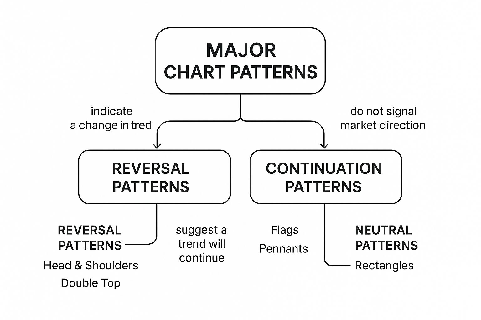
Think of this as your roadmap. It helps you understand the clues different patterns are giving off so you can pick the right strategy for what the market is doing right now.
The Engulfing Pattern: A Clear Power Shift
The engulfing pattern is one of the most powerful and easy-to-spot reversal signals you'll find. It’s a simple two-candle setup that can scream that a violent change in direction is coming. The whole secret is that the body of the second candle completely "engulfs" or swallows the body of the candle before it.
A bullish engulfing pattern shows up at the bottom of a downtrend. You'll see a small red (bearish) candle, followed by a large green (bullish) candle that completely covers the body of that prior red candle. This tells a story: sellers were in control, but then the buyers stormed in with overwhelming force, completely flipping the script.
On the flip side, a bearish engulfing pattern forms at the top of an uptrend. A small green candle is followed by a massive red candle that swallows it whole. This is a huge red flag for the bulls. It shows that even though buyers gave it a push, sellers took over the driver's seat aggressively, signaling the rally might be toast. These patterns are most potent when they form right at a major support or resistance level.
The Pin Bar: A Sharp Rejection of Price
The Pin Bar, which is short for "Pinocchio Bar," is another killer reversal signal. Its name is perfect because it tells a "lie" about where the market is headed. It’s defined by a very long wick (the "nose") and a small body, looking a lot like a Hammer or a Shooting Star candle. That long wick is the key—it shows a sharp rejection of a specific price level.
A bullish Pin Bar has a long lower wick. This shows that sellers tried their best to shove the price down, but buyers fought back hard, driving the price all the way back up to close near where it opened. It’s a powerful sign of buying pressure.
A bearish Pin Bar is the opposite, with a long upper wick. Here, buyers tried to rally higher but got slammed back down by sellers. This decisive rejection screams selling pressure and points to a potential top.
The context for a Pin Bar is everything. A Pin Bar floating in the middle of nowhere is just noise. But a perfect Pin Bar forming at a well-defined support or resistance level is a high-probability signal that demands your attention.
The Inside Bar: A Coiling Spring of Energy
The Inside Bar is a two-bar pattern that signals consolidation and hints at a big move to come. The entire range of the second candle—both its high and its low—is contained within the range of the first candle, which we call the "mother bar."
Think of the Inside Bar as the market taking a quick breather. It’s like a spring coiling up, building potential energy. Volatility contracts, and buyers and sellers reach a temporary standstill. But this calm often comes right before a major price expansion.
The trading strategy here is pretty straightforward: you wait for a breakout from the mother bar's range.
- A break above the mother bar's high can signal the uptrend is continuing or a new bullish move is starting.
- A break below the mother bar's low can signal the downtrend is resuming or a new bearish move is beginning.
These three core patterns—the Engulfing, the Pin Bar, and the Inside Bar—are the bread and butter of many successful price action strategies. Once you learn to spot them, understand the story they tell, and—most importantly—only act on them when they appear at key chart levels, you'll start to see a chaotic chart transform into a map of clear, actionable opportunities.
Building Your First Price Action Strategy
Knowing how to spot patterns is one thing. Actually having a plan to trade them is a whole different ball game. This is where the rubber meets the road—where your chart analysis has to translate into real-world trading decisions.
A strategy is nothing more than a clear, rule-based framework that guides your actions. It’s what helps you ditch the emotional rollercoaster and stop making rash, gut-feel trades. Building one doesn't have to be some overly complex, academic exercise. A solid plan simply takes the core ideas we've discussed and puts them into a repeatable checklist.
Let's walk through exactly how to construct a simple but powerful price action strategy from scratch. This is how you go from just watching the markets to actively participating with a real edge.
The Four Pillars of a Solid Strategy
Every complete price action strategy can be broken down into four critical stages. Think of it as a pre-flight checklist you run through before every single trade. Each step builds on the last, taking you from spotting an opportunity all the way to managing a live position.
- Identify the Market Context: First, zoom out. What's the big picture? Is the market in a clear uptrend, a downtrend, or just chopping sideways in a range? Use your trend lines and look for higher-highs/higher-lows to figure out the market's dominant direction.
- Locate a Key Level: Where are the major support and resistance zones? You're looking for those horizontal price shelves where the market has turned around before. These are the hot spots where high-probability trades are born.
- Wait for a Clear Signal: Now you need a trigger. Is a valid price action pattern forming right at your key level? This could be a clean Pin Bar, a powerful Engulfing pattern, or an Inside Bar waiting to break out. Patience is everything here. If the signal isn't clean, you don't trade.
- Execute and Manage the Trade: Once you have your signal, you need a battle plan. Where will you enter? Where is your stop-loss? Where will you take profit? This step is all about defining your risk and potential reward before you even think about hitting the buy or sell button.
Defining Your Risk and Reward
Getting into a trade is easy. The real skill is knowing exactly where you’ll get out—for both a loss and a win. This is the absolute foundation of responsible trading, and it's completely non-negotiable if you want to last in this business.
Your stop-loss is your safety net. In a price action strategy, it shouldn't be random; it must be logical. For a bullish Pin Bar, for instance, a logical stop would sit just below the low of the pin's wick. Why? Because if the price drops that low, your trade idea is proven wrong. Simple as that.
Your take-profit target is your payday. A good rule of thumb is to always aim for a risk-to-reward ratio of at least 1:2. That just means for every $1 you're willing to risk, you're aiming to make at least $2. You can set this target at the next major support or resistance level that stands in your way.
A winning strategy has nothing to do with being right all the time. It’s about making sure your winners pay for your losers, and then some. A positive risk-to-reward ratio is how you stay profitable even if you only win 50% of your trades.
A Practical Trade Example Step by Step
Alright, let's put all the pieces together. Imagine this hypothetical bullish setup on the EUR/USD.
Scenario: The EUR/USD is in a clear uptrend on the daily chart, printing a nice series of higher highs and higher lows. Right now, the price is pulling back towards a significant horizontal support level that has held strong on two previous occasions.
Here’s how our four-step strategy plays out:
-
Step 1: Market Context
The primary trend is up. We're not fighting the tape. That means we are only interested in buying opportunities to trade with the prevailing momentum. -
Step 2: Key Level
We've marked a strong horizontal support zone around the 1.0850 price level. Now, we just sit on our hands and patiently watch how the price reacts when it gets there. -
Step 3: Price Action Signal
Bingo. After tapping the 1.0850 level, the daily chart closes with a perfect bullish Pin Bar. That long lower tail is screaming that buyers stepped in and aggressively rejected lower prices right at our support zone. This is our signal, our trigger to act. -
Step 4: Execution and Management
- Entry: We place a buy-stop order just a few pips above the high of the Pin Bar.
- Stop-Loss: Our stop goes just below the low of the Pin Bar's long wick. This gives the trade some breathing room while defining our maximum risk.
- Take-Profit: Looking left on the chart, the next major resistance area is up at 1.1050. This gives us a great risk-to-reward ratio, so we'll set our take-profit target right there.
This simple, four-step process creates a clear, logical, and repeatable way to trade. When you consistently follow a rules-based plan, you build discipline and learn to trade what the chart is actually telling you, not what your fear or greed is screaming in your ear.
Common Questions About Price Action Trading
When you first dive into price action trading, you're bound to have a lot of questions. It's only natural. Moving away from charts cluttered with indicators can feel like you're suddenly trading without a safety net.
But here’s the thing: you’re actually learning to read the market’s raw language. That’s the most direct and unfiltered information you can possibly get.
This section tackles the most common questions I hear from traders making this switch. My goal is to give you clear, practical answers that cut through the usual noise, bust a few myths, and give you the confidence to trade what you see.
Can I Combine Price Action With Indicators?
Absolutely—but you have to approach it with the right mindset. The whole point of price action is to declutter your charts and, more importantly, your thinking. If you start piling on indicators, you’ll end up right back where you started: in a state of analysis paralysis.
The key is to use indicators as secondary, confirmatory tools. They should never be the main reason you enter a trade. Price action must always be the star of the show.
Here are a few simple tools that can add context without creating a mess:
- Moving Averages: A simple 20-period or 50-period exponential moving average (EMA) is a fantastic way to quickly see the short-to-medium-term trend. It also helps pinpoint dynamic support and resistance areas where buyers or sellers might step in.
- Volume: Volume isn't an overlay on your price chart, but it tells you the conviction behind a move. Think about it: a breakout on massive volume is a powerful statement. The same breakout on weak, anemic volume? Not so much.
- Pivot Points: These are mathematically calculated levels that can act as extra support and resistance zones. You’ll often find they line up perfectly with key areas that price action traders are already watching.
The trick is to keep it minimal. If an indicator is screaming "SELL" while a crystal-clear price action signal is forming at major support, a pure price action trader listens to the price. Every single time.
Is Price Action Trading Suitable For Beginners?
This is a question I get all the time, and the answer is a resounding yes. In fact, I believe learning price action from day one is a huge advantage. It can stop you from picking up the bad habits that indicator-reliant traders spend years trying to unlearn.
When you start with price action, you learn to think like a real trader, not just a technician. You’re learning to read market psychology, understand risk, and interpret the constant battle between supply and demand right from the chart itself. That’s a foundational skill.
Learning price action first is like learning to cook with fresh ingredients instead of only using pre-packaged meals. It's more challenging initially, but you develop a much deeper understanding and skill set that allows for far greater creativity and success in the long run.
For new traders, my advice is to focus on mastering just one or two high-probability patterns, like the Pin Bar or the Engulfing Bar, at obvious support and resistance levels. Don't try to learn everything at once. This focused approach builds skill and, just as importantly, confidence. To help you get going, I suggest reviewing these 10 price action trading tips to become a better trader which offer some solid, practical advice for newcomers.
How Long Does It Take To Become Proficient?
This is the "how long is a piece of string?" question of the trading world. There's no fixed timeline, and frankly, anyone who gives you one is probably trying to sell you something.
How quickly you become proficient depends entirely on your dedication, the amount of screen time you put in, and your commitment to disciplined, methodical practice.
Some traders start to find their footing and see consistent results within 6-12 months of focused effort. For others, it might take a few years. It's not about the number of trades you take; it’s about the quality of your analysis, your record-keeping, and your raw ability to learn from both your wins and your losses.
These are the factors that will speed up your learning curve:
- Focused Study: You have to dedicate time each day to reviewing charts. I don’t just mean looking for trades, but going back and analyzing past price movements to see what worked and what didn't.
- Journaling: Keep a detailed journal of every single trade. Write down your reasoning, the outcome, and what you could have done differently. This is non-negotiable.
- Patience: The fastest way to learn what actually works is to resist the urge to trade out of boredom. You have to learn to sit on your hands and wait for only the A+ setups.
Becoming a proficient trader is a journey of continuous improvement, not a destination with a finish line. The market is always changing, and so must you.
What Is a Price Gap and Should I Worry About It?
A price gap is simply what happens when a market opens at a price that is significantly different from its previous close. This leaves an empty space or "gap" on your chart. You'll see them all the time over the weekend in forex or after a major news event rocks the market.
Should you worry? Not really, but you absolutely must understand what they mean.
Gaps represent a sudden, powerful shift in market sentiment. For a price action trader, a gap isn't noise; it's a critical piece of information. For example, a "breakaway gap" at the very beginning of a new trend can be an incredibly powerful signal. On the flip side, an "exhaustion gap" at the end of a long, tired trend can signal an imminent reversal.
The most important thing to remember is that you never trade based on the gap alone. A gap must always be analyzed within the broader context of the chart's structure, the overall trend, and the price action surrounding it.
At Colibri Trader, we provide the clear, no-nonsense guidance you need to master price action and transform your trading performance. Our action-based programs are designed to build your skills from the ground up, ensuring you can achieve consistent results.
Start your journey to trading mastery with Colibri Trader today.