


Trading Without Indicators: Master Price Action Strategies
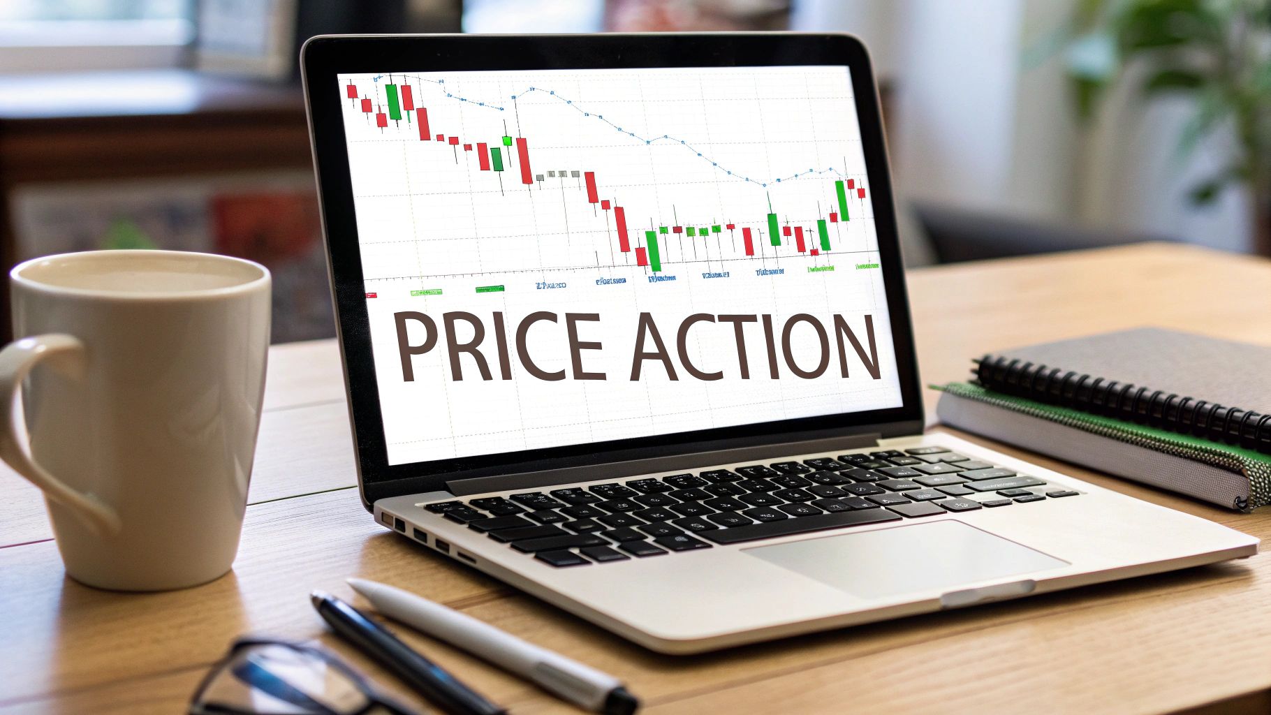
Trading without indicators, a skill many experienced traders call naked trading, is all about learning to read the market’s story through pure price action. It means you’re making calls based on what you see—candlestick patterns, support and resistance levels, and the overall market structure—not waiting on lagging signals from tools like the RSI or MACD.
Frankly, it’s a cleaner, more direct way to understand what the market is doing right now.
Why Trading Without Indicators Is A Smarter Approach
A lot of traders, especially when they're starting out, fall into a common trap: they think more indicators mean better decisions. Before they know it, their charts are a tangled mess of colorful lines and oscillators, all screaming different things. This leads to what we call "analysis paralysis," where conflicting signals make it impossible to pull the trigger on a trade with any real confidence.
The fundamental issue here is that almost all technical indicators are lagging. They’re just mathematical formulas based on past price data. In other words, they only confirm what has already happened. By the time an indicator finally flashes a "buy" signal, the best part of the move is usually long gone.
Ditching The Lag For Clarity
When you trade without indicators, you’re forced to focus on the one thing that truly moves the market: the current price. Price action is the purest reflection of market sentiment—it's the real-time battle between buyers and sellers playing out right in front of you. Learning to read this raw data gives you a massive edge.
This isn’t about making wild guesses. It’s a skill you build by recognizing repeatable patterns rooted in human psychology and behavior. It cuts through the noise and simplifies your decision-making, allowing you to act quickly and decisively when a real opportunity pops up.
The goal is to react to what the market is doing right now, not what it did ten bars ago. Stripping your charts down to just the price allows you to see the market's true narrative without the distracting noise of lagging signals.
To better understand this distinction, let's break down the core differences between these two approaches.
Indicator-Based vs Indicator-Free Trading
| Aspect | Indicator-Based Trading | Indicator-Free (Price Action) Trading |
|---|---|---|
| Focus | Past price data via mathematical formulas | Current and emerging price patterns |
| Signals | Lagging; confirms moves after they've started | Leading; anticipates future price movement |
| Chart Appearance | Often cluttered with multiple overlays and oscillators | Clean and simple, focused on candles and levels |
| Decision-Making | Can lead to "analysis paralysis" from conflicting signals | Faster and more intuitive, based on direct observation |
| Skill Development | Learning to interpret various indicator settings | Mastering the "language" of the market itself |
While indicators have their place, relying on them too heavily can become a crutch that actually holds you back. The real skill is in reading the chart itself.
A Proven Path To Consistency
Focusing on pure price action gives you a robust framework that works in any market and on any timeframe. The core principles of support, resistance, and trend are universal, and traders have been using them successfully for decades to get consistent results. In fact, some of the most seasoned pros I know have reported win rates of up to 80% just by mastering these foundational concepts.
This approach helps you build true market intuition. Instead of just blindly following a lagging indicator, you start to understand why the price is moving in a certain way. Our complete guide on indicator-free trading dives much deeper into these concepts, giving you the tools to build that solid foundation.
Ultimately, this shift in perspective is what separates struggling traders from those who are consistently profitable. It’s about moving from being a passenger on your trading journey to being the pilot.
How To Identify High-Impact Price Levels
The entire game of trading without indicators boils down to one critical skill: identifying high-impact price levels. These aren't just random lines you slap on a chart. Think of them as battlegrounds—horizontal zones where buyers and sellers have historically duked it out, leaving behind a roadmap of future possibilities. Getting good at spotting these areas is your first real step toward reading the market's story directly from price itself.
Forget about complicated formulas. A high-impact level is just a price point where the market has repeatedly hit a wall, paused for a breath, or completely reversed course. It's the market's memory, visualized right on your chart.
This infographic lays out the bare-bones setup for a price action trader. Notice how clean the chart is? That's by design.
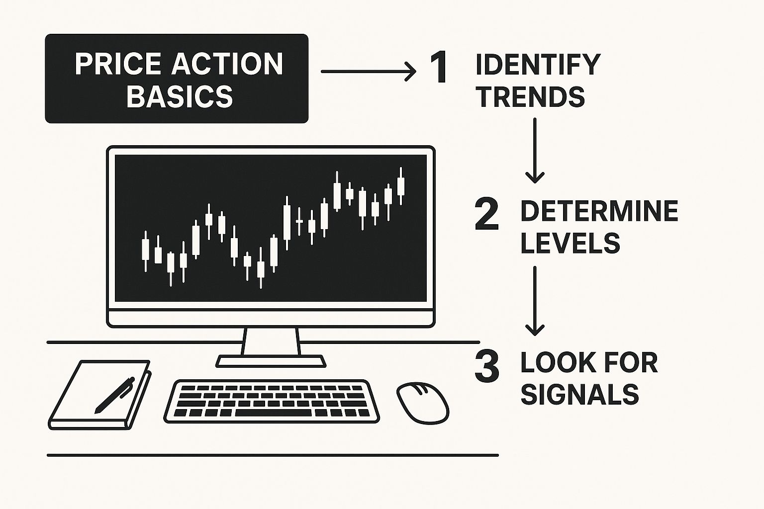
This minimalist style, built around simple candlestick charts, forces you to focus purely on price movement and structure. There are no distractions. The big secret here is that clarity breeds confidence. The less noise you have, the easier it is to see the levels that actually matter.
Support And Resistance The Right Way
Most traders new to the scene make the same mistake: they draw support and resistance as razor-thin lines. This is a rookie move. Price almost never turns on a dime at an exact price. It probes, it tests, it feels out an area before it decides to make a real move. That's why you need to think of these levels as zones.
- Support Zone: An area on the chart where buyers have consistently shown up in force, overpowering sellers and causing a downtrend to either stall or reverse.
- Resistance Zone: An area where sellers have historically been dominant, stepping in to halt or reverse an uptrend.
To find these zones, pull up a daily or 4-hour chart and just look. Scan for the obvious swing highs and swing lows. Where has the price clearly reversed in the past? Mark those spots with a horizontal rectangle. The more times a zone has been respected, the more significant it becomes.
Pro Tip: Don't go crazy and clutter your chart. Your goal is to identify only the most obvious, most significant levels. A clean chart with two or three major zones is infinitely more powerful than one plastered with dozens of minor lines.
Gauging The Strength Of A Level
Not all zones are created equal. Some will hold like a fortress wall, while others will crumble like a sandcastle. Before you ever think about putting capital on the line, your job is to figure out how strong a level really is.
I look at a few things to judge a level's importance:
- Timeframe: This is a big one. Levels you find on the daily or weekly charts carry way more weight than something on a 5-minute chart. The big money—the institutions and funds that move markets—are making their decisions based on these higher timeframes.
- Number of Touches: How many times has price hit this zone and backed off? A level that has held as support or resistance three or more times is well-established. It’s on everyone’s radar.
- The Nature of the Reaction: How did the price react the last time it visited this zone? A sharp, violent rejection with long wicks or tails on the candles screams strength. On the flip side, if the price just chops around the level and consolidates, it might be showing signs of weakness.
It’s like bouncing a tennis ball. A powerful, decisive bounce tells you the floor is hard (strong support). A weak, sluggish bounce suggests the surface is soft and might give way (weakening support). You're applying the exact same logic when you watch price interact with a key level.
The Role Reversal Phenomenon
Okay, this is where it gets really interesting for a price action trader. One of the most reliable dynamics you'll ever see is role reversal. This is what happens when a broken support level flips and becomes new resistance, or when a broken resistance level turns into new support.
This simple flip signals a massive shift in market psychology.
- Example Scenario: Imagine a stock is trending up but keeps getting rejected at $100 (a clear resistance zone). When it finally smashes through, the whole game changes. The traders who were shorting at $100 are now in pain and might look to buy back their positions if the price dips to that level to cut their losses. At the same time, buyers who missed the initial breakout now see $100 as a bargain.
This flood of new buying interest is what turns the old resistance ceiling at $100 into a new support floor. Spotting this "old ceiling becomes new floor" dynamic is a classic, high-probability sign that the trend is strong and has room to run. It gives you a perfect area to start hunting for a trade entry, all without a single indicator.
Reading The Market Story With Chart Patterns
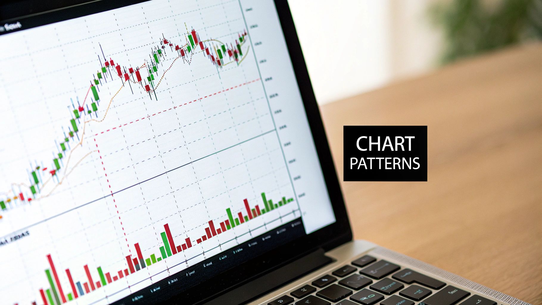
Alright, so you've gotten the hang of spotting those crucial support and resistance zones. Now for the fun part: learning to read the story the market is telling you through chart patterns.
These aren't just squiggles on a screen. Think of them as the visual footprint of the constant battle between buyers and sellers. Getting a feel for these patterns is a cornerstone of trading without indicators.
Every pattern tells you something. Take the classic head and shoulders pattern. It’s a fantastic visual of an uptrend running out of gas. That first peak (the left shoulder) shows buyers are in control. The higher peak (the head) is their last big push, but when the price fails to make a new high and forms a lower peak (the right shoulder), it's a huge red flag. It tells you the buyers are exhausted, and sellers are starting to smell blood in the water.
When you grasp the psychology behind the pattern, you stop just memorizing shapes and start seeing real, high-probability trade setups unfold.
Continuation Patterns: Signs Of A Healthy Trend
Continuation patterns are your bread and butter. They tell you the market is just catching its breath before continuing in the same direction. I love these setups because you're trading with the dominant momentum, not against it. It's like hopping onto a moving train instead of trying to stop it.
Two of the most reliable continuation patterns you'll see are flags and pennants.
- Bull and Bear Flags: These look like small, rectangular channels tilting against the main trend. For a bull flag, you'll see a powerful move up, followed by a gentle, downward-sloping consolidation. This shows sellers are trying to push back, but they lack conviction. The original buyers are just waiting to jump back in.
- Pennants: Very similar to flags, but the consolidation part looks like a small, symmetrical triangle. It’s a brief moment of equilibrium before the big players push the price in the direction it was already heading.
When you spot one, the classic entry is the moment the price breaks out of the pattern in the direction of the primary trend. You can tuck your stop-loss just on the other side of the pattern, giving you a very clear point where you know your idea was wrong.
Reversal Patterns: Spotting The Turning Tide
Reversal patterns are the exciting ones. Catching one early can put you at the very beginning of a major new trend. But a word of caution: they need more patience and confirmation. A lot of would-be reversals end up failing.
The most powerful reversal patterns are those that form right at a major, pre-identified support or resistance level.
A double top forming at a key weekly resistance level is a far more significant signal than one appearing in the middle of a choppy, undefined range. Context is everything when you are trading without indicators.
Let's dig into two of the most common reversal patterns you'll encounter.
The Double Top and Double Bottom
This is one of the simplest, yet most powerful, reversal signals out there.
- Double Top: Price hits a high, pulls back, and then rallies to test that same high again but gets rejected. This "M" shape clearly shows that buyers tried twice to break a level and failed. That failure is often all the confirmation sellers need to step in aggressively.
- Double Bottom: This is the mirror image, looking like a "W" at the end of a downtrend. Price hits a low, bounces, retests that same low, and holds. It’s a clear signal that sellers have run out of steam and buyers are stepping up to defend that price level.
Trading the Double Bottom: A Practical Example
Let's put this into practice. Imagine a stock has been tanking and finally finds some buyers at $50. It manages a weak bounce up to $52 before sellers push it back down. The critical moment is when the price stops dead at $50 again and starts to reverse. That’s your double bottom confirmation.
The horizontal line at the lows ($50) is your support. The peak of the bounce ($52) is what we call the "neckline."
A conservative trader would wait for the price to break and close above that $52 neckline. This shows the buyers have truly seized control. Your stop-loss would go just below the $50 lows. For a profit target, a simple method is to measure the height of the pattern (from $50 to $52, which is $2) and project that distance up from the breakout point. This gives you a logical initial target around $54.
See how that works? You’ve just built a complete trade plan—entry, stop, and target—using nothing but the price action on your chart. That is the essence of trading without indicators.
Using Candlesticks For Precision Timing
Once you've mapped out the major price levels and chart patterns, you've figured out where a trade might happen. Now we need to zoom in and nail down when. This is exactly where individual candlesticks shine, acting as your tools for precision timing.
Trading without indicators isn't about flying blind; it's about focusing on the most direct piece of information available: the story a single candle tells when it forms at a make-or-break location on your chart.
Think of it this way: a chart pattern like a double bottom hints that a reversal could be on the horizon. But it's the specific candlestick pattern that forms at that second bottom that acts as your final trigger. It’s the market screaming, "Okay, buyers are showing up right now." This is the final confirmation that allows you to step into a trade with real confidence.
The Power of Context in Candlestick Trading
Let's get one thing straight before we dive into specific patterns: a candlestick is only as good as its location. A textbook reversal candle that pops up in the middle of a choppy, sideways market is just noise. It's meaningless.
But what happens when that exact same candlestick pattern appears at a major support or resistance zone you've already identified on a higher timeframe? Now that's a high-probability signal worth acting on. This is the secret sauce. The level provides the significance; the candle provides the timing.
A pin bar rejection at a weekly resistance level is a signal that demands your attention. A pin bar in the middle of nowhere is a signal to ignore. Your job as a trader is to filter for quality, and quality comes from context.
High-Impact Candlestick Triggers
You don’t need to memorize dozens of obscure candlestick patterns. In my experience, that just leads to analysis paralysis. Instead, you'll be far more effective by mastering a few of the most powerful and psychologically revealing patterns. Our in-depth guide to Japanese candlestick patterns goes into more detail, but for now, let's focus on the essentials.
Here are three crucial patterns I look for at my pre-identified support and resistance zones:
- Pin Bars (or Hammer/Shooting Star): This is a candle with a long wick, or "tail," and a small body. A long lower wick at a key support level shows that sellers tried to force the price down but were aggressively beaten back by buyers. It's a classic, powerful sign of buying pressure.
- Engulfing Candles: A bullish engulfing pattern happens when a large green candle completely "swallows" the body of the previous red candle, right at a support zone. This signals a dramatic and sudden shift in momentum, showing that buyers have completely overwhelmed sellers in a single session.
- Dojis: A doji is a candle with a tiny or even non-existent body, which points to pure indecision. When a doji appears at a key level after a long, established trend, it often warns that the trend is running out of gas and a reversal could be just around the corner.
Putting It All Together: A Practical Scenario
Let's walk through a real-world example. Imagine EUR/USD is in a downtrend and you see it approaching a major daily support zone at 1.0500. You've had this level marked on your chart for days, and you're patiently waiting for the right signal to emerge.
Price finally taps 1.0500, and on the 4-hour chart, a bullish pin bar forms. That long lower wick is your confirmation—it shows sellers were aggressively rejected right at that critical support level. This is the high-probability entry signal you've been waiting for.
You could then enter a long trade just above the high of that pin bar, placing your stop-loss just below its low. Your entry is pinpointed by a specific candle, your risk is clearly defined by that candle's range, and the entire setup is validated by its location at a major support zone. That's a complete, indicator-free trading plan.
It's also interesting to note that there's statistical evidence suggesting traders who focus purely on price action can gain an edge by concentrating on more recent market data. In today's dynamic markets, analyzing patterns from the last year often gives more relevant signals than data from a decade ago. You can find more on this statistical approach over at Ninjatrader.com.
Practical Risk Management For Price Action Traders

It’s easy to get caught up in the thrill of nailing a perfect entry off a candlestick pattern. But I'll tell you from experience, that's only a tiny piece of the trading puzzle. Your long-term survival and profitability in this game have very little to do with brilliant entries. It all comes down to disciplined, iron-clad risk management.
This is the unglamorous side of trading, the part nobody wants to talk about, but it's the absolute foundation of a lasting career. Without it, even the sharpest market analysis will eventually lead you straight to a blown account. The discipline you build here is what separates the pros from the amateurs.
Setting Stops The Price Action Way
When you’re trading clean charts without indicators, you don't have some lagging oscillator or moving average to tell you where to put your stop-loss. Instead, you use something far more powerful: the market's own structure. This makes your stop placement incredibly logical, not random.
Your stop-loss should sit at the exact point where your trade idea is definitively proven wrong.
- For Long Trades: I place my stop just a few ticks below the key support level or below the low of the bullish reversal candle (like a pin bar or engulfing bar) that gave me the signal to buy.
- For Short Trades: The stop goes just above the key resistance level or above the high of the bearish candle that triggered my short entry.
The logic is simple but profound. If the price slices through that structural point, the entire reason you took the trade is gone. You’re letting the market—not some arbitrary percentage—tell you when it's time to get out.
The Art Of Smart Position Sizing
Once you know exactly where your stop-loss needs to be, you can figure out your position size. This is probably the most critical skill you'll ever learn in risk management. Get this right, and a single loss will never knock you out of the game.
The golden rule I live by is to risk only a small, fixed percentage of my capital on any single trade. For most traders, this should be between 1% and 2%.
A trader with a $10,000 account risking 1% per trade can withstand a string of 10 consecutive losses and still have $9,043 left to trade. This is the kind of capital preservation that allows you to survive the inevitable drawdowns and stay in the game.
Let's walk through a real-world example. Say you have a $10,000 account and you've committed to a 1% risk per trade, which is $100. You spot a great long setup on a stock with an entry at $50.50. Your structural stop-loss, based on the recent low, is at $49.50. That means your risk per share is $1.00.
To calculate your position size, you just divide your maximum risk by your per-share risk: $100 / $1.00 = 100 shares. This simple math ensures that if the trade goes against you and hits your stop, you lose exactly your planned $100 (plus commissions). Your capital is protected for the next opportunity.
Calculating Risk-To-Reward Before Every Trade
The final piece of this puzzle is your risk-to-reward ratio (R:R). This quick calculation is your best filter for weeding out low-quality trades. It forces you to answer the most important question: "Is the potential profit actually worth the risk I'm about to take?"
Before I even think about clicking the buy or sell button, I need to see a setup where the potential reward is at least twice my risk—a 2:1 R:R is my minimum.
- Risk: The distance from your entry to your stop-loss.
- Reward: The distance from your entry to your profit target, which is typically the next major support or resistance level.
Example Scenario
- Entry Price: $100
- Stop-Loss: $98 (Your Risk = $2)
- Profit Target: $106 (Your Reward = $6)
- Risk-to-Reward Ratio: $6 / $2 = 3:1
A 3:1 R:R like this is fantastic. It means you stand to make three times what you're risking. This kind of asymmetry is how you make money over the long run, because you don’t even have to be right half the time. With a 3:1 ratio, you only need to win one out of every four trades just to break even. A win rate over 25% becomes profitable. Proper managing of trading risk is a skill that compounds, building a rock-solid foundation for your entire trading approach.
It's important to keep perspective. While the stock market has a historical average annual return of around 9.8% over 93 years, traders like us face much more volatile conditions. The most successful traders I know keep their methods simple. They avoid the noise and delay of indicators and focus on pure price. High discipline, combined with this kind of robust risk management, is what will truly set you apart.
Common Questions About Trading Without Indicators
When you start pulling indicators off your charts, it’s only natural to have a few questions pop up. It can feel like you're taking the training wheels off a bike for the first time. Let’s go through some of the most common things traders ask when they decide to focus purely on what price is telling them.
Believe me, this switch isn't about losing something (like those lagging signals). It's all about what you gain: real clarity and a much deeper feel for how the market actually moves.
Is Trading Without Indicators Suitable For Beginners?
Yes, without a doubt. In my opinion, it's one of the best ways a new trader can start. When you begin your journey by trading without indicators, you're forced to learn the most important skill of all—reading the market's language directly from the price chart. You build an essential foundation from day one.
Instead of getting lost in a mess of colourful lines and oscillators, you learn to spot what truly matters:
- How to find the major support and resistance zones where big moves start.
- How to read the story a trend is telling you.
- How to see the live battle between buyers and sellers playing out on your screen.
Starting this way keeps you from developing bad habits, like blindly chasing signals that often get you into trades way too late. You learn to anticipate, not just react.
What Timeframes Work Best For Price Action Trading?
Here’s the great thing about price action: its principles are universal. They apply whether you're looking at a 1-minute chart or a monthly one. The core ideas of support, resistance, and trend are fractal—they show up no matter how much you zoom in or out.
That being said, a lot of experienced price action traders I know, including myself, tend to stick to higher timeframes like the 4-hour and daily charts.
The main reason for this is that higher timeframes act as a natural filter, cutting out a huge amount of market "noise." The signals you get are usually cleaner, more reliable, and you're less likely to get shaken out by the sudden whipsaws that happen constantly on lower timeframes.
This isn't to say you can't be a great price action day trader on a 5-minute chart. You absolutely can. But if you're just getting started, focusing on the daily and 4-hour charts makes it so much easier to see the bigger picture and spot solid setups without feeling rushed or stressed by every little price tick.
Can I Combine Price Action With Simple Indicators?
Of course. The goal here isn't to become a rigid purist; it's to avoid analysis paralysis and keep your charts clean and readable. Many very successful traders use a hybrid method. They use pure price action for their main analysis and then add one or two simple indicators for an extra layer of confirmation.
For example, you might use your price action skills to spot a perfect reversal pattern forming at a major support level. Before you pull the trigger, you could take a quick look at a simple 20-period moving average to make sure it agrees with the short-term trend.
The secret is to always keep the indicator in a supporting role. It should never be the main reason you take a trade. Your core decision has to come from the price action itself. If an indicator helps you feel more confident in a setup you’ve already found with price action, then it’s a useful tool.
At Colibri Trader, we teach you how to build a robust trading plan based on these proven, action-based principles. Stop guessing and start trading with confidence by exploring our programs at https://www.colibritrader.com.