


Build a Powerful Trading Journal Excel to Boost Profits

A well-built trading journal in Excel is probably the most personal and powerful tool you can have in your arsenal. It goes way beyond just tracking wins and losses. It becomes a crystal-clear, data-driven mirror reflecting your every decision and your discipline, or lack thereof.
Your Trading Journal Is Your Greatest Edge
Let's be real—most trading advice is generic. You hear about discipline, strategy, and risk management all the time, but these are just abstract ideas until you see them play out in your own results. This is where building a custom trading journal in Excel gives you an insane advantage. It’s not just a logbook; it's a diagnostic tool you build yourself, specifically for your own trading.
Forget about rigid, one-size-fits-all software. The real magic of Excel is its incredible flexibility. You get to create a system that perfectly matches your unique trading style, the markets you trade, and the stats that actually matter to you. This isn't just about logging trades—it's about turning raw data into actionable intelligence.
The Psychological and Statistical Advantage
Every single trader fights a battle with their emotions. Fear, greed, and impatience can quietly wreck even the most solid strategy. Your journal is the buffer against these emotional impulses. When you commit to recording every trade—the good, the bad, and the ugly—you create a layer of accountability that forces you to look at your performance objectively.
A trading journal isn't for remembering what you did; it's for discovering what you were thinking. It’s the only way to separate strategy flaws from psychological errors.
The statistical perks are just as powerful. Journaling consistently gives you the hard data to spot patterns you'd completely miss otherwise. You might find out that:
- Your highest win rate actually happens during a specific two-hour window.
- A particular setup you love always underperforms, even though it feels right in the moment.
- You have a bad habit of cutting winners short on Fridays, killing your weekly P/L.
Here’s a glimpse of what a professional-grade Excel trading dashboard can look like. This is how you turn a boring list of trades into clear, visual insights that speak to you instantly.
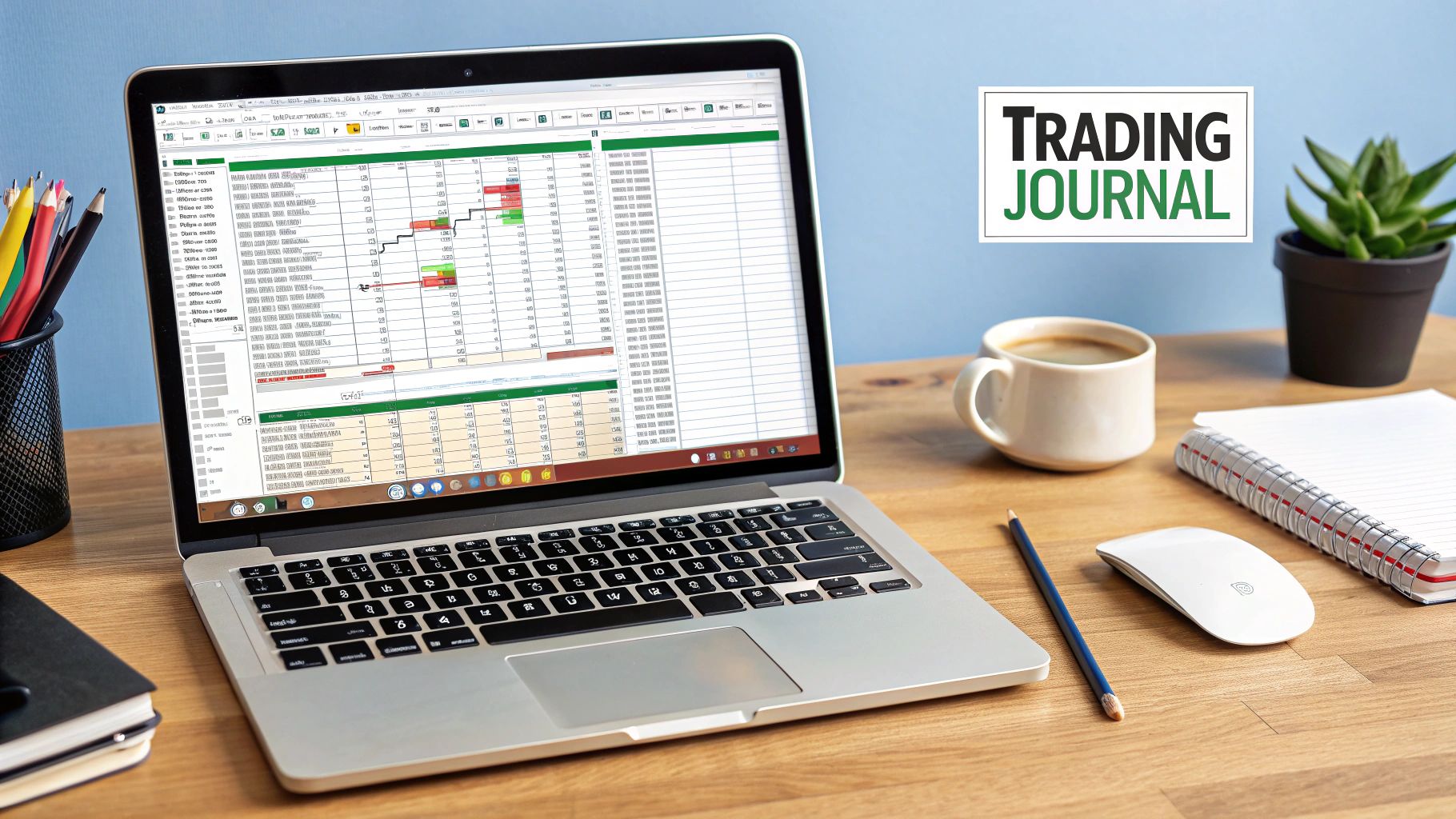
A dashboard like this immediately shows you key metrics like your monthly profit/loss, win rate, and which strategies are actually making you money, helping you analyze your performance in seconds.
Turning Data into Profitability
A trading journal in Excel is a non-negotiable tool for serious traders. In my experience, and from what I've seen across the industry, traders who religiously keep a journal can boost their accuracy and decision-making by around 35%. This jump comes from the discipline and data-driven adjustments that journaling demands. Some traders I know have even seen their profitable trades increase by up to 40% just by tracking everything—stocks, options, crypto—in one detailed spreadsheet. You can learn more about how a comprehensive spreadsheet can elevate your trading analysis.
Ultimately, a good journal stops you from making the same expensive mistakes over and over. It gives you undeniable proof of what works and what doesn't. This lets you systematically cut out your weaknesses and double down on your strengths. That data-backed confidence is the bedrock of consistent, long-term profitability in the markets.
Laying the Groundwork: Your Core Trade Log
Every powerful analysis starts with clean, well-structured data. This is where we build the engine of your entire trading journal excel system—the core trade log.
Think of this as the foundation of a skyscraper; if it’s weak or poorly designed, everything you build on top of it will be unstable. We're not just creating columns here. We are building a robust data collection tool that will serve you for years to come.
The goal is simple but absolutely crucial: capture the most essential details of every single trade in a consistent, error-free way. A messy log leads to flawed analysis and, inevitably, bad decisions. A clean log, however, becomes your source of truth. It’s what will reveal the objective patterns in your trading.
Defining Your Essential Data Columns
Let’s walk through the indispensable columns for your trade log. You can always add more later, but these form the non-negotiable core. Each one has a specific analytical purpose we’ll get into.
Your initial setup should include these fields:
- Date: The date you executed the trade. This is vital for time-based analysis, like seeing your performance by day of the week or month.
- Ticker/Pair: The symbol of the asset you traded (e.g., AAPL, EUR/USD, BTC/USD).
- Strategy: The specific setup or reason you entered the trade. This is arguably the most important qualitative data point you'll track.
- Position: Whether the trade was Long or Short. This helps you see if you perform better in certain market directions.
- Position Size: The number of shares, contracts, or lots you traded.
- Entry Price: The average price where you entered the position.
- Exit Price: The average price where you exited the position.
- Stop Loss: Your pre-defined exit price if the trade moved against you. This is all about tracking your risk discipline.
- Profit/Loss ($): The gross monetary result of the trade, plain and simple.
- Notes: A space for your thoughts, emotions, or any deviations you made from your plan.
Your trading journal is only as good as the data you put into it. The 'Strategy' column is your key to unlocking which setups are actually profitable versus which ones just feel like they should be.
This structure gives you all the raw material needed to calculate every important performance metric, from your win rate to your profit factor. It's the engine that powers your entire analytical dashboard. To see how these elements come together in a more advanced format, you can check out this comprehensive trading journal spreadsheet which builds upon these core principles.
Building Data Integrity from Day One
The biggest threat to your journal's usefulness is inconsistent data entry. A typo in a ticker ("APPL" instead of "AAPL") or a slightly different name for the same strategy can completely skew your results.
Don't worry, we can prevent this with a few simple Excel features to enforce consistency from the start.
One of the most powerful tools for this is Data Validation, which lets you create drop-down lists. This is perfect for the 'Strategy' and 'Position' columns.
How to Create a Drop-Down for Your Strategies:
- Create a 'Lists' Tab: In a new sheet within your Excel workbook, create a column titled "Strategies." List every single trading setup you use. For example: "Bull Flag," "Mean Reversion," "Opening Range Breakout."
- Select Your Column: Go back to your main trade log. Select the entire 'Strategy' column.
- Apply Data Validation: Navigate to the
Datatab on the Excel ribbon and clickData Validation. - Set the Criteria: In the box that pops up, under 'Allow', choose
List. For the 'Source', click the small icon and then select the range of cells that contains your strategy names from your 'Lists' tab.
That's it. Now, when you go to log a trade, the 'Strategy' cell will have a drop-down menu with your pre-defined options. This little trick eliminates typos and ensures every "Bull Flag" trade is categorized identically, making your future analysis clean and deadly accurate.
You can do the exact same thing for the 'Position' column with the options "Long" and "Short." This simple step is one of the most effective ways to maintain the integrity of your trading journal.
Bringing Your Performance Data to Life
Once you've got your trade log structured, this is where the magic really happens. It's time to take that raw data and turn it into a dynamic, visual command center. A well-built dashboard in your trading journal excel file does all the heavy lifting, giving you instant, actionable insights without having to scroll through hundreds of individual trades.
This is the jump from simply logging data to actively analyzing it. We're going to build a summary sheet that automatically pulls from your log and spits out your most critical performance metrics. This visual feedback is what will help you spot patterns, reinforce good habits, and—most importantly—catch costly mistakes before they snowball.
The image below gives you a sense of how a clean, organized template is the foundation for everything that follows.
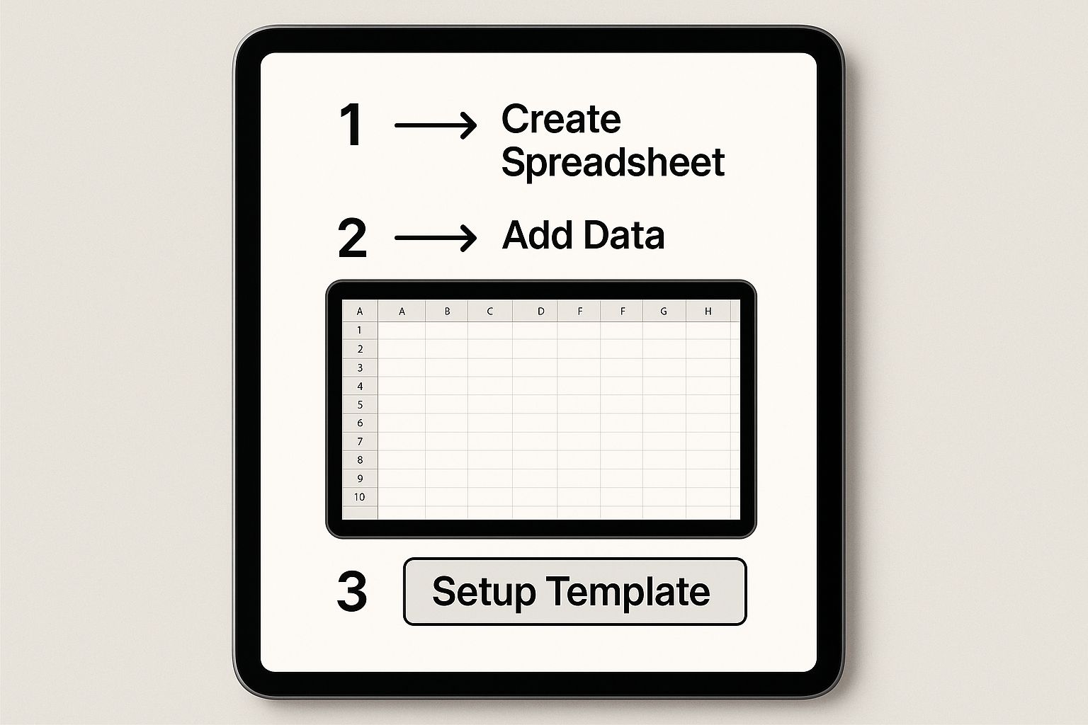
Think of a clean template as the launchpad for all your analysis and charting. Get this right, and the rest becomes much easier.
Making the Dashboard Dynamic with Formulas
To bring your dashboard to life, we don't need anything overly complex. A few powerful Excel functions will do the trick. The goal is that every time you add a new trade to your log, your dashboard updates automatically, in real-time.
We're going to lean heavily on conditional formulas like SUMIF, COUNTIF, and AVERAGEIF. These are perfect for traders because they let you calculate things based on specific criteria. For example, you can tell Excel to only sum the profits from winning trades, completely ignoring the losers for that specific calculation.
Want to calculate your Total Gross Profit? You'll use a SUMIF formula that scans your 'Profit/Loss ($)' column and only adds up the positive numbers. To get your Total Gross Loss, you do the exact same thing but tell it to only add up the negative numbers. It’s that straightforward.
Calculating Your Core Trading Metrics
Let's start building out the essential calculations. For all these examples, let's assume your trade data is on a sheet named 'TradeLog' and your P/L figures are in column I.
- Total Trades: A simple count of every trade you've logged. The formula is
=COUNTA(TradeLog!B:B)-1. This counts all non-empty cells in the column and subtracts one for the header row. - Winning Trades: Here, we use
COUNTIFto count only the trades with a positive P/L. That formula looks like this:=COUNTIF(TradeLog!I:I, ">0"). - Losing Trades: Just the opposite. We count trades where the P/L was negative:
=COUNTIF(TradeLog!I:I, "<0"). - Win Rate: This is a crucial metric, but a simple calculation. You just divide your winning trades by your total trades and format the cell as a percentage. The formula would be
=(Winning Trades Cell) / (Total Trades Cell).
These foundational numbers give you that immediate, high-level snapshot of your performance. They're the first layer of analysis in any serious trading journal.
Your dashboard isn't just a scoreboard; it's a diagnostic tool. Metrics like Win Rate and Profit Factor tell you how you're winning, not just that you're winning.
Of course, for any of this data to be meaningful, you need a decent sample size. From my experience, and from what research suggests, you need to log at least 30 to 50 trades for your stats to become relevant. An empirical study even found that over 70% of consistently profitable traders said detailed journaling was the key to improving their risk management. You can read more about how journaling practices improve trader performance if you want to dig deeper.
This just drives home the point: consistency is everything. Every single trade you log makes the picture of your performance clearer.
Essential Formulas for Your Trading Dashboard
To make it even easier, I've put the most important formulas into a quick-reference table. These are the workhorses that will power your dashboard and pull the key metrics from your 'TradeLog' sheet.
| Metric | Excel Formula | Purpose |
|---|---|---|
| Total Gross Profit | =SUMIF(TradeLog!I:I, ">0") |
Adds up all the profits from your winning trades only. |
| Total Gross Loss | =SUMIF(TradeLog!I:I, "<0") |
Adds up all the losses from your losing trades only. |
| Average Win | =AVERAGEIF(TradeLog!I:I, ">0") |
Calculates the average dollar amount of your winning trades. |
| Average Loss | =AVERAGEIF(TradeLog!I:I, "<0") |
Calculates the average dollar amount of your losing trades. |
| Profit Factor | =-(Total Gross Profit Cell / Total Gross Loss Cell) |
Shows how many dollars you make for every dollar you lose. |
Pay close attention to the Profit Factor. A lot of pros consider this more revealing than win rate. A value over 1.0 means your strategy is profitable. A high win rate doesn't mean much if your average loss is wiping out all those small wins.
Visualizing Your Equity Curve
Finally, let's create what is arguably the most powerful visual in any trading journal: the equity curve. This is simply a running line chart of your cumulative profit and loss over time. It gives you an immediate, visceral understanding of your account's growth and drawdowns.
To get this set up, you'll need one new column in your 'TradeLog' sheet. Call it 'Cumulative P/L'.
In the first data row of this new column (let's say K2), you just need to reference the P/L from your first trade. The formula is just: =I2.
For the next cell down (K3), you'll add the current trade's P/L to the previous cumulative total. The formula is: =K2+I3. Now, just click and drag the corner of that cell all the way down your trade list. Excel will do the rest.
With that column populated, you can create a simple Line Chart. Use your 'Date' column for the X-axis and your new 'Cumulative P/L' column for the Y-axis. This one chart will tell you more about your consistency, volatility, and progress than any single number ever could. It’s the visual heartbeat of your trading journey.
Alright, you’ve got your trade log set up and the dashboard is giving you the high-level view. That's a solid foundation for tracking your core performance. But now it’s time to go deeper. We need to move beyond the basics and start asking our data the really tough questions. This is how you find those hidden patterns and subtle edges that separate the consistently profitable traders from everyone else.
We're about to shift gears from simple formulas to the single most powerful data analysis tool in your trading journal excel file: the PivotTable.
A PivotTable lets you slice, dice, and rearrange massive amounts of data in seconds, all with a few clicks. Forget about wrestling with complex formulas. Instead, you can just drag and drop different data points to answer questions that would otherwise be a nightmare to figure out. This is how you uncover the why behind your P/L.
Slicing Your Data with PivotTables
Let's say you have a nagging feeling you perform better on certain days of the week. Or maybe you suspect your long trades are outperforming your shorts. A PivotTable can give you a definitive answer almost instantly.
Let's build one right now to see how your different strategies are performing.
First, you'll want to add a "Day of the Week" column to your 'TradeLog' sheet. It’s simple. In the cell right next to your first trade's date (assuming the date is in cell A2), pop in this formula: =TEXT(A2, "dddd"). Now, just drag that formula down the entire column. It'll automatically fill in the day ("Monday," "Tuesday," etc.) for every single trade you've logged.
With that done, you're ready to create the PivotTable:
- Click anywhere inside your trade data on the 'TradeLog' sheet.
- Head over to the
Inserttab in Excel and click onPivotTable. - Excel is smart and will probably guess your data range correctly. Just make sure you select
New Worksheetto keep things clean.
You'll be looking at a blank PivotTable and a "PivotTable Fields" pane on the right side of your screen. This is your command center. For this analysis, drag your 'Strategy' field into the 'Rows' area and your 'Profit/Loss ($)' field into the 'Values' area. Just like that, you have a clean summary of the total profit or loss for every strategy you trade.
A Real-World Analysis Scenario
This is where it gets interesting. Let's add another layer. Find your 'Position' field (the one with "Long" or "Short") and drag it over to the 'Columns' area.
Your PivotTable instantly evolves, breaking down each strategy’s P/L by whether the trades were long or short. You might immediately see that your "Bull Flag" strategy is an absolute cash machine on the long side, but bleeds money whenever you try to short it. That single insight is pure gold. It tells you exactly where to double down and, just as importantly, what to stop doing.
A PivotTable transforms your journal from a simple record book into an interactive diagnostic tool. You become a detective, hunting for clues in your own performance data to solve the mystery of what actually works for you.
This isn't just about crunching numbers; it's a dynamic form of backtesting using your own live results. By dissecting which setups and conditions deliver the best outcomes, you're building a library of hard evidence to refine your entire trading plan. For traders who want to take this even further, you can learn how to backtest a trading strategy with historical data, which is a perfect complement to this kind of live analysis.
The evolution of trading journals from basic spreadsheets to sophisticated platforms shows just how crucial this deep analysis has become. While a powerful trading journal excel setup is a fantastic start, modern tools can offer hundreds of statistical metrics and advanced pivot analyses right out of the box. You can see how deep this analysis can go on TradesViz.com to get an idea of what's possible.
Making Key Data Jump Out with Conditional Formatting
Another brilliant tool in Excel for this kind of work is Conditional Formatting. This feature automatically changes how a cell looks—its background color, for instance—based on the value inside it. It's an incredibly simple way to make your biggest wins and most painful losses visually pop.
Go back to your 'TradeLog' sheet and select the entire 'Profit/Loss ($)' column.
- On the ribbon, go to
Home > Conditional Formatting > Color Scales. - Pick the "Green – Yellow – Red" color scale.
Instantly, Excel applies a color gradient. Your biggest profits will glow bright green, your worst losses will be a stark red, and everything in between will be shaded accordingly. This visual feedback is powerful. It forces you to notice the outliers—both good and bad—that demand a closer look at your notes. Why was that one trade a monster winner? What on earth happened on that deep red loss? This simple visual cue sparks the critical review process that ultimately leads to real improvement.
Making Your Journal a Daily Trading Habit
Let's be honest. You can build the most beautiful, complex trading journal excel file in the world, but it’s completely worthless if it just sits on your hard drive gathering digital dust. A tool is only a tool when you actually use it, and using it consistently is what separates the wannabes from the traders who are actually profitable. This isn't about willpower; it's about building a habit.
The single most important part of this habit is logging your trades the second they close. Don't put it off. Don't tell yourself you'll do it at the end of the day. Your memory is a terrible bookkeeper—it’ll find ways to justify dumb mistakes and make lucky wins feel like genius. Capturing the trade immediately means you get the raw, unfiltered data, including the real reason you took it, not the story you tell yourself later.

This whole process shouldn't take more than 60 seconds. Seriously. Alt-tab to Excel, punch in the numbers—entry, exit, size—and you’re done. The easier you make it, the more likely you are to do it.
Integrating Qualitative Notes
The numbers tell you what happened, but your notes tell you why. This is where the real gold is buried, in the context that a P/L column will never show you. As part of your trade entry, make it mandatory to answer a few quick questions about the trade.
- Emotional State: Were you anxious? Greedy? Maybe a little too confident after a few wins?
- Conviction Level: On a scale of 1-5, how solid did the setup feel before you put your money on the line?
- Deviations: Did you stick to the plan like a robot? Or did you get scared and move your stop, or get greedy and push your target?
This is the practice of self-observation, and it's what truly sharpens your edge over time. You start connecting your headspace to your trading results, a link that stays invisible until you start writing it down.
The Weekly Review Ritual
Your daily entries are like collecting bricks; the weekly review is when you build the house. This needs to be a non-negotiable appointment with yourself. Block out some time—maybe Sunday evening when the market is closed—to sit down with your journal without the pressure of live charts blinking at you.
The point of a weekly review isn’t to beat yourself up over past trades. It’s to find recurring patterns—both good and bad—that you can actually do something about in the week ahead.
Fire up that dashboard and get your PivotTables working. Start asking pointed questions and let your data give you the cold, hard answers.
- Spot Recurring Mistakes: Filter for all the trades you tagged as a "mistake." Is there a common thread? Maybe you’re constantly chasing momentum a little too late.
- Identify Top Performers: Which of your strategies had the best profit factor last week? How can you put yourself in a position to find more of those setups?
- Analyze Emotional Impact: Go back to your notes. Did those FOMO-driven trades end up as losers? Seeing that pattern in black-and-white data hits a lot harder than just having a gut feeling.
This weekly ritual is your feedback loop for getting better. It’s how you systematically plug your psychological leaks, refine your strategies, and build the kind of discipline that long-term success demands.
If you want to dive deeper into building that mental game, our guide on the 7 steps to become more disciplined in your trading is a great next step. Turning your journal into a habit is the final piece of the puzzle, making it your single greatest asset as a trader.
Common Questions About Trading Journals in Excel
Getting started with a dedicated trading journal in Excel is a huge step, but it often brings up a few common questions. It’s completely natural to wonder if you’re setting things up right or how long it will take for your efforts to pay off.
Let's walk through some of the things that traders ask most often. My goal here is to give you clear, straightforward answers to build your confidence.
How Many Trades Make My Data Useful?
This is probably the number one question I get. Traders are putting in the work to log everything, and they want to know when that data will start telling a meaningful story. While you should log every single trade right from the start, the real magic happens once you have a decent sample size.
For any specific strategy you're testing, your data really starts to become statistically useful after about 30 to 50 trades. This is generally the sweet spot where you can begin to separate genuine edge from pure luck.
Think of it as a baseline. It’s enough data to calculate meaningful metrics like your win rate and profit factor with some degree of confidence. The key isn't hitting a magic number, but being consistent. Every single trade you log brings the picture of your performance into sharper focus.
Can I Use This Journal for Crypto or Forex?
Absolutely. This is the real beauty of building your own trading journal in Excel—it’s incredibly flexible. The principles and templates we’ve discussed are asset-agnostic. You can easily adapt them for whatever market you trade.
With just a few tweaks, you can have a journal perfectly set up for forex pairs like EUR/USD or cryptocurrencies like BTC/USD. You just need to modify the columns to track what’s relevant.
For example, you might add specific fields like:
- Pips Gained/Lost for forex trading.
- Exchange Name if you're trading crypto across multiple platforms.
- Slippage, which is crucial for highly volatile assets.
Adding these is as simple as inserting a new column in your trade log sheet. The core structure remains the same.
The most powerful metric is the one that forces you to confront your risk management. For many, that's not just win rate, but the Profit Factor or your average R-Multiple. These numbers tell the true story of your strategy's viability.
What Is the Most Important Metric to Track?
While metrics like Win Rate get all the glory, especially for new traders, I've found that the single most powerful stat for serious trading is the Profit Factor. You calculate it by dividing your total profits by your total losses.
It answers one simple but profound question: For every dollar you lose, how many dollars do you make? A Profit Factor above 1.0 means you have a profitable system. Simple as that.
Another critical, and often overlooked, metric is your R-Multiple (Risk/Reward). Tracking the R-Multiple for each trade—did you make 2R or lose 1R?—gives you a much clearer picture of your strategy's true effectiveness and your discipline in sticking to your plan. It strips away the dollar amounts and shows you how well you’re managing risk.
At Colibri Trader, we teach traders how to build this kind of discipline through a pure price action approach. If you're ready to move beyond indicators and create a trading system based on what the market is actually doing, explore our proven educational programs. Learn more about transforming your performance at https://www.colibritrader.com.