


Your Free Trading Chart Patterns PDF Guide

Ready to start speaking the market's language? My free trading chart patterns PDF is the perfect tool to get you started, giving you a quick visual guide to the most important formations you'll see on the charts. Think of this downloadable cheat sheet as your go-to reference for spotting patterns on the fly.
Your Essential Chart Patterns PDF
This is your first step toward mastering price action. I've built this entire guide around a simple but powerful trading chart patterns PDF—it’s a visual toolkit designed to live on your trading desk. Don't think of it as a long list to memorize; see it as a map for navigating market behavior.

This PDF is your quick-reference companion. It cuts through the noise and focuses on what really matters in the heat of the moment: clarity and speed. When a potential setup starts forming on your screen, a quick glance at the cheat sheet will help you confirm if you're looking at a Bull Flag, a Head and Shoulders, or another key pattern.
How to Use This PDF for Maximum Impact
You'll get the most out of this resource by using it as a daily reference tool. Instead of trying to cram every pattern into your brain at once, just focus on identifying one or two during your live trading sessions. This hands-on approach will make the knowledge stick far better than rote memorization ever could.
- Quick Identification: Use it to instantly spot the most common continuation and reversal patterns as they take shape in real-time.
- Reinforce Learning: Keep it visible to build that crucial "muscle memory." This helps you internalize what these shapes actually mean for the market's next move.
- Build Confidence: When you can confirm your analysis with a reliable guide, you'll find yourself executing trades with more conviction and discipline.
This cheat sheet turns abstract textbook diagrams into a practical, actionable framework. It’s the bridge between knowing a pattern’s name and truly understanding the story it tells.
As we go through this guide, we're going to bring every pattern from this PDF to life. We’ll dive into the psychology behind them, break down real chart examples, and map out clear strategies for trading them effectively.
[Download Your Free Trading Chart Patterns PDF Here]
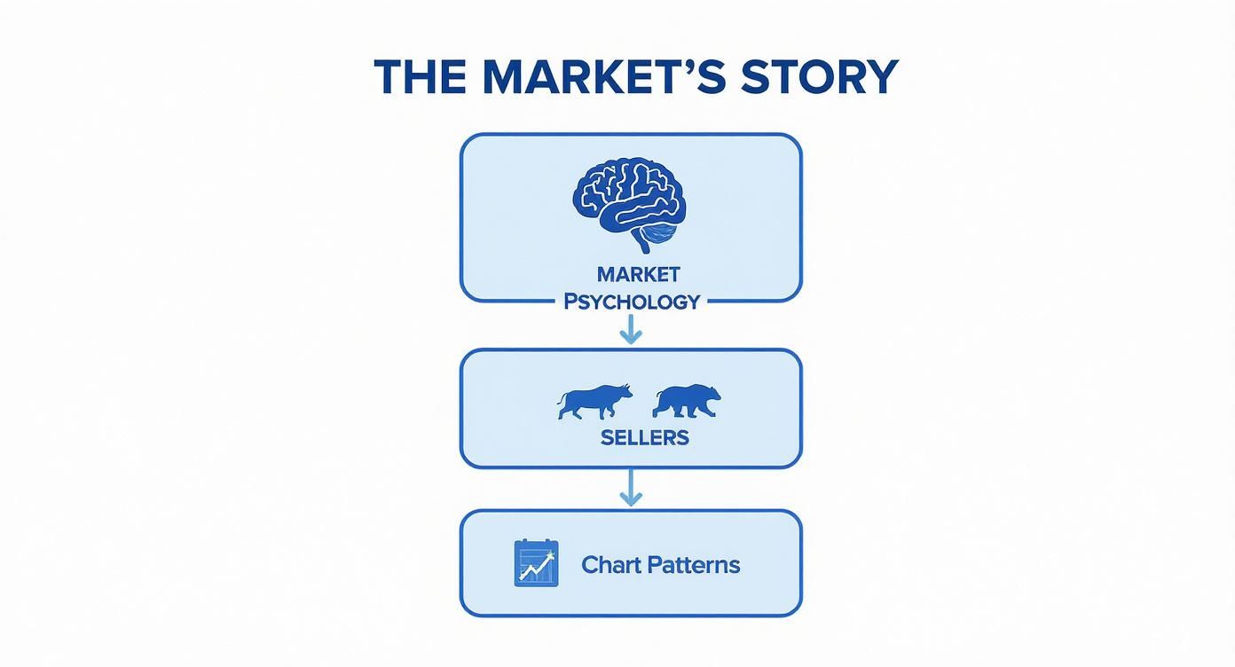
Why Chart Patterns Reveal the Market's Story
Before you start trying to memorize every shape in your trading chart patterns PDF, let's get one thing straight: these patterns aren't just random squiggles. They're the market's language, a visual story of the collective psychology of millions of traders making decisions.
Think of them like footprints left in the sand after a fierce battle. Each mark tells you about the constant tug-of-war between the buyers (bulls) and the sellers (bears). Every peak, every valley, every sideways grind—it’s all a clue about who has the upper hand and when the tide might be about to turn.
The Psychology Behind the Shapes
This is the foundation that separates amateurs from seasoned pros. Instead of just spotting a "Head and Shoulders," you'll start to see the story unfold: you'll see buyers making three attempts to push the price higher, failing on that last push, and then you'll see the moment sellers finally take overwhelming control.
When you start thinking this way, your analysis transforms. You’re no longer just identifying patterns; you’re interpreting the narrative.
Chart patterns are the graphical representation of human emotion—fear, greed, hope, and uncertainty. By learning to read them, you're essentially learning to read the market's mind.
These psychological battles are what create the distinct price formations we see. For example, a period of high excitement and greed often leads to bullish patterns like ascending triangles. On the other hand, widespread fear and uncertainty can carve out bearish patterns like the head and shoulders. This interplay is a direct reflection of how groups of traders react to news, economic data, and geopolitical events. You can read more about this dynamic on OANDA.com.
Turning Your PDF into a Powerful Tool
Once you truly grasp the 'why' behind each formation, that downloadable PDF becomes more than just a cheat sheet. It becomes a powerful analytical weapon. You won't just spot a pattern; you'll understand the supply and demand dynamics that are creating it in real time.
This deeper insight is what allows you to anticipate market moves with a lot more confidence. You’re no longer just following a diagram. You're actively interpreting a live story unfolding on your charts. For traders looking to deepen their knowledge, exploring external resources that offer expert trading insights can be a great next step. This foundational knowledge is the real key to using technical analysis to make informed decisions instead of just guessing.
Spotting Trend Continuations Versus Reversals
Not all chart patterns are created equal. They actually fall into two distinct families that tell very different stories about where the market might be heading next. Getting a handle on this difference is the first big step from just spotting shapes to making truly informed trading decisions.
The two main categories are continuation patterns and reversal patterns. Think of them like traffic signals on your chart. A continuation pattern is like a green light, suggesting the current trend is good to go. A reversal pattern, on the other hand, is a big flashing red light, warning you of a potential U-turn right around the corner.
Let's quickly compare the two side-by-side.
Continuation Vs Reversal Patterns at a Glance
| Characteristic | Continuation Patterns | Reversal Patterns |
|---|---|---|
| Market Signal | The current trend is likely to resume after a brief pause. | The current trend is losing momentum and may be ending. |
| Trader's Action | Look for opportunities to join the existing trend. | Prepare to exit a trade or look for an entry in the opposite direction. |
| Common Examples | Flags, Pennants, Rectangles, Triangles. | Head and Shoulders, Double Tops/Bottoms, Wedges. |
| Psychology | A temporary "breather" or consolidation period. | Exhaustion of the dominant market force (buyers or sellers). |
This table gives you a high-level look, but the real magic is in understanding the story each pattern tells.
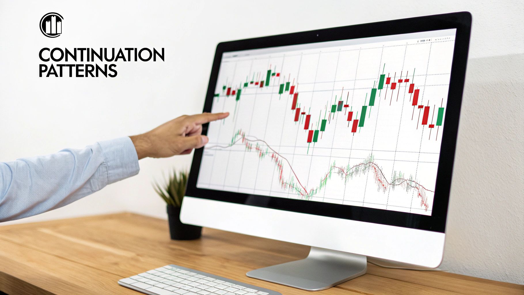
Continuation Patterns: The Trend Pauses
Continuation patterns show up when a trend takes a temporary breather. Imagine a marathon runner slowing down for a quick water break before getting back up to speed. That's what's happening here.
Patterns like Flags, Pennants, and Rectangles show a brief moment where buyers and sellers are in a standoff before the original trend takes over again.
For traders, spotting these formations is huge. They offer lower-risk entry points because you’re essentially jumping back into a trend that already has momentum. The psychology here is that the market is just catching its breath before continuing its main push. Your trading chart patterns PDF will be an excellent reference for spotting these in the wild.
A continuation pattern is the market’s way of catching its breath. The primary trend remains intact, and the pattern represents a brief consolidation before the next major move in the same direction.
The infographic below really nails how all these patterns are just the result of the constant tug-of-war between buyers and sellers.
As you can see, the patterns we see on the chart are the final, visible result of the invisible forces of market psychology.
Reversal Patterns: The Trend Ends
On the flip side, reversal patterns are the market’s warning flares. They signal that a trend is running out of gas and might be about to flip entirely.
Formations like the Head and Shoulders or a Double Top/Bottom tell a story of pure exhaustion. They represent a final, failed push by the dominant side—buyers in an uptrend, or sellers in a downtrend—to keep the party going.
When a reversal pattern completes, it signals a major shift in who's in control. A Double Top, for instance, shows us that buyers tried twice to break a key resistance level and failed. This failure gives sellers the confidence they need to step in and take over.
Recognizing these patterns is critical. It can be your cue to exit a profitable trade before it turns sour, or to position yourself to catch the brand new trend just as it begins.
Mastering Key Continuation Patterns
While reversal patterns are like a dramatic plot twist in the market's story, continuation patterns are the chapters that keep things moving in the same direction. These formations are the real workhorses for any trend trader. They show a brief pause or consolidation before the price gets back on its original journey.
Think of them as a quick huddle in a football game. The team is still aiming for the same end zone; they're just catching their breath and planning the next play.
Spotting these patterns is a huge part of any trend-following strategy. They give you logical, lower-risk moments to jump into a trend that's already shown it has momentum. Your trading chart patterns PDF is loaded with these, and we'll break down the most reliable ones right here.
The Bull Flag and Its Psychology
The Bull Flag is one of the most recognizable continuation patterns out there. It kicks off with a strong, sharp move up (that's the "flagpole"), followed by a period of gentle, downward-sloping consolidation (the "flag").
This pattern tells a simple but powerful story. The flagpole is a pure surge of buying pressure and excitement. The flag part isn't weakness; it's just a bit of minor profit-taking and consolidation. The bulls are still firmly in control, just letting the price cool off before launching the next assault higher.
A bull flag isn't a sign the trend is ending; it's a sign the trend is healthy. It shows that buyers are organized enough to absorb selling pressure without giving up significant ground.
The power of patterns like the bull flag isn't just trading folklore. A 2007 study on major stock indices found that specific technical rules, including this pattern, were statistically linked to better returns. The research showed that these patterns correctly predicted market direction with notable consistency, proving they have real practical value. You can discover more about the study on JPMorgan's tech blog.
Ascending Triangles and Pennants
Two other classic continuation patterns you’ll find in your PDF are Ascending Triangles and Pennants. Each one tells its own unique story.
- Ascending Triangles: This pattern shows up when you see a clear horizontal resistance level and a series of higher lows pushing up against it. What this tells you is that while sellers are digging in their heels at a certain price, buyers are getting more and more aggressive, willing to pay more on each dip. The tension just builds and builds until the buyers finally overwhelm the sellers, leading to a breakout.
- Pennants: A pennant looks a lot like a flag and also follows a sharp flagpole. The difference is that its consolidation phase is marked by converging trendlines, which form a small, symmetrical triangle. This shows a brief period of equilibrium before the original trend kicks back into gear with force.
Trading these patterns usually means waiting for a confirmed breakout. Mastering the art of trading these price bursts is a critical skill. For a deeper dive into the strategies, check out our complete guide on how to trade breakouts effectively.
By understanding the psychology behind these shapes, you transform your PDF from a simple reference sheet into a powerful tool for anticipating the market's next move.
How To Identify Powerful Trend Reversals
Knowing when a trend is about to die is just as important as knowing when to jump on one. Powerful reversal patterns are your early warning system, screaming that the market's momentum is running out of gas. Think of it as the market finally hitting a brick wall—the force that was pushing prices just can't push anymore.

Unlike continuation patterns, which are just the market taking a quick breather, reversals signal a real transfer of power from buyers to sellers (or vice versa). Spotting these formations, which you'll find in your trading chart patterns PDF, is the key to locking in your profits before they vanish and getting ready for the next big move.
Let's dive into the three most reliable reversal patterns you'll see time and time again.
The Head and Shoulders Formation
The Head and Shoulders pattern is a classic for a reason. It's a bearish reversal setup that tells a story of an uptrend in its final, dying moments. You can literally see the story play out on the chart: buyers make one last, desperate push higher before sellers wrestle back control for good.
This pattern has three distinct peaks:
- Left Shoulder: A solid peak, followed by a small pullback.
- Head: A higher peak than the left shoulder, showing that final burst of buying enthusiasm.
- Right Shoulder: A lower peak that can't even reach the height of the Head. This is the big red flag for buyer exhaustion.
These three peaks all rest on a level of support we call the neckline. The real signal, the moment you should be paying attention, is when the price breaks decisively below this neckline. That breakdown is your confirmation that sellers have won the battle and the uptrend is likely over.
Of course, there's a bullish version, too. The Inverse Head and Shoulders flips this pattern upside down and shows up at the bottom of a downtrend.
Double Tops and Double Bottoms
If Head and Shoulders feels a bit complex, you'll love Double Tops and Double Bottoms. They are simpler, easier to spot, and just as powerful. These patterns are all about a clear, failed second attempt to push a trend further.
A Double Top forms what looks like the letter "M." It happens after a nice uptrend when the price slams into a resistance level, pulls back, and then tries to rally back to that same level… but fails. That second failure is a huge tell that the buying pressure is gone, giving sellers the green light.
A Double Top is the market’s definitive “no.” Buyers knock on the door of a resistance level once, get rejected, try again, and are rejected a second time. This double failure is a strong signal that the uptrend has lost its strength.
On the flip side, a Double Bottom looks like a "W" and signals a bullish reversal after a downtrend. It happens when price finds a support level, bounces, and then comes back down to retest that exact same support level—and holds. This successful second test confirms that sellers are exhausted and buyers are finally stepping in with confidence.
To really get a handle on these, our guide on trading reversal patterns offers a much deeper dive into the strategies behind them.
Picking the Right Chart for Pattern Analysis
Having a library of patterns like the ones in your trading chart patterns PDF is a great start, but it's only half the story. The chart you use can either make these patterns jump out at you or keep them frustratingly hidden.
Think of it this way: you wouldn't use a road map to navigate the open ocean. For traders, choosing the right chart is just as critical, and it usually boils down to three main options.
Each chart type tells the market's story with a different level of detail. The most basic is the line chart, which just connects the closing prices over time. It’s perfect for spotting the big-picture trend at a glance, but it completely misses the intraday tug-of-war between buyers and sellers.
Next up, you have bar charts. These pack in a lot more information by showing the open, high, low, and close (OHLC) for each period. They offer a much richer view than a simple line chart, but most modern traders have moved on to a more visual and intuitive tool.
Why Candlestick Charts Are the Trader's Choice
And that brings us to candlestick charts—the undisputed champion for pattern analysis. A candlestick gives you the same OHLC data as a bar chart, but its visual design is a game-changer. The "body" of the candle shows the range between the open and close and is color-coded, instantly telling you whether the bulls or bears won that session.
Candlestick charts translate raw price data into a visual story of market sentiment. Each candle is a chapter, revealing the outcome of the battle between buyers and sellers within that specific timeframe.
This visual storytelling is what makes candlesticks so incredibly powerful. In fact, studies on specific formations like the doji or engulfing patterns show success rates between 55% and 70% for predicting short-term moves. They give clear signals about potential market reversals or continuations.
Choosing the right chart is a fundamental skill. If you want to dive deeper, you can explore the seven types of Forex charts every serious trader should know. And remember, beyond just recognizing patterns, the real skill is in interpretation. To build on that, learning how to read crypto charts effectively can give you an even broader perspective.
Your Top Chart Pattern Questions Answered
As you start working with the trading chart patterns PDF, you're bound to have some questions pop up. It's totally natural. This is where we'll tackle the most common ones I hear from traders, giving you direct, practical answers to help you build confidence and sidestep the usual traps.
Think of this as the final piece of the puzzle. We’ve covered the what and the why of chart patterns. Now, let’s get into the nitty-gritty "how-to" questions that come up when you're staring at a live chart.
How Reliable Are Chart Patterns?
Let’s be crystal clear: no chart pattern is 100% foolproof. Anyone who tells you otherwise is selling something. Their real power—and reliability—skyrockets when you combine them with other factors. A pattern is a strong clue, not a crystal ball.
For example, imagine a Bull Flag pattern showing up right at a major support level, with trading volume starting to pick up. That's a much more potent signal than the same pattern forming randomly in the middle of nowhere during choppy, directionless trading. Context is absolutely everything.
The best traders I know never take a trade based on a single pattern in isolation. They look for confluence—multiple signals all pointing in the same direction. That’s when they're willing to put their capital on the line.
What Is the Best Timeframe for Chart Patterns?
One of the coolest things about chart patterns is that they're fractal. That’s just a fancy way of saying they appear on all timeframes, from a one-minute chart all the way up to a weekly or monthly chart.
So, the "best" timeframe really just comes down to your personal trading style.
- Day Traders: You'll likely live on the 5-minute to 15-minute charts, looking for multiple setups within a single trading session.
- Swing Traders: You're probably more comfortable on the 4-hour to daily charts, aiming to catch moves that play out over several days or even weeks.
The most important thing is to be consistent. A Head and Shoulders pattern on a daily chart carries a lot more significance and suggests a much larger potential move than the same pattern on a 5-minute chart. Pick the timeframes that fit your strategy and stick with them.
Ready to stop guessing and start trading with a proven, indicator-free strategy? At Colibri Trader, we teach you how to read the market's story through pure price action. Learn more and transform your trading today at https://www.colibritrader.com.