


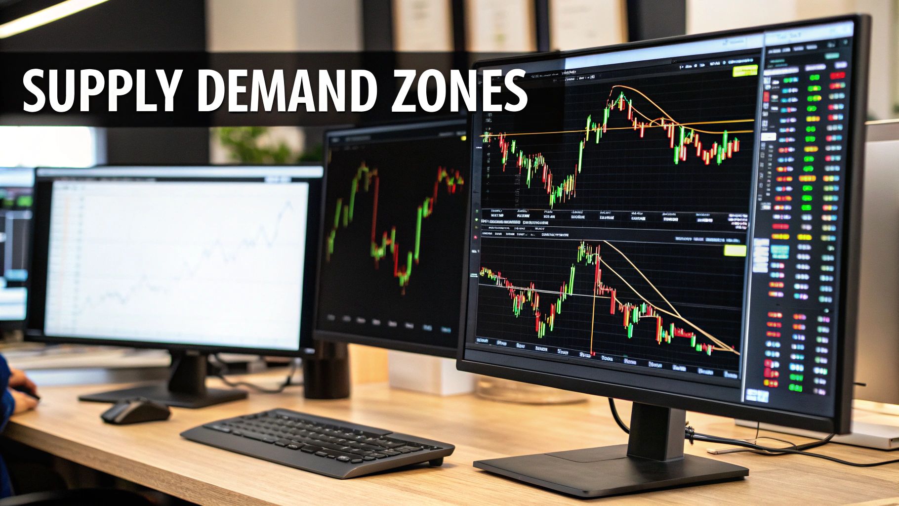
Master Supply Demand Zone Trading

When you learn to trade using supply and demand zones, you're essentially learning a price action technique that’s all about spotting where the big players—the institutional banks and hedge funds—have left their tracks. These areas on a chart show where a massive number of buy or sell orders completely swamped the other side, triggering a powerful move in price. The secret isn't to fight these moves, but to trade alongside them.
Learning to Read the Market's Footprints
For a moment, let's push aside all the complex, lagging indicators and just look at the raw price chart. The true story of the market is written right there in its candles and waves. Trading with supply and demand is about learning to read this story—to see the market not as a jumble of random ticks, but as a trail of clues left by the "smart money."
Think of it like a wholesale market where massive buyers and sellers are constantly making deals. Their huge transactions throw the market out of balance, and it's these imbalances that we, as traders, are looking to pinpoint.
Key Takeaway: Supply and demand zones aren't just arbitrary lines on a chart. They represent areas of powerful, pre-existing buying or selling pressure that can often dictate where the price will turn next with a surprisingly high degree of reliability.
Why Institutional Footprints Matter
At its heart, supply and demand trading is all about finding those key price levels where institutional investors have previously flooded the market with buy or sell orders. When they do this, they create zones that deeply influence how the price behaves later on. Why? Because these zones often contain a backlog of unfilled orders from that initial, powerful move.
Getting a grip on this concept is your first step toward swimming with the market's current instead of fighting against it. It gives you a real edge because you’re essentially aligning your trades with the most powerful forces in the market. You can dig deeper into this idea and find more great insights on how to apply supply and demand zone analysis.
Demand Zones vs. Supply Zones
To get practical, we need to break this down into two types of zones. Each one tells a different story and points to a different opportunity.
-
Demand Zones: These are areas where an army of buyers completely overwhelmed sellers, causing the price to rally sharply. When the price dips back into a demand zone, we expect those leftover buy orders to kick in and push the price back up. Think of it as a floor of support.
-
Supply Zones: On the flip side, these are areas where sellers dominated, leading to a steep drop in price. When the price climbs back to a supply zone, we anticipate that the remaining sell orders will be activated, forcing the price down again. This acts as a ceiling of resistance.
To help you quickly tell them apart, here's a simple breakdown.
Supply vs. Demand Zones At a Glance
| Characteristic | Demand Zone (Support) | Supply Zone (Resistance) |
|---|---|---|
| Market Action | Aggressive buying | Aggressive selling |
| Price Movement | Strong rally away from the zone | Sharp drop away from the zone |
| Location | Found below the current price | Found above the current price |
| Trader Expectation | Price will bounce upwards | Price will be rejected downwards |
| Analogy | A floor or support level | A ceiling or resistance level |
| Opportunity | Look for potential "buy" setups | Look for potential "sell" setups |
At the end of the day, you're on the hunt for areas where the price was "unfairly" tipped in one direction. This approach strips away the noise and confusion of most indicators and gets you to focus purely on what the price itself is telling you. Once you master this, you'll find yourself anticipating major market turns before they happen, instead of just reacting after the fact.
How to Spot High-Probability Zones Like a Pro
Going from theory to practice is where a trader's real skill is put to the test. Finding powerful supply and demand zones isn't about marking every little peak and valley on your chart. It's about training your eye to see the signatures of institutional power. The best, most reliable zones are always born from explosive price moves that launch away from a tight base of consolidation.
Think about it this way: when price hangs out in a narrow range for a while and then suddenly rockets upward, it’s a clear signal of a massive imbalance where buyers absolutely crushed the sellers. The opposite is true for a sharp nosedive from a consolidation base—that’s sellers overwhelming the market. These are the footprints of smart money, and they create the highest-probability setups you’ll ever find.
The Anatomy of a Powerful Zone
The strength of any supply or demand zone comes down to the speed and force of the price move away from it. A slow, grinding move away from a base just doesn't have the same impact as a swift, decisive breakout with big, energetic candles. The more aggressive the exit, the more likely it is that there are a ton of unfilled institutional orders left behind, just waiting for price to come back.
This is the process I follow to spot and validate these zones on my own charts.
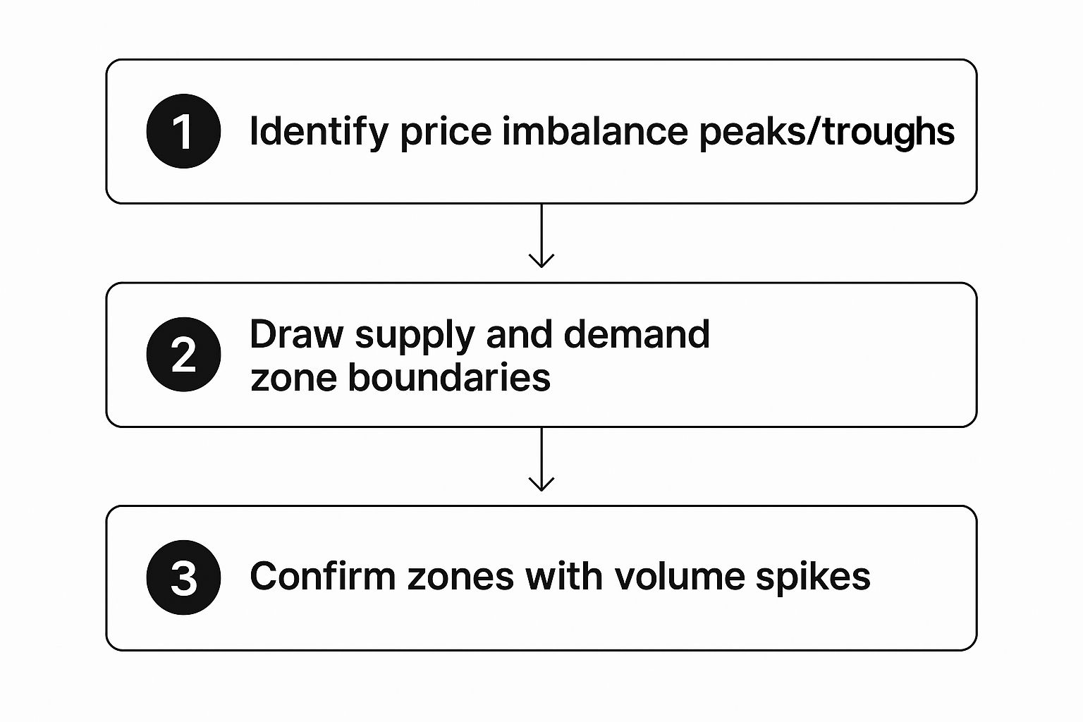
This visual guide really hammers home the point that finding good zones isn't a one-shot deal. It's a process of combining raw price action with other clues, like volume, to filter for only the best opportunities.
Another thing I look for is how much time the price spent at the base. A zone that forms from just a few quick, tight candles before an explosion is usually much stronger than one that formed over a long, drawn-out period. A quick base tells me that institutions built their positions fast and efficiently, creating a much more potent imbalance.
Pro Tip: In my own trading, I've found that the absolute strongest zones are often created around major news events or at the open of the London or New York sessions. That's when institutional volume floods the market, creating clear, powerful imbalances that are much easier to spot and trade.
Fresh vs. Tested Zones
Here's a critical concept: not all zones are created equal. The idea of "freshness" is a huge deal in supply demand zone trading because it directly affects the odds of a zone holding up.
- Fresh Zones: These are pristine areas where the price has not returned since the zone was created. They carry the highest probability of a strong reaction because that original pile of unfilled orders is still completely untouched. These are the A+ setups you should be hunting for.
- Tested Zones: Once price comes back and touches a zone, it starts to eat up those original orders. Think of it like a wall being hit over and over again—each hit weakens it. A zone that's been tested multiple times is far more likely to break.
Let’s take a real-world scenario. Imagine a fresh demand zone on the EUR/USD chart between 1.0710 and 1.0725. The very first time price dips back into this area, a bounce is highly likely. But if it bounces and comes back for a second or third try, the odds of it breaking straight through to the downside increase dramatically with each touch.
As a personal rule of thumb, I might take a trade on the first test of a quality zone, but I'm extremely cautious on the second test. I will almost always ignore a zone completely after it has been touched more than twice. Your job is to find where the institutional orders are fresh and waiting, not where they've already been spent. By focusing on fresh zones and strong price departures, you cut through the market noise and lock in on the highest-quality signals.
Developing Your Zone-Based Trading Plan
Spotting a great-looking zone on a chart is one thing. Actually making money from it is something else entirely. It’s the execution that separates the chart analysts from the consistently profitable traders.
This is where your trading plan comes in. It’s not just a set of rules; it's your battle plan for every single trade. By defining exactly how you’ll get in, where you'll get out if you're wrong, and where you'll cash in your profits, you take the emotion and guesswork out of the equation.
Mastering these three steps turns supply demand zone trading from a cool concept into a practical, repeatable strategy.
Choosing Your Entry Strategy
So, price is heading back to a zone you've marked. What now? You’ve basically got two ways to play it. Neither is right or wrong, but your choice will say a lot about your personality as a trader.
-
The "Set-and-Forget" Entry: This is for the more aggressive trader. You place a limit order right at the edge of the zone (the distal line) and let the market do the work. The beauty of this is you won't miss the trade if price just "kisses" the zone and rips away. The trade-off? A lower win rate, because some zones will just slice through without a second thought.
-
The Confirmation Entry: This is the conservative route. Instead of jumping in blind, you wait for price to enter your zone and give you a signal that it’s respecting the level. This "confirmation" could be a classic candlestick pattern—maybe a big bullish engulfing candle in a demand zone or a sharp pin bar rejection at supply. You'll win more often with this method, but you'll inevitably miss some explosive moves that don't give you a clean signal.
Here's a key insight from my own experience: confirmation entries often mean you get in at a slightly worse price, which nibbles away at your potential reward-to-risk ratio. For many traders, though, the psychological comfort of a higher win rate is well worth it.
Setting Your Protective Stop-Loss
Your stop-loss is non-negotiable. It's your escape hatch, your primary defense against a trade idea going south. Luckily, with zone trading, the logic for where to place it is baked right in.
You want to set your stop just outside the far boundary of the zone (the proximal line). I always give it a little extra breathing room to avoid getting clipped by market "noise" or a wide spread.
- For a demand zone, your stop goes just below the low of the zone.
- For a supply zone, your stop goes just above the high of the zone.
It's that simple. If the price breaks completely through the zone, your whole reason for taking the trade is invalid, so you want to be out.
Defining Your Profit Targets
The last piece of the puzzle is knowing when to take your money and run. In my book, the most logical way to set a profit target is to aim for the next opposing zone.
If you just bought at a crisp demand zone, your first take-profit should be the nearest, most obvious supply zone sitting above your entry. It’s that straightforward.
This approach forces you to size up the trade before you even click the buy or sell button. By targeting the next area of potential opposition, you inherently look for setups where the reward is bigger than the risk. Over hundreds of trades, this is how you build a real edge.
This is especially true in massive, institutionally-driven markets. Take the forex market, for example. With a daily trading volume now topping $7.5 trillion, its movements are dictated by the colossal orders of banks and funds. These are the very orders that carve out the supply and demand zones on your chart. If you want to dive deeper into how this institutional flow works, you can master supply and demand strategies on ChartsWatcher.com.
Recognizing High-Probability Chart Patterns

Once you've gotten the hang of spotting strong supply and demand zones, the next step is to recognize the specific chart patterns that create them. These aren't just random squiggles on a chart; they're visual clues that tell the story of the constant tug-of-war between buyers and sellers.
Learning these formations gives you a deeper layer of confidence. You stop just seeing a “zone” and start understanding the why behind it, which is a massive shift in perspective. Each pattern gives you a hint about what the big players are thinking, signaling whether the market is about to turn around or just take a breather.
The Core Supply And Demand Patterns
At their heart, all of these patterns boil down to just two main types: reversal and continuation. Reversal patterns tell you a trend is likely running out of steam and about to change direction. Continuation patterns, on the other hand, signal that a trend is just pausing before it picks up speed again.
These aren't abstract theories. They are the footprints left behind by institutional order flow, and learning to spot them can feel like having a roadmap for what's coming next.
Below is a breakdown of the four primary patterns you'll encounter. Think of them as the building blocks for your supply and demand analysis.
Core Supply and Demand Patterns
| Pattern Name | Structure | Market Signal |
|---|---|---|
| Drop-Base-Rally (DBR) | Price drops, consolidates, then rallies. | A powerful bullish reversal; the base forms a demand zone. |
| Rally-Base-Drop (RBD) | Price rallies, consolidates, then drops. | A powerful bearish reversal; the base forms a supply zone. |
| Rally-Base-Rally (RBR) | Price rallies, consolidates, then rallies again. | A bullish continuation; the base is a demand zone in an uptrend. |
| Drop-Base-Drop (DBD) | Price drops, consolidates, then drops again. | A bearish continuation; the base is a supply zone in a downtrend. |
Understanding these four structures is crucial. They represent the only ways supply and demand zones can form, so mastering them will put you miles ahead.
Reversal Patterns: The U-Turns of The Market
Reversal patterns are what most traders dream of finding because they can get you in right at the start of a brand-new trend.
-
Drop-Base-Rally (DBR): This is your classic demand zone setup. Price falls sharply (the Drop), goes sideways in a tight range as buyers soak up all the selling pressure (the Base), and then explodes higher (the Rally). That base area becomes a high-probability demand zone to look for buys if price ever returns.
-
Rally-Base-Drop (RBD): This is the mirror image and it creates a potent supply zone. Price shoots up (the Rally), pauses in a tight base as sellers overwhelm the buyers (the Base), and then plummets (the Drop). This base is now a prime spot to look for sell opportunities.
Trader Insight: Reversal patterns are so effective because they show a major shift in market control. You're literally seeing the moment where one side gave up and the other side took over with overwhelming force.
Continuation Patterns: Taking A Quick Breather
Continuation patterns show a temporary pause in a strong, established trend. These zones are often where institutions add to their positions before pushing the price further along its original path. For a deeper dive, I recommend looking into charting supply and demand with real-world strategies.
-
Rally-Base-Rally (RBR): Price is in a clear uptrend (Rally), pauses to consolidate while more buy orders build up (Base), and then continues its journey with another strong push higher (Rally). This base forms a fresh demand zone right in the middle of the trend.
-
Drop-Base-Drop (DBD): In a downtrend, price falls hard (Drop), pauses as sellers regroup and add to their short positions (Base), and then continues its steep decline (Drop). This creates a new supply zone, giving you a chance to hop on the existing downtrend.
Smarter Risk Management for Zone Traders
Finding a killer supply or demand zone is a great start, but it's only half the battle. What really separates the traders who make it from those who don't is rock-solid risk management. I'm not just talking about throwing a stop-loss on the chart and hoping for the best.
I mean a complete framework designed to protect your hard-earned capital and make sure your wins are big enough to matter.
Think of risk management as the engine of your supply demand zone trading strategy. Without it, even the most brilliant analysis will eventually lead you right to a blown account. The name of the game is survival—staying in the fight long enough for your trading edge to do its job.
Position Sizing Based On Zone Width
Before you even think about hitting that "buy" or "sell" button, you need to calculate your position size. This isn't a gut feeling or a random guess. It’s a simple calculation based on two things: the width of the zone you're trading and your personal risk tolerance.
It's common sense, really. A tight, clean supply zone that's only 15 pips wide lets you use a much larger position size compared to a sprawling 50-pip demand zone, if you're risking the same percentage of your account on both trades.
Key Takeaway: My rule, and a good one for any trader, is to risk a small, fixed percentage of your account on every single trade. Stick to 1-2%, max. This discipline prevents a few bad trades from wiping you out and keeps the emotion out of your decisions.
Imagine you have a $10,000 account and you follow a 1% risk rule. That gives you a $100 risk budget per trade. If your stop-loss (the zone's width plus a small buffer) is 25 pips away from your entry, you can figure out the exact lot size that ensures a loss won't cost you more than that $100. This is non-negotiable.
Active Trade Management And Breakeven Stops
Once your trade is live and starts moving your way, your job isn't done. This is where active management comes in. A powerful technique I use all the time is moving my stop-loss to my entry point—what we call "going to breakeven"—once the price has moved a decent amount in my favour.
This one simple move transforms a winning trade into a risk-free trade. Suddenly, the worst thing that can happen isn't a loss, but getting stopped out for zero gain. That's a massive psychological win. For a deeper dive into more advanced tactics like this, check out our guide on advanced supply and demand zones trading.
The Power Of Reward-To-Risk Ratios
If there’s one concept that underpins all long-term trading success, it's the reward-to-risk (R:R) ratio. This is the simple math that gives you a real, statistical edge in the market.
I never take a trade unless my potential profit is at least twice my potential loss. That's a 2:1 R:R ratio, and it should be your absolute minimum.
- Risk: The distance in pips from your entry to your stop-loss.
- Reward: The distance in pips from your entry to your take-profit target.
If you risk $100 on a trade, you should be aiming for a $200 profit, minimum. When you stick to this rule, you can actually be wrong more often than you are right and still grow your account. It's true! Winning just 40% of your trades with a consistent 2:1 R:R will make you a profitable trader over time. That’s the simple, powerful math that keeps you in business.
Common Questions About Zone Trading
Even with a solid plan, a few questions always pop up when you move from staring at charts to actually placing trades. It's totally natural. Let's run through some of the most common ones I hear from traders who are just getting started with supply and demand.
Getting these cleared up will help you sidestep some common frustrations and trade with a lot more confidence.
How Do I Know if a Zone Is Still Valid?
A zone's real power comes from being "fresh"—meaning price hasn't come back to test it since it was formed. Think of it like a wall. Every time price slams into it and orders get filled, the wall gets a little weaker.
A zone is pretty much done for once price closes decisively beyond its outer edge.
For instance, say you've marked a great-looking demand zone between $50.00 and $51.00. If a big, angry bearish candle closes at $49.75, that's your signal. The zone has been broken, sellers have taken over, and you should no longer be looking for buy setups there.
What Is the Real Difference Between Zones and Support/Resistance?
This is a huge one, and getting it right changes how you see the market. The simplest way to put it is that traditional support and resistance are lines, while supply and demand are zones.
A support or resistance line is just connecting a few dots on the chart—usually previous swing highs or lows. A supply or demand zone, on the other hand, captures the entire price area where institutional order flow created a massive imbalance right before a powerful move.
This is what makes zones so much more robust. They represent the full "footprint" of big money, not just a single price. That makes them less likely to get pierced by a quick wick that would stop out anyone trading off a simple line. Zones give you a far more accurate picture of where the real buying or selling pressure is hiding.
Can I Combine Zone Trading With Other Indicators?
Absolutely, and many experienced traders do. The trick is to let the zones lead the way and use indicators purely for confirmation. The price action at your zones is the main event; indicators are just the supporting act.
You never want to take a trade just because an indicator says so.
Here's a practical example:
- You spot price moving toward a well-formed supply zone on the daily chart.
- At the same time, you notice a bearish divergence on the Relative Strength Index (RSI).
- This adds a second layer of evidence that buying momentum is drying up, giving you more confidence in your short setup.
Another popular approach is to use a moving average, like the 50-period EMA, to make sure you're only taking zone trades that align with the overall market trend. It's a simple filter that can keep you out of a lot of trouble.
Ready to stop relying on confusing indicators and learn a proven, price-action based strategy? At Colibri Trader, we teach you how to read the market's story and trade with the confidence that comes from a deep understanding of supply and demand. Take our free Trading Potential Quiz to get started.