


A Trader’s Guide to Price Action Patterns

Price action patterns are simply the footprints left behind by buyers and sellers. They're the recurring shapes and formations you see on a financial chart, and they tell a powerful story about the collective behavior of the market. Once you learn how to spot them, you can start to anticipate potential price moves without cluttering your charts with complex indicators.
Think of it as reading the market's story directly from the source.
Learning to Read the Market Story
Imagine trying to understand a conversation in a foreign language by only picking out a few keywords. You'd probably get the gist, but you’d completely miss the nuance, the emotion, and the real meaning. Trading with lagging indicators like RSI or MACD can feel a lot like that—they give you clues, but they're almost always reacting after the big move has already started.
Price action trading is different. It's like becoming fluent in the language of the market itself. It’s the raw art of reading a clean chart to understand the real-time battle between bulls and bears.
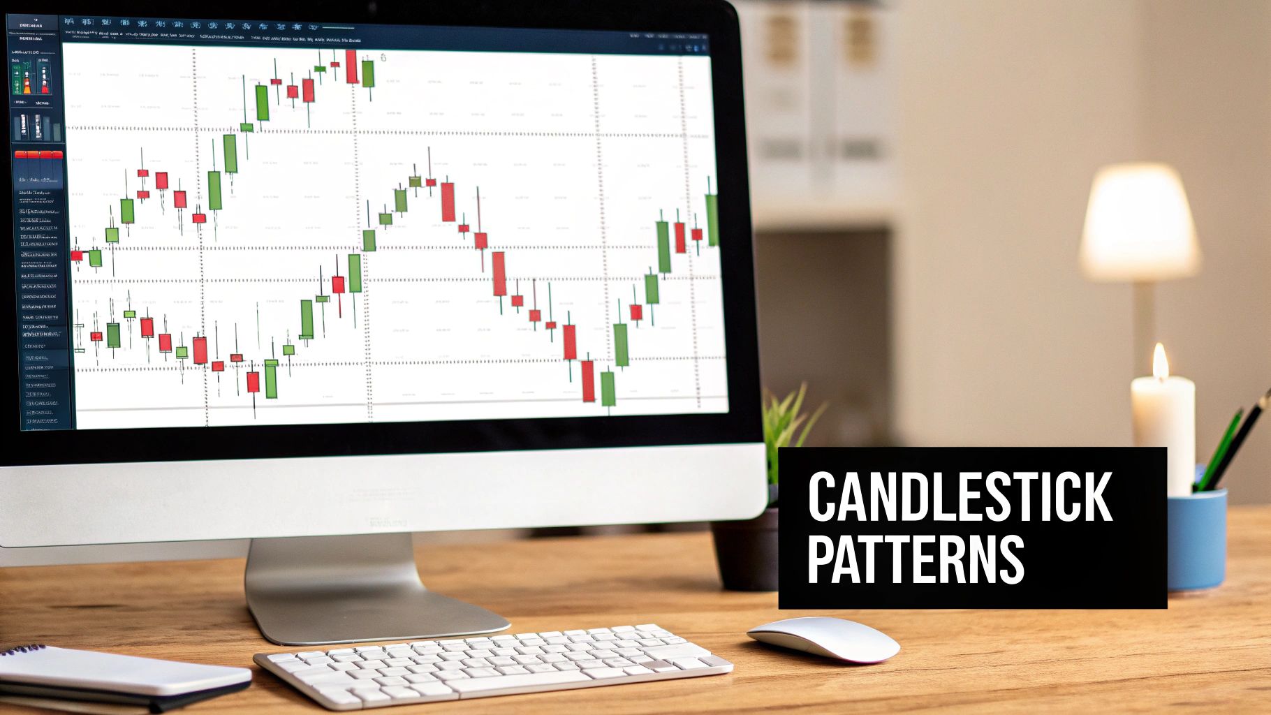
The Language of Candlesticks
At its core, every single candlestick is a "word" in the market's story. A big, long bullish candle screams buyer confidence. A tiny doji whispers indecision. When you start stringing these "words" together, they form "sentences"—and those are the very price action patterns we're here to master.
These aren't just random shapes on a screen; they're visual maps of market psychology. They reveal critical moments of:
- Momentum: When one side (buyers or sellers) is clearly in the driver's seat.
- Indecision: When buyers and sellers are in a standoff, often coiling up for a big move.
- Exhaustion: When a strong trend starts to run out of gas and becomes vulnerable.
- Reversal: The moment the balance of power decisively flips from one side to the other.
By focusing purely on price action, you cut through all the noise. You stop guessing based on secondary data and start interpreting the primary source of all market information: the price itself.
Why This Approach Actually Works
This whole methodology works because it's built on the unshakable foundation of supply and demand—the same forces that drive every financial market on the planet. It doesn't matter if you're trading forex, stocks, or crypto; the human emotions of fear and greed always show up on the charts as price action patterns.
This guide is your roadmap to fluency. We'll begin with the alphabet—individual candlesticks—and slowly build our way up to constructing complex sentences with advanced chart formations. The goal isn't to predict the future with a crystal ball. It's to understand the present so you can react intelligently to high-probability setups as they happen.
This is the bedrock of consistent, indicator-free trading.
The Building Blocks of Price Action
Before you can start reading the complex “sentences” the market writes every day, you need to learn its basic “words.” These are the single and multi-candle patterns that pop up on your charts constantly. They’re the simplest, yet most powerful, building blocks of all price action patterns, and each one tells a quick but vital story about who's in control—buyers or sellers.
Getting these foundational patterns down is non-negotiable. They give you the immediate context you need to understand the market's real-time psychology.
H3: Pin Bars: The Story of Rejection
The Pin Bar is one of the most intuitive patterns you'll ever see. That long tail, or "wick," tells a crystal-clear story of rejection. Picture it like a battle: one side makes a huge push, only to be violently shoved back by the opposition before the candle closes.
This isn't just a random shape on your screen; it's a narrative. A long lower wick shows that sellers tried to hammer the price down, but buyers stormed in and drove it right back up. On the flip side, a long upper wick shows buyers made a run for it, but sellers seized control and slammed the price back down.
- Bullish Pin Bar (Hammer): Has a long lower wick, signaling that buyers flat-out rejected lower prices. You'll often spot this near support levels, hinting at a potential rally.
- Bearish Pin Bar (Shooting Star): Has a long upper wick, showing that sellers rejected higher prices. This pattern frequently appears near resistance and can often lead to a drop.
H3: Engulfing Bars: The Story of a Power Shift
While a Pin Bar shows rejection, the Engulfing Bar shows a complete and utter takeover. This two-candle pattern signals a dramatic, decisive shift in who’s running the show. It happens when the second candle's body totally "engulfs" the body of the candle right before it.
Think of it like a tug-of-war. The first candle shows one team holding its ground. The second candle shows the other team not just pulling the rope back, but yanking it so hard that the first team gets completely dragged through the mud.
The key takeaway here is the sheer force of the momentum reversal. A small bearish candle followed by a massive bullish one that swallows it whole shows that sellers were in charge, however briefly, before buyers came in with overwhelming force and flipped the script.
This image really drives home the concepts of support and resistance—the key battlegrounds where you’ll often find these powerful patterns.
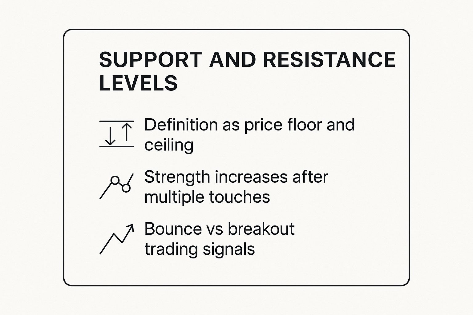
You can see how these levels act as price floors and ceilings. They get stronger each time they're tested and give us clear signals for either a bounce or a breakout.
H3: Inside Bars: The Story of Indecision
The Inside Bar pattern is the market taking a breath and saying, "Hold on, I need to think." It's a two-bar pattern where the second bar (the "inside bar") is completely tucked inside the high and low of the previous bar (the "mother bar").
This pattern represents a temporary truce or a period of consolidation. The market is coiling up like a spring, volatility is shrinking, and energy is building. Traders aren't sure which way to go next, leading to a quiet, tight range.
But this quiet period is often the calm before the storm. The Inside Bar tells us a breakout is probably just around the corner. We watch for the price to snap either above the mother bar's high or below its low to tell us where the market is headed next. It’s a classic continuation signal, but it can also pop up at major turning points.
Here’s a quick-reference table to help you keep these core patterns straight.
Common Candlestick Patterns and Their Meanings
| Pattern Name | Appearance | What It Signals | Trader Psychology |
|---|---|---|---|
| Pin Bar (Hammer/Shooting Star) | Small body with a long wick on one side. | Rejection of a price level. | One side (buyers or sellers) attempted a push but was forcefully rejected by the opposition. |
| Engulfing Bar | A large candle whose body completely covers the body of the previous, smaller candle. | A Power Shift and strong momentum reversal. | The dominant market force was completely overwhelmed by a surge from the opposing side. |
| Inside Bar | A small candle completely contained within the high and low of the previous candle. | Indecision and consolidation; potential for a breakout. | The market is pausing and coiling energy as traders await a clear directional signal. |
These foundational patterns—Pin Bars, Engulfing Bars, and Inside Bars—are the absolute essentials for reading a price chart. They are the simplest forms of price action patterns, but they offer incredible insight into the constant battle between buyers and sellers.
Once you learn to read their stories of rejection, takeovers, and indecision, you gain a massive edge. You start to see the market not as random noise, but as a clear conversation that you can finally understand. From here, we can start putting these words together to form more complex sentences.
How To Spot Trend Reversal Patterns
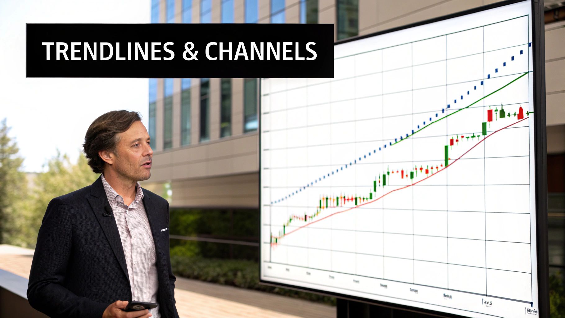
Candlesticks capture single moments. But string a few together, and they reveal how a trend can lose steam.
Multi-bar price action patterns aren’t born in a flash. They evolve as momentum shifts and one side gradually gives way to the other.
Catching these formations early is like spotting cracks forming in a dam. Most people see a solid wall—but a trained eye detects the pressure building behind it.
By learning these patterns, you can anticipate major market turns before the herd reacts.
The Head And Shoulders Formation
The Head And Shoulders pattern is a classic sign that an uptrend might be running out of fuel. Picture this sequence:
- Buyers push price to a peak (the left shoulder).
- A brief pullback follows.
- Price surges to a higher high (the head).
- A final rally tops out below the head (the right shoulder).
The inability of buyers to stamp out a new high is the core message here. It signals that buying power is fading and sellers are gaining the upper hand.
This pattern confirms once price breaks the neckline—the support drawn through the two pullback lows. Flip it upside down and you’ve got an inverse Head And Shoulders hinting at a bullish reversal.
Tips To Trade This Pattern:
- Enter just below the neckline break
- Place your stop-loss above the right shoulder
- Target a move roughly equal to the head-to-neckline height
Double Tops And Double Bottoms
When an “M” or “W” shape emerges, you’re likely looking at a Double Top or Double Bottom. These twins are simple yet powerful.
| Pattern | Shape | Signal |
|---|---|---|
| Double Top | M | Bearish Reversal |
| Double Bottom | W | Bullish Reversal |
- A Double Top forms when price hits a resistance level twice and fails both times.
- A Double Bottom appears when support holds firm on two attempts to push price lower.
In each case, repeated rejection at a key level marks a shift in control from buyers to sellers—or vice versa.
Reading The Broader Market Story
These setups aren’t just lines on a chart—they’re snapshots of a power struggle. Other formations, such as the Three Black Crows bearish reversal pattern, dramatize seller aggression with three consecutive down candles.
Pattern reliability varies. For instance, the Bump and Run studied across several Asian markets shows about 59% accuracy in signaling reversals. For more on this, see chart pattern reliability.
Once you understand the psychology behind these formations, random price swings stop feeling like noise. Instead, you’ll recognize the telltale signs of a trend running out of steam.
Finding Institutional Footprints on Your Charts
Classic reversal patterns are great, but they often show a slow, gradual shift in market sentiment. What if you could pinpoint the exact zones where the biggest players—the banks and institutions—are laying their traps? This is where we go beyond simple patterns and start hunting for what traders call "smart money" footprints.
And guess what? These footprints aren't hidden. They show up as incredibly powerful price action patterns known as Supply and Demand zones and Order Blocks. It’s time to stop thinking of support and resistance as thin little lines. These are entire areas on your chart where massive battles between buyers and sellers went down.
Picture these zones as old battlegrounds. Price doesn't just waltz through them without a fight. When it comes back to visit, it often triggers a huge reaction. Why? Because of all the unfilled orders left behind from that first big conflict. Learning to map these zones is like getting your hands on a blueprint of institutional interest.
Understanding Supply and Demand Zones
At its heart, a Demand Zone is just a spot on the chart where aggressive buying completely steamrolled any selling pressure. You'll usually spot it as a powerful rally launching away from a tight consolidation area. On the flip side, a Supply Zone is an area where intense selling absolutely crushed buyer interest, causing a sharp drop in price.
These zones matter because they represent a massive imbalance. The explosive price move away from the zone tells you that not all the big institutional orders got filled at that price. So when the price returns to a Demand Zone, those big buyers are often waiting eagerly to fill the rest of their orders, which shoves the price right back up. The same logic works in reverse for Supply Zones.
To spot these zones, you're looking for a few key things:
- A period of price going sideways in a tight range.
- A powerful, explosive move away from that range.
- That original sideways area is your high-probability zone.
The real secret is the strength of the departure. A weak little drift away from a level doesn't create a good zone. You need to see a decisive, energetic move that practically screams institutional involvement, leaving a trail of unfilled orders in its wake.
This is a world away from a standard support level, which is just a single price point that's been hit a few times. A Demand Zone is an entire price area absolutely saturated with buying interest.
What Are Order Blocks
Order Blocks are a more refined, precise version of this same idea. An Order Block is usually the last opposing candle right before a strong, impulsive move that breaks the market structure. For instance, a bullish Order Block is the last down-candle before a massive surge upward that makes a new high.
That final down-candle is like the last gasp of the sellers before the institutional buyers came in with overwhelming force. That specific candle and its range become a hot spot. Traders will watch for price to pull back to this block to find super precise, low-risk entries, betting that the institutions will step in to defend their positions.
So why do these levels get so much respect? Because the institutions that kicked off that big move have a vested interest in protecting that price level. If price were to move against them, their massive positions would start losing money. It’s in their best interest to add to their positions when price revisits the Order Block, creating the powerful reaction traders are looking for.
Learning to see these institutional footprints is a giant leap forward in mastering price action patterns. You stop just reacting to what the market is doing and start anticipating its next move by trading right alongside the most powerful players.
Advanced Patterns for Tactical Trade Entries

Once you've got the basic shapes down, you can start digging into the more nuanced price action patterns—the ones that flash a signal right at the peak of market panic or euphoria. These are the setups that give seasoned traders a tactical edge, offering sharp entry points that others miss.
You'll often spot them when a trend feels like it can't possibly go any further. They're the market's way of showing you that a final, desperate shove is happening right before the tide turns.
One of the most powerful signals in this category is the Exhaustion Bar. This pattern tells a dramatic story of a trend that's simply run out of gas. Think of a marathon runner who sprints the last hundred yards, giving it everything they have, only to collapse the second they cross the finish line. That's an Exhaustion Bar in a nutshell.
It perfectly captures that last, climactic push from panicked traders right before the other side steps in and takes over. If you can learn to spot this, you can position yourself for the reversal, often getting in just as the old trend dies.
Dissecting the Exhaustion Bar
So, what does an Exhaustion Bar actually look like? It’s defined by a big gap in the direction of the trend, immediately followed by a powerful close against that same trend. This visual sequence tells a very clear story.
Let's break it down:
- The Gap: Imagine a downtrend. The market might gap down hard at the open. This is raw fear at work, as novice traders dump their positions, convinced the floor is about to give way.
- The Reversal: But instead of continuing the freefall, something shifts. Professional buyers see an opportunity and step in, soaking up all that panic-selling. They start buying aggressively, pushing the price all the way back up until the bar closes near its high, completely wiping out the initial drop.
This violent rejection is a huge tell. It signals that the sellers have fired their last shot. That panic-driven gap was their final move, and now the smart money is taking control to push the market in the opposite direction. This whole drama usually plays out on a big spike in volume, which confirms that institutions were involved.
The core idea is that the market's final emotional surge creates a vacuum. When everyone who wanted to sell has finally sold in a panic, there are no sellers left, leaving only buyers to drive the price aggressively in the opposite direction.
A Real-World Example in Microsoft Stock
This isn't just textbook theory; you see it happen all the time. A classic bullish exhaustion pattern popped up in Microsoft (MSFT) stock back on May 19, 2021. The stock gapped down significantly at the open, but instead of crashing, it fought back hard and closed near the day's high.
This reversal unfolded over two bars, with volume picking up on the second bar. Even better, it all happened right as the price tested a major volume level from the week before. This combination of signals was a strong hint that big players were defending that price and buying up shares.
Why Volume Confirmation Is Crucial
Adding volume analysis to these patterns is like turning on the lights in a dark room—it provides a critical layer of confirmation. High volume on an Exhaustion Bar proves that a real battle took place and a clear winner emerged. Without that volume spike, the pattern just doesn't have the same teeth.
For traders who want to learn more about focusing purely on price and volume for cleaner charts, our guide on trading without indicators is a great place to start.
By combining advanced patterns like the Exhaustion Bar with volume confirmation, you start to trade on a different level. You're no longer just spotting shapes; you're reading the psychology driving the market and making moves based on what the most influential players are doing.
Why Market Context Is Your Most Important Tool
Learning to spot a bunch of price action patterns is a great first step, but honestly, it's only half the game. A perfect-looking bullish pin bar is completely useless—and can be downright dangerous—if you don’t get the bigger picture of where it’s showing up. This is where market context comes in, and it's what separates struggling traders from the pros.
Think of context as everything happening around the pattern. Is the market grinding higher in a strong trend, or just chopping back and forth in a messy range? Are you seeing this signal during a wild news release or on a sleepy holiday afternoon? A pattern that’s a goldmine in one scenario can be a total disaster in another.
Patterns Aren't Static Rules
Price action patterns are not rigid, cookie-cutter formulas. They are dynamic signals, and their reliability changes with the market's mood.
Here’s a simple way to think about it: imagine a hammer pattern forming right at a major support level while the market is in a clear uptrend. That's a high-probability, A+ setup. Now, picture that exact same hammer popping up in the middle of a chaotic, directionless market. It's probably just noise.
Good trading is about constantly observing and adapting, not just blindly applying shapes you've memorized. You have to get in the habit of asking the right questions before you even think about putting on a trade:
- What's the overall market structure? Are we trending up, down, or just stuck in a range?
- Where is this pattern actually forming? Is it at a key supply zone, or is it just floating in the middle of nowhere?
- What's the volatility like right now? Is the market calm and orderly, or is it erratic and unpredictable?
Context gives you the "why" behind a pattern. Without it, you’re just trading shapes on a screen. With it, you're trading a story the market is telling you, which gives you a massive edge over everyone else who ignores the bigger picture.
A Real-World Example of Shifting Reliability
The effectiveness of a pattern can even change over time in the same market. A classic example is trading breakouts from the opening range of the E-mini S&P 500 futures. You'd think a breakout is a breakout, right? Not so fast.
Recent analysis showed that a "double break"—where the price breaks both above and below the initial 15-minute range—happened over 80% of the time in one quarter. But by the fourth quarter of that same year, this behavior had dropped off to just 68%. You can dig deeper into how these market tendencies shift in this analysis of trading patterns on NinjaTrader.com.
This drives home a critical lesson: no strategy works forever without being tweaked. The market is a living, breathing thing, and its habits evolve. Your job as a trader is to pay close attention to these shifts in context and adjust your game plan. Nailing this skill is the real secret to sticking around in this business for the long haul.
Common Questions About Price Action Patterns
As you start to get the hang of spotting these patterns on a chart, a few questions always pop up. It's natural. I've put together answers to the most common things traders ask, just to clear up any confusion and help you build some real confidence in your price action patterns.
Think of this as your go-to reference. It’ll help lock in the core ideas we've covered so you can start putting them to work.
Can I Use Price Action Patterns on Any Timeframe?
Yes, you absolutely can. Price action is fractal, which is a fancy way of saying the same patterns show up everywhere—from a one-minute chart right up to the monthly. It doesn't matter if you're looking at a few minutes or a few months; the human emotions of greed and fear that shape the market are the same.
But here's the crucial part: context is everything. A pattern on a higher timeframe, like a daily or weekly chart, carries a lot more weight. It represents a bigger, more powerful agreement among traders. For swing traders, the 4-hour and daily charts are often the sweet spot for finding the most dependable signals.
Do I Need Indicators to Trade Price Action?
If you're a purist, price action trading means looking at nothing but a clean chart. The core belief is that the price itself tells you everything you need to know. That said, a lot of successful traders I know use a hybrid approach, blending that beautiful simplicity with a bit of confirmation.
For example, you might throw a simple moving average on your chart just to get a quick read on the overall trend. From there, you'd hunt for high-probability price action patterns that form at key levels with that trend. The key is to avoid "analysis paralysis." Keep your charts clean and let the price lead.
The most reliable pattern isn't one specific shape. It's any pattern that forms in a high-probability context. A bullish pin bar at a major support level in a clear uptrend is infinitely more powerful than one that shows up randomly in a messy, directionless market.
What Is the Most Reliable Price Action Pattern?
That's the million-dollar question, isn't it? But the truth is, there's no magic bullet. No single pattern is the "best" on its own. A pattern's power comes entirely from the market context—where it forms and what the bigger picture looks like.
Real success comes from learning how to spot when all the pieces of the puzzle line up. For more practical advice on building that skill, you should check out these seven price action tips that have been proven to work. At the end of the day, the most reliable setup is one where the pattern, the location, and the market trend are all telling you the exact same story.
Ready to stop relying on confusing indicators and finally master the art of reading a clean chart? At Colibri Trader, we provide straightforward, action-based programs designed to help you profit in any market. Discover your trading potential with our free quiz today!