


Trading the Inverted Head and Shoulders Pattern Like a Pro

The inverted head and shoulders pattern is one of the most reliable bullish reversal signals you'll find. When it shows up at the bottom of a downtrend, it’s a strong clue that the sellers are running out of steam and the buyers are gearing up to take over. It's made up of three distinct troughs: a central low point (the "head") with two slightly higher lows on either side (the "shoulders"). Think of it as a sign that the market is shifting from bear to bull.
What the Inverted Head and Shoulders Pattern is Really Telling You
Instead of just seeing a shape on a chart, learn to see the story playing out. The inverted head and shoulders is a classic tale of a power struggle between buyers and sellers. It's a tug-of-war, and if you can read the psychology behind each move, you'll understand the market's intentions so much better.
The story always starts in an established downtrend. Sellers are in complete control, pushing the price down again and again. Bearish confidence is at a high, and any attempt at a rally gets squashed immediately.
The First Challenge from Buyers
The formation of the left shoulder is the first real sign of a fightback. As sellers push the price to another low, buyers suddenly step in with enough force to create a respectable rally. This counter-attack is a big deal—it’s the first hint that the bearish momentum is starting to wobble, even though sellers eventually wrestle back control and shove the price down one more time.
The Sellers' Last Stand
Next up is the head, the most dramatic part of the whole story. Sellers throw everything they have into one final, exhaustive push, driving the price to a new low that's even deeper than the left shoulder. But this victory is incredibly brief. Buyers storm back with even more power, driving the price all the way back up to where the last rally peaked. This massive rebound from the absolute low is the critical signal—it screams that the sellers are almost completely spent.
This moment is the climax of the battle. The sellers gave it their best shot to continue the downtrend but failed to sustain the pressure, revealing a significant shift in market power.
The Turning of the Tide
The right shoulder confirms that the sellers are exhausted. They try to push the price down again, but they don't have the conviction to even match the low of the left shoulder, let alone the head. The price forms a higher low, a textbook sign of a weakening trend. This time, buyers step in earlier and with more confidence, defending a higher price level.
Finally, the story hits its conclusion with the breakout. The price rallies from the right shoulder and punches decisively through the neckline—the resistance level connecting the pattern's peaks. That breakout is the buyers' victory cry. It signals that power has officially changed hands, the downtrend is dead, and a new uptrend is likely just getting started. When you understand this story, you can trade with the confidence that comes from reading the market's own narrative.
To dig deeper into trading strategies and chart patterns, check out the resources over on the BuddyPro Blog.
To really get a feel for this pattern, you need to understand each part and what it's signaling about the ongoing fight between buyers and sellers.
Anatomy of the Inverted Head and Shoulders
This table breaks down each component of the pattern, revealing the market psychology behind every move.
| Pattern Component | Description | What It Signals |
|---|---|---|
| Prevailing Downtrend | The market is in a clear downtrend with lower lows and lower highs. | Sellers are firmly in control. |
| Left Shoulder | Sellers push to a new low, but buyers rally the price back up. | The first sign of buyer strength and potential seller weakness. |
| Head | Sellers make a final, deeper push to a lower low, but buyers respond with a strong rally back to the previous high. | Climax of selling pressure; buyers show significant strength and resolve. |
| Right Shoulder | Sellers attempt another push down but fail to reach the low of the head, forming a higher low. | Sellers are exhausted, and buyers are now stepping in sooner. |
| Neckline | A resistance line connecting the peaks of the left shoulder and the head. | The final barrier buyers must overcome to confirm the reversal. |
| Breakout | The price moves decisively above the neckline, often with an increase in volume. | Confirmation that buyers have taken control; the bullish reversal is on. |
By breaking it down like this, you're not just memorizing a shape; you're learning to read the emotional state of the market.
How to Spot the Pattern on Your Charts
Moving from theory to actually spotting patterns on your live charts takes a bit of a trained eye. It’s not about wishful thinking; it's about following a strict, evidence-based checklist. If you break down the process, you can learn to separate the high-probability setups from all the random market noise.
First thing's first: context is everything. The pattern must show up after a real, established downtrend. If you see something that looks like this pattern in a sideways, choppy market, it's not the real deal. It’s just noise. That prior downtrend is the whole reason the pattern exists—it sets the stage for the reversal by establishing the sellers who are about to lose control.
Once you’ve got your downtrend, you need to find the three key pieces: the two shoulders and the head. These troughs have to form in a specific order, telling the story of a power shift from the sellers to the buyers.
- The Left Shoulder: Sellers manage to push the price to a new low, but then buyers step in with a decent rally. This is the very first sign that the downtrend is meeting some real resistance.
- The Head: Sellers give it one last, powerful shove, driving the price to the absolute lowest point in the whole formation. But the rally that follows is strong, often bringing the price right back up to where the left shoulder’s rally fizzled out.
- The Right Shoulder: The sellers try to push down one more time, but they’re clearly running out of gas. This final trough forms a higher low than the head—a classic signal that the bears are losing their grip.
Drawing the All-Important Neckline
After you’ve identified the three troughs, you can draw the neckline. You simply connect the peaks that formed between the shoulders and the head. Think of it as the final line in the sand. Buyers have to cross it to prove they’ve truly taken over. This is a fundamental concept in market analysis, which we cover in-depth in our guide on support and resistance levels at https://www.colibritrader.com/resistance-and-support/.
The neckline is almost never perfectly flat. It usually slopes a bit, and that angle can give you some extra clues. An upward-sloping neckline is a great sign, suggesting strong bullish sentiment because buyers are getting aggressive at higher and higher prices. A downward-sloping one is still valid, but it might point to a less explosive reversal.
Crucial Insight: The neckline acts as a resistance zone. A clean, decisive break above this level is the signal that the old downtrend's ceiling has become the new uptrend's floor.
This flowchart really brings to life the power struggle happening behind the scenes as the pattern forms. You can see the market shift from seller dominance to a battle, and then a final victory for the buyers.
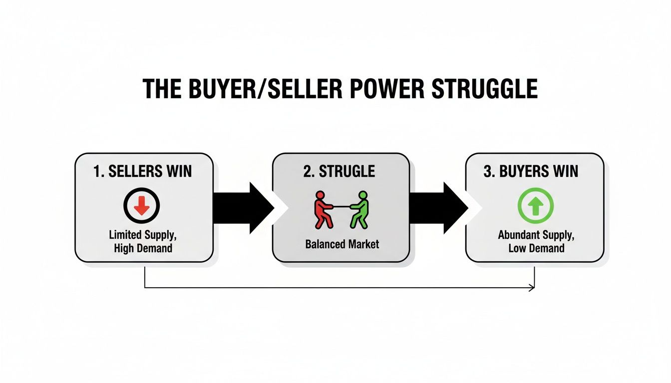
As the visual shows, the pattern is just a chart’s way of telling a story: sellers were in control, buyers fought back, and now buyers have won.
Volume: The Ultimate Confirmation Signal
The final, and perhaps most important, piece of the puzzle is volume. A true inverted head and shoulders breakout needs to happen on a big spike in trading volume. That surge tells you that the big money—the institutional players—are throwing their weight behind the new uptrend. That’s the fuel a real reversal needs.
A breakout on weak or dying volume is a massive red flag. It shows a lack of conviction and dramatically increases the chances of a "false breakout," where the price pokes its head above the neckline only to get smacked right back down. To make sure you're reading your charts correctly, it’s worth reviewing these data visualization best practices.
Think back to the S&P 500 in early 2023 for a perfect real-world example. On April 28th, the index broke out of a classic inverse head and shoulders. The move smashed through the neckline as trading volume exploded to 180% above the 20-day average. This confirmation signaled the start of a new bullish phase that led to a 5.8% rally in the weeks that followed.
Building Your Actionable Trading Plan
Spotting a clean inverted head and shoulders pattern is a great start, but it's only half the battle. If you want to turn that chart analysis into a profitable trade, you need a rock-solid, repeatable plan.
Without knowing your exact entry, stop-loss, and profit target before you get in, you're not trading—you're gambling. This is where we move from simply reading the chart to executing with discipline. A good plan takes the emotion out of the equation, giving you a clear playbook to follow when the market is moving fast and the pressure is on.
Choosing Your Entry Strategy
There’s no single “best” way to enter a trade on this pattern. The right method for you comes down to your personal risk tolerance and trading style. Most traders fall into one of three camps, each with its own trade-offs.
-
The Aggressive Breakout Entry: This is for traders who want to get in on the action right away. You place a buy order as soon as the price closes firmly above the neckline. The upside? You can catch the entire initial burst of momentum. The downside is the higher risk of getting caught in a "false breakout"—where the price pokes its head above the line only to slump right back down.
-
The Conservative Retest Entry: This is my preferred method and the one I recommend for most traders. After the initial breakout, you patiently wait for the price to pull back and retest the old neckline, which should now act as a new floor of support. You enter your long position only after you see the price bounce off this level, confirming its strength. You might miss the first part of the move, but this approach gives you a much better risk-to-reward ratio and filters out a ton of fake-outs.
-
The Secondary Pullback Entry: Sometimes, a powerful breakout just keeps running and never gives you that clean retest of the neckline. In this case, you can wait for the new uptrend to establish itself and then look to enter on the first significant pullback. It requires patience, but it lets you join the new trend at a discount after it’s already proven its strength. Understanding these nuances is a key part of learning how to trade breakouts effectively.
Trader's Insight: The best entries almost always come with a big surge in trading volume. A breakout on weak volume is a major red flag. A breakout on high volume, on the other hand, shows real conviction from the buyers.
No matter which entry you choose, having a clear rule is what separates a professional approach from just winging it.
Setting Your Stop-Loss and Profit Target
Once you're in a trade, the two most important decisions you'll make are where to get out if you're wrong and where to take profits if you're right. These levels must be set before you ever click the buy button.
Defining Your Stop-Loss
Think of your stop-loss as your emergency exit. It's the point where you accept the trade isn't working out and you cut your losses to protect your capital.
For the inverted head and shoulders, the most logical place to put your stop-loss is just below the low of the right shoulder.
- This placement gives the trade enough room to wiggle around without getting stopped out by normal market noise.
- More importantly, if the price drops below the right shoulder, the entire bullish structure of the pattern is broken. That's a crystal-clear signal that your original idea was wrong.
Placing your stop too tight is a rookie mistake that gets you kicked out of perfectly good trades. Using the pattern's own structure to define your risk is a much smarter way to go.
Calculating Your Profit Target
The classic way to set a profit target for this pattern is simple and objective. It’s based on a measured move, which helps you avoid the emotional traps of closing a trade too early out of fear or holding on too long out of greed.
- Measure the Height: Calculate the vertical distance from the lowest point of the head straight up to the neckline.
- Project Upward: Take that same distance and project it upward from the point where the price broke through the neckline.
That projected price level is your minimum profit target. For example, if the head formed at $50 and the neckline is at $60, the pattern's height is $10. You would project that $10 up from the $60 breakout point, giving you a minimum target of $70. This technique gives you a logical target based on the energy that was built up while the pattern was forming.
Real-World Examples of the Pattern in Action
Theory is a great place to start, but seeing the inverted head and shoulders pattern play out on a real chart is where the lessons truly click. The best way to build confidence is by watching how these patterns form and resolve in different markets and on various timeframes.
Let's walk through a few detailed examples to see this powerful reversal signal in action.
Each example is a mini case study. We'll identify the downtrend that sets the stage, mark each component of the pattern, draw the crucial neckline, and pinpoint the volume spike that gives the green light. Seeing these real-world scenarios unfold is how a trading plan comes to life.

Case Study 1: A Stock Market Reversal
Let's imagine a stock, "TechCorp Inc.," on its daily chart. After weeks of sliding, sellers were clearly in control, establishing a solid downtrend. This context is everything; without it, any pattern that forms is just noise.
Then, the price action started telling a new story:
- Left Shoulder: The stock hit a low of $110 before buyers stepped in, pushing it back up to $120. This was the first sign of a fight.
- Head: Sellers made one last, aggressive push, driving the price down to a new low of $105. But buyers responded with even greater force, rallying the stock all the way back to that same $120 resistance level.
- Right Shoulder: A final, weaker sell-off took the price to $112—a higher low that confirmed sellers were running out of steam.
The two peaks at $120 formed a clear, horizontal neckline. The breakout was a large bullish candle closing above $120, and critically, this move came with a trading volume spike of over 150% of the daily average. That was the confirmation we were waiting for.
A conservative trader might enter on a retest of the $120 level, placing a stop-loss just below the right shoulder's low at $111. The pattern's height was $15 (from the $105 head to the $120 neckline), which gave us a measured profit target of $135. The stock consolidated for a bit before marching up toward the target.
Case Study 2: A Forex Pair Bottom
Now, let's switch gears and look at a forex pair like EUR/USD on a 4-hour chart. The pair was in a textbook downtrend, printing a series of lower lows and lower highs. The formation of an inverted head and shoulders hinted that the momentum was about to shift from sellers to buyers.
Here’s the play-by-play:
- The Left Shoulder formed as the price bottomed out before rallying to a point of resistance.
- The Head was created when sellers pushed the price to a significant new low, only to be overwhelmed by a wave of buying that brought the price right back to that same resistance.
- The Right Shoulder was just a shallow dip, forming a higher low than the head. This showed that the bears' power was fading fast.
In this case, the neckline connecting the two peaks was slightly sloped upwards. An upward-sloping neckline is often seen as an extra sign of bullish strength.
Key Takeaway: The angle of the neckline tells a story. An upward slope suggests buyers are getting more aggressive, stepping in at higher prices even before the official breakout.
The breakout came as a strong candle closed decisively above this sloped trendline. A trader could have entered on this confirmation, placing a stop-loss below the low of the right shoulder to guard against a fakeout. The profit target, calculated by measuring the head-to-neckline distance, was hit a few days later as the new uptrend found its legs.
This example really highlights that the inverted head and shoulders pattern is just as effective in the forex market as it is with stocks.
Common Trading Mistakes and How to Avoid Them
Even the most dependable chart patterns lay traps for the unwary. The inverted head and shoulders is a powerful bullish signal, for sure, but a few classic mistakes can flip a promising setup into a painful loss. Knowing these pitfalls is just as critical as knowing how to spot the pattern in the first place.
Sidestepping these errors will dramatically shorten your learning curve and bring a lot more consistency to your trading. Let’s break down the most common blunders and, more importantly, how you can steer clear of them.

Forcing a Pattern That Isn't There
One of the biggest mistakes any trader can make is seeing what they want to see on the chart. When you're itching for a trade, it’s all too easy to stare at a messy price chart and try to jam the puzzle pieces into an inverted head and shoulders shape. This is confirmation bias in its purest form.
- What Not to Do: Don’t even think about trading a pattern with misshapen shoulders, a head that isn't the clear low point, or a choppy, ambiguous structure.
- What to Do Instead: Only trade the clean, obvious patterns. If you have to squint or second-guess whether it's a valid setup, it isn’t. The A+ setups are the ones that practically jump off the chart at you.
Ignoring the Importance of Volume
A breakout without a significant spike in volume is like a car trying to start with an empty gas tank. Sure, it might lurch forward a bit, but it has no fuel for a real journey. Volume is your ultimate confirmation that buyers mean business.
Ignoring this crucial signal is a recipe for getting trapped in a false breakout. So many failed patterns show the price peeking above the neckline on weak, unconvincing volume, only to collapse right back down.
Trader's Rule: A breakout on low volume is a bright red warning sign, not an entry signal. High volume confirms that institutional money is backing the move, giving the new trend a much higher probability of success.
Mismanaging Your Risk
Proper risk management is the bedrock of any successful trading career. Two huge errors I see with this pattern are setting the stop-loss way too tight and trading without a clear exit plan from the start. Sticking a stop just a few cents below your entry is asking to get shaken out by normal market noise.
A well-placed stop-loss gives your trade the room it needs to breathe while still protecting your capital if the pattern's structure fails. To really master this, check out our detailed guide covering the best practices for risk management and apply those core principles here.
Here’s a quick look at poor vs. smart risk management:
| Aspect | Poor Risk Management | Smart Risk Management |
|---|---|---|
| Stop-Loss | Placed too close to the entry, based on fear. | Placed logically below the right shoulder's low. |
| Target | Set arbitrarily or based on greed. | Calculated using the measured move objective. |
| Mindset | "I hope this works out." | "I have a plan for both a win and a loss." |
Entering the Trade Too Early
Patience is a trader's greatest virtue, period. The fear of missing out (FOMO) is a powerful force that tempts you to jump in before the inverted head and shoulders is fully confirmed. Entering before a decisive close above the neckline is just buying straight into a known resistance level.
It’s a low-probability trade because you're betting on a future event—the breakout—instead of reacting to one that's already happened. The price could easily tag the neckline and get rejected, stopping you out before the real move even has a chance to begin. Always, always wait for the market to prove your thesis right with a confirmed breakout.
Your Top Questions Answered
Even when you feel like you've mastered a pattern on paper, questions always pop up when you see it on a live chart. Let's tackle the most common ones I hear from traders about the inverted head and shoulders. Think of this as a quick-fire round to clear up any confusion before you put real money on the line.
Getting these details straight is what separates a confident, prepared trader from one who hesitates. Let’s dig in.
What Is the Difference Between a Head and Shoulders and an Inverted Head and Shoulders?
The easiest way to think about them is as perfect opposites—mirror images signaling two totally different market moves. They're both reversal patterns, which means they show up when a trend is exhausted, but that's where the similarity ends.
-
Standard Head and Shoulders: This is a bearish pattern. You'll find it at the top of a strong uptrend, and it’s a big warning sign that the buyers are running out of steam. A new downtrend is likely coming. It looks like a peak with two smaller peaks on either side.
-
Inverted Head and Shoulders: This one is bullish. As we've covered, it forms at the bottom of a downtrend. It’s a signal that sellers are finally exhausted and buyers are about to take control, kicking off a new uptrend. It's literally the standard pattern flipped upside down.
So, the key difference is where they form and what they predict. One screams "get ready for a drop," while the other whispers "a rally could be starting."
How Reliable Is This Reversal Pattern?
Let's be clear: no chart pattern is a crystal ball, and nothing in trading works 100% of the time. Anyone who tells you otherwise is selling something. That said, the inverted head and shoulders is considered one of the more reliable bullish reversal signals out there. Its strength isn't just in its shape, but in the story of shifting momentum it tells.
Its reliability shoots up when you get confirmation. The single most important confirmation is a big spike in trading volume as the price breaks above the neckline. That surge in volume is your proof that big money is backing the move, giving it the fuel it needs to follow through. Without that volume, the odds of a false breakout go way up.
Key Principle: Your job isn't to find a pattern that never fails. It's to find high-probability setups and then use rock-solid risk management—like a properly placed stop-loss—to protect yourself when the market decides to do something else.
Can the Neckline Be Sloped Instead of Horizontal?
Yes, and honestly, most of the time it is. Finding a perfectly horizontal, textbook-style neckline on a live chart is pretty rare. The neckline is just a trendline connecting the two peaks between the head and shoulders.
The angle of that line can actually give you an extra clue about what's happening under the surface:
-
Upward-Sloping Neckline: I see this as an extra bullish sign. It shows that buyers are already getting impatient and are willing to step in at higher and higher prices, even before the pattern is officially confirmed.
-
Downward-Sloping Neckline: This is still a perfectly valid formation. The trading rules don't change one bit. You still wait for a clean, high-volume close above that sloped line to trigger your entry.
The slope doesn't invalidate the pattern. The breakout is what matters. Don't ever dismiss a good-looking setup just because its neckline isn't perfectly flat.
Ready to stop relying on lagging indicators and start trading with the clarity of pure price action? At Colibri Trader, we teach a straightforward, no-nonsense approach to reading the markets. Discover our action-based programs and unlock your trading potential today.