


A Price Action Trader’s Guide to the Inverse Head and Shoulders

The inverse head and shoulders pattern is a classic chart formation, and for good reason. It’s one of the most reliable signals that a downtrend might be losing steam, paving the way for buyers to take the wheel.
What I love about this pattern is that it tells a story. It visually maps out the struggle between sellers and buyers, showing you the exact moment the tide begins to turn.
The Story Behind the Pattern

Forget seeing this as just a random shape on your screen. The inverse head and shoulders is a three-act play about a power shift in the market. Each part of the formation reveals a critical chapter in the battle between the bears and the bulls.
This pattern is a cornerstone of technical analysis because it’s not just about lines on a chart—it’s about reading the market’s collective psychology. You're watching confidence shift from sellers to buyers in real-time. This is the very essence of what is price action trading.
To really get a feel for this pattern, let's break down its components and what they signal about the market's inner workings.
Anatomy of the Inverse Head and Shoulders
Here's a quick-reference table to help you visualize each part of the pattern and, more importantly, understand the story it tells.
| Pattern Component | What It Looks Like on a Chart | What It Means for Price Action |
|---|---|---|
| Left Shoulder | A low point in a downtrend, followed by a minor rally. | Sellers are still in control, but buyers are starting to show up. First hint of weakness in the downtrend. |
| Head | The lowest point of the entire pattern, plunging below the left shoulder. | A final, desperate push by sellers. The subsequent rally back to the neckline shows they're losing strength. |
| Right Shoulder | A third low that is higher than the head. | This is the crucial tell. Sellers can't even push the price to the previous low. Buyers are stepping in earlier and with more force. |
| Neckline | A resistance line connecting the peaks of the rallies after the left shoulder and the head. | The line in the sand. A decisive break above this level confirms the buyers have officially won the battle. |
This table gives you the "what," but the "why" is where the real trading edge comes from. Let's walk through the narrative, act by act.
Act One: The Left Shoulder
Our story starts in an established downtrend. Sellers have been in command, confidently pushing prices lower. The left shoulder forms when they drive the price to a new low, but the rally that follows shows some buying pressure is quietly emerging. It’s the first sign that the sellers' momentum is starting to fade.
Act Two: The Head
Next, sellers make one last, aggressive push. They manage to drive the price even lower than the left shoulder, creating the lowest point of the pattern—the head. This move often happens on a wave of panic selling.
But here's the twist: the rally that follows is strong, bringing the price all the way back up toward the previous resistance level. This failure to hold new lows is a major red flag for the bears. Their dominance is clearly slipping.
Act Three: The Right Shoulder
The final act is where the power shift becomes undeniable. Sellers try to push down again, but they just don't have the strength. The right shoulder forms at a higher low than the head. This is the key moment. Buyers are now stepping in sooner and with more conviction. The sellers are exhausted.
This progression—from a strong downtrend, to a final failed low, and then a higher low—is like watching a compressed spring. Each push down by sellers coils the spring tighter with buying pressure until it finally releases upward.
The "neckline" is the resistance level that connects the peaks between the shoulders and the head. When the price breaks decisively above this line, the story has its climax. The power has officially shifted, buyers have won, and a new uptrend is likely beginning.
A Trader's Checklist for Identifying Valid Setups
Spotting a shape that looks like an inverse head and shoulders is the easy part. The real skill is telling the high-probability setups from the fakes that just want to take your money. Experienced traders run a strict mental checklist to validate every single pattern before they even think about putting capital on the line.
This isn't just about finding a familiar shape; it's about confirming a specific story the market is telling. A valid pattern has to show the complete narrative: sellers getting exhausted, and buyers officially taking over. If you skip even one step on this checklist, the story doesn't make sense, and the trade becomes a total gamble.
The Non-Negotiable Pre-Condition
Before you even start looking for the shoulders or the head, you have to confirm one thing: a prior downtrend.
The inverse head and shoulders is a reversal pattern. By its very definition, it needs something to reverse. If the pattern shows up in a messy, sideways market or, even worse, during a strong uptrend, it's not a real signal. It's just random noise. For the setup to have any meaning at all, you must see a clear series of lower lows and lower highs leading into the left shoulder.
Think of it like this: you can't reverse a car that's already parked. The downtrend provides the context and the momentum needed for the pattern to have any real bullish power behind it.
The Three Structural Pillars
Once you've confirmed the downtrend, the pattern's structure has to follow three strict rules. These pillars are what prove you’re seeing a genuine handover of control from the sellers to the buyers.
-
The Head Must Be the Lowest Point: This is the moment of peak fear, the seller's final, desperate push that ultimately fails. If the right shoulder drops below the low of the head, the pattern is instantly invalidated. A lower low there means sellers are still in charge, and the whole bullish idea has fallen apart.
-
The Right Shoulder’s Low Must Be Higher Than the Head’s Low: This is probably the most critical sign that the balance of power is shifting. It shows buyers are stepping in earlier and with more force than they did down at the head. Sellers couldn't even manage to push the price back to its previous low—a classic sign of exhaustion.
-
The Neckline Connects the Peaks: The neckline is simply a line drawn to connect the high points of the two small rallies that form after the left shoulder and after the head. This line acts as the final wall of resistance that buyers have to break through. You can get a better feel for how these levels work by understanding resistance and support in trading.
A neckline that's horizontal or slopes slightly down is ideal. If you see one that's sloping up steeply, be careful. It can sometimes mean the buying pressure underneath isn't as strong as you'd like.
Trader's Insight: A real inverse head and shoulders isn't just a shape; it's a sequence of events. It shows a downtrend losing power (left shoulder), a last-ditch failed attempt to go lower (head), and buyers finally stepping in with real strength (right shoulder). Every piece has to be there, and in the right order.
The Ultimate Confirmation Signal
Even if the structure looks perfect, you need one final piece of evidence to prove the buyers have truly won the fight: volume.
A true breakout above the neckline has to happen on a big surge in trading volume. This volume spike is conviction. It’s a signal that big institutional money is likely driving the move, giving it the fuel needed for a real rally. A breakout on weak or dying volume is a huge red flag. It's often just a "bull trap" waiting to slam the price right back down.
Without that volume confirmation, even the most perfect-looking inverse head and shoulders pattern should be viewed with a ton of skepticism. The volume is the market's way of shouting that the reversal is the real deal.
Executing The Trade With Precision And Confidence
Spotting a clean inverse head and shoulders pattern is a great start, but that's only half the job. Turning that chart pattern into an actual, profitable trade is a different skill altogether. This is where a clear, systematic plan comes in—moving from simply seeing the pattern to actually trading it.
A solid trading plan takes the emotion and guesswork out of the equation. It gives you a framework for exactly how you'll enter, where you'll get out if you're wrong, and where you plan to take profits. Without a plan, even the most textbook-perfect pattern can turn into a losing trade from a bad entry, a sloppy stop loss, or unrealistic profit goals. The key is to build a repeatable process.
This decision tree helps visualize the checklist I run through before even thinking about placing an order. It’s not just about a shape; it's about a sequence of events that must be confirmed.
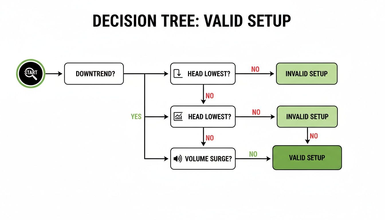
As the chart shows, a valid setup needs a preceding downtrend, a distinct head as the absolute low, and ideally, a pop in volume. If those boxes aren't ticked, it's not a trade.
Choosing Your Entry Strategy
There’s no single “best” way to get into the trade. The right entry for you will depend on your own trading style and how much risk you’re comfortable with. Let's walk through three of the most common approaches.
-
The Aggressive Breakout Entry: This is for traders who want to get in the moment the trend officially shifts. You place your buy order as soon as a candle closes decisively above the neckline. The big plus here is that you're guaranteed to be in the trade if the price takes off like a rocket, so there's no fear of missing out. The downside? It's the riskiest entry. Breakouts can fail spectacularly, sucking you into a nasty "bull trap."
-
The Conservative Retest Entry: This is the patient trader's approach. You wait for the initial breakout to happen, but instead of chasing it, you let the price pull back and "retest" the old neckline area, which should now act as a floor of support. This often gives you a much better entry price and a superior risk-to-reward ratio. The trade-off is that powerful breakouts sometimes just keep running and never give you that retest. Roughly 52% of patterns offer a classic pullback, so it happens more often than not, but it's never a guarantee.
-
The Demand Zone Entry: For traders who view the market through a supply and demand lens, we can get even more precise. Instead of just aiming for the neckline, you can identify the small pocket of demand (a cluster of buy orders) that was created right below the neckline during the breakout. Placing your entry within this zone can give you an even tighter entry with a smaller stop-loss.
Defining Your Risk With a Stop Loss
Your stop-loss is non-negotiable. It's your safety net. It’s the price you decide on before you enter the trade where you'll admit the idea was wrong and get out to protect your capital.
A well-placed stop-loss isn't just a defensive move; it's an offensive tool that defines your risk from the outset, allowing you to calculate your position size and potential reward accurately.
For an inverse head and shoulders, the most logical spot for a stop-loss is just below the low of the right shoulder.
- Why here? The whole bullish argument of the pattern rests on the right shoulder forming a higher low. If the price drops below that point, the pattern's structure is broken, and the bullish thesis is invalidated. It's time to get out.
Placing your stop too tight, like just below the neckline, is a rookie mistake. You'll often get shaken out by normal market noise, even if the overall pattern is still perfectly valid. If you want to dive deeper into this crucial topic, check out our guide on how to effectively set your stop-loss and take-profit levels.
Setting Your Profit Targets
The final piece of your plan is knowing where to cash in. The classic and most widely used method for an inverse head and shoulders is the "measured move" technique.
This approach gives you an objective, data-driven target based on the size of the pattern itself. It's simple to calculate:
- Measure the Height: Get the vertical distance from the lowest point of the head straight up to the neckline.
- Project the Target: Take that same distance and add it to the point where the price broke out of the neckline. That price level is your minimum profit target.
For example, if the head is at $95 and the neckline is at $100, the pattern's height is $5. You would project a target of $105 (the $100 breakout point + the $5 height). Statistics show this target is hit about 74% of the time after a confirmed breakout, making it a very reliable objective to shoot for.
For those looking to build a more comprehensive trading foundation beyond any single pattern, exploring resources on how to become a Forex and Trading Expert can provide that broader skill set.
What the Data Says About This Pattern's Reliability
While the psychological story behind the inverse head and shoulders is compelling, professional traders operate on probabilities, not just narratives. A pattern's true value lies in its historical performance, and thankfully, this is one of the most studied formations in technical analysis.
Understanding these statistics is what separates a methodical trading plan from hopeful guessing. It lets you trade with a clear-eyed view of what to expect from a setup, turning abstract chart shapes into real, quantifiable opportunities.
When you know the odds, you can manage your risk more effectively and build a system that has a statistical edge. Let’s move beyond the theory and look at the hard numbers.
The High Probability of a Bullish Breakout
One of the most powerful statistics backing the inverse head and shoulders is its incredibly high rate of bullish follow-through. Once a valid structure completes and breaks its neckline, the outcome is overwhelmingly positive.
A large historical study found that in 98% of cases, the price exits the formation to the upside. This solidifies its reputation as a premier bullish reversal signal and means a confirmed breakout is almost always followed by at least some upward price movement.
What's more, the data shows that in 97% of cases, the bullish move continues immediately after the neckline break, signaling strong momentum once buyers take control. This is crucial information when you're deciding between an aggressive breakout entry and a more conservative retest entry. You can learn more about these pattern findings to see the full context.
This high success rate is a direct reflection of the market psychology we've discussed. The pattern is an effective filter, weeding out weaker setups and leaving only those where sellers are truly exhausted and buyers are stepping in with conviction.
Hitting the Measured Move Target
Knowing the price is likely to go up is one thing; knowing how far it's likely to go is what creates a complete trade plan. The classic "measured move" technique provides a logical price objective, and the data confirms it works.
The same research reveals that the price target, calculated by projecting the pattern's height from the breakout point, is reached approximately 74% of the time. This means nearly three out of every four confirmed patterns not only move higher but also achieve their full measured objective.
This 74% success rate in reaching the projected target is the cornerstone for calculating your risk-to-reward. It gives you a data-backed reason to hold a trade for its full potential instead of getting shaken out too early.
This statistic is vital. It allows you to structure trades with a favorable risk profile, knowing that the potential reward isn't just a guess but a historically probable outcome.
Understanding the Pullback Probability
For traders who prefer a more conservative entry, the pullback to the neckline is a key event. It offers a lower-risk entry point, but it comes with a trade-off: you might miss the move entirely if the price takes off without looking back.
So, how often can you expect that second chance?
- The data indicates that about 52% of patterns experience a classic pullback to retest the neckline as new support after the initial breakout.
- This means it's essentially a coin flip whether you'll get another opportunity to enter at a better price.
This 52% figure helps you dial in your entry strategy. If you exclusively wait for retests, you have to accept that you'll sit out nearly half of all successful inverse head and shoulders breakouts. On the other hand, an aggressive breakout strategy gets you in every time but at the cost of a less favorable entry price and a wider initial stop-loss.
Real-World Examples from Major Markets

Theory and statistics give us a great foundation, but nothing makes the lesson stick quite like seeing a pattern play out in the messy reality of a live market. The inverse head and shoulders isn't just an abstract idea in a textbook; it shows up everywhere, from major stock indices to the wild west of cryptocurrencies.
Looking at these real charts is where we connect all the dots. We can see the structure form, watch for that crucial volume spike on the breakout, and map out a full trade plan from entry to exit. These examples really prove how universal this pattern is.
The S&P 500 Textbook Reversal
You'll often find the cleanest examples on major market indices like the S&P 500. Why? Because they represent broad market sentiment. When an index this big carves out a clear inverse head and shoulders, it can signal a major shift in the entire economic tide.
We saw a perfect case study back in 2023 when the S&P 500 formed a textbook pattern on its daily chart. The left shoulder printed near 3,810, followed by the head—the moment of peak pessimism—down around 3,720. The right shoulder then formed a higher low at roughly 3,785, a subtle but powerful clue that buyers were starting to step in with more conviction.
The neckline, a clear resistance level around 3,950, finally gave way on April 28, 2023. And here's the key: the breakout happened on trading volume that was about 180% above its average. That’s a massive tell that institutional money was fueling the reversal. The measured-move target projected a move to around 4,180, which was hit about six weeks later, netting a 5.8% advance from the breakout point. You can find more discussions of inverse head and shoulders patterns on cmcmarkets.com to see how professionals track these setups.
A Forex Example in GBP/USD
The forex market, famous for its powerful trends, is another great place to hunt for this pattern. Let's walk through a hypothetical setup on the GBP/USD 4-hour chart after a long, grinding downtrend.
- Left Shoulder: The pair finds some buyers at 1.2250 before a weak rally.
- Head: Sellers give it one last, final push, driving the price to a new low of 1.2180, but the move is rejected almost immediately.
- Right Shoulder: The next wave of selling runs out of steam at 1.2265. This is a classic higher low, screaming seller exhaustion.
- Neckline & Breakout: A descending neckline forms around 1.2350. It's eventually smashed by a strong bullish candle with a very obvious spike in volume.
A trader could jump in right on the breakout or play it safer by waiting for a retest of the broken 1.2350 neckline. The stop-loss goes just below the right shoulder's low (say, at 1.2240). To find a target, we just measure the distance from the head (1.2180) to the neckline (1.2350)—a 170-pip height—and add that to the breakout point. This gives us a logical target up near 1.2520.
This methodical approach turns a simple chart observation into a fully structured trade with a defined risk and a clear profit objective. It’s the very essence of a clean, indicator-free trading strategy.
Bitcoin and High-Volatility Markets
Even in the chaotic and often unpredictable world of crypto, the inverse head and shoulders reliably signals major turning points. Bitcoin's price history is dotted with several massive bottoms that were marked by this exact pattern.
In these faster markets, all the core principles are the same, but your execution has to be sharp. Volume confirmation becomes absolutely critical here. You need it to tell the difference between a genuine, institution-backed breakout and a fake move or "scam pump."
The real beauty of this pattern is its fractal nature. It works on weekly charts to signal the end of multi-year bear markets, and it works just as well on hourly charts for shorter-term swing trades. Seeing it perform so consistently across such different environments—from blue-chip stocks to digital assets—just goes to show its enduring power as a map of market psychology.
Common Failure Points and How to Avoid Them
No chart pattern is a crystal ball, and the inverse head and shoulders is no exception. Knowing what a good setup looks like is only half the battle. The real skill comes from learning to spot the warning signs of a weak pattern before you risk a single dollar.
Think of failed patterns not as losses, but as market tuition. They're invaluable lessons in what not to do, helping you sharpen your eye and become a more selective trader. Let's break down the most common ways these patterns fall apart.
The Missing Context
The number one reason an inverse head and shoulders pattern fails is painfully simple: it forms without a meaningful prior downtrend.
This is a reversal pattern, after all. It needs something to reverse. If you find one of these popping up in the middle of a choppy, sideways market, it’s basically meaningless. The story of sellers running out of steam and buyers taking over has no plot. Always zoom out. Is there a clear, established downtrend leading into the left shoulder? If not, walk away.
Structural Flaws That Invalidate the Pattern
Even when a pattern shows up after a solid downtrend, its internal structure can have fatal flaws. These are non-negotiable red flags that should immediately disqualify a setup.
-
The Right Shoulder Undercuts the Head: This is an instant deal-breaker. The whole bullish argument is built on the right shoulder forming a higher low. This is our signal that sellers are losing their punch. If sellers can shove the price below the absolute low of the head, they're still in charge. The reversal thesis is dead on arrival.
-
A Steeply Sloping Neckline: A flat or slightly descending neckline is what you want to see. But when the neckline slopes sharply upward, it’s often a sign of trouble. It tells you the rallies between the lows were weak and anemic, suggesting there isn't enough buying power to fuel a real breakout.
A valid inverse head and shoulders tells a clear story of shifting momentum. If any part of that story is missing or out of order—like a weak downtrend or a broken structure—the trade's probability of success plummets.
The Anemic Breakout
This is probably the most common heartbreaker. You get a perfect pattern, a beautiful neckline… and then the price just sort of limps across it with no conviction. A breakout on weak, unconvincing volume is a classic bull trap.
Imagine trying to push-start a car. A half-hearted shove won't get it going. You need a powerful, committed push. A breakout on low or dying volume shows a complete lack of institutional conviction. It's often just retail traders jumping the gun, and this weak push gets aggressively sold into, trapping eager buyers and sending the price right back below the neckline.
You absolutely must see a significant spike in volume as price closes above the neckline. That surge is your confirmation that the "big money" is backing the move. It's the fuel for a sustained rally. Without it, you’re just gambling.
Common Questions About the Inverse Head and Shoulders
Even when you feel you've got a handle on the pattern, seeing it on a live chart always brings up new questions. Let's tackle the most common ones I hear from other traders to clear up any lingering confusion and help you trade with more confidence.
What Is the Best Timeframe to Use?
You'll see this pattern pop up everywhere, from the 1-minute chart all the way to the weekly. But when it comes to reliability, higher timeframes are king. The 4-hour, daily, and weekly charts are where this pattern really shines.
Think about it: patterns on these charts form over days or weeks. That means they reflect the decisions of a huge number of market participants and carry a lot more weight. A breakout on a daily chart is a far more meaningful event than one on a 5-minute chart, which can easily get tossed around by short-term market noise.
How Is It Different From a Double Bottom?
It's easy to confuse an inverse head and shoulders with a double or triple bottom since they're both bullish reversal patterns. The key difference is in the story they tell about sellers running out of steam.
- Double/Triple Bottom: This shows buyers defending the exact same price level two or three times. The lows are all at roughly the same depth, like a line in the sand.
- Inverse Head and Shoulders: This shows a progression of weakening selling pressure. The head is the final, desperate push lower. The right shoulder’s higher low is the crucial tell—it shows buyers are stepping in earlier and with more conviction than before.
Can I Use Indicators for Confirmation?
Plenty of traders like to use indicators like the Relative Strength Index (RSI) or MACD for an extra layer of confirmation. A great example is finding a bullish divergence, where the price makes a new low (the head) but the RSI makes a higher low. This can add serious weight to the pattern’s validity.
But remember, the purest form of analysis comes from price and volume alone. The most critical confirmation is always a big surge in volume as price breaks the neckline. That’s your signal that other traders are jumping in with conviction and backing the move.
What if the Breakout Fails?
It happens. Price punches through the neckline, you get excited, and then it slumps right back below. This is a failed breakout, often called a "bull trap." Instead of panicking, a pro sees this as valuable new information.
A failed breakout is often a powerful signal in its own right—it tells you the downtrend is likely to continue with force. It can even become a great opportunity to trade in the opposite direction.
At Colibri Trader, we teach you how to read the story of the market through pure price action, turning chart patterns into a complete, indicator-free trading methodology. Find out if our approach is right for you by visiting us at https://www.colibritrader.com.