


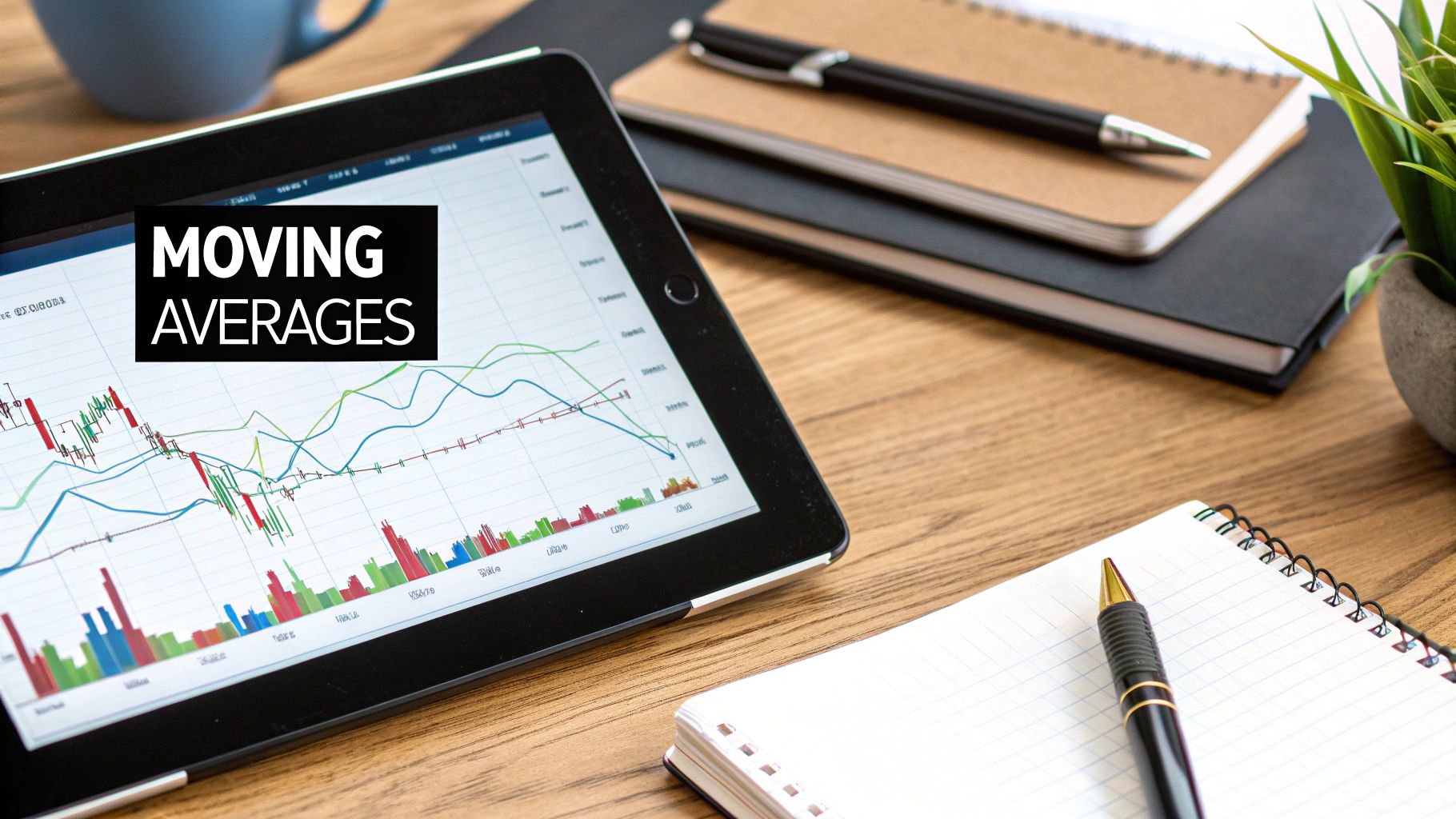
How to Read Stock Market Charts: A Beginner’s Guide
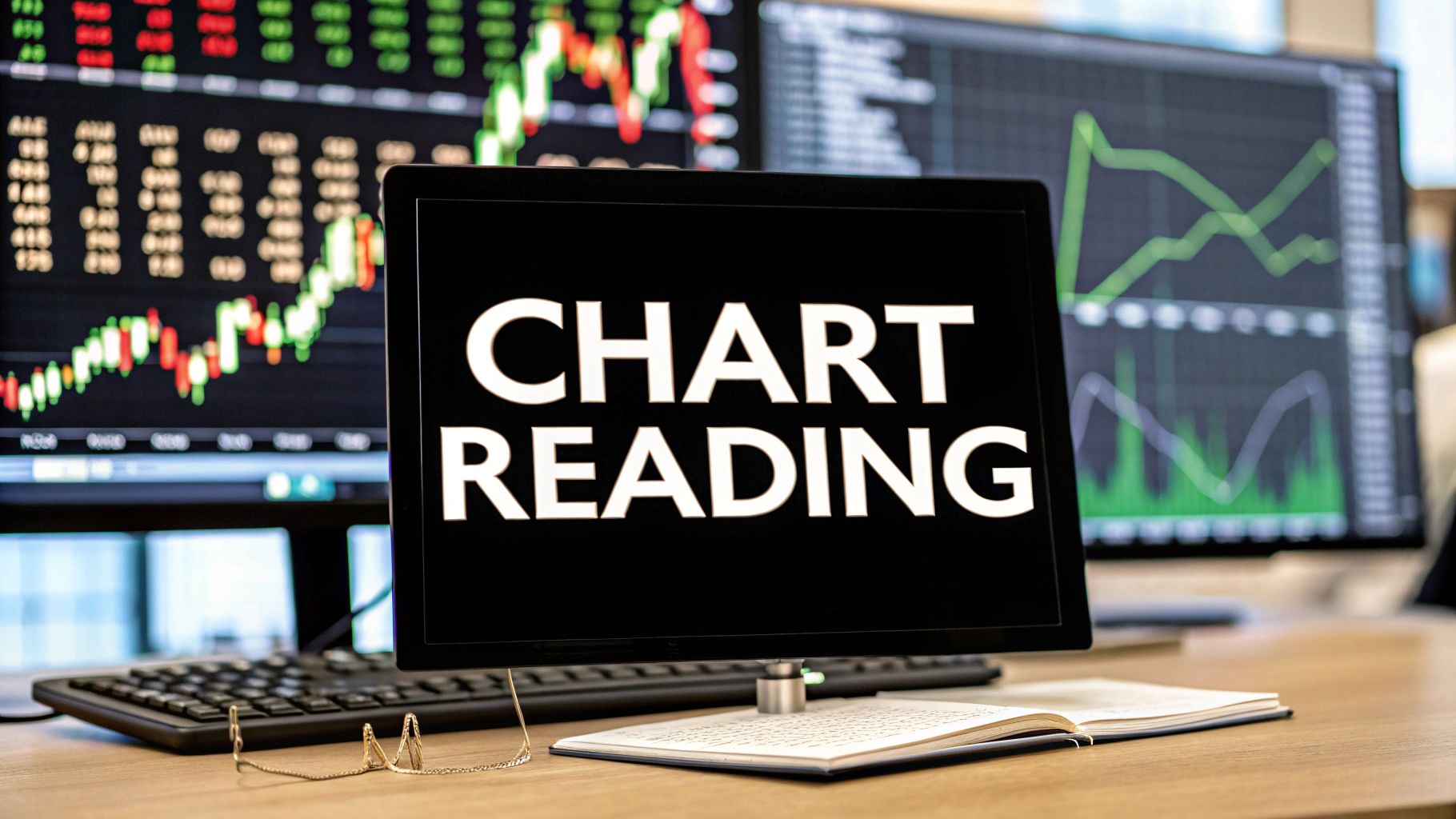
Learning to read stock market charts is all about translating visual data—price, volume, and time—into real, actionable ideas about where the price might go next. It’s like learning a new language. You're figuring out the patterns in the constant tug-of-war between buyers and sellers so you can anticipate the next move.
This skill is your roadmap for navigating the market. It turns those confusing wiggles on a screen into something you can actually understand and use.
Why Stock Charts Are Your Most Important Tool
Before you can even think about making smarter trades, you have to get a grip on the visual language of the market. A stock chart isn't just a squiggly line; it's a live picture of market psychology. It shows you the constant push and pull between buyers (bulls) and sellers (bears). Learning to read these charts is the absolute foundation of technical analysis.
This isn't some new fad. The whole practice has deep historical roots, going back centuries. We can trace its origins to 17th-century Dutch markets and even 18th-century Japanese rice trading, which is where early candlestick charting was born. It was Charles Dow who helped systemize chart reading in the late 19th century, laying the groundwork for what we use today. You can get the full rundown on the evolution of technical analysis on Wikipedia.
When you master reading charts, you give yourself a massive edge.
- Objective Decision-Making: Charts give you hard data on price action. This helps you get away from trading based on emotion or a gut feeling, which is a recipe for disaster.
- Identifying Trends: You can see with your own eyes whether a stock is in an uptrend, downtrend, or just chopping sideways. This is critical for knowing which strategy to apply.
- Risk Management: Charts help you find logical spots to place your stop-losses (at support levels) and set your take-profit targets (at resistance levels). This is how you protect your capital.
A stock chart is a story written in the language of price and volume. Your job as a trader is to learn how to read that story to understand the plot and anticipate the next chapter.
The first step is to forget all the complex jargon you might have heard. Instead, just focus on the core concepts we're about to cover—things like candlestick patterns, trend analysis, and reading volume.
Think of this guide as your first real lesson in market literacy. By the time we're done, you'll start seeing beyond the random noise and begin recognizing meaningful patterns that can genuinely inform your trading strategy.
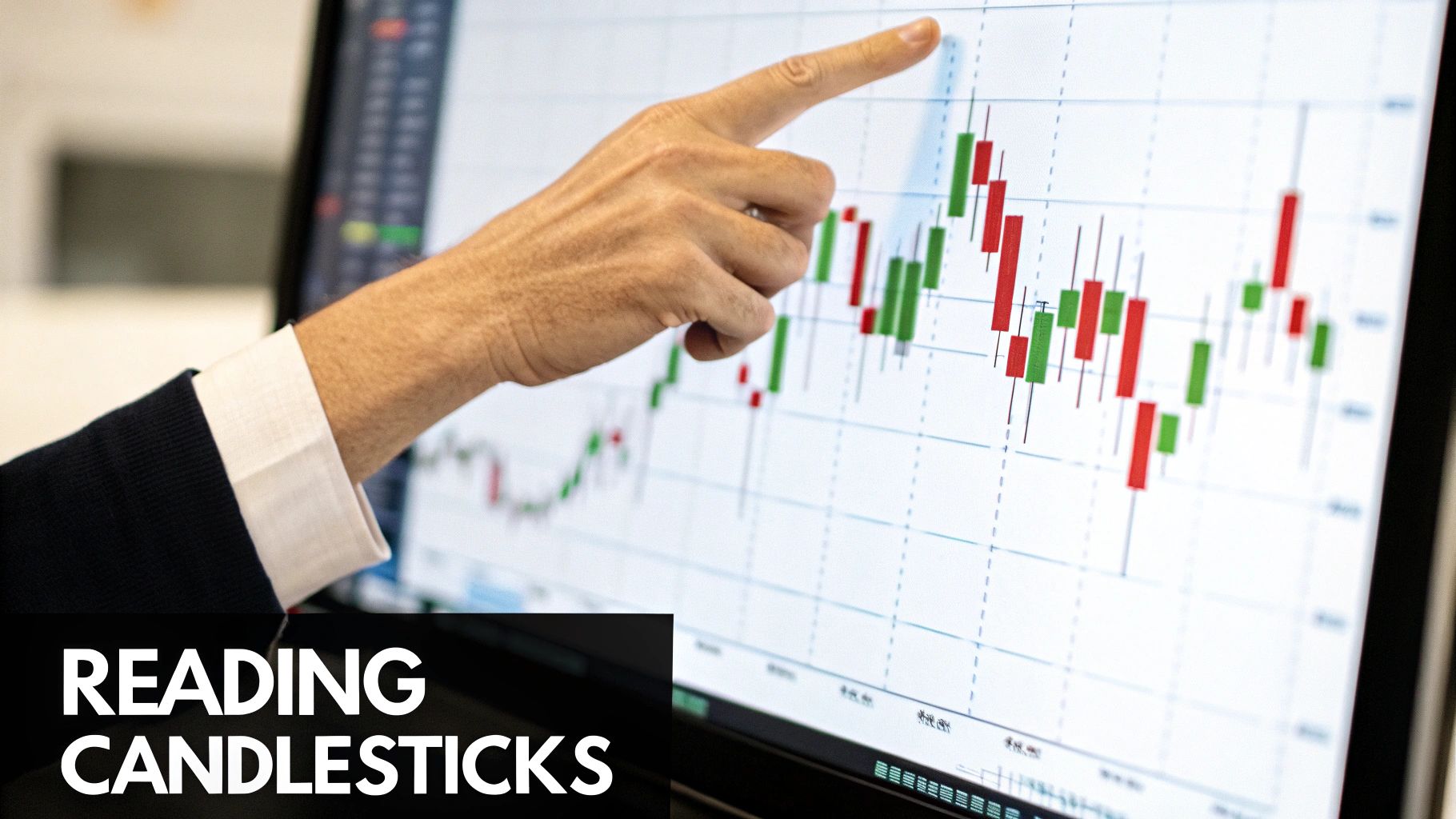
Mastering Candlesticks and Chart Types
If you're only looking at a simple line graph, you're missing the real story. Sure, it shows you the general direction, but all the juicy details—the battles between buyers and sellers—are completely hidden. To really learn how to read stock market charts, you've got to graduate to Japanese candlesticks.
Each candlestick is a rich, data-packed snapshot of market psychology within a specific timeframe.
Think of a single candlestick as a miniature story. In one glance, it tells you four crucial things:
- The opening price at the start of the period.
- The closing price at the end.
- The highest price the market reached.
- The lowest price the market hit.
The main rectangular part is called the real body. This shows you the distance between the open and close. The thin lines sticking out from the top and bottom are the wicks (or shadows), which represent the period's absolute high and low.
The color is the plot twist. A green (or white) candle means the price closed higher than it opened—a win for the bulls. A red (or black) candle means it closed lower, signaling a victory for the bears.
Understanding Candlestick Anatomy
The real magic of candlesticks is in reading their anatomy. A long green body screams strong buying pressure. Conversely, a long red body tells you sellers were in complete control.
Long wicks are a sign of volatility and, often, indecision. The price traveled a long way, but couldn't hold those extremes, ultimately closing somewhere else. It shows a struggle.
For instance, a Doji is a fascinating candle where the open and close are nearly identical, creating a cross shape. This pattern signifies a total stalemate and can often show up right before a trend reverses. Another classic is the Hammer, which has a short body and a long lower wick. This suggests buyers rushed in to reject lower prices—a classic bullish signal.
If you want to go deeper down the rabbit hole of patterns and their meanings, check out this guide on how to read candlestick charts.
A candlestick chart doesn't just show you what the price did; it shows you how it did it. It visualizes the market's sentiment, hesitation, and conviction in a way no other chart can.
To make this crystal clear, here’s a quick breakdown of what each part of the candlestick tells you about the market's mood.
Candlestick Components at a Glance
| Component | What It Represents |
|---|---|
| Real Body | The range between the opening and closing price. A longer body signifies stronger momentum (buying or selling). |
| Upper Wick | The highest price reached during the period. A long upper wick can signal selling pressure pushed the price down from its high. |
| Lower Wick | The lowest price reached during the period. A long lower wick can indicate that buyers stepped in to push the price up from its low. |
| Color (Green/Red) | Instantly shows the direction of the price movement. Green (or white) is bullish (closed higher); red (or black) is bearish (closed lower). |
This table is your cheat sheet. The size and relationship between these parts reveal the underlying psychology of the market for that period.
Choosing the Right Chart for the Job
While candlesticks are my go-to, they aren't the only game in town. Different charts have different uses, though I find that most serious traders gravitate toward candlesticks for their incredible detail. The infographic below confirms just how dominant they are.
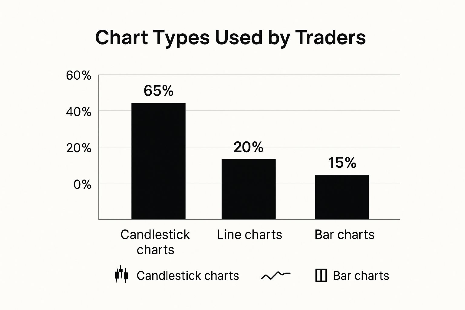
It’s pretty clear from the data that candlestick charts are the tool of choice for a solid majority (65%) of traders. There's a good reason for that—they offer the most information at a single glance.
Here’s a quick comparison to put things in perspective:
-
Line Charts: The simplest form. They just connect the closing prices over time. Great for seeing the big-picture trend over months or years, but they lack the detail needed for active trading decisions.
-
Bar Charts: These are the predecessor to candlesticks. A bar chart (or OHLC chart) shows the open, high, low, and close. You get all the same data, but many traders find them less intuitive to read quickly compared to the visual punch of a colored candlestick body.
-
Candlestick Charts: The modern standard. They present the same OHLC data as bar charts but in a far more digestible format. The colored bodies make it instantly obvious whether a period was bullish or bearish, which is why they've become the gold standard for technical analysis.
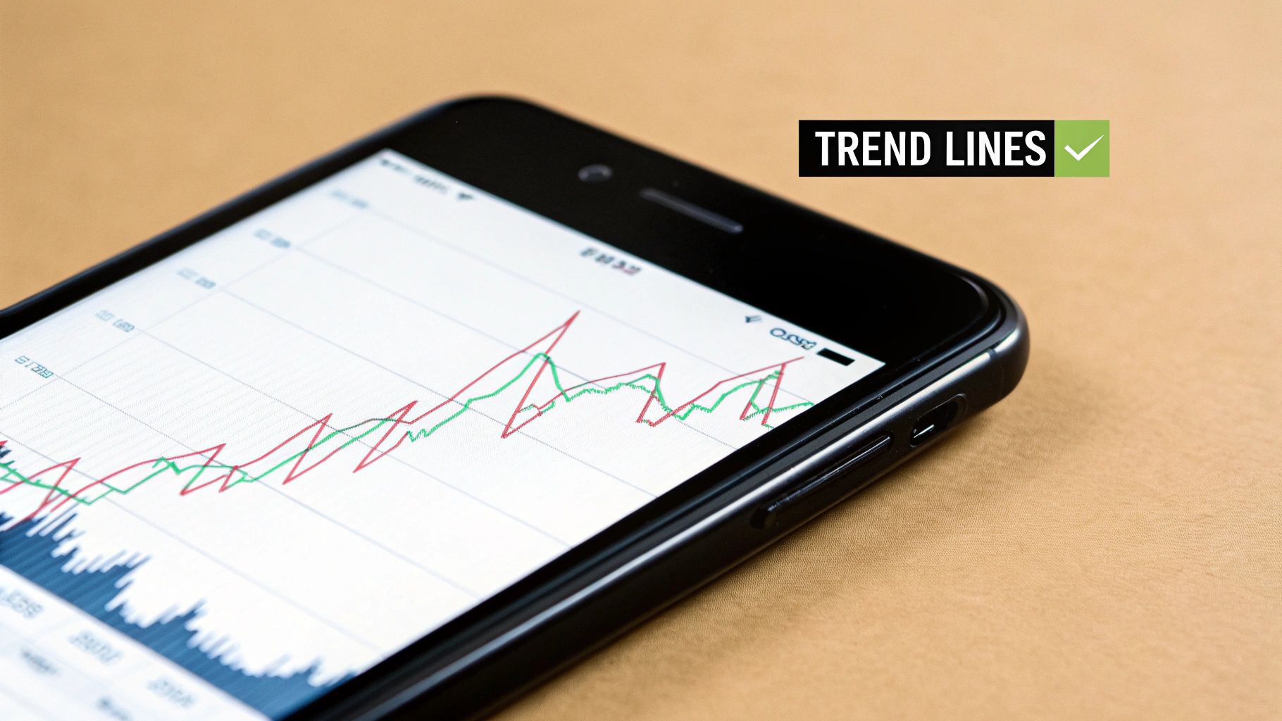
Identifying Market Direction with Trendlines
If candlesticks are the individual words, then trendlines are the sentences that tell the market's story. They're simply diagonal lines you draw on a chart to connect key price points, giving you a clean visual of which way the market is leaning. This is the entire foundation behind that old trading mantra, "the trend is your friend."
At its heart, a trend is just the general direction of the market. An uptrend is easy to spot—you'll see a series of higher highs and higher lows. This is a clear sign that buyers are in the driver's seat. The opposite is a downtrend, defined by a pattern of lower highs and lower lows, which tells you sellers have a firm grip on the price.
How to Draw Accurate Trendlines
Drawing trendlines that actually work is more art than science, but there are definitely rules that help. For a solid uptrend line, you need to connect at least two significant swing lows. For a downtrend, you're connecting at least two major swing highs.
A line with just two points is a start, but it's still just a potential trend. The real magic happens on the third touch. When the price comes back to the line and respects it a third time, it gives your analysis a ton of validity. This is a fundamental skill, and for a much deeper look, our guide on how to draw trend lines breaks it down perfectly.
Think of a well-drawn trendline as a moving support or resistance level. In a clear uptrend, many traders will look for buying opportunities as the price pulls back to the trendline, betting that it will act as a springboard for the next move higher.
What Happens When a Trendline Breaks
This is where things get interesting. A decisive break of a trendline is often a huge clue about what's coming next. A clean close below a long-standing uptrend line can be your first warning that the buyers are running out of steam. Likewise, when price smashes above a downtrend line, it suggests the bears are losing control and a reversal might be on the cards.
These breaks aren't just lines on a chart; they're critical signals. They can tell you when it's time to take profit, protect your capital by tightening a stop, or even start looking for a trade in the opposite direction.
Spotting these trends on an individual chart is powerful stuff, but you always have to keep the bigger picture in mind. The major indexes go through massive, long-term bull and bear markets that pull everything else along for the ride. The S&P 500, for example, has moved through a clear cycle of six major bull and bear markets over the past 65 years, all driven by huge economic shifts. Knowing this history helps you make sense of the daily wiggles on your chart.
Finding Key Price Levels with Support and Resistance
Once you've got a handle on trendlines, the next layer to peel back is identifying key horizontal price levels. This is where we talk about support and resistance—the invisible floors and ceilings where price action tends to get interesting.
Think of them as battlegrounds. Support is a price level where buying pressure has historically stepped in and overwhelmed the sellers, causing the price to bounce. It’s the “floor.” Resistance is the opposite; it's a "ceiling" where sellers take control and push the price back down. These levels are pure market psychology in action.
Identifying Support and Resistance Zones
The trick here is to stop thinking about a single, perfect price point. It’s almost never that clean. Instead, you're looking for a zone where the price has turned around multiple times. The best way to find them? Just look left on your chart.
- For Resistance: Scan for previous swing highs. These are the peaks where the price stalled out and reversed lower. Connect them with a horizontal line or box.
- For Support: Do the same for swing lows. Find the troughs where the price found a bottom and rallied, then connect those points.
The more times a level has been tested and held, the more weight it carries. A support or resistance zone that has been respected three or four times is a much bigger deal than one that's only been touched once. These become powerful reference points for planning your trades.
Support and resistance are powerful because they are self-fulfilling prophecies. Traders everywhere see these same levels, place their orders around them, and in doing so, reinforce their strength.
This isn’t just random guesswork; it's rooted in data. Look at the US stock market, where the US500 index hit a record 6666.36 points in September 2025. That number, marking a 16.54% annual gain, is now burned into the market's memory. Big round numbers and major highs often become psychological reference points for future support or resistance. You can dig into historical data like this on NYU's Stern School of Business website to see how these major levels form over decades.
The Principle of Role Reversal
Here’s one of the most reliable concepts you'll encounter in price action trading: role reversal. This is what happens when a key level finally breaks.
When a strong support level gives way, it very often flips and becomes the new resistance. And when the price smashes through a major resistance ceiling, that ceiling frequently turns into a new support floor.
Why does this happen? The market psychology around that price has fundamentally shifted. For instance, traders who bought at the old support level are now underwater. When the price rallies back to that level, they're often desperate to sell and get out at break-even, which adds a wave of selling pressure to what was once a support zone. This principle is a cornerstone of learning how to identify support and resistance and is something I look for in my own trading every single day.
Measuring Market Conviction with Volume
If price action tells you what is happening, the volume bars lurking at the bottom of your chart tell you how much conviction is behind the move. Volume simply represents the number of shares traded over a specific period, but its real value lies in measuring participation and emotional intensity.
Think of it like this: price is the car, but volume is the gas in the tank. A big price move on high volume has serious horsepower behind it. A move on low, sputtering volume? It's probably just coasting and could run out of steam at any moment.
By analyzing volume alongside price, you add a critical layer of confirmation to your reads. It's one of the best ways to spot a phony move before it traps you.
For instance, a healthy, sustainable uptrend should have increasing volume on the up-legs and decreasing volume on the pullbacks. This is classic behavior. It shows that buyers are jumping in enthusiastically as the price rises, but sellers are mostly sitting on their hands during the dips.
On the flip side, a nasty downtrend often gets its power from high volume on the down-moves. This signals aggressive, sometimes panicked, selling. Learning to read this interplay is a core skill for anyone figuring out how to read stock market charts because it reveals the true strength—or weakness—of any trend.
Decoding Common Price and Volume Scenarios
The relationship between price and volume gives you incredible clues about what the big players are thinking. Let's say a stock finally breaks out above a major resistance level that has held it down for months. If that breakout happens on a massive surge in volume, that's a huge green flag. It screams that institutions are piling in, giving the move a much higher chance of success.
But what if that same breakout occurs on weak, anemic, below-average volume? That's a major red flag. It suggests there's no real power or broad participation behind the move. The odds are much higher that it's a fakeout, destined to reverse and trap all the hopeful breakout traders.
Volume often precedes price. A subtle change in volume can be your first warning that a trend is losing momentum or that a reversal is brewing, long before the price action makes it obvious.
Getting a feel for these dynamics is how you start to filter out the low-probability trades and focus only on the setups that have real market conviction behind them.
To get you started, here's a quick reference for interpreting the most common price and volume combinations you'll see every day.
Interpreting Price and Volume Combinations
This table breaks down what the market is likely telling you based on how price and volume are acting together.
| Price Action | Volume Action | What It Typically Means |
|---|---|---|
| Price Up | Volume Up | Strong Bullish Confirmation. Lots of participation and strong conviction from buyers. This is what you want to see in an uptrend. |
| Price Up | Volume Down | Weakening Bullish Trend. The buying interest is drying up. This is a warning sign that the move might be exhausted and a reversal could be near. |
| Price Down | Volume Up | Strong Bearish Confirmation. Heavy selling pressure, possibly fueled by fear or panic. This confirms the strength of a downtrend. |
| Price Down | Volume Down | Weakening Bearish Trend. Selling pressure is fading. This suggests the downtrend is losing steam, which could lead to a bottom or a bounce. |
By constantly cross-referencing price moves with the volume signature, you stop guessing and start reading the market’s true intentions. This simple but powerful habit can dramatically improve your chart reading skills.
Common Questions About Reading Stock Charts
Once you get a handle on candlesticks and start drawing your first trendlines, a whole new set of questions inevitably pops up. That’s a good sign—it means you're moving beyond the theory and into the practical side of trading. Let’s tackle some of the most frequent hurdles that trip up new and developing traders.
Getting these things straight is what builds a real, practical framework for trading, moving you away from just memorizing rules and into a place of genuine understanding.
What Is the Best Time Frame to Use?
This is easily the question I hear most often, and the answer is always the same: it completely depends on your trading style. There's no magic time frame that works for everyone. The right one for you is the one that lines up with how long you plan to be in a trade.
Different strategies demand different views of the market.
- Day Traders: These folks are in and out of the market within the same day, sometimes holding positions for just a few minutes. They live on the 1-minute, 5-minute, and 15-minute charts to scalp small, quick profits.
- Swing Traders: Looking to catch a move over several days or a couple of weeks, swing traders need a wider perspective. They're typically parked on the hourly, 4-hour, and daily charts to spot trends and turning points.
- Long-Term Investors: If you're looking to hold for months or even years, you need to zoom way out. Weekly and monthly charts are your friend here, as they filter out all the day-to-day noise and reveal the major, underlying trends.
One of the most powerful techniques I've learned is multiple time frame analysis. The idea is simple: use a longer time frame to figure out the main trend, then drill down to a shorter one to nail your entry and exit. A swing trader might see a strong uptrend on the daily chart, then switch to the hourly chart to find a low-risk spot to buy on a minor pullback.
Are Technical Indicators Like RSI or MACD Necessary?
Let me be clear: technical indicators can be helpful, but they are absolutely not necessary for profitable trading. Many of the best traders I know are "price action purists." They get all the information they need from the raw chart itself: the price movement, the candlestick shapes, and the key levels.
Indicators like the Relative Strength Index (RSI) or the Moving Average Convergence Divergence (MACD) can be great for confirmation, but they shouldn't be the reason you take a trade. Think of them as a second opinion on what the price is already telling you.
An indicator should confirm what you already see on the chart, not be the primary reason for a trade. If you need an indicator to tell you what to do, you haven't mastered reading the chart itself.
For example, you might spot a big bearish pin bar at a major resistance level. If you look down and see the RSI is overbought, that just adds more weight to your decision to sell. For traders just starting out, my advice is always to master reading the chart first. Piling on too many indicators too early leads to "analysis paralysis," where conflicting signals leave you frozen, unable to make a move. Keep it simple.
How Reliable Are Chart Patterns?
Chart patterns are about probabilities, not certainties. This is a crucial distinction. Not a single pattern—whether it's a head and shoulders top or a bullish flag—is going to work 100% of the time. Thinking in absolutes is the fastest way to blow up your account.
These patterns are just visual footprints of market psychology—the tug-of-war between buyers and sellers. They've shown up time and time again throughout history, which gives us a statistical edge, tilting the odds just a little bit in our favor.
The reliability of any pattern skyrockets when other factors line up with it.
- Location: A bearish reversal pattern at a minor level is interesting. That same pattern at a major, multi-year resistance level is a high-probability setup.
- Volume: A breakout from a bullish pattern on weak, sputtering volume is suspicious. The same breakout on a massive spike in volume tells you the big money is likely behind the move.
- Trend Context: A bull flag (a continuation pattern) is far more reliable when it shows up in the middle of a strong, established uptrend.
Always treat patterns as a single piece of evidence in a larger puzzle. They are signals, not guarantees. That’s why every trade, no matter how perfect the pattern looks, must have a solid risk management plan, including a pre-defined stop-loss for when the pattern inevitably fails.
Ready to stop relying on indicators and start reading what the market is truly telling you? At Colibri Trader, we teach a pure price-action approach that works in any market condition. Join thousands of successful traders who have transformed their results with our proven, action-based programs. Start your journey with us today!