


How to Read Stock Charts for Beginners PDF A Price Action Guide
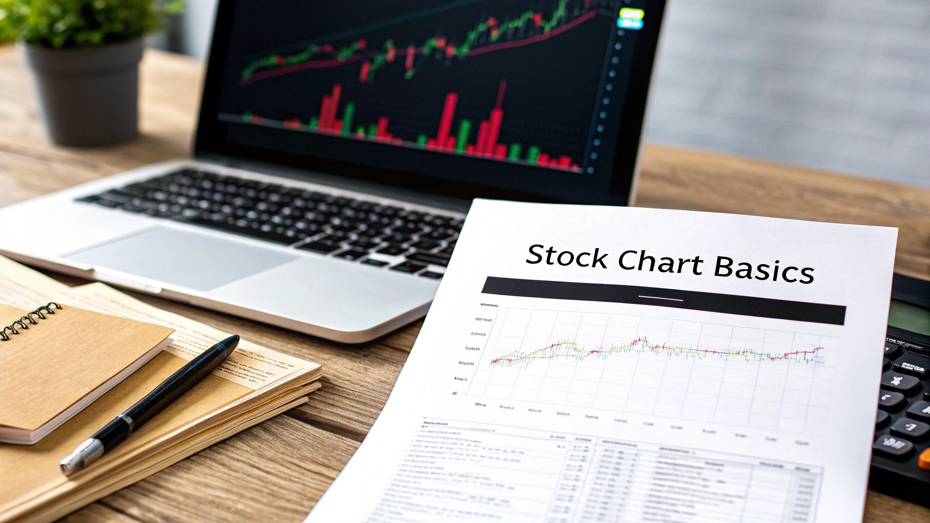
Learning how to read stock charts is a lot less intimidating than it looks, and this guide (complete with a downloadable PDF) is designed to get you on the right path, fast. It all boils down to understanding three core elements: the price axis, the time axis, and the candlestick patterns that reveal the ongoing battle between buyers and sellers.
Once you get these fundamentals down, you'll have the foundation you need to start making informed trading decisions.
Your Starting Point: Decoding Stock Charts Without Confusion
Jumping into stock trading can feel like trying to learn a completely new language. You're hit with charts full of jagged lines, colorful bars, and indicators that might as well be hieroglyphics.
But here’s a secret I learned early on: you don't need to master every complex tool to get good at this. In fact, many of the most successful traders I know rely on the purest data available—the price itself. Our guide is built around this very idea, breaking things down into simple, digestible pieces. It’s a structure that mirrors the core concepts of designing effective learning experiences.
This approach is called price action trading, and it's all about cutting through the noise. It forces you to focus on what the market is actually doing, right now. Before you can ever hope to interpret complex patterns, you first have to understand the canvas they're painted on.
The Three Pillars of a Stock Chart
Every single stock chart you'll ever look at is built on three fundamental pillars. Think of them as the basic grammar of the market's language. Internalize these, and everything else starts to click into place.
To make this crystal clear, I've put together a quick-reference table.
Essential Stock Chart Components at a Glance
| Chart Component | What It Represents | Why It's Important for Beginners |
|---|---|---|
| Price Axis (Y-Axis) | The vertical axis on the right, showing the stock's price level. | This is your most direct feedback. Is the price going up or down? It's the "what" of market movement. |
| Time Axis (X-Axis) | The horizontal axis at the bottom, showing the passage of time. | This provides context. Price action over one minute tells a very different story than over one year. |
| Volume Bars | Vertical bars at the bottom representing the number of shares traded. | This shows conviction. A big price move on high volume is significant; the same move on low volume is not. |
Memorize these three components. Price, time, and volume are the non-negotiable first step because they give you the complete context for every move the market makes.
Why Candlestick Charts Are the Best for Beginners
You'll come across different chart types, like line or bar charts, but for price action traders, the candlestick chart is the undisputed gold standard. These charts, first used by Japanese rice traders back in the 18th century, pack an incredible amount of information into a simple, visual format.
Each individual "candle" tells you four crucial pieces of data for any given timeframe:
- The opening price
- The closing price
- The highest price reached
- The lowest price reached
Imagine you were a brand-new trader looking at your first S&P 500 chart back in 2008, just as the financial crisis was unfolding. That year, the index crashed by a massive 45.9%. Being able to read the story the candlesticks were telling—the fear, the selling pressure, the failed rallies—could have been a game-changer. They offer clear, visual clues about market sentiment that a simple line chart just can't match.
Choosing Your Timeframe
The last piece of the foundational puzzle is picking the right timeframe. This decision is all about aligning the chart with your personal trading style and goals. There's no single "best" timeframe—only the one that's right for you.
- Long-Term Investors: These folks live on the weekly or monthly charts. They're looking for major, multi-year trends.
- Swing Traders: My preferred style. We typically hang out on the daily and 4-hour charts, aiming to catch moves that last a few days to a few weeks.
- Day Traders: They operate on the front lines, using intraday charts like the 1-minute, 5-minute, or 15-minute to jump in and out of trades within hours or even minutes.
My advice for beginners? Start with the daily chart. It gives you a great feel for a stock's overall personality without the chaotic, high-speed noise of the shorter timeframes. It's a critical first step, and you can learn more about how to read market charts with this price-first focus right here: https://www.colibritrader.com/how-to-read-market-charts/
By nailing these basics, you're building a solid framework for all the more advanced concepts we'll cover next.
Mastering Candlesticks: The Language of Price Action
If you think of stock charts as the canvas, then candlesticks are the brushstrokes painting the market's story. Every single candle is a visual snapshot of the psychological tug-of-war between buyers (bulls) and sellers (bears) over a specific time period.
My advice? Forget about memorizing dozens of complex patterns. Your real goal is to learn the language of price action itself.
Understanding this language is a core skill when you're figuring out how to read stock charts for beginners. Our downloadable PDF is designed to be a handy reference you can keep by your side. Once you can interpret what individual candles and small groups of them are telling you, you'll start to see the market with incredible clarity. This isn't about some crystal ball—it's about understanding the probabilities and seeing where the momentum is right now.
Decoding the Anatomy of a Candle
No matter the shape or color, every candlestick is made of the same two parts. Nailing these down is your first step to fluency.
- The Body: This is the thick, rectangular part. It shows you the distance between the opening and closing price for that period. A long body screams strong conviction, while a short body whispers indecision or a lack of momentum.
- The Wicks (or Shadows): These are the thin lines poking out from the top and bottom of the body. They show the highest and lowest prices hit during the period. Long wicks tell a story of volatility and price rejection.
The color of the body is just as important. Typically, a green candle means the price closed higher than it opened (bullish), while a red candle means it closed lower (bearish). A string of long, green candles paints a pretty clear picture of intense buying pressure.
Key Single-Candle Patterns to Know
You don't need to become a walking encyclopedia of candle patterns. Instead, focus on a few powerful formations that signal important shifts in market sentiment.
A classic example is the Doji. This candle has a tiny, almost non-existent body, which means the open and close prices were nearly the same. It looks like a plus sign or a cross and screams pure indecision—neither the bulls nor the bears could take control. When a Doji shows up after a strong trend, it can be an early warning sign that momentum is sputtering out.
Another vital pattern is the Hammer. It has a short body at the top and a long lower wick, at least twice the length of the body. This candle tells a story: sellers hammered the price way down, but buyers stormed back in and drove the price all the way back up to close near where it started. It often signals a potential bullish reversal at the bottom of a downtrend.
Pro Tip: The power of any candlestick pattern is magnified by its location. A Hammer appearing at a known support level is a much more reliable signal than one showing up in the middle of a random price range. Context is everything.
Powerful Two-Candle Reversal Patterns
While single candles give you clues, patterns using two or more candles often provide stronger confirmation that the trend might be changing. Two of the most reliable reversal patterns are the engulfing bars.
- Bullish Engulfing: This pattern forms after a downtrend. It’s made of a small red candle followed by a large green candle whose body completely "engulfs" the body of the previous red one. It shows that buyers stepped in with overwhelming force, completely wiping out the prior period's selling pressure.
- Bearish Engulfing: This is the exact opposite. After an uptrend, a small green candle is followed by a large red candle that swallows the prior green candle's body. This is a strong signal that sellers have seized control and a move down could be next.
Learning to spot these formations is a non-negotiable skill. For a deeper dive, you can learn more about how to read candlestick charts and see more examples of these patterns in action.
By focusing on the story each candle tells—indecision, rejection, or dominance—you'll move from just seeing shapes to actually understanding the market's psychology. This is the foundation for making smarter, price-action-based trading decisions.
Drawing Your Lines: Support, Resistance, and Trends
Once you've got a feel for what individual candlesticks are telling you, it's time to zoom out and map the entire battlefield. This is where you shift from just reading the chart to actively strategizing with it. Forget about plastering your screen with a dozen confusing indicators. The real power comes from two fundamental concepts: horizontal support and resistance and diagonal trendlines.
These simple lines are your roadmap. They show you where the market has pivoted before and, crucially, where it’s likely to react again.
Pinpointing Support and Resistance Zones
Think of support and resistance levels as psychological floors and ceilings for price. I say "zones" because it's rarely a single, precise line. It's an area where a major tug-of-war between buyers and sellers previously took place.
- Support: This is a price zone where buying pressure was strong enough to halt a downtrend and turn things around. It's a floor. When the price drops back into this area, traders expect buyers might show up again.
- Resistance: This is the opposite—a price ceiling where sellers overwhelmed the buyers, stopping an uptrend cold. As the price climbs back to this zone, we watch for sellers to re-emerge.
The more times a price tests a zone and fails to break through, the stronger that level becomes. A level that has held firm on three separate occasions is far more significant than one that's only been touched once.
To find these zones, just scan your chart for obvious turning points—the significant peaks and troughs where the price reversed course. Draw a horizontal line or a narrow box connecting these points. That's your zone.
This simple act gives you a massive strategic advantage. Instead of taking random trades in the middle of nowhere, you can now patiently wait for the price to come to you—to a key level you've already identified.
The Art of Drawing a Trendline
While support and resistance mark the horizontal battlegrounds, trendlines show you the market's overall direction. They bring a sense of order to what can look like chaotic price swings. For any price action trader, this is a core skill.
The method is refreshingly simple:
- For an Uptrend: Find at least two major swing lows (the bottoms of the pullbacks) and connect them with a rising diagonal line. Extend it out to the right.
- For a Downtrend: Find at least two major swing highs (the peaks of the relief rallies) and connect them with a falling diagonal line.
This line now acts as dynamic support or resistance. In an uptrend, for instance, you can anticipate that buyers might step in to defend this trendline on future pullbacks. A clean break below it is a big red flag that the trend is losing steam. If you want to dive deeper into the specifics, our guide on how to draw a trendline correctly has you covered.
Think about the massive bull run in the Nasdaq during 2020-2021. A simple trendline connecting the lows from March 2020 would have perfectly framed the incredible 114% surge to its peak. Historically, data shows that major uptrends that respect key support and trendlines can produce incredible gains.
By mastering just these two types of lines, you create a powerful framework for your analysis. Your chart is no longer a confusing mess; it's a strategic map with clearly defined zones of interest. This is a vital part of learning how to read stock charts for beginners, and we cover it extensively in our downloadable PDF.
Using Volume to Confirm Your Trading Decisions
If price action shows you what the market is doing, volume tells you why. Think of it as the fuel in the tank. A stock making a big move is interesting, but the volume bars at the bottom of your chart reveal the conviction—the real money and emotion—powering that move.
Ignoring volume is like trying to watch a movie on mute. You see lips moving, but you miss all the context and emotion. For traders figuring out how to read stock charts for beginners, learning to read volume is the skill that separates pure guesswork from educated analysis. It’s your chart’s built-in lie detector.
What Are Those Bars at the Bottom?
Those vertical bars you see beneath your price chart represent volume. Each bar shows the total number of shares that changed hands during that candle's timeframe, whether it's a minute, an hour, or a day. They're usually colored green or red to match the corresponding price candle.
Here's the simple way I think about them:
- Big Bars (High Volume): This signals intense interest. A lot of shares are being bought and sold, which tells you the current price move has serious participation, very likely from institutional players. This is a move to pay attention to.
- Small Bars (Low Volume): This is a red flag for me. It shows a lack of interest or conviction. Any price move that happens on low volume is immediately suspect and has a high chance of fizzling out or reversing.
- The Average Line: Most charting platforms, like TradingView, let you overlay a moving average on the volume bars. This is incredibly useful because it gives you an instant visual baseline. You can immediately see if the current volume is unusually high or just noise.
When a stock breaks out above a key resistance level, it's easy to get excited. But if it happens on weak, below-average volume? I get skeptical. That's a classic setup for a "false breakout"—a trap designed to lure in eager buyers right before the price collapses back down.
On the flip side, a breakout that occurs on a massive volume spike tells a completely different story. It screams that the big players are on board and committed to pushing the price higher.
How Volume Acts as Your Final Confirmation
Volume is the final piece of the puzzle that confirms the patterns you're learning to spot. It adds that crucial layer of evidence that turns a "maybe" setup into a high-probability trade.
Take a classic Head and Shoulders top, a pattern that often signals a reversal from bullish to bearish. The textbook chart of Apple (AAPL) on July 8, 2010, shows this perfectly. The stock formed the pattern, hinting at what would become a 20% correction. But the real confirmation was the volume.
While daily volume was averaging around 50 million shares, it spiked by 80% when the price broke down from the left shoulder. This isn't a coincidence. It's why historical data from major markets like the NYSE from 2000-2022 shows that high-volume breakouts succeed 65% more often than low-volume fakes. Mastering this simple check can help you dodge the traps that wipe out so many new traders. You can find more insights on interpreting stock data over at NerdWallet.
Interpreting Volume Signals
To make things easier, I've put together a quick guide for connecting volume with what you're seeing on the price chart. This is the kind of mental checklist I run through constantly.
| Volume Scenario | Price Action | What It Likely Means |
|---|---|---|
| Rising Volume | Price rising in an uptrend | A healthy, strong trend. The bulls are in control. |
| Rising Volume | Price falling in a downtrend | A strong, bearish trend. Sellers are aggressive and confident. |
| Falling Volume | Price rising in an uptrend | The trend is losing steam. Buyers might be getting tired. |
| Volume Spike | Price breaks a key level | Strong confirmation. This breakout is likely the real deal. |
Think of this table as your cheat sheet. When you see one of these scenarios playing out, it gives you a much clearer picture of what the market is trying to tell you.
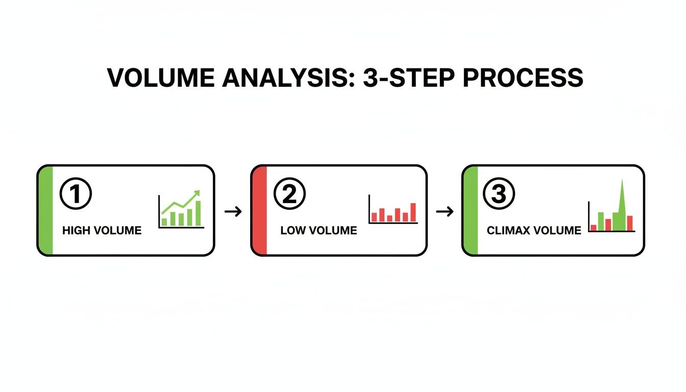
Spotting "The End" with Climax Volume
One of the most powerful signals you'll ever see is something called climax volume. This is a gigantic, towering volume spike that shows up near the end of a long, established trend. It often looks like the grand finale of a fireworks show.
Climax Volume Explained: Picture a stock that's been rocketing up for weeks. One morning, it gaps up on the single largest volume bar you've seen in months. New traders might see this as the ultimate "buy" signal. But experienced traders see a huge warning sign. This is often an exhaustion move—the moment when all the late, emotional buyers have finally piled in, leaving no one left to keep pushing the price higher.
This is a classic topping signal. The same logic applies in a downtrend. A "capitulation climax," where the price crashes on enormous volume, can often mark the exact bottom as the last of the panicked sellers finally give up and throw in the towel.
Learning to spot these dramatic volume spikes can help you do two things very well: get into a new trend right as it’s being born and get out of an old one just before it dies.
Putting It All Together: A Practical Trading Walkthrough
Understanding the theory is one thing; seeing it applied on a live chart is when the concepts really click. In this section, you’ll follow a fully annotated trade on an actual historical chart. It’s not about finding the “perfect” setup—it’s about adopting a reliable routine you can use on any instrument.
Setting The Scene: The Higher Timeframe View
I always begin with a top-down look on the daily timeframe to set the context. Is the market bullish, bearish, or simply range-bound? That big-picture bias shapes every decision down the road.
In our example, the stock has carved out a clear uptrend over several months. You can spot higher highs and higher lows, with a trendline hugging the swing lows. This tells you to lean into long setups rather than fight the prevailing momentum.
Trader’s Insight: A bullish reversal on a 5-minute chart rarely pays off if the daily chart is plunging. Align your trades with the dominant trend for the best odds.
Once the daily bias is locked in, I switch to a 4-hour chart. Here, my mission is to watch for a pullback into a zone that offers both value and a confluence of technical factors.
Pinpointing A High-Probability Entry Zone
On the 4-hour chart, price has retraced into a previous swing high that now acts as support. I draw a horizontal line at that level and notice it converges with the daily trendline. When a static support line and a dynamic trendline meet, you get a powerful confluence zone.
Patience is the name of the game. We’ve marked our zone—now we simply wait for price to revisit it and deliver a clear signal that buyers are stepping in.
This visual guide shows how to distinguish between high volume confirming a trend, low volume signaling weakness, and climax volume indicating a potential reversal.
The Entry Signal And Volume Confirmation
As price dips into our confluence zone, it prints a Bullish Engulfing candle—where a large green candle swallows the prior red one. That’s our first green light: buyers have overpowered sellers right at support.
Now for the final check: volume. A look at the bars below shows this engulfing candle on a significant spike above the recent average. That tells you big players are committing capital.
Here’s our concise entry checklist:
- Overall Trend: Uptrend confirmed on the daily chart
- Key Level: Retracement into confluence zone (horizontal support + trendline)
- Candlestick Signal: Bullish Engulfing at support
- Volume Confirmation: Engulfing candle printed on elevated volume
This step-by-step routine takes emotion out of trading and replaces it with a clear, repeatable framework.
A Few Common Questions I Get Asked All The Time
Even when you feel like you've got a handle on the basics, jumping into live charts always brings up new questions. It's just part of the process, and it happens to everyone.
This section is for those moments. I'm going to tackle some of the most common hurdles I see beginners struggle with. Think of these as the questions I wish I had clear answers to when I was starting out.
How Many Indicators Should I Use On My Chart?
This is easily the most popular question, and my answer surprises a lot of people: as few as possible.
For a trader who wants to master price action, the real answer is often zero. The entire philosophy behind reading a chart is to see what the price is actually doing, without the noise and conflicting signals that most indicators throw on your screen.
So many new traders fall into the trap of "analysis paralysis." They load up their charts with RSI, MACD, Stochastics, and Bollinger Bands until it's an unreadable mess. Instead of making things clearer, they just create confusion.
Your best "indicators" are the ones we've already focused on: support and resistance levels, trendlines, candlestick patterns, and volume. These are direct reflections of market psychology, not some second-hand calculation of it. Start clean, and only add something if you can prove beyond a doubt that it improves your trading.
What’s The Best Timeframe To Trade?
There's no magic answer here. The "best" timeframe is the one that fits your personality, your schedule, and your trading goals. Don't let anyone tell you otherwise.
Here’s a quick way to think about it:
- The Patient Investor: If you're looking for major, long-term trends and are happy holding a position for months or even years, the weekly and monthly charts are where you'll want to be.
- The Swing Trader: This is my personal sweet spot. Using the daily and 4-hour charts, the goal is to catch moves that play out over a few days to several weeks. It's a great balance, giving you enough action without requiring you to be glued to the screen.
- The Active Day Trader: If you thrive on fast-paced action, you'll live on the 1-minute, 5-minute, and 15-minute charts. This demands intense focus and the ability to make split-second decisions for trades that last just minutes or hours.
My honest advice for anyone just learning how to read stock charts for beginners is to start with the daily chart. It does a fantastic job of filtering out the distracting market "noise" and gives you a clear, powerful view of the dominant trend. That's always the most important piece of the puzzle.
Do These Price Action Concepts Work In All Markets?
Absolutely. One hundred percent.
The principles of price action—support, resistance, trends, volume—are universal because they're based on human psychology. It all comes down to the timeless battle between supply (sellers) and demand (buyers), and that dynamic is the same in every single freely traded market.
It doesn't matter if you're looking at a chart for:
- Stocks (like Apple or Tesla)
- Forex (like EUR/USD)
- Cryptocurrencies (like Bitcoin)
- Commodities (like Gold or Oil)
The patterns and behaviors are identical. A Bullish Engulfing pattern at a key support level on a Bitcoin chart tells the exact same story as one on a stock chart. This is what makes price action such an incredibly powerful and versatile skill. Once you learn to read one chart, you can read them all.
Here at Colibri Trader, my entire focus is on transforming you into a confident, profitable trader using these timeless price action principles. My programs are built to give you a complete, step-by-step system without all the confusing indicators. If you're ready to truly master the charts and find consistency, explore my proven trading courses today.