


How to Read Stock Charts for Beginners: A Simple Guide
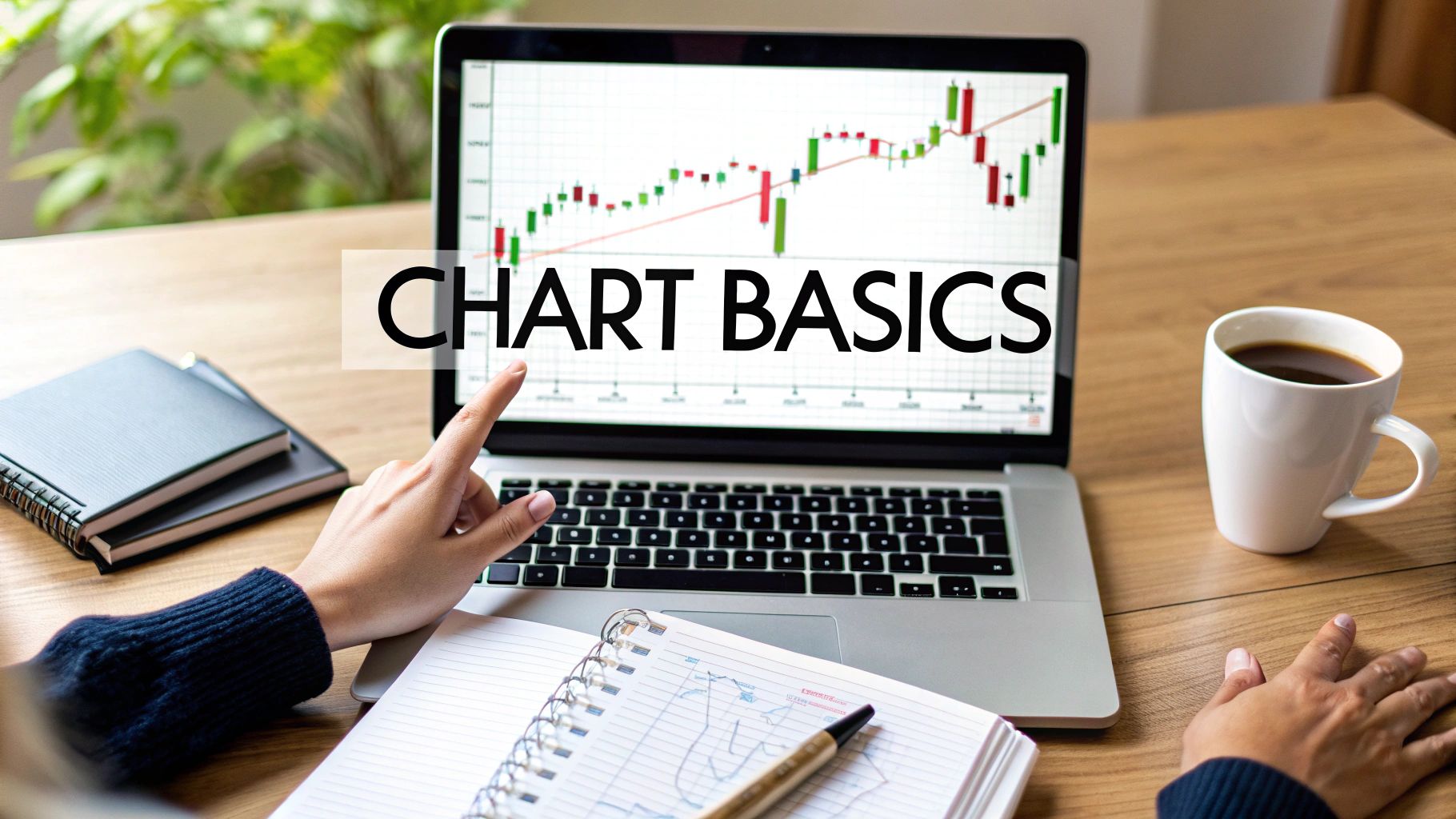
Finding Your Way Around Your First Stock Chart
Remember that feeling of staring at a stock chart for the first time and thinking, "What in the world am I looking at?" We've all been there. The trick is to not overcomplicate things. Start with the basics.
Think of a stock chart as a roadmap of a stock's price over time. Time moves from left to right along the x-axis, just like reading a sentence. The price is on the y-axis, showing the highs and lows the stock hit during that time. Those lines or bars you see? That's the price action, and we'll get to that in a minute.
Let's take Apple (AAPL) as an example. It's a good one for learning because it's traded frequently and the price moves are pretty easy to see. Here’s a snapshot from Yahoo Finance:

This gives you a quick look at Apple’s trading data at a specific moment, like the price, the high and low for the day, and the trading volume. You can immediately see where the price is at, the day's range, and key stats like the PE ratio. In this particular snapshot, Apple’s price was dipping a little.
Now, here's where it gets interesting. Most charting platforms let you change the timeframe. A daily chart shows you each day's activity. But switch to a weekly chart, and you get a broader view of how the stock has performed over weeks. Changing your perspective like this can really shift how you see trends.
I personally use TradingView, and setting up a chart there is simple. Enter the ticker symbol (AAPL for Apple) and choose your timeframe. Play around with different timeframes to see how your view changes. Don’t worry about all the extra features just yet – we’ll cover those later. For now, focus on getting comfortable with navigating time and price. These are the fundamental building blocks of reading stock charts. Once you've got that down, you'll stop seeing charts as these confusing puzzles and start seeing them as useful tools for understanding the market.
Choosing the Right Chart Type for Your Analysis
I remember when I first started trading, I was so overwhelmed by all the different chart types. I'd spend hours staring at basic line charts, completely baffled why I couldn't seem to grasp what the market was doing. Truth is, I was using the wrong tools. What I learned is that the chart you use drastically affects how you interpret the market. Picking the right chart can give you a real leg up.
Let's break down the main chart types: line, bar, and candlestick. Line charts are good for a quick overview of general trends and are perfect when you're starting out. They simply connect closing prices over time, giving you a smooth, easy-to-read visualization of price action. But, they miss some of the finer details you need for deeper price action analysis.
That's where bar charts come in handy. These became my go-to for a while because they provide a lot more detail. They show the open, high, low, and close (OHLC) for each period. This gives you a much better picture of the price range and how the market behaved during that timeframe.
This screenshot from TradingView is a great example of how clearly OHLC data is presented using candlestick charts. The colors and shapes make it easy to see at a glance the price movement and overall market sentiment. Remember how we talked about customizing timeframes? You can do that here too, to get different perspectives on market trends. Platforms like TradingView are invaluable for quickly comparing different chart types and timeframes.
Candlestick Charts: The Gold Standard
Now, let's talk about candlestick charts. These are the industry standard, used by everyone from beginners just learning how to read stock charts to seasoned professionals. They provide the most visual information, using colors to indicate whether a stock closed higher or lower than its opening price. There's a whole language to candlesticks, allowing you to see patterns and clues about market psychology that other charts just can't convey. Schwab has some great resources on understanding charts if you want to dive deeper.
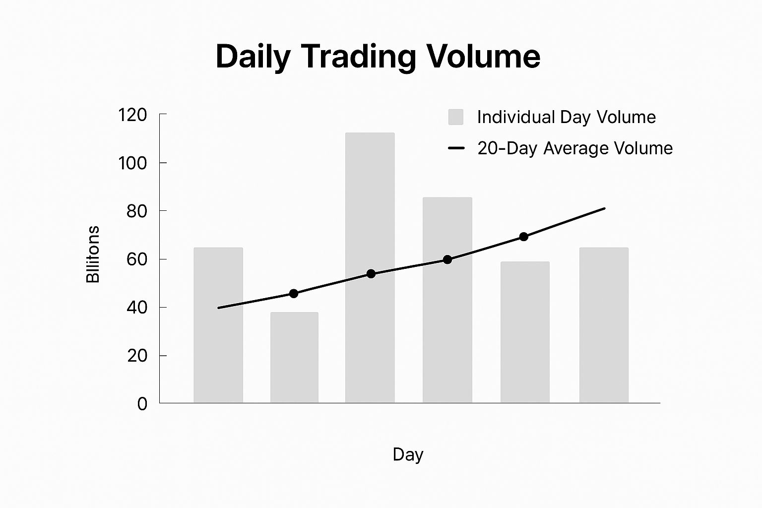
This infographic shows daily trading volume over five days, with a line representing the 20-day average. See how two of the days spike well above the average volume? That tells us there was a lot more trading activity on those days, possibly indicating some important market events. This is why it's so important to look at volume along with price action. The story a stock tells can change dramatically depending on which chart you're looking at.
I want to show you how to choose the chart that gives you the clearest view of what's really going on in the market. A little further down, I've included a table comparing the different chart types to help you decide which one is best for your needs.
To help illustrate the differences between the various chart types and their uses, I've put together a handy comparison table. It highlights the key features, best use cases, and complexity levels of each.
To help illustrate the differences between the various chart types and their uses, I've put together a handy comparison table. It highlights the key features, best use cases, and complexity levels of each.
Chart Types Comparison for Beginners
A side-by-side comparison of line, bar, and candlestick charts showing their features, best use cases, and complexity levels
| Chart Type | Information Displayed | Best For | Complexity Level | Visual Appeal |
|---|---|---|---|---|
| Line Chart | Closing prices over time | Identifying overall trends, beginner-friendly overview | Simple | Basic |
| Bar Chart | Open, high, low, and close (OHLC) prices | Detailed price analysis, understanding price ranges | Intermediate | Moderate |
| Candlestick Chart | OHLC prices, visual representation of price movement (bullish/bearish) | Advanced price action analysis, identifying patterns and market sentiment | Advanced | High |
As you can see, line charts are a great starting point, but candlestick charts offer the most comprehensive insights. Bar charts fall somewhere in between, offering more detail than line charts but not the visual storytelling of candlesticks. Choosing the right chart depends on your experience and the depth of analysis you're aiming for.
Understanding What Candlesticks Are Really Telling You
When I first started exploring stock charts, all the jargon – "doji," "hammer," "shooting star" – felt like a foreign language. It sounded more like astrology than finance! But I soon learned these terms aren't about predicting the future; they're a visual representation of trader psychology, a snapshot of the ongoing battle between buyers (bulls) and sellers (bears). Each candlestick encapsulates this struggle within a specific timeframe.
Let's dissect a candlestick. The body is the difference between the opening and closing prices. A green (or white) body? The stock closed higher than it opened – bulls won that round. A red (or black) body? The opposite – bears took charge.
The wicks, sometimes called shadows, stick out above and below the body, marking the highest and lowest prices during that period. These show the extremes of the price action. A long upper wick suggests buyers initially pushed the price higher, only for sellers to wrestle back control and drive it down before the close.
This screenshot shows different candlestick types. Look closely at the difference between a long upper wick on a red candlestick versus a long lower wick on a green one. The red candlestick's long upper wick hints at selling pressure, while the green one's long lower wick indicates strong buying interest. For a deeper dive into candlestick patterns, especially in Forex, check out Colibri Trader. It's a great resource.
Single Candle Patterns: Quick Insights
Some single candlestick patterns can give you clues about potential reversals or continuations in price. A doji, for instance, has a tiny body, suggesting market indecision. A hammer, with its long lower wick and small body at the top, might signal a potential upswing after a downtrend. Remember, these are just clues, not guarantees.
Context is King
Here's a crucial lesson I learned firsthand: context matters more than the patterns themselves. A doji appearing after a long downtrend is much more significant than one in a choppy sideways market. This article on candlestick patterns in Forex also highlights this point. Understanding the bigger picture – trends, support and resistance levels, volume – is essential. This is where the real power of chart reading lies. It's about piecing together the story the market is telling, not just focusing on isolated patterns. One classic rookie mistake is relying solely on candlestick patterns without considering broader market conditions. This can lead to misinterpretations and, potentially, costly trading decisions.
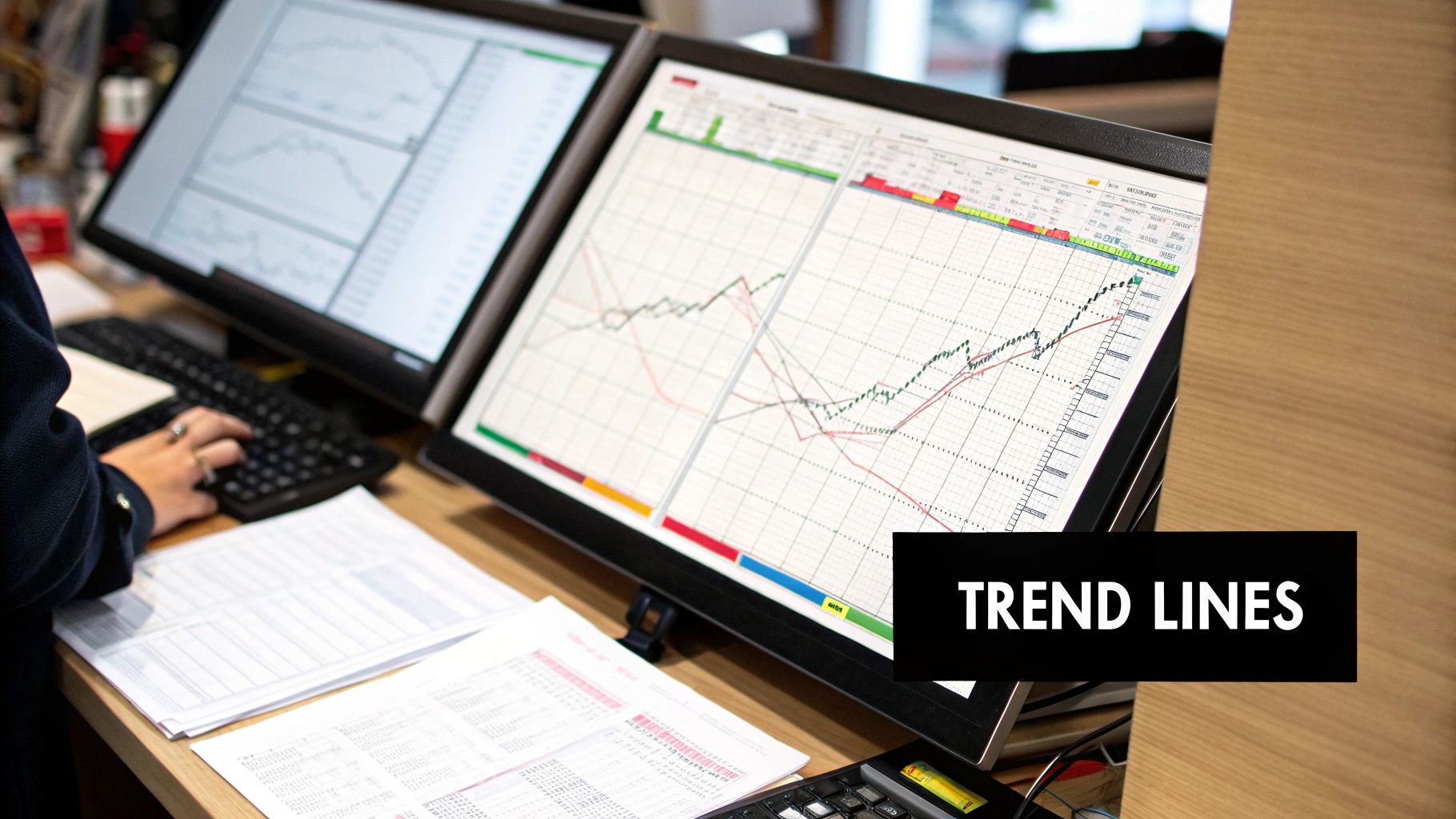
Recognizing Trends That Actually Lead Somewhere
Everyone loves the saying "the trend is your friend." But honestly, how many times have you heard that and still felt lost staring at a chart? Trust me, I've been there. After years of looking at charts, I've learned that spotting a real trend is about more than just seeing the market bounce around. It's about understanding what separates genuine momentum from temporary noise. It's especially important when you're starting out and learning how to read stock charts for beginners.
Identifying Real Trends: Higher Highs and Lower Lows
Forget the daily drama of ups and downs. Instead, focus on the bigger picture. Look for higher highs and higher lows – that's the hallmark of a true uptrend. Conversely, lower highs and lower lows signal a downtrend.
Think of it like climbing a mountain. You might stumble or take a few steps back, but you're generally ascending. That’s an uptrend in action.
For example, let's look at an Apple chart:
See how Apple's price, despite the occasional dips, keeps making higher highs and higher lows? That’s a clear uptrend. The same principle applies to spotting downtrends. Want to get even better at this? Check out our guide on how to draw trendlines. It's a game-changer.
Timeframes: Zooming Out for Confirmation
Ever get a second opinion before making a big decision? That's what using multiple timeframes is like in trading. A trend might look convincing on a daily chart, but zooming out to the weekly or monthly view can tell a different story. If a trend holds strong across various timeframes, it's more likely to continue. This is especially helpful for beginners learning how to read stock charts. Understanding broader trends provides context for daily fluctuations. For example, a five-year view of Apple's stock reveals steady long-term growth despite short-term dips. Over those five years, Apple’s stock has shown impressive resilience. Periods of strong growth are often followed by small corrections, which is typical. This consistent upward movement suggests strong underlying demand – a good sign for long-term investors. Analyzing these long-term trends helps beginners grasp the overall direction of a stock – up, down, or sideways – and flags any major spikes or drops that might signal significant market events. Want to dive deeper into Apple's stock movements? Check out this insightful video.
Strong vs. Weak Trends: Spotting the Difference
Remember, not all trends are created equal. Strong trends have sharp, decisive price movements and consistent higher highs/higher lows (or the opposite in a downtrend). Weak trends are wishy-washy – shallow price moves, lots of indecision, and no clear direction. Knowing how to spot the difference is crucial. It helps you decide when to jump in and when to stay on the sidelines. Personally, I look at the angle of the trendline, the volume accompanying price moves (more on that another time!), and the overall market conditions. With practice, you’ll develop a feel for which trends are worth following and which ones are likely to fizzle out.
Identifying Support and Resistance Levels That Actually Work
Let's be honest, after years of trading, I've learned a tough lesson: support and resistance levels aren’t all the same. I've seen countless traders draw lines on charts, hoping for a miracle. But truly powerful support and resistance levels are built on real trading activity and market psychology.
So, how do we find these crucial levels? We'll explore how to identify them using previous highs and lows, areas where volume is concentrated, and psychological price points that traders actually watch. We'll uncover why some levels hold strong while others crumble.
Drawing Support and Resistance: More Than Just Lines
My approach goes beyond simply connecting the dots. It's about understanding the story the price action is telling. Here’s my process:
- Previous Highs and Lows: These often mark turning points, like historical battlegrounds between buyers and sellers.
- Round Numbers: Traders tend to gravitate toward whole numbers, like $50 or $100. These psychological levels can become self-fulfilling.
- Volume: High volume at specific price levels reinforces their importance, showing us where traders are focused.
This TradingView screenshot displays support and resistance on a stock chart. See how the price bounces off support several times before breaking through? This shows how these levels can act as barriers, but also how breaks can signal big shifts.
Using Support and Resistance for Profit and Protection
Once you've identified key levels, use them to set profit targets and stop losses. Support levels can be excellent entry points, placing a stop loss just below. Resistance levels offer exit points, setting profit targets just above.
Want a more in-depth strategy using support and resistance? Check out Colibri Trader's guide on support and resistance trading strategies. It’s packed with useful tips on applying these concepts effectively.
The Flip Side: When Support Becomes Resistance (and Vice Versa)
One of the most interesting aspects of support and resistance is their ability to swap roles. A broken support level can transform into a new resistance level, and vice versa. Understanding this dynamic can seriously improve your entry and exit timing.
For example, a stock breaking through resistance with strong volume hints at a potential change in market sentiment. That old resistance might become new support. This is a core concept in price action trading and is especially helpful for beginners learning to read stock charts. Recognizing these shifts helps you anticipate future price movements. This realization was a game-changer for me. It's like seeing the market flip a switch, and being prepared can be incredibly profitable.
Let's talk about how reliable different support and resistance levels are. I've put together a table summarizing some of my observations over the years. It should give you a better feel for which levels tend to hold and which ones are more susceptible to breaking.
| Level Type | Reliability Rate | Best Timeframe | Common Failure Points | Confirmation Signals |
|---|---|---|---|---|
| Previous Highs/Lows (Daily) | High | Daily | High volume breakouts, Extended periods of consolidation | Strong volume on breakout, Retest of broken level as support |
| Psychological Levels | Medium | All | News events, Overall market sentiment shifts | Confluence with other indicators, High volume |
| Trendlines | Medium | 4H+ | Shallow angles, Multiple touches without a strong bounce | Strong price rejection at the trendline, Confluence with S/R |
| Moving Averages (200-day MA) | High | Daily | Strong momentum against the trend | Golden/Death cross with other MAs, High volume on break |
| Fibonacci Levels | Medium | All | Confluence with other levels is crucial | Multiple Fibonacci levels converging, Price action patterns |
This table, "Support and Resistance Level Reliability," isn't exhaustive, but it offers a starting point. Remember, no level is foolproof. Context is key. The more confirmation signals you have, the stronger the level is likely to be. Pay attention to these factors, and your trading will improve dramatically.
Using Volume to Confirm What Price Is Really Saying
Volume is often overlooked, yet it's essential for understanding stock charts. It's like the engine behind price movements. Without sufficient volume, even promising chart patterns can fail. Think of it as the market's way of showing its true intentions.
Take a look at this Yahoo Finance chart of Tesla. See those volume bars at the bottom? Notice how the volume spikes during significant price swings? That's volume confirming the strength of the move. Conversely, low volume during sideways periods indicates less conviction, suggesting the price might not be headed anywhere decisively.
Those taller red and green volume bars highlight periods of increased trading activity. This often coincides with major news or earnings announcements, or during times of heightened market volatility. Basically, it means more shares are changing hands. Learning how to interpret volume, especially in the context of broader market trends and other indicators, is crucial for understanding how to read stock charts effectively. Technical analysis, which involves examining historical price and volume data, plays a significant role in anticipating future price movements. For those new to charts, focusing on volume can be particularly helpful. Want to learn more? Dive deeper into the world of technical analysis and volume.
High Volume vs. Low Volume: What's the Difference?
A price surge with high volume is a strong signal. It indicates real buying pressure and conviction. Lots of traders are piling in, pushing the price higher. On the flip side, a price move on low volume is much less reliable.
It could be a false breakout, a trap that snares many newer traders. I've seen it happen firsthand. A stock breaks through a resistance level, but the volume is anemic. Those who jump in quickly often get caught when the price reverses. I once avoided such a trap by simply waiting. The breakout happened, but the volume was unconvincing. The price quickly retreated, proving my caution was justified.
Spotting Warning Signs With Volume
Sometimes, volume tells a different story than the price. This divergence is a valuable warning. Imagine a stock making higher highs, but on declining volume. That suggests weakening momentum. It's a sign that the uptrend could be losing steam and might even reverse.
This is where volume truly shines as a confirmation tool. It helps validate or invalidate what other indicators are telling you. It’s like learning to read the market's body language. Smart traders watch volume closely because that’s where the "smart money" often reveals its actions. Understanding these patterns is an essential skill for anyone learning to read stock charts. Even understanding more complex indicators like volume weighted average price (VWAP) can further enhance your analysis. VWAP can help identify when large institutional investors are buying or selling — a valuable insight into longer-term trends.
Developing Your Personal Chart Reading System
So, you've got the basics of stock charts down. Great! Now, let's talk about actually using them. We're going to build a system – your personal system – that takes you from bewildered to confident when faced with a chart. Think of it as going from staring at a bunch of lines hoping for a miracle to actually dissecting price action like a pro. I'm going to walk you through the checklist I've honed over the years. It's nothing fancy, but it works.
This TradingView screenshot shows a chart packed with indicators. See how the price bounces off that support level created by the moving average? That's the power of combining tools. We'll get there.
Start Big, Then Drill Down
I always start with the 10,000-foot view. What's the overall trend? Uptrend? Downtrend? Sideways chop? I'll flip through different timeframes – daily, weekly, monthly – just to be sure. Then, I pinpoint the key support and resistance levels. These are your potential turning points. Think of them as the walls the price bounces between. This big-picture approach keeps you from getting lost in the day-to-day market noise.
Prioritizing Conflicting Signals
Let's be real: indicators will sometimes disagree. You might see a candlestick that screams "reversal!" while the overall trend calmly says, "Nope, we're continuing." So, which one do you trust? I prioritize the stronger signal based on context. For example, a reversal signal during a powerful, established trend is less reliable than one appearing after a period of consolidation. Trust me, this intuition comes with experience. You'll start to see which signals carry more weight.
Avoid Analysis Paralysis
One of the biggest traps for new traders is analysis paralysis. It's easy to overthink every little wiggle on the chart. So many indicators, so many signals… It’s information overload. My advice? Build a simple routine, focusing on the most important information first. Don't get lost in the minutiae.
Common Beginner Mistakes
I’ve seen these mistakes countless times:
- Ignoring the Obvious: Sometimes the clearest signals are right in front of you. Don’t overcomplicate it.
- Over-Reliance on Single Indicators: No single indicator is perfect. Look for confirmation from other sources.
- Not Adapting: Markets shift constantly. Your approach has to evolve with them.
Making Decisions and Managing Risk
Chart analysis isn't just about finding pretty patterns. It’s about making smart decisions. Use your analysis to define profit targets and, crucially, stop losses. Risk management is your best friend. Know how much you're willing to lose on any given trade, and stick to it.
Continuous Improvement
Learning to read charts is a journey, not a destination. Practice consistently, and analyze both your wins and your losses. Your mistakes are your greatest teachers. A trading journal is invaluable here. Document every trade, your reasoning, and the outcome. It’s like having a personal feedback loop, showing you exactly where you can improve. This cycle of analyze, learn, and adapt is how you become a truly skilled trader. It’s a marathon, not a sprint.
Ready to step up your trading game? Colibri Trader offers programs for everyone, from beginners to experienced traders. Whether you're starting with the basics or diving into Supply & Demand and Day Trading, there's a program for you. Check out Colibri Trader and learn how to profit consistently, no matter what the market throws your way.