


How to Read Candlestick Charts A Trader’s Guide
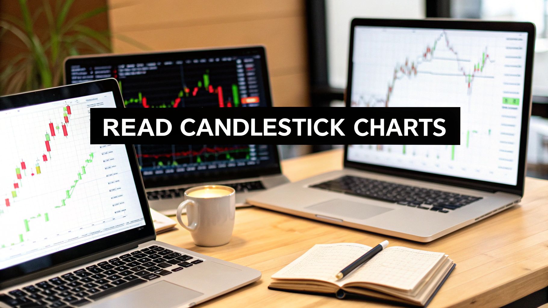
Jumping into trading charts for the first time can feel a lot like trying to decipher a foreign language. It's a sea of colors, bars, and lines that can seem overwhelming. But there's one tool that, once you understand it, tells a vivid story about the market: the candlestick chart.
At its core, a single candlestick is a visual summary of price action. It doesn't just show you that the price moved; it shows you how it moved, capturing the entire battle between buyers and sellers within a specific timeframe—whether that's one minute, one hour, or a full day.
This powerful method isn't new. It was developed back in 18th-century Japan by a legendary rice trader named Munehisa Homma. He used it to track not just prices, but the momentum and psychology driving the market. You can dig deeper into its history and the four key price points it tracks on its Wikipedia page.
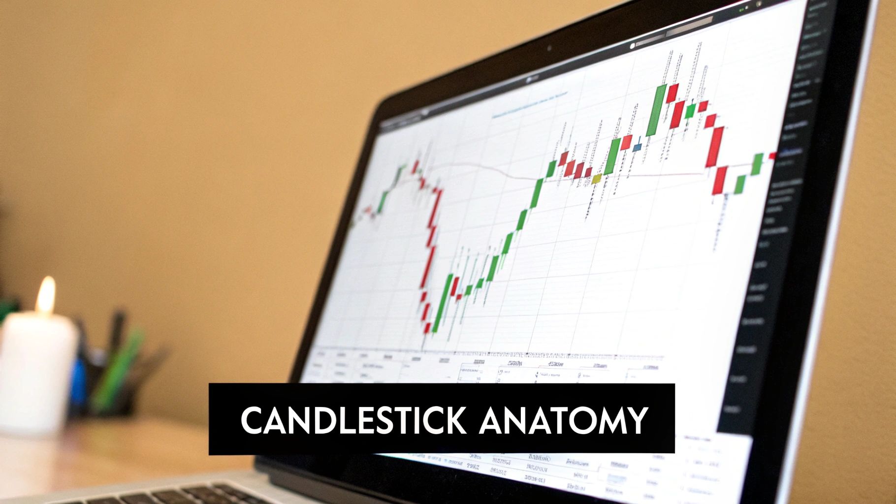
The Anatomy of a Single Candle
Every single candlestick, no matter the chart or timeframe, is made of two basic parts: the body and the wicks (which some traders call shadows). Getting a handle on these is your first real step to reading the story of the market.
- The Body: This is the thick, colored part of the candle. It shows you the distance between the opening and closing price for the period. A long body tells you there was strong, decisive momentum. A short body, on the other hand, hints at indecision or a quiet market.
- The Wicks (Shadows): These are the thin lines sticking out from the top and bottom of the body. They represent the highest and lowest prices the asset hit during that session, showing the full price range beyond just the open and close. Long wicks are a big clue—they signal volatility and that price was sharply rejected at those extreme levels.
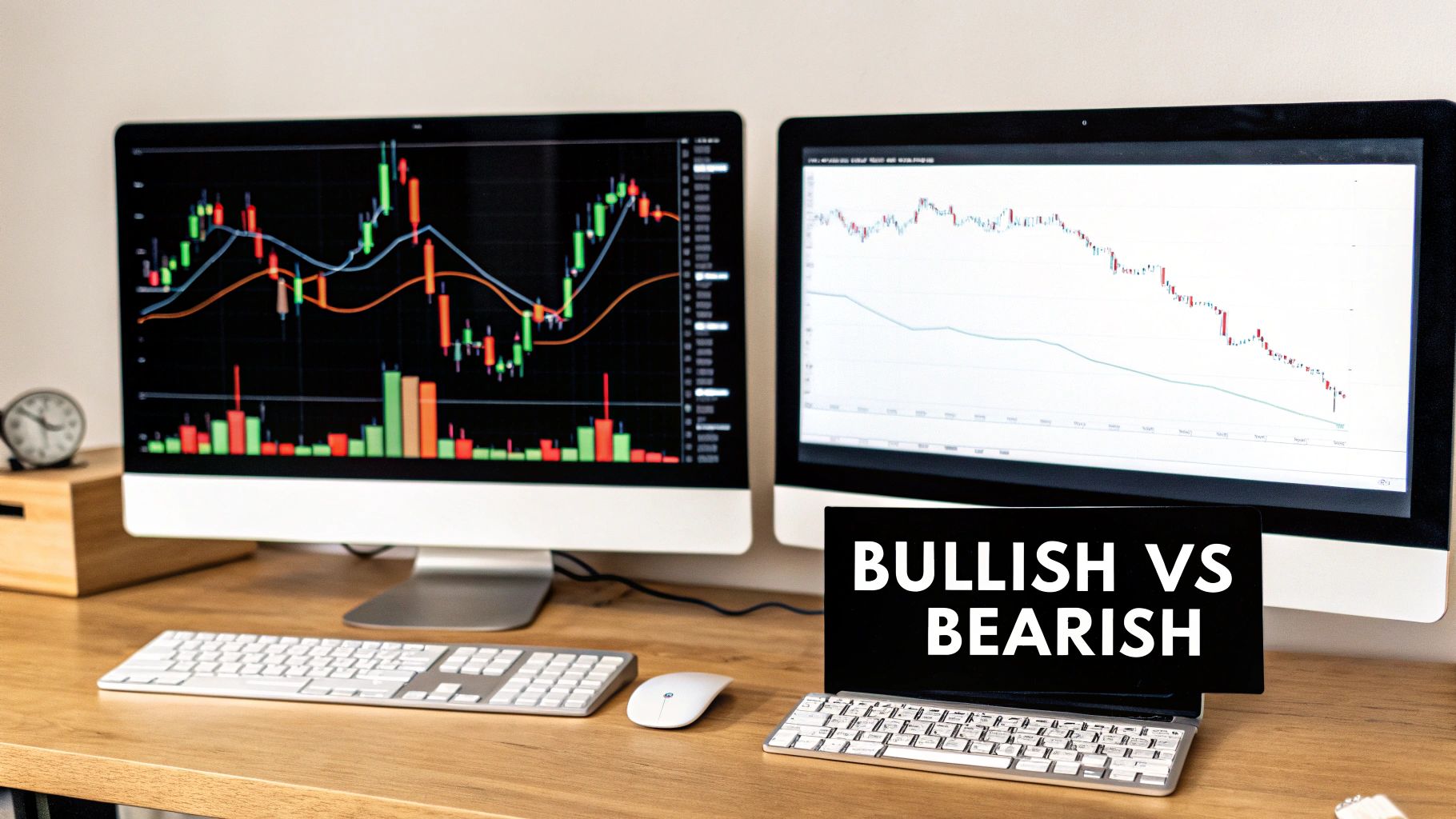
The color of the body gives you an instant read on the direction. The standard setup, which you can almost always customize, is green for a bullish candle (price closed higher than it opened) and red for a bearish one (price closed lower).
Trader's Tip: The real magic is in the relationship between the body and the wicks. For instance, if you see a green candle with a very long upper wick, it tells a specific story. Buyers tried to shove the price way up, but sellers jumped in and pushed it back down before the session closed. That's a subtle but powerful signal that buying pressure might be fading.
To make this perfectly clear, let's lay out what each component means for both bullish and bearish candles.
Candlestick Anatomy At a Glance
This table breaks down the four essential price points of any candle and what its components signify.
| Component | What It Represents | Indication in a Bullish (Green) Candle | Indication in a Bearish (Red) Candle |
|---|---|---|---|
| Top of Body | Where the price closed or opened | The closing price (price closed higher) | The opening price (price opened here) |
| Bottom of Body | Where the price opened or closed | The opening price (price opened here) | The closing price (price closed lower) |
| Upper Wick | The session's highest price | Shows the peak price reached during the period. | Shows the peak price reached during the period. |
| Lower Wick | The session's lowest price | Shows the lowest price reached during the period. | Shows the lowest price reached during the period. |
Once you master these fundamental pieces, you're no longer just staring at random shapes on a screen. You're beginning to read the language of the market and understand the story it's telling you, one candle at a time.
Decoding the Story of a Single Candle
Now that you know the basic anatomy of a candlestick, it's time to learn its language. I want you to think of each candle as a rich, detailed story of the battle between buyers (the bulls) and sellers (the bears) within a single trading session. Learning to read charts really begins here, by interpreting the momentum, indecision, and raw psychology packed into just one candle.
The real magic happens when you look at the relationship between the candle’s body and its wicks. The size of the body tells you how strong the winning side was, while the length of the wicks reveals just how intense the fight really got.
Reading Candle Bodies for Momentum
The body of the candle—that colored part showing the open and close—is your go-to indicator for momentum. It’s a direct signal of who was in control and how decisively they won that session.
A long body tells a story of strong, committed pressure. When you see a long green body, it screams that buyers were in full command, shoving the price up significantly from the open. On the flip side, a long red body shows that sellers completely dominated, driving the price down with force.
A short body, however, signals a lack of conviction. It shows there was very little ground gained or lost between the open and close. This could mean a quiet session, but more importantly, it often points to market indecision. Seeing short bodies crop up after a strong trend can be one of the first red flags that momentum is starting to sputter out.
Interpreting Wicks for Pressure and Rejection
The wicks, sometimes called shadows, tell the tale of the session's volatility and price rejection. They show you the full range of the battle, including the moments where one side made a move but was ultimately beaten back.
Let's imagine a candle with a long upper wick and a small body. This paints a very clear picture for us:
- Buyers initially had the strength to push the price much higher, creating that wick's peak.
- But then, sellers stormed in with overwhelming force, driving the price all the way back down near the open before the session closed.
- This candle is a powerful signal that buying pressure is weakening and sellers are starting to take control.
Conversely, a long lower wick tells the opposite story. Sellers managed to drag the price down, but buyers stepped in aggressively, rejecting those lower prices and pushing the market back up. I’ve found this to be a classic bullish sign, showing there’s strong support lurking below.
Key Takeaway: A long wick represents a price level that the market tested but ultimately rejected. The longer that wick, the more significant the rejection was, and the more powerful the signal is about a potential shift in who's in charge.
Introducing Dominant Single-Candle Patterns
Some single-candle shapes pop up so frequently and carry such specific meaning that they’ve earned their own names. Getting to know them is a core skill for any trader learning how to read candlestick charts. Two of the most foundational patterns you need to know are the Marubozu and the Doji.
The Marubozu: The Candle of Pure Dominance
A Marubozu is a candlestick that is all body and has no wicks at all. It is the ultimate signal of one-sided, absolute control.
- A Green Marubozu opens at its absolute low and closes at its absolute high. Buyers were in complete control from the first second to the last.
- A Red Marubozu opens at its high and closes at its low, showing total domination by sellers.
The Doji: The Candle of Perfect Indecision
A Doji is a special candle where the open and close prices are virtually identical. This creates a cross-like shape with no real body. It represents a perfect stalemate between buyers and sellers. While a single Doji just signifies indecision, its appearance after a strong, established trend can be a powerful warning sign of a potential reversal.
Many other powerful Japanese candlestick patterns are built upon these foundational concepts of momentum and indecision.
Mastering Bullish and Bearish Chart Patterns
Once you've got a handle on individual candles, the real magic begins when you start seeing patterns formed by two or more. These formations tell a much richer story about what's happening in the market, giving you powerful clues about where the price might be headed next. Getting this right is a huge part of learning how to read candlestick charts like a pro.
In my experience, recognizing these patterns is what separates guessing from educated trading. There are over 40 distinct candlestick patterns out there, and they are all about spotting short-term shifts in market psychology. Patterns like the 'hammer', 'shooting star', 'engulfing', and 'doji' are essentially visual cues about the ongoing battle between buyers and sellers. They signal whether a trend is likely to reverse or continue. If you want a full list, IG.com has a great resource on the 16 must-know patterns for every trader.
This image gives you a fantastic side-by-side look at some of the most common patterns you'll run into.
Seeing them laid out like this really helps. You can immediately see the difference in psychology between a bullish reversal like a Hammer and its bearish cousin, the Shooting Star.
Let’s dig into the patterns that I've found to be the most reliable, starting with the ones that scream, "buyers are taking over."
Spotting Bullish Reversal Patterns
Bullish reversal patterns are your heads-up that a downtrend is running out of gas. When you see one at the bottom of a slide, it’s a strong hint that despite all the recent selling, buying pressure is starting to win the fight.
The Hammer
The Hammer is a classic, and it looks just like the name implies. It’s a single candle with a tiny body at the top and a long lower wick that’s at least twice the length of the body.
- What it means: During this period, sellers managed to push the price way down. But then, a wave of buying pressure came in and drove the price all the way back up to close near where it opened. It's a textbook sign of price rejection at lower levels.
- Where to find it: Always look for it at the bottom of a downtrend. A green Hammer is a bit more bullish, but a red one still sends a powerful signal.
The Inverted Hammer
The Inverted Hammer is just an upside-down version of the Hammer. You'll see a small body at the bottom with a long wick sticking out of the top. Its location is what gives it meaning.
- What it means: When you spot this after a downtrend, it shows buyers gave it a shot, pushed prices up, but hit resistance. The key takeaway is that they showed enough strength to suggest the bears are losing their grip. It's a flicker of buying interest.
- Confirmation is crucial: Because sellers did manage to push the price back down, I always wait for a strong green candle on the next session to confirm the reversal before I'd even think about acting on it.
The Bullish Engulfing Pattern
This is one of the most powerful two-candle reversal signals you’ll ever find. It’s made up of a small red (bearish) candle that is completely swallowed up—or engulfed—by a large green (bullish) candle right after it.
Trader Insight: A true Bullish Engulfing pattern happens when the big green candle opens lower than the previous close and closes higher than the previous open. This signals a massive, almost violent, shift in sentiment from bearish to bullish in a single session.
Identifying Bearish Reversal Patterns
Just like bullish patterns can signal a bottom, bearish patterns are your warning that an uptrend might be hitting a ceiling. These formations tell you that the buying frenzy is fading and sellers are starting to call the shots.
The Shooting Star
The Shooting Star is the evil twin of the Inverted Hammer. It’s a single candle with a small body at the bottom and a long upper wick, looking like a star falling from the sky.
- What it means: Buyers tried to push the price higher, but sellers came in with overwhelming force, shoving the price right back down to close near its open. This is a very strong signal of price rejection at higher levels.
- Where to find it: This pattern only matters when it shows up at the top of an uptrend. Anywhere else, it's just noise.
The Bearish Engulfing Pattern
This pattern is the mirror image of the Bullish Engulfing and is an extremely potent sign that a top might be in. It happens when a small green candle is followed by a massive red candle that completely engulfs the body of the first one.
- Identification Criteria: The second (red) candle has to open higher than the previous day's close and then close lower than the previous day's open.
- Market Psychology: This pattern shows a huge shift in momentum. The market gapped up, full of optimism, but then sellers stepped in with such conviction that they not only wiped out the previous session’s gains but pushed the price even lower. This kind of abrupt reversal can be the start of a new downtrend.
Getting these core patterns down gives you an incredible foundation. As you get more comfortable, you can start looking for more complex three-candle patterns like the Morning Star and Evening Star. Each pattern you add to your toolkit helps you read market psychology with more and more accuracy. This deep understanding is a cornerstone of any solid strategy; you can go deeper by checking out our guide to learn price action trading.
Putting Candlesticks in Their Place: Trading with Market Context
Spotting a candlestick pattern is easy. Almost anyone can do it after a bit of practice. But knowing when that pattern actually means something? That’s a whole different ball game.
A pattern without market context is just a pretty shape on your chart. More often than not, it's a false signal waiting to eat your lunch. This is where you graduate from simply identifying patterns to actually reading what the market is telling you.
Think of it like this: a big, beautiful Bullish Engulfing pattern at the rock bottom of a long downtrend? That’s a potential game-changer. But the exact same pattern showing up in the middle of a messy, sideways market? It’s probably a trap.
Context is what turns a simple shape into a high-probability trade.
The Power of Confirmation with Support and Resistance
The single most powerful way to add context is by layering your candlestick analysis with support and resistance zones. These are simply areas on your chart where price has hit a wall in the past. Support is a floor where buyers tend to show up, and resistance is a ceiling where sellers take control.
Let’s walk through a scenario. A stock has been bleeding out for a week straight. It then drops to a price level that has acted as a launchpad three times in the last month—a major support zone. Right at that critical level, a perfect Hammer candle forms. This isn't just a random pattern; it's what traders call a "confluence" of signals.
Here's what the market is screaming at you:
- The Downtrend: Sellers have been in charge, pushing prices down.
- The Support Zone: This is a historically significant area where buyers have previously overpowered sellers.
- The Hammer Candle: This is your real-time evidence that buyers are stepping in right now, fighting back against lower prices.
This combination massively stacks the odds in your favor. The support zone confirms the story the candlestick is trying to tell you. The same logic works in reverse for bearish patterns at resistance. A Shooting Star is interesting on its own, but a Shooting Star at a key resistance level is a signal that demands your full attention.
Following the Momentum with Trendlines
Another incredibly simple yet effective tool is the humble trendline. By drawing a line connecting the higher lows in an uptrend or the lower highs in a downtrend, you create a visual roadmap of the market's momentum.
A healthy uptrend will often pull back and "kiss" its rising trendline before continuing higher. When you see a bullish pattern, like a Piercing Line, form right as the price taps that trendline, you have a solid confirmation. You aren't just trading a pattern anymore; you're trading a pattern that aligns with the dominant market flow.
Trader's Insight: One of the biggest mistakes I see new traders make is trying to be a hero and fight the trend. They'll spot a bullish pattern in the middle of a freight-train downtrend and jump in, only to get steamrolled. Always trade with the flow. Use patterns as your entry ticket to join the trend, not to stand in front of it.
Research backs this up. Studies suggest that candlestick patterns can reach an accuracy rate of around 70% when they appear within strong, trending markets. In choppy, directionless markets, their reliability drops off a cliff. If you want to dig deeper, Strike.money has a good breakdown on the effectiveness of candlesticks.
Using Moving Averages as Dynamic Support
Finally, let's talk about moving averages. A moving average (MA) smooths out the chaotic price action and helps you define the trend with a single, flowing line. Many traders, myself included, use the 20-period or 50-period MA as a dynamic level of support or resistance.
When a stock is in a clear uptrend and pulls back to touch its 50-period moving average, that's when you need to zoom in and watch the candles. A fat Bullish Engulfing candle that forms right on that MA line is a classic, high-probability setup. It's telling you the pullback is likely exhausted and the primary trend is ready to take off again.
By layering these simple tools—support and resistance, trendlines, and moving averages—you stop trading in a vacuum. You start to see the bigger picture, filtering out the noise and focusing only on the setups where the market context validates what your candles are saying. This is the secret to trading with more confidence and, ultimately, improving your odds of success.
Practical Tips for Real-World Chart Analysis
Knowing candlestick patterns is one thing. Actually using them to make consistent, intelligent trading decisions is something else entirely. This is where we bridge the gap between theory and what really matters—your trading account. These are the practical, real-world tips that I use to sharpen my own analysis and build discipline.
The most powerful patterns get their strength from confirmation. One of the best ways I’ve found to get this is by using multiple timeframes. Honestly, a trader who only looks at a single chart is flying with one eye closed.
Imagine you spot a perfect Bullish Engulfing pattern on a daily chart. That’s a strong signal, no doubt. But before you jump in, zoom into a 4-hour or 1-hour chart. If you see price action there forming a clear bottom or breaking a short-term downtrend, your confidence in that daily signal should skyrocket.
The Underrated Role of Volume
Volume is your truth serum for candlestick patterns. It reveals the conviction behind a price move, and a pattern without supporting volume is often just market noise.
Think of it this way: a massive Bearish Engulfing pattern at the top of an uptrend is a red flag. But if that red candle formed on a huge spike in trading volume, it's a five-alarm fire. That surge tells you a large number of participants are aggressively selling, which gives the pattern so much more weight.
- High Volume on a Breakout: When price smashes through a range on a strong candle with high volume, it signals commitment. The move is likely real.
- Low Volume on a Retracement: If price pulls back to a support level but volume is drying up, it suggests the sellers are weak. The primary trend is probably about to resume.
Trader's Insight: I always look for a spike in volume to confirm a key reversal pattern. A Hammer on low volume is questionable; a Hammer on high volume shows a real battle was fought and won by the buyers.
Setting Smarter Stop-Losses
Candlesticks aren't just for finding entries; they are invaluable for managing your risk. In fact, the wicks of reversal candles give you logical places to set your stop-loss orders.
If you take a trade based on a Hammer pattern, where does the stop-loss go? The answer is just below the low of the Hammer's wick. That wick represents the price level the market aggressively rejected. If the price breaks below that point, your trade idea is proven wrong, and it’s time to get out with a small, manageable loss.
This takes the emotion out of it. You aren't guessing where to place your stop. The chart itself is telling you the exact point where the setup is invalidated.
The Discipline of Waiting for the Close
This might be the most common and costly mistake I see new traders make. You spot a pattern forming in real-time and jump the gun, only to watch the candle morph into something else entirely before it closes.
Let's say you see what looks like a beautiful Shooting Star forming at a key resistance level. You immediately enter a short position. But in the final minutes of the session, buyers rush in and push the price up, turning your would-be Shooting Star into a strong bullish candle with no upper wick. You acted on an incomplete signal and are now trapped in a terrible trade.
You absolutely must develop the discipline to wait for the candle to close. A pattern is not valid until the trading period is officially over. Only then is the story of that session complete and ready for you to analyze. Gaining this level of insight is crucial, and you can explore more advanced concepts to learn how to trade with candlestick charts like a pro.
Of course. Here is the rewritten section, formatted to match the provided examples and requirements.
Common Questions About Candlestick Charts
Once you start moving from theory to actually trading the charts, a lot of questions will inevitably pop up. Learning to read price action is an ongoing journey, not a one-and-done deal. Let's tackle some of the most common questions I hear from traders, so you can build a more solid foundation for your own analysis.
Which Candlestick Timeframe Is Best for Trading?
This is one of the first questions every new trader asks. The honest answer? There’s no single “best” timeframe. It really comes down to your personal trading style and what you’re trying to accomplish.
A day trader, for instance, is going to live on the 5-minute and 15-minute charts. They're hunting for quick intraday moves, and their decisions hinge on very short-term price action.
On the other hand, a swing trader looking to hold positions for a few days or weeks will find their home on the 4-hour and daily charts. These higher timeframes give them a much clearer picture of the dominant trend. Long-term investors might even zoom out to the weekly or monthly charts to get a sense of the major market cycles.
Key Takeaway: The real edge comes from using multiple timeframes together. Maybe you spot a powerful setup, like a Hammer bouncing off support on the daily chart. You can then drill down to a 1-hour chart to nail down a much more precise entry. This is called multi-timeframe analysis, and it adds a serious layer of confirmation to your trades.
How Reliable Are Candlestick Patterns?
This is a critical question, and it deserves a realistic answer. No candlestick pattern is going to work 100% of the time. If you think of them as foolproof signals, you're setting yourself up for a quick way to lose money.
The reliability of a pattern isn't just in its shape; it's all about the context.
A pattern’s predictive power absolutely skyrockets when you get confirmation from other technical clues. A Bullish Engulfing pattern becomes exponentially more powerful when it shows up with:
- A big spike in trading volume.
- In alignment with the overall market trend (for example, in a clear uptrend).
- Right at a key support level or a significant moving average.
Think of candlestick patterns as tools that help put the odds in your favor, not as a crystal ball. They are simply pieces of evidence in your trading case, not a guarantee.
Can I Use Candlestick Charts for Any Asset?
Yes, and this is one of the biggest strengths of candlestick charting—its incredible versatility. You can apply this type of analysis to literally any financial instrument that gives you open, high, low, and close price data for a specific period.
This universal nature makes candlesticks invaluable across all sorts of markets. You can effectively use them to analyze:
- Stocks
- Cryptocurrencies
- Forex (currency pairs)
- Commodities (like gold and oil)
They tend to work best in liquid markets. When there's plenty of trading activity, the price action truly reflects the raw struggle between buyers and sellers. In thinly-traded or illiquid assets, the patterns can become a bit less reliable.
What Is the Difference Between a Doji and a Spinning Top?
This is a common point of confusion for traders learning how to read the charts, mostly because both signal that the market is undecided. The real difference is found in the candle's body.
A Doji represents a near-perfect stalemate. The open and close prices are basically identical, which creates that classic cross shape with almost no real body. It’s a very precise signal of equilibrium, where neither the bulls nor the bears could gain any ground.
A Spinning Top, on the other hand, also has long upper and lower wicks but has a small, defined body. This shows that while there was a lot of indecision and a fight between both sides, one side did manage a minor net price change between the open and close. While both show uncertainty, I’ve found a Doji is often a stronger, more urgent signal of a potential turning point.
Ready to stop relying on confusing indicators and start reading the market's story directly from the charts? At Colibri Trader, we teach a straightforward, price-action based approach to help you profit in any market condition. Unlock your trading potential by visiting us at https://www.colibritrader.com and discover a clearer path to consistent results.