


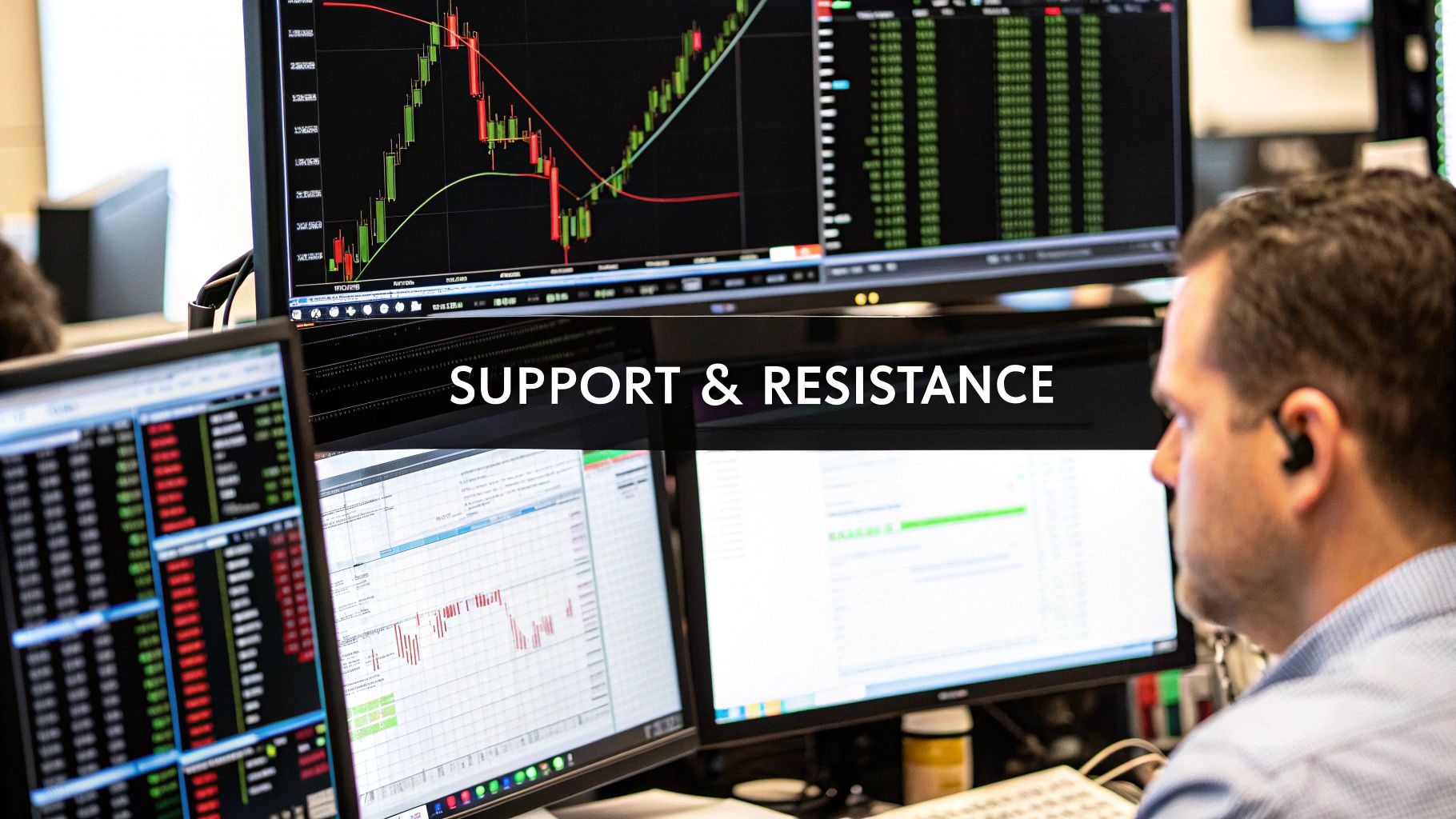
How to Identify Support and Resistance Levels
Spotting support and resistance is all about one thing: finding historical price points where the market has consistently changed direction. It really is that simple. You're looking for price floors (support) and ceilings (resistance) where the balance between buyers and sellers has flipped in the past. Getting a feel for this is your first real step toward making smarter trading decisions.
Understanding The Market's Invisible Boundaries
Before you start plastering lines all over your chart, it’s critical to understand what these levels actually represent. Support and resistance aren't just random price points; they're dynamic zones created by the constant tug-of-war between bulls and bears.
Think of them as invisible boundaries forged by collective market psychology.
A support level forms where buying pressure is finally strong enough to absorb all the selling, causing a downtrend to halt and reverse. On the flip side, a resistance level pops up where selling pressure overwhelms the buyers, stopping a rising price dead in its tracks.
The Psychology Behind Price Levels
These levels gain power because traders have memories. If a stock repeatedly fails to break above $100, traders start to anticipate that ceiling. They'll place sell orders near that price, which in turn reinforces $100 as a solid resistance level. It becomes a self-fulfilling prophecy.
The more times a price level gets tested and holds firm, the more significant it becomes in the minds of market participants. This collective memory is what gives these horizontal zones their teeth.
Support and resistance are just a visual map of supply and demand. At support, demand outstrips supply, pushing prices up. At resistance, supply swamps demand, pushing prices down.
Looking at historical price action is one of the most reliable ways to pinpoint these crucial zones. If a stock price keeps bouncing off $50, it tells you there's strong support there—buyers consistently see value and step in to prevent it from falling further.
Likewise, if that same stock repeatedly fails to climb past $75, you’ve found robust resistance where sellers are eager to take profits. The frequency and recency of these tests are what matter most; in fact, these levels guide over 70% of technical traders' decisions on major exchanges. You can find more great insights on technical analysis from the team at Financial Modeling Prep.
Knowing why these levels form is just as important as knowing how to draw them. They give you a framework for understanding the market's structure and potential turning points—a clear map of the battlefield where buyers and sellers are fighting for control.
To break it down even further, here's a quick cheat sheet on the core differences between these two critical concepts.
Support vs Resistance Key Differences
This table offers a quick summary of the fundamental characteristics that distinguish support from resistance levels.
| Characteristic | Support Level | Resistance Level |
|---|---|---|
| Price Action | Acts as a price "floor," preventing prices from falling further. | Acts as a price "ceiling," preventing prices from rising higher. |
| Market Psychology | Represents a zone where demand (buying pressure) is stronger than supply. | Represents a zone where supply (selling pressure) is stronger than demand. |
| Trader Behavior | Buyers are motivated to enter positions, anticipating a price bounce. | Sellers are motivated to enter positions, anticipating a price rejection. |
| Role Reversal | When broken, a former support level can become a new resistance level. | When broken, a former resistance level can become a new support level. |
Understanding these distinctions is fundamental. It's the language of the charts, telling you where the big players are likely to make their moves.
Using Price History to Find Key Levels
The past doesn't predict the future in trading, but it sure does leave a valuable map. The most reliable way to start identifying support and resistance is by digging into a chart's historical price action. Think of yourself as a market detective, hunting for clues where momentum has flipped before.
Start by zooming out. I mean really zoom out. Pull up a daily or weekly chart to get the big picture. Your goal is to spot the most obvious peaks and valleys where the price made a significant U-turn. These are what we call swing highs and swing lows, and they form the absolute skeleton of your analysis.
Now, a common rookie mistake is trying to connect the absolute highest or lowest wicks with a perfect, razor-thin line. Drop that idea. Markets are messy, driven by human emotion, not a ruler. You need to think in terms of zones—broader areas where price has repeatedly reacted.
Locating Swing Highs And Lows
So, what are we looking for? A swing high is just a clear peak before the price heads down. A swing low is a distinct trough right before the price moves up. You're looking for the points that visually stand out.
Seriously, if you have to squint and search for a level, it’s probably not significant enough to matter. The best, most reliable levels are the ones that jump right off the screen at you.
Once you’ve spotted a few of these key turning points, you can start connecting the dots.
- For Support: Find at least two major lows sitting at roughly the same price level. A horizontal line or, better yet, a zone drawn here shows a floor where buyers have historically jumped in.
- For Resistance: Do the same for the highs. Two or more significant peaks at a similar price tell you there's a ceiling where sellers consistently take over and push the price back down.
This image shows a great, simplified example of how multiple lows can line up to form a clear support level.
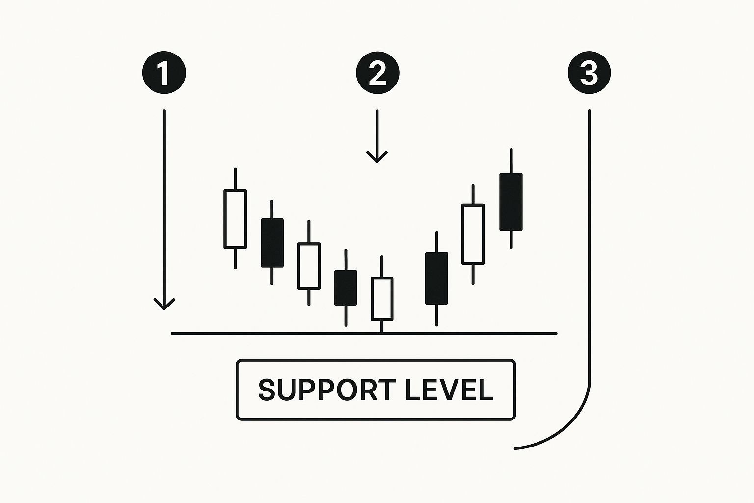
See how the price bounces off that same horizontal zone multiple times? That's what confirms its strength. It’s a floor where buying interest is clearly concentrated.
Validating Your Levels
The more a level is tested, the stronger it becomes. A support or resistance level that has held firm on three separate occasions is far more reliable than one that's only been touched once. This isn't some new-age trick; it's a foundational technique that's been used in markets for decades.
This principle is everywhere once you start looking. For instance, a classic analysis of Halliburton (HAL) stock between late 1999 and early 2000 shows it perfectly. Support was clearly established in a zone between $31 and $33.50, a floor the price hit repeatedly. On the flip side, resistance formed like a brick wall around $42.50, a level the stock just couldn't break through on multiple attempts.
Pro Tip: This is a big one. When a key resistance level finally breaks, it often transforms into a new support level. The same thing happens in reverse: a broken support level can become future resistance. This "role reversal" is a powerful concept to watch for.
Connecting these swing points isn’t just for horizontal levels, either. When you see a series of higher lows in an uptrend, or lower highs in a downtrend, you can connect them to form trendlines. These act as dynamic, angled support and resistance. If you want to get good at this, check out our guide on how to draw trend lines. It's another essential tool for reading the story that price history tells you.
Recognizing Psychological Price Barriers
There's another kind of barrier that markets respect, one that's less about the chart's visible peaks and valleys and more about what's going on in our heads.
Ever see a stock rocket up, only to hit a wall at $50? Or a currency pair grind to a halt right at 1.2000? That’s not a coincidence. It's raw market psychology playing out right on your screen.
These psychological price barriers are basically self-fulfilling prophecies. As humans, we're just drawn to clean, round numbers. They feel important, making them natural spots for traders of all sizes to place take-profit orders, new entries, and protective stop losses.
famously struggled for a long time to break and hold above the $200 mark. Analysis shows that 60-80% of short-term price movements in large-cap stocks and ETFs respect these psychological lines, making them an essential overlay for any technical strategy. You can learn more about how indicators can confirm these levels.
By anticipating these invisible barriers before the rest of the market fully piles in, you can position yourself for much higher-probability setups. A failure to break a round number can be a great early signal of a reversal, while a decisive slice through it can signal the start of a powerful new trend.
How to Use Psychological Levels
The key is not to just blindly trade these levels. Think of them as "areas of interest"—zones where you need to pay extra close attention.
As price approaches a major round number, watch the price action. Look for signs of hesitation. Are you seeing long wicks on the candlesticks, showing rejection? Is there a huge surge in volume as it hits the level? These are the clues.
The real magic happens when a psychological level lines up with a technical one. If a stock’s all-time high is $98.75, that $100 level just above it becomes a monster of a resistance zone. It's both technical and psychological. The market is often drawn to these confluences like a magnet.
Adding Indicators for Stronger Confirmation
Relying on pure price action is a clean, powerful way to find support and resistance. I’ve seen many traders build entire careers using nothing else. However, layering in a few select technical indicators can add a tremendous amount of confidence to your analysis.
Think of indicators as a second opinion. They aren't there to give you the primary signal, but to act as a source of evidence that confirms what the price is already telling you.
The magic word here is confluence—that beautiful moment when multiple, independent tools all point to the same conclusion. When your hand-drawn support zone lines up perfectly with a key moving average, you've likely found a level the market is going to respect. It helps you filter out the noise and focus on the real, high-probability setups.

This isn’t about cluttering your charts until they look like a Jackson Pollock painting. It’s about being precise and using tools to validate what you already see.
Using Moving Averages as Dynamic Levels
Unlike the static, horizontal lines you've been drawing, moving averages (MAs) give you dynamic support and resistance. These lines move right along with the price, offering an ever-shifting view of the market's average value. They adapt.
The most widely-watched MAs, like the 50-day or 200-day, often become self-fulfilling prophecies. Why? Because so many traders—from retail to institutional—are watching them. When price pulls back to a major MA during a solid trend, you can bet that a lot of eyeballs are on that level.
Imagine a stock is in a clear uptrend, and you've marked a horizontal support zone around $120. If you then notice the 50-day moving average is also creeping up to that exact price point, the strength of that level just multiplied. This confluence signals a zone where both horizontal support buyers and trend-following MA buyers are likely to jump in.
Pinpointing Confluence with Other Tools
Moving averages are just the start. Plenty of other tools are fantastic for confirming the levels you've already found through price history.
- Fibonacci Retracements: Drawn between a major swing high and swing low, these help spot potential reversal points. If the 61.8% Fibonacci level lands right on top of a historical support area you've drawn, that's a powerful sign of confluence.
- Volume Profile: This is a game-changer. It shows you exactly how much volume was traded at specific price levels. A "high-volume node" (a bulge in the profile) shows a price where a ton of business was done, often acting as a magnet for future price and a rock-solid support or resistance zone.
To keep this practical, I've put together a simple checklist you can run through when you think you've found a key level. It helps organize your thoughts and weigh the evidence.
Indicator Confluence Checklist
| Confirmation Method | What to Look For | Confidence Level |
|---|---|---|
| Moving Average | Does a key MA (e.g., 50, 100, 200) align with your S/R zone? | High |
| Fibonacci Level | Does a major Fib retracement (38.2%, 50%, 61.8%) overlap the zone? | Medium to High |
| Volume Profile | Is your level near a High-Volume Node (HVN)? | High |
| Trend Line | Does a diagonal trend line intersect with your horizontal S/R zone? | Medium |
| Psychological Number | Is the level a round number (e.g., $50, $100, $1000)? | Medium |
Using this checklist helps you move from "I think this is a level" to "I have three independent reasons to believe this is a level." It’s about building a case for your trade.
The real skill here is understanding that indicators are followers, not leaders. They react to price. Your job is to use them to confirm the story that price action is already telling you, not to generate signals out of thin air.
As I mentioned, many top traders build their strategies around pure price action. It's absolutely possible to profit without a single indicator, and it’s a mindset worth exploring. To learn more about this minimalist approach, you can find some great insights on trading without indicators and focusing purely on what the candles are doing.
Ultimately, whether you add indicators for confirmation or not, your primary focus should always remain on the raw price action itself. That's where the truth of the market lies.
Common Mistakes When Drawing Support and Resistance
Spotting support and resistance is a core trading skill. But like any skill, it's incredibly easy to pick up bad habits that can quietly sabotage your trades. Even a small error in where you place your line can throw off an otherwise perfect plan.
Let’s walk through the most common pitfalls I see traders make, so you can sidestep them from day one.
Forcing Levels to Fit a Narrative
This one is huge. A trader wants a stock to reverse, so they start hunting for any two minor bumps on the chart to justify drawing a resistance line, completely ignoring the stronger, more obvious levels staring them in the face.
This is confirmation bias, plain and simple. It’s bending the chart to fit your hopes.
Your job isn't to tell the market where it should go; it's to listen to where it has been. Let the chart guide you. If a level doesn't practically jump off the screen at you, it's probably not significant enough to be trading off of.
Treating Zones as Exact Lines
Another classic mistake is demanding laser-like precision from your levels. You have to remember, markets are driven by the messy emotions of millions of people, not a mathematical grid. They rarely reverse on a single, exact price down to the penny.
The big mindset shift here is to think of these levels as zones or areas, not razor-thin lines. A support zone might span from $49.50 to $50.00. This way, you're accounting for the natural chaos of the market—all the little overshoots and undershoots that are designed to shake out traders who place their stops too tightly.
You’ll almost never find a key level that lines up perfectly with every single high or low. The real goal is to draw your line where it gets the most touches, even if it cuts through a few candle wicks. This shows you the true center of gravity for that price area.
When you adopt a "zone" mindset, you give your analysis the breathing room it needs to actually work in the real world. It stops you from getting needlessly stopped out on minor market noise.
Cluttering Your Chart with Minor Levels
When you first learn this stuff, the temptation is to mark every little peak and valley you can find. Next thing you know, your chart is a tangled web of lines, and you’re paralyzed with indecision. "Analysis paralysis" is a very real thing.
In trading, less is almost always more.
Your focus should be on the major, most significant levels. These are the ones that are clearly visible on a higher timeframe like the daily or weekly chart because that's what the big institutional players are watching.
Try this simple exercise to clean up your charts:
- Start fresh. Get rid of every single line you've drawn.
- Zoom out. Go to the daily or weekly timeframe and identify only the three to five most obvious, in-your-face support and resistance levels.
- Stop there. Don't add anything else unless the price creates a brand-new, undeniable turning point over time.
This minimalist approach forces you to focus on the price action that truly matters. The result? Cleaner charts and far more confident, objective trading decisions.
Applying Support and Resistance in Your Trading
Spotting solid support and resistance zones is a huge step forward, but let's be honest—it's only half the job. The real skill is turning that analysis into a concrete trading plan. Knowing how to act on these levels is what separates the chart-watchers from the consistently profitable traders.
Ultimately, it all boils down to one simple question: will the level hold, or will it break? Your answer to that question will shape your entire trade.
Playing the Bounce or the Breakout
The first, and probably most common, approach is to trade a bounce or rejection. The core idea here is that you're banking on a well-established support or resistance zone doing its job and turning the price back around.
- For a bounce off support: You'd be on the lookout for a chance to buy as the price dips into your support zone and starts showing signs of heading higher.
- For a rejection at resistance: This is the opposite. You're looking for an opportunity to sell as the price hits that resistance ceiling and begins to lose steam.
The second strategy is to trade a breakout. This is more of a momentum play. You're anticipating that price will build up enough pressure to smash right through a support or resistance level, kicking off a powerful move in that same direction. This requires patience, though—a lot of initial pokes through a level are just "fakeouts" designed to trap traders who jump the gun.
As a rule of thumb, the longer a support or resistance level has held and the more times it's been tested, the more explosive the eventual breakout tends to be. The market builds up a tremendous amount of energy at these key inflection points.
A Practical Framework for Your Trades
Whether you're playing a bounce or a breakout, going in without a clear plan is just gambling. Simply buying at support or selling at resistance without a defined process is a recipe for disaster.
Every solid trading plan needs these three core components:
- The Entry Trigger: What specific price action signal will get you into the trade? Maybe it's a specific bullish candlestick pattern at support or a bearish one at resistance. The point is, don't just enter because the price touched your line. Wait for confirmation.
- The Stop-Loss: Where will you get out if you're wrong? For a long trade at support, your stop-loss has to go just below the zone. For a short at resistance, it goes just above. This is your safety net—don't trade without it.
- The Profit Target: Where will you cash out? A logical first target is often the next major support or resistance level in the opposite direction.
Putting together a complete plan is non-negotiable. To see how these pieces all fit together in live markets, you can dive into a more detailed support and resistance trading strategy. It provides a structured way to move from simply drawing lines to executing trades with real confidence.
Got Questions? Let's Clear Things Up
Even when you've got the basics down, you'll still run into specific questions out in the wild. Let's tackle some of the most common ones I hear from traders, so you can stop second-guessing and start charting with more confidence.
What Happens When a Support or Resistance Level Breaks?
When a key level finally gives way, it’s a big deal. It tells you there's been a major shift in the balance of power between buyers and sellers.
If resistance breaks, it means the buyers have soaked up all the selling pressure at that price and are now in control. This often kicks off a strong move higher.
On the flip side, a break below support shows the sellers have overwhelmed the buyers. The price is likely headed lower. This is where you see role reversal come into play—a concept you absolutely have to understand. A broken resistance level will often become the new floor (support), and a broken support level turns into a new ceiling (resistance).
How Can I Tell if a Level Is Strong?
Not all levels are created equal. Some are minor speed bumps, while others are concrete walls. The strength of a support or resistance zone really comes down to a few key ingredients you should always be scanning for.
- Number of Touches: How many times has the market tested this level and failed to break through? A level that has rejected price three or four times is way more significant than one that's only been touched once. More tests mean more traders are watching it.
- Timeframe: This is a big one. Levels that stand out on the higher timeframes (like the daily or weekly charts) carry far more weight than something you only see on a 5-minute chart. Why? Because the "big money" is making decisions based on the bigger picture.
- Confluence: This is where things get interesting. A level becomes exponentially stronger when it lines up with other technical factors. Think of a horizontal level that also happens to be a major moving average, a big psychological round number (like $100), or a key Fibonacci retracement.
The most powerful, high-probability trading opportunities are born at zones that have been respected multiple times, are obvious on a higher timeframe, and have confluence with another technical element.
Should I Use the Candle Wicks or Bodies to Draw My Lines?
Ah, the classic debate. The answer is actually much simpler than you think: Draw your line where it gets the most touches. Period. It doesn't matter if it's hitting wicks or bodies.
Markets are messy and rarely perfect. If you try to draw a perfect, razor-thin line that only touches the absolute highs of the wicks or the exact closing prices, you'll often miss the true area of value.
A much better approach is to think in terms of zones, not lines. Draw a thicker zone that captures the general area where price has reacted. This simple mental shift from "lines" to "zones" is a game-changer for applying this stuff in the real world.