


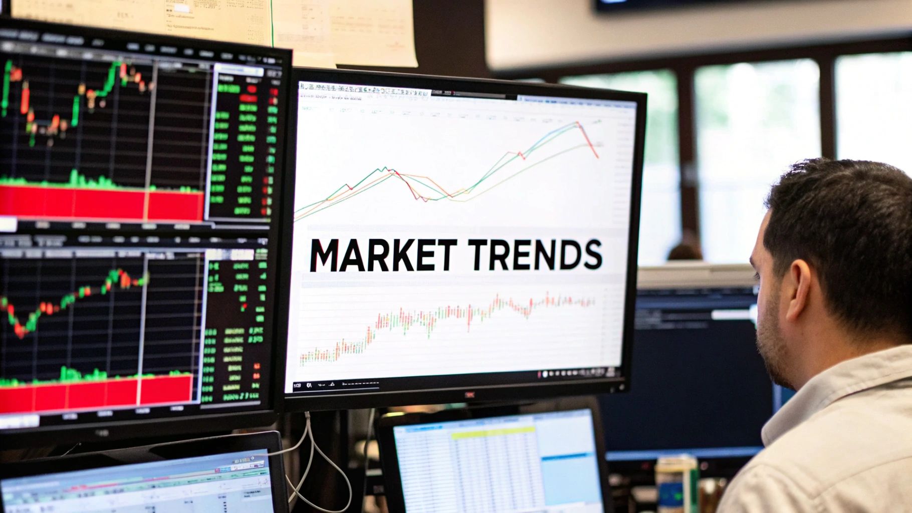
How to Identify Market Trends for Smarter Trading
To start spotting market trends, you need to get back to basics and look at the raw price action on a chart. Forget the fancy indicators for a moment. It all boils down to seeing patterns of higher highs and higher lows for an uptrend, or the reverse—lower highs and lower lows for a downtrend.
This is the most fundamental skill you can develop. It’s about learning to interpret what the market is doing right from the source, without any distractions.
Reading the Market Story in Price Action
Before you clutter your screen with a single indicator, take a look at the chart itself. It’s telling a story. Every candlestick, every peak, and every valley represents a constant battle between buyers and sellers. Learning to read this narrative is where real technical analysis begins.

Price action is the unfiltered language of the market. It shows you exactly what’s happening in real-time, not what a lagging indicator thinks happened ten bars ago. When you strip away all the noise, you can see the market's underlying psychology laid bare.
The Anatomy of an Uptrend
An uptrend has a simple, repeatable rhythm: a series of higher highs and higher lows. I like to think of it as climbing a set of stairs. Each step up is a new high, and each small pause is a higher low. This structure is a dead giveaway that buyers are in control.
- Higher Highs (HH): Every new peak pushes beyond the last one. This signals aggression from buyers and a generally optimistic mood.
- Higher Lows (HL): Each time the price pulls back, it finds support at a level higher than the previous dip. This tells you that buyers are jumping in on the dips, preventing the price from falling too far.
For instance, if a stock hits $110 (a high), pulls back to $105 (a low), and then rallies again to $115 (a new higher high) before pausing at $112 (a new higher low), the uptrend is confirmed. That’s the footprint of consistent buying pressure.
The Anatomy of a Downtrend
A downtrend is just the opposite. It's a sequence of lower highs and lower lows. This time, imagine you're walking down a staircase. Each step down is more significant than any brief step up. It's a clear signal that the sellers have taken over.
- Lower Highs (LH): Every attempt to rally fizzles out before it can reach the previous peak. This shows a lack of conviction from buyers.
- Lower Lows (LL): Each wave of selling pushes the price to a new low, breaking past the old support levels. This confirms sellers are dominating the action.
Picture a cryptocurrency dropping to $30,000, weakly rallying to $32,000, then plunging again to $28,000. That pattern of lower highs and lower lows paints a clear bearish picture.
"Price action analysis is the art of understanding market psychology through its movements. A series of higher highs isn't just a pattern; it's a footprint left by confident institutional buying and growing retail interest."
Distinguishing Trends from Sideways Markets
Of course, the market isn't always trending up or down. A lot of the time, price just chops sideways in a range, what traders call consolidation. In this state, you won't see any clear higher highs or lower lows. Instead, the price just bounces between a well-defined floor (support) and ceiling (resistance).
Recognizing this lack of direction is just as important as spotting a trend. It tells you the market is undecided. Trying to force a trend-following strategy in a choppy, sideways market is one of the most common and costly mistakes a trader can make.
To help you quickly recognize what the market is doing, I've put together a simple table summarizing these three states.
Quick Guide to Market Trend Characteristics
Use this summary to quickly identify the three primary market states by observing their core price action signals and underlying psychology.
| Trend Type | Core Price Action Signal | Dominant Market Psychology |
|---|---|---|
| Uptrend | Higher Highs (HH) & Higher Lows (HL) | Optimism & Buyer Control |
| Downtrend | Lower Highs (LH) & Lower Lows (LL) | Pessimism & Seller Control |
| Sideways Range | No clear sequence of highs and lows | Indecision & Equilibrium |
By really mastering these basics, you’ll develop a powerful lens to see what the market is actually doing. If you want to go even deeper, you can explore our detailed guide on how to read price action to sharpen your chart-reading skills even further.
Confirming Trends with Volume and Moving Averages
Spotting a potential trend by reading price action is a fantastic first step, but it's only half the battle. A series of higher highs looks great on paper, but how can you be sure it's a real move with power behind it and not just market noise?
This is where confirmation comes in. It's the process of gathering more evidence to back up your initial read, giving you the confidence to trust what the chart is telling you.
To validate a trend, we bring in two of the most trusted tools in any trader's kit: trading volume and moving averages. They don't predict the future, but they offer crucial context about the strength and momentum of the price action you're seeing.
Think of it this way: price action is the car, but these indicators are the fuel gauge and the speedometer. They tell you if the car has enough gas to keep going and how fast it's traveling.
The Power of Volume Confirmation
Volume is simple. It's the total number of shares or contracts traded over a certain period, and it's a direct measure of market participation. A trend without strong volume is like a hot stock tip from a stranger—interesting, but you probably shouldn't bet your house on it.
So, what does healthy confirmation look like?
A strong, sustainable uptrend should have increasing volume on the moves up and decreasing volume on the pullbacks. This pattern tells a clear story: buyers are getting more enthusiastic as prices rise, while sellers are weak and disinterested when the price dips. It's a classic footprint of institutional buying.
On the flip side, a price rally on weak or declining volume is a massive red flag. It suggests there isn't broad participation behind the move and hints that the trend is running on fumes. This is often called a divergence between price and volume, and it’s a warning sign that a reversal could be just around the corner.
"A price move without volume is a signal without noise. It’s easy to move a market when no one is participating. True, sustainable trends are always confirmed by a surge in volume, indicating widespread agreement among market participants."
For example, if you see a stock break out to a new 52-week high, your eyes should immediately dart to the volume bar for that day. A huge spike in volume is your confirmation that the big money is behind the move. If the volume is lower than average, that breakout has a much higher chance of failing.
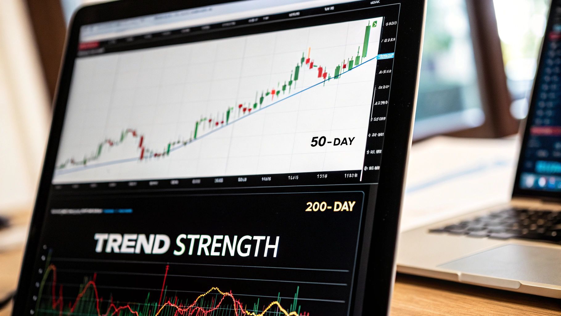
Using Moving Averages to Define Trend Direction
Moving averages are designed to smooth out price data, creating a single, flowing line that makes it much easier to see the underlying trend. They are lagging indicators—they confirm what's already happened—but their real value is in providing objective reference points for trend strength and potential support or resistance.
The two most-watched moving averages by far are the 50-day and the 200-day simple moving averages (SMA).
- The 50-Day Moving Average: This is your go-to for the medium-term trend. When the price is consistently trading above the 50-day MA, the medium-term bias is bullish.
- The 200-Day Moving Average: This is the big one—the benchmark for the long-term trend. As long as a stock stays above its 200-day MA, the long-term outlook is generally considered positive.
The relationship between price, volume, and these averages is where the magic happens. When prices rise on increasing volume above these key moving averages, it signals a strong trend. In fact, studies have shown that sustained price increases accompanied by volume growth have a greater than 70% probability of continuing for at least several months. For more on the data behind market moves, you can check out resources like TradingEconomics.com.
The Golden Cross and the Death Cross
Perhaps the most famous signals derived from moving averages are the "Golden Cross" and the "Death Cross." These happen when the shorter-term 50-day MA crosses over the longer-term 200-day MA.
- The Golden Cross (Bullish): This occurs when the 50-day MA crosses above the 200-day MA. It signals that medium-term momentum has turned positive and is starting to overpower the long-term trend, often happening just before a major bull market takes hold. The S&P 500, for instance, saw a Golden Cross in early 2019 right before it rallied over 30% that year.
- The Death Cross (Bearish): This is the opposite, happening when the 50-day MA crosses below the 200-day MA. It warns that short-term weakness is becoming a long-term problem and has historically been a precursor to significant market downturns.
By combining what you see in the raw price action with volume and moving averages, you build a much more robust framework for identifying trends. Price action tells you what’s happening now, volume tells you how much conviction is behind it, and moving averages give you the long-term context.
To build on these concepts, you can take a deeper dive into moving averages in trading strategies.
Connecting Market Trends to the Bigger Economic Picture
Technical signals on a chart don't happen in a vacuum. A series of higher highs or a Golden Cross is powerful, but these patterns are often just the market's reaction to real-world events. The sharpest traders I know have all learned to connect the dots between what they see on the charts and the broader economic landscape.

This isn't about becoming an economist. It’s about understanding the "why" behind major market moves. Price action shows you what is happening, but macroeconomic data helps explain why it's happening, giving your analysis some much-needed context and resilience.
Using Economic Indicators as Context
Key economic reports—think Gross Domestic Product (GDP), inflation rates (CPI), and employment numbers—are the pulse of the economy. When these numbers drop, they can either pour fuel on an existing trend or stop it dead in its tracks.
Let’s say you’ve spotted a strong uptrend in the S&P 500. Then, the latest inflation report comes out hotter than expected. This single piece of data could signal that the central bank might hike interest rates to cool things down, a move that's typically a headwind for stocks. Suddenly, your perfect-looking uptrend is on shaky ground.
This is exactly why a good economic calendar is one of a trader's best friends. Don't see it as noise; think of it as a schedule of potential market-moving events.
- To confirm a trend: You're seeing a rally in industrial stocks, and then global manufacturing data comes out strong. That's a solid confirmation of the fundamental strength behind the move you're seeing.
- To question a trend: Retail stocks are soaring, but the latest consumer spending data is weak. That disconnect, or divergence, should make you a bit more cautious.
Central Banks and Their Impact on Trends
No single entity has more power to create or kill market trends than central banks. Their decisions on interest rates and monetary policy directly influence the cost of borrowing money, which has a ripple effect on everything from corporate profits to consumer spending.
A period of low interest rates, what we call "easy money," often fuels powerful bull markets. Companies can borrow cheaply to expand, and investors are pushed into riskier assets like stocks to find a decent return. On the flip side, when central banks start raising rates to fight inflation, it can trigger a bear market.
Even the language used by central bank officials can send shockwaves through every asset class. Understanding the basics of the power central banks hold is non-negotiable if you're serious about trend analysis.
By layering macroeconomic context over your technical analysis, you move from simply following a trend to understanding the fundamental forces driving it. This deeper perspective is what separates consistently profitable traders from those who get blindsided by news events.
Global Trends and Long-Term Cycles
Zooming out even further, long-term economic cycles can shape market trends for years, even decades. The rise of globalization, for example, has had a profound impact on corporate earnings and stock market performance.
You can spot these massive trends by looking at the right macroeconomic indicators. For example, global trade volume, measured as an index, shot up from 100 in 1913 to over 500 by 2000. This huge growth lines up perfectly with globalization, which in turn juices stock markets. By tracking global trade indexes alongside GDP growth rates—like the US GDP climbing from about $100 billion in 1929 to $29,185 billion in 2023—you can see these major economic shifts that create long-term market trends.
Even on a smaller scale, keeping an eye on industry-specific trends can help you spot future market leaders. For instance, tracking the latest innovations in nicotine pouches can reveal emerging patterns and potential disruptors in that specific consumer space. The same idea applies to any sector, from tech to healthcare.
Ultimately, connecting your chart work to the bigger economic picture provides a crucial layer of validation. It ensures you're not just trading patterns, but trading with a clear understanding of the fundamental currents moving the market. This approach helps build conviction when a trend is strong and gives you an early warning when the economic winds start to change.
Measuring Market Sentiment and Conviction
Charts and economic data are fantastic, but they don't tell the whole story. They miss the one thing that truly drives markets: human emotion. Fear and greed are incredibly powerful forces, and they leave distinct footprints all over the charts if you know where to look. Learning to measure these emotions—what we call market sentiment—gives you a serious edge.
It's all about looking past the raw numbers to get a feel for the psychological state of other traders. Is the crowd panicking? Or are they dangerously complacent? Answering that can help you spot when a trend is losing steam or about to reverse with much more confidence.
Using Volatility to Read Market Fear
One of the best ways to measure fear is simply by tracking market volatility. When panic sets in, prices swing wildly. When everyone is calm and confident, the market tends to just drift along. The go-to tool for this is the CBOE Volatility Index, better known as the VIX.
People call the VIX the "fear gauge" for a reason—it measures the market's expectation of volatility over the next 30 days.
- A low VIX (typically below 20) signals that fear is low and traders are getting complacent.
- A high VIX (above 30) shows significant fear and uncertainty are creeping in.
But here’s the real insight: extreme fear often marks market bottoms, while extreme complacency can signal market tops. When the VIX spikes, it’s a good sign that panic selling is hitting its peak. On the flip side, when the VIX is eerily quiet for a long stretch, it suggests nobody sees any risks on the horizon—a classic warning sign of an overconfident, vulnerable market.
This flow shows how you can combine the different sentiment puzzle pieces together.
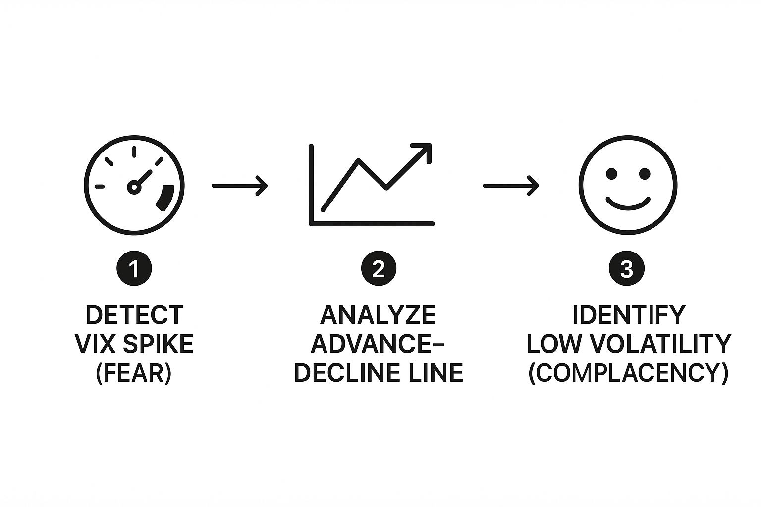
As the visual guide shows, you can use spikes in the VIX to spot fear, then cross-reference that with breadth indicators before checking for periods of low volatility that might suggest complacency is setting in.
Gauging the Health of a Trend with Market Breadth
While the VIX tells you about the overall emotional state, market breadth indicators tell you how many stocks are actually participating in a move. Think about it: a healthy uptrend should be like a rising tide that lifts all boats. If just a few mega-cap names are dragging an index higher while most other stocks are sinking, that's a huge sign of weakness under the surface.
The most common breadth indicator is the Advance-Decline Line (A-D Line). It's a simple but incredibly powerful tool. Each day, it subtracts the number of declining stocks from the number of advancing stocks and adds that value to a running total.
What you're looking for is confirmation.
If the S&P 500 is hitting new highs, you want to see the A-D Line making new highs, too. That shows broad participation and confirms the trend is healthy. But if the S&P 500 is rising while the A-D Line is flat or falling—what we call a bearish divergence—it’s a major red flag that the rally is narrow and could easily fall apart.
Adding some statistical analysis to your sentiment tools really gives you a quantitative edge. Historically, stock index volatility averages around 15%-20% annually. When it spikes sharply above 30%-40%, it often happens right before a trend reverses. We saw this during the 2007-2009 crisis when S&P 500 volatility shot past 50%. Likewise, the Advance-Decline Line showed incredibly strong breadth just before major bull runs, like the US equity rally from 2013 to 2017. You can dig into historical stock data and see these patterns play out time and again.
When you combine sentiment (VIX) and breadth (A-D Line), you get a much richer, more complete picture of the market's health. A trend that’s confirmed by broad participation and rational sentiment is far more reliable than one driven by a handful of stocks while everyone else is getting way too complacent. These tools help you see the cracks forming long before they become obvious on a price chart.
Building Your Personal Trend Analysis Framework
Knowledge without a system is just a collection of disconnected ideas. If you really want to get consistent at spotting market trends, you have to assemble everything you’ve learned into a repeatable, personal framework. This is what turns reactive guessing into a proactive process, giving you the clarity to act with confidence.
It's just too easy to get lost in the daily noise of market chatter and conflicting signals without a routine. A disciplined approach ensures you check all the critical components—from the big-picture economy down to the specific price action on your chart—every single time. That’s how you build consistency.
Establishing Your Daily and Weekly Routine
A solid framework always starts with a consistent routine. Your goal is to create a rhythm for your analysis that becomes second nature, so you never miss a critical piece of the puzzle. The idea is to move from a wide-angle lens down to a microscopic view.
Your weekly analysis is all about the big picture. Before the week even begins, take some time to understand the major economic events scheduled. Pull up the weekly charts and review the long-term price structure. Check in on key moving averages like the 200-day SMA. This whole process sets the strategic context for the days ahead.
Then, your daily routine becomes much more tactical. It’s a quick, focused check-in to see how the story is developing. Are there any surprises in the pre-market? How did volume look on yesterday's move? This daily pulse check keeps you locked in with the market’s immediate direction.
A personal framework isn't about being rigid; it's about being systematic. The goal is to free up your mental energy from wondering what to look at so you can focus entirely on what the market is telling you.
This structured approach helps you build a coherent narrative day by day. You aren't just reacting to a single candle; you're interpreting it within the broader context you already established during your weekly review.
Your Go-To Trend Analysis Checklist
To make this process practical, a simple checklist can be your best friend. It acts as a mental backstop, forcing you to confirm each piece of the puzzle before you even think about committing to a trade. We're not looking for perfect signals, but for confluence—where multiple pieces of evidence all point in the same direction.
Here’s a straightforward checklist you can adapt for your own use:
- Price Structure: Is the chart making clear higher highs and higher lows for an uptrend, or lower lows and lower highs for a downtrend? This is your foundation.
- Volume Confirmation: Is volume picking up on moves in the trend’s direction and drying up on pullbacks? Healthy volume is the fuel that keeps a trend alive.
- Moving Average Signals: Is the price trading above its key moving averages (like the 50-day and 200-day)? Are the averages themselves sloping in the direction you expect?
- Sentiment Check: Where's the VIX? Is it excessively low (complacency) or spiking (fear)? Does market breadth (the Advance-Decline Line) actually confirm what the major indexes are doing?
If you're interested in seeing how these principles play out in niche markets, looking at resources on sports card market trends can be fascinating. The same core ideas of supply, demand, and sentiment apply, just in a different arena.
To really nail this down, I've put my own process into a simple table.
My Daily Trend Analysis Checklist
This checklist is my non-negotiable morning routine. It’s a straightforward way to structure my analysis, ensuring I cover all the critical components before making a decision. It keeps me honest and prevents me from getting swept up in a single, exciting-looking chart pattern.
| Analysis Component | Core Question to Answer | Primary Tools to Use |
|---|---|---|
| Macro Context | Are there any major economic releases or news events today? | Economic Calendar, News Feed |
| Long-Term Structure | What is the prevailing trend on the weekly and daily charts? | Weekly/Daily Candlestick Charts |
| Key Levels | Where are the major support/resistance zones and moving averages? | Charting Platform, 50/200 SMA |
| Price Action | Is the recent price action confirming the trend (e.g., higher highs)? | 4-Hour/1-Hour Charts |
| Volume Profile | Does volume support the recent price move? | Volume Bars, On-Balance Volume (OBV) |
| Market Sentiment | Is the broader market in a "risk-on" or "risk-off" mood? | VIX, Advance-Decline Line |
Following a list like this helps build the discipline needed to avoid emotional, impulsive trades and focus only on high-probability setups where the evidence is stacked in your favor.
Applying The Framework: A Real-World Example
Let's walk through how this works with a recent trend in a major tech stock. For months, it had been in a nasty downtrend, consistently trading below its 200-day SMA. A classic dog.
First, the price action started to shift. The stock stopped making new lows and began carving out a base—a clear sign that selling pressure was finally letting up. Then came the big move: it broke above a key resistance level, creating its first significant higher high in almost a year.
Okay, that’s our initial signal. Now, we look for confirmation. That breakout day was lit up by a massive volume spike, over 250% of its daily average. That’s not retail traders; that’s a sign of institutional commitment.
Soon after, the stock powered through its 50-day SMA, which itself began to curl upwards. The broader market sentiment was still pretty bearish, but our checklist was screaming that a potential reversal was in play. The pieces were aligning, turning what could have been a hopeful guess into a high-probability setup based on a systematic review.
Common Questions About Identifying Market Trends
When you start trying to apply these ideas, the questions come fast. It's one thing to read about price action in a blog post, but it's a completely different ballgame when your own money is on the line. Let's tackle some of the most common hurdles traders hit when they're learning to spot market trends.
How Long Does a Market Trend Actually Last?
This is the million-dollar question, isn't it? The only honest answer is: there is no set timeline. A trend lasts exactly as long as the forces pushing it.
Some trends are short-lived, maybe lasting a few days or weeks, often kicked off by something specific like an earnings report or a big news story. Others are monsters, unfolding over months or even years, driven by major fundamental economic cycles.
The real key isn't trying to predict a trend's expiration date. It's about making sure your trading style fits the trend's timeframe.
- A day trader cares about the trend playing out over the next few hours.
- A swing trader might ride a trend for several weeks.
- A long-term investor is looking at the primary trend that could last for years.
Your strategy dictates which trend matters. Trying to day trade a multi-year economic cycle makes about as much sense as planning your retirement based on a five-minute chart.
Is It Safe to Use Just One Indicator?
Leaning on a single indicator is a classic rookie mistake, and a risky one at that. Whether it's a moving average, a volume spike, or an oscillator, no single tool is foolproof. Relying on just one is like trying to navigate a ship with only a compass—you’re missing the rest of the map.
This is why experienced traders always look for confluence. That’s just a fancy word for seeing multiple, independent signals all pointing in the same direction.
A trend only becomes a high-probability setup when it’s confirmed from several different angles. A bullish pattern of higher highs and higher lows is good, but it's far more powerful when it’s also supported by rising volume and positive market sentiment.
This multi-faceted approach helps you filter out the market's random noise. It allows you to focus only on the moves that have real conviction behind them.
What Is the Biggest Mistake Beginners Make?
By far, the most common and costly mistake I see new traders make is fighting the trend. It’s an almost primal urge. They see a stock that's been climbing for weeks and the first thought is, "This thing is overbought, it has to fall soon." So they jump in and try to short it.
This is like trying to swim against a powerful river current. You might make a tiny bit of progress, but you’ll exhaust yourself, and eventually, the current will win.
A much, much better approach is to simply trade with the primary trend. You have to learn to see those temporary dips and pullbacks not as the end of the world, but as potential buying opportunities within the larger uptrend. "The trend is your friend" is a cliché for a reason—it’s one of the most fundamental truths in trading.
Making that mental shift—from trying to predict the exact top or bottom to just participating in the existing momentum—is a huge step. It’s what separates the guessers from the traders who strategically ride the market's most powerful moves.
At Colibri Trader, we teach you to master these concepts through a straightforward, price-action based approach. Stop guessing and start trading with confidence. Learn more at https://www.colibritrader.com.