


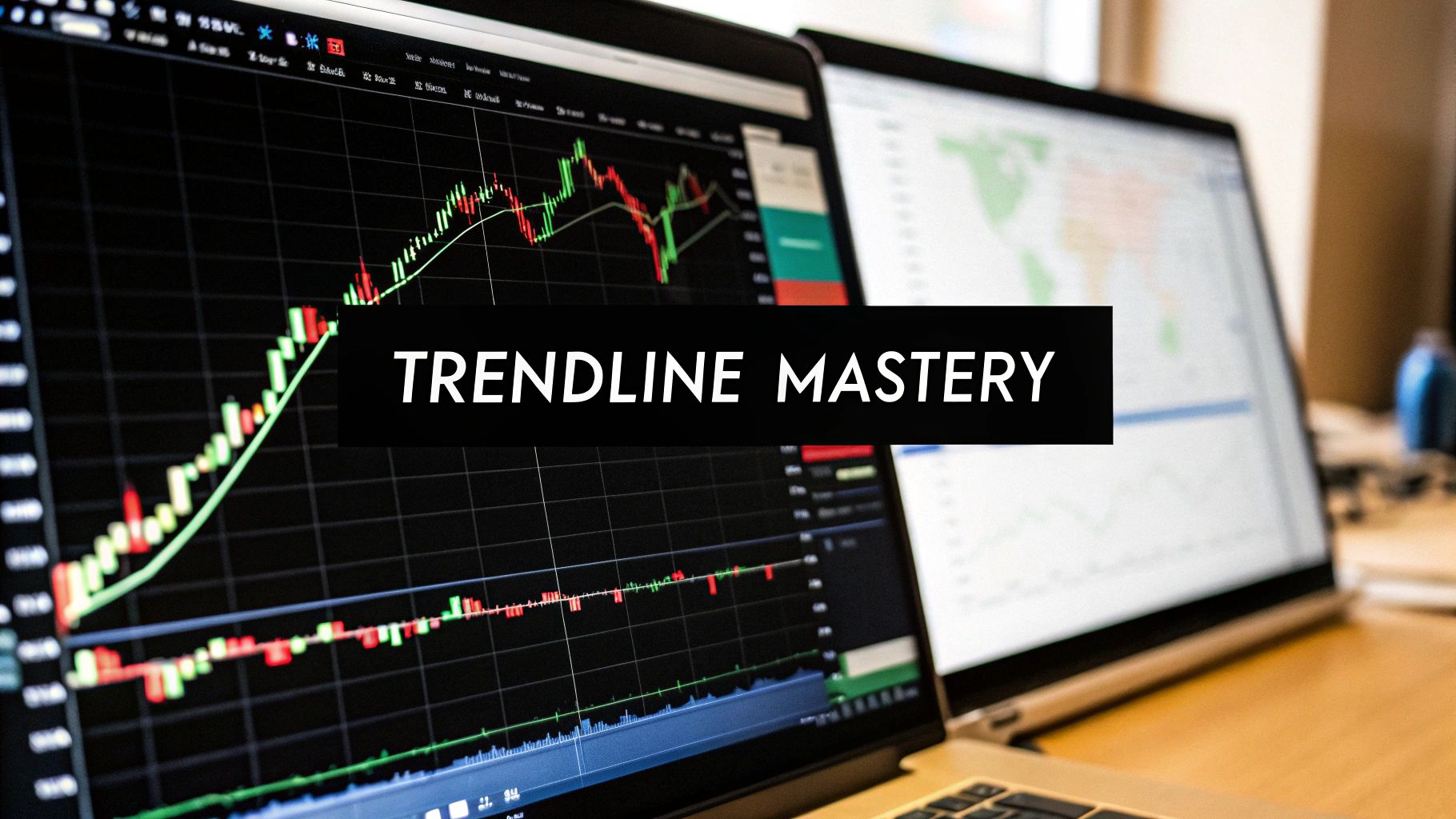
How to Draw Trendlines That Actually Work A Practical Guide
At its core, drawing a trendline is simple. You find at least two major swing points on your chart and connect them with a straight line. For an uptrend, you're connecting two or more significant lows. In a downtrend, you connect two or more significant highs. This line becomes a visual representation of the market's direction, acting as a dynamic level of support or resistance.
Why Trendlines Are a Trader's Essential Tool
Let's be clear: trendlines aren't magic. They don't predict the future. Think of them instead as a visual map of supply and demand playing out in real-time. They are one of the simplest yet most powerful tools a price action trader has to cut through market noise and identify the path of least resistance.
A well-drawn trendline frames your entire trading plan. It gives you a clear, objective reference point on what can otherwise feel like a chaotic chart, helping you make sense of the market's flow. Instead of guessing, you can literally see the dominant direction of buying or selling pressure.
Defining Structure in the Market
The main job of a trendline is to bring order to price action. By connecting key pivot points, you create a boundary that helps contextualize every candle that forms afterward. This simple act provides immense clarity and serves a few critical functions:
- Risk Management: A trendline gives you a logical place to hide your stop-loss. If price breaks decisively through a long-standing trendline, that’s a clear signal the underlying market dynamics have shifted.
- High-Probability Entries: When price pulls back to and respects a valid trendline, it offers a high-probability area to enter a trade in the direction of the dominant trend.
- Trend Strength Analysis: The slope of a trendline gives you clues about the market's health. A steep line might signal an unsustainable rally, while a flattening line can hint at trend exhaustion.
This approach is fundamental to understanding how to read price action, because it forces you to focus on what the market is actually doing.
A trendline isn’t just a line; it’s a story about the ongoing battle between buyers and sellers. Your job is to learn how to read that story and trade with the winning side.
Ultimately, mastering how to draw trendlines is about building a skill, not just blindly following a signal. Studies have shown that mechanically trading trendline breaks can yield modest returns, but often with significant risk. For example, some automated strategies produced 4–7% annualized returns over a benchmark but also faced drawdowns exceeding 30% in volatile periods.
This just highlights the fact that trendlines are most effective when used as part of a complete trading methodology—one that includes robust risk management and contextual market awareness, not as a standalone signal generator.
The Mechanics of Drawing an Accurate Trendline
Drawing a trendline that actually means something isn't some mystical art form; it’s a repeatable, mechanical process. It all starts with finding the right anchor points—the significant swing highs and lows that signal a real shift in market sentiment, not just random noise.
A valid swing point is a clear peak or trough where price has made a decisive turn. Think of it like a prominent mountain peak on your chart, not a tiny foothill. You'll often see these points form with higher-than-average volume, which tells you there's real conviction behind the move. Getting good at spotting these major turning points is the bedrock skill for drawing a trendline that matters.
Identifying Your First Anchor Points
For an uptrend, your job is to connect at least two significant higher lows. These are the valleys where selling pressure finally gave out, and buyers stepped back in with enough muscle to push the price past its previous high.
On the flip side, for a downtrend, you need to connect at least two significant lower highs. These are the peaks where the buying momentum fizzled out, allowing sellers to take over and drive the price below its previous low.
A trendline is only as good as its anchor points. If you start connecting insignificant wiggles, you’ll end up with a useless line that tells you nothing about the real trend. Focus on the major pivots that jump out at you.
Once you've connected your first two points, you simply extend that line out into the future. The real magic happens when the price comes back to test this line for a third time. This third touch is your confirmation. It validates that other traders are watching and reacting to the same level, turning your simple line into a dynamic area of interest for the market.
Wicks vs. Bodies: The Practical Debate
One of the most common questions I get is whether to draw the line connecting the candle wicks or the candle bodies. The truth is, there's no single "right" answer, but there is a practical way to approach it.
- Connecting Wicks: This method captures the absolute price extremes. It can be useful in volatile markets where you see sharp but quick rejections.
- Connecting Bodies: This approach helps filter out some of the "noise" by focusing on where price opened and closed, which often shows where the real battle was won or lost.
A simple, effective technique is to start by drawing your line on the candle bodies. If you notice the wicks are constantly poking through the line but the candles are still closing back on the other side, your trendline is most likely still valid and being respected. Consistency is what you're looking for.
Finally, you have to consider the scale of your chart. For long-term charts that span several years, price movement is often exponential. Switching your chart to a logarithmic scale can normalize this data, making it much easier to draw a straight line that accurately reflects the long-term trend. An arithmetic scale might make a trendline look broken, when on a log scale, the trend is perfectly intact. It’s a simple switch that can make a world of difference in your long-term analysis.
Before you start basing trades on a trendline, it's crucial to make sure it's actually valid. A weak or poorly drawn line is worse than no line at all. I've put together a quick checklist of the essential criteria a trendline must meet to be considered reliable.
Essential Checks for a Valid Trendline
| Validation Criteria | What to Look For | Why It's Important |
|---|---|---|
| Minimum Touches | At least three distinct touches of the line. | The first two points create the line, but the third touch validates it, showing other traders are also respecting this level. |
| Significant Swings | The anchor points are major, obvious turning points on the chart. | Connecting minor fluctuations creates noise. Major swings reflect true shifts in supply and demand. |
| Consistent Spacing | The touches are reasonably spaced out over time. | Touches clustered too closely together might just be short-term consolidation, not a true test of the trend. |
| Clear Angle | The trendline is not too steep (unsustainable) or too flat (weak trend). | An angle between 30-45 degrees often indicates a healthy, sustainable trend that is more likely to hold. |
| Price Reaction | Price clearly reacts and bounces off the line with conviction. | Strong bounces confirm the trendline is acting as a dynamic support or resistance level. Weak reactions are a red flag. |
Think of this table as your pre-flight checklist. Running through these points ensures you're working with a high-probability tool, not just a random line on a chart. It builds discipline and keeps you from falling for fakeouts.
Gauging a Trendline's Strength and Slope
It’s a mistake to think all trendlines carry the same weight. Some are just faint whispers of market direction, while others are powerful boundaries that command respect from traders across the globe. Learning to tell the difference is a critical skill, and it all comes down to a few key tells.
The three big ones are a trendline's duration, the number of touches, and its slope. Think about it: a trendline that's held firm for six months and survived five different tests is in a different league than a two-day-old line with only a couple of touches. The longer a line lasts and the more it's tested, the more it becomes a self-fulfilling prophecy as traders everywhere start to notice and react to it.
Reading the Angle of the Trend
The slope, or the angle, of your trendline is a fantastic clue about the health and emotion behind a trend. It’s like a speedometer for the market's momentum.
- A steep slope (above 60 degrees): This is usually a sign of a market running on pure adrenaline—euphoria in an uptrend, panic in a downtrend. They’re exciting to watch, but these moves rarely last and often end with a sharp, violent correction.
- A healthy slope (around 30-45 degrees): Now this is what you want to see. It suggests a steady, sustainable trend with a good balance of forward movement and healthy pullbacks.
- A shallow slope (below 20 degrees): This points to a weak, tired trend. The momentum is likely fading, making it vulnerable to a reversal.
A trendline that keeps getting steeper is a classic warning sign of a potential blow-off top. On the flip side, if you see a trendline starting to flatten out, that's an early signal that the underlying momentum is dying down.
This visual breaks down the simple, mechanical process for drawing a valid trendline on your charts.
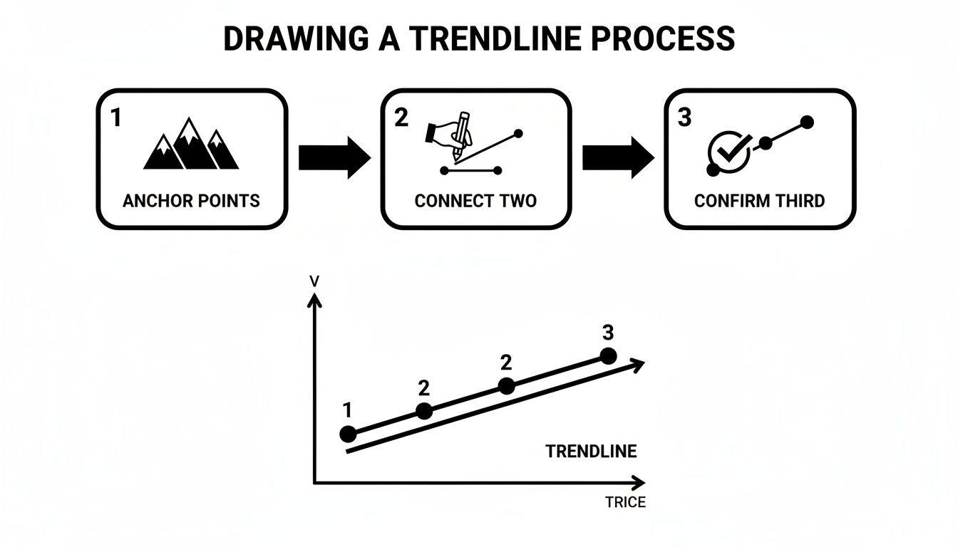
It all starts with spotting a couple of major anchor points, connecting them, and then waiting for that crucial third touch for validation. That third touch is what turns a simple line into a meaningful market boundary.
Context Is Everything
This idea of context isn't just for traders. Economists fitting trendlines to macroeconomic data like GDP have to be just as careful. A single trendline slapped onto 70 years of GDP data can be wildly misleading. Depending on the start and end dates you pick, your annualized growth estimate could swing from 1.5% to 2.5%—a massive difference when compounded over decades. It just goes to show that the timeframe and context of any trendline completely change its meaning.
Once you learn https://www.colibritrader.com/how-to-identify-support-and-resistance/, you'll start to see that a well-tested trendline is really just a dynamic version of these key levels. The more times it holds, the more significant it becomes. Always check its age and the conviction of price action at each touch. A strong trendline will produce clear, decisive bounces, confirming that buyers or sellers are actively defending that diagonal zone.
Common Trendline Mistakes and How to Fix Them

Learning to draw a proper trendline means learning what not to do. Too many traders, hungry for a setup, fall into the same traps that make their analysis completely useless.
Spotting these pitfalls is the first real step toward drawing lines that bring clarity, not confusion.
One of the biggest blunders is forcing a trendline to fit your bias. If you want the market to be bullish, it’s all too easy to grab two minor lows, connect them, and convince yourself you've found the holy grail of support. A real trendline should be obvious. It needs no convincing.
Another common mistake is constantly adjusting your line for every little price wiggle. A strong trendline is a boundary. If you have to move it every few candles, it was never a valid line to begin with.
The Problem of "Forcing" a Line
Forcing a line is just confirmation bias in action. Your job is to let the market show you the trend, not to impose your will on the chart. This single mistake is why you see so many charts with trendlines slicing right through candle bodies—a massive red flag.
The fix is simple. Step back and ask yourself, "Does this line connect the most obvious pivot points, or am I hunting for them?"
If you have to squint, it’s not there. Patience is your greatest ally; wait for the market to give you a clear structure.
A trendline should jump off the chart at you. If you have to search for it, it probably isn't there.
This one simple idea will keep your analysis clean and objective. It stops you from chasing trades based on wishful thinking instead of what price is actually doing.
Ignoring the Slope and Time
The angle and duration of a trendline are just as crucial as the points it connects. Traders often mess this up in one of two ways:
- Drawing lines that are too steep: An almost vertical trendline is a sign of an unsustainable, parabolic move. These are ticking time bombs, prone to breaking violently. You can't rely on them for stable trades.
- Using lines that are too flat: A nearly horizontal line shows a weak, barely-there trend. It lacks momentum and is broken easily, offering very little predictive power.
A healthy, sustainable trendline typically has a slope somewhere between 30 and 45 degrees. This suggests a good balance between upward (or downward) progress and healthy pullbacks.
Finally, you can't just connect two random points in time. A line touching a low from last year and another from yesterday, with absolutely no interaction in between, isn't a trendline. It's just a random line on a chart.
A true trendline gains its validity from being tested and respected repeatedly over a reasonable period.
Putting Trendlines into Action for Trading
Drawing a clean, validated trendline is only half the battle. Now it’s time to turn that line on your chart into a tangible trading plan. This is where analysis becomes action, with clear rules for entry, exit, and managing your risk.
There are two primary ways I trade with trendlines: playing the bounce for trend continuation or trading the break for a potential reversal. Both are powerful, but they require different mindsets and specific confirmation signals to avoid getting caught in costly false moves.
Trading the Trendline Bounce
This is my go-to trend-following strategy. The goal is simple: enter the market when price pulls back to and respects your established trendline. This often offers a high-probability entry right in the direction of the dominant trend.
The setup itself is straightforward. In a confirmed uptrend, you're just watching for price to retrace down to your rising trendline. The key is to avoid jumping in the moment it touches. Patience here is what separates professional traders from the amateurs who get shaken out.
You need to see signs that buyers are stepping back in to defend the trend. For me, that confirmation could be:
- A strong bullish candlestick pattern like a pin bar or an engulfing candle forming right on the trendline.
- A noticeable surge in buying volume as price touches the line, showing real conviction.
Once you have this confirmation, your entry becomes much clearer. I'll typically place a stop-loss just below the low of that confirmation candle. This gives the trade enough room to breathe while protecting my capital if the trendline unexpectedly fails.
Trading the Trendline Break
This approach is for traders looking to catch a potential trend reversal or a major breakout. Here, you're betting that the established trend has run out of steam and a new move in the opposite direction is about to kick off.
A real break is more than just a wick poking through the line; it requires conviction. For a valid breakout signal, I need to see a full-bodied candle close decisively beyond the trendline. A weak close or a long wick rejecting that breakout level is a massive red flag for me.
The most powerful trendline breaks I've seen are almost always accompanied by a significant increase in volume. This signals that institutional money is likely participating, adding serious fuel to the new move.
Empirical data from historical charts shows that false breakout rates can be high, often ranging from 20% to 45% depending on the market and timeframe. Intraday charts, for example, can see false-break rates climb above 40%, while weekly charts tend to be more reliable, with rates closer to 22%. To counter this, many traders—myself included—wait for additional confirmation like a retest of the broken line before committing capital.
After a confirmed break, the trendline often experiences a "role reversal." A broken support line frequently becomes new resistance, and a broken resistance line becomes new support. Waiting for price to retest this newly flipped level provides a second, and often safer, entry opportunity. For a deeper dive into this concept, check out our complete trendline trading strategy guide.
In this scenario, your stop-loss can be placed on the other side of that broken trendline, effectively using the market's old boundary as your new shield.
Trendline FAQs: Answering Your Burning Questions
Even with a clear set of rules, drawing trendlines on a live chart always brings up new questions. It's just part of the process. Let's tackle some of the most common sticking points I see traders run into so you can get past them and start applying this stuff with confidence.
Wicks vs. Bodies: Where Do I Draw the Line?
This is the classic debate, and honestly, there's no single "right" answer. You'll find successful traders in both camps. The absolute key here isn't what you choose, but that you stick with it. Consistency is everything.
Drawing your line on the wicks captures the full emotional range of the market—every last spike and rejection. This can be particularly useful in volatile markets where those sharp turnarounds are telling a big part of the story.
On the other hand, using the candle bodies filters out a lot of that noise. It focuses on where price actually opened and closed, showing you where the real battle for control was won. It’s a cleaner, more decisive picture.
Here's a practical tip I use all the time: I start by drawing the line on the candle bodies. If I see wicks repeatedly piercing that line but the candles keep closing back on the right side, I know the level is still being respected. The market tested it and failed.
This hybrid approach gives you the best of both worlds. You see the emotional spikes (the wicks) but base your analysis on the areas of real control (the bodies).
When Should I Adjust a Trendline?
Here’s the thing: a truly strong, valid trendline shouldn't need constant tweaking. If you're nudging your line every few candles just to make it fit the latest price action, it probably wasn't a valid line in the first place. A clean break—where a full candle closes decisively on the other side of your line—is your signal that the underlying trend structure is likely changing.
But what if the trend just… speeds up? You'll see this happen. A steady trend suddenly accelerates. In that scenario, you can draw a new, steeper "inner" trendline to track this new momentum.
It's crucial, however, to leave your original, less steep "outer" trendline on the chart. That original line often remains a major long-term support or resistance level that price could very well revisit down the road. The goal is never to force a line to fit the price; it's to see if the price is creating a new, valid structure for you to follow.
What's the Best Timeframe for Trendlines?
Trendlines work on every single timeframe. Period. From the one-minute chart right up to the monthly, the principles are the same. The "best" timeframe is simply the one that aligns with your trading style.
- Long-Term Investors: You’ll be living on the weekly and monthly charts, identifying the major, multi-year market direction.
- Swing Traders: Your sweet spot is the daily and 4-hour charts. This is perfect for catching moves that play out over several days or weeks.
- Day Traders: The hourly and 15-minute charts are your playground for finding opportunities within a single trading session.
The real power, though, comes from using them together. I always start my analysis on a higher timeframe, like the daily, to get the big picture. Once I've identified that dominant trend, I'll drill down to a lower timeframe, like the hourly, to draw more precise trendlines and pinpoint high-probability entries that flow with that bigger trend. Aligning your trades with the primary market flow is one of the most important things you can do.
Ready to stop guessing and start trading with a clear, repeatable price action strategy? At Colibri Trader, we provide the no-nonsense education you need to succeed. Explore our courses and transform your trading today.