


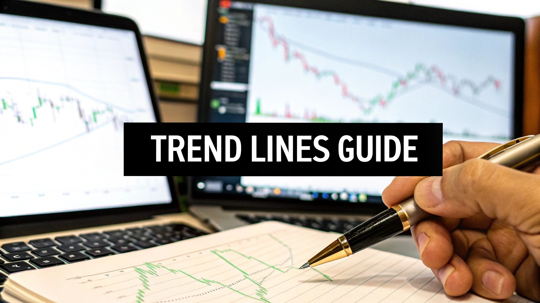
How to Draw Trend Lines a Trader’s Guide
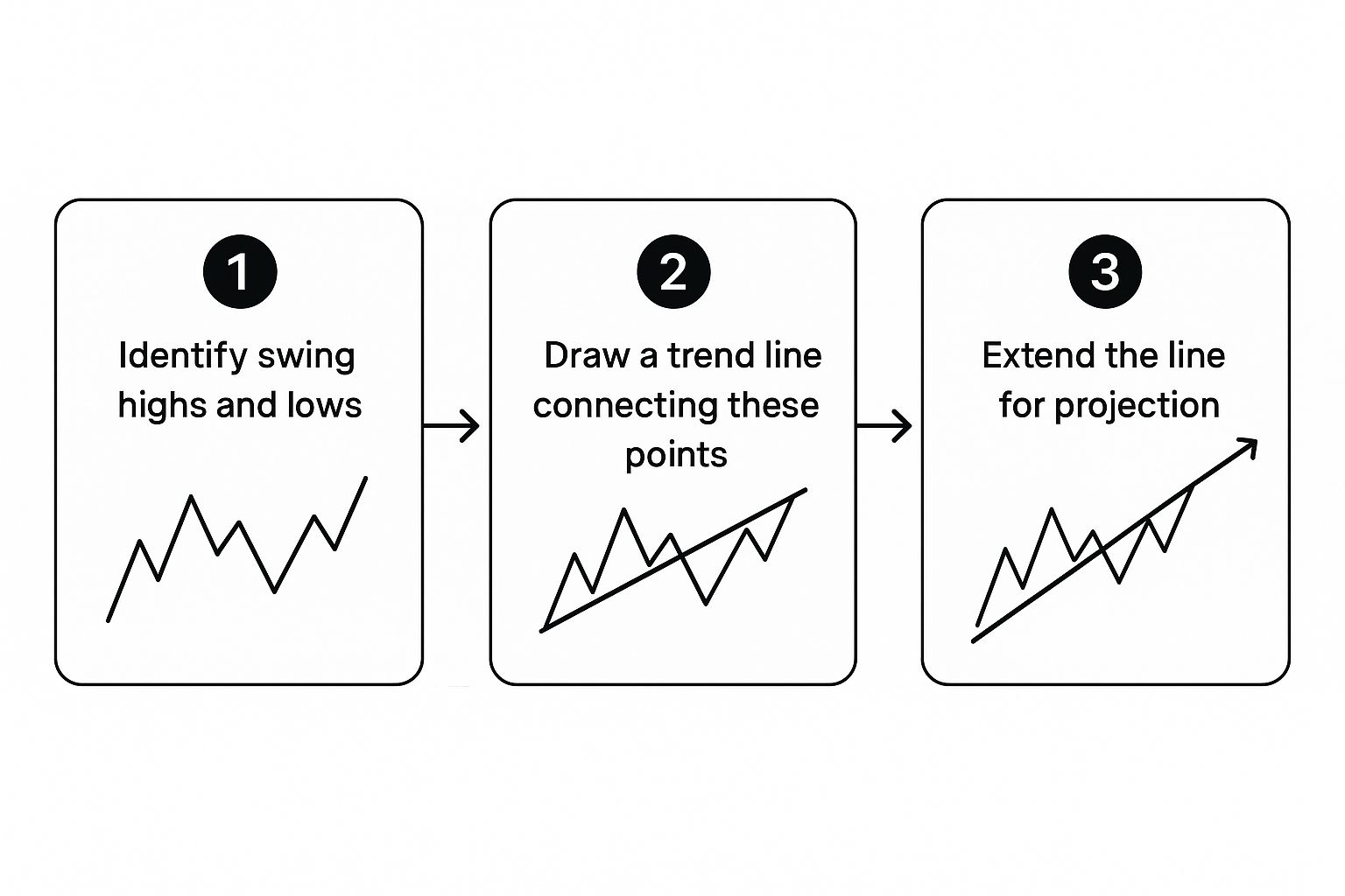
At its core, drawing a trend line is simple. You're just connecting significant swing points on a chart. For an uptrend, that means connecting two or more higher lows. For a downtrend, you're linking two or more lower highs.
The whole point is to visualize where the market is headed and spot potential areas of support or resistance. Think of it as drawing a roadmap for where the price might go next.
Why Trend Lines Are a Trader's Roadmap

Before we get into the nitty-gritty of how to draw these lines, it's really important to understand why they're a cornerstone of technical analysis. These simple diagonal lines are much more than just connecting the dots; they bring some much-needed clarity to the chaos of market noise.
For a lot of traders I know, a well-drawn trend line is the very first step in building a solid trading plan. It helps accomplish a few key things right off the bat:
- Visualizes Market Direction: With just a glance, you can tell if the market is bullish (uptrend), bearish (downtrend), or just chopping sideways.
- Identifies Dynamic Support and Resistance: Unlike your standard horizontal levels, trend lines actually adapt to the market's momentum. They show you where price is likely to find a floor or hit a ceiling as it moves.
- Improves Trade Timing: They are fantastic for helping pinpoint potential entry and exit points. Buying near a rising trend line or shorting near a falling one is a classic, time-tested strategy.
This all works because markets tend to move in trends. In fact, historically, markets trend roughly 70-80% of the time, which is what makes a correctly drawn line such a powerful tool. The more validated touches a line has, the more reliable it becomes. You can find more great insights on trend analysis over at coresignal.com.
A trend line isn't just a line; it’s a story about the ongoing battle between buyers and sellers. Learning to read it gives you a distinct advantage.
Finding the Right Swing Points to Anchor Your Line
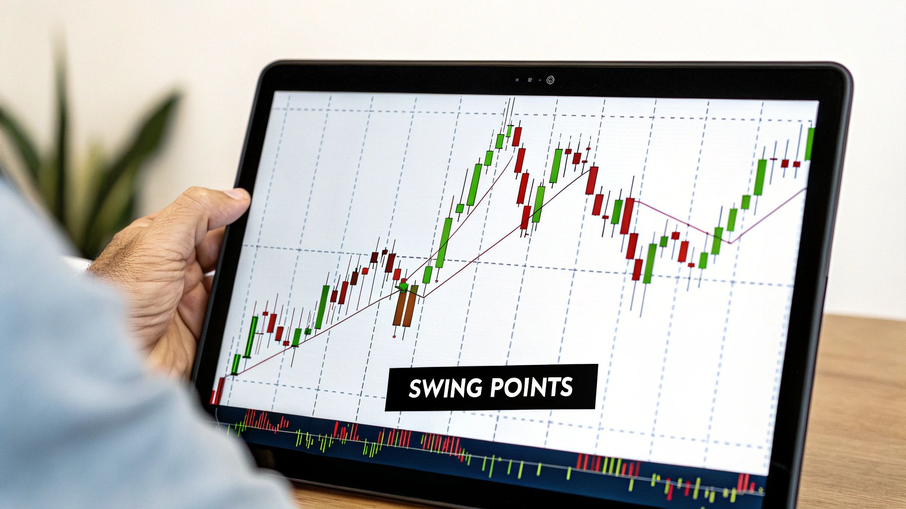
The accuracy of your trend line hangs entirely on the anchor points you pick. This is where a lot of traders trip up right out of the gate, connecting minor price blips and ending up with a line that’s basically useless.
Your job is to pinpoint the significant swing points—those unmistakable peaks and valleys where the market genuinely pivoted.
If you're charting an uptrend, you're hunting for the major troughs, or what we call swing lows. These are the spots where the price took a dive, found a floor of support from buyers, and then shot up to a new high. For a downtrend, you’re looking for the clear-cut peaks, or swing highs, where sellers grabbed control and slammed the price back down.
Distinguishing Major Swings from Minor Noise
Not every little wiggle on the chart is a valid swing point. A lot of that is just market noise. A real swing point is a prominent turning point that jumps out at you visually. It signals a real shift in market psychology.
Here’s a simple way to spot them:
- Look for Clear Reversals: A swing high is just a candlestick with lower highs on both its left and right. A swing low is the exact opposite—a candle with higher lows on each side.
- Zoom Out: Always start your analysis on a higher timeframe, like the daily or weekly chart. This is a game-changer. It filters out all the distracting noise and makes the major pivot points pop. A swing low on a daily chart has far more significance than some tiny flicker on a 5-minute chart.
A classic mistake is trying to force a trend line to fit a trade idea you already have. Let me be clear: the best trend lines are the most obvious ones. If you have to squint and search for the swing points, they probably aren't strong enough to be your anchors.
Practical Tips for Selecting Anchors
When you're learning to draw trend lines, it’s all about quality, not quantity. Two rock-solid, obvious swing points are infinitely better than three weak, questionable ones.
Another pro tip: always connect the wicks of the candles (the absolute highest or lowest price points), not the bodies. This makes sure your line is respecting the full range of price action.
For instance, looking at a EUR/USD daily chart, you might spot a major swing low in March and then another, higher low in May. Connecting those two distinct points gives you a solid foundational uptrend line. From there, you can start using it to anticipate where price might find support in the future.
Drawing Uptrend and Downtrend Lines That Work
Once you've managed to pinpoint the significant swing points, you're ready to connect them and bring your trend line to life. This is where the market's story really starts to take shape, but precision is everything.
The goal here is to let the price action guide your hand. Don't try to force a line to fit a trend you think should be there.
Capturing an Uptrend
For a bullish market, or an uptrend, the rule couldn't be simpler: connect two or more significant higher lows. Start with the lowest swing low you see in your chosen timeframe and draw a line up, connecting it to the next higher low. This line now acts as a dynamic level of support.
As the price keeps climbing, it will often pull back to test this line. Each time it touches and bounces off, the line's validity gets stronger. Think of it as buyers consistently stepping in at progressively higher prices, confirming they're still in control.
This simple visual shows that a trend line isn’t just a historical record. It's a predictive tool that you project into the future to anticipate where buyers might show up again.
Defining a Downtrend
Drawing a line for a bearish market—a downtrend—just flips the logic. Here, you'll connect two or more significant lower highs. Find the highest peak on your chart and draw a descending line that links it to the next peak that fails to break higher. This creates a dynamic resistance level.
In this scenario, the line shows you where sellers are consistently overpowering buyers, pushing the price down after each attempted rally. Every time the price climbs to the line and gets rejected, it just reinforces the strength of that downtrend.
For a clearer picture, here's a quick reference table breaking down the key differences.
Uptrend vs. Downtrend Line Rules
| Characteristic | Uptrend Line (Bullish) | Downtrend Line (Bearish) |
|---|---|---|
| Connection Points | Two or more significant higher lows | Two or more significant lower highs |
| Placement | Drawn below the price action | Drawn above the price action |
| Function | Acts as a dynamic support level | Acts as a dynamic resistance level |
| What It Shows | Buyers are in control, pushing prices up | Sellers are in control, pushing prices down |
| Angle | Ascending (slopes up from left to right) | Descending (slopes down from left to right) |
Ultimately, whether you're charting a bullish run or a bearish slide, the core principles are identical. Find your anchors, connect them cleanly, and always respect what the price action is telling you.
The most reliable trend lines are always the most obvious ones. If you have to squint or second-guess your swing points, the trend probably isn't strong enough to be meaningful. Just let the chart speak for itself.
Mastering this skill is a massive part of price action trading. In fact, many successful traders rely almost entirely on interpreting these patterns without cluttering their charts with indicators. If that stripped-back approach sounds interesting, you can learn more about the power of trading without indicators and see just how potent it can be.
How to Validate Your Trend Line for More Confidence

Anyone can draw a line between two points on a chart. That’s the easy part. But that line doesn't mean you've found a valid trend. In reality, an unconfirmed line is nothing more than a guess—a hypothesis—until the market itself proves you right.
This is where validation separates the pros from the amateurs. It’s the process of turning a simple line into a high-probability analytical tool.
The most widely trusted method I've used over the years for confirming a trend line is the "three-touch rule." It's simple: two points create your initial line, but it’s the third touch that gives it real credibility. When the price returns to your line a third time and bounces off, it's a powerful signal. It tells you that other traders are seeing the exact same level and reacting to it.
Each additional touch after that just adds more weight and reinforces its strength.
Analyzing the Slope and Other Confluences
Beyond just counting the touches, the character of your line gives you essential clues about the trend's health. For me, the angle, or slope, of a trend line is one of the most revealing factors.
- A steep slope often points to a powerful, aggressive trend. The downside? They can be completely unsustainable and are far more likely to break suddenly.
- A shallow slope suggests a slower, more measured trend. These might have more staying power but won't offer the same kind of momentum for quick profits.
To really build confidence in your analysis, you need to look for other technical factors that align with your trend line. This is a concept we call confluence—when multiple, independent signals all point to the same conclusion.
For example, is a key moving average, like the 50 EMA, running parallel to your trend line? Do you see trading volume spike each time the price tests that line? These are the questions you should be asking.
Combining trend lines with other indicators is a powerful way to filter out the noise and avoid false signals. A trend line that aligns with other key elements of the market structure becomes a high-confidence zone for making trading decisions.
The data backs this up. Traders who combine trend lines with tools like moving averages often reduce false signals by 20-30%. What's more, trend lines with three or more confirmed touches have shown a 65-75% probability of correctly signaling the trend's continuation in the near term.
Understanding these dynamics is a huge part of reading the underlying market structure, which you can learn more about here: https://www.colibritrader.com/what-is-market-structure/
Common Trend Line Mistakes and How to Avoid Them
Look, even the most seasoned traders have a long history of making mistakes. It's just part of the game. But what if you could sidestep some of the most common—and costly—errors right from the start? Learning how to draw trend lines correctly is as much about recognizing what not to do as it is about what to do.
One of the biggest pitfalls I see is forcing a line to fit a preconceived bias. You might be totally convinced a market should be in an uptrend, so you start fudging your line—ignoring candle wicks or connecting insignificant little bumps just to make it fit your narrative.
The best trend lines are always the most obvious ones. If a line doesn’t jump out at you, it’s probably not a valid trend and is best left off your chart entirely.
This "curve-fitting" is a fast track to unreliable signals and bad trading decisions. Don't force it. Let the market's price action dictate where the line should go. If it doesn't fit cleanly, move on. There's always another chart.
Redrawing and Connecting the Wrong Points
Another rookie mistake is constantly redrawing your lines to accommodate every new price candle. A trend line is supposed to be a stable guidepost, not something you have to adjust every five minutes. If you find yourself tweaking it daily, that’s a massive red flag that the trend you’re tracking is either incredibly weak or just isn't there. A valid line should hold firm through minor fluctuations.
Connecting the wrong anchor points is just as problematic. I often see beginners drawing a major trend line based on a few minor wiggles on a 15-minute chart. That's a recipe for disaster.
- What Not to Do: Don't draw a line connecting small, insignificant price movements on a low timeframe.
- Do This Instead: Always start your analysis on a higher timeframe, like the daily or weekly chart. This is where you'll find the truly significant swing highs and lows that matter. A trend line anchored by major pivots on the daily chart carries far more weight and respect from the market.
Avoiding these simple but critical errors is essential for building a solid foundation in technical analysis. These slip-ups are just a few of the common trading mistakes that can derail your progress, but recognizing them early gives you a massive edge. By prioritizing obvious trends and significant anchor points, your trend lines will become reliable tools instead of sources of frustration.
Answering Your Questions About Drawing Trend Lines
Once you start trying to draw trend lines on a live chart, you’ll quickly find that theory and reality can be two different things. Let's tackle some of the most common questions that pop up when you're in the trenches.
Wicks or Bodies?
This is probably the most-asked question, and for good reason. Should your line connect the candle wicks or the bodies?
My rule is to always try and connect the wicks—the absolute highs or lows of a move. This respects the entire price journey. But here's the real secret: the most important thing is getting the most touches possible without slicing through the body of a candle. Consistency is what really matters.
What Timeframe Works Best?
You can draw a trend line on any chart you pull up, but they are not all created equal. Far from it.
Higher timeframes like the daily or weekly charts are where you'll find the most significant, reliable trend lines. Think about it: a trend line that has held strong for six months on a daily chart tells a much bigger story than one on a 5-minute chart that's only been around for a couple of hours. The longer the timeframe, the more weight the trend line carries.
How Do You Know When a Trend Line Is Really Broken?
Seeing price poke through your trend line can get your heart racing, but don't jump the gun. A true break isn't just a quick jab; it needs confirmation before you can trust it.
- Wait for a Candle to Close: A real break happens when a candle's body closes decisively on the other side of your line. If it’s just a wick that pierces through and then retreats back, that’s often just a test, not a true breakout.
- Watch for the Retest: This is a classic piece of price action. After breaking a trend line, the price will often pull back to "retest" the line from the opposite side. If it bounces off the old line and continues in the new direction, that’s your confirmation.
A valid trend line should be obvious. If you find yourself squinting and wondering if it’s a real break, it probably isn’t strong enough to trade. The best signals are the ones that jump right off the chart at you.
Using these clear, data-driven methods for trend analysis has even found its way into algorithmic trading. Some backtested models have shown up to a 12% improvement in annual returns over simple buy-and-hold approaches in major markets. You can read more about these data-driven trend analysis findings.
Ready to stop guessing and start trading with a proven, price-action based strategy? Colibri Trader provides the clear, no-nonsense guidance you need to achieve consistent results without relying on confusing indicators. Take our free Trading Potential Quiz and see how our action-based programs can transform your performance today. https://www.colibritrader.com