


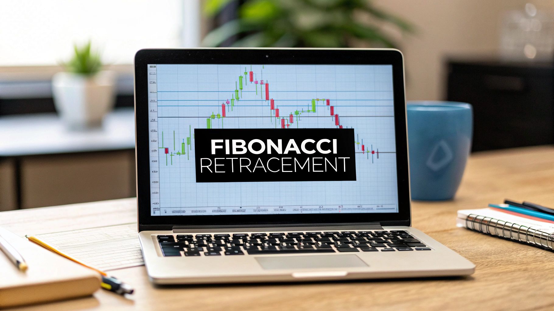
How to Draw Fibonacci Retracements A Trader’s Practical Guide
Drawing Fibonacci retracements is pretty straightforward once you get the hang of it. You just need to spot a clear price swing on your chart. In an uptrend, you select the tool, click the swing low, and drag your cursor up to the swing high. For a downtrend, you do the opposite. The platform then overlays the key levels where price might find a floor or a ceiling.
Your Blueprint for Using Fibonacci Retracements
Before we jump into the nitty-gritty of drawing lines, it's worth understanding why Fibonacci retracements have become such a staple for traders. Don't think of them as some magical formula. Instead, see them as a practical roadmap for pinpointing potential support and resistance zones based on natural market psychology and universally recognised mathematical ratios.
These levels help you anticipate where a market pullback might stall or even reverse before hopefully continuing in its original direction. This gives you a structured way to hunt for higher-probability entry points during those temporary dips in both bull and bear markets.
The Psychology Behind the Ratios
The real power of Fibonacci isn't mystical; it’s rooted in collective human behaviour. When a massive number of traders are all watching and reacting to the same levels, those levels can become self-fulfilling prophecies. The whole process kicks off when you identify a clean, obvious price swing on a chart.
From there, you use your Fibonacci retracement tool to connect the swing low to the swing high (or vice-versa), which automatically plots horizontal lines at key ratios: 23.6%, 38.2%, 50%, 61.8%, and 78.6%.
The self-fulfilling nature of this tool is amplified by just how many people use it. Some surveys suggest up to 70% of institutional traders incorporate it into their analysis, turning levels like 61.8% into major psychological battlegrounds.
Fibonacci retracement is a preparation tool, not a prediction tool. It gives you an edge by highlighting where markets are most likely to react, helping you manage risk and avoid emotional decisions during pullbacks.
Why These Levels Matter in Your Trading
When you start weaving Fibonacci analysis into your routine, you move beyond random entries and exits. It provides a logical framework for making decisions based on what price is actually doing.
- Improved Entry Accuracy: Pinpoint zones where a trend is likely to resume after a pullback.
- Structured Risk Management: Set logical stop-loss orders just below key Fibonacci levels.
- Clear Profit Targets: Use Fibonacci extensions (a related tool) to identify potential take-profit areas.
To really get the most out of Fibonacci retracements, it helps to have a solid grasp of broader market concepts. You can seriously boost your learning by exploring the best way to learn stock trading from video courses. This section will set you up to use this tool with confidence.
Understanding Key Fibonacci Retracement Levels
To make sense of what you're seeing on the chart, it helps to know what each of the primary Fibonacci levels typically suggests. Think of them as signposts for potential market reactions.
| Fibonacci Level | Type of Retracement | What It Suggests |
|---|---|---|
| 23.6% | Shallow Retracement | Often the first line of defence in a very strong trend. A bounce here indicates significant buying/selling pressure. |
| 38.2% | Moderate Retracement | A common pullback level. If price holds here, it's a good sign the original trend remains intact. |
| 50.0% | Mid-Point Retracement | Though not a true Fibonacci ratio, it's a key psychological level representing a 50% pullback. |
| 61.8% | Golden Ratio | Considered the most significant retracement level. A strong reaction here is a classic trend-following signal. |
| 78.6% | Deep Retracement | A final area of potential support/resistance before the previous swing high/low is invalidated. |
While these levels provide a great framework, remember they are zones, not exact lines. Always look for confluence with other price action signals before making a trading decision.
Identifying the Right Price Swings to Draw
The accuracy of your Fibonacci retracement levels hinges entirely on one thing: the price swing you choose to measure. This is the single biggest stumbling block for traders learning this tool. If you pick a weak or insignificant swing, you'll get unreliable levels and, frankly, make poor trading decisions.
Your goal is to find the truly significant swing highs and lows, not just the minor ripples of market noise.
A valid swing is a clear, committed price move that really stands out on your chart. It should represent a distinct leg of a trend, not a small wiggle inside a consolidation range. If you have to squint to see the swing, it’s probably not worth drawing on. Think of it as identifying the major chapters in a story, not the individual sentences.
Defining a Valid Swing in Uptrends and Downtrends
The mechanics are simple, but they demand a disciplined eye. You have to learn to distinguish a strong, clear trend from choppy, sideways action—that's where Fibonacci tools lose their edge. For a price-action trader, this distinction is everything.
In a clear uptrend, you’re on the hunt for a significant swing low followed by a significant swing high.
- How to draw: Click your Fibonacci tool on the absolute bottom of the swing low (wick included) and drag it to the absolute top of the swing high (wick included).
In a clear downtrend, you just flip the process. You need to spot a significant swing high that’s followed by a significant swing low.
- How to draw: Click the tool on the peak of the swing high and drag it down to the bottom of the swing low.
This simple act of connecting two distinct points lays the entire foundation for your analysis. It's a lot like how you find your anchor points when you learn how to draw a trendline; the quality of your anchor points determines the quality of your analysis.
Timeframe Matters, But Principles Do Not
A question I get all the time is, "What timeframe is best?" The truth is, the principles for spotting a valid swing are universal. It doesn't matter if you're a swing trader on the daily chart or a day trader on the hourly.
A swing trader looking at a daily chart might pick out a swing that spans several weeks of price action. On the other hand, an intraday trader on the 1-hour chart might focus on a swing that formed over just a single trading session. The scale is different, but the criteria for a "significant" move are the same: it must be a clear, obvious push in one direction.
Pro Tip: When in doubt, zoom out. If a price swing isn't obvious on your current timeframe, take a look at a higher one. A major swing on the 4-hour chart will always be more reliable than a minor blip on the 5-minute chart.
Whatever you do, avoid drawing Fibonacci levels in range-bound or choppy markets. When the price is just drifting sideways without clear direction, there are no meaningful swings to measure. Slapping the tool on a chart like that will only create a mess of confusing, useless lines.
Wait for the market to show its hand with a clear directional move before you try to measure its potential pullback. This patience is what separates consistently profitable traders from the rest.
Placing Your Fibonacci Levels with Precision
Moving from theory to practice is where things get interesting. Let’s walk through the actual mechanics of drawing Fibonacci retracements on your chart. I'll use TradingView as an example since it's what most traders use, but the process is nearly identical on any platform.
It's a simple process, but getting it right is what separates a useful level from just another line on your screen.
First, you'll need to find the Fibonacci Retracement tool. On most platforms, it’s tucked away in the drawing panel on the left-hand side. Once you select it, your cursor will change, letting you know it's ready to go. Now for the most important part: anchoring it to the correct candles.
For real accuracy, you have to use the absolute highest and lowest points of the candle wicks within your chosen price swing—not the bodies. This is a common mistake I see all the time. Those wicks represent the full story of where price traveled, and ignoring them means your levels will be off from the start.
Customizing Your Tool for Clarity
By default, most charting platforms throw a whole mess of Fibonacci levels onto your chart. While some traders might use them all, I find a cleaner chart leads to clearer, more confident decisions. The good news is you can easily tweak the settings to show only the levels that truly matter.
Just double-click on the Fibonacci drawing you made. This will pop up a settings or style menu. From there, you can customize which levels you want to see.
To keep things clean and effective, I recommend focusing on these core ratios to start:
- 38.2% (0.382)
- 50.0% (0.5)
- 61.8% (0.618)
- 78.6% (0.786)
By unchecking the boxes for the other levels, you instantly declutter your workspace. This helps your brain focus only on the high-probability zones where price is most likely to have a reaction. Trust me, a clean chart is a profitable chart.
The flowchart below gives you a simple way to think about analysing price swings for different market conditions.

As you can see, Fibonacci tools really shine in clear uptrends or downtrends. They lose their edge in choppy, sideways markets.
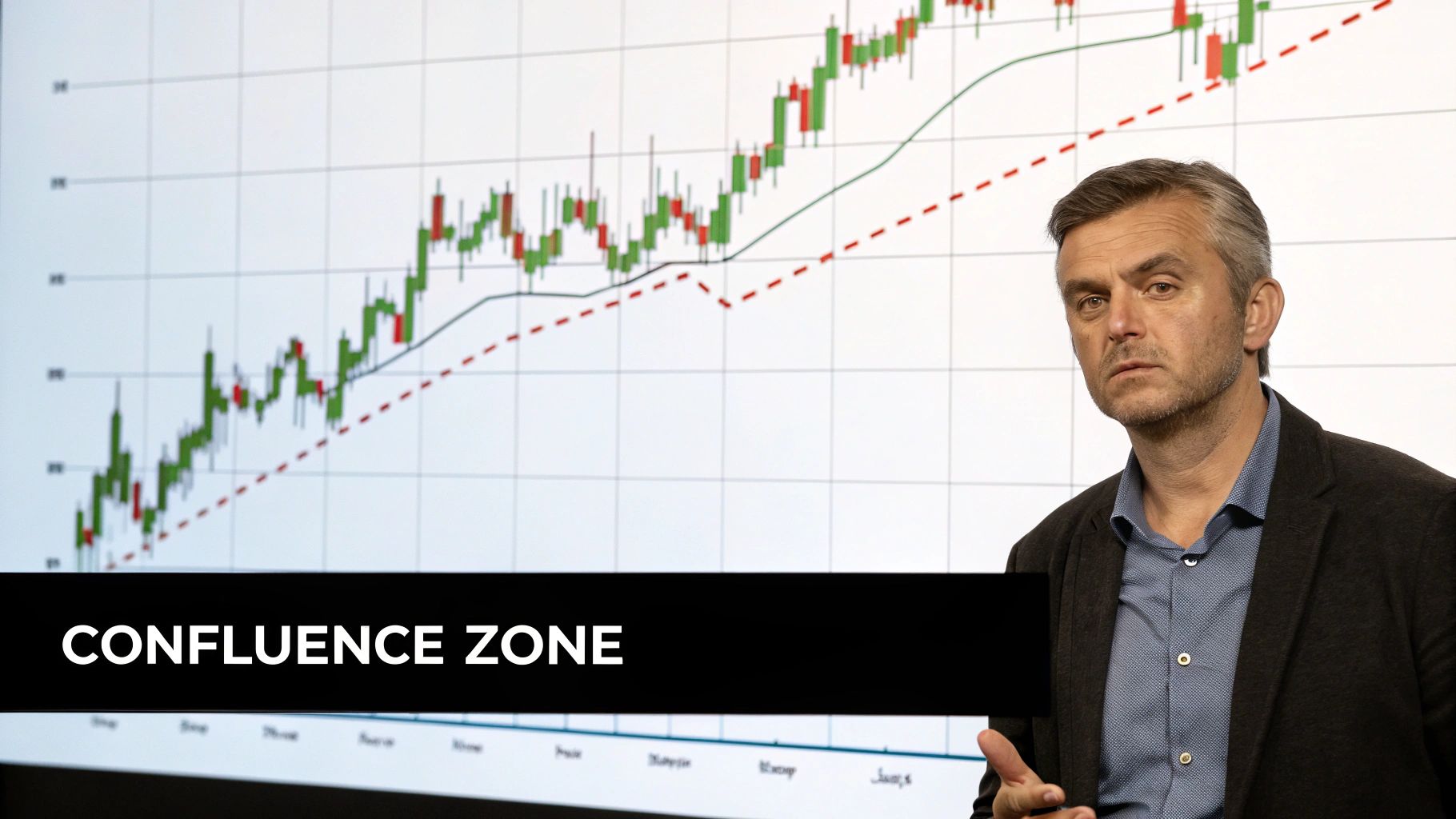
A well-drawn Fibonacci level isn't just a line; it's a potential area of confluence where buyers and sellers will battle for control. Your job is to measure the battlefield accurately.
These retracement zones become incredibly powerful when they line up with other key technical areas. In fact, learning how to identify support and resistance and then watching for overlaps with Fibonacci ratios is a classic technique for finding high-probability setups.
Imagine a 61.8% retracement level lining up perfectly with a major support zone from last week. When you see that kind of confluence, your confidence in the trade should go way up. That's what we're looking for.
Reading the Story Told by Key Fibonacci Levels
Once you’ve drawn your Fibonacci levels on the chart, the real work begins. These horizontal lines aren’t just random markers; they tell a story about the market's strength, conviction, and where it might be headed next. Your job is to learn how to read that story.
Think of a strong trend as a long-distance run. A pullback, or retracement, is simply the market catching its breath. The depth of that pullback—where the price pauses—tells you a lot about the runner's stamina.
A shallow pause suggests the trend is powerful and ready to keep going. A deep one, however, hints at fatigue and a potential change of direction.
Decoding Shallow and Deep Retracements
Not all retracements are created equal. The specific level where price finds support or resistance gives you critical clues about the momentum behind the original move.
A shallow pullback that bounces off the 23.6% or 38.2% level is a massive sign of strength. It tells you that buyers (in an uptrend) or sellers (in a downtrend) are so aggressive that they're jumping back in before the price can even offer a decent discount. These are the powerful, high-momentum trends you want to be a part of.
On the other hand, a deep retracement all the way to the 78.6% level is a major warning sign. While it can still mark a turning point, it shows that the opposition had enough power to almost completely erase the previous move. This tells me the original trend might be running out of steam.
The Significance of the Golden Ratio: 61.8%
Out of all the levels, the 61.8% retracement holds a special place in technical analysis. Often called the "golden ratio," this level is frequently the make-or-break point for a trend. A lot of institutional algorithms and professional traders have their eyes glued to this level, which often creates a self-fulfilling prophecy.
A strong, decisive bounce from the 61.8% level is a classic, high-probability signal that the trend is healthy and likely to continue. Its historical reliability is well-documented.
For example, after the Dow Jones plummeted 54% during the 2008 financial crisis, the 61.8% retracement acted as a brick wall of resistance. More recent analysis on the Nasdaq 100 showed that buying at the 61.8% pullback level produced a 58% win rate, outperforming other key levels over a 33-year period. You can dig deeper into this data with Fibonacci's historical performance on CME Group's site.
The golden ratio isn't a magic bullet, but it is a critical battleground. How price behaves at the 61.8% level often reveals the market's true intentions for the next major move.
Fibonacci Level Trading Signals
To translate this theory into real-world trading decisions, let's compare how you might interpret price action at different retracement depths. This will help you see how the context changes your potential trade plan.
| Scenario | Shallow Retracement (23.6% – 38.2%) | Deep Retracement (61.8% – 78.6%) |
|---|---|---|
| Market Signal | Indicates a very strong, confident trend with high momentum. | Suggests the trend is weakening or facing significant counter-pressure. |
| Trader's View | Looks for an aggressive entry, expecting a swift continuation of the trend. | Approaches with caution, waiting for strong confirmation before entering. |
| Risk Management | Can use a tighter stop-loss, as the trend should not violate recent lows/highs. | Requires a wider stop-loss to account for increased volatility and uncertainty. |
By learning to interpret these nuances, you move beyond just drawing lines on a chart. You start to engage with the market's narrative, making informed decisions based on the strength and conviction you see playing out at these key Fibonacci levels.
Finding High-Probability Setups with Confluence
A standalone Fibonacci level might catch your eye, but on its own, it's not a complete trade signal. To get a real edge, you need to look for confluence—that sweet spot on the chart where multiple, independent technical factors all line up and point to the same outcome.
This is the secret to moving beyond just drawing lines on a chart and starting to build robust, high-probability trading setups. A single retracement level is a hint; a cluster of signals is a compelling reason to take action.
Picture this: a 61.8% Fibonacci retracement that lands exactly on top of a major support zone that has held strong in the past. Now, what if a rising 50-day moving average is also creeping up to meet the price at that very same spot? That's confluence. You’ve just identified a powerful zone where a market reaction is far more likely.
Stacking the Odds in Your Favor
The idea behind confluence is really quite simple: the more reasons you have to take a trade, the better your odds of success. Instead of trusting one tool in isolation, you actively hunt for areas where different forms of analysis overlap.
This builds a much stronger technical argument for a potential reversal. Think of it like a detective building a case—each new piece of evidence makes your conclusion more convincing.
So, what should you be looking to combine with your Fibonacci levels? Here are some of the most effective pairings I use in my own trading:
- Support and Resistance Zones: Does your Fib level align with a historical price floor or ceiling where the market has clearly pivoted before?
- Moving Averages: Is a key moving average, like the 20 EMA or 50 SMA, acting as dynamic support or resistance right at your level?
- Trendlines: Does a retracement level intersect with a long-term, respected trendline that has been tested multiple times?
- Supply and Demand Areas: This is the holy grail for price action traders. When a key Fibonacci level falls smack in the middle of a powerful supply or demand zone, you've got a Grade-A setup on your hands.
When you start layering these tools, your chart transforms from a random collection of lines into a strategic map. You can get a much deeper understanding of these zones by reading our guide to confluence areas in forex trading.
Confirming Setups with Momentum Indicators
Confluence isn't just about price structure. You can add another powerful layer of confirmation by bringing in momentum indicators like the Relative Strength Index (RSI) or MACD. These tools are fantastic for gauging the strength—or exhaustion—behind a price move.
For instance, say the price pulls back to the 50% retracement level. If you look at your RSI and see it’s showing an oversold reading (below 30), that’s a potent combination. It tells you that not only has price reached a key support area, but the downward momentum is likely running out of steam.
The goal of confluence isn't to find a perfect, risk-free trade—those don't exist. The real goal is to filter out the weak, low-probability signals and focus your capital only on the setups where the technical evidence is stacked overwhelmingly in your favor.
A Few Common Questions About Fibonacci Retracements
Once you start drawing Fibonacci levels, a few questions always seem to pop up. This is perfectly normal. Getting these small details right is what separates a clean, actionable chart from a confusing mess, so let's clear up the most common sticking points I see traders struggle with.
Should I Use the Candle Wicks or Bodies?
This is probably the biggest one, and for a pure price action trader, the answer is simple: always use the wicks.
The absolute highest point (the wick's high) and the lowest point (the wick's low) of any swing tell you the full story of where price traveled. The wicks represent the price extremes where buyers or sellers momentarily lost control before the tide turned. If you ignore them and just use the candle bodies, you're working with incomplete data. Your levels will be just plain wrong.
Which Swing Is the Right One to Draw On?
Another question I get all the time is, "Which price swing should I actually use?" This is where a bit of trader discretion comes into play, but there's a simple rule to guide you.
You should always select the most recent, most obvious swing that defines the current leg of the trend you're looking at. Don't get lost in the noise trying to draw levels on tiny, insignificant wiggles within a larger move. It just clutters your chart.
- A swing trader on the daily chart might measure a move that took several weeks to form.
- A day trader on the 15-minute chart will be focused on a swing that formed over a few hours.
The key is relevance. The swing you choose has to be significant for your trading timeframe and strategy.
A good rule of thumb I tell my students: if you have to squint and really search for a swing, it’s not significant enough. A valid swing should literally jump off the chart at you.
What About Choppy, Sideways Markets?
So, what happens when the market isn't trending clearly and is just chopping around? Can you still use the Fibonacci tool?
The short answer is no. You shouldn't.
The Fibonacci retracement tool is, by its very nature, a trend-following tool. It’s designed specifically to measure pullbacks within a directional move. When there is no clear trend, there are no meaningful swings to measure.
Trying to force Fibonacci levels onto a choppy chart will only create a web of confusing, unreliable lines. It’s a recipe for bad trades. In these conditions, the best move is no move at all. Be patient, sit on your hands, and wait for a clear, directional breakout before you even think about drawing your levels.
At Colibri Trader, we teach you to build a trading strategy based on these powerful, no-nonsense price action principles. Move beyond indicators and learn to read the market with clarity. Find out more on the Colibri Trader website.