


A Trader’s Guide to Higher Highs and Higher Lows

When you see a series of higher highs and higher lows, the market is handing you a storybook. It’s a clear tale of strength, a visual footprint of an uptrend that tells you buyers are firmly in the driver's seat.
Decoding the Market's Story of Upward Momentum

Stop seeing charts as just random wiggles. Instead, think of them as a narrative. An uptrend is simply a story of consistent growth, and the main characters are the higher highs (HH) and higher lows (HL).
It's a lot like climbing a staircase. Every time you plant your foot on a new, higher step, you've just made a higher high. When you pause for a breath on a landing before climbing again, that's your higher low. The key? Each landing is higher than the last one.
This isn't just noise. This simple, rhythmic movement is hard evidence of a powerful market dynamic where buyers are consistently outmuscling sellers.
The Psychology Behind the Steps
This staircase pattern isn't random; it's pure market psychology in action. A higher high shows that bullish energy is strong enough to shatter previous peaks. Buyers are literally willing to pay more for an asset than they were just a short time ago. That’s confidence.
After that peak, some traders will naturally take profits, causing the price to dip. This little pullback forms the higher low.
The higher low is the most crucial part of this entire sequence. It shows that even as some people cash out, a fresh wave of buyers is waiting to jump in at what they see as a discount. They prevent the price from tumbling back to its old low, proving the market's underlying strength and resilience.
This cycle—a new push to a higher peak, followed by a shallow, resilient pullback—is the very definition of a classic uptrend. It's not just a pattern on a screen; it's a direct reflection of collective market sentiment, where optimism and buying pressure keep winning the day.
Once you can spot this simple structure, you're on your way to trading with the trend, not against it. You don't need a mess of complicated, lagging indicators. The core components are beautifully simple:
- Higher High (HH): The price hits a new peak, smashing through the previous one. This screams strong buying momentum.
- Higher Low (HL): After that new high, the price pulls back but finds support at a level higher than the previous low. This confirms buyers are stepping in to defend prices and that demand is solid.
To give you a clearer picture, let's break down what each of these components signals to a price action trader.
Uptrend Characteristics at a Glance
| Component | Definition | What It Signals to a Trader |
|---|---|---|
| Higher High (HH) | A new price peak that is higher than the previous peak. | Strong bullish momentum is present; buyers are in full control and pushing prices to new territories. |
| Higher Low (HL) | A price pullback that finds support above the prior low. | Underlying strength is confirmed; buyers see value and are entering on dips, defending the trend. |
| The Sequence | A consistent series of HH followed by HL. | The uptrend is healthy and sustained. This is the "green light" to look for buying opportunities. |
By learning to read this fundamental story, you can start identifying high-probability trading setups. It’s a core concept in the Colibri Trader methodology that provides the clarity you need to make confident decisions based on what price is actually doing, not what you hope it will do.
How to Spot Higher Highs and Higher Lows on Any Chart
Knowing what an uptrend is in theory is one thing. Being able to actually see it on a live chart is a completely different skill. This is where the rubber meets the road, separating traders who guess from those who analyze. Spotting higher highs and higher lows is that core skill, and this is your visual training guide.
The secret is to tune out the noise and focus on the swing points—the obvious peaks and valleys that form the backbone of price movement. Think of it like a dot-to-dot puzzle. When you can connect a low, to a high, then down to a higher low, and finally up to a new, higher high, you've just visually confirmed an uptrend.
This isn't about getting caught up in every tiny wiggle on the chart. You're hunting for the major turning points where momentum clearly shifts. Learning to ignore the market chatter and zero in on these significant swing points is what brings real clarity to your trading.
Pinpointing Significant Swing Points
First things first, we need to find the peaks and valleys that actually matter. A swing high is just a clear peak with lower prices on either side of it. A swing low is the opposite—a distinct valley with higher prices around it.
For these points to signal a real trend, they have to appear in a specific order:
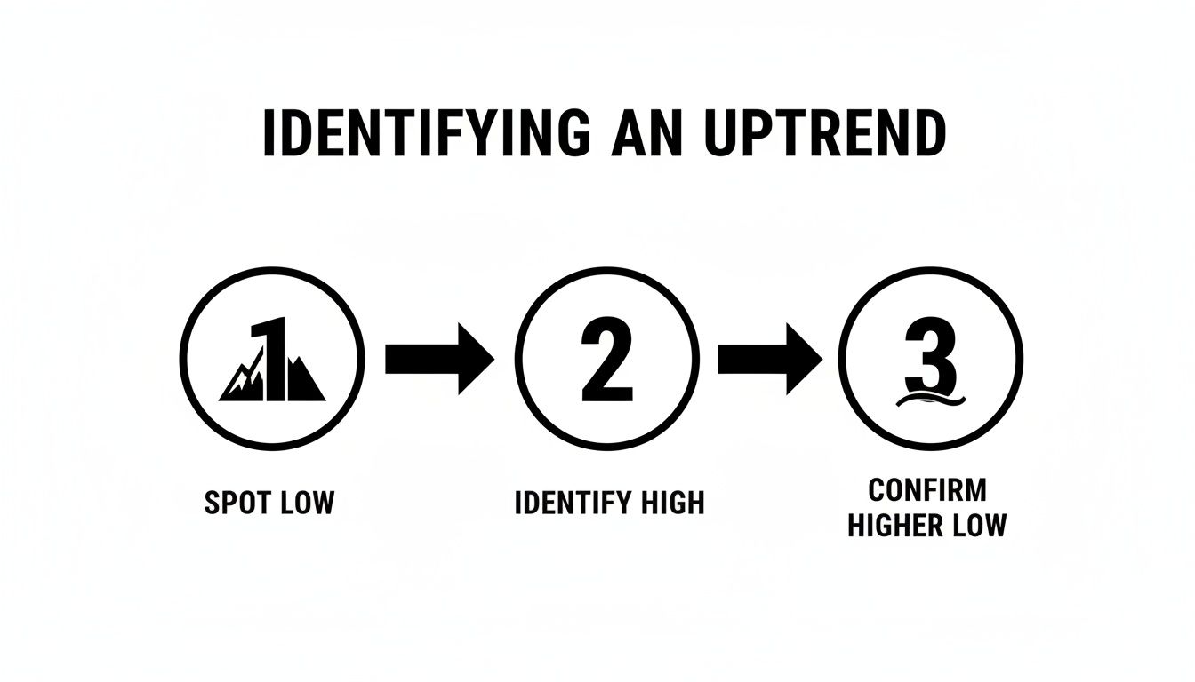
- Find a Swing Low: Locate a clear bottom where the price stopped bleeding and began to climb.
- Mark the First Swing High: Pinpoint the peak where that first push up ran out of gas and started to pull back.
- Confirm the Higher Low (HL): This is the moment of truth. Watch that pullback. For the uptrend to stay alive, the new low must be above the first swing low.
- Validate with a Higher High (HH): From that new higher low, the price has to surge again and break above the previous swing high.
This four-step dance is your confirmation that buyers are running the show. They stepped in to defend a higher price on the dip and had enough muscle to push the market to new territory.
The real skill here is telling the difference between a meaningful pullback (a higher low) and just some sideways chop. A true higher low isn't just a wiggle; it's a battlefield where buyers successfully defended new ground before launching their next attack.
This process is universal. It doesn’t matter if you’re trading stocks, forex, or crypto. For a great example of this in action, check out how these same principles apply to Bitcoin's price movements. The underlying structure of a trend is the same everywhere.
A Real World Example in Commodities
The pattern of higher highs and higher lows isn't just textbook theory; it’s how real money is made, especially when markets get choppy. Gold's price action from August 2018 to August 2020 is a perfect case study. Starting from a swing low around $1,166, gold kicked off a monster uptrend, climbing to $1,557. It then pulled back to form a critical higher low at $1,451 in June 2019—that's 25% higher than where it started—before taking off again.
By the time it peaked in August 2020 at $2,067, gold had carved out five major higher highs, with each new peak beating the last by an average of 8-12%. During this incredible run, 71% of the weekly closes held above the previous higher low structure. Even more telling, historical data showed that volume at the highs swelled by 55%, confirming big players were accumulating. This is exactly what a healthy HH and HL sequence looks like—a clear roadmap of sustained buying pressure. If you want to dig deeper into this, learn more about leveraging historical data on Bookmap.
Recognizing a Break in Market Structure
Just as important as spotting a trend is knowing when it’s dead. An uptrend is officially over when this beautiful sequence of higher highs and higher lows breaks down. This happens in one of two ways:
- A Lower Low: The price pulls back and crashes below the previous higher low. This is a massive red flag. We call it a "break of market structure," and it tells you that sellers just overpowered the buyers who were holding that line.
- A Lower High: After a swing high, the next rally attempt fizzles out before making a new higher high. This is a sign that the buyers are getting exhausted.
Spotting these breaks is your cue to stop looking for buys and start paying very close attention. The market is telling you the story has changed.
An Actionable Blueprint for Trend Trading Entries
Spotting a series of higher highs and higher lows is one thing. Knowing exactly when to pull the trigger and enter a trade? That's where a good trader earns their keep.
The key isn't to chase the market higher. It’s about being patient and strategically joining the momentum that’s already there. This blueprint will give you a repeatable, methodical way to enter trades with a genuine edge.
Most amateurs get caught up in the excitement of a new higher high and buy at the absolute peak—the riskiest possible moment. The professional approach is to wait for the pullback. We’re looking to get long precisely as a new higher low is being formed. Think of it as buying strength on sale, getting in just as the next wave of buyers is ready to push the market up.
The whole game is about finding that sweet spot where the price is most likely to stop falling, find its footing, and bounce.
This simple diagram shows you the exact sequence to confirm an uptrend before you even think about placing an order. The secret ingredient is patience. You have to wait for the market to prove itself by forming that crucial higher low, confirming the trend is still very much alive.
Identifying Key Support Zones for Entries
Your entry zone isn't just a random spot on the chart; it's a specific area where you expect buyers to jump back in and defend their territory. These are technically significant levels where the balance of power is likely to shift back to the bulls. Smart traders don't chase—they wait for the price to come to them.
Here are the primary areas I watch for a higher low to take shape:
- Previous Resistance Becomes New Support: This is a classic price action principle you can't ignore. A price level that once acted as a ceiling (resistance) often turns into a new floor (support) after it's been broken. When the price dips back to retest this old resistance level, it’s a Grade-A spot to look for an entry.
- Major Moving Averages: Key moving averages, like the 20 or 50-period EMA, often act as a dynamic, moving support level in a healthy trend. A pullback that touches one of these MAs is often a signal that trend-following institutions are loading up.
- Fibonacci Retracement Levels: The zone between the 38.2% and 61.8% Fibonacci levels (drawn from the last swing low to the new high) is a high-probability magnet for pullbacks.
When you find a spot where two or three of these levels overlap, you've found what we call "confluence." This dramatically stacks the odds in your favour. If you want a deeper look at this powerful technique, check out my detailed guide on how to successfully trade with the trend.
Using Candlesticks to Confirm Your Entry
Finding a great support zone is only half the battle. The other half is getting confirmation that buyers are actually stepping in. You never want to try and catch a falling knife.
This is where candlestick patterns become your eyes and ears on the market.
Wait for a bullish candlestick pattern to print right in your support zone. This is your trigger—your proof that the sellers are exhausted and the bulls are taking back control.
Some of the most reliable confirmation patterns I look for are:
- Bullish Engulfing Pattern: A big green candle completely swallows the previous small red one. It’s a powerful, in-your-face signal that momentum has shifted.
- Hammer: A candle with a small body and a long lower wick. This tells a clear story: sellers tried to shove the price down, but buyers came in with force and rejected them.
- Morning Star: This is a three-candle pattern that shows a clear transition from bearishness, to indecision, and finally to bullish control. It often marks the exact bottom of a pullback.
By waiting for one of these patterns, you add a critical layer of evidence to your trade. You’re no longer just guessing at a price level; you're reacting to what the market is telling you right now. This patient, methodical approach is what separates the pros from the crowd, helping you enter with precision and confidence instead of just chasing candles.
Mastering Risk and Setting Smart Profit Targets

Spotting a great entry point feels good, but it's only half the equation for success. The real secret to long-term trading isn't just your wins; it's how you handle the losses that are an inevitable part of the game. This is where a solid risk plan turns trading from a gamble into a real business.
When you're trading the higher highs and higher lows pattern, the chart itself hands you a logical roadmap for managing your risk. You don't have to guess where to get out if you're wrong. The market tells you exactly where your trade idea is no longer valid, letting you make clean, emotion-free decisions.
This structure is what builds consistent results. It all starts with knowing precisely where to draw your line in the sand before you even think about placing a trade.
Protecting Your Capital with a Logical Stop-Loss
Your stop-loss is your number one defense. When you place it correctly, it's not a sign of failure—it's just smart business. It ensures one bad trade doesn't erase the hard work you put into several good ones.
So, where's the most logical place to set it? When buying a pullback in an uptrend, your stop-loss belongs just below the most recent higher low.
This isn't just a random spot on the chart. It's the structural point holding the entire uptrend together. If the price breaks below this higher low, the market structure is officially broken, and your original reason for getting into the trade is gone.
Placing your stop here does two critical things:
- It gives the trade room to breathe. This helps you avoid getting knocked out by random market noise.
- It provides a crystal-clear exit signal. A break of that level tells you the buyers have lost control. It's time to step aside with a small, manageable loss.
Understanding what is capital preservation is a non-negotiable step toward consistency, and this stop-loss strategy is how you put that principle into practice.
Setting Realistic and Data-Driven Profit Targets
Just as you need to know where you're wrong, you need to know where you'll take your profits. Your target shouldn't be based on a wish or a random dollar amount. Instead, let the market's own structure guide you. This ensures your potential reward is actually worth the risk you're taking.
Look left on your chart. The market almost always leaves clues about where it might run into trouble next.
- Previous Swing High: The most recent higher high is the most obvious first target. A lot of traders will be looking to take profits there, which creates natural resistance.
- Identifiable Resistance Zones: Scan for older, significant price levels where the market has turned around in the past.
By setting a target at one of these logical levels, you can make sure you're trading with a positive risk-to-reward ratio. For example, if your stop-loss is 50 pips away, your first profit target should be at least 50 pips away (a 1:1 ratio), though I always encourage aiming for 1:2 or higher.
This methodical approach was incredibly powerful during major trends. Think about the S&P 500's epic bull run from March 2009 to February 2020—that was a textbook picture of higher highs and higher lows. In that entire period, false breakdowns below a higher low only happened about 15% of the time, which dramatically cut the risk of getting stopped out too early. You can dive deeper into this type of historical analysis on TradingView.
Using Multiple Timeframes to See the Bigger Picture
Trading on a single timeframe is like driving a car while staring only at your speedometer. You see your current speed, but you have no idea what’s coming up on the road ahead.
What might look like a powerful uptrend on the 15-minute chart could just be a small blip—a minor pullback—within a massive downtrend on the daily chart. Context is everything in trading.
By using multiple timeframes, you get to zoom out and see the real story the market is telling. It’s a top-down approach that makes sure you’re trading with the primary market flow, not trying to swim against a current you can't even see. This is how you start stacking the odds in your favour.
The process is simple, but its impact is huge. You start on a higher timeframe, like the daily or weekly, to get a handle on the dominant, overarching trend. Then, you zoom into a lower timeframe, like the 4-hour or 1-hour, to find a precise, low-risk spot to get in.
The Top-Down Analysis Method
Think of yourself as a military general. You wouldn't send your troops into a specific engagement without first looking at the entire battlefield from a high vantage point. The same logic applies here.
-
Find the Dominant Trend (Higher Timeframe): Pull up a daily chart. Is the market carving out a clear series of higher highs and higher lows? If the answer is yes, the primary trend is up. Your job is to look for buying opportunities, period.
-
Wait for a Pullback (Higher Timeframe): Stick with that daily chart. Don't chase the price. Instead, patiently wait for it to pull back toward a logical area where a higher low could form—think of a previous resistance level that might now flip into support.
-
Nail Your Entry (Lower Timeframe): Now it’s time to zoom in. Drop down to a 4-hour chart. You’re watching for this lower timeframe to stop falling and start creating its own new series of higher highs and higher lows. That shift in market structure is your green light; it signals the pullback is likely over and the main uptrend is ready to kick back in.
When you align your entry on a lower timeframe with the dominant trend on a higher one, you create a powerful state of confluence. This isn't just about finding a good setup; it's confirmation that both short-term and long-term traders are finally on the same page—your page.
This synchronization is a core principle for any professional trader. To really get a grip on this, you should explore our deeper guide on the power of confluence in trading.
Adapting to Different Market Conditions
This method is an absolute powerhouse in strong, trending markets. Just look at the EUR/USD from mid-2020 to late 2022—it was a picture-perfect example of a multi-timeframe uptrend.
Historical data shows that uptrends defined by higher highs and higher lows in major forex pairs can last four times longer than downtrends, with average gains often being 2.5x the size of any pullbacks. A trader using this top-down approach during that period could have consistently found high-probability long entries on the 4-hour chart.
But here’s the reality check: in choppy, range-bound markets, this pattern loses its edge. When the price isn't making clear directional moves and is just bouncing between support and resistance, you need a different game plan.
Recognizing when to apply this strategy—and when to sit on your hands—is what separates the amateurs from the pros. It’s how you adapt, protect your capital, and wait for the high-quality trends to return.
Common Trading Mistakes and How to Avoid Them
Knowing what to do is one thing. True mastery, the kind that separates the consistently profitable traders from the rest, comes from knowing what not to do.
Even with a crystal-clear pattern like higher highs and higher lows, a few common psychological traps can completely derail an otherwise perfect setup. I’ve seen it happen time and time again.
Think of these mistakes as tuition paid to the market. But the good news? You can learn from others' expensive lessons. Recognizing these pitfalls ahead of time gives you a massive edge.
Misidentifying Significant Swing Points
This one is huge. It’s probably the most common mistake I see new traders make. They confuse minor market "noise" with a real, structural swing point.
You might be staring at a 5-minute chart, see a tiny pullback, and think, "Aha! A higher low!" You jump in, only to get steamrolled when the real pullback continues much lower. This happens when you're too zoomed in and lose sight of the bigger picture. A true swing point isn't just a few indecisive candles; it’s a meaningful shift in momentum.
The Fix: It’s simple. Always start your analysis on a higher timeframe. I’m talking about the daily or 4-hour chart. Find the major swing highs and lows there first. Once you have the main structure locked in, then you can drill down to a lower timeframe to pinpoint your entry. This top-down approach keeps you trading with the real trend, not just reacting to meaningless blips on the chart.
Entering Trades Prematurely
Patience is a superpower in trading. Nowhere is this more obvious than when you’re waiting for a higher low to confirm itself. FOMO (the fear of missing out) is a killer. It whispers in your ear, tempting you to jump into a long position the second a pullback starts.
This is basically trying to catch a falling knife. You're buying while the price is still dropping, with zero proof that buyers have even shown up yet. It's a pure gamble, not a calculated trade.
Here's how to avoid that trap. Follow these steps, in this exact order:
- Wait for the pullback to reach a key support area.
- Wait for confirmation that buyers are actually stepping in.
- Enter only after you see a clear bullish candlestick pattern form in that support zone—something like a hammer or a powerful bullish engulfing candle.
This sequence changes everything. You're no longer guessing. You're reacting to hard evidence the market is giving you, confirming the higher low is likely in place before you risk a single penny.
Setting Stop-Losses Too Tight
Protecting your capital is job number one. But strangling your trade with a stop-loss that’s way too tight is a guaranteed way to get knocked out of perfectly good trades by random noise. So many traders place their stop just a handful of pips below their entry candle, leaving zero room for the market to breathe.
Look, the market almost never moves in a perfectly straight line. Even in the strongest uptrends, price will wiggle and shake you out if you let it.
The Fix: The most logical, bulletproof place for your stop-loss is just below the most recent higher low. That swing point is your line in the sand. If the price breaks below it, the entire uptrend structure is broken, and you want out anyway. Placing your stop there gives your trade room to move while still defining exactly where your idea is proven wrong. It's the perfect balance.
Frequently Asked Questions
Even after you get the hang of spotting higher highs and higher lows, a few questions always pop up when you try to apply it to live charts. Let's tackle the most common ones to clear up any confusion and get you trading with more confidence.
Think of this as ironing out the details so you can use this pattern like a pro, no matter what the market throws at you.
Are Higher Highs and Higher Lows Bullish or Bearish?
This one’s straightforward: the sequence of higher highs and higher lows (HH and HL) is the textbook definition of a bullish market. It's the chart screaming "uptrend!"
Here’s what’s really happening:
- A higher high tells you buyers are in control, with enough muscle to push price beyond the last resistance point.
- A higher low is even more telling. It shows that when sellers try to take over, buyers step back in much earlier, defending a higher price level. They're eager.
On the flip side, a series of lower highs and lower lows is a clear bearish signal, showing sellers are dominating.
How Do I Know if a Swing Point Is Significant?
This is where a lot of traders get tripped up. They get lost in all the tiny little zigs and zags on the chart. The secret is to ignore the noise. A truly significant swing point is an obvious, unmissable turning point where you can visually see the momentum shift.
The best way to do this? Start on a higher timeframe. The major peaks and valleys you see on the daily or 4-hour chart are the ones that actually define the market structure. The little wiggles on a 5-minute chart are usually just static.
Once you’ve marked out those major points, then you can drill down to a lower timeframe to pinpoint your entry.
Can This Pattern Be Used in Any Market?
Absolutely. That's the real power of pure price action. Patterns like higher highs and higher lows are built on the foundation of human psychology—fear and greed—which is the same whether you're trading currencies or corn.
This structure works beautifully in:
- Forex: You’ll see clean HH and HL trends all the time in major pairs like EUR/USD.
- Stocks: Strong, growing companies will paint this exact pattern on their charts.
- Commodities: Gold and oil trends are driven by the same supply and demand principles.
- Cryptocurrencies: Even in a volatile market like Bitcoin, this is how clear trends are formed.
The core concept never changes. You just have to adapt your strategy to the personality and volatility of whatever you're trading.
At Colibri Trader, we teach you to see these patterns clearly, stripping away the noise so you can find simple, powerful trade setups. Our price action courses give you a real edge, without a single confusing indicator. Ready to see what you're capable of? Start your journey with us today. Find out more at https://www.colibritrader.com.