


Trading Double Tops and Double Bottoms

Of all the shapes and squiggles you see on a price chart, few are as reliable or as powerful as the double top and double bottom. These classic patterns are pure price action signals, painting a clear picture of a trend that's run out of gas and is ready to reverse.
A double top looks like a capital "M" and warns that a strong uptrend might be rolling over into a downtrend. Conversely, a double bottom forms a "W" shape, signalling that a downtrend is exhausted and an uptrend could be starting.
At their heart, they show a clear struggle where the market’s momentum simply fails.
Unpacking Double Tops and Double Bottoms

Think of a chart pattern as the story of a battle between buyers and sellers. Double tops and bottoms are one of the most compelling chapters in that story, showing us the exact moment a trend is exhausted. This isn't about complex indicators; it's a raw price action narrative that any trader can learn to read.
Picture an uptrend in full swing. Buyers are in control, confidently pushing prices higher. They hit a peak, but then sellers step in, forcing the price to pull back and carve out a temporary support level. Still optimistic, the buyers rally for another push, but they falter at the exact same resistance level as the first peak.
That failure is everything. It's a huge red flag that the buying pressure that fueled the entire uptrend has finally dried up. When the price then drops and slices through that temporary support level, it's confirmation: the sellers have seized control.
The Key Components of the Pattern
To trade these setups effectively, you have to know their anatomy. Every true double top or double bottom has three non-negotiable parts:
- Two Peaks or Troughs: These are the two failed attempts to make a new high (in a double top) or a new low (in a double bottom). Critically, they must form at roughly the same price level.
- The Neckline: This is the horizontal line you draw connecting the low point of the pullback between the two peaks, or the high point of the rally between the two troughs.
- A Prior Trend: You can't have a reversal without something to reverse. A double top must form after a clear uptrend, and a double bottom must come after a solid downtrend. Without this context, the M or W shape is just random noise.
The neckline is the line in the sand. It’s the single most important part of the pattern. A clean, decisive break of the neckline is the trigger we’re waiting for—it turns a potential pattern into a high-probability trade.
You can think of these patterns as the market's two-strike rule. The first attempt to break a level fails, which is a warning. The second failure at that same level signals the trend is dead in the water.
This whole dynamic is driven by pure market psychology and is the foundation for understanding how key price levels work. Recognizing these components is the first step toward moving from just spotting shapes to truly understanding the forces behind the price action. It’s all rooted in the concepts we cover in our guide to resistance and support levels.
The Psychology Behind Reversal Patterns
Chart patterns like double tops and bottoms are so much more than just shapes on a screen. Think of them as the visual story of a fierce battle between buyers and sellers. Getting to grips with the psychology driving these formations is what separates traders who just see lines from those who see real opportunities.
Every pattern tells a story about shifting market sentiment, and this entire narrative is built on the two core emotions that drive all financial markets: greed and fear. When a trend is running strong, one side is clearly in the driver's seat. But as that trend gets older, conviction starts to wobble, setting the stage for a major reversal.
The Story of a Double Top Exhaustion
Let's picture an asset in a powerful uptrend. Buyers are firmly in control, confidently pushing the price to new highs. They eventually hit a peak—the first top—where some of the early investors and short-term traders decide it's time to cash in and take profits. This wave of selling causes a natural pullback, forming a temporary floor, or what we call the "neckline."
This is a make-or-break moment. The bulls who are still in the market see this dip as just another buying opportunity. They launch a second attempt to drive the price even higher, but this push runs out of steam right around the same level as the first peak.
This failure is the key. The inability to punch through to a new high is a massive red flag. It signals that the buying power that fueled the entire uptrend is completely exhausted. Confidence evaporates. Traders who were once bullish now see a ceiling they just can't break.
When the price rolls over from this second peak and slices decisively through the neckline, it’s game over. The power has officially shifted. Fear takes the wheel as sellers flood the market, and the trend reverses. That M-shape isn't just a pattern; it's the final gasp of a dying uptrend.
The Narrative of a Double Bottom Capitulation
The double bottom tells the exact opposite story—one of seller exhaustion and a glimmer of returning hope. In a long, grinding downtrend, sellers are dominant, relentlessly hammering prices lower. They finally hit a point of maximum pessimism, forming the first trough. Here, the price looks so cheap that a few brave buyers start to step in, causing a small rally up to a resistance level (the neckline).
But bearish sentiment is still thick in the air. Sellers muster their strength for one last push to drive the price into a new low. This second selling wave fails, stalling out at or near the same support level as the first trough. This is the moment of capitulation. The sellers have thrown everything they have at the market and have nothing left to show for it.
This failure proves that selling pressure is depleted. Buyers, seeing that the downward momentum is gone, rush back in with fresh confidence. They shove the price back up, and when it breaks through the neckline, it confirms the bears have lost control. The W-shape represents the market building a solid foundation of support before launching a brand new uptrend.
Understanding the narrative behind these patterns is everything. It transforms your analysis from simple shape-spotting into a much deeper read of market dynamics. Mastering the psychology of trading is what allows you to actually read the story the charts are telling and anticipate major turns with far greater clarity. Every pattern is a tug-of-war, and seeing who is winning—and why—is the key to successful price action trading.
How to Identify Valid Trading Setups
Spotting what looks like an "M" or a "W" on your chart is one thing. Knowing if it's a genuine, high-probability signal or just market noise is another game entirely. The reality is that most of these shapes are just random price swings that can easily trap you in a bad trade.
So, how do we separate the real opportunities from the fakes? We need a clear, rule-based checklist. This isn't about guesswork; it's about turning a potential pattern into a validated setup. Think of yourself as a detective, piecing together clues to build a solid case before you risk a single dollar.
The Anatomy of a High-Probability Pattern
A real double top or double bottom is more than just a familiar shape. It’s a story about a failed attempt to continue a trend. For the pattern to be valid, a few specific criteria must be met, confirming that we're seeing a true shift in market psychology, not just a brief pause.
The two peaks of a double top (or the two troughs of a double bottom) need to be distinct and well-defined. We're looking for a significant failure of momentum, not just minor wiggles in the price action.
Here are the non-negotiables:
- A Clear Prior Trend Must Exist: This might sound obvious, but you can't have a reversal without a trend to reverse. A double top must form after a solid uptrend, and a double bottom needs to follow a clear downtrend.
- Peaks and Troughs Must Be Aligned: The two highs in a double top should hit roughly the same price level, showing a clear resistance barrier that buyers failed to break. The same goes for the two lows in a double bottom, which mark a strong support level.
- The Retracement Must Be Meaningful: That dip between the two peaks (or the rally between the two troughs) has to be significant. A shallow pullback is often just minor consolidation—a sign the trend might just be catching its breath.
This entire thought process starts with one simple question, as shown below.
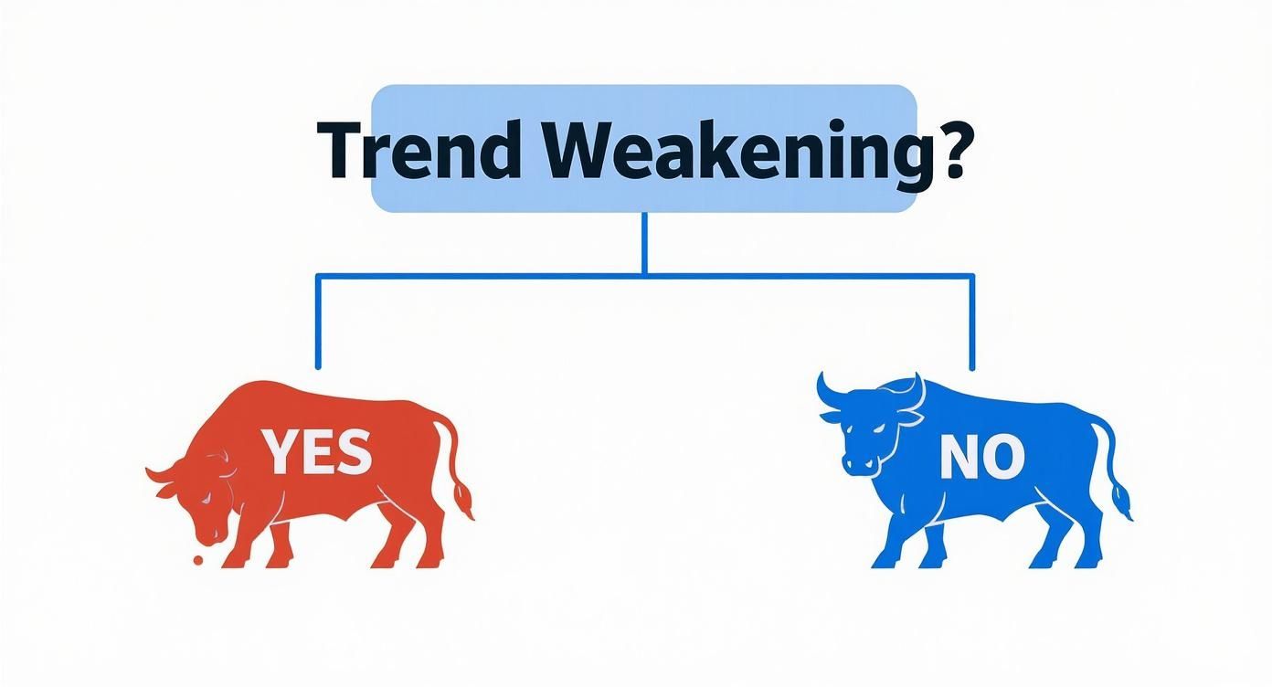
Is the underlying trend running out of steam? If the answer is yes, then you have the green light to start looking for the specific components of a valid reversal pattern.
Using Volume as Your Confirmation Tool
Volume is your truth serum. It shows you the conviction—or lack thereof—behind any price move. When it comes to double tops and double bottoms, paying attention to volume can give you a massive edge.
In a textbook double top, you want to see lower volume on the second peak compared to the first. This is a huge clue. It tells you that the buyers are losing enthusiasm and there just isn't enough power behind that second push higher.
For a double bottom, the opposite is true. Lower volume on the second low suggests the sellers are exhausted. Then, when the price finally breaks the neckline, you want to see a big surge in volume. This spike confirms that the new direction has strong participation and is much more likely to follow through. A breakout on weak volume is a major red flag.
Applying a Rule-Based Framework
To tighten things up even more, we can borrow some statistical insights. Research from the legendary chart pattern analyst Thomas Bulkowski provides a fantastic framework. His studies show that for a classic double top, the two peaks should be within 6% of each other in price. He also found that the valley between them should represent a retracement of at least 10% to 20% from the first peak.
You can learn more about how to use these statistical insights to dodge fakeouts over on luxalgo.com.
By combining visual recognition with hard rules for price and volume, you build a much more robust trading system. The checklist below gives you a clear, side-by-side guide for your analysis.
Identification Checklist for Double Tops and Double Bottoms
To make validation as straightforward as possible, here is a simple checklist comparing the key criteria for both patterns. Use this to confirm every element before even thinking about an entry.
| Validation Criterion | Double Top (Bearish Reversal) | Double Bottom (Bullish Reversal) |
|---|---|---|
| Prior Trend | Must be a clear and established uptrend. | Must be a clear and established downtrend. |
| Peak/Trough Alignment | Two distinct peaks at a similar resistance level. | Two distinct troughs at a similar support level. |
| Retracement Depth | A significant pullback between the peaks to form the neckline. | A significant rally between the troughs to form the neckline. |
| Volume Signature | Volume on the second peak should ideally be lower than the first. | Volume on the second trough should ideally be lower than the first. |
| Neckline Break | A decisive, high-volume break below the neckline support. | A decisive, high-volume break above the neckline resistance. |
Following a systematic approach like this keeps you from chasing ambiguous shapes on the chart. It forces patience and discipline, ensuring you only act when multiple points of confirmation are aligned in your favor. This is how you filter out the noise and focus on setups with the highest probability of success.
Executing Your Trade Entry, Exit And Targets

Spotting a high-quality pattern—like a double top or double bottom—is only half the battle. How you execute that pattern decides your bottom line. A clear plan for entry, stop-loss and profit target is what keeps emotion on a leash.
Jump in too early and you’re trading guesses, not market proof. That’s the mistake most traders make.
Pinpointing Your Exact Trade Entry
Think of the neckline as your line in the sand. Only a decisive close beyond that level counts.
- For a double top, wait for a candle to close below the neckline support. A mere wick poke won’t do—you need the full candle body to break the level.
- For a double bottom, you want a candle closing above the neckline resistance. If you prefer extra confirmation, wait for a slight pullback to retest that broken level before you pull the trigger.
No break, no trade. Patience here is non-negotiable.
Setting A Protective Stop-Loss
Every pattern outlines its own danger zone.
• Double Top: Place your stop just above the higher peak of the “M” formation.
• Double Bottom: Tuck your stop just below the deeper trough of the “W.”
This approach does two things:
- It gives the trade room to breathe around normal volatility.
- It locks in your risk before you ever hit “Enter.”
Calculating Your Profit Target
Your profit target should come straight from the setup’s built-in energy. Use the measurement technique:
- Measure The Height: Calculate the distance—from peak to neckline (double top) or trough to neckline (double bottom).
- Project From The Breakout: Extend that same distance from the point where price closed beyond the neckline.
- Double Tops: Project downward for your bearish target.
- Double Bottoms: Project upward for your bullish target.
This method anchors your target in actual market movement. If you’re curious how manual setups stack up against algos, see the comparison in AI trading versus manual trading.
Tie entry, stop, and target into one cohesive plan, and every decision becomes part of a solid framework. For a deeper dive into matching your upside to your downside, check out calculate your risk-to-reward ratio.
Common Mistakes and How to Avoid Them
Even the most rock-solid chart patterns aren't foolproof. Understanding why double tops and double bottoms sometimes fail is what separates traders who last from those who get washed out. Too many traders get burned by common, avoidable errors that turn a high-probability setup into a frustrating loss.
The good news? These pitfalls are completely predictable. Once you learn to spot them, you can build the discipline needed to sidestep these traps entirely. Let's break down the most frequent mistakes I see and the simple adjustments you can make to avoid them.
Fighting an Overpowering Trend
This is probably the costliest mistake a trader can make: trying to pick a top or bottom in a market that is still roaring with momentum. A small "M" or "W" shape that appears inside a powerful, almost vertical trend is usually just a brief pause for breath—a small consolidation range—not a real reversal signal.
Forcing a trade against a freight train of a trend is a losing game. The trend will almost always win.
- The Mistake: You spot a small double top in a raging bull market and jump in short, only to watch the price blast right through your entry and scream higher.
- The Fix: Always zoom out. Get some perspective on the bigger picture. Is the trend looking tired and showing signs of exhaustion on the higher timeframes? A double top is far more reliable after a long, grinding uptrend than it is during a short, explosive rally. Context is everything.
The Dreaded False Breakout
Ah, the false breakout. It's the ultimate trap for pattern traders. This is when the price stabs through the neckline, sucking you into a trade, only to violently snap back in the other direction and smash your stop-loss. It’s a classic move designed to catch impatient traders off guard.
A false breakout preys on your fear of missing out (FOMO). Traders see the price move, they panic, and they jump in, assuming the pattern is confirmed without waiting for real proof. This lack of patience is a leading cause of avoidable losses.
The stats back this up. A comprehensive study on double tops showed that while about 75% of patterns did signal a true reversal, a significant 17% were false signals where the price broke the neckline only to reverse course. You can dig into these pattern reliability findings on QuantifiedStrategies.com. This just hammers home the need for solid confirmation before you risk a single dollar.
Psychological Trading Errors
Beyond the chart itself, your own psychology can be your worst enemy. Trading is a mental game, first and foremost, and patterns like these will test your discipline like nothing else.
Two major psychological hurdles always stand out:
- Entering Too Early: This is pure FOMO in action. You see the second peak or trough start to form and you convince yourself the pattern is going to complete. So you enter before the neckline even breaks, essentially gambling on a setup that hasn't been confirmed. This kills your edge and turns a strategic trade into a hopeful guess.
- Ignoring Confirmation Signals: The neckline break is your primary trigger, but as we've discussed, it's not the only piece of the puzzle. Ignoring volume is a classic mistake. A breakout on weak, anemic volume is a massive red flag. It screams that there's no real conviction behind the move, which dramatically increases the odds of it failing.
To get around these pitfalls, you need to become a rule-based trader. Create a simple checklist for yourself and have the discipline to never enter a trade unless every single box is ticked.
Your Anti-Mistake Checklist
| Rule | Action Required |
|---|---|
| Trend Context | Is there a clear, mature trend to reverse? |
| Neckline Confirmation | Has a full candle closed beyond the neckline? |
| Volume Confirmation | Did the breakout happen on a noticeable spike in volume? |
| Risk Management | Is my stop-loss placed correctly and is the risk acceptable? |
By patiently waiting for the market to prove you right, you shift the odds dramatically in your favor. This discipline is what separates the consistently profitable traders from those who fall for the same old traps, time and time again.
Using Market Context for Better Trades
Seeing a textbook double top or double bottom form on your chart is exciting. It's a clean, classic pattern. But trading it in a vacuum is a quick way to get yourself into trouble.
To really level up your trading, you have to stop seeing these patterns as standalone signals. Think of them as just one crucial piece of evidence in a much larger puzzle. The best price action traders I know never, ever rely on a single reason to take a trade.
They wait for confluence. That’s just a trader's way of saying they need to see multiple, independent signals all pointing in the same direction. It’s this layering of evidence that turns a "maybe" setup into a high-probability trade.
Building Your Case with Confluence
Imagine you're a detective building a case for a market reversal. A double top is your prime suspect, but you can’t get a conviction on that alone. You need more evidence, and that’s where confluence comes in. It provides the corroborating details that strengthen your conviction that a real trend change is about to happen.
Here are the key signals I always look for to back up a double top or double bottom:
- Major Support and Resistance Levels: Is that double top forming right at a major weekly or monthly resistance level that has held for ages? Did that double bottom just bounce perfectly off a historical demand zone? When a pattern lines up with a massive price barrier, its power multiplies tenfold.
- Fibonacci Retracement Levels: A double top that pops up right at the 61.8% Fibonacci retracement of a major downtrend? That’s a classic, A+ short setup. The same goes for a double bottom finding its footing on a key Fib level during a larger uptrend.
- RSI Divergence: This is a big one. Let's say the price makes that second, slightly higher peak in a double top, but the Relative Strength Index (RSI) makes a lower high. That’s bearish divergence, and it's a massive red flag that the buying momentum is completely exhausted. It adds some serious firepower to the reversal signal.
By waiting for a pattern to form at a point of technical confluence, you are confirming that the signal is not just random noise. You are validating that the market structure itself supports the reversal story the pattern is telling you.
Why Higher Timeframes Are Your Best Friend
Context isn’t just about other indicators; it’s also about time. A double top on a 5-minute chart might just be a small hiccup, a minor pullback. But a double top on the daily or weekly chart? That can signal a massive trend reversal that could play out for weeks or even months.
Higher timeframes are brilliant at filtering out the market "noise" and revealing the true, underlying trend. Double tops and double bottoms are exponentially more reliable on daily and weekly charts. Why? Because they represent a much more significant, drawn-out battle between buyers and sellers. The longer the timeframe, the more weight the pattern carries.
Even algorithmic strategies aren't immune to market conditions. One study on automated trading of these patterns found that profitability wasn't constant, showing that success hinges on the broader market environment, not just the pattern itself. You can learn more about how market conditions affect pattern performance in this detailed analysis.
Putting it all together—context and confluence—is what separates the pattern spotters from the consistently profitable traders.
A Few Common Questions
What Is The Ideal Timeframe?
You'll see double tops and double bottoms pop up on just about any chart, but they carry a lot more weight on the higher timeframes. Think 4-hour, daily, and weekly charts.
Why? Because these longer periods cut through the market noise. The patterns you see here reflect real shifts in market sentiment, not just short-term jitters. This means fewer false signals and much more significant moves when the neckline finally gives way. Your choice really comes down to your trading style—swing traders will naturally gravitate toward daily charts, while a day trader might stick to the hourly.
How Important Is Volume Confirmation?
Honestly, it's a critical piece of the puzzle. For a textbook double top, you want to see the volume on that second peak be lighter than the first. It's a subtle clue that the buying pressure is drying up.
Then, when the price breaks the neckline, you should see a big surge in volume. That's your confirmation that the bears have taken control.
A breakout on weak, anemic volume is a massive red flag. It tells you there's no real conviction behind the move, which dramatically increases the chances of a fakeout. Treat those situations with extreme caution.
Can These Patterns Fail?
Absolutely. Let's be clear: no chart pattern is foolproof 100% of the time. A double top can easily fail if a powerful underlying trend has enough momentum to just punch right through the resistance of the two peaks.
This is exactly why solid risk management, especially using a hard stop-loss, is completely non-negotiable. A failed pattern isn't a total loss, though; it often signals a strong continuation of the previous trend, giving you a valuable piece of information in itself.
Ready to stop relying on indicators and master pure price action? Colibri Trader provides the clear, action-based training you need to trade with confidence. Start your journey and unlock your trading potential today.