


Trading the Double Top Pattern A Complete Guide

A double top pattern is one of the classic signals in a trader's playbook. You’ll see it pop up on a chart looking like a big letter "M," and it’s often a warning sign that a strong uptrend is running out of steam and getting ready to reverse. The pattern takes shape after an asset’s price hits a high point, pulls back, and then fails to break that same high on a second attempt. It's a clear signal that the buyers are getting tired.
Understanding the Double Top Pattern

Think of it like a mountain climber trying to conquer a tough peak. On their first attempt, they get high up but have to retreat. After a rest, they try again, only to get turned away at the very same spot. That failure to push any higher is a sign of exhaustion, and it suggests a long climb down is about to begin. That’s the simple story the double top pattern tells us on a chart.
In trading, this pattern reveals the story of a battle between buyers (the bulls) and sellers (the bears). It highlights that crucial moment when the bulls' excitement starts to fade, and the sellers begin to take control. Those two distinct peaks at a similar price level are a powerful visual cue that the uptrend might be finished.
The Anatomy of the Pattern
The double top isn’t just some random "M" shape; it has a few key parts that give it meaning. Getting to know these components is the first step to trading it properly.
- Two Peaks: These are two back-to-back highs that form at roughly the same price. This area becomes a heavy zone of resistance.
- The Neckline: This is the support level created by the lowest point of the pullback between the two peaks. A decisive break below this line is the confirmation signal that traders are waiting for.
The pattern’s roots go way back to the early 20th century with Charles Dow, one of the pioneers of technical analysis. Dow recognized its power as a sign of a major trend reversal, where bullish momentum finally gives way to bearish pressure. The inability to get past that first peak shows that buyers are losing their grip and sellers are stepping in with more force.
The double top pattern is essentially the market’s visual signal of failure. When buyers can’t break a previous high on their second attempt, it reveals a fundamental shift in market psychology from optimism to doubt.
Why This Pattern Matters
Learning to spot a double top can give you a real edge. It helps you get ahead of potential downturns, allowing you to either protect profits on your long positions or scout for new opportunities to go short.
The pattern is a direct reflection of market psychology and herd behavior, making it a potent tool. By learning to read this "M" shape on the chart, you're not just looking at lines; you're reading the story of a trend's potential end. You can learn more about how to trade with price action to get better at interpreting these kinds of market signals.
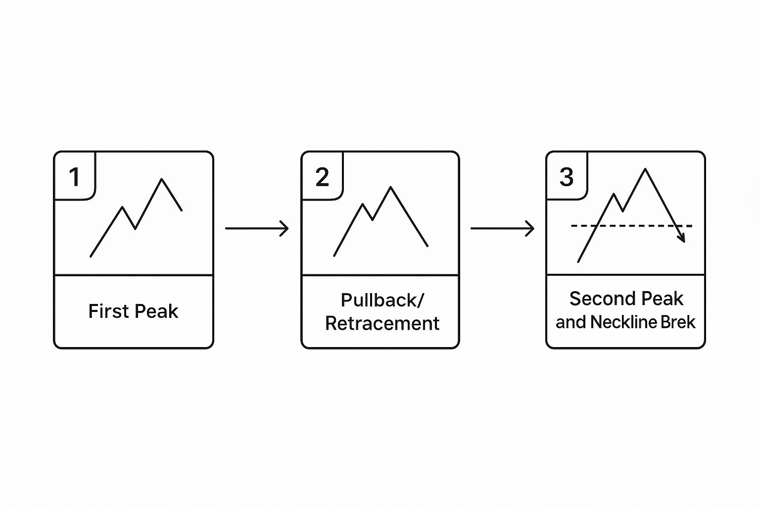
How to Identify a Double Top Pattern
Spotting a double top pattern on a chart isn't just about finding something that looks like the letter "M." To confidently identify this bearish signal, you have to understand its anatomy and how each piece tells a story about the shifting power between buyers and sellers.
Think of it like a five-act play unfolding in real-time. Each act must happen in the right order for the plot to make sense. If a crucial step is missed, the pattern is incomplete and likely a false alarm.
Act 1: The Established Uptrend
First things first: a double top can only form after a solid uptrend. This is a non-negotiable rule. If there's no prior bullish run, there's simply nothing to reverse. The uptrend sets the stage, showing that buyers have been in control, pushing prices consistently higher.
This initial phase builds the momentum that will eventually be challenged. You should be able to see a clear series of higher highs and higher lows leading into the pattern.
Act 2: The First Peak and Initial Rejection
The first peak marks the highest point of the uptrend. This is where the buying momentum hits a wall for the first time as sellers step in, carving out a significant resistance level. For the first time in a while, buyers can’t push the price any higher.
This peak is the first real sign of exhaustion. The price then pulls back as traders start taking profits and new short positions are opened.
Act 3: The Pullback and Neckline Formation
After the rejection at the first peak, the price retreats. This pullback creates a temporary low point, or trough, before buyers try to muster another push higher. This low point is critical because it forms the neckline.
The neckline acts as a temporary floor—a support level holding the price up between the two peaks. Learning how to identify support and resistance is fundamental to trading this pattern correctly.
The neckline is the line in the sand. It’s the buyers' last stand. A clean break below this level signals that sellers have officially won the battle for control.
Act 4: The Second Peak and Failed Rally
Finding support at the neckline, buyers give it another go. They try to drive the price back up, aiming to smash through the resistance created by the first peak.
But this rally fizzles out. The price reaches a similar height as the first peak but gets smacked down again. This failure is a massive red flag. It shows that buying pressure has seriously weakened and that the resistance level is holding firm. Often, this second push happens on lower trading volume, which screams a lack of conviction from the bulls.
This infographic breaks down the critical stages of the pattern.
As you can see, the journey from the initial high to the crucial break of the neckline is what ultimately validates the bearish signal.
To bring all these concepts together, let's look at a quick summary table.
Key Components of a Double Top Formation
This table summarizes the essential parts of a double top pattern and what they tell us about the market's state.
| Component | Description | What It Signals |
|---|---|---|
| Prior Uptrend | A sustained period of rising prices. | Establishes the bullish context that is about to be challenged. |
| First Peak | The highest point of the uptrend. | Initial buyer exhaustion and the formation of a key resistance level. |
| Neckline | The low point of the pullback between the two peaks. | A temporary support level; the "line in the sand" for buyers. |
| Second Peak | A failed attempt to break the first peak's high. | Waning buying pressure and confirmation of strong resistance. |
| Neckline Break | The price closes decisively below the neckline. | The official confirmation of the pattern and a signal to sell. |
Understanding these components is key to accurately spotting and trading this formation.
Act 5: The Breakdown and Confirmation
The final act is the confirmation—the moment of truth. The double top pattern isn't complete or actionable until the price breaks below the neckline support. This breakdown is the definitive signal that sellers have seized control and the uptrend is likely over.
Smart traders look for a decisive candle close below the neckline, ideally on increased volume. This validates the entire "M" formation and signals the potential start of a new downtrend. Waiting for this confirmation is crucial for avoiding false signals where the price just bounces off the neckline and continues its upward march.
Developing Your Double Top Trading Plan

Spotting a double top is a great start, but it's just that—a start. The real skill is turning that observation into a profitable trade, and that requires a plan. Think of your trading plan as your rulebook, your blueprint. It’s what keeps you from making emotional, in-the-moment decisions.
A solid plan for this pattern boils down to three core pillars: your entry trigger, your protective stop-loss, and your profit target.
Without these rules, you're just gambling. With them, you can attack every double top setup with confidence, knowing exactly what you'll do before you even click the mouse. Let's build out this framework.
Choosing Your Entry Strategy
When it comes to trading a double top, you really have two main ways to get in. Each has its own risk profile, and the one you pick will probably come down to your personal trading style and how much risk you're comfortable with.
- The Aggressive Entry: This is for traders who want to get ahead of the move. You’d enter a short position as the price is forming the second peak, betting that the resistance from the first peak is going to hold firm. It can get you a fantastic entry price, but it comes with higher risk because the pattern hasn't actually been confirmed yet.
- The Conservative Entry: This is the safer, more common approach. Here, you wait patiently for the price to break and close decisively below the neckline. This is your confirmation. It’s the market telling you the sellers have wrestled control, which validates the whole pattern and cuts down the risk of getting faked out.
While the aggressive entry looks tempting with its potential for higher profits, the conservative entry gives you a much stronger signal that the reversal is real. For most traders, especially if you're new to this pattern, waiting for that neckline break is the smarter play.
Setting Your Protective Stop-Loss
No pattern works 100% of the time. The double top can, and will, fail sometimes. That’s why a well-placed stop-loss isn't just a suggestion; it's your non-negotiable insurance policy. It's what protects your account when the market zigs when you expected it to zag.
Where you put your stop depends entirely on how you entered the trade.
- For an Aggressive Entry (at the second peak): Your stop-loss goes just above the high of that second peak. Simple. If the price punches through that level, the pattern is busted, and you need to get out immediately.
- For a Conservative Entry (after the neckline break): You'll still place your stop-loss just above the high of the second peak. Placing it too close to the neckline is a classic mistake—you can easily get stopped out by normal market noise before the real move happens. Giving it room above the peaks respects the structure of the pattern.
A stop-loss is not an admission of failure; it is a declaration of discipline. It defines your maximum acceptable loss on a single trade, which is the cornerstone of effective risk management.
Determining Your Profit Target
The final piece of the puzzle is knowing when to cash out. The most common way to set a target for a double top pattern is a simple technique called the "measured move." It's logical, easy to calculate, and uses the pattern’s own structure to project a target.
Here's how you do it:
- Measure the vertical distance in price from the highest peak down to the neckline.
- Take that same distance and subtract it from the point where the price broke the neckline.
Let's say the peaks formed at $100 and the neckline is at $95. The height of the pattern is $5. Your profit target would then be projected to $90 (which is $95 – $5). This gives you a logical exit based on the volatility shown inside the pattern itself.
Using Volume and Indicators to Confirm the Pattern

Spotting that classic "M" shape is a good start, but trading on the pattern alone is a quick way to get burned. For real conviction, you have to look under the hood and find evidence that backs up what the price is telling you.
Think of it like a detective at a crime scene. The pattern is your initial lead, but you need to dust for fingerprints and gather forensic evidence to build a solid case. For us traders, that evidence comes from trading volume and momentum indicators. These tools help you see if buying pressure is really drying up and if sellers are actually ready to take charge.
The Critical Role of Trading Volume
Volume is one of the most honest tools in your arsenal. It’s a direct measure of market participation, showing you the conviction behind any price move. For a textbook double top, the volume should tell a very specific story of bullish exhaustion.
Here’s what that story looks like, step-by-step:
- Peak One: Volume is usually pretty strong here. The uptrend is in full swing, and high volume confirms the intense buying that pushed the price to its first high.
- The Trough: As the price pulls back toward the neckline, volume tends to drop off. This is just a temporary lull in the action, not a definitive power shift.
- Peak Two: This is where you need to pay close attention. The rally to the second peak should happen on noticeably lower volume than the first. This is a massive red flag. It tells you buyers lacked the enthusiasm and the firepower to push prices any higher.
- The Neckline Break: When the price finally slices through that neckline, you want to see volume surge. This spike in activity is your confirmation that sellers have seized control and are now driving the market down.
A second peak forming on weak, declining volume is one of the strongest signs of exhaustion you can get. It’s the market whispering that the buyers have run out of fuel.
Spotting Bearish Divergence with Momentum Indicators
While volume shows you conviction, momentum indicators like the Relative Strength Index (RSI) or the Moving Average Convergence Divergence (MACD) reveal the underlying strength of a trend. One of the most powerful signals they can give you here is bearish divergence.
Bearish divergence occurs when the price makes a similar or even slightly higher high (our second peak), but the momentum indicator makes a lower high. This mismatch is a classic sign of internal weakness. The price might look strong on the surface, but the engine driving it is sputtering.
Imagine pushing a heavy car up a hill. On the first push (Peak One), you give it everything you've got. On the second try (Peak Two), you manage to get it to the same spot, but you're clearly exhausted and using far less force. That's exactly what bearish divergence is showing us.
This signal adds another powerful layer of confirmation. It suggests the failure at the second peak wasn't just random chance—it was the result of a genuine loss of buying power.
Now, while the double top is a classic bearish pattern, it’s not infallible. In fact, an analysis of over a thousand formations found its win rate to be around 38%. Its real strength, however, often comes from a solid average reward-to-risk ratio of 3:1. And its reliability climbs higher when you find confirmation signals like divergence, especially on longer timeframes. You can dig into more double top pattern statistics on Bapital.com.
By layering the visual pattern with hard data from volume and subtle warnings from indicators, you build a much stronger case for a trade. It's this kind of deep analysis that separates guesswork from strategic, high-probability trading.
A Real-World Double Top Pattern Example
Theory is one thing, but there's nothing like seeing a pattern play out in a live market to make the concepts click. Let's walk through a textbook case of a double top pattern that formed in crude oil futures. This will connect all the dots and show you exactly how these principles look in the wild.
The story starts back in late 2023. Crude oil was in a solid uptrend, fueled by news of production cuts. This bullish run is the first ingredient we need—you can't have a reversal pattern without an existing trend to reverse.
The Two Peaks and a Neckline
The rally started to lose steam as prices neared the $90 per barrel mark. Buying pressure just fizzled out, and the price pulled back. That first high is crucial; it established our first peak and set a major resistance level.
On the pullback, the price found some footing around the $86 level. This little dip between the peaks is super important because it draws our neckline—the line in the sand that buyers had to defend. After a bit of consolidation here, buyers gave it another shot, pushing prices back toward that $90 resistance zone.
But this second push just didn't have the same fire. The price failed to break through $90 again, forming the second peak. This failure is a classic sign of buyer exhaustion, telling us that $90 was a brick wall.
Confirmation Signals That Added Conviction
An alert trader would have spotted a couple of huge warning signs as that second peak was forming. These clues added some serious weight to the bearish case.
- Declining Volume: The rally up to the second peak happened on way less trading volume than the first. This is a big red flag. It suggests the big players weren't participating, and the move lacked real conviction.
- Bearish Divergence: At the same time, momentum indicators like the RSI were screaming "trouble!" Even though the price made a high equal to the first peak, the RSI was printing a lower high. This told us the underlying momentum was draining away fast.
These confirmation signals were the market's way of whispering that the uptrend was on its last legs.
The combination of a failed second peak, declining volume, and bearish divergence is a high-probability setup. It's the market telegraphing that the bullish story is falling apart.
The final nail in the coffin was the decisive break below the $86 neckline, which happened on a big surge of selling volume. For traders who saw this double top developing, this breakdown was the green light to open a short position. You can see a great breakdown of this crude oil double top formation on HighStrike.com.
Once the pattern was confirmed, it was time to set a price target. By measuring the distance from the peaks ($90) to the neckline ($86), we get a pattern height of $4. Subtracting that $4 from the neckline gives a measured move target of $82. And as sellers took firm control, that target was hit pretty quickly. This example shows exactly how the double top gives you a complete trading framework—from spotting the reversal to finding your entry, confirmation, and exit.
Common Mistakes to Avoid When Trading This Pattern
It's easy to get excited when you spot a potential double top forming on your chart. But that excitement, if you're not careful, can lead to some expensive mistakes. Knowing the common pitfalls is just as important as knowing the setup itself—it's what separates a high-probability trade from a frustrating loss.
The single biggest mistake I see traders make is jumping the gun. They get impatient and rush into a short position as the second peak is still forming, long before the neckline gives way. That's a gamble, not a calculated trade. Until that neckline breaks, the pattern isn't confirmed. The price could just as easily find support there and rocket right back up.
Patience is a trader's greatest asset. A true double top pattern is only confirmed when sellers prove they have enough strength to break the established support of the neckline. Anything before that is just speculation.
Ignoring Crucial Confirmation Signals
Another frequent error is getting tunnel vision. Traders see that "M" shape and fixate on it, completely ignoring the other clues the market is giving them. A valid double top is rarely silent; it provides supporting evidence if you know where to look.
One of the most critical things people overlook is volume. A textbook double top should show you that buying pressure is fading. You'll typically see volume shrink on that second peak. If the volume is just as heavy—or heavier—than the first peak, that's a massive red flag. It tells you the bulls might have plenty of fight left in them.
On top of that, you can't just apply this pattern anywhere and expect it to work. Context is everything. Here are a couple of common ways traders get this wrong:
- Misusing Short Timeframes: Sure, the pattern can show up on a 1-minute or 5-minute chart, but it's notoriously unreliable down there. The random noise and volatility can easily paint false "M" shapes that mean nothing. This pattern carries much more weight on higher timeframes like the daily or weekly charts.
- Forgetting the Broader Context: Think about it—a double top forming during a raging, market-wide bull run has a much lower chance of success than one appearing in a market that's already looking tired and showing signs of weakness. You always have to zoom out and consider the bigger picture.
These unforced errors usually boil down to a lack of patience and a failure to stick to a solid trading plan. Just recognizing these tendencies in yourself is the first step to avoiding them. To protect your capital even further, you can check out this deeper list of the 10 fatal mistakes traders make and really sharpen your discipline.
Frequently Asked Questions
Even after you feel you've got a handle on the double top pattern, a few questions always seem to pop up. Let's tackle some of the most common ones to clear up any lingering confusion and help you trade with more confidence.
What Is the Difference Between a Double Top and a Double Bottom?
Think of them as mirror images—polar opposites telling two completely different stories about the market's intentions.
The double top is a bearish reversal pattern that looks like the letter "M." It signals that an uptrend is running out of steam and a downtrend might be just around the corner. We get confirmation when the price breaks below the neckline support.
On the flip side, the double bottom is a bullish reversal pattern shaped like a "W." This one suggests a downtrend is losing its momentum and an uptrend could be starting. It’s confirmed when the price breaks above its neckline resistance.
How Reliable Is This Pattern?
Let's be real: no chart pattern is foolproof, and the double top is no exception. If you trade it in isolation, you might be disappointed. One study of over 1,000 formations found a win rate of only around 38%, but that number doesn't tell the whole story.
The real magic of the double top is its often excellent risk-to-reward ratio, which averages around 3:1. More importantly, its reliability skyrockets when you start looking for other confirming signals.
A double top that forms with declining volume on the second peak, shows bearish divergence on an indicator like the RSI, and follows through with a decisive neckline break on high volume? That's a much higher-probability setup than just seeing the "M" shape by itself.
What Happens When a Double Top Fails?
A double top is considered a failed pattern if the price refuses to break below the neckline. Instead, it rallies and pushes above the resistance level created by the two peaks. This move completely invalidates the bearish signal and tells you the original uptrend is probably still in control.
This is exactly why disciplined risk management is non-negotiable. A properly placed stop-loss order just above the peaks is your safety net, protecting your capital when the market goes off-script. A failed pattern isn't a disaster; it's just new information. Your stop-loss ensures you're around to trade another day.
At Colibri Trader, we teach you how to read pure price action and master powerful patterns like the double top without getting bogged down by confusing indicators. Our courses are practical and designed to give you a real, sustainable edge. Start your journey to trading mastery with us today.