Trading Double Bottom and Double Top Patterns Like a Pro
The double bottom and double top are two of the most reliable reversal patterns you'll find on a chart. They act like giant signposts, flagging a potential end to the current trend.
A double top looks like an "M" and warns that an uptrend might be rolling over into a downtrend. The double bottom, its mirror image, resembles a "W" and suggests a downtrend is losing steam, potentially reversing into an uptrend.
Reading the Market's Story in Double Tops and Bottoms
Think of a price chart as a story unfolding in real-time—a battle between buyers and sellers. The double top and double bottom patterns are a pivotal chapter in that story, signaling that one side is exhausted and the other is about to take control.
Learning to spot these narratives is a fundamental part of learning how to read market charts effectively.
Picture an army trying to seize a hill. A double top is like that army charging the hill, getting pushed back, regrouping, and trying again, only to fail at the exact same spot. That second failure is a massive blow to morale. It shows their strength is spent, and a full-blown retreat (a new downtrend) is probably next.
On the flip side, a double bottom is like defenders holding a crucial line in a valley. The sellers push the price down once but get repelled. They gather their strength for another assault but are thrown back from the same price level. This tells you the sellers are out of ammo, and the buyers are gearing up for a powerful counter-attack (a new uptrend).
The Psychology of Trend Exhaustion
What you're really seeing with these patterns is trend exhaustion. One side of the market simply runs out of conviction, and the other side senses the weakness and steps in.
This isn't just some abstract theory. These patterns have been observed and documented across every market for decades. They are statistically significant signals, especially when other clues like trading volume confirm the story. You can dig deeper into their historical track record on major indices by exploring comprehensive guides on how to read stock charts.
The double top and double bottom are visual proof of a failed test at a key price level. The inability to break a prior high or low twice is a powerful signal that the market's collective mind has changed.
Grasping this dynamic is what matters. The "M" shape of a double top is a bearish reversal pattern, while the "W" of a double bottom is its bullish counterpart. Understanding the psychology behind why they form is what will give you an edge.
Anatomy of a High-Probability Reversal Pattern
Spotting a simple "M" or "W" shape is just the first clue. If you want to confidently trade a double bottom and double top, you have to know what separates a weak signal from a genuine, high-probability reversal setup.
Think of it as a checklist. Each item has to be there for the pattern to be valid. The whole sequence tells a story about a power shift between buyers and sellers.
The chart below shows this story playing out: a clear trend hits a wall, a struggle ensues, and finally, a new trend takes over.

This process flow shows how an established trend first meets opposition, leading to a battle at a key price level before a new direction is confirmed.
The Five Critical Checkpoints
To really validate any double top or bottom, you need to see these five structural elements in order. Miss even one, and the reliability of the pattern drops dramatically.
-
A Clear Prior Trend: The pattern must come after a sustained uptrend (for a double top) or downtrend (for a double bottom). You can't have a reversal pattern without a trend to reverse.
-
First Peak or Trough: The market makes its first test of a price level, creating the initial high or low. This establishes the critical resistance or support zone that will be tested again.
-
Pullback to the Neckline: After that first test, the price pulls back. This forms a trough in a double top or a peak in a double bottom. A horizontal line drawn through this point creates the neckline—the single most important level in the entire pattern.
-
Second Failed Attempt: Price rallies back to the prior peak (or drops back to the prior trough) but fails to break through. This is the market telling you the buyers (or sellers) have run out of steam.
-
Breakout Confirmation: The pattern is only truly complete when the price breaks decisively through the neckline. A double top is confirmed by a break below the neckline, while a double bottom is confirmed by a break above it.
Why Volume Is Your Most Important Clue
Price action tells you what's happening, but volume tells you the conviction behind the move. It gives you a window into the psychology of other traders. For a high-probability setup, volume should follow a very specific sequence.
A second peak or trough forming on lower volume than the first is a strong indication that the initial trend is running out of fuel. This "fading conviction" is exactly what you want to see before a reversal.
Then, as the price breaks through the neckline, you want to see a surge in volume. This surge confirms that the new direction has strong participation behind it and is much more likely to follow through.
Mastering how to combine price action with other signals like volume is key to building what traders call confluence in trading. It stacks the odds in your favor.
Double Top vs Double Bottom Key Characteristics
To help you quickly tell these patterns apart, here’s a simple breakdown of their core features. Think of this as your quick-reference guide when you're scanning the charts.
| Characteristic | Double Top (Bearish) | Double Bottom (Bullish) |
|---|---|---|
| Prior Trend | Must be a clear, established uptrend. | Must be a clear, established downtrend. |
| Shape | Resembles the letter "M". | Resembles the letter "W". |
| Key Level | The neckline, which acts as support. | The neckline, which acts as resistance. |
| Volume on Second Peak | Ideally, volume is lower on the second peak than the first. | Ideally, volume is lower on the second trough than the first. |
| Confirmation Signal | A decisive price break below the neckline support. | A decisive price break above the neckline resistance. |
| Volume on Breakout | Look for a surge in selling volume as the neckline breaks. | Look for a surge in buying volume as the neckline breaks. |
| Market Psychology | Buyers fail twice to push prices higher, signaling exhaustion. | Sellers fail twice to push prices lower, signaling exhaustion. |
This table highlights the mirrored nature of the two patterns. What you look for in a double top is essentially the inverse of what you look for in a double bottom, from the prior trend to the breakout confirmation.
Executing Your Trade From Entry to Profit Target
Spotting a high-probability double bottom and double top is a great starting point, but that's only half the battle. Turning that pattern into a profitable trade requires a rock-solid, mechanical plan. A complete trade isn't just about identifying the pattern; it's built on three critical pillars: a precise entry, a protective stop-loss, and a logical profit target. If you're missing even one of these, you're not trading—you're gambling.
The chart below shows how these three components come together, transforming a pattern on the screen into an actionable strategy with clearly defined risk and reward.

This simple framework is what separates a professional approach from just hoping for the best. It's about executing a plan with controlled, calculated risk.
Pinpointing Your Entry Point
Your entry is your first move into the market, and you've got two main ways to play it. Each comes with its own trade-offs between risk and reward. How you enter a trade is a skill that can make or break your results, and you can dive deeper into the nuances by reading our guide on how to enter a trade.
-
The Aggressive Entry: This is for traders who want to get in on the action right away. You enter the moment the price slices through the neckline. The upside? You get in early and can catch a bigger piece of the move. The downside is the higher risk of a "false breakout," where the price teases a move only to snap right back into the pattern.
-
The Conservative Entry: This method demands more patience. You wait for the price to break the neckline, but you don't jump in immediately. Instead, you wait for the price to pull back and retest that same neckline. If it holds—acting as new support for a double bottom or new resistance for a double top—then you enter. This gives you much stronger confirmation, but you run the risk of the price taking off without you if it never pulls back.
Setting Your Stop-Loss for Capital Protection
Think of your stop-loss as your non-negotiable insurance policy. It's the line in the sand that says, "This is the absolute maximum I'm willing to lose on this idea." A well-placed stop prevents a small miscalculation from turning into a catastrophic account blow-up.
For a double top, the logical place for a stop-loss is just above the highest peak of the "M." For a double bottom, it goes just below the lowest trough of the "W."
This placement is strategic. It gives the trade just enough breathing room to work, but it gets you out immediately if the fundamental premise of the pattern—that the previous high or low is a significant turning point—is proven wrong.
Calculating Your Profit Target with the Measured Move
The final piece of your trading plan is knowing when to take your profits off the table. The most common and reliable method for double top and double bottom patterns is the measured move technique. It's a simple, objective way to set a target.
-
Measure the Height: First, you calculate the vertical price distance from the pattern's highest peak (or lowest trough) down to the neckline. This distance represents the potential energy built up within the formation.
-
Project from the Breakout: Next, you take that exact same distance and project it from the neckline in the direction of the breakout.
Let’s say a stock forms a double top with peaks at $150 and a neckline at $130. The height of the pattern is $20. When the price breaks below $130, you project that $20 distance downward, giving you a measured move target of $110. This technique gives you a data-driven target to aim for, completing your plan.
Remember, studies have shown that patterns on longer timeframes, when confirmed with a spike in volume, can see their success rates improve by 10-20 percentage points. You can find more statistical insights about the reliability of chart patterns at TrendSpider.
Seeing These Patterns in the Wild
Theory is great, but seeing a double bottom or double top call a major market turn is where the rubber really meets the road. These patterns aren't just squiggles on a chart; they're the footprints of titanic struggles between buyers and sellers at historic moments. Seeing them play out builds the kind of confidence you just can't get from a textbook.
When you pull up historical charts, you can see these power struggles unfold on a massive scale. Let's look at a couple of big ones to really cement the idea in your head.
The 2009 Great Financial Crisis Bottom
One of the most dramatic double bottoms in modern history formed at the absolute low of the 2008 financial crisis. After a brutal, soul-crushing downtrend, the S&P 500 carved out a textbook "W" base between late 2008 and early 2009.
- The Set-Up: A catastrophic bear market. Utter panic.
- First Low: The initial trough hit in November 2008 as the selling reached a fever pitch.
- Second Low: After a relief rally created the neckline, the market plunged again. It successfully retested the November low in March 2009, but this time, the selling pressure was noticeably weaker. The bears were running out of steam.
- The Confirmation: The breakout above the neckline was the starting gun. It confirmed the reversal and kicked off one of the longest bull markets we've ever seen.
This is a classic example of a double bottom marking the point of maximum fear and the start of a new, long-term uptrend.
Sector Peaks Before the Fall
On the flip side, double tops have a habit of showing up near the peak of hot sectors right before they roll over. We saw double-top-like action in certain sectors in late 2018 and again during the 2021-2022 period.
In those cases, rallies repeatedly failed at similar resistance levels, a clear signal that the buyers were simply exhausted. Those chart patterns were the warning shot for drawdowns of 20% to 30% in those market groups.
The big takeaway here is that major trend changes often start with a failed second attempt. Whether it's sellers failing to push prices to a new low or buyers failing to break a new high, that exhaustion is the critical signal you're looking for.
Looking at these huge market shifts helps put real numbers to these patterns. After U.S. indices cratered by roughly 50% from their 2007 highs, the basing process that followed was littered with double bottoms that preceded a multi-year bull run. This is exactly why institutional risk managers don't just look for patterns in isolation; they combine them with other tools like moving averages to get a clearer signal and keep risk in check. You can see more on how historical market volatility is analyzed at XBTFX.io.
By studying these real-world charts, you start to move beyond just identifying a "W" or an "M". You begin to understand the powerful story the market is telling you.
Common Mistakes and How to Avoid Them
Knowing what not to do in trading is often what separates the profitable from the broke. It’s all about avoiding those unforced errors. When you're dealing with double tops and double bottoms, a few common slip-ups can turn what looks like a golden opportunity into a painful loss.
The number one mistake I see is pure impatience—jumping the gun before the neckline breaks. Sure, seeing that "M" or "W" take shape gets the blood pumping, but the pattern is just a potential setup until that critical support or resistance level is taken out. Entering early isn't trading; it's gambling.
What Not to Do: Shorting a potential double top the moment the second peak forms, just assuming the neckline will break.
What to Do Instead: Cool your jets. Wait for a solid, convincing candle to close below the neckline. Patience is your best friend here. Let the market prove your analysis right before you put your capital on the line.
Ignoring What Volume is Screaming at You
Another classic blunder is getting tunnel vision on price and completely ignoring volume. A breakout that happens on weak, anemic volume is a massive red flag. It tells you there's no real muscle, no serious conviction behind the move. This is how you get caught in a "false breakout" that snaps right back in your face.
For a trade to have a high probability of working out, you need to see a surge in volume as the price smashes through the neckline. That volume spike is your confirmation that the big money—the institutions—are on board. A breakout without volume is like a rocket with no fuel; it's not going anywhere.
Setting Your Stops Way Too Tight
Look, using a stop-loss isn't optional, but choking your trade with a stop that's too tight is a guaranteed way to get knocked out of a perfectly good position. Markets breathe. They ebb and flow. A little bit of normal volatility can easily tag a tight stop right before the real move takes off.
- The Mistake: Placing a stop-loss just a handful of ticks below the neckline on a double bottom breakout.
- The Solution: Give your trade some room to work. Place your stop logically below the absolute low of the "W" pattern (or above the highest peak of the "M"). This way, you're only taken out if the fundamental structure of the entire pattern fails, not just because of some market noise.
Finally, and this is a big one, traders often fail to look at the bigger picture. A beautiful double bottom forming in the middle of a screaming bear market is a low-probability bet. Always zoom out. Does the larger trend support the reversal you're trying to trade? Fighting a strong, established trend is an uphill battle you'll rarely win.
Advanced Insights and Pattern Variations
Once you move past the textbook "M" and "W" shapes, you start to see the real story behind double tops and double bottoms. Think of them less as geometric patterns and more as a battlefield report. They're the visual record of a failed auction at a critical price level.
A double top is simply the market telling a story of buyers trying—and failing—twice to push through a heavy supply zone (resistance). The second failure is the final signal that the sellers have won the fight and are taking control.
Conversely, a double bottom shows us the opposite. Sellers tried to smash through a key demand zone (support) on two separate occasions and got absorbed by the buyers both times. The selling pressure is exhausted, and the buyers are now stepping in with force. Seeing the patterns this way is far more powerful than just memorizing shapes.

Recognizing Common Pattern Variations
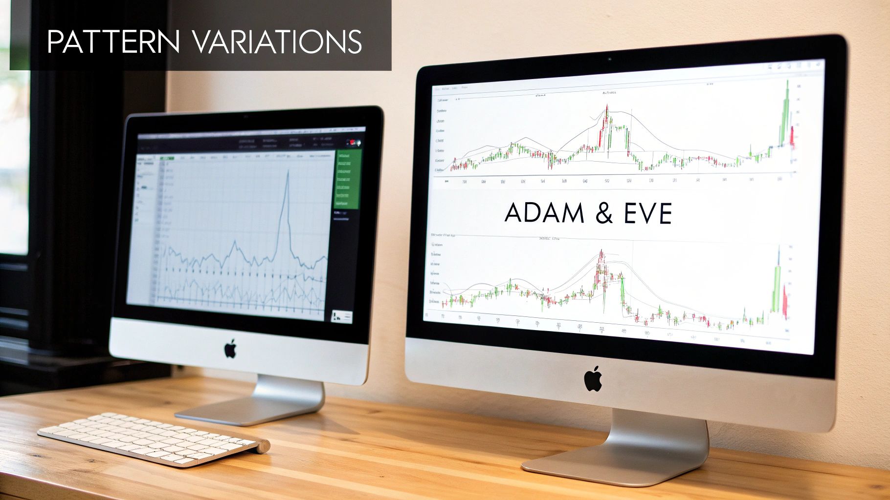
Let's be honest: markets are messy. You'll rarely find a pattern that looks like it came straight out of a textbook. The peaks and troughs won't always be perfectly aligned, and that's okay. One of the most common variations you'll run into is the Adam & Eve pattern.
- Adam: This is a sharp, V-shaped first peak or trough. It represents a sudden, almost panicked rejection of a price level.
- Eve: This is a much more rounded, U-shaped second peak or trough. It shows a slower, more methodical attempt to break the level that ultimately runs out of steam.
The crucial thing to remember is that the underlying psychology is identical, no matter what the exact shape looks like. The market made two distinct attempts to break a level and failed both times. Don't throw away a potentially great trade just because it isn't picture-perfect.
The Critical Role of Timeframe Analysis
Not all patterns are created equal. A pattern's significance is directly tied to the timeframe it forms on.
Think about it: a double top forming on a weekly chart represents months of failed attempts to break higher. That carries infinitely more weight than a quick double top that forms on a 5-minute chart during a slow afternoon. The longer the timeframe, the more capital and conviction were involved in that struggle between buyers and sellers.
High-probability trades often appear when you find multi-timeframe confluence. This is when a pattern on a lower timeframe, like an hourly chart, forms right at a major support or resistance level you've identified on the daily or weekly chart. For traders who want to dig deeper, learning how to calculate moving averages in Excel can add another layer of confirmation to your analysis, helping you spot these powerful alignments.
Answering Your Key Trading Questions
Even when you feel like you've got a solid trading plan, questions always pop up when you're staring at a live chart. Let's tackle some of the most common ones I hear from traders about double bottom and double top patterns. Think of this as a quick way to cement what you've just learned.
How Reliable Are These Patterns?
While they are considered highly effective, you need to understand that no chart pattern is a magic bullet. Nothing works 100% of the time.
Their reliability shoots up when you get confirmation from other signals. I'm talking about things like a surge in volume as the price breaks the neckline, or seeing the pattern form at a major support or resistance level on a higher timeframe. False breakouts are part of the game, which is exactly why disciplined risk management is non-negotiable.
The goal isn't to find a pattern that's foolproof. It's to find one that gives you a statistical edge over a long series of trades. The double top and double bottom do exactly that.
Can I Trade Them on Any Timeframe?
Absolutely. These patterns show up everywhere, from the one-minute charts that day traders live on to the weekly charts used by long-term investors.
But here's the crucial part: a pattern's significance is directly tied to its timeframe. A double bottom that takes several months to form on a weekly chart is a far more powerful signal than one that plays out over a few minutes on an intraday chart. The longer the timeframe, the more weight it carries.
What If the Peaks or Troughs Aren't Perfectly Even?
Markets are messy, driven by human emotion—they're rarely perfect. So, your chart patterns won't be perfect either.
It’s incredibly common for the second peak or trough to be a little higher or lower than the first. As long as they are reasonably close and the overall "M" or "W" structure is clear, the pattern is usually good to go.
The real story here is the market's failure to push to a significant new high or low. It's about the psychology of that failed test, not about demanding geometric perfection down to the last tick.
Ready to stop relying on complex indicators and master the art of reading price action? At Colibri Trader, we teach a straightforward, effective approach to trading that works in any market. Discover your trading potential with our free quiz and start your journey today!


