


Mastering Day Trading Chart Patterns for Consistent Wins

Day trading chart patterns are simply visual maps of supply and demand playing out on your screen. These repeating shapes, like flags or triangles, give you a way to read the market's intentions and anticipate what might happen next—all without cluttering your charts with lagging indicators.
Why Chart Patterns Are a Trader's Secret Weapon
Forget trying to keep up with the firehose of financial news or deciphering a dozen conflicting indicators. The real story is being told right on your chart, candle by candle. At its heart, trading is a constant tug-of-war between buyers (demand) and sellers (supply). Day trading chart patterns are the footprints left behind from this battle.
Don't think of them as just geometric shapes. Think of them as recurring psychological dramas playing out in the market. A "Double Top" isn't just an M-shape on your screen; it’s the story of buyers trying twice to break higher and failing. It’s a clear signal that sellers are digging in and taking control. This is the very essence of what is price action trading: reading the market’s narrative directly from the price itself.
Cutting Through the Noise
In the heat of the moment, a day trader's success hinges on making fast, clear-headed decisions. Chart patterns are the perfect tool for this. They help you process information faster and filter signal from noise, which is absolutely critical when markets are moving quickly. They boil down complex market action into simple, recognizable structures.
This clean approach gives you several massive advantages:
- Clarity: Patterns offer a straightforward, visual reason for taking a trade. This helps cut out the guesswork and keeps emotional decisions at bay.
- Defined Risk: Every valid pattern gives you a logical spot to place your stop-loss, protecting your capital if the trade goes against you.
- Actionable Setups: They provide specific entry triggers and potential price targets, which are the core components of any disciplined trading plan.
By focusing on price action, you learn to trust what the market is actually doing, not what you think it should be doing. This mental shift is what separates the consistently profitable traders from everyone else.
Ultimately, mastering these patterns turns a confusing chart into a clear roadmap. It gives you the confidence to anticipate market turns and continuations before they happen. This guide is a no-nonsense look at how to spot and trade the most reliable patterns, giving you a solid foundation for a successful trading career.
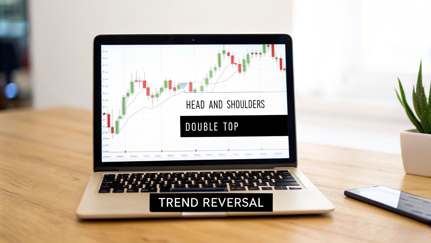
Decoding Reversal and Continuation Patterns
If you want to trade chart patterns successfully, you first have to learn their language. Every pattern tells a story about where the market might be headed next, and these stories boil down to two basic plots: reversal or continuation.
Think of a market trend like a car driving down the highway. A continuation pattern is just a quick pit stop. The car pulls over for a bit, maybe grabs some fuel, and then gets right back on the highway, heading in the same direction. These patterns are simply a pause in an ongoing trend, not the end of it.
On the flip side, a reversal pattern is a full-blown U-turn. The car gets off at an exit, turns around, and starts driving in the complete opposite direction. These formations are a warning sign that the current trend is losing steam and a major change of direction is likely coming.
This whole process is driven by the constant tug-of-war between buyers and sellers, which is really just a reflection of trader psychology. This concept map lays out how those forces create the patterns we see on our charts.
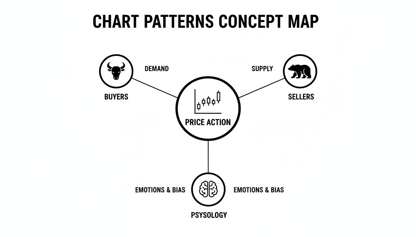
As you can see, every pattern is a visual story of the battle between bulls and bears.
Understanding Continuation Patterns
Continuation patterns are the market’s way of catching its breath. Prices rarely shoot up or down in a perfectly straight line, even in the strongest trends. They move in waves—an impulse move followed by a period of consolidation.
These patterns are those consolidation phases. A Bull Flag, for instance, typically appears after a sharp rally. Price then chops around in a small, downward-sloping channel as early buyers cash in. At the same time, new buyers are stepping in, soaking up that selling pressure before the next push higher.
The most common continuation patterns you’ll see are:
- Flags (Bullish and Bearish): Short, rectangular pauses that lean against the main trend.
- Pennants: Very similar to flags, but they form a small, symmetrical triangle.
- Ascending and Descending Triangles: While they can be reversal patterns, they often act as continuation signals, showing pressure building before a breakout in the direction of the trend.
Identifying Reversal Patterns
Reversal patterns tell you that the dominant side—whether it’s the buyers or the sellers—is getting tired. They are the footprint of exhaustion, showing you the exact moment the opposition starts to take control.
The classic Head and Shoulders is a perfect example. It shows up after a long uptrend and is made of three attempts to push higher. The middle push (the "head") makes the highest point, but the crucial part is the third push (the "right shoulder"), which fails to reach a new high. That failure is a massive red flag that buying power is drying up.
Another powerful setup is the Double Top or Double Bottom. These patterns show the market trying—and failing—twice to break through a key support or resistance level. We go into much more detail on how to trade these in our guide to the Double Bottom and Double Top. They're a crystal-clear signal that a level is being heavily defended and a reversal is becoming highly likely.
Reversal patterns don't just happen out of the blue; they form at critical supply and demand zones where the balance of power is finally shifting. Seeing them isn't about spotting a shape—it's about understanding the story of a trend's final moments.
To make things even clearer, this table breaks down the key differences between these two pattern types at a glance.
Continuation vs Reversal Patterns at a Glance
| Characteristic | Continuation Patterns | Reversal Patterns |
|---|---|---|
| Market Signal | The current trend is taking a breather and will likely resume. | The current trend is running out of gas and will likely reverse. |
| Common Location | Forms in the middle of a healthy, established trend. | Forms at the very top of an uptrend or the bottom of a downtrend. |
| Trader Psychology | A brief moment of profit-taking or simple indecision. | Total trend exhaustion followed by a decisive power shift. |
| Example Patterns | Flags, Pennants, Rectangles | Head and Shoulders, Double Tops, Wedges |
Understanding this core distinction is the first step. When you can instantly tell if the market is resting or reversing, you’re already way ahead of the game.
Spotting Powerful Trend Reversal Patterns
Knowing the difference between a trend taking a quick breather and one that’s about to completely reverse course is where the real skill—and money—in day trading lies. Reversal patterns are your heads-up that the current momentum is fizzling out. Think of them as flashing warning signs that the tug-of-war between buyers and sellers is about to have a new winner.
Spotting these formations isn't about memorizing geometric shapes. It's about reading the story of a trend's last gasps. When you see a classic reversal pattern taking shape, you're literally watching the dominant market force run out of steam. This is your cue to get ready for the next trend, not to chase the tail end of the old one.
The Head and Shoulders Pattern
The Head and Shoulders pattern is like the grand finale of a powerful uptrend. It’s a story of buyer exhaustion told in three acts, and it's one of the most reliable reversal signals you can find. It’s made up of three peaks, with the middle one (the "head") being the highest. The two on either side (the "shoulders") are a bit lower and roughly at the same height.
The key to this pattern is the "neckline," a support line connecting the lows formed between the three peaks.
- Left Shoulder: Buyers are still feeling confident, pushing the price to a new high before a small pullback. Business as usual.
- Head: Here, buyers give it one last, heroic shove to an even higher peak. But the sell-off that follows is sharp and deep, often wiping out the entire gain and returning to the previous low. This is the first major red flag.
- Right Shoulder: The bulls try to rally again, but they can't even get close to the previous high. This failure is the final nail in the coffin, showing that the buying pressure has all but evaporated.
The Head and Shoulders pattern isn't just a shape; it's a visual representation of fading conviction. The failure to make a new high on the right shoulder shows that the buyers who drove the trend are gone, and sellers are stepping in with force.
The trade trigger is a decisive break below the neckline. This confirms that the support level has cracked and sellers are now in charge. A fantastic, high-probability entry often comes if the price rallies back to retest the broken neckline, which has now flipped into a new resistance level.
To see how this works in reverse for a downtrend, check out our in-depth guide to the Inverse Head and Shoulders.
Double Top and Double Bottom Formations
A bit simpler than the Head and Shoulders but no less potent, Double Top and Double Bottom patterns signal a reversal after the market fails twice to break through a key level. A Double Top looks like the letter "M" and shows up at the end of an uptrend. Its mirror image, the Double Bottom, resembles a "W" and forms at the bottom of a downtrend.
Let's walk through the Double Top:
- First Peak: The price rallies up to a strong resistance level and gets knocked back down.
- Trough: Price pulls back, carving out a temporary support level.
- Second Peak: Buyers regroup and try to smash through that resistance again, but they fail at the exact same spot. This tells you sellers are defending that price with everything they've got.
The setup is confirmed when the price breaks below the support level of the trough. That breakdown is your signal that the buyers have finally thrown in the towel. The Double Bottom is the exact same story, just flipped upside down, signaling a powerful bullish reversal when price breaks above the resistance line connecting the peaks.
These patterns are so effective because they paint a crystal-clear picture of support and resistance. Those failed breakout attempts give you a well-defined, low-risk area to place your stop and structure a trade against.
The Bullish Engulfing Candlestick
While the bigger patterns take some time to develop, sometimes a reversal is signaled by a single, explosive candlestick. The Bullish Engulfing is one of the most trusted single-candle signals out there. You'll find it at the bottom of a downtrend, and it's made up of two candles.
The first is a small bearish (red) candle that just continues the downward move. But the second candle is a massive bullish (green) one whose body completely swallows, or "engulfs," the body of the little red candle before it.
This pattern tells a very simple, very powerful story. The session started with sellers still in control, pushing the price down. But then, out of nowhere, buyers stormed in with overwhelming force. They didn't just stop the decline; they completely reversed it and closed the session well above where the previous candle even opened.
It's a clear signal that the balance of power has shifted dramatically in a single session.
To trade it, I always look for confirmation. This could be another strong green candle on the next bar or a surge in trading volume, which proves the buyers are serious. You can place a tight stop-loss just below the low of the engulfing candle itself, giving you a clearly defined risk for a potentially explosive move higher.
How to Ride the Trend with Continuation Patterns

While catching a big reversal feels great, some of the most consistent day trading profits come from a much simpler idea: just go with the flow. Don't fight the trend, join it. Continuation patterns are your invitation to do exactly that. They show up as short pauses in a strong, established trend, signaling that the market is just catching its breath before the next big move.
Think of a marathon runner. They don't sprint the full 26.2 miles. They hit a solid pace, then maybe slow down for a quick cup of water before picking up speed again. Continuation patterns are that water station—a brief moment of consolidation that recharges the trend for its next leg.
What's happening behind the scenes? These formations represent a temporary balance between buyers and sellers. The dominant side of the market is still very much in control, but some of the early birds are cashing out and taking profits. At the same time, new traders are waiting on the sidelines for a low-risk spot to jump in. This creates a perfect, low-risk opportunity to ride the existing momentum.
The Anatomy of Bull and Bear Flags
Flags are hands-down one of the most reliable and easy-to-spot continuation patterns you'll find. They look just like their name suggests: a small, rectangular flag hanging off a flagpole. They can be bullish (a Bull Flag) or bearish (a Bear Flag), depending on which way the main trend is heading.
Let's break down the parts of a classic Bull Flag:
- The Flagpole: This is the initial, powerful blast higher. It's a sharp, almost vertical rally that happens on strong volume, showing that buyers are completely in charge. This aggressive move is the entire foundation of the pattern.
- The Flag: Right after that explosive move, the price settles into a consolidation phase. It forms a small, tidy channel that drifts gently downward, against the primary uptrend. This is the "water station" where early buyers take a little profit, and their selling is easily soaked up by new buyers entering the market.
A valid flag needs to be a shallow, orderly pullback. If the consolidation retraces more than 50% of the flagpole, the pattern is probably broken, and the trend itself might be in trouble.
A Bear Flag is just the mirror image. It kicks off with a sharp, aggressive drop (the flagpole), followed by a weak, upward-drifting consolidation channel (the flag). This shows a brief pause in the selling pressure right before the next major leg down.
Trading the Flag Pattern: A Step-by-Step Guide
Trading a flag is a pretty straightforward process built on a clear set of rules. The whole point is to get into the trade just as the price breaks out of that consolidation and the main trend kicks back into gear.
- Entry: The classic entry signal is a decisive candle closing outside the flag's channel, moving in the direction of the main trend. For a Bull Flag, you'd get in when the price breaks and closes above the upper trendline of the downward-sloping channel.
- Stop-Loss: Your safety net—the stop-loss—goes on the other side of the flag. For a Bull Flag, you'd place your stop just below the lower trendline of the channel. This gives you a really tight, well-defined risk.
- Profit Target: A common way to set a profit target is by measuring the height of the flagpole and projecting that same distance up from the breakout point. This is often called a "measured move."
And this isn't just some old-school textbook theory. Its power is backed by real numbers. One of the most compelling studies was done back in 2007 by Wang and Chan, who analyzed major global indices like the Nasdaq. Their research found that trading rules based on the bull flag pattern were strongly correlated with higher returns, outperforming simple buy-and-hold strategies. It's fascinating stuff, and you can discover more about how data science validates these classic chart patterns.
Pennants and Triangles as Continuation Signals
Pennants are a close cousin to flags, with one key difference. Instead of consolidating in a rectangular channel, the price action forms a small, symmetrical triangle where the trendlines squeeze together. Just like a flag, a pennant represents a very brief pause before the trend barrels onward.
Ascending and Descending Triangles also frequently act as powerful continuation patterns. An Ascending Triangle in an uptrend shows buyers aggressively pushing into a flat ceiling of resistance, creating a series of higher lows. This builds up pressure that often resolves with an explosive breakout to the upside.
Conversely, a Descending Triangle in a downtrend shows sellers hammering down on a flat floor of support, creating a series of lower highs. This tells you that sellers are getting more aggressive, and a breakdown through that support level is likely on the horizon.
For all these patterns, the trading logic is the same: identify the primary trend, wait patiently for the consolidation to form, and then enter on a confirmed breakout with a clearly defined stop-loss. Mastering these simple yet powerful day trading chart patterns allows you to join strong moves with real confidence and precision.
Putting It All Together with a Trading Plan

Spotting day trading chart patterns is one thing, but actually making money from them? That's a whole different ball game. The bridge between seeing a setup and seeing consistent results is a disciplined, rule-based trading plan.
Without one, even the most textbook-perfect pattern is just a random shape on your screen. It’s the plan that turns that shape into an actionable strategy with clearly defined risk and a specific goal. It forces you to think like a pro by making you answer the tough questions before your money is on the line.
Let's walk through this in practice using a classic Rectangle pattern. Think of it as a pressure cooker—price bounces between clear support and resistance, building up energy before a powerful move, usually in the direction of the prior trend.
Building Your Rule-Based Plan
Your plan needs to be a simple, repeatable checklist that guides every move you make. This is how you take emotion and guesswork out of the equation. Integrating patterns into a solid plan is a non-negotiable step, and for a deeper dive, you might explore the best way to learn stock trading from video courses.
Here’s what a plan could look like for a bullish Rectangle breakout:
- 1. Pattern ID: Is price trapped between two horizontal support and resistance lines? Has it touched each boundary at least twice? Most importantly, is this happening inside a bigger uptrend?
- 2. Confirmation: Look at the volume. Is it dropping off during this consolidation? That's a great sign. It often means sellers are losing steam and buyers are quietly stepping in.
- 3. Entry Trigger: We don’t guess. We enter a long position only after a strong candle closes above the resistance line. This breakout needs to come with a big spike in volume to show that buyers mean business.
- 4. Stop-Loss Placement: The moment you're in, place a stop-loss just below the midpoint of the Rectangle. This defines your risk from the get-go. No exceptions.
- 5. Profit Target: Measure the height of the Rectangle (the distance from support to resistance). Project that same distance up from your breakout point. That’s your initial target.
This simple five-step process gives you a complete, repeatable system for every single trade.
Managing the Trade with Discipline
Data is your friend here. One study of the Rectangle pattern in bull markets showed that upside breakouts only had a failure rate of 15%. That's a great edge. But here's the kicker: the same study found that price pulled back to the breakout level 66% of the time.
This is exactly why you need a plan. When that pullback happens, amateurs panic and sell. A trader with a plan sees it as a potential confirmation of the breakout's strength—old resistance becoming new support.
A trading plan is your personal rulebook for the markets. It’s your best defense against the two things that kill most trading accounts: fear and greed.
Once the trade is live, your plan is still your guide. Let's say the price moves strongly toward your target. Your plan might dictate taking partial profits (maybe selling half your position) and moving your stop-loss up to your entry price. Just like that, you've created a "risk-free" trade, letting the rest run without any chance of losing your initial capital.
When you systemize your trading, you stop hoping for a win and start focusing on executing your plan flawlessly. That shift in mindset is the foundation of professional trading and the only real path to long-term consistency.
Common Questions About Chart Patterns
As you get your hands dirty with day trading chart patterns, some questions are bound to come up. It's totally normal. This section is a straight-up FAQ, built from the most common hurdles and "what ifs" I've seen traders grapple with over the years.
Getting these things straight isn't just about memorizing shapes on a screen. It's about building a deep, intuitive feel for why these patterns work and how to deploy them inside a rock-solid trading plan.
How Reliable Are Day Trading Chart Patterns
This is the million-dollar question, isn't it? Let's be brutally honest: no chart pattern works 100% of the time. Anyone who tells you otherwise is selling something. Treating patterns like guarantees is the fastest way to wreck your account.
Think of them as high-probability setups. They give you a statistical edge, and in this game, an edge is everything. Their reliability goes through the roof when you learn to stack the odds in your favor:
- Context is King: A Bull Flag forming in a screaming uptrend is a beautiful thing. The same pattern in a choppy, sideways market? Not so much. The surrounding market structure tells you if the pattern has a real shot.
- Confirmation Matters: A pattern's breakout is just a suggestion until it's confirmed. A huge spike in trading volume on the breakout candle tells you the big money is getting involved. That's the confirmation you wait for.
- Confluence Adds Strength: Imagine a Double Bottom pattern forming perfectly on a major, long-term support level that you identified on the daily chart. That’s a Grade-A setup. A pattern appearing in the middle of nowhere has far less power.
Patterns aren't crystal balls. They're simply tools for managing probability.
What Are the Best Timeframes for Day Trading Patterns
For the fast-paced world of day trading, the sweet spot is usually between the 5-minute and 15-minute charts. This is where the magic happens. These charts move quickly enough to give you a few decent trade opportunities in a single session, but they're slow enough to filter out most of the chaotic "noise" you see on the super-low timeframes.
The 1-minute chart can be a minefield of false breakouts and head-fakes. It's just too erratic for reliable pattern trading. On the other end, the 1-hour chart is fantastic for spotting the bigger picture—the main trend and key support/resistance levels—but the patterns themselves just take too long to form for an intraday plan.
Here’s how pros do it: Use the higher timeframes (like the 1-hour or 4-hour) to figure out which way the wind is blowing for the day. Then, zoom into the 5 or 15-minute charts to hunt for your precise entry patterns.
Should I Use Indicators with Chart Patterns
Less is more. I can't stress this enough. The number one rookie mistake is plastering a chart with ten different indicators, hoping one of them will scream "BUY!" This just leads to "analysis paralysis," where you're too confused to pull the trigger on anything.
The whole point of price action trading is its beautiful simplicity. The candles and the patterns they create should be your primary focus.
If you insist on using indicators, keep it clean. A simple volume indicator is non-negotiable for confirming breakouts. A single moving average, like the 20 EMA, can be a great visual guide for the immediate trend. But let price lead the way. Indicators should only ever play a supporting, confirmational role.
What Is the Single Biggest Mistake Traders Make
Without a doubt, the single biggest and most expensive mistake traders make is forcing trades that simply aren't there. It's so common. You learn a new pattern, you get excited, and suddenly you start seeing it everywhere, even when the setup is sloppy, weak, or incomplete.
This impatience is a killer. It makes you take low-probability gambles and throw your own rules out the window.
A professional trader has the patience of a sniper. They wait, and wait, and wait for that perfect, textbook setup that ticks every single box on their checklist. An amateur gets bored after ten minutes and jumps into a "good enough" trade. Always remember: your job isn't to be busy; it's to wait for the easy money.
At Colibri Trader, we cut through the noise. We teach a disciplined, price-action-first approach that helps you focus on what really moves the market. We'll show you how to spot these high-probability setups and, just as importantly, build the patience to wait for them. That's the real edge.
To see how our trading education can sharpen your skills, check out our programs at https://www.colibritrader.com.