


Mastering Day Trading Candlestick Patterns
Day trading candlestick patterns are a visual language. They show you the story of what the price did over a certain period, helping you get a feel for the market's mood and what it might do next.
Think of each candle as a snapshot of the constant tug-of-war between buyers (the bulls) and sellers (the bears).
Learning The Language of Price Action
Before you can spot complex patterns, you have to learn the alphabet. For a day trader, that means understanding what a single candlestick is telling you. Skipping this step is like trying to read a book without knowing what the letters mean—you just can't do it.
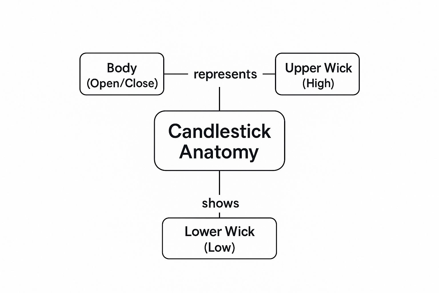
Each candle encapsulates the entire story of a specific time frame, whether it’s one minute, five minutes, or an hour. It visually summarizes the outcome of the battle between buyers and sellers with four key pieces of information:
- The Open: Where the price started when the period began.
- The High: The absolute highest point the price reached.
- The Low: The absolute lowest point the price hit.
- The Close: The final price when the period ended.
These four points come together to create the candle's unique shape, giving you an immediate visual cue about what just happened in the market.
Decoding The Story of a Single Candle
A candlestick has two main parts: the body and the wicks (you’ll also hear them called shadows).
The body is the thick, rectangular part. It shows you the distance between the opening and closing price. The color tells you who won that round: a green (or white) body means the buyers pushed the price up, closing it higher than it opened. A red (or black) body means the sellers took control, closing the price lower than it opened.
The wicks are the thin lines sticking out from the top and bottom of the body. They show you the full extent of the battle—the session's high and low. A long upper wick tells you that buyers tried to rally but got smacked back down by sellers. On the other hand, a long lower wick shows that sellers tried to tank the price, but buyers came storming back in and pushed it up.
This table breaks down each part of a candlestick and the psychological clues it offers.
Anatomy of a Candlestick Explained
| Component | What It Represents | Market Psychology Insight |
|---|---|---|
| Body | The range between the open and close price. | A long body shows strong conviction from one side. A small body signals indecision or a weak move. |
| Color | The direction of the net price change (green/red). | Shows whether buyers (bulls) or sellers (bears) won the battle for that session. |
| Upper Wick | The highest price reached during the period. | A long upper wick indicates that sellers rejected higher prices, pushing them back down before the close. |
| Lower Wick | The lowest price reached during the period. | A long lower wick suggests that buyers stepped in to defend lower prices, pushing them back up. |
By understanding these components, you're not just looking at a chart; you're reading a story of supply and demand in real-time.
As the image shows, the body reveals the ultimate winner of the session, while the wicks tell the tale of the struggle that happened along the way.
Why This Foundation Matters
Getting this down is non-negotiable. A long green candle with no wicks is screaming bullish conviction. A candle with a tiny body but long wicks on both ends signals a chaotic stalemate—total indecision.
A single candlestick is a window into the market's mind. It tells you if conviction, rejection, or uncertainty is in control, giving you the building blocks for much deeper analysis.
Once you can instinctively read these individual candles, you can start putting them together to spot powerful, multi-candle day trading candlestick patterns. This is the core of price action trading—making decisions based on what the price is doing right now, not on what some lagging indicator told you it did ten minutes ago. To take the next step, you should learn about some of the best price action patterns that really form the backbone of a solid trading plan.
Spotting Bullish Reversal Patterns
After a stock has been sliding, every trader is asking the same thing: where’s the bottom? The real skill lies in spotting the exact moment when the sellers are finally exhausted and the buyers are starting to creep back in. This is where bullish reversal patterns come in—they’re the signals that a downtrend might be running out of gas.
Think of it this way: a downtrend is the sellers' game. They're in total control, pushing the price down day after day. A bullish reversal pattern is the first sign of a comeback—a signal that buyers are finally putting up a fight. While they’re never a guarantee, these patterns are high-probability clues that market sentiment is shifting from fear back toward confidence.
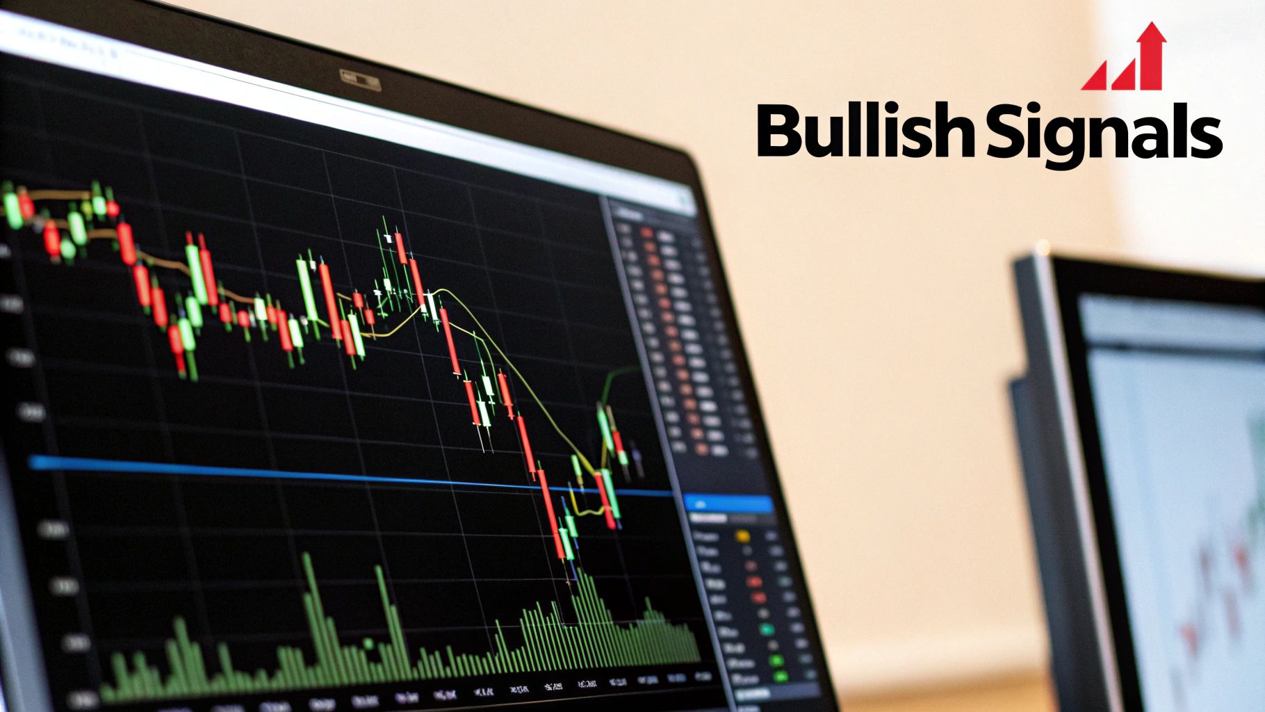
Learning to spot these formations is key to anticipating potential turning points and timing your long entries with much better precision. Let’s break down three of the most reliable bullish reversal patterns you’ll see on the charts. If you want to go even deeper, check out our complete guide on how to trade with candlestick charts like a pro.
The Hammer: A Signal of Rejection
Picture a stock in a freefall. The sellers are having their way with it, but then, something shifts. In a single session, they manage to push the price way down, only to see a wave of buyers rush in and push it all the way back up to close near where it opened. The shape this battle leaves behind is unmistakable: a Hammer.
A Hammer has a small body up top with a long lower wick that's at least twice the length of the body. The body can be red or green, though a green one adds a little extra bullish conviction.
- Small Body: This shows a tight tug-of-war between the open and close prices.
- Long Lower Wick: This is the key. It’s a powerful visual of price rejection, showing that buyers aggressively stepped up to defend those lower prices and completely overwhelmed the sellers.
The psychology here is what matters. That long wick is proof that heavy selling pressure got absorbed and thrown right back. It’s a warning shot for anyone short and a welcome mat for buyers looking for a potential floor.
The Bullish Engulfing Pattern
The Bullish Engulfing is one of the most powerful and easy-to-spot reversal signals out there. It’s a two-candle pattern that tells a simple story of a sudden and dramatic power shift from sellers to buyers.
First, you have a red (bearish) candle that continues the downtrend. The very next candle, however, opens lower but then rallies with so much strength that it completely "engulfs" the entire body of the previous red candle.
This pattern screams momentum shift. It’s like the sellers' hard work from the first day was not only cancelled out but completely bulldozed by buyers on the second day.
To be a true Bullish Engulfing pattern, that second candle must be green (bullish), and its body has to swallow the body of the prior red (bearish) candle.
The Morning Star: A Glimmer of Hope
The Morning Star is a three-candle pattern that signals a more gradual, but just as meaningful, reversal. Think of it as the dawn after a long night of selling—a sign that a new uptrend could be starting.
Here’s how the story unfolds over three sessions:
- First Candle: A long red candle appears, showing sellers are still firmly in charge of the downtrend.
- Second Candle: The next candle is tiny (it can be red, green, or even a Doji) and gaps down from the first. This small body represents a pause—a moment of indecision where the selling pressure stalls out.
- Third Candle: A strong green candle forms, pushing up and closing well into the body of that first red candle. This confirms the buyers have taken over and are now driving the price higher with conviction.
The Morning Star is a classic for a reason. While performance always varies, one 2022 study found its Doji variant had a 68% success rate over 10 years across multiple markets. Its reliability comes from the clear story it tells: selling exhaustion, followed by indecision, and ending with a decisive takeover by the bulls.
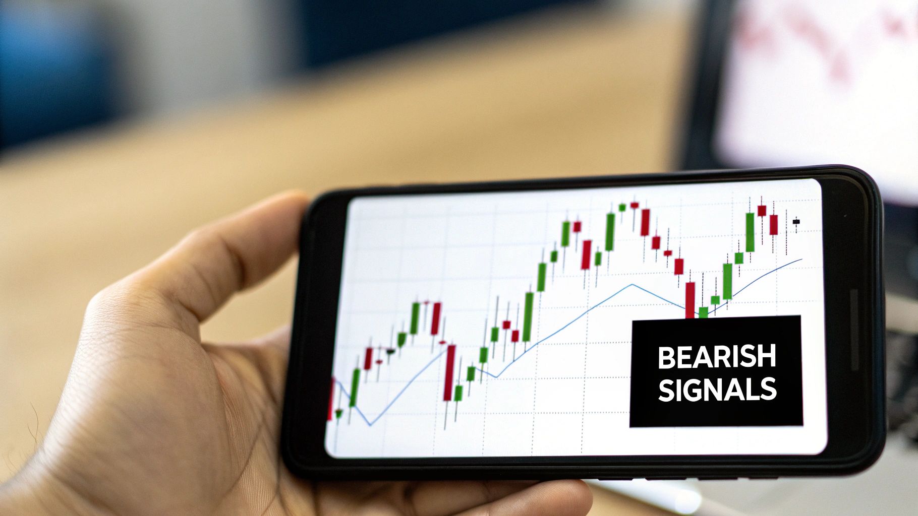
Identifying Bearish Reversal Patterns
Just as bullish patterns can hint at a coming rally, bearish reversal patterns are the storm clouds gathering on an uptrend's horizon. Learning to spot these is a non-negotiable skill for day traders, whether you're looking to cash out a profitable long position or find a solid entry for a new short.
These patterns tell a story—the story of buying momentum drying up and sellers starting to take over the field.
Catching these formations near key resistance levels gives you a serious edge. Think of it like seeing the first cracks in a dam; it’s no guarantee of a flood, but it’s a clear warning that the pressure is building and the balance is shifting. Let's break down three of the most reliable bearish patterns that tell you the buyers are losing their grip.
The Shooting Star: A Warning Shot from Sellers
Picture this: a stock is in a solid uptrend. The market opens, and the bulls keep pushing the price higher, extending the rally. But then, out of nowhere, sellers step in with force. They aggressively reject those new highs and slam the price all the way back down to where it started the day. The candlestick left behind is a Shooting Star.
This pattern is the mirror image of the Hammer. It’s defined by a small body at the low end of the candle and a long upper wick that’s at least twice the length of the body. While the body can be green or red, a red body packs a little more bearish punch.
- Small Body: This shows that despite all the drama during the session, the price closed right back near where it opened. It’s a sign of a stalemate.
- Long Upper Wick: This is the key. That long wick is the visual evidence of a fierce rejection of higher prices. It tells you the bulls tried to run, but the bears met them with overwhelming force and won the battle.
When you see a Shooting Star after a good run-up, it’s a flashing red light that buying power is getting exhausted.
The Bearish Engulfing Pattern: A Decisive Power Shift
Out of all the day trading candlestick patterns, the Bearish Engulfing is one of the most dramatic and powerful. It’s a two-candle formation that paints a crystal-clear picture of a sudden, brutal shift in control from buyers to sellers.
The story starts with a green (bullish) candle that’s part of the existing uptrend. Nothing unusual there. The very next candle, however, opens higher but then reverses so violently that its red body completely swallows, or "engulfs," the body of the previous green candle.
This pattern isn’t just a pullback; it signifies a complete sentiment reversal in a single trading session. The prior day's gains aren't just erased—they're obliterated by a massive surge of selling pressure.
For this pattern to be legit, the second candle's body must be bearish (red) and fully envelop the body of the preceding bullish (green) candle. It’s about as clear a signal as you can get that the sellers have yanked the steering wheel away from the buyers.
The Evening Star: The Twilight of an Uptrend
The Evening Star is a three-candle bearish reversal pattern that signals a more gradual, but equally potent, end to an uptrend. As the bearish cousin of the Morning Star, it tells a story of momentum dying out over three distinct sessions.
Here’s how the narrative of an Evening Star plays out on the chart:
- First Candle: A long, strong green candle shows up, confirming that the bulls are still firmly in charge of the uptrend. Confidence is high.
- Second Candle: The price gaps up on the open, but the candle that forms is tiny—maybe a Doji or a Spinning Top. This is a huge red flag. The buying momentum has stalled, and indecision is creeping in.
- Third Candle: A powerful red candle forms, often gapping down and closing deep within the body of that first green candle. This confirms it: the sellers have seized control and are now pushing the price down with conviction.
The Evening Star is so respected because it shows a clear, logical progression: an uptrend loses steam, hangs in a moment of uncertainty, and then decisively reverses. Spotting this is like watching the sun set on a bull run—a clear signal that the bears are about to take over the night.
Spotting Pauses and Stalemates in the Market
Not every candlestick pattern screams "reversal!" Sometimes, the market just needs to take a breather before carrying on. One of the most critical skills you can develop as a day trader is learning to spot the difference between a trend that's genuinely running out of steam and one that's simply taking a quick pit stop.
These signals generally come in two flavors: continuation patterns, which hint that the current trend is about to fire back up, and indecision candles, which show a temporary stalemate that could break either way. Getting a feel for these nuances is what helps you ride profitable trades longer and keeps you from getting chewed up when the market is just churning sideways.
When a Trend Is Just Catching Its Breath
Continuation patterns are the market’s version of a quick pause in the action. Think of it like a race car making a pit stop—it pulls off the track for a moment, refuels, and then roars right back into the race, heading in the same direction.
In trading, these formations show a brief period of consolidation within a much larger trend. Once the consolidation is over, the original momentum takes over again. Two of the most common examples you'll see are the Rising and Falling Three Methods.
-
Rising Three Methods: This is a bullish continuation pattern that shows up during an uptrend. It kicks off with a big green candle, followed by three smaller red candles that drift down but importantly, stay within the range of that first candle. The pattern gets its confirmation when a fifth, powerful green candle closes above the high of the first one, signaling the bulls have wrestled back control.
-
Falling Three Methods: This is the bearish mirror image. It starts with a long, commanding red candle in a downtrend. Next, you'll see three small green candles that try to rally but can't break out of the first candle's range. The confirmation comes with a final, strong red candle that closes below the low of the first candle. The sellers are back.
Recognizing these helps you hang on during minor pullbacks instead of bailing on a perfectly good trend too early.
Reading Indecision on the Chart
While continuation patterns show a temporary pause, indecision candles signal a true equilibrium—a tug-of-war where neither buyers nor sellers can get the upper hand. These candles usually have tiny bodies with wicks sticking out of both ends, showing that price bounced around but ultimately closed right back where it started.
Indecision candles are all about market uncertainty. They're often the quiet before the storm, popping up right before a major price move as pressure builds between buyers and sellers.
Understanding these signals is at the very core of learning to read the market. In fact, a lot of successful traders base their entire strategy on this skill. You can dive deeper into this disciplined approach by understanding what price action is and how it becomes the foundation for any solid trading plan.
Key Indecision Candles to Watch
Two of the most common indecision signals every trader needs to know are the Doji and the Spinning Top. They look similar, but they tell slightly different stories about what's going on behind the scenes.
The Doji
A Doji is the classic picture of indecision. It has a super thin body—sometimes just a line—which means the open and close prices were almost exactly the same. The wicks can be long or short, but the main takeaway is a perfect stalemate. If a Doji appears after a strong run, it's a major warning sign that momentum is fading and a reversal could be just around the corner.
The Spinning Top
A Spinning Top is the Doji's close cousin but with a slightly fatter (though still small) body. Just like the Doji, it has wicks on both sides, telling you the price moved around quite a bit during the session. But that small body shows that by the end, neither the bulls nor the bears could claim a real victory. A Spinning Top signals high volatility mixed with uncertainty, suggesting the current trend might be on shaky ground.
Building a Complete Day Trading Strategy
Being able to spot bullish and bearish day trading candlestick patterns is a fantastic skill, but it’s only one piece of a much larger puzzle. Seeing a single pattern in isolation is like hearing one note of a song—it’s a hint, but it doesn’t give you the whole melody. To actually trade well, you have to weave these patterns into a complete, risk-managed strategy.
The most common trap new traders fall into is jumping on a pattern the second it appears, without any other evidence to back it up. This is a recipe for chasing false signals and getting chopped up by market noise. The real key to consistency is learning to demand more from your setups.
The professional approach is all about confluence. This simply means you're looking for multiple, separate reasons that all point to the same outcome. This is how you turn a simple candlestick pattern into a high-probability trade.
By waiting for a few technical factors to line up, you seriously stack the odds in your favor. It’s the difference between making a wild guess and making a calculated, evidence-based decision.
The Power of Confirmation
Confirmation is just the process of using other tools to verify what a candlestick pattern is suggesting. A Bullish Engulfing pattern on its own is interesting. But a Bullish Engulfing pattern that forms right at a major support level, with a huge spike in buying volume? Now that's a setup you can trade with some real confidence.
Here are the three most critical confirmation factors to layer into your analysis:
-
Volume Analysis: Think of volume as the fuel behind the price move. A reversal pattern on weak, low volume is flimsy and untrustworthy. But when you see that same pattern backed by a big surge in volume, it shows real conviction from other traders and is way more likely to follow through.
-
Support and Resistance Levels: These levels are the most important battlegrounds on any chart. A bearish pattern like a Shooting Star becomes infinitely more powerful when it pops up at a known resistance level, a place where sellers have historically shown up to push prices down.
-
Moving Averages: Key moving averages (like the 20 or 50-period) often act as dynamic, or moving, support and resistance. A bullish Hammer that bounces perfectly off a rising 20-period moving average is a classic, textbook sign that the uptrend is likely to continue.
To make this practical, here is a simple checklist you can run through before taking a trade. It helps ensure you're not just reacting to a pattern, but confirming it with solid evidence.
Confirmation Checklist for a High-Probability Trade
| Confirmation Factor | What to Look For | Why It Matters |
|---|---|---|
| Volume Spike | A noticeable increase in trading volume on the pattern's final candle. | High volume signals strong conviction and participation, making the move more reliable. |
| Key Price Level | The pattern forms at a pre-identified support or resistance zone. | Patterns at key levels have a higher probability of success because they align with historical price behavior. |
| Moving Average Bounce | The pattern respects and bounces off a significant moving average (e.g., 20, 50, or 200 EMA). | This shows the pattern is in sync with the underlying trend, adding another layer of confirmation. |
| Trend Context | A bullish reversal pattern appears in an uptrend; a bearish one in a downtrend. | Trading with the trend is always the path of least resistance. It increases the odds of a successful follow-through. |
This checklist isn't about finding perfect setups every time—it's about building a disciplined habit of seeking confluence. The more boxes you can tick, the stronger your trade idea becomes.
From Pattern to Actionable Trade Plan
Okay, so you've found a confirmed pattern. Now what? You need a clear plan of attack. A complete trade plan has three non-negotiable parts that define your risk and potential reward before you even think about clicking the buy or sell button.
1. The Entry Trigger
Your entry is how you get into the trade once the pattern is confirmed. For a bullish pattern, a common trigger is to enter when the price breaks just above the high of the pattern's last candle. For a bearish one, you'd enter on a break below the low. This little step makes sure momentum is actually starting to move in your direction.
2. The Stop-Loss
Your stop-loss is your emergency exit. It's the price where you admit the trade idea was wrong and get out to protect your capital. For a bullish pattern, a logical spot for the stop-loss is just below the low of the formation. For a bearish setup, it goes right above the pattern's high. No exceptions.
3. The Profit Target
Where are you going to get out and take your winnings? A popular method is to find the next major support or resistance level and set your target there. Another great approach is to use a fixed risk-to-reward ratio, like aiming for a profit that is at least twice the amount you're risking (2:1 R:R).
Building this framework turns spotting patterns from a passive hobby into an active, disciplined trading method. It’s how you go from just reading charts to strategically trading them. While no strategy is foolproof, this structured approach gives you a real statistical edge. Don't just take my word for it; an April 2024 study showed that 66% of 75 recognized candlestick patterns beat a simple buy-and-hold strategy in the S&P 500. You can read the full research on candlestick pattern success rates to dig deeper into the data.
Common Questions About Candlestick Patterns
Once you start spotting day trading candlestick patterns on your charts, the real questions begin to pop up. Knowing the theory is one thing, but knowing how to apply it in the heat of the moment is what separates the pros from the crowd. This is where we get into the nitty-gritty.
Think of this as the practical field guide to trading with candlesticks. We're moving past just naming patterns and diving into the "how" and "when" that actually matter when your money is on the line.
Which Candlestick Timeframe Is Best for Day Trading?
This is easily the most common question I get, and the honest answer is: it depends on your style. For day traders, the action is usually on the 1-minute, 5-minute, and 15-minute charts. Each tells a slightly different story.
For many, the 5-minute chart hits the sweet spot. It's clean enough to show you clear, tradable patterns but filters out much of the frantic "noise" and false signals that can make the 1-minute chart a nightmare. It gives you a moment to breathe, analyze a setup, and execute without feeling like you're a step behind.
Ultimately, your own approach is the deciding factor:
- Scalpers: If you're hunting for quick-fire trades to scalp a few ticks of profit, the 1-minute chart is your playground. It provides the most signals, but be warned: it demands razor-sharp execution and a cool head.
- Intraday Trend Traders: For those looking to ride bigger intraday waves that last an hour or more, the 15-minute chart is a fantastic tool. It helps you see the bigger picture and avoid getting shaken out by minor blips.
The secret weapon for many seasoned traders is multi-timeframe analysis. You might spot a critical support level on the 15-minute chart, then drill down to the 5-minute to patiently wait for a textbook reversal pattern to print. This way, you combine the strategic clarity of the higher timeframe with the tactical precision of the lower one.
How Reliable Are Candlestick Patterns?
Standing alone, a candlestick pattern is just a hint—not a guarantee. Their real power is unlocked when you combine them with other evidence. This idea, called confluence, is the bedrock of any solid price action strategy.
Think about it. A random Bullish Engulfing pattern in the middle of a choppy range doesn't mean much. But what if that same pattern appears right at a major support level, bounces perfectly off the 50-period moving average, and is confirmed by a huge spike in volume? Now you've got an A+ setup.
A candlestick pattern is like a single piece of evidence in a courtroom. It might be interesting, but you need multiple, independent pieces of evidence all pointing in the same direction before you can reach a confident verdict.
The single biggest mistake new traders make is trading patterns in isolation. It's a fast track to getting chopped up by false signals. Always treat a pattern as a signal to pay attention, then look for confirmation from the rest of your trading plan before you risk a single dollar.
Can Candlestick Patterns Be Used in All Markets?
Yes, absolutely. The beauty of candlestick analysis is its universal nature. The patterns work in stocks, forex, crypto, and commodities for one simple reason: they are a visual representation of human psychology.
At its core, any market is just a tug-of-war between buyers and sellers. The emotions of fear, greed, and indecision are what drive price, and it doesn't matter if you're trading Bitcoin or corn futures. Candlesticks give us a language to read that human behavior.
That said, you have to respect the unique personality of each market.
- High-Volatility Markets: Assets like cryptocurrencies or volatile tech stocks will often print wilder patterns, with long wicks and frequent gaps.
- Lower-Volatility Markets: Blue-chip stocks or major currency pairs tend to form cleaner, more "textbook" patterns.
A Hammer is a Hammer, but you still need to get a feel for how these patterns behave on the specific chart you're trading. The language of price action is universal, but the accent changes from market to market.
At Colibri Trader, we teach you to stop memorizing patterns and start reading the story the market is telling you. Our price-action programs are built to give you the skills to trade with confidence, free from cluttered indicators. Discover how to transform your performance by exploring our courses today. Learn more at https://www.colibritrader.com.