


A Price Action Guide to Chart Patterns in Forex
Chart patterns are the forex market's visual language. They're not just random squiggles on your screen; they represent the collective psychology of buyers and sellers, forming repeatable shapes that can signal where the market might be headed next.
Think of them as a roadmap, showing the footprints of other traders and giving you clues about the path of least resistance for price.
Why Chart Patterns Are the Language of the Market
Imagine trying to understand a conversation in a foreign language with only a dictionary. You could look up individual words, but you'd miss the nuance, the emotion, the real story. Trading with indicators alone can feel a lot like that—you get isolated signals without grasping the narrative behind the price moves.
This is where learning to read chart patterns in forex changes the game.
These patterns cut through the noise of lagging indicators and complex algorithms, letting you focus on pure price action. They are the raw, visual record of the constant tug-of-war between buyers (bulls) and sellers (bears). When you learn this language, you stop guessing and start interpreting what the market is actually telling you.
Reading Market Psychology
Every pattern tells a story about supply and demand. A "Double Top," for instance, isn't just an "M" shape. It’s a story of buyers trying to push the price higher, failing twice at the same ceiling, and finally losing steam and handing control over to the sellers. This is market psychology, made visible.
Understanding this story gives you a massive edge. You're no longer just reacting to a signal; you're trading based on the market's underlying behavior.
The chart itself is a powerful storyteller. It reveals the footprints of institutional money, the exhaustion of a trend, and the buildup of momentum before an explosive move. Your job is to learn how to read that story.
The Benefits of a Price Action Approach
Focusing on chart patterns offers a much cleaner, more direct way to analyze the forex market. Instead of cluttering your screen with a dozen indicators that are often lagging and giving you conflicting signals, you can make clear-headed decisions based on what the price is actually doing. It’s about building a trading edge on timeless principles, not on a magic formula.
Here are a few of the key advantages:
- Clarity: It radically simplifies your decision-making by cutting out the noise from lagging indicators.
- Universality: Chart patterns show up in all markets and on all timeframes. What works on a 5-minute chart often works on a weekly chart, too.
- Defined Risk: Patterns give you obvious places to put your stop-loss and set your profit targets, like the neckline in a Head and Shoulders pattern.
- Proactive Signals: Unlike indicators that just confirm what’s already happened, patterns can give you early clues about what might happen next.
Understanding The Three Core Pattern Families
If you want to get good at trading chart patterns, you can't just try to memorize dozens of random shapes. That’s a recipe for confusion. Instead, a much smarter approach is to think of them in terms of three core families.
Every single pattern you'll ever see on a forex chart fits into one of these categories. Grouping them this way helps you instantly understand the story the market is telling and what its next move is likely to be.
This isn't about memorizing geometry; it's about reading the battlefield. As the hierarchy chart below shows, patterns are just the visual footprint left behind by the psychological tug-of-war between buyers and sellers. That battle is what we call price action.
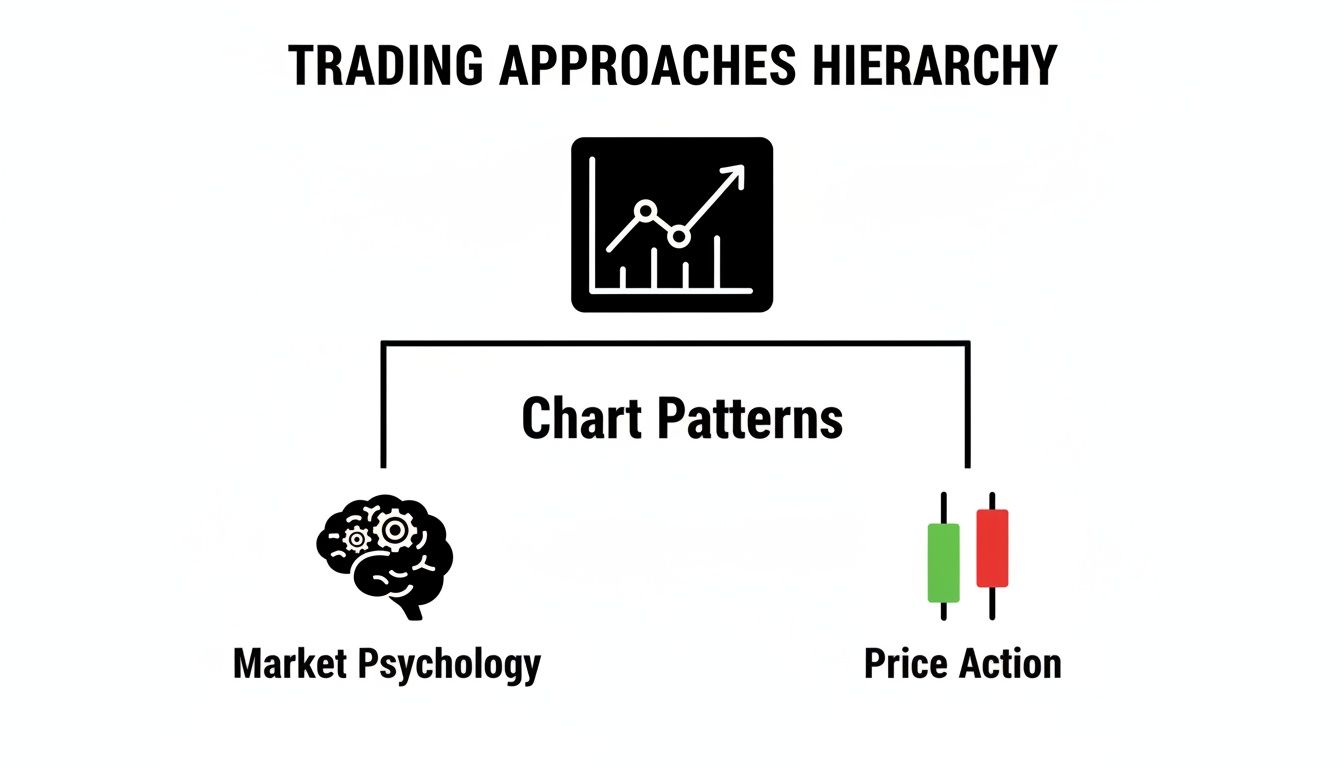
Let's break down these three families so you know exactly what you're looking for.
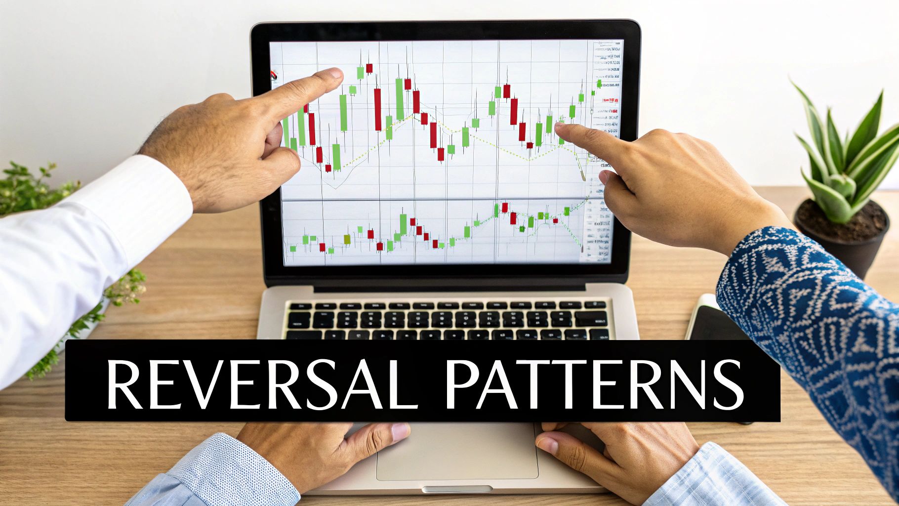
H3 Reversal Patterns
Think of a reversal pattern as a speeding car hitting a brick wall. A strong trend has been moving in one direction, but it's starting to lose steam. The dominant side—whether it’s the buyers in an uptrend or sellers in a downtrend—is running out of gas.
This is where the other side gets its chance to take over. Patterns like the classic Head and Shoulders or a Double Top are massive red flags that the trend is exhausted and a U-turn is probably coming. Spotting these early can put you in a prime position to catch a brand new trend right from the start.
H3 Continuation Patterns
If reversals are a U-turn, then continuation patterns are just a quick pit stop on a long highway trip. They show up as a temporary pause or a bit of sideways chop inside a healthy, established trend. The market is just taking a breather and gathering strength before it continues on its original path.
Common examples here are Flags and Pennants. When you see one, it’s a strong clue that the original momentum is still very much alive. For a trader, these patterns are a great, lower-risk opportunity to jump into a trend that has already proven itself. If you're looking for more details, Colibri Trader offers a deeper exploration of various forex chart patterns and how to apply them.
H3 Bilateral Patterns
Bilateral patterns are the market’s cliffhangers. Price gets squeezed into a tight range, and you can almost feel the tension building. Buyers and sellers are in a dead-even fight, and nobody has the upper hand… yet. The price coils up like a spring, getting ready for an explosive move.
Bilateral patterns, such as Ascending or Descending Triangles, signal that a significant breakout is about to happen. The critical takeaway is that the direction of this breakout is uncertain—it could go either way.
These patterns are completely neutral. They aren't telling you the trend will reverse or continue; they are simply screaming that a big move is coming soon. Your job isn't to guess the direction. It's to wait patiently for the price to break out of the pattern and then trade with the resulting momentum.
A Practical Guide to Chart Pattern Families
To tie this all together, here’s a quick-reference table that summarizes the three pattern families, what they mean psychologically, and what you should be looking for.
| Pattern Family | Market Psychology | What It Signals | Common Examples |
|---|---|---|---|
| Reversal | Trend exhaustion; the dominant side is losing control. | The current trend is ending, and a new trend in the opposite direction is about to begin. | Head and Shoulders, Double/Triple Tops & Bottoms, Wedges |
| Continuation | A temporary pause in a healthy trend; the market is taking a breath. | The existing trend is still strong and is likely to resume its original direction. | Flags, Pennants, Rectangles |
| Bilateral | A period of high indecision and volatility compression. | A significant price breakout is imminent, but the direction is unknown until it happens. | Ascending Triangles, Descending Triangles, Symmetrical Triangles |
Thinking in terms of these three families—Reversal, Continuation, and Bilateral—will make your chart analysis faster, clearer, and far more effective.
How to Trade High-Probability Reversal Patterns
Spotting a potential trend change is one of the most powerful skills you can build as a forex trader. Reversal patterns are your go-to tool for this job. Think of them as early warning signs that a dominant trend is running out of steam and the market tide is about to turn.
But trading these setups isn't just about recognizing a shape on your screen. It’s about understanding the psychological tug-of-war that creates the pattern and then having the discipline to execute a solid plan.
Let’s move past the theory and get practical. We're going to break down the most reliable reversal patterns, giving you clear rules for your entry, stop-loss, and take-profit levels. The idea is to trade with precision, letting the market confirm your analysis before you put any capital on the line.
The Head and Shoulders Pattern
The Head and Shoulders is probably the most famous bearish reversal pattern out there, and for good reason. It signals the potential end of an uptrend, showing a clear power shift from buyers to sellers. The pattern is made up of three peaks: a central peak (the Head) that's higher than the two on either side (the Shoulders).
What this pattern is really telling you is a story of bullish exhaustion. The left shoulder is the peak of a healthy uptrend. The head represents one final, desperate push to a new high, which quickly gets smacked down. Then, the right shoulder shows a pathetic attempt to rally that can't even reach the previous high—a dead giveaway that the buyers are gassed.
The neckline is a line connecting the lows between these three peaks. This line is the kill zone. Once price breaks below it, the pattern is confirmed, and it’s your signal to consider a short entry.
The Head and Shoulders pattern has an impressive 89% success rate on the 4-hour to daily timeframes, making it a trader's favorite. Backtesting has shown that in trending markets, this pattern reversed the trend 87% of the time when paired with supply-demand analysis. Traders who patiently waited for a confirmed neckline break often saw risk-reward ratios hitting 1:3.
Trading the Head and Shoulders:
- Entry Trigger: Go short after a candle closes decisively below the neckline. Don't jump the gun; wait for confirmation.
- Stop-Loss Placement: Your stop-loss goes just above the high of the right shoulder. If the price goes back up there, your idea was wrong.
- Profit Target: Measure the vertical distance from the top of the head down to the neckline. Project that same distance downward from your entry point to set your target.
The Inverse Head and Shoulders
No surprises here—the Inverse Head and Shoulders is simply the bullish version of the classic pattern. It shows up at the bottom of a downtrend and signals a potential reversal to the upside. The whole structure is just flipped upside down: three troughs, with the middle one (the Head) being the lowest.
The psychology is a mirror image. The left shoulder marks a low in the downtrend. The head is that final capitulation low, where sellers throw everything they have at the market before they're completely spent. The right shoulder is a higher low, proving that sellers have lost their punch and can't push prices down to the previous depths.
The neckline connects the peaks between the troughs, forming a critical resistance level. A solid break above this line is your green light that buyers have taken charge.
Trading the Inverse Head and Shoulders:
- Entry Trigger: Go long after a candle closes firmly above the neckline.
- Stop-Loss Placement: Tuck your stop-loss just below the low of the right shoulder.
- Profit Target: Measure the vertical distance from the bottom of the head up to the neckline. Project this distance upward from the breakout point.
The Double Top Pattern
The Double Top is another classic bearish reversal that looks like a big "M". It typically forms after a long uptrend and screams that buying momentum is dying. The pattern is built from two consecutive peaks at roughly the same price, with a small valley in between.
The story here is one of clear rejection. Buyers push the price up to a resistance level but get knocked back. After a small pullback, they give it another go but fail to break through that same ceiling. That second failure is a huge red flag showing a lack of conviction and tells you sellers are stepping in.
The trough between the two peaks creates a support level we call the neckline. A break below this level confirms the uptrend is likely over and gives you a high-probability entry to sell.
Trading the Double Top:
- Entry Trigger: The textbook entry is to sell once a candle closes firmly below the neckline.
- Stop-Loss Placement: A safe stop-loss can be placed just above the two peaks.
- Profit Target: Measure the height from the peaks down to the neckline. Project that distance down from the breakout point to find your profit target.
If you really want to master these kinds of trend-killing signals, our complete guide on trading reversal patterns digs even deeper with more examples and advanced strategies.
The Double Bottom Pattern
The Double Bottom is the bullish twin of the Double Top, carving out a "W" shape at the end of a downtrend. It’s a sign that selling pressure is fading and a new uptrend could be starting. You'll spot it by its two distinct troughs at about the same price level, separated by a peak.
This formation tells a story of support holding the line. Sellers manage to drive the price down to a key level, but buyers step in and stop the bleeding. The sellers try again, but they fail at the exact same support level, showing they're out of ammo. This failure to make a new low is a powerful clue that momentum is shifting to the buyers.
The peak sitting between the two lows acts as a resistance level, or neckline. A breakout above this level confirms the pattern and completes the reversal.
Trading the Double Bottom:
- Entry Trigger: Wait for a decisive candle close above the neckline before you even think about going long.
- Stop-Loss Placement: Your stop-loss goes right below the low of the two troughs.
- Profit Target: Measure the distance from the troughs up to the neckline and project that distance upward from where the price broke out.
Capitalizing on Powerful Continuation Patterns
If reversal patterns are the market screaming "full stop, U-turn!", then continuation patterns are more like a quick tap on the brakes before hitting the accelerator again. Let's be honest, the big money in forex is made by riding sustained trends, and these patterns are your green light that the trend has more gas in the tank. They represent a healthy pause—a moment of consolidation or a little profit-taking before the dominant trend gets back to business.

Think of a marathon runner. They don't sprint the entire race; they find a solid pace, maybe slow down for a second at a water station, and then they're off again. Continuation patterns are the market's water stations. Getting good at spotting them means you can jump into a proven trend, often at a much lower-risk entry point than chasing the initial move.
Bullish and Bearish Flags
The Flag is easily one of the most dependable and visually obvious continuation patterns out there. It gets its name because it looks just like one: a sharp, almost vertical price move (the flagpole) followed by a brief, rectangular consolidation (the flag) that drifts slightly against the main trend. What this shows is a powerful burst of momentum, followed by a very orderly, brief pause as some early birds take profits.
A Bull Flag shows up during a strong uptrend. After a big rally, the price will consolidate inside a channel that slopes gently downwards. This is key—it shows that while some traders are cashing out, there’s absolutely no major selling pressure trying to reverse the trend. Once this little pause is over, the price usually explodes upward with fresh energy.
On the flip side, a Bear Flag pops up in a downtrend. It kicks off with a steep drop, followed by a weak rally inside an upward-sloping channel. This weak little bounce tells you that sellers are just catching their breath and reloading before they shove the price lower again.
Key Insight: The slope of the flag is everything. It must drift against the primary trend. A bull flag drifts down; a bear flag drifts up. This counter-move shows a complete lack of conviction from the other side.
Trading a Flag Pattern:
- Entry Trigger: Jump in after a candle closes decisively outside the flag's channel, going in the same direction as the original flagpole.
- Stop-Loss Placement: For a Bull Flag, your stop goes just below the lowest point of the flag. For a Bear Flag, place it just above the flag's high point.
- Profit Target: The classic way to set a target is to measure the height of the flagpole and project that same distance up (or down) from your breakout point.
Bullish and Bearish Pennants
Pennants are the close cousins of Flags. They share the same market psychology but look a little different. Just like a Flag, a Pennant starts with a strong flagpole move. The difference is the consolidation phase, which takes the shape of a small, symmetrical triangle where the price range squeezes tighter and tighter.
This coiling action represents a brief moment of indecision, but the expectation is that the original trend is going to win. As the trendlines converge, you can feel the volatility contracting right before an expected expansion—the breakout. A Bullish Pennant forms in an uptrend, and a Bearish Pennant appears in a downtrend.
The story here is identical to the Flag: a temporary breather before the next major move. The main distinction is that the coiling price action of a Pennant often leads to a much more explosive breakout as market pressure builds to a snapping point.
Trading a Pennant Pattern:
- Identify the Flagpole: First, look for that strong, sharp move that screams momentum.
- Watch the Consolidation: See if the price starts forming converging trendlines, creating that small triangle shape.
- Confirm the Breakout: Don't jump the gun. Enter your trade only after a candle closes outside the Pennant's trendlines, in the direction of the flagpole.
- Manage Your Risk: Place your stop-loss on the other side of the Pennant, just outside the opposing trendline.
- Set Your Target: Measure the height of the flagpole and project that length from the breakout point to find your profit target.
Wedges as Continuation Patterns
While many traders think of Wedges as reversal patterns, they can absolutely signal continuation depending on the context. A Falling Wedge that forms during a powerful uptrend is a classic bullish continuation setup. Here, the price consolidates between two downward-sloping, converging trendlines. It looks like sellers are trying to push things down, but they're failing to make any real headway. This narrowing action builds pressure until buyers finally overwhelm the weak selling and trigger an upward breakout, resuming the main uptrend.
Likewise, a Rising Wedge appearing within a solid downtrend can be a fantastic bearish continuation signal. It shows buyers attempting a rally, but each new high is weaker and less convincing than the last. The price gets squeezed into this narrowing upward channel until sellers reassert their dominance, break the price down, and continue the original bearish move.
For anyone looking to dive deeper into these kinds of consolidating shapes, a good guide to trading triangle patterns can be a goldmine of information.
Trading Continuation Rectangles
The Rectangle, also known as a trading range or consolidation box, is another beautifully simple continuation pattern. It takes shape when the price bounces sideways between clear, parallel support and resistance levels. It literally looks like a box on your chart. This pattern simply means that buyers and sellers have reached a temporary truce within a much larger trend.
In an uptrend, a Bullish Rectangle shows that buyers are consistently stepping in to defend the support level, absorbing all selling pressure without letting the price fall. When the price finally breaks out above the resistance line, it’s a clear signal that the buyers have won and are ready to drive the trend higher.
Conversely, a Bearish Rectangle in a downtrend shows sellers are guarding the resistance level like a fortress, shutting down any attempt at a rally. The breakdown below the support level confirms sellers are still in full control and the downtrend is about to resume. The trading rules are as simple as it gets: wait for a confirmed breakout from the box, trade in that direction, and use the opposite boundary as your stop-loss.
Navigating Indecision with Bilateral Patterns
So far, we've looked at patterns that give us pretty clear directional clues. But some of the most explosive moves in forex come from periods where the market just can't make up its mind. This is where bilateral patterns come into play.
Think of them as the market’s cliffhangers. They paint a picture of a tense standoff between buyers and sellers, where the price coils up like a spring, just waiting to snap.

Unlike the other chart patterns in forex we've covered, these formations are neutral. They scream that a big breakout is on the horizon, but the direction is a total coin toss. The name of the game here is patience. Your job isn’t to guess which way it’ll go, but to be ready to act when it finally does.
The Ascending Triangle
The Ascending Triangle is a classic. You'll spot it by its flat, horizontal resistance line up top and a rising trendline of higher lows at the bottom. This structure tells a fascinating story: sellers are digging their heels in at a specific price, refusing to budge. Meanwhile, the buyers are getting more and more aggressive with every dip.
Each of those higher lows shows buyers jumping in sooner and with more cash each time, literally squeezing the price up against that stubborn ceiling. Now, this often looks like a bullish setup, but don't be fooled. If the buyers run out of steam and fail at that resistance, it can trigger a nasty sell-off, making this a true two-way street.
The key takeaway with an Ascending Triangle is the buildup of buying pressure against a fixed supply level. A breakout in either direction will likely be fueled by the release of this built-up tension.
The Descending Triangle
Flip the Ascending Triangle on its head, and you get the Descending Triangle. This time, you have a flat, horizontal support line at the bottom and a falling trendline of lower highs at the top. This pattern paints a picture of growing seller confidence.
Buyers are holding the line at a specific support level, but sellers are muscling the price down more forcefully on each rally, creating that series of lower highs. This is a clear signal that bearish momentum is building. The pressure just keeps mounting on that support level until one of two things happens: it holds and causes a sharp rally, or it breaks and triggers a major downward slide.
The Two-Sided Game Plan for Triangles
The secret to trading these patterns is to stop trying to predict and start reacting. You absolutely must have a clear plan for both a bullish and a bearish outcome before the breakout happens. This takes the emotion out of the equation and lets you execute like a pro.
If the breakout is BULLISH (upward):
- Entry: Go long on a decisive candle close above the horizontal resistance (for an Ascending Triangle) or the descending trendline (for a Descending Triangle).
- Stop-Loss: Tuck your stop just below the most recent swing low that formed inside the triangle.
- Profit Target: Measure the height of the triangle at its widest point and project that distance upward from your entry point.
If the breakout is BEARISH (downward):
- Entry: Go short on a decisive candle close below the rising trendline (for an Ascending Triangle) or the horizontal support (for a Descending Triangle).
- Stop-Loss: Place your stop just above the most recent swing high inside the triangle.
- Profit Target: Just like before, measure the triangle's height and project that distance, but this time, project it downward from your breakdown point.
Common Trading Mistakes and How to Avoid Them
Being able to spot chart patterns in forex is a massive edge, but it's really only half the job. I've seen countless traders pinpoint a perfect Head and Shoulders pattern and still end up losing money on the trade. Why? Because of simple, unforced errors.
Avoiding these common slip-ups is what separates consistently profitable traders from the rest. It’s what protects your capital day in and day out.
Think of it like building a house. You can have the best blueprint (the pattern), but if you ignore the foundational rules of construction (your trading plan), the whole thing is going to come crashing down. Let's tighten up your process by looking at the mistakes I see traders make most often.
Forcing a Pattern That Isn't There
This is probably the biggest trap for eager traders: seeing what you want to see on the chart. You might try to squeeze a flag pattern onto a messy, choppy price action or call something a "Double Top" when the two peaks aren't even close to the same level.
That's not technical analysis; it's wishful thinking.
The Fix: A tradable pattern should be clean and obvious. It should literally jump out at you. If you have to squint, tilt your head, or second-guess yourself, it’s not strong enough to risk your money on. Wait for the A+ setups.
Entering Before Confirmation
Patience is a trader's superpower, but it's often the first thing to disappear when we see a potential setup. A lot of traders will see a pattern taking shape and jump in before the critical breakout happens, hoping to get a better entry price. This is just gambling. The pattern isn't confirmed and could easily fall apart.
The Fix: Don't even think about entering until you see a decisive candle close beyond the pattern’s key boundary—like the neckline of a Head and Shoulders or the trendline of a wedge. You have to wait for the market to prove your idea right before you put capital on the line.
Trading without confirmation is like betting on a horse race before the gates have even opened. You're operating on pure hope, not on a confirmed signal from the market.
For a deeper dive into the psychological traps that catch traders out, take a look at these common trading mistakes that can wreck even the most solid strategies. Just being aware of these pitfalls is the first major step toward getting them out of your trading for good.
Frequently Asked Questions About Chart Patterns
Which Timeframe Is Best for Trading Forex Chart Patterns?
There's no single "best" timeframe, but reliability definitely shoots up on the higher ones like the 4-hour, daily, and weekly charts. Think of it this way: more traders are involved over these longer periods, which means the patterns that form are based on more collective market sentiment. This helps filter out the random "noise" and pesky false breakouts you often see on lower timeframes.
For day traders looking for a sweet spot, the 1-hour chart is often a great middle ground. It tends to offer a good number of trading opportunities without sacrificing too much signal quality.
Should I Use Indicators to Confirm Chart Patterns?
Honestly, you don't have to. The whole philosophy behind pure price action trading is that the pattern is the signal. It's a direct reflection of the battle between buyers and sellers, the raw supply and demand dynamics playing out on your screen.
When you start adding indicators like the RSI or MACD, you risk muddying the waters. They often lag behind price and can give you conflicting information, leading to the dreaded "analysis paralysis." My advice? Focus on keeping your charts clean. Mastering chart patterns in forex on their own is a much more direct—and often more effective—way to trade.
A pattern worth trading should be clear and obvious; you shouldn't have to squint and force it to fit. The real confirmation isn't an indicator crossing a line, it's the breakout itself—when price closes decisively past a key level with a noticeable burst of momentum.