


A Price Action Guide to Chart Patterns Forex Trading
Forex chart patterns are nothing more than shapes you see on a price chart that hint at where the market might go next. These patterns are carved out by the constant tug-of-war between buyers and sellers, giving you a visual roadmap to spot solid entry and exit points without cluttering your screen with a dozen confusing indicators.
Reading the Market's Story Through Chart Patterns
Ever tried to trade just by watching the price tick up and down? It feels like trying to decipher a foreign language, doesn't it? The endless stream of fluctuations looks like random noise, leaving you feeling lost and always a step behind.
But what if you could learn to read the market's language directly from the charts?
That’s exactly what studying forex chart patterns allows you to do. These aren't just random squiggles on a screen; they are the literal footprints of market psychology. Each pattern tells a story—a visual narrative of the battle between the bulls and the bears, exposing their collective fear, greed, and moments of pure indecision.
Think of a chart pattern like a recurring scene in a movie. You’ve seen it before, you know the setup, and you have a pretty good idea of what's about to happen. Learning patterns gives you that same predictive edge in the market.
When you learn to spot these formations, you start trading based on what the price is actually doing, not what some lagging indicator told you it did ten minutes ago. This entire guide is built on one simple, unshakable truth: price action is king.
This approach gives you a massive advantage, no matter your experience level:
- Clarity: You cut through the noise. Forget about conflicting signals from multiple indicators and just focus on the raw movement of price.
- Universality: These patterns show up everywhere—on every currency pair, every stock, every commodity, and across all timeframes. They're a truly versatile tool.
- Proactive Trading: You stop reacting to old news. Instead, you learn to spot developing price structures and anticipate high-probability moves before they happen.
In this guide, we're going to dig deep. We won't just show you a picture of a pattern and call it a day. We’ll break down the mechanics behind each one, give you precise rules for trading them, and arm you with practical drills to sharpen your eye. By the end, you'll be able to read the market's story and make clear, confident decisions right from your charts.
Understanding Reversal and Continuation Patterns
Before you can trade any chart pattern with confidence, you have to get one thing straight: every single pattern falls into one of two camps. They're either reversal patterns or continuation patterns.
Think of them as road signs on your chart. One tells you a U-turn might be coming up, while the other gives you the green light to keep cruising in the same direction. This simple distinction is the first, most crucial step to making sense of price action. It stops you from just memorizing random shapes and starts training your eye to see the market's real intentions.
Reversal Patterns: The Market's Warning Shot
Reversal patterns are exactly what they sound like—they warn you that the current trend is probably running out of gas. When you see one of these forming, it's a signal that the prevailing momentum is fading, and the market could be about to turn on a dime.
These patterns don't just pop up out of nowhere. They usually appear after a long, sustained move, marking the spot where the battle between buyers and sellers reaches a fever pitch and the balance of power finally shifts. For you, it’s a red light. Time to tighten stops, take some profit off the table, and prepare for a potential change in direction.
A few of the classic reversal patterns you'll see are:
- Head and Shoulders: The textbook bearish pattern signaling the top of an uptrend.
- Double Top: Looks like an "M" on the chart. It's a bearish signal showing price hit a ceiling twice and failed to break through.
- Double Bottom: The bullish version of the double top. It forms a "W" shape and suggests a trend is bottoming out.
Continuation Patterns: The Trend Is Still Your Friend
On the flip side, we have continuation patterns. These are your green lights. They signal that the market is just taking a breather before resuming its original journey. It's a brief pause, a moment of consolidation within a much larger, established trend.
For traders looking to jump into a moving market, these patterns are gold. They provide a lower-risk place to get in after the market has shaken out the weak hands and confirmed it's ready to keep running.
A continuation pattern is like a rest stop on a highway. The journey hasn't ended; the market is just refueling before hitting the road again in the same direction.
Common examples you'll want to master are:
- Flags and Pennants: These are quick, tight consolidation patterns that show up after a sharp, almost vertical price move.
- Triangles (Ascending, Descending, and Symmetrical): These show a battle between buyers and sellers slowly reaching a climax before an explosive breakout.
- Rectangles: Just simple, sideways price action caught between clear support and resistance levels.
To help you keep these straight, here's a quick cheat sheet.
Reversal vs Continuation Patterns at a Glance
| Pattern Type | What It Signals | Common Examples |
|---|---|---|
| Reversal | The current trend is likely ending and a new trend is about to begin in the opposite direction. | Head & Shoulders, Double Tops/Bottoms, Rounding Tops/Bottoms, Wedges |
| Continuation | The market is taking a brief pause (consolidating) before resuming its original trend. | Flags, Pennants, Triangles, Rectangles, Channels |
Getting a feel for the difference between these two categories is fundamental. It's the framework that lets you properly interpret the chart patterns forex markets throw at you and anticipate what might happen next with a much higher degree of clarity.
Mastering Major Reversal Chart Patterns
Think of reversal patterns as the market screaming at you. They're the clearest signal you'll get that a trend is running out of gas and a big move in the other direction is on the horizon.
Learning to spot these formations is like seeing the first tiny cracks in a dam. You know what's coming next. It gives you a chance to get positioned for the flood, not get washed away by it.
These patterns aren't just random shapes on a chart. They're the visual result of a battle between buyers and sellers where the winning side finally runs out of steam. I'll walk you through the most powerful reversal chart patterns forex traders have in their arsenal, focusing on the story they tell and, more importantly, how to trade them.
This flowchart breaks down how patterns fall into two main camps: reversal and continuation. This is the foundation of reading the market's intentions.
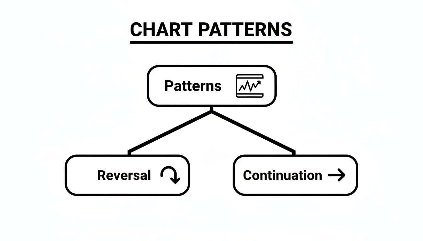
This simple split helps you quickly figure out if a trend is about to die or just catching its breath.
The Head and Shoulders Pattern
The Head and Shoulders is the classic bearish reversal pattern. It's the market's way of saying an uptrend is likely over. Its name is a perfect description of what it looks like: three peaks, with the middle one (the head) being the highest. The two outside peaks (the shoulders) are a bit lower and roughly the same height.
This pattern tells a story of bulls losing their nerve. The left shoulder is the peak of a healthy, confident uptrend. The head is a final, exhaustive push to a new high that quickly gets smacked down. The right shoulder is the moment of truth—buyers try one last time to rally, but they can't even get back to the previous high. That's a huge sign of weakness.
The line connecting the lows between the peaks is called the neckline. This line is your trigger.
Trading the Head and Shoulders:
- Entry: You only go short after a candle closes decisively below the neckline. Jumping the gun here is a classic mistake. Wait for the pattern to confirm.
- Stop-Loss: Tuck your stop-loss just above the high of the right shoulder. If the pattern fails, this gets you out with a small, manageable loss.
- Profit Target: Measure the vertical distance from the top of the head down to the neckline. Then, project that same distance down from where the price broke the neckline.
The neckline break is the point of no return. It signifies that support has crumbled and sellers have seized control. Trading before the break is gambling; trading after it is a calculated risk based on confirmed price action.
You'll also see an "Inverse Head and Shoulders," which is just the bullish version. It shows up at the bottom of a downtrend and signals a potential move up. The rules are the same, just flipped upside down.
The Double Top Pattern
Simpler, but no less effective. The Double Top is another bearish pattern that looks like a big "M." It forms after a strong uptrend when price hits a ceiling, pulls back, and then tries to break that same ceiling again… but fails.
This pattern shows a clear power shift. The first peak is where buyers hit a wall of sellers. The pullback is profit-taking. The second peak is the real test—when buyers can't push to a new high, it tells you they're exhausted. Sellers see this weakness and pounce.
The low point between the two peaks creates the neckline, which acts as a floor of support.
Trading the Double Top:
- Entry: You enter a short trade on a confirmed candle close below the neckline. This proves the support floor has broken.
- Stop-Loss: Your stop-loss goes just above the highs of the two peaks. This keeps your risk clearly defined.
- Profit Target: Measure the height from the peaks down to the neckline. Project that distance downward from the breakout point to find your take-profit level.
The Double Bottom Pattern
You guessed it—the Double Bottom is the bullish twin of the Double Top. It looks like the letter "W" and forms at the end of a downtrend. It’s a signal that the bears are losing their grip and buyers are building a new price floor.
The story here is one of a successful defense. The first dip marks a low in the downtrend. A small rally follows. Then, sellers try to push the price down again but can't break the previous low. This failure to make a new low is a massive red flag for sellers.
The peak between the two lows forms the neckline, or the resistance level that needs to break.
Trading the Double Bottom:
- Entry: Go long when the price breaks and closes decisively above the neckline.
- Stop-Loss: Place your stop just below the lows of the two troughs.
- Profit Target: Measure the distance from the lows up to the neckline and project that distance upward from the breakout point.
These "M" and "W" patterns are some of the most reliable chart patterns forex traders lean on every day. For anyone wanting to really master them, this detailed guide on the double top and double bottom covers some more advanced ways to use them.
By mastering just these three major reversal patterns, you're putting yourself leagues ahead of the crowd. You stop guessing when a trend might end and start reading the market's story, placing trades based on clear signals that the balance of power has shifted.
Identifying High-Probability Continuation Patterns
While reversal patterns scream that the party's over, continuation patterns are much more common. They’re the market’s way of taking a quick coffee break.
Think of it like this: the main trend is still going strong, but it needs to pause, catch its breath, and build up some steam. These lulls are great for shaking out the impatient traders before the real move continues.
Nailing these formations is a huge part of my trading. Why? Because they offer some of the highest-probability setups to jump into a trend that's already proven itself. Instead of gambling on picking a top or bottom, you're just hopping on a train that's made a brief stop.
We're about to break down the most reliable continuation chart patterns forex traders see day in and day out.

These patterns are really just periods of balance, a tug-of-war where neither buyers nor sellers are winning. The real magic happens on the breakout—that’s the signal that the trend is back on.
The Triangle Family: Coiling for a Breakout
Triangles are everywhere once you learn to see them. They show a market that’s getting squeezed into a tighter and tighter range, like a spring coiling up before it explodes. The direction it breaks is your cue to get in.
You'll mainly run into three types.
1. The Ascending Triangle (Bullish)
This one is a dead giveaway that bullish pressure is building. You’ll see a flat, horizontal resistance level holding the price down, but a rising trendline of higher lows pushing up from below.
The story here is simple: buyers are getting more aggressive, willing to pay more each time, while sellers are stubbornly defending one price. Sooner or later, that buying power just overwhelms the sellers, and the price pops.
2. The Descending Triangle (Bearish)
No surprises here—this is the exact opposite. You've got a flat support level at the bottom that buyers are defending, but a descending trendline of lower highs shows sellers are getting the upper hand.
It’s a battle of wills, but eventually, the selling pressure is too much. The price breaks down through that support level, and the downtrend resumes.
3. The Symmetrical Triangle (Neutral)
This is the picture of pure market indecision. Two converging trendlines—one of lower highs and one of higher lows—show that both sides are losing their nerve.
While it can technically break either way, it usually acts as a continuation pattern. My rule of thumb is to expect the breakout to follow the direction of the trend that led into the triangle.
Forex chart patterns are the bread and butter of technical trading. In fact, studies show that continuation patterns like triangles make up a massive chunk of the patterns we can actually trade. When you spot an ascending triangle, for example, the odds are roughly 60-70% that the uptrend will continue. That’s a reliable edge.
Trading Triangle Patterns
The great thing about triangles is that the playbook for trading them is the same, no matter which one you find. It's clean and simple.
- Entry: Don't jump the gun. Wait for a solid candle to close outside the trendlines. Trying to guess the breakout beforehand is just a coin flip.
- Stop-Loss: Tuck your stop just on the other side of the pattern. If you’re buying an ascending triangle breakout, the stop goes right below the rising trendline. For a descending triangle, place it just above the falling trendline.
- Profit Target: The classic way is to measure the widest part of the triangle—the "base"—and then project that same distance from your breakout point.
If you really want to master this pattern, our guide on the ascending triangle pattern dives much deeper into the little details that make a big difference.
Flags and Pennants: Quick Pauses in a Sprint
Picture a market that just ripped higher in a near-vertical move. That initial, powerful thrust is what we call the "flagpole." After a move that explosive, the market has to take a breather.
This pause creates a small, tight consolidation—either a little rectangle (a Flag) or a tiny triangle (a Pennant).
These patterns are like a sprinter catching their breath after a 100-meter dash before taking off again. The pause is usually short and sharp, showing the underlying trend is urgent to continue.
Bull Flags and Bear Flags: A Bull Flag shows up after a big move up, and you’ll see the consolidation channel drift slightly downward. A Bear Flag appears after a sharp drop, with the channel pointing slightly up.
Trading Flags and Pennants:
- Identify the Pole: First things first, you need a strong, sharp move leading into the pattern. No flagpole, no trade. It’s that simple.
- Entry: Get in when the price breaks out of the consolidation channel, in the same direction as the pole.
- Stop-Loss: Place your stop just on the other side of the flag or pennant's channel.
- Profit Target: A tried-and-true method is to measure the length of the flagpole and project that distance up from the breakout point. The logic is that the next leg of the move will be just as powerful as the first.
Rectangles: The Sideways Grind
The Rectangle pattern—sometimes called a trading range or consolidation box—is one of the easiest patterns to spot. The price is just bouncing between a clear horizontal support and a clear horizontal resistance.
This pattern shows a long, drawn-out fight where neither the bulls nor the bears can land a knockout punch. The market is just chopping sideways, accumulating orders for its next big move. Like symmetrical triangles, rectangles are technically neutral, but more often than not, they break in the direction of the existing trend.
Trading the Rectangle Pattern:
- Entry: The safest play is to wait for a confirmed candle close above resistance (for a long trade) or below support (for a short trade).
- Stop-Loss: This is easy. Just place your stop on the other side of the box. Your risk is clearly defined.
- Profit Target: Measure the height of the rectangle itself (the distance from support to resistance) and project that distance from the breakout point.
Once you’ve mastered these three core families of continuation patterns—Triangles, Flags, and Rectangles—you'll have a powerful arsenal for joining established trends. They give you clear, low-risk entries with logical stops and targets, letting you ride major market moves with a whole lot more confidence.
Avoiding Common Chart Pattern Trading Mistakes
Just knowing the names of a few chart patterns isn't going to make you money. Far from it. The real chasm between knowing what a Head and Shoulders looks like and actually trading it for profit is filled with a few painful, but completely avoidable, rookie mistakes.
Mastering chart patterns forex trading is as much about what you don't do as what you do. It's about discipline.
Successfully navigating these markets means you have to learn how to sidestep the traps that snare so many aspiring traders. These aren't complex strategic blunders; they're simple breakdowns in patience and process. Let's pull back the curtain on the most common mistakes and give you a clear, actionable fix for each.
Stop Forcing the Pattern
This is, without a doubt, the number one killer of new traders. You just learned about the Head and Shoulders pattern, and suddenly, you're seeing it on every chart, everywhere you look. The problem is, most of them are sloppy, poorly formed, and barely count. You start playing connect-the-dots with random price swings, trying to make the market fit your new favorite setup.
This is a classic case of confirmation bias—our brains are wired to find evidence that supports what we already believe. In trading, that means you'll subconsciously ignore all the signals telling you a pattern is weak and focus only on the bits that scream "trade me!"
The market doesn't care what you want it to do. A true high-probability pattern should jump off the chart and smack you in the face. If you have to squint, tilt your head, and force the lines to fit, it's not a real pattern.
The Solution: Become a pattern snob. Be incredibly picky. You should only be interested in the A+ setups that are clean, obvious, and follow the rules to the letter. If it looks messy or ambiguous, just close the chart and move on. Patience is what gets you paid in this game.
Chasing Unconfirmed Breakouts
The adrenaline rush is real. You see the price finally poke through a critical neckline or trendline, and the fear of missing out (FOMO) kicks into overdrive. You jump in the second it crosses the line, convinced it's headed to the moon. Then, seconds later, the price viciously snaps back in the other direction, hitting your stop for a frustrating loss.
You've just been caught in a false breakout. It's a classic "bull trap" or "bear trap" designed specifically to lure in emotional, impatient traders. A breakout means nothing until the market validates it.
The Solution: Simple. Wait for a candle close as your confirmation. A strong, confident candlestick closing firmly on the other side of that line is your signal. It shows genuine momentum and tells you the big players are behind the move. This one tiny act of patience will filter out a staggering number of bad trades.
Ignoring the Broader Market Context
No pattern lives in a bubble. A perfect-looking bullish flag pattern is much more likely to fail if it's forming smack in the middle of a brutal, long-term downtrend. On the flip side, a bearish double top has a much higher chance of success if the overall market sentiment is already weak and heading south.
It's so easy to get tunnel vision, staring at the 15-minute chart and completely ignoring the much bigger story unfolding on the 4-hour or daily charts.
Statistical studies on historical forex data show that solid backtested strategies can hit win rates between 40-60%. But here's the harsh reality: research also shows that 30-40% of strategies that look fantastic on paper completely fall apart in live trading. Why? A huge reason is that they fail to account for the ever-changing market context. You can dig deeper into historical forex data and its applications to see why this matters.
The Solution: Always, always start your analysis on a higher timeframe. Figure out the primary trend first. Are we in a clear uptrend, a downtrend, or just chopping sideways? Only then should you look for patterns that align with that bigger picture. In a raging uptrend, your job is to hunt for bullish continuation patterns like flags and ascending triangles. It's that simple.
Your Pre-Trade Chart Pattern Checklist

Knowing how to spot patterns is one thing. Actually using that knowledge to make money is a whole different ball game. This final section is about turning theory into a routine that gets results.
Use this checklist before you even think about placing a trade. It’s your last line of defense against emotional, impulsive decisions.
Think of it like a pilot's pre-flight check. It’s a non-negotiable step that keeps them safe. This simple habit is what separates the consistently profitable traders from the gamblers.
The Core Four Questions
Before you hit that buy or sell button, you need a crystal-clear answer to these four questions. If even one of them is a "maybe," the trade is a no-go. Simple as that.
-
What is the bigger picture? First, zoom out. Is the main trend on the daily or 4-hour chart on your side? Trying to trade a bullish pattern in the middle of a screaming downtrend is a low-probability gamble, and we're not in the business of gambling.
-
Is the pattern clear and valid? The setup should practically jump off the chart at you. Have you drawn the critical level—the neckline, trendline, or support/resistance zone—that will act as your trigger? If you have to squint and force it to fit, it’s not an A+ setup.
A high-quality setup is obvious. If you're second-guessing it, the market is telling you to stay out. Listen to it.
-
How will I enter the trade? You need a specific event to pull the trigger. The most reliable signal is a decisive candle close past the pattern's breakout level. This is your proof that the move has real conviction behind it.
-
Where are my exit points defined? You must know your exits before you enter. Period. Where is your stop-loss going? What’s your realistic profit target based on the pattern’s measurement rules?
Having this structured approach is crucial. For those looking to add an extra layer of confidence, it helps to see how multiple signals line up. You can dig deeper into this concept by studying confluence in trading to really solidify your decision-making process.
Frequently Asked Questions About Chart Patterns
Even after you've learned the textbook definitions, you'll find that real-world trading throws you curveballs. Let's tackle some of the most common questions I get from traders trying to apply these patterns in a live market. Getting these answers straight will give you a ton more confidence.
What Is the Best Timeframe for Trading Chart Patterns?
There’s no magic timeframe. The reality is, patterns are fractal—they show up everywhere, from a chaotic 1-minute chart all the way up to a monthly chart.
The right timeframe is the one that fits you. If you're a day trader, you'll live on the 5-minute to 1-hour charts. Swing traders? You'll feel more at home on the 4-hour, daily, or even weekly charts.
Here's a pro tip: Start your analysis on a higher timeframe, like the daily chart. This gives you the big picture—the dominant trend and any major patterns brewing. Once you have your bearings, you can drop down to a lower timeframe, like the 4-hour, to pinpoint a much sharper entry.
How Reliable Are Forex Chart Patterns?
Let's be brutally honest: chart patterns are not a crystal ball. They are tools of probability, plain and simple.
Their reliability shoots way up when you don't trade them in a vacuum. You need to see them in the context of other price action signals, like major support and resistance levels. A textbook pattern might work out 60-70% of the time historically, but that's no guarantee for the trade you're about to take.
True success isn't about finding a pattern that never fails. It's about using patterns to spot high-probability setups and then clamping down with strict risk management. A failed pattern isn't a mistake in your analysis; it’s just part of the game. That’s what a stop-loss is for.
Do I Need Indicators to Confirm Chart Patterns?
Absolutely not. In fact, relying on them can hurt you. With a pure price-action approach, the best confirmation comes straight from the chart itself.
What you're looking for is a strong, powerful candle closing decisively past a key level—like a neckline or trendline. That's the cleanest, most direct signal you'll ever get. Throwing lagging indicators like RSI or MACD into the mix just complicates things, gives you late signals, and leads to analysis paralysis.
For those just starting out and wanting to get a feel for the bigger picture before getting lost in technicals, it can be helpful to look into some essential investing strategies for beginners.
At Colibri Trader, we cut through the noise. We teach you how to read the story that price is telling you, so you can trade with clarity and confidence. If you're ready to stop guessing, take the first step and see how we do things at https://www.colibritrader.com.