


Chart: chart patterns for day trading – A Practical Guide
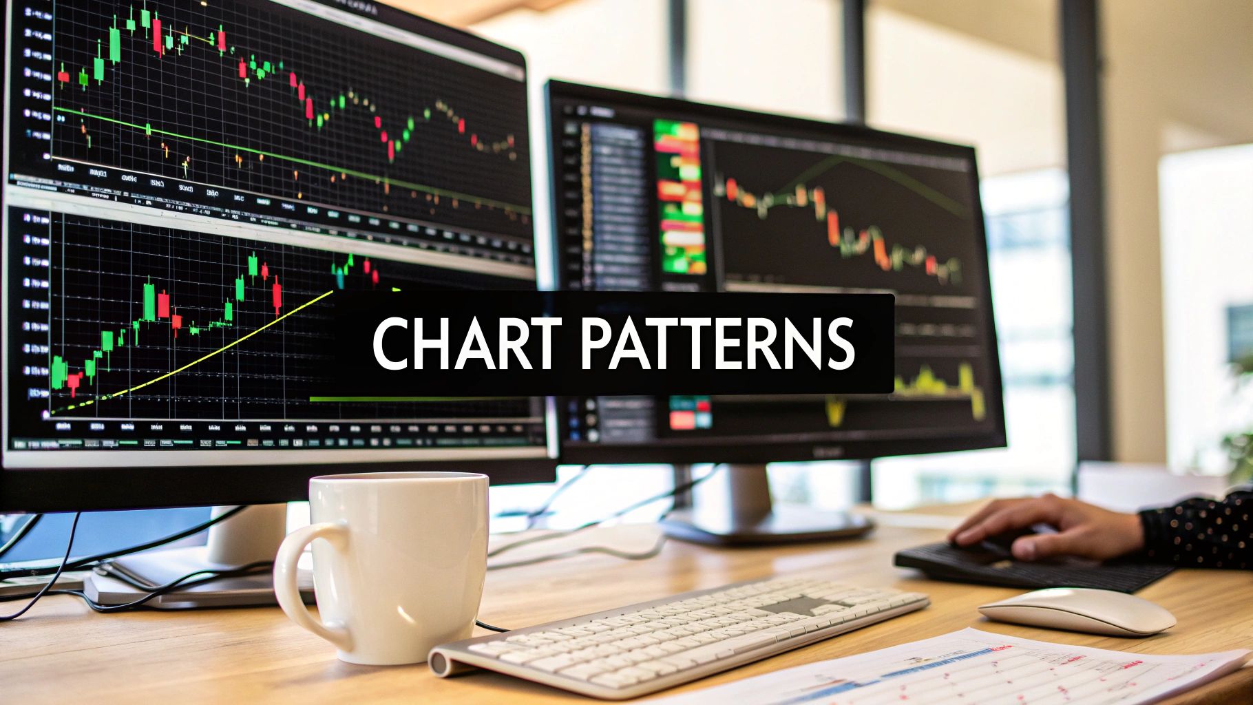
Chart patterns are the bread and butter of day trading. They’re the visual evidence of the constant tug-of-war between buyers and sellers, etched directly onto your intraday chart. Instead of getting bogged down by lagging indicators, patterns like flags, triangles, and wedges let you read the market’s psychology straight from the price action itself. If you want a repeatable edge, mastering a few of these is one of the most direct paths to get there.
Reading the Market's Story Through Price Action

Every price chart tells a story. Each candlestick, every swing high, and every swing low is a new sentence in the narrative of who's in control—the bulls or the bears. Chart patterns simply organize that story into recognizable shapes that give us clues about what might happen next.
This is the very essence of price action trading: learning to read the market’s language without the clutter of indicators. While indicators are busy crunching old data, price action shows you what’s happening right now. For a day trader who needs to make sharp, decisive calls, that’s a massive advantage. Our guide on what is price action trading dives much deeper into this powerful method.
The goal isn't to predict the future with 100% certainty—that's impossible. Instead, the goal is to identify high-probability scenarios where the potential reward significantly outweighs the risk.
By focusing on pure price, you train your eyes to spot these setups directly. It cuts through the noise and helps you react to shifting market dynamics in real-time.
To illustrate the difference, here's a quick comparison of what you're looking at when you use pure price versus indicators.
Comparing Price Action Signals with Indicator-Based Alerts
| Signal Type | Focus | Reliability Factor | Example |
|---|---|---|---|
| Price Action | Current market behavior | What’s happening now | A bullish pin bar forms at a key support level. |
| Indicator-Based | Past price data | What happened before | A moving average crossover signals a new trend. |
Price action gives you the raw, unfiltered story, while indicators offer a summary of past chapters. For day trading, reading the live action is crucial.
Why Less Is More with Patterns
A classic rookie mistake is trying to memorize dozens of obscure chart patterns. This almost always leads to "analysis paralysis," where you see conflicting signals everywhere and just freeze up. The professional approach is to master a handful of the most common and reliable patterns.
This guide will zero in on the essential chart patterns for day trading that show up frequently and have a proven track record. They fall into two main camps:
- Continuation Patterns: These signal that the current trend is just taking a breather and is likely to resume (think flags and pennants).
- Reversal Patterns: These formations suggest a trend is running out of steam and might be about to turn around (like head and shoulders or double tops).
The Crucial Role of Context
Here’s something you absolutely cannot forget: a pattern is never a signal in isolation. Its reliability hinges entirely on the market context. Before you even think about placing a trade, you have to look at the bigger picture.
Ask yourself these questions:
- What's the trend on the higher timeframe? Is my pattern going with that trend or fighting it?
- Is volume confirming the move? A breakout on a huge spike in volume is way more convincing than one on a dribble.
- Where are the major support and resistance levels? A beautiful bullish flag forming right underneath a major resistance ceiling is a low-probability trade.
When you combine pattern recognition with a solid understanding of market structure and context, you stop just seeing shapes on a screen. You start reading the story the market is telling you. That skill is the foundation of consistent, long-term success.
Trading With The Trend Using Continuation Patterns
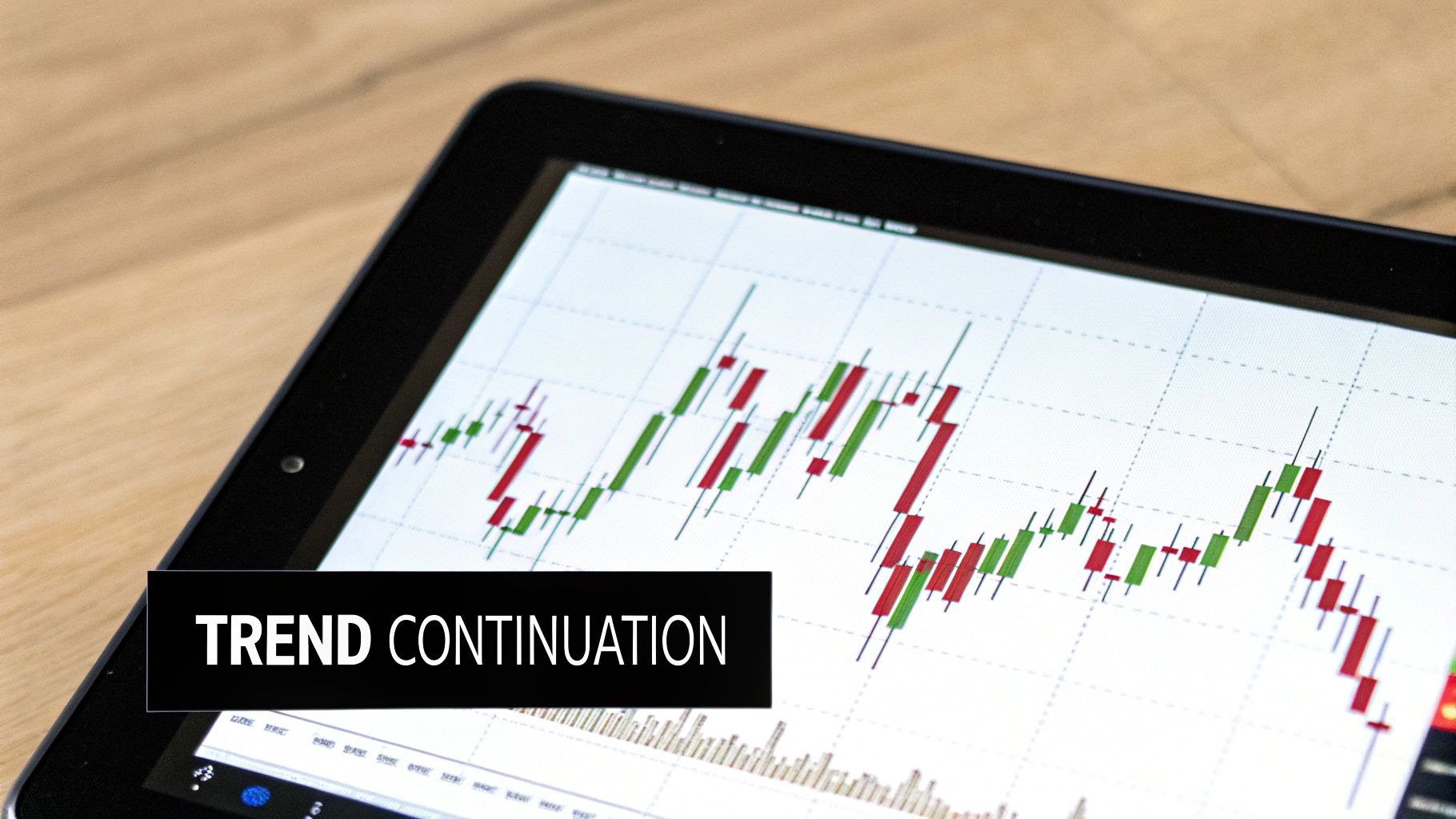
Continuation patterns feel like catching the market’s breath before it charges ahead again. As a day trader, you’re not guessing a reversal—you’re hopping back on a train already rolling in your direction. That edge, where you follow dominant momentum instead of fighting it, is what keeps your P&L healthy.
Imagine the market as a marathon runner setting a strong pace, pausing at a water station, then pushing on. Flags, pennants and wedges are those quick breaks. For a deeper dive into why timing yourself with the overall market is crucial, check out my guide on trading with the trend.
The Anatomy Of Bull Flags And Bear Flags
Flags are the bread-and-butter continuation pattern for busy intraday traders. They’re easy to spot once you know the tell-tale signs and can deliver high-probability setups on a 5- or 15-minute chart.
Bull Flag
- Flagpole: A rapid, near-vertical price rally backed by heavy volume. Think of sharp market excitement as “smart money” stepping in.
- Flag: A pause in the form of a tight rectangle or slight downward slope, on lighter volume. Sellers have almost no conviction—buyers are simply catching their breath.
Bear Flag
- Flagpole: A steep sell-off with big volume, marking aggressive bearish sentiment.
- Flag: A brief upward drift within a narrow channel, on dwindling volume. Buyers are tentative, and the next leg down is imminent.
The psychology here is straightforward: big players initiate the move (flagpole), weaker hands take profits (flag), and then dominance reasserts itself on the breakout.
How To Trade Flag Patterns Effectively
When a pattern speaks, you need clear rules to listen—and react. Here’s a practical framework I use every day:
Entry Trigger
• For a Bull Flag, wait for a close above the upper trendline of the flag.
• For a Bear Flag, enter only after a candle closes below the lower trendline.
No second-guessing. A confirmed close filters out those classic whipsaws.
Stop-Loss Placement
• Bull Flag: Just below the lowest point of the flag’s consolidation channel.
• Bear Flag: Just above the highest point of the flag’s consolidation.
This gives breathing room but gets you out fast if price snaps back into the pattern.
Pro Tip: A genuine breakout should ignite a spike in volume. If volume is weak, treat that move like a red flag—one more reason to stay cautious.
Profit Target Calculation
• Measure the flagpole’s length (base to start of the flag)
• Project that distance from the breakout point
• Set your target at that level for a logical, strength-based profit zone
Pennants: The Flag’s Close Cousin
Pennants share the same DNA as flags but squeeze price action into a tiny symmetrical triangle. After the flagpole’s impulsive move, highs and lows converge until the breakout signals continuation.
Entry, stop-loss and profit-target rules mirror those of flags. Simply watch for the decisive close beyond the pennant’s trendlines and follow through.
Wedges: Context Is Everything
Wedges can look like triangles but always tilt in one direction. The interpretation hinges on trend context.
• Falling Wedge (Bullish): Two downward-sloping lines after an uptrend. A breakout above the upper line means the uptrend resumes.
• Rising Wedge (Bearish): Two upward-sloping lines during a downtrend. A breakdown under the lower line signals the next leg down.
Wedges often hint at exhaustion before the move—perfect for day traders who want a heads-up on the next surge.
Quick Comparison Table
| Pattern | Shape | Trend Context | Breakout Direction |
|---|---|---|---|
| Bull Flag | Rectangle/Channel | Uptrend | Up |
| Bear Flag | Rectangle/Channel | Downtrend | Down |
| Pennant | Symmetrical Triangle | Up/Down Trend | Continuation |
| Falling Wedge | Converging Downlines | Uptrend Pullback | Up |
| Rising Wedge | Converging Uplines | Downtrend Pullback | Down |
With this roadmap, you’ll recognize each setup on your intraday charts—and know exactly what to do when it forms. Trade on the side of momentum, keep your rules crystal clear, and let the market’s biggest moves become your greatest opportunities.
Spotting Market Turning Points with Reversal Patterns
While continuation patterns are all about jumping on a moving train, reversal patterns are your signal that the train is grinding to a halt and about to switch tracks.
For a day trader, catching the subtle signs of trend exhaustion isn't just a neat trick—it's how you protect your capital and get into the next big intraday move before the crowd. These patterns are the market’s way of whispering that the dominant side is finally losing its grip.
This is where classic formations like the Head and Shoulders and Double Tops/Bottoms really shine. They don’t just pop up out of nowhere; they paint a clear picture of a battle where the winning side is suddenly failing to push prices any further. That hesitation is the opening the other side needs to take control. Learning to spot these turning points is what separates the traders who react from those who anticipate.
The Head and Shoulders: A Classic Bearish Reversal
The Head and Shoulders is easily one of the most reliable reversal signals you'll ever find. It’s a classic for a reason. It tells a clear story of a buying frenzy that has peaked and is now running on fumes, hinting at an impending shift from an uptrend to a downtrend.
The pattern is made up of three distinct peaks:
- The Left Shoulder: A solid rally followed by a minor pullback. At this point, the uptrend still looks perfectly healthy.
- The Head: Price pushes to an even higher high, but the pullback that follows is much deeper, often wiping out the entire previous gain. This is the first real red flag that buying pressure is fading.
- The Right Shoulder: Buyers give it one last, weaker shot. The rally attempt fails to even challenge the high of the head. This failure to make a new high is the final nail in the coffin.
When you connect the lows of these three peaks, you get the neckline. Think of it as the ultimate line in the sand.
A Head and Shoulders isn't just a shape on a chart; it's a story of failure. The failure of buyers to push past the head, and the subsequent break of the neckline, is the market screaming that sellers have wrestled back control.
This pattern has been a staple since the early 20th century because it works. For day traders, you’ll typically see it form on the 30-minute or 1-hour charts in major markets like DAX or Dow futures. While some patterns have become less reliable over the years—with failure rates on downward breakouts climbing to 49% in the 2000s—the Head and Shoulders has held up remarkably well. It maintains much lower failure rates, often around 5-10%, especially when volume confirms the move, and produces an average price move of 52% post-breakout. You can dig deeper into its historical performance on Dukascopy.
How to Trade The Head and Shoulders Pattern
Patience is everything here. Jump the gun before the pattern is fully confirmed, and you're just asking for a losing trade.
Entry Trigger: The only entry that counts is a decisive candle close below the neckline. Aggressive traders might try to get in right as the price breaks, but a more conservative approach is to wait for a retest of that broken neckline. When price comes back to touch it from below, it often provides a much lower-risk entry point.
Stop-Loss Placement: Tuck your stop-loss just above the high of the right shoulder. If the price manages to rally back above that level, the bearish setup is dead, and it's time to get out—no questions asked.
Profit Target Calculation: The classic way to set a target is to measure the vertical distance from the peak of the head down to the neckline. Then, project that same distance downward from the breakout point. That gives you a solid primary profit target.
And don't forget its bullish cousin, the Inverse Head and Shoulders. It’s the exact same pattern, just flipped upside down at the end of a downtrend. The trading rules are identical, just in reverse.
Double Tops and Bottoms: The "M" and "W" of Trend Exhaustion
Double Tops and Double Bottoms are simpler but just as powerful. They represent a very clear test of a key support or resistance level, followed by a definitive failure to break through, which often signals a sharp shift in momentum.
A Double Top looks like the letter "M." It happens when:
- Price rallies to a peak, slams into resistance, and gets knocked back down.
- Buyers regroup and make a second, determined push to break that same resistance level, but they fail again.
- The pattern is confirmed only when the price breaks below the support level created by the low point between the two peaks.
On the flip side, a Double Bottom looks like the letter "W." It forms when:
- Price sells off hard, finds a floor (support), and bounces.
- Sellers try to push prices to a new low but get stopped cold at that same support level.
- The reversal is confirmed when the price breaks above the resistance formed by the peak between the two troughs.
The psychology here couldn't be clearer: the market tried twice to continue the trend and failed both times. That double failure gives the opposing side the confidence to step in and drive the price hard in the other direction.
Trading Double Tops and Bottoms With Discipline
The single biggest mistake traders make with these patterns is trying to predict the reversal before it's confirmed. You have to wait. Otherwise, you might just be trading inside a boring consolidation range that's about to continue in the original direction.
Entry Rules
- For a Double Top: Go short only after a candle closes below the support (the "neckline") between the two highs.
- For a Double Bottom: Go long only after a candle closes above the resistance between the two lows.
Stop-Loss Placement
- Double Top: Place your stop just above the highest high of the two peaks.
- Double Bottom: Place your stop just below the lowest low of the two troughs.
Profit Targets
- Measure the height of the pattern from the peak/trough down to the neckline.
- Project that distance from your breakout point to set a logical profit target.
By waiting for that confirmed breakout, you avoid getting suckered into false moves and ensure you're trading with the new, emerging momentum. This kind of disciplined patience is what separates consistently profitable traders from the rest.
The Bull-Power Play: Trading the Engulfing Pattern

Sometimes the most telling signals on a chart aren't the big, complicated ones that take days to form. Often, it's a simple, single-candle event that screams "pay attention!" The Bullish Engulfing pattern is one of those signals. While larger formations tell a longer story, this candlestick pattern points to a sudden, often violent, shift in momentum. For a day trader, that's a clean, actionable trigger.
Think of it as a signal of pure aggression. It happens when a big green candle completely swallows the body of the previous red candle. This isn't just a minor win for the buyers; it's a declaration that they've taken control with overwhelming force.
What this picture tells you is that sellers were in charge, pushed the price down, and then got absolutely steamrolled by a wave of buying pressure—all within one trading period. For a day trader, that sharp reversal can be the very beginning of a new intraday trend worth riding.
Spotting a High-Quality Bullish Engulfing Setup
Look, not all engulfing patterns are created equal, especially when you're day trading on lower timeframes like the 5-minute or 15-minute chart. You have to be ruthless in filtering out the noise to focus on the setups with the highest odds.
Here's my checklist:
- Prior Downtrend: The pattern has to show up after a clear pullback or downtrend, even if it's a small one. An engulfing candle in the middle of a choppy, sideways mess is meaningless.
- Complete Engulfment: The body of the green candle must completely cover the body of the previous red one. I don't care so much about the wicks, but the real-money bodies must be fully engulfed.
- A Bump in Volume: A real shift in power comes with participation. A good engulfing pattern should ideally pop on higher-than-average volume, confirming there's real conviction behind the move.
- Location, Location, Location: The most powerful signals form where they should—at or near a key support level, a prior swing low, or a major moving average. Context is everything; it adds serious weight to the signal.
This pattern is a trading staple because it reflects a classic, repeatable story of market psychology. The Bullish Engulfing is one of the most reliable chart patterns for day trading because it clearly shows that buyers have wrestled control from sellers, signaling a strong upward move is likely next. On a 5-minute Nasdaq futures chart, for example, a trader might enter right after the engulfing candle closes with a tight stop. When you see it with a volume spike, this pattern can easily have a success rate north of 60% in volatile markets.
A Bullish Engulfing isn't just a change in color on your screen; it's the footprint of institutional buyers. It signals a shift from passive buying to aggressive accumulation.
A Simple Trading Plan for the Bullish Engulfing
Having a game plan before the pattern appears is what separates pros from amateurs. Here’s a straightforward framework for trading this powerful signal.
1. The Entry Trigger
Get long as soon as the bullish engulfing candle closes. And I mean closes. Don't jump the gun, because price can easily fall apart in the final moments of the candle. Patience here ensures the signal is actually confirmed. For a deeper dive, check out our complete guide on the Bullish Engulfing pattern.
2. Placing Your Stop-Loss
Tuck your protective stop-loss just a few ticks below the absolute low of the engulfing candle. That's your line in the sand. If the price breaks that low, the bullish idea is wrong, and you get out immediately to protect your capital. No questions asked.
3. Setting Profit Targets
A simple and effective approach is to aim for a risk-to-reward ratio of at least 1:1.5, or even better, 1:2.
- Calculate Your Risk: Measure the distance from your entry price down to your stop-loss. That's your "1R."
- Set Target 1: Project that same distance (1R) up from your entry. This is your first target, a great place to take some profits off the table.
- Set Target 2: Project twice that risk distance (2R) from your entry to find a logical second target.
By truly mastering this one candlestick pattern, you can build an entire trading strategy around pure price action. It allows you to react quickly and confidently when you see a clear shift in market momentum.
Chart Patterns to Approach with Caution
Knowing which patterns to trade is only half the battle. Honestly, figuring out which ones to avoid can be even more crucial for protecting your trading account.
Not every pattern you can spot on a chart offers a high-probability edge, especially in today's lightning-fast electronic markets. Some formations that might have worked reliably years ago have lost their punch, turning into traps that just lead to frustrating losses and churn your account.
A perfect example of this is the Inside Day pattern. This is when an entire day's price range—the high and the low—is completely contained within the range of the day before it. On the surface, it seems to signal market indecision, like a temporary pause where buyers and sellers are at a stalemate. Classic technical analysis taught traders to buy the break of the high or short the break of the low, expecting a big move to follow.
Why the Inside Day Fails So Often
Here's the problem: in modern markets, this pattern has become notoriously unreliable for day traders. That signal of "indecision" often turns out to be just a lack of real momentum.
The breakout frequently fails. What you get is a frustrating whipsaw where the price barely pierces the prior day's high or low, only to reverse sharply and stop you out. This is often driven by high-frequency trading algorithms programmed to hunt for these obvious breakout levels. They provide liquidity by fading the move, effectively trapping all the eager breakout traders.
The most expensive lesson in trading is learning that a "textbook" pattern doesn't guarantee a textbook result. Avoiding low-probability setups like the Inside Day is an active strategy for capital preservation.
The data backs this up. The Inside Day, once a dependable signal, now fails nearly 50% of the time—a massive drop in reliability since the 1990s. Research has shown that similar consolidation patterns saw their price target failure rates jump from 14% to 28% in the 2000s alone.
For the Inside Day specifically, recent stats show failure rates hitting 54% on upside breaks and a staggering 56% on downside breaks. Even when they do work, the average moves are pathetic, with targets only being reached 30-34% of the time. You can dig into more of these changing pattern statistics on jpmorgan.com.
Instead of gambling on these ambiguous patterns, focus your energy on the high-probability continuation and reversal setups we've already covered. By learning to filter out these capital-draining patterns, you actively improve your odds and keep your powder dry for when a true A+ opportunity comes along.
Your Pre-Trade Pattern Checklist
Theory is one thing; execution is another. Knowing every pattern in the book won't help you one bit if you can't apply that knowledge systematically when the pressure is on. This is exactly where a pre-trade checklist becomes your most valuable tool. Think of it as a final mental checkpoint before you risk any capital, ensuring you only pull the trigger on high-quality setups.
This isn't about finding a perfect, magical system that never fails. It’s about building discipline. It’s about consistently applying a proven framework that filters out the junk and keeps you focused. Before you even think about hitting that "buy" or "sell" button, you must be able to give a hard "yes" to these crucial questions.
The Foundational Questions
First things first, you have to confirm the pattern itself is actually valid. A lot of traders get into trouble by trying to force a pattern that just isn't there.
- Is the pattern clearly defined? Can you draw the trendlines without having to guess? If you have to squint or it feels ambiguous, it’s not a clean signal. Pass on it and wait for a better one.
- Does it align with the higher timeframe trend? A bullish flag on the 5-minute chart is far more powerful if the hourly chart is also in a clear, strong uptrend. Trying to fight the dominant market trend is a losing game over the long run.
- Is there volume to support the trade idea? A breakout needs to happen on a significant spike in volume. Any move on low volume is untrustworthy and has a high probability of failing.
If you can't get a clear "yes" on all three of these, the trade is probably a low-probability gamble. There's no reason to even move to the next step.
Defining Your Trade Plan
Once you've validated the pattern, the next step is to define your exact trade parameters. I'll say it plainly: entering a trade without a predefined plan for every possible outcome is just reckless.
A professional trader knows their exit points before they even consider their entry. This single habit separates consistent winners from the crowd that trades on hope.
Have you explicitly defined your risk and potential reward?
- Entry Point: Where exactly will you enter? Be specific. Is it on the break of a trendline at a certain price? Or will you wait for a retest?
- Stop-Loss: Where is your "I'm wrong" point? This has to be a specific price level that, if hit, automatically invalidates your entire trade idea. No exceptions.
- Profit Target(s): Where will you take profits off the table? Will you use a measured move from the pattern, or are you targeting a key resistance or support level?
- Risk-to-Reward Ratio: Is your potential profit at least 1.5 times your potential loss? Taking trades with a poor risk/reward is a guaranteed way to bleed your account dry, even if you have a decent win rate.
Knowing which chart patterns to avoid is just as critical as knowing which ones to trade. This simple flow chart shows how to filter out some notoriously unreliable setups that trap a lot of new traders.
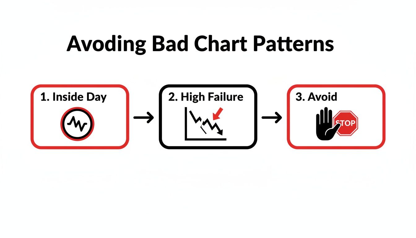
This process shows why patterns signaling pure indecision, like the Inside Day, often have high failure rates and should be handled with extreme caution. By consistently running through this checklist, you build the discipline you need to trade chart patterns for day trading with confidence, turning a reactive habit into a professional process.
At Colibri Trader, we teach a straightforward, price-action-based approach to help you master these skills. Transform your performance by learning to trade without indicators or complex analysis. Unlock your trading potential with us today.