


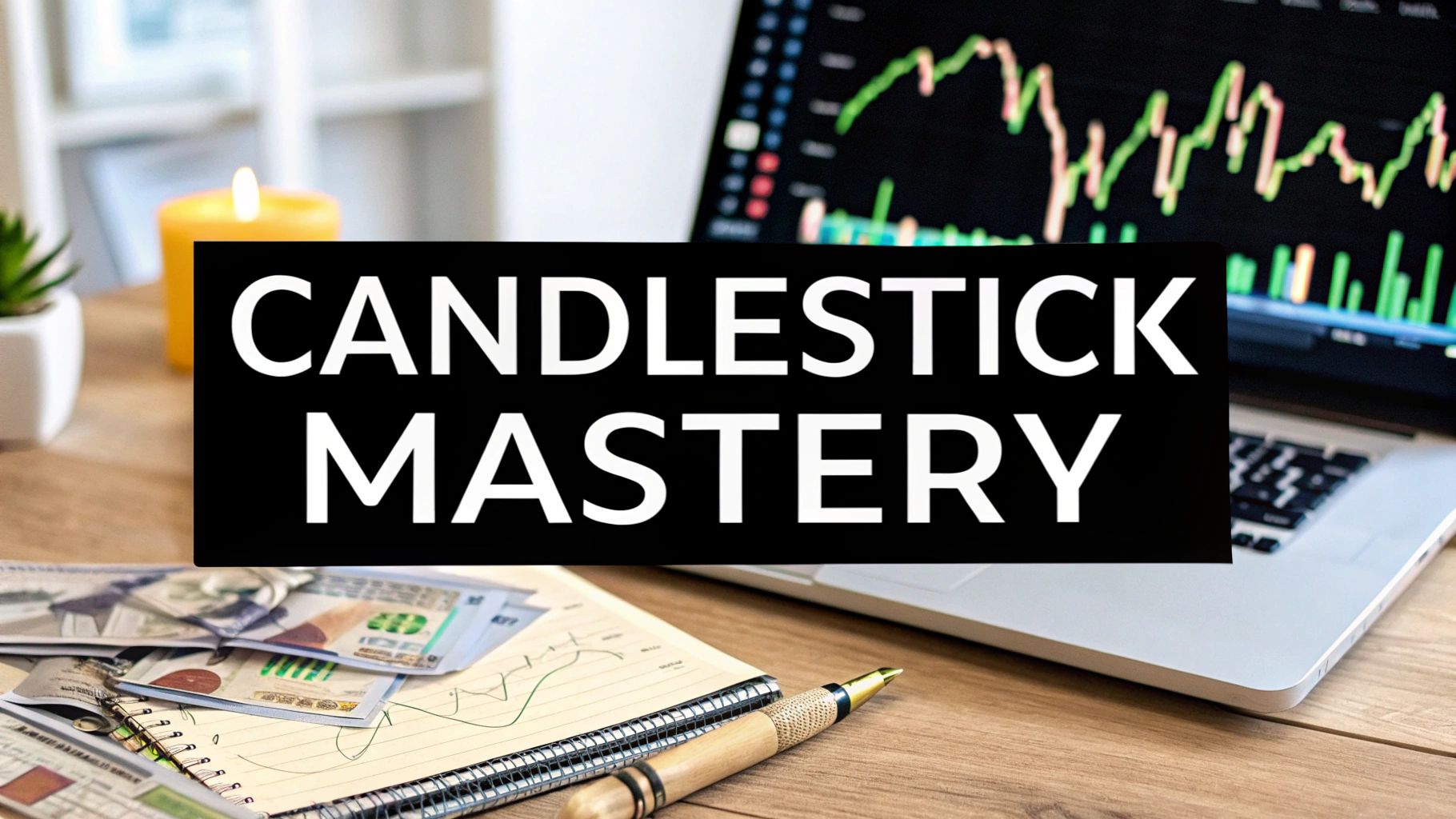
Candlestick Patterns in Forex: A Trader’s Journey to Success
The Ancient Wisdom That Changed Modern Trading Forever
Imagine the bustling Osaka rice exchange in 18th-century Japan. Picture a trader named Munehisa Homma, meticulously observing the chaos of price fluctuations. He was searching for a deeper understanding, a way to decode the market's whispers. His quest led him to develop a powerful tool: candlestick patterns.
This method, initially a closely guarded secret within Japan, took the raw, numerical data of price and transformed it into a visual story. Think of it like translating a complex equation into a vibrant painting. Suddenly, the market's narrative came alive.
This wasn’t simply about making charts prettier. Candlestick patterns in forex provide a unique window into the emotional tug-of-war between buyers and sellers. They illuminate the psychological forces at play, offering insights traditional bar charts couldn't. It's like seeing the expressions on the faces of the traders in the rice exchange, not just the price of the rice. Each candlestick adds a new line to the ongoing story. Take a look at the chart below:
This Investopedia chart quickly conveys a wealth of information about price action. Notice how each candlestick reveals the opening, closing, high, and low price for a given period. Green candles tell a tale of bullish momentum, where the closing price surpasses the opening price. Conversely, red candles signify bearish sessions, where the closing price falls below the opening.
The evolution of this method stemmed from the limitations of earlier bar charts, which merely displayed the open, high, low, and close (OHLC) prices. As trading practices grew more sophisticated, the need for a tool that reflected trader sentiment became clear. Candlestick charting filled this gap, representing a significant leap forward. Its roots trace back to Homma and the Osaka rice exchange, offering a more nuanced understanding of price action and market sentiment than ever before. Want to delve deeper into the history?
Homma's key insight was that price isn't just a number; it's a reflection of human psychology. Fear and greed, hope and doubt—these emotions all leave their mark on the patterns we see. This understanding is precisely what makes candlestick patterns in forex so effective, even centuries after their inception. Combining this ancient wisdom with modern trading strategies offers a powerful edge in today's forex markets.
Reading Market Stories Through Candlestick Language
Imagine the forex market as a bustling stage, with buyers and sellers, the bulls and bears, locked in a constant tug-of-war. Each candlestick on a chart is a snapshot of this battle, a single scene in the ongoing market drama. Understanding candlestick patterns is like learning the language of this play, allowing you to interpret the narrative unfolding before you.
The Body: The Main Plot
Let's start with the candle body, the thick part of the candlestick. This represents the core story of a specific time period, say an hour on an hourly chart. It shows the range between the opening and closing prices.
A green (or sometimes white) body signals a victory for the buyers – the closing price ended higher than the opening price. A red (or black) body tells the opposite tale: sellers dominated, pushing the closing price below the opening.
Think of it like this: a long green body suggests a powerful surge of buying, a confident advance. A short red body, on the other hand, might indicate hesitant selling, a lack of strong conviction.
The Wicks: The Subplot Twists
Now, consider the wicks, also known as shadows. These are the thin lines extending above and below the body, adding intrigue to our market story. They reveal the highest and lowest prices touched during that period, like plot twists in a suspenseful movie.
These wicks show us price points that were tested but ultimately rejected. A long upper wick, for example, suggests buyers tried to push prices higher but were met with a wall of selling, forcing a retreat. Conversely, a long lower wick might show sellers attempting a downward push, only to be countered by eager buyers. These give and takes within the session create a more nuanced understanding of the price action.
Color and Size: Revealing the Winners and Their Conviction
The candlestick’s color instantly tells us who won the battle – bulls or bears. But the size and shape of the body provide critical insights into the strength of their victory.
A long body, regardless of color, signifies strong momentum, a decisive move. A short body, however, suggests indecision or a stalemate, a lack of clear direction. By looking at body length, we can gauge the intensity of buying or selling pressure. For more advanced candlestick techniques, you might find this helpful: How to Trade with Candlestick Charts Like a Pro.
To truly grasp the power of candlestick analysis, let's explore their individual components and their market implications. The following table breaks down the anatomy of a candlestick and how each element reveals underlying market psychology.
Essential Candlestick Components and Their Market Meanings
A comprehensive breakdown of candlestick anatomy and what each element reveals about market psychology
| Component | Visual Description | Market Psychology | Trading Significance |
|---|---|---|---|
| Body | Thick part of the candlestick | Shows the price range between open and close. Green/White signifies buyers dominated the session, Red/Black signifies sellers dominated. | Reveals overall session sentiment (bullish or bearish). Length signifies conviction/momentum. |
| Wicks (Shadows) | Thin lines extending above and below the body | Shows the high and low prices reached during the session. Long upper wick suggests rejection of higher prices, Long lower wick suggests rejection of lower prices. | Reveals temporary price fluctuations and potential resistance/support levels. |
| Color | Green/White or Red/Black | Green/White: Closing price is higher than opening price (bullish). Red/Black: Closing price is lower than opening price (bearish). | Instantly reveals who won the trading session (buyers or sellers). |
| Size | Length of the body | Long body indicates strong momentum/conviction. Short body suggests indecision or weak momentum. | Helps gauge the intensity of buying or selling pressure. |
This table summarizes how each part of a candlestick provides clues about market behavior. From body length to wick length and color, each element contributes to the overall story.
From Bars to Psychology: Reading the Market's Mind
With practice, you'll move beyond simply seeing colored bars on a chart. You’ll learn to recognize patterns that reveal market sentiment, from confidence (long green candles) and hesitation (short bodies, long wicks) to potential reversals (specific patterns we’ll explore further).
Candlestick patterns become your window into market psychology, unveiling the collective sentiment of traders worldwide. By mastering this "language," you transform from a passive observer into an active interpreter, anticipating market movements and making informed trading decisions.
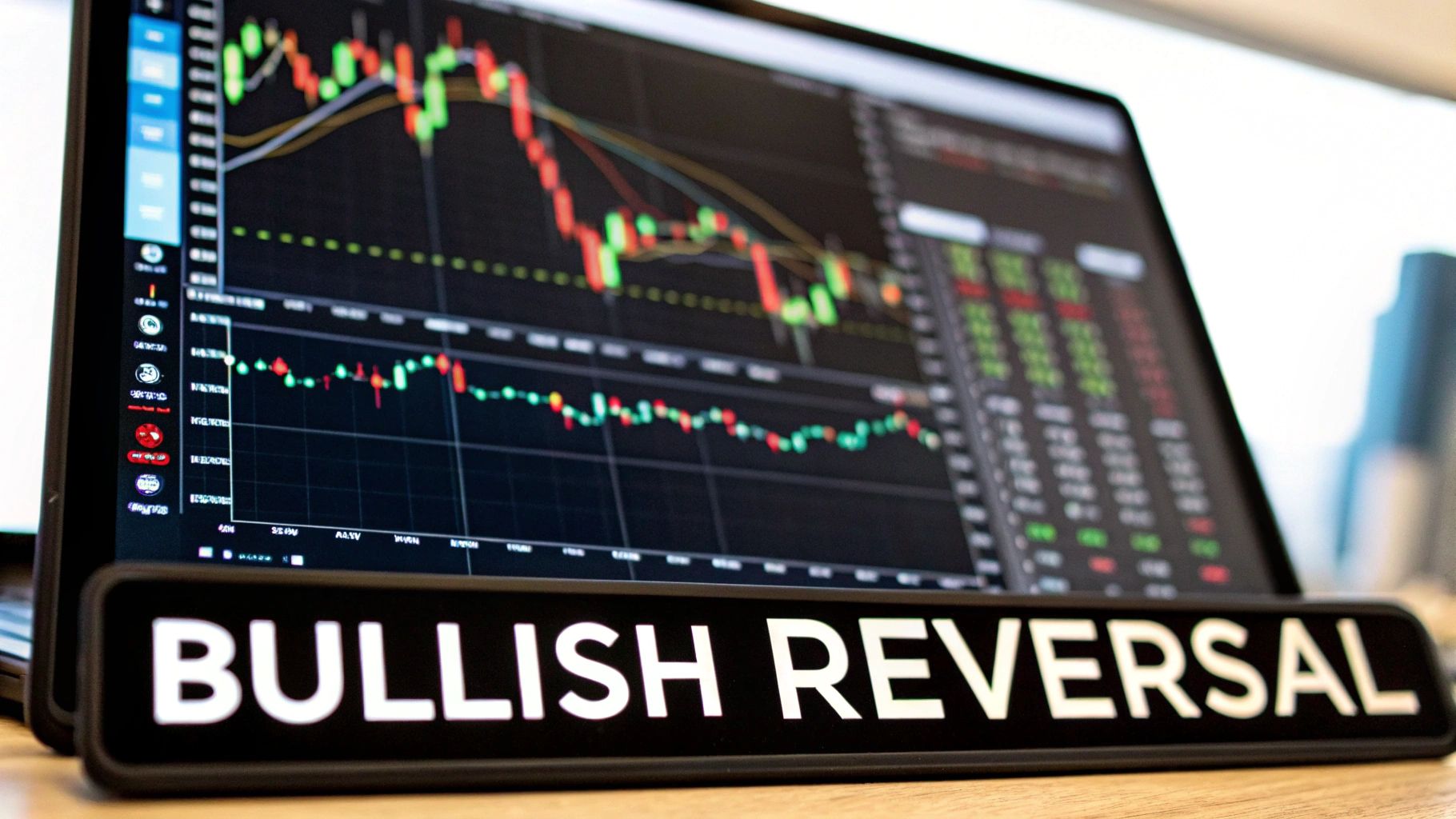
When Markets Show Their Optimistic Side: Bullish Patterns
Just like people, markets have moods. Bullish candlestick patterns in forex show us when the market is feeling upbeat – hinting at potential upward swings. While these patterns aren't a crystal ball, they do offer valuable clues. Let's explore some of the most important bullish signals.
The Hammer: Finding Support After a Fall
Imagine a market tumbling down, only to hit solid ground and bounce right back up. That's the hammer pattern in a nutshell. Picture a single candlestick with a small body at the top and a long wick underneath – at least twice the body's length. It really does look like a hammer! The color of the body isn't as important as that long lower wick. That wick tells a story: sellers pushed the price down, but buyers wrestled back control, driving it up again. This could signal a shift in momentum.
For example, let's say the EUR/USD pair forms a hammer after a downtrend. This might suggest sellers are losing their grip, and buyers are stepping in. But confirmation is key. Look for the next candlestick to close green and above the hammer’s high to really validate this bullish signal.
The Morning Star: Dawn After the Darkness
The morning star pattern is a three-candlestick formation that appears after a downtrend, like a beacon of hope. It starts with a long red candlestick, followed by a small-bodied candlestick (the "star" – which can be red or green) that gaps down. The third candlestick is a long green one, closing near or above the midpoint of the first candlestick. This pattern shows selling pressure fading and buyers starting to take charge. The "star" represents a moment of indecision, a pause before the market makes up its mind. The final green candle confirms the bullish shift.
This pattern is especially strong when the third candlestick gaps up from the star, creating a more dramatic reversal. Think of it as the sun rising after a long night – a fresh start for the market.
The Engulfing Pattern: A Bullish Takeover
Picture a big buyer barging into the market and swallowing up all the selling pressure. That's the engulfing pattern. It's a two-candlestick formation: a small red candlestick followed by a much larger green one that completely engulfs the previous candle. The green candlestick's body has to open lower than the red candlestick's close and close higher than the red candlestick's high. This shows a powerful shift from sellers to buyers.
The engulfing pattern is especially potent after a long downtrend or at a key support level. It suggests the downtrend is running out of steam, and a bullish reversal might be on the horizon. For example, in the GBP/USD pair, an engulfing pattern after a steep drop could signal a good time for traders to consider long positions.
Context Is King: Avoiding Pattern Traps
While these patterns offer valuable insights, they're not magic bullets. Context is everything. Dr. Thomas N. Bulkowski’s research in his book 'Encyclopedia of Chart Patterns' shows the Tweezer Bottom pattern has a success rate of about 61% across various stocks and indices. Other studies show the morning star boasts a success rate of roughly 65%. Discover more insights. This means these patterns don't always lead to the predicted price action. Always consider the bigger picture – things like overall market trends, support and resistance levels, and other technical indicators – before making any trading decisions.
Successful forex traders use candlestick patterns as one piece of a larger trading strategy, not as standalone predictors. By combining these patterns with other technical analysis tools and a solid understanding of market dynamics, you can improve your chances of spotting real opportunities and navigate the forex market with more confidence.
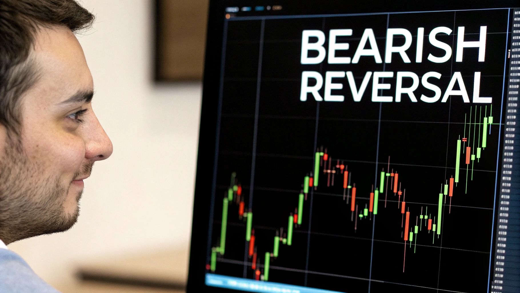
Recognizing Market Pessimism: Bearish Pattern Mastery
When the market's mood shifts from sunny optimism to gloomy pessimism, it speaks through the language of bearish candlestick patterns. These patterns are like whispers of caution, warning signs for savvy forex traders. Just as a seasoned sailor reads the subtle shifts in wind and currents, a trader interprets these patterns to understand the market's changing tides.
The Shooting Star: A Fleeting Glimpse of Hope
Imagine a shooting star, briefly blazing across the night sky before fading into darkness. The shooting star candlestick pattern, a single candlestick, mirrors this fleeting hope in a bearish market. It has a small body at the top and a long upper wick, just like its celestial namesake. This pattern usually appears after an uptrend, hinting that the party might be over. The long upper wick tells a story: buyers initially pushed prices higher, but sellers quickly wrestled back control, driving prices down before the day's end. Think of it as a brief, optimistic rally swiftly extinguished by renewed selling pressure.
For instance, picture a shooting star appearing on the EUR/USD daily chart after a period of growth. This could signal a potential reversal. However, remember that confirmation is key. A subsequent red candlestick closing below the shooting star's body adds weight to the bearish signal. It’s like getting a second opinion confirming the initial diagnosis.
The Evening Star: A Fade to Black
The evening star is a three-candlestick pattern that narrates a gradual descent from optimism to pessimism. It emerges after an uptrend, starting with a long green candlestick (optimism), followed by a small-bodied candlestick (indecision – the market pausing for breath), and concluding with a red candlestick that closes well into the body of the first green candle (pessimism confirmed). This sequence signals weakening buying pressure and growing seller momentum. The bulls are tiring, and the bears are starting to growl.
Observing this pattern in the GBP/USD pair, for example, might suggest that the upward momentum is stalling, hinting at a potential downtrend. Just as the evening star marks the transition from day to night, this pattern can signify a shift from a bullish to a bearish market.
The Dark Cloud Cover: Storms on the Horizon
Just as dark clouds gathering on a sunny day foreshadow a coming storm, the dark cloud cover pattern signals potential trouble ahead in the market. This two-candlestick formation begins with a red candlestick opening above the previous green candlestick's close. However, it then closes significantly below the midpoint of the green candle's body. This shows that sellers haven't just countered the buying pressure; they've pushed prices considerably lower, hinting at a possible trend reversal.
Spotting a dark cloud cover pattern on the USD/JPY chart after a period of upward movement should serve as a warning. The uptrend might be losing steam, and a bearish reversal could be brewing. The "dark cloud" suggests the potential for turbulent market conditions ahead.
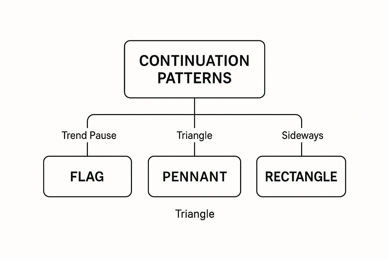
The infographic above illustrates some continuation patterns in forex. These patterns, like flags, pennants, and rectangles, indicate that a trend might pause before resuming in its original direction. They are like rest stops on a long road trip – a chance for the market to “catch its breath.” Recognizing these patterns can prevent misinterpreting them as reversals, allowing you to maintain potentially profitable positions.
From Patterns to Profits: Context is Key
Candlestick patterns aren't standalone fortune tellers. Just as a single word can have different meanings depending on the sentence, candlestick patterns require context. They are most effective when combined with other technical analysis tools like TradingView and a solid understanding of market dynamics. Learning to distinguish between temporary pessimism (a normal market correction) and a genuine trend reversal is essential for trading success. Avoid the trap of seeing bearish signals everywhere. By understanding the nuances of these patterns and integrating them into a broader trading strategy, you can navigate the forex market with increased confidence and potentially improve your trading performance.
Let's summarize these key bearish reversal patterns with a comparison table:
Major Bullish vs Bearish Candlestick Patterns Comparison: This table provides a side-by-side comparison of key reversal patterns, highlighting their formation, the market psychology they reveal, and their typical success rates.
| Pattern Type | Formation | Market Psychology | Success Rate (Estimated) | Best Used When |
|---|---|---|---|---|
| Shooting Star (Bearish) | Small body at top, long upper wick | Buyers lose momentum, sellers take control | 60-70% | After an uptrend |
| Evening Star (Bearish) | Long green, small body, long red | Transition from optimism to pessimism | 70-80% | After an uptrend |
| Dark Cloud Cover (Bearish) | Red candle opens above previous green close, closes below midpoint | Sellers overpower buyers, pushing prices lower | 65-75% | After an uptrend |
This table emphasizes that while these patterns offer valuable insights, their success rates are not absolute guarantees. They are probabilities, not certainties, and highlight the importance of combining candlestick analysis with other technical indicators for confirmation. Always consider the broader market context and risk management principles.
When Markets Need a Breather: Continuation Patterns
Forex markets don't always scream "trend reversal!" Sometimes they just take a pause, like a deep breath before the next move. These pauses are what we call continuation patterns, and they're like rest stops on a long drive, letting the market catch its breath before continuing on its journey.
Spinning Tops: Moments of Indecision
Think of a tug-of-war where neither side budges. That's the spinning top candlestick. It has a small body and long wicks, both about the same length. This shows indecision in the market. It doesn't tell us which way things will go, but the market often continues in the same direction after this brief pause. Imagine a spinning top during an uptrend. It suggests a temporary hesitation before buyers potentially jump back in.
Doji: The Equilibrium Point
The doji is a special case. The open and close prices are almost the same, making the candlestick look like a cross or plus sign. It's a moment of perfect balance, a true equilibrium point. Like standing at a crossroads, the market is unsure which path to take. The next candlestick usually reveals whether the current trend will continue or reverse. For example, a doji in the EUR/USD pair during an uptrend signals a pause. The next candle is key – will the bulls keep pushing forward, or will the bears take charge?
Small-Bodied Candles: Consolidation, Not Reversal
Not every small candle is a doji. Several small-bodied candles in a row, regardless of color, can simply mean consolidation. The market is taking a break, digesting recent price moves, before potentially continuing along the same trend. This is different from a reversal, where momentum clearly shifts. These small bodies reflect less trading activity – a period of calm before the next significant price swing. You might find Supply and Demand Trading helpful for understanding these market dynamics.
Distinguishing Pauses from Trend Changes: Why It Matters
Telling the difference between continuation patterns and reversal signals is crucial for Forex traders. If you mistake a pause for a reversal, you might close a profitable trade too early, leaving money on the table. For example, seeing a spinning top and thinking it's a bearish reversal during a strong uptrend could lead to selling prematurely, just before the price continues to rise.
Practical Applications: Reading the Market’s Breath
Continuation patterns are powerful tools for price-action traders. Recognizing these patterns gives you valuable insight into a trend’s strength. A series of spinning tops followed by a strong bullish candle can confirm an uptrend’s continuation, creating a good opportunity to enter a long position or add to an existing one. Likewise, spotting a doji in a downtrend and waiting for the next candle's direction can prevent early exits and boost potential profits. Understanding these patterns helps you make smarter trading decisions, navigating the Forex market with greater skill.
The Human Psychology Behind Pattern Success
Have you ever looked at a candlestick chart and wondered how those colored rectangles could possibly predict where the market is headed? The answer lies in understanding the powerful influence of mass psychology on forex trading. Human emotions are timeless, driving market behavior just as they did centuries ago when Munehisa Homma traded rice in 18th-century Japan. These same emotions continue to shape trading decisions today.
Emotions in Action: Fear, Greed, Hope, and Despair
Think of candlestick patterns as a visual representation of trader emotions unfolding in real time. Each candlestick tells a story. It whispers of fear and greed, hope and despair. A long green candle might depict the rush of buyers, fueled by greed and the hope of even bigger profits. On the flip side, a long red candle can illustrate the panic of sellers driven by fear as prices tumble.
Let's paint a picture. Imagine the EUR/USD pair takes a sudden dive. A series of long red candles with long upper wicks begin to form. These wicks, like little flags, signal the fear gripping sellers as they scramble to exit their positions. This can create a domino effect, pushing prices down even further.
Why Patterns Work (and Sometimes Don't)
Candlestick patterns offer a glimpse into the collective emotional state of traders. Certain patterns, like the hammer or the engulfing pattern, hint at a potential shift in sentiment. But here's the catch: they aren't magic bullets.
Their effectiveness is tied to market conditions. In volatile markets, emotions run high, making patterns more pronounced and potentially more reliable. However, in quiet markets, these patterns can be subtle and easily misinterpreted.
This explains why a pattern that performs brilliantly in a trending market might fall flat in a consolidating market. During consolidation, prices move sideways, and indecision prevails. Clear emotional signals become much harder to decipher. This is where truly understanding the "why" behind the patterns becomes critical.
From Pattern Recognition to Market Understanding
Memorizing candlestick patterns won't make you a trading guru. The real power comes from understanding the underlying psychology that drives these patterns. This transforms you from a pattern-spotting machine into a trader who can interpret market sentiment and anticipate potential price movements.
Take support and resistance levels, for instance. Support levels are price points where buying pressure is expected to overpower selling pressure. Resistance levels are the opposite – where selling pressure is likely to win out. Through the lens of crowd psychology, these levels represent points where collective fear and greed are amplified. Candlestick patterns emerging around these levels can offer valuable clues about potential breakouts or reversals.
Candlesticks: Exposing the Collective Mind
Candlestick patterns expose the collective emotional state of countless traders making split-second decisions. These decisions, driven by primal forces of fear and greed, ultimately dictate currency prices. By learning to read the emotional language of candlesticks, you gain a significant edge in the forex market.
This edge doesn't come from predicting the future. It comes from understanding the present psychological landscape of the market and positioning yourself accordingly. This nuanced understanding allows you to approach trading with a more insightful and informed perspective, boosting your potential for success.
Turning Pattern Recognition Into Trading Profits
Theory is good, but making money is the real goal. This section shows you how to go from spotting candlestick patterns on a forex chart to actually using them in your trades. Think of it as your personal trading cookbook, filled with recipes for different market situations.
Combining Candlesticks with Other Indicators
Candlestick patterns alone are helpful, but they can be a bit like navigating with only a compass. You know the general direction, but not exactly where you are. Using them with other technical indicators gives you a much more precise picture. It’s like having a map and a compass.
For instance, let’s say you see a bullish hammer pattern. This hints at a potential price reversal. If you also see that the Relative Strength Index (RSI) is showing oversold conditions, that adds more evidence. Now you know that the selling pressure might be easing up, making the reversal even more likely. Similarly, if a bearish engulfing pattern shows up with a jump in trading volume, that confirms the downward momentum is strong.
This screenshot from TradingView shows this in action.
This Bitcoin chart uses several indicators alongside candlestick patterns. You can see the volume, moving averages, and the RSI, all giving you a more complete view of the market.
Mastering Entry and Exit Strategies
Think of a chef carefully preparing a dish. Timing and execution are everything. Trading is no different. A clear entry strategy based on pattern confirmation is crucial.
Let’s take that bullish engulfing pattern again. If the next candlestick closes higher, that confirms the pattern and gives you a better entry point for a long position. Setting a stop-loss order just below the low of the engulfing pattern limits your risk if things don't go as planned. Your profit targets should be sensible and based on the pattern's potential. If the engulfing pattern shows up after a long downtrend, aiming for a profit target at a key resistance level makes sense. For more on entry and exit strategies, check out: 3 Day Trading Strategies That Work.
Risk Management and Position Sizing
Every trader has losing trades. The trick is to manage your risk so they don’t wipe you out. Position sizing – how much you invest in each trade – is key. Think of a ship's captain adjusting the sails based on the wind. In choppy markets, smaller positions help you ride out the storm. In calmer markets with a strong signal, you can take on bigger positions. Knowing the market and the pattern is essential for managing your capital.
Knowing When Not to Trade
Sometimes, the best trade is no trade at all. Just as a doctor doesn't prescribe medicine for every sniffle, you shouldn't trade every candlestick pattern. If a pattern looks iffy, or the market is too uncertain, hold back. For example, in volatile markets, especially during major news events, candlestick patterns can give false signals. Patience and discipline are your best friends in these situations. Waiting for clearer market conditions often leads to better trades than jumping in on weak signals.
Ready to use price action to improve your trading? Visit Colibri Trader to explore programs designed to help you navigate the forex market. We offer everything from beginner courses to specialized programs on supply and demand and day trading. Our focus is on proven price action patterns and disciplined money management. Start your trading journey with us and see the Colibri Trader difference.