


Point and Figure Charts Explained
Point and Figure Charts Explained
The time value of money says that for people, the same amount of money has a different value if available at different point in the future. Time, apparently, plays a vital role in money valuation. For over a century, traders used point and figure charts to filter the time element from a trade.
What is known as the point and figure trading theory has became one of the most curious, yet effective trading theories.
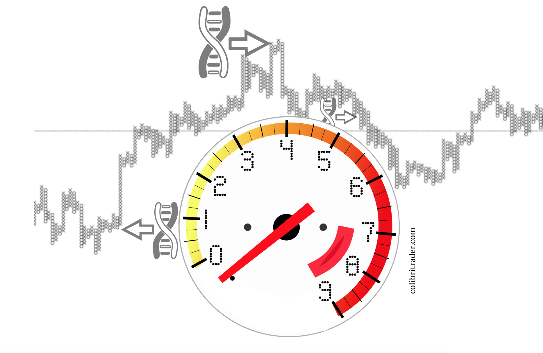
The main thing about point and figure charts is that not all days are equal. In other words, this trading concept attempts to filter the daily noise and focus only on market moves.
The Evolution of Point and Figure Charts
It is, perhaps, one of the most curious trading theories that exists out there. What’s extraordinary about it is that point and figure charts not only survived the test of time but adapted to new markets, too.
21st-century trading involves financial markets not available over a hundred years ago. For instance, Forex or foreign exchange appeared only after the United States ended the gold standard in the early 1970s.
Yet, the point and figure trading concept applies successfully to this relatively new market. In other words, point and figure charts work on any asset class available in today’s financial markets.
Any trader, rookie or professional, has access to various trading platforms offered by the brokerage houses. Starting with MT4 and MT5, and ending with cTrader, or Bloomberg terminals, their main purpose is to provide technical analysis tools to traders.
Point and figure charting doesn’t exist on all platforms. I mean, it doesn’t come with the default types of charts available.
Most platforms offer only the line, bar, and candlestick charts. Still, a quick Internet search gives traders the possibility to add an indicator that transforms the classic charts into point and figure.
The Point and Figure Trading Concept
Savvy and experienced traders keep their charts manually. Point and figure charts distort the time in such a way that only when the market moves, the chart needs updating.
Hence, there’s plenty of time to update point and figure charts, regardless of how many markets are traded.
But what exactly is point and figure charting?
As already mentioned, the theory aims at filtering the non-moving days. In other words, a classic daily chart shows all days, regardless of price action.
Instead of that, point and figure charts show only the days when the market has moved. The trading theory implies that some trading days are more important than others.
Here’s the recent EURJPY daily candlestick chart. It shows the price action since August 2018.
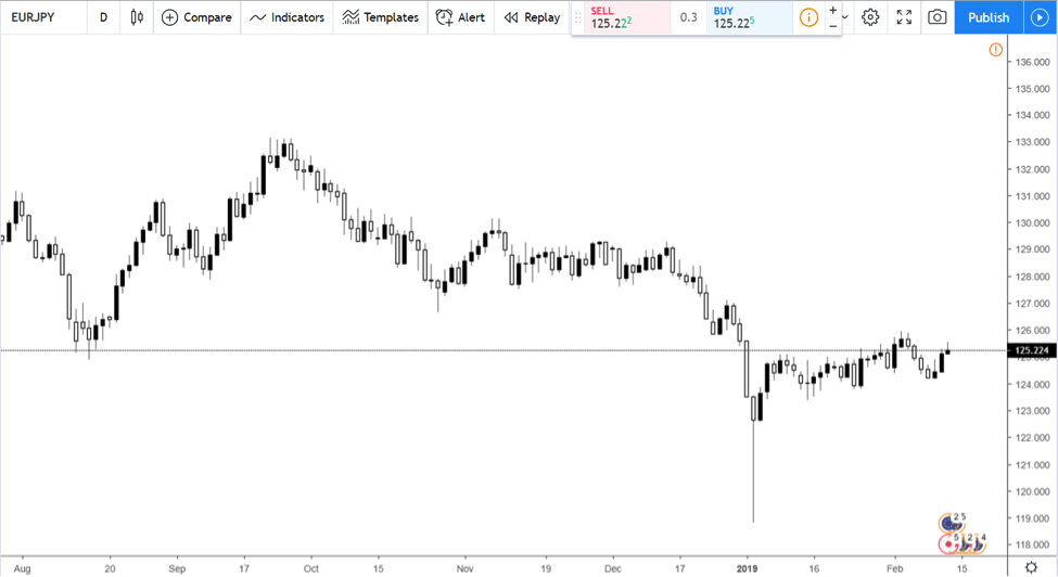
Each candlestick represents one trading day. Regardless of the price action, the chart shows everything.
If we apply the point and figure concept on the same pair, it looks different.
A lot more different!
On an area similar to the one previously used, the point and figure chart depicts the price action for the last seven years!
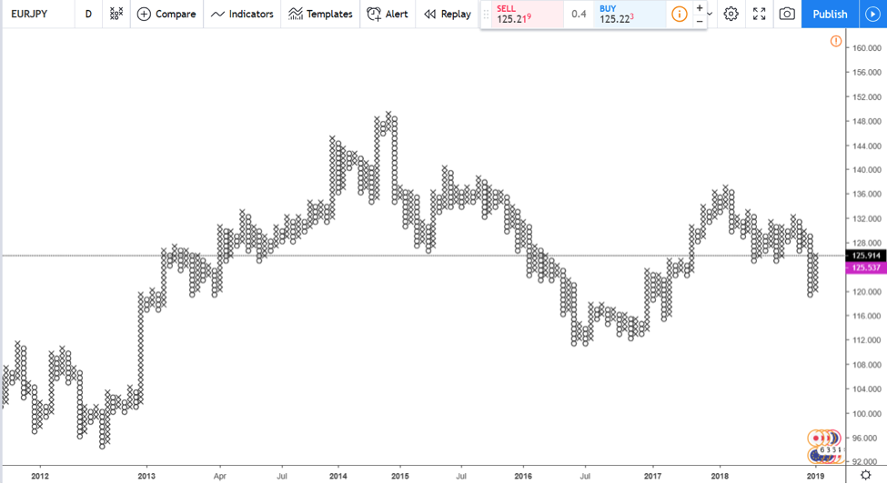
As it filters the days and considers only the relevant ones, this chart eliminates consolidation times. Therefore, traders using point and figure open and close positions only when the market is on the move.
Imagine trading only when the market moves! The account is the main beneficiary.
First, it avoids potential negative swaps. Second, it saves margin, in the sense that more free margin remains available for trading. Finally, it saves commission costs.
Therefore, one of the main benefits of point and figure trading is its “cost-efficiency” element. It avoids unnecessary costs associated with trading the financial markets.
Point and Figure History
The theory appeared around 1880s.
However, it truly became popular in the late 1920s, when speculation on the American stock exchange became popular.
For the ones familiar with other trading theories, some other theories based on the time element appeared around the same time. For example, the Elliott Waves Theory was born around the 1930s, while the famous W.H. Gann made history trading the markets during the early 1900s.
It has a funny history, that is reflected in its name. It was born in the bucket shops where traders started recording prices.
One should remember that those were the days of the earlier technical analysis concepts. Traders began noticing patterns, documented them, and used the outcome to forecast prices.
Nowadays, we take for granted all the info that exists in the technical analysis area, but in those times things were different.
When recording the price of a stock, traders wrote them on the vertical. Thus, a rising column showed the price rose. A falling one, logically, showed the price has fallen.
The term “figure” comes from the fact that traders began noticing patterns.
What about the “point” term, then?
Well, writing down the price levels for various stocks took a lot of time. To save it, traders started using “X’s” instead of numbers.
And so, a chart full of X’s became known as a point chart. Next thing you know, point and figure charts were on everyone’s lips.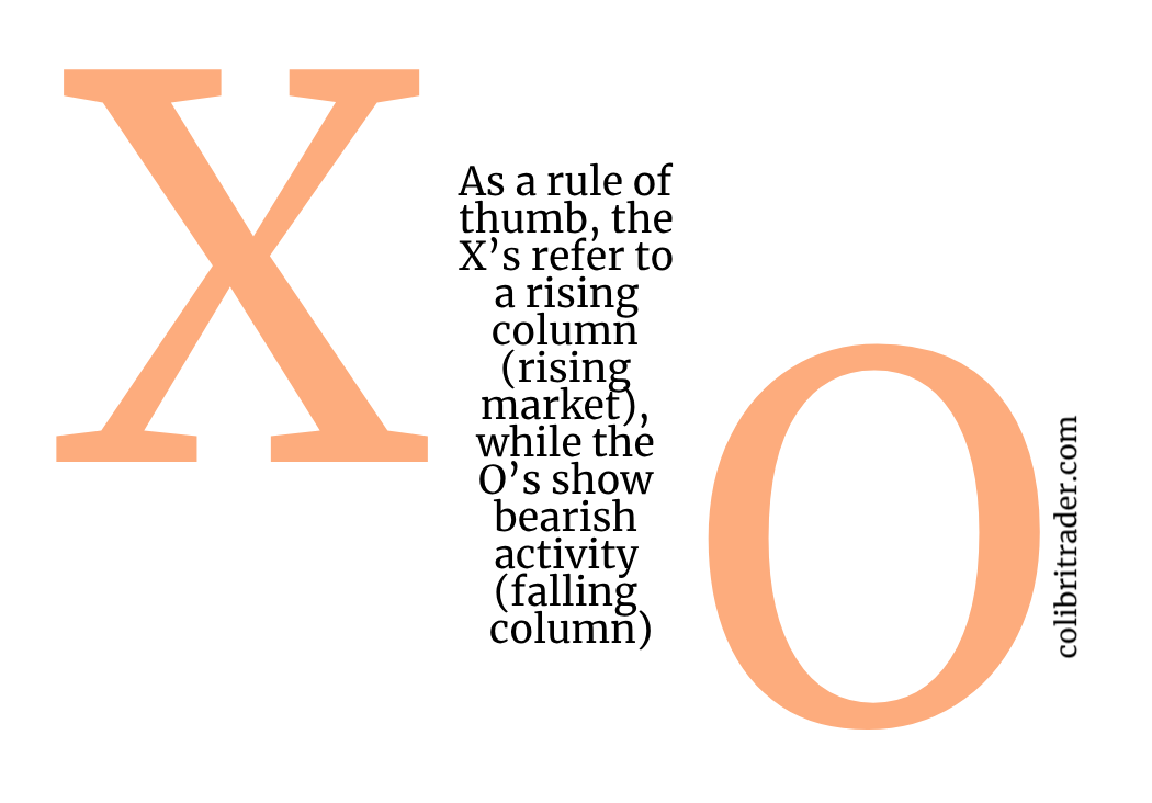
Furthermore, today’s point and figure charts show a series of X’s and O’s. As a rule of thumb, the X’s refer to a rising column (rising market), while the O’s show bearish activity (falling column).
Building a Point and Figure Chart
So far, we know that an X denotes a bullish move, or a break. And, the O’s, a bearish, or a downside break.
The point and figure theory requires that traders set the boundaries of a break. More precisely, what the price needs to do for the move to be considered a bullish or a bearish break.
Back in time traders used the average true range. To this day, the ATR is the indicator to use.
The classic setup uses an ATR of 14 for plotting a new X or an O on a point and figure chart. In other words, the trading platform will plot a new X or an O every time the daily range exceeds the ATR (14).
However, there’s a trick. Two possibilities exist for plotting a point and figure chart.
That is, it depends on what the chart considers. One option is to look at the closing price for the previous day.
Therefore, the point and figure chart plots a new X or O only if the distance from the opening to closing price exceeds the ATR of the last fourteen days.
Another possibility is to use the High/Low distance, instead of the closing price. For the example we used so far, the EURJPY, the High/Low distance criteria applies.
Let’s have another look at it. Only this time, let’s zoom in for more details.
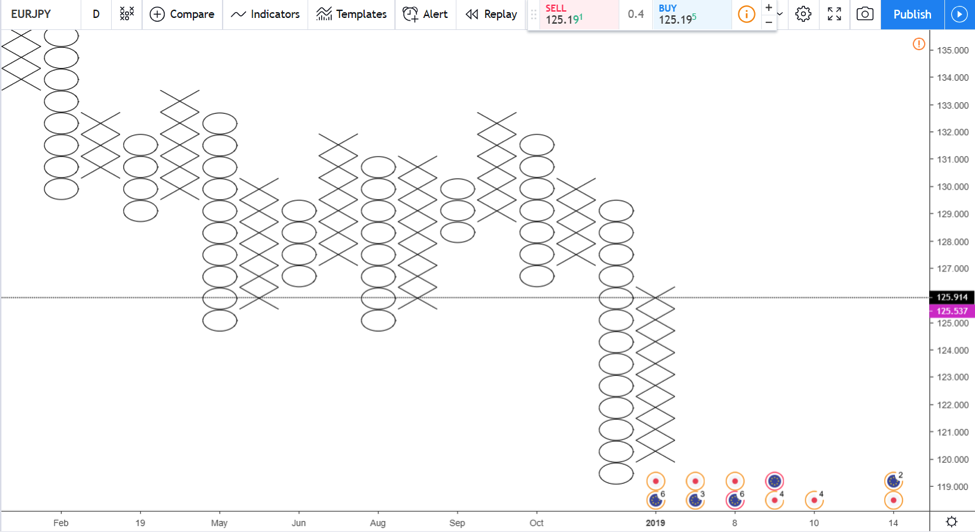
We see the last price action on this point, and figure chart is bullish. The pair is in the middle of a rising column, adding an X every on top of the previous ones.
But a close look at the X’s and the classic candlestick chart, reveals something else. Do we have straight eight days that exceeded the previous ATR(14) high/low range?
The answer is somewhere in the middle.
Introducing the 1-Box, 3-Box and 5-Box Reversal Charts
When applied to the currency market, some traders use arbitrary boxes on point and figure charts. For instance, the ranges differ on a cross pair (one without the USD in its pair) when compared with a major (one with the USD in its pair).
As it turns out, the ATR only is not enough for a point and figure chart. Again, the time element decides everything.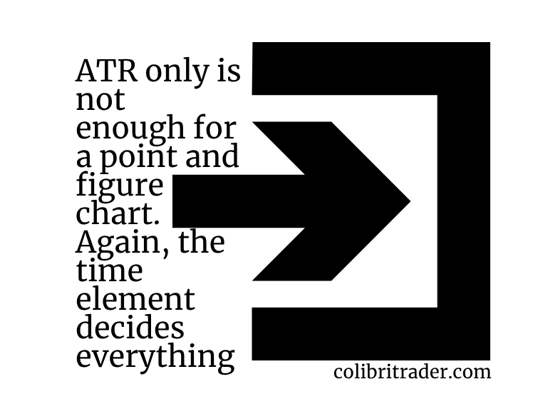
Because initially the point and figure chart used tick data, updating a chart by hand was impossible for long periods. For instance, back-testing it for five years or more proved to be quite a challenge.
The point and figure chart considers the ATR(14) range a 1-box. Therefore, to reverse a falling or rising column, the price needs to exceed 1-box. Or, one time the ATR(14).
But even this method fell out of favour. In the early 1950s, the 3-box reversal charts became popular. It means that the chart plots an opposite sign only when the price reverses three times the distance shown by ATR(14).
Moreover, some traders used 5-box reversal patterns too. If you want, the more significant the timeframes we see on the candlestick charts are the equivalent of 3-box and 5-box reversal charts.
Such developments transformed the point and figure trading theory into a long-term analysis tool. Suddenly, investors of all sorts and traders interested in the bigger picture started using this approach too.
Trading with the 3-Box Point and Figure Reversal Chart
The 3-box reversal chart stood the test of time as the most widely used one. For this reason, the standard setup for today’s point and figure chart has:
- ATR (14)
- 3-box reversal
So, the setup for a point and figure chart considers the box size and the reversal condition. Now that we know that let’s have a look at some of the ways traders use for forecasting future prices with the point and figure theory.
There are many ways to use the 3-box point and figure reversal chart. From standard interpretations (moving averages, Bollinger Bands, Parabolic SAR) to alternative ones (internal lines), traders interpret markets more accurately using point and figure trading.
Using the 45-Degree Internal Lines
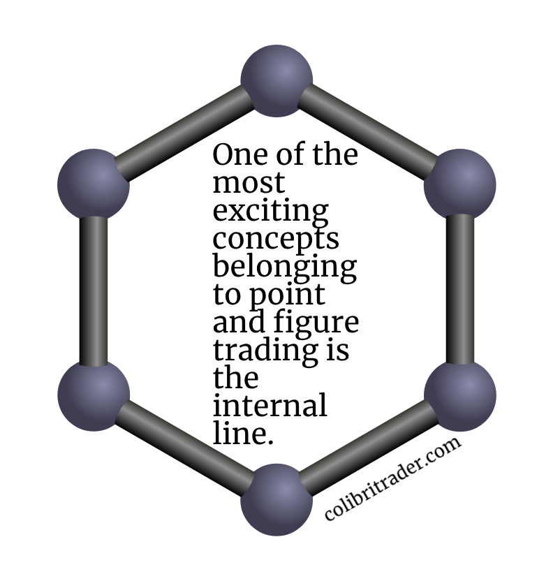
One of the most exciting concepts belonging to point and figure trading is the internal line.
 According to the theory, when the time doesn’t distort the price action anymore, the rising and falling angle of a market is close to 45-degrees.
If back in time traders updated the charts by hand, today’s trading platforms allow finding the angle very quickly. Here are some steps to use for finding such internal lines:
- start from a recent high or low
- mark it with a horizontal line
- place a vertical line so that the two form a 90-degree angle
- use a regular trendline and divide the 90-degree angle into two equal parts
Some trading platforms offer trendlines that automatically show the angle. If that’s the case, just make sure the 45-degree angle starts from a top or bottom.
If we zoom out on the previous EURJPY point and figure chart and apply the above, here’s the result: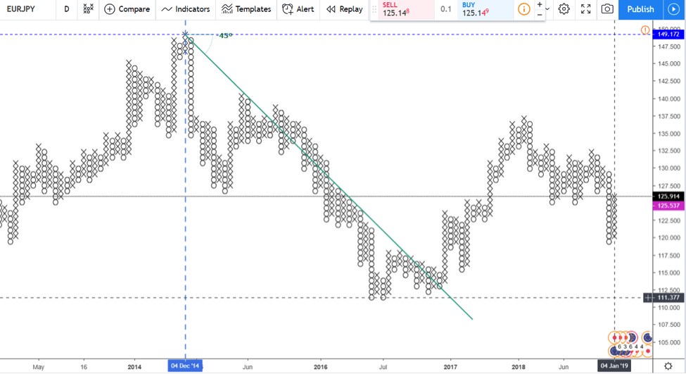
The green line respects the 45-degree internal line. We see that the 3-box reversal point and figure chart respected it for almost three years.
Using the same principle and rules, the 45-degrees internal lines can be applied on all charts. And, from all tops and bottoms.
Their main advantage is that they show the relevant trend. On top of that, they keep traders on the right side of the market, avoiding unwanted spikes or dips that turn out to be false moves.
How to Trade 45-Degrees Internal Lines
The rules of a trend help. In a bearish trend like the one above, the market keeps forming lower lows. And, at the same time, the bounces don’t break the previous lower highs.
Therefore, while it seems that the point and figure price action breaks the 45-degrees internal line, in reality, it doesn’t. The rules of a trend remain in place.
In other words, the high on every column of X’s does not exceed the highs in the O’s. Hence, the bearish trend resumes, despite the internal line’s break.
Remember, it guides the price action. As such, it doesn’t act like a regular trendline.
Now you see the value of looking at the bigger picture with point and figure charts. If anything, the 45-degree internal line showed the bearish direction for almost three years.
Moreover, the price dropped from 149 to 111, a multiple big-figures downtrend. Can you name another type of chart so efficient?
A regular candlestick, bar or line chart won’t show such a trend. They will show the move, probably on the weekly and monthly timeframes, but without filtering for the periods of inactivity.
Finding the Internal Line’s Break
During such long trends, traders always look for potential reversals. In so many years, monetary policy changes.
Fundamentals change, and a pair will react immediately. Because the point and figure charts filter the usual false spikes, we see in the currency market, the price action updates slowly.
However, when it does, it is a signal you don’t want to miss. Remember the rules of a bearish trend? The market keeps forming lower lows.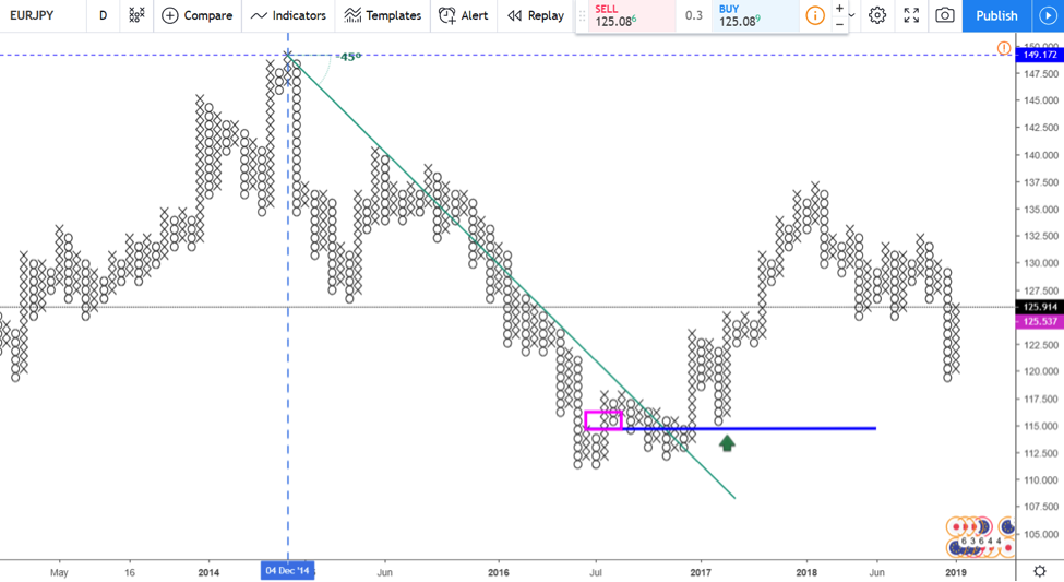
The EURJPY point and figure chart from above shows the X’s column rising above the previous O’s column. That’s a reversal to consider.
Moreover, the previous O’s column failed to make a new lower low. That’s another indication that the years-long bearish trend is about to reverse.
Furthermore, the focus shifts on the 45-degree internal line. Traders mark the reversal level (the magenta box) with a horizontal line (the blue line). The level acts as a future support and reversal level.
Other Ways to Trade with Point and Figure
The 45-degrees internal lines are, by far, the most critical development in this theory. Since the 3-box reversal became the standard, the internal lines stretch for many years, offering traders the full picture.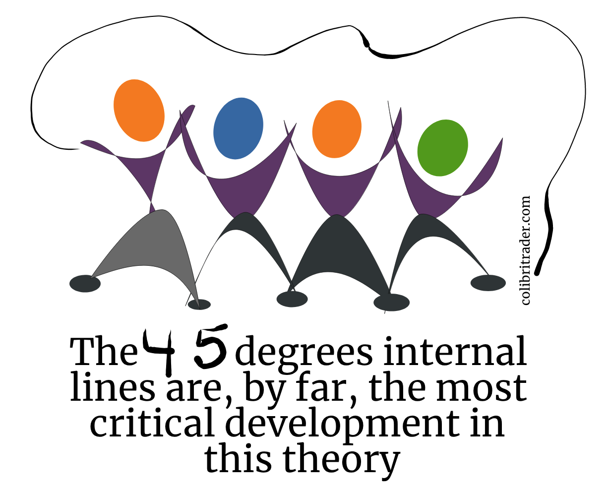
But they are not the only way to trade point and figure charts. Here are some other methods, for you to be aware of:
- finding time horizons for derived targets
- traders apply the time element for a trade, closing it if the time to reach a target expires
- using moving averages with point and figure charts
- the classic golden and death crosses work
- using the Wilder’s parabolic SAR indicator
- the SAR stands for stop and reverse, and, when used on columns, is very efficient
Conclusion
We won’t cover any of the above methods in this article. Instead, the aim was to introduce the point and figure method and to explain the charts.
For a trading theory with such old roots, point and figure trading provides an excellent market overview. Regardless of the financial market traded (commodities, CFDs, indices, currencies, bonds, etc.) and the trading style, point and figure charts offer a glimpse into the long-term trends of a market.
That’s especially important when trading the currency market. As we all know, the volatility given by algorithmic trading often results in fake moves and spikes.
Aggressive spikes in bearish trends or quick dips in bullish ones are the norm. Without point and figure charts to keep an eye on the real direction, traders can sometimes have a hard time finding it.
Out of the two ways to set up a point and figure chart, the high/low one is preferred. However, even when using the closing prices, the chart is more relevant than regular ones.
W.H. Gann was one of the first traders to use the time in his analysis. Moreover, we used time derived targets to accompany price targets. Furthermore, he believed that every security rises and falls following a certain angle.
The point and figure charting is the closest to Gann trading techniques. Perhaps, given the fact that both trading theories originated from the same period, there is a connection. We’ll never know.
What we do know is that point and figure trading evolved with financial markets. And, it will continue doing so for as long as trading exists.
P.S.
Check out my other article on Renko or Candlestick charts